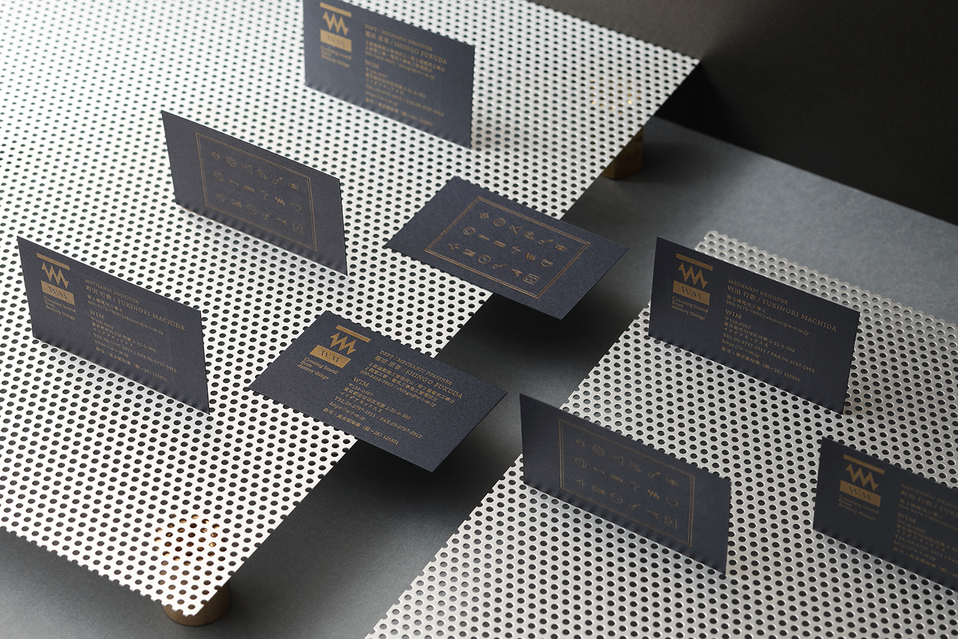
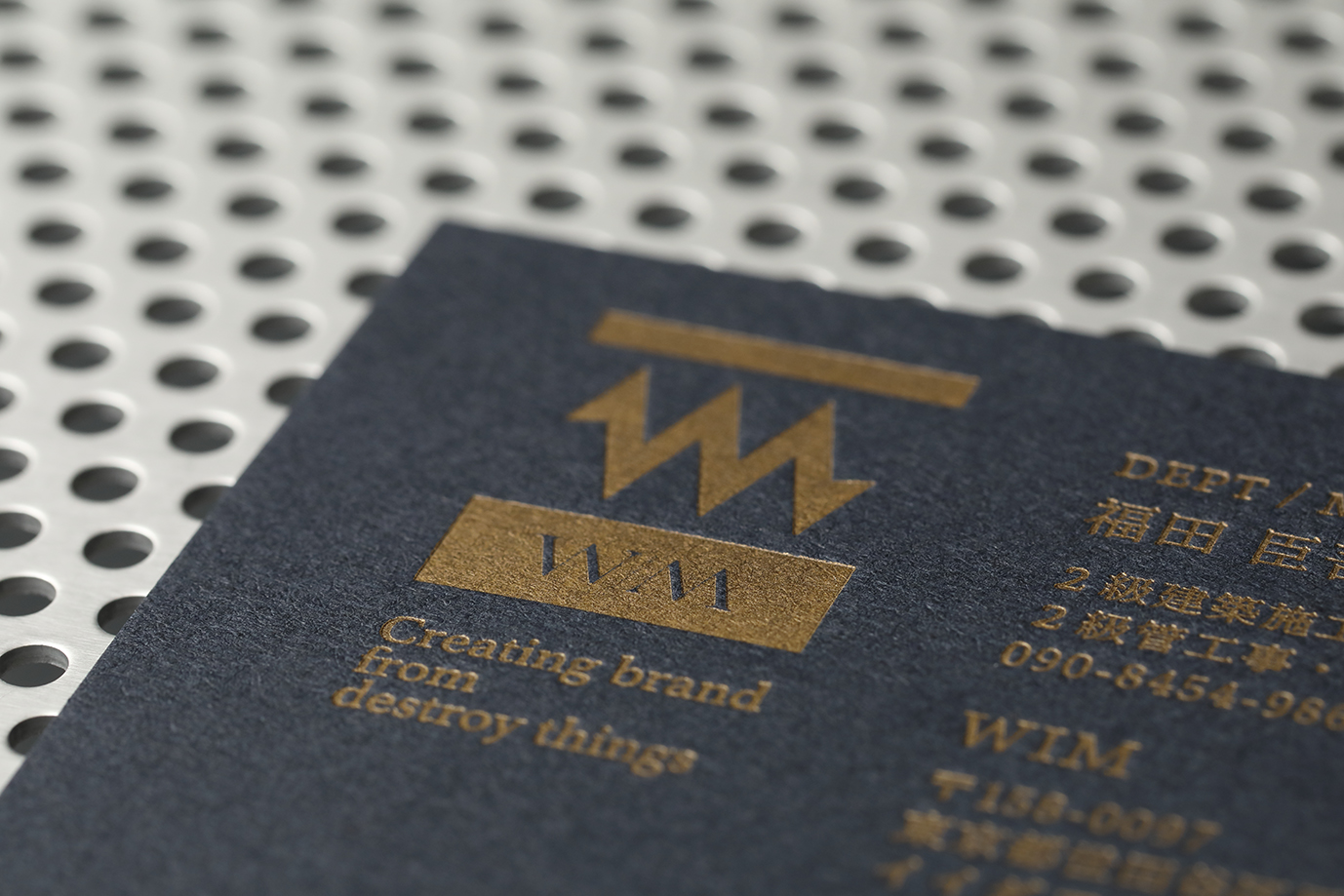
Because I think it's a good idea to strengthen the story of WIM's past 20 years of experience in demolition & facility design, I decided to brand the company using the word "Mechanic". I designed the W & M to look like an electrical schematic of a resistor. This represents two concepts: 1, we'll no longer be bound by the past rules of the construction industry: &, 2, that we'll step forward on a new path. This symbolizes where we've come from & where we're headed. Moreover, we used images and symbols from electrical schematics and construction tools on the card, etc. to show the brand's creativity & express the brand identity of Mechanic.


Country
Japan
Year
2019
Client
WIM
Affiliation
BEAR BRANDING INC.
Designer
YUKI
The copyright of this work belongs to K-DESIGN AWARD. No use is allowed without explicit permission from owner.

New user?Create an account
Log In Reset your password.
Account existed?Log In
Read and agree to the User Agreement Terms of Use.

Please enter your email to reset your password
Comment Board (0)
Empty comment