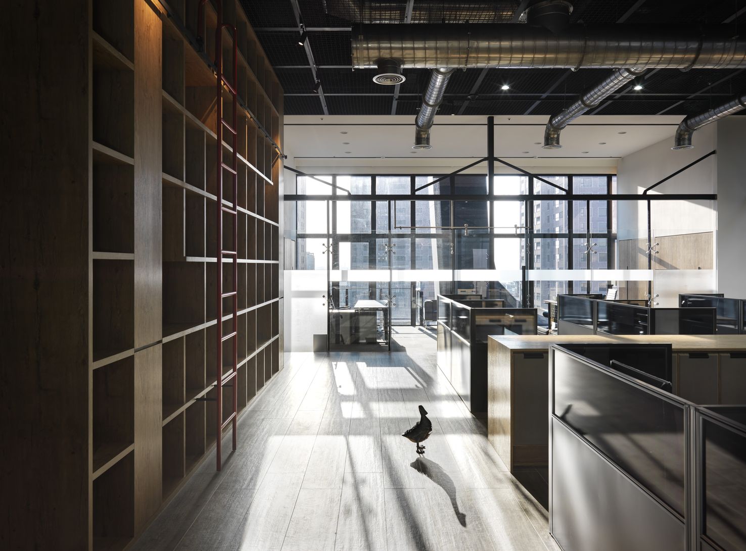
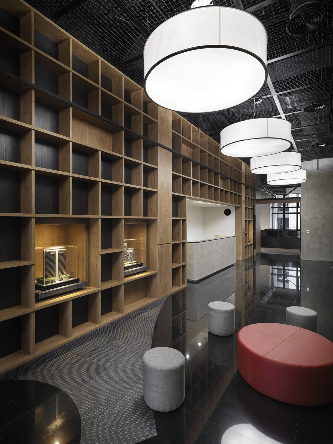
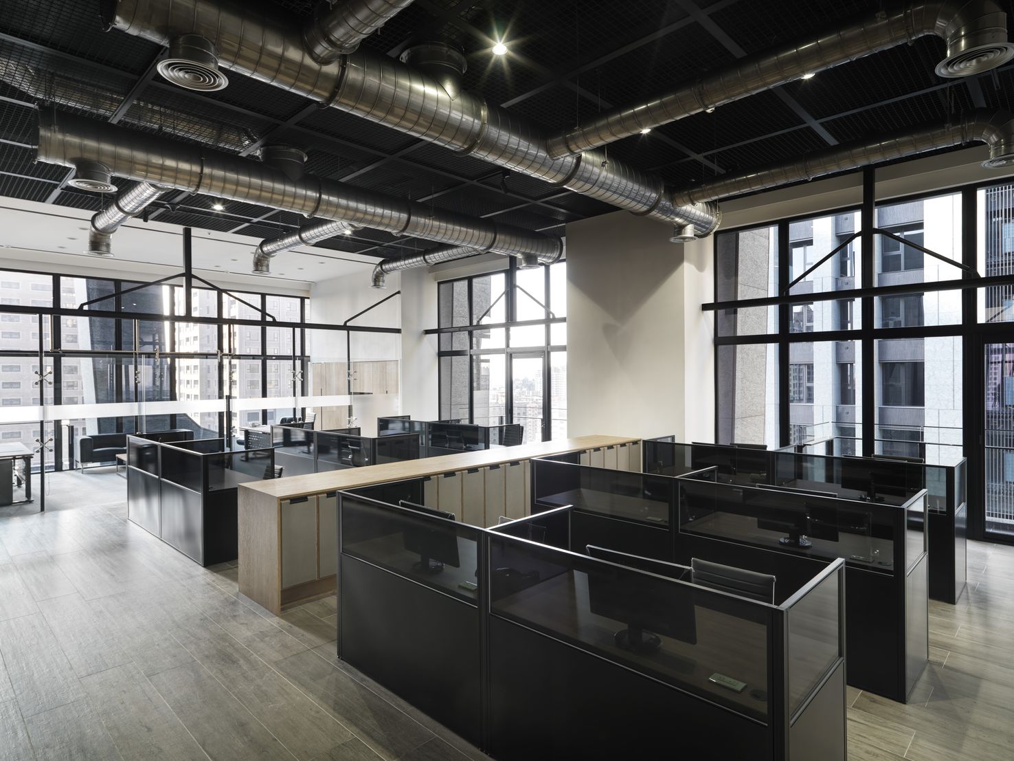
The concept actually originates from the so-called "fundamental", the root of an enterprise's growth, deep into the soil, steady absorption, and the increasing supply of branches and green leaves to nourish, gradually mature and thrive, and then eventually become a big tree that can bear the wind and shelter from the rain. In this way, in the huge four-family connected space, taking the center as the root, it is composed of the main backup and reserved transactional support space, including archives, affairs area, large conference room, storage room, etc. The form is just like the root and trunk of a big tree. Solid wood is used as the main element in a large area. In the performance of the facade, it is not only treated as "face, it is just like the image of the bark with layers and times, corresponding to the actual and the actual. Under the regular surface pattern, there are always natural irregularities. Therefore, in the seemingly regular open-shelf display, the irregular units are placed by leaps, and the top surface of the elevated space is directly reached from the ground plane, thus impersonating the image of branches. Second, the space comes to branches and leaves. Around the trunk, it is the various departments that grow out after receiving nutrients, including the competent offices at all levels, the staff office area and the small conference room. They are graded layer by layer, but they are kept at the same distance from the central area. Solid wood is also used, the scale is reduced, and the space for raising heights is no longer challenged. Like twigs, the leaves in between are naturally endless, people who are dedicated to the company. In this way, the image of a big tree takes shape immediately. Not only does it end here, with such a natural concept of space, it mostly falls on the expression style of free curve structure, but in response to the customer's own corporate style, it should actually be more neat, concise and direct, so it deliberately introduces industrial elements. Create a hard-core approach to explain the conflict and combination of soft inside.


Country
Taiwan
Year
2017
Client
Soundrise Construction Co., ltd.
Affiliation
none
Designer
David Hsiao
[K design award]
[www.kdesignaward.com/]
The copyright of this work belongs to K-DESIGN AWARD. No use is allowed without explicit permission from owner.

New user?Create an account
Log In Reset your password.
Account existed?Log In
Read and agree to the User Agreement Terms of Use.

Please enter your email to reset your password
Comment Board (0)
Empty comment