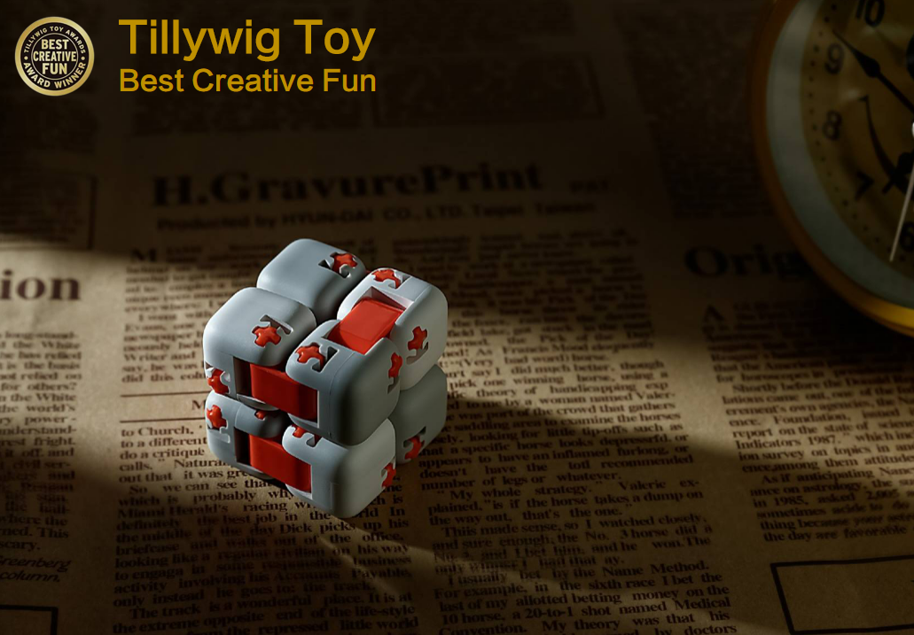
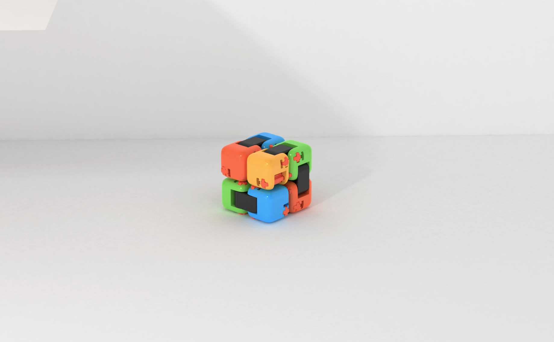
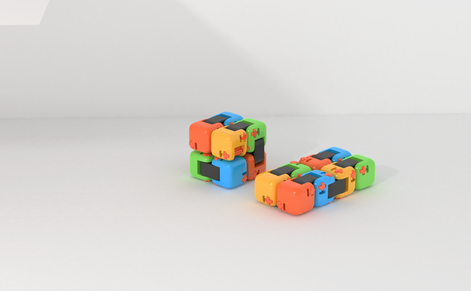
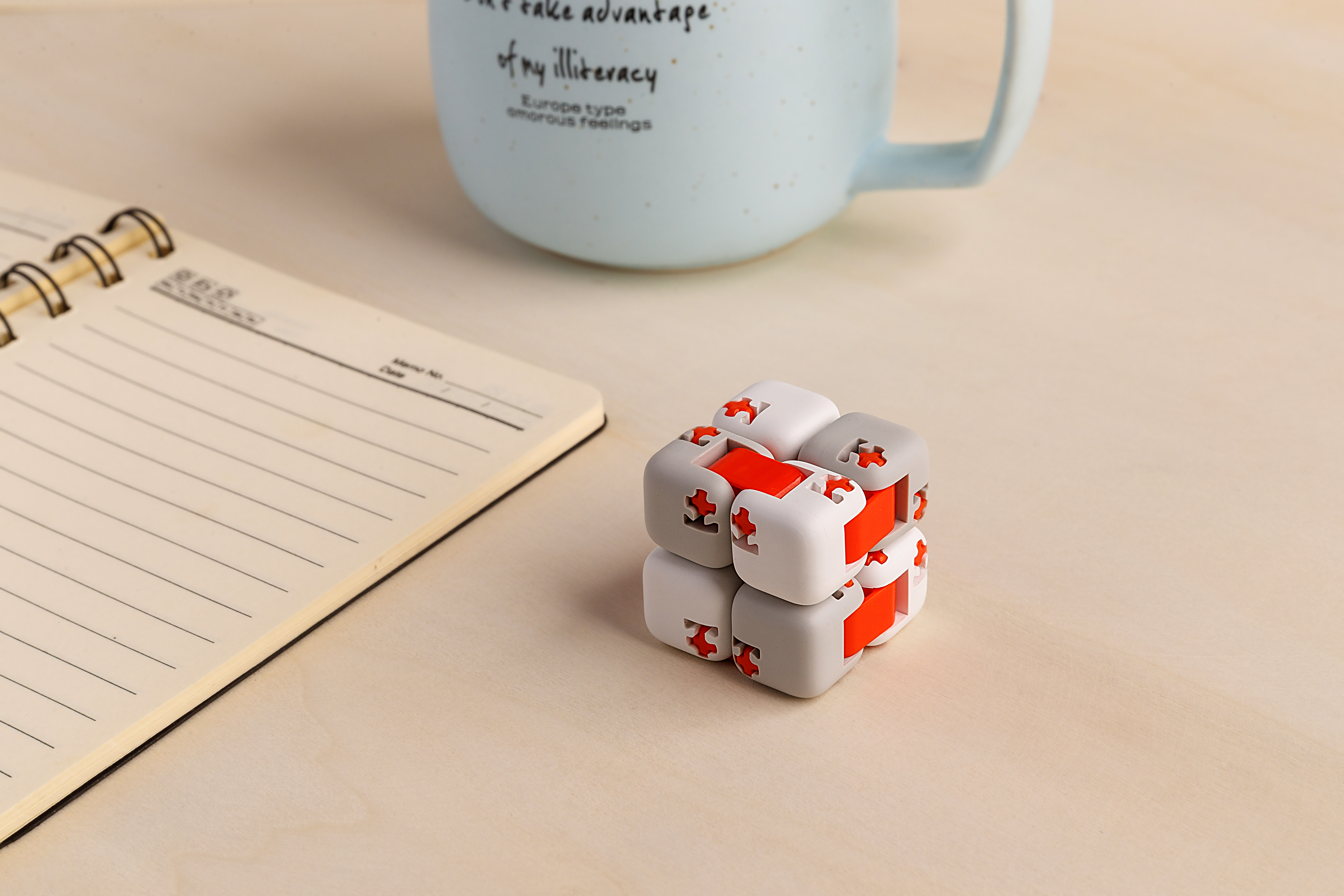
At the beginning of the design, it was colored, such as the head picture. Later, Yingmi's style was changed to white gray orange. I always felt that color was better and color was more vivid;


The copyright of this work belongs to 一条大鱼. No use is allowed without explicit permission from owner.

New user?Create an account
Log In Reset your password.
Account existed?Log In
Read and agree to the User Agreement Terms of Use.

Please enter your email to reset your password
White gray orange is better
Children feel boring when playing with this. Adults may use more and reduce stress! Gray and white orange color matching can adapt to more scenes
Fun, interesting, praise
A wave of impressionist painting style?
Xiaomi, you designed it
Isn't it millet!
The bottom map [white, gray and red] is quite well matched, and it is ideal to have some colorful embellishments in the black, white and gray world.
Very good, suitable for playing with
White gray orange is more style, and the color is too similar to children's toys , personal opinion