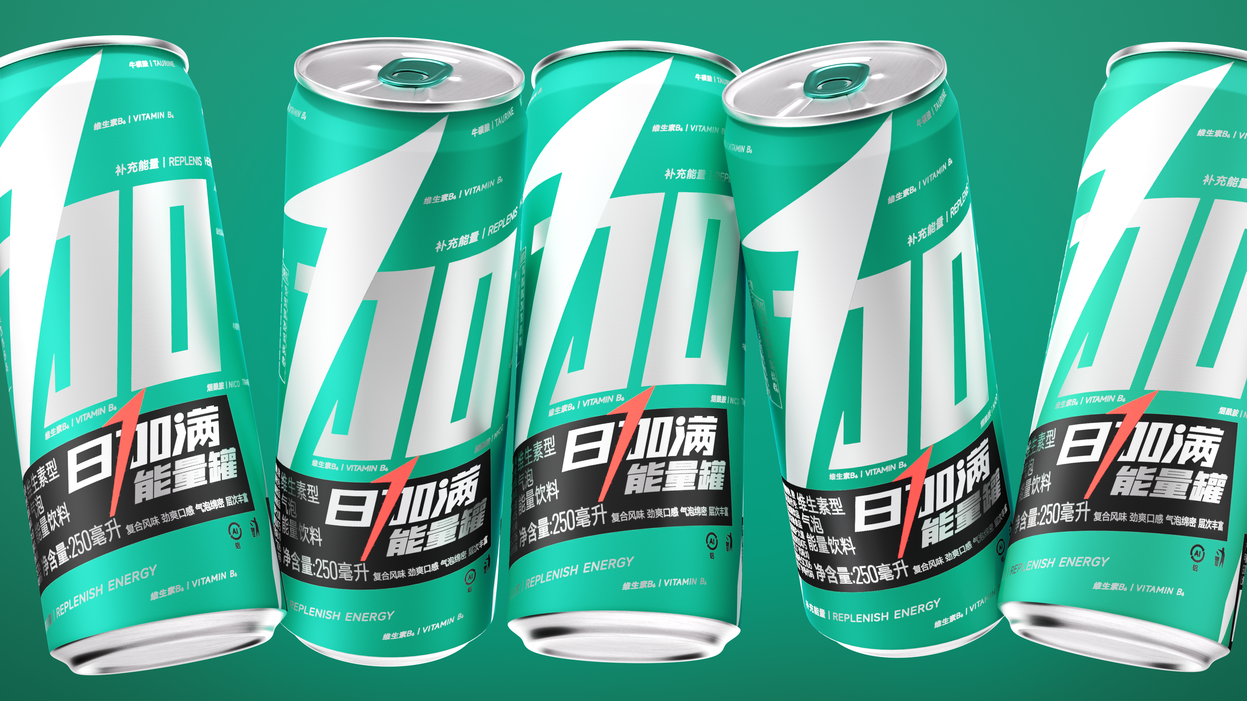
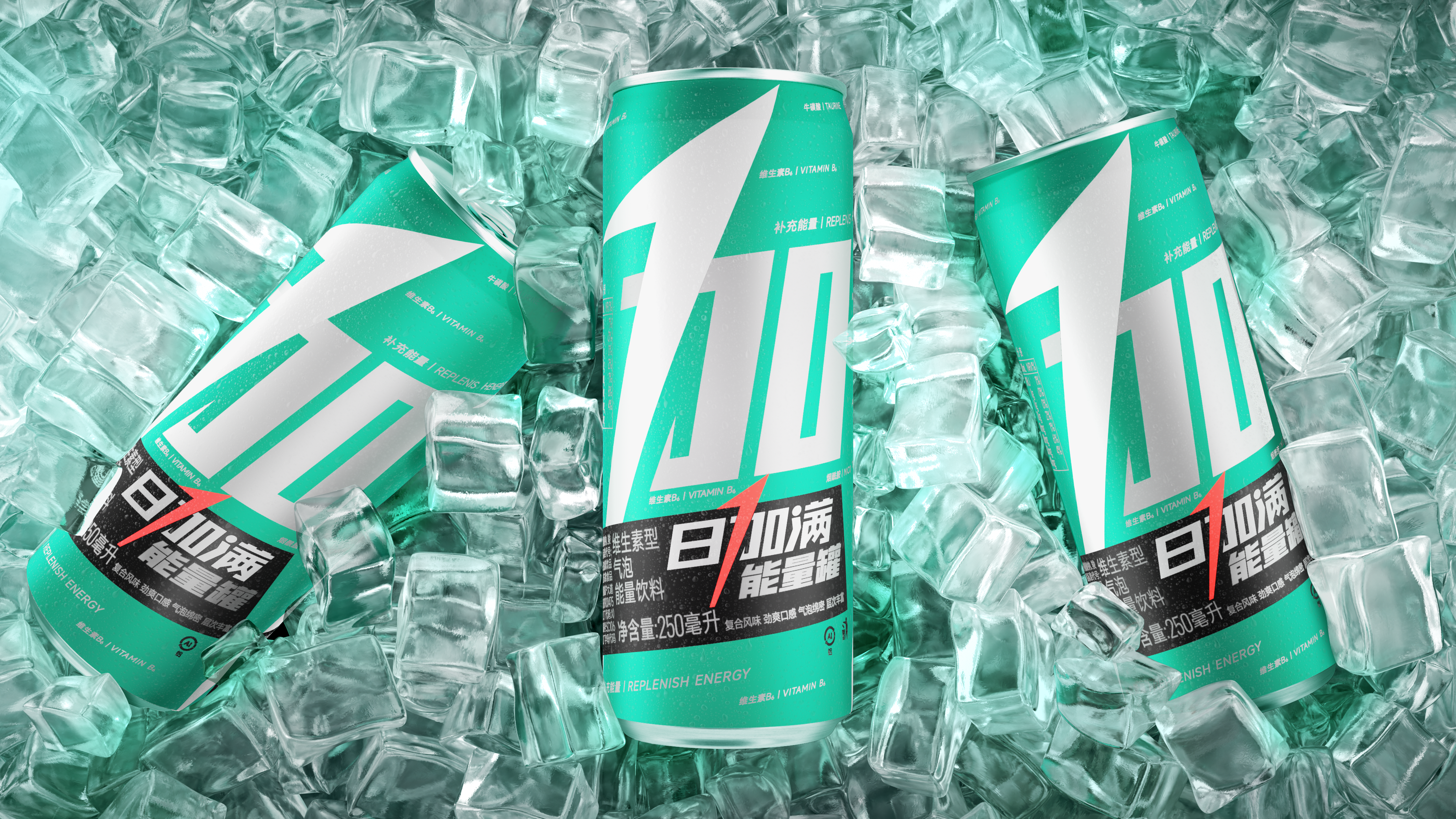
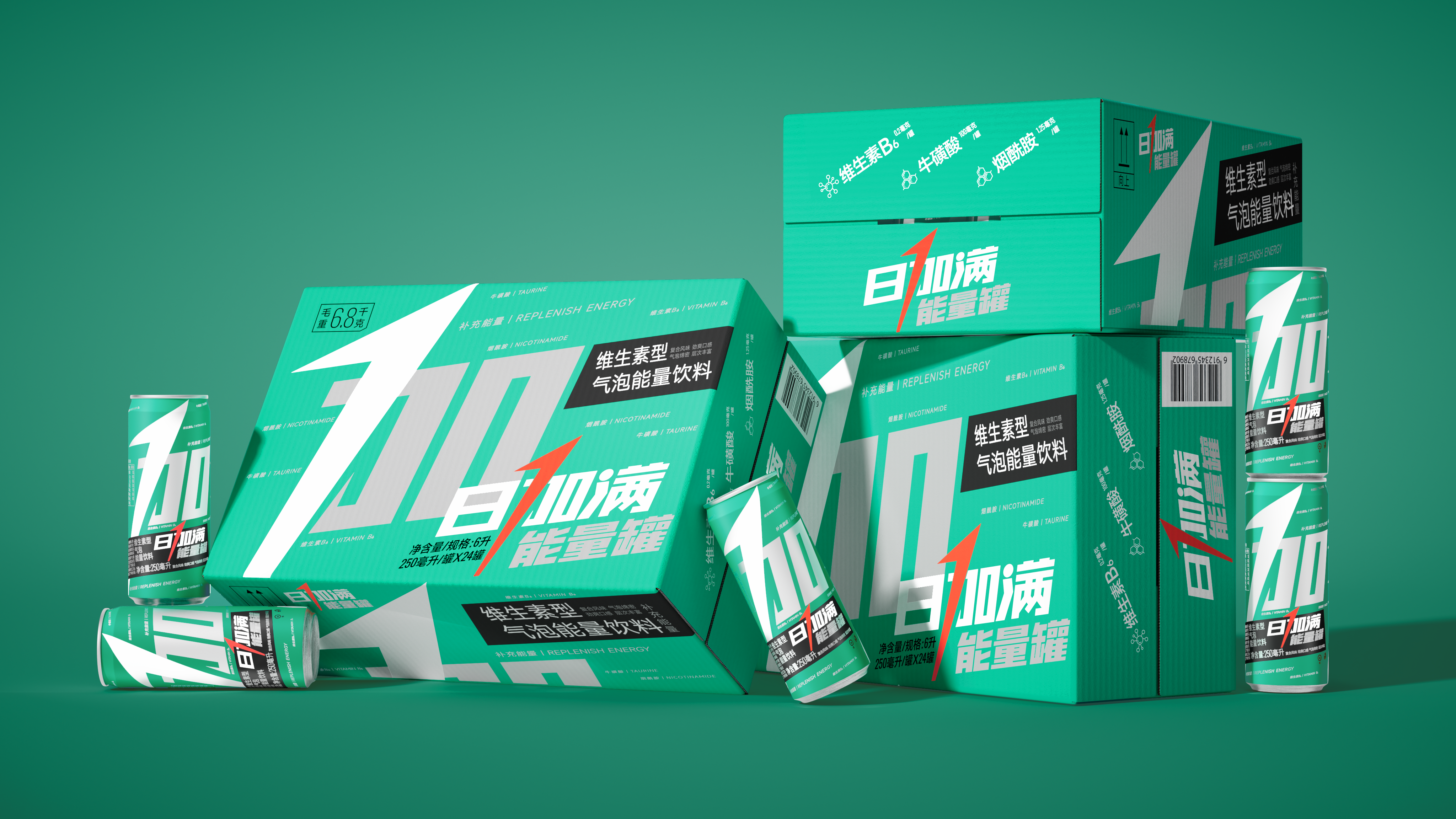
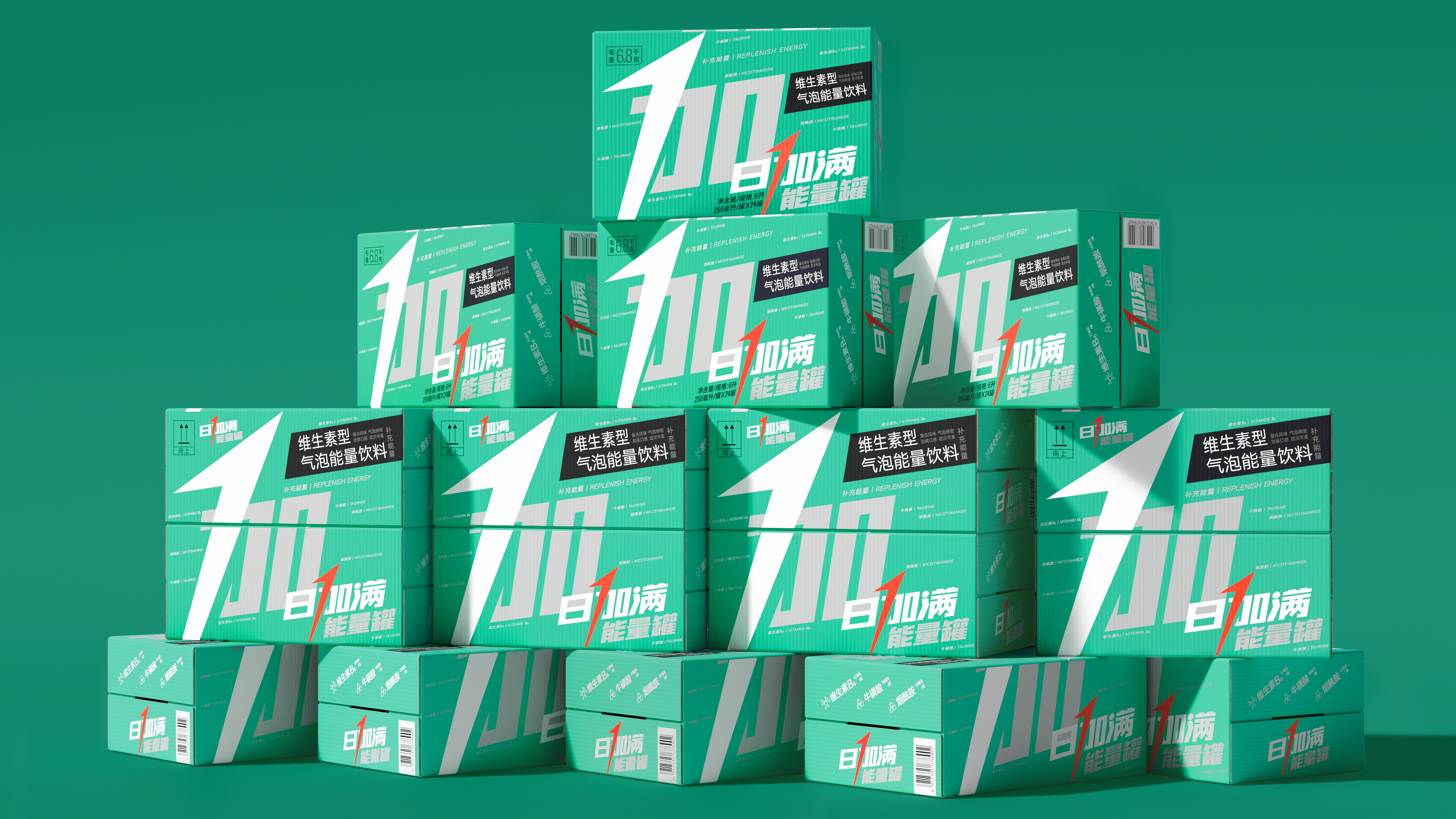
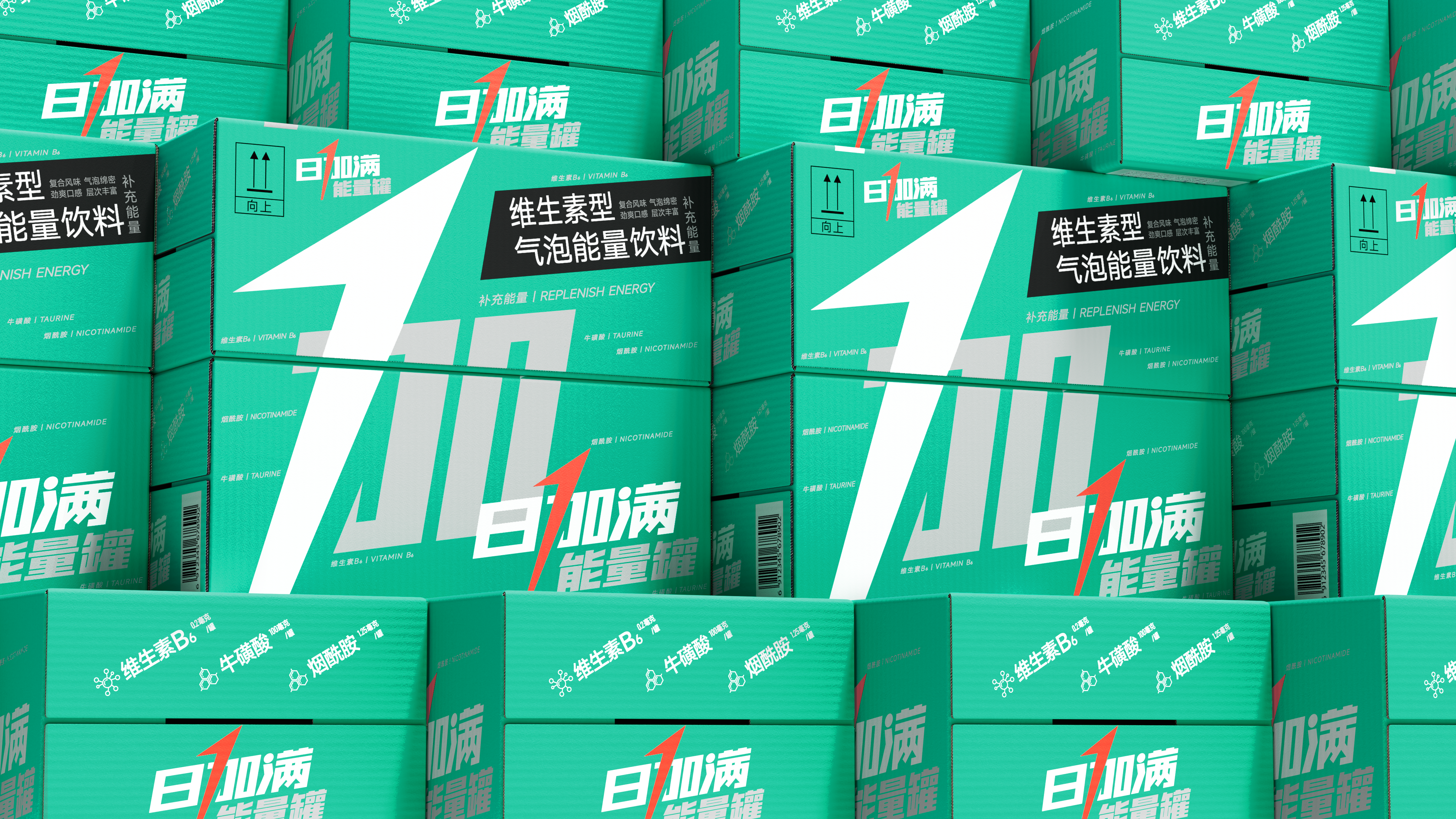
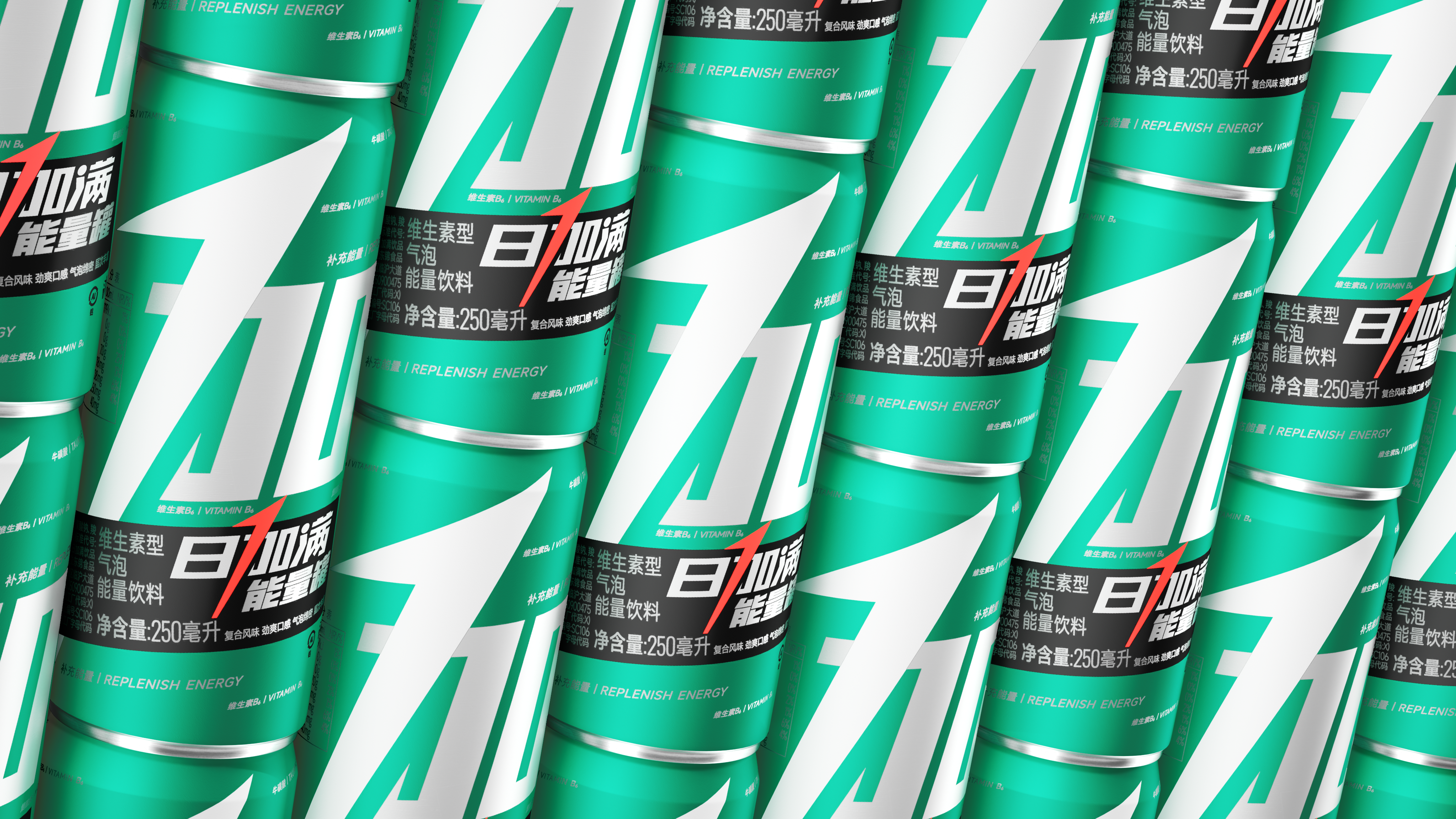
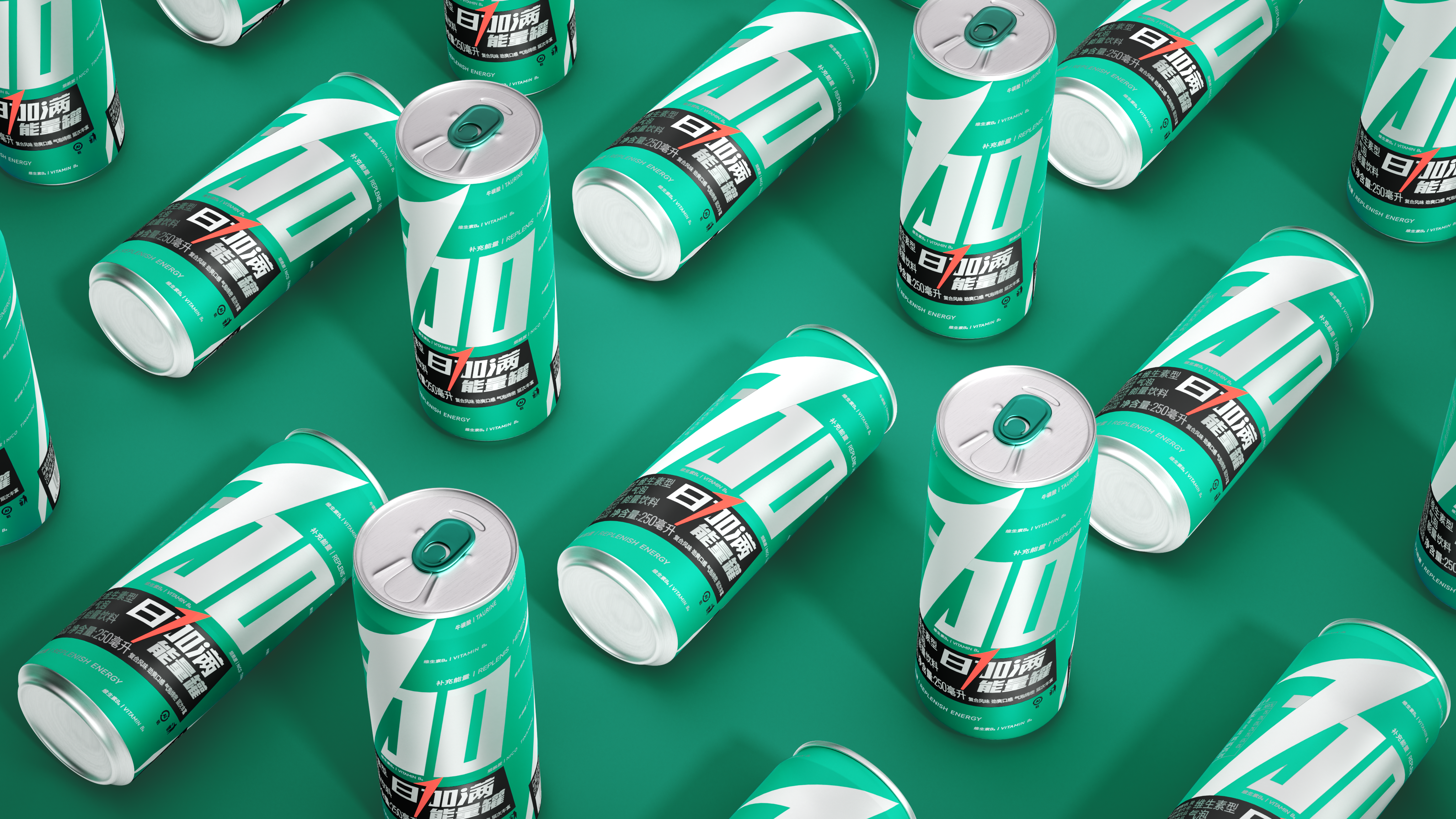
Energy is not only a function, it is an experience. Although the energy drink market is crowded, most products are caught in a strange circle of homogenization of functional stacking. In a complex market, maintaining brand recognition and uniqueness through simple design is the deep interpretation of the core demands of the brand in this design.
Symbolization, the first step out of the circle. We do subtraction on the basis of the original packaging, first focus on refining the most recognizable arrow "plus" in a stroke to play a new height-directly into the number "1". This stroke not only accurately conveys the core function of "replenishing energy", but also reminds people of the full score concept of "100", which makes the brand's sense of speed and energy instantly full. This design has full potential to become a super symbol of the brand, just as Nike's simple, powerful and memorable check gives the brand stronger recognition and long-term market extensibility.
The copyright of this work belongs to 潘虎设计实验室. No use is allowed without explicit permission from owner.

New user?Create an account
Log In Reset your password.
Account existed?Log In
Read and agree to the User Agreement Terms of Use.

Please enter your email to reset your password
The Big Brother's Works
The copywriting is unique.