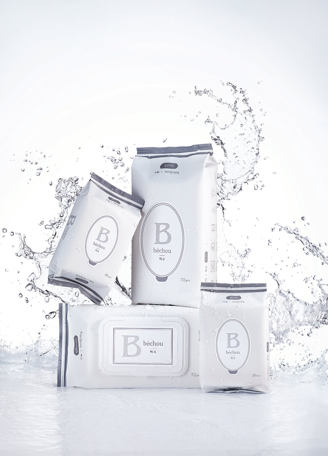
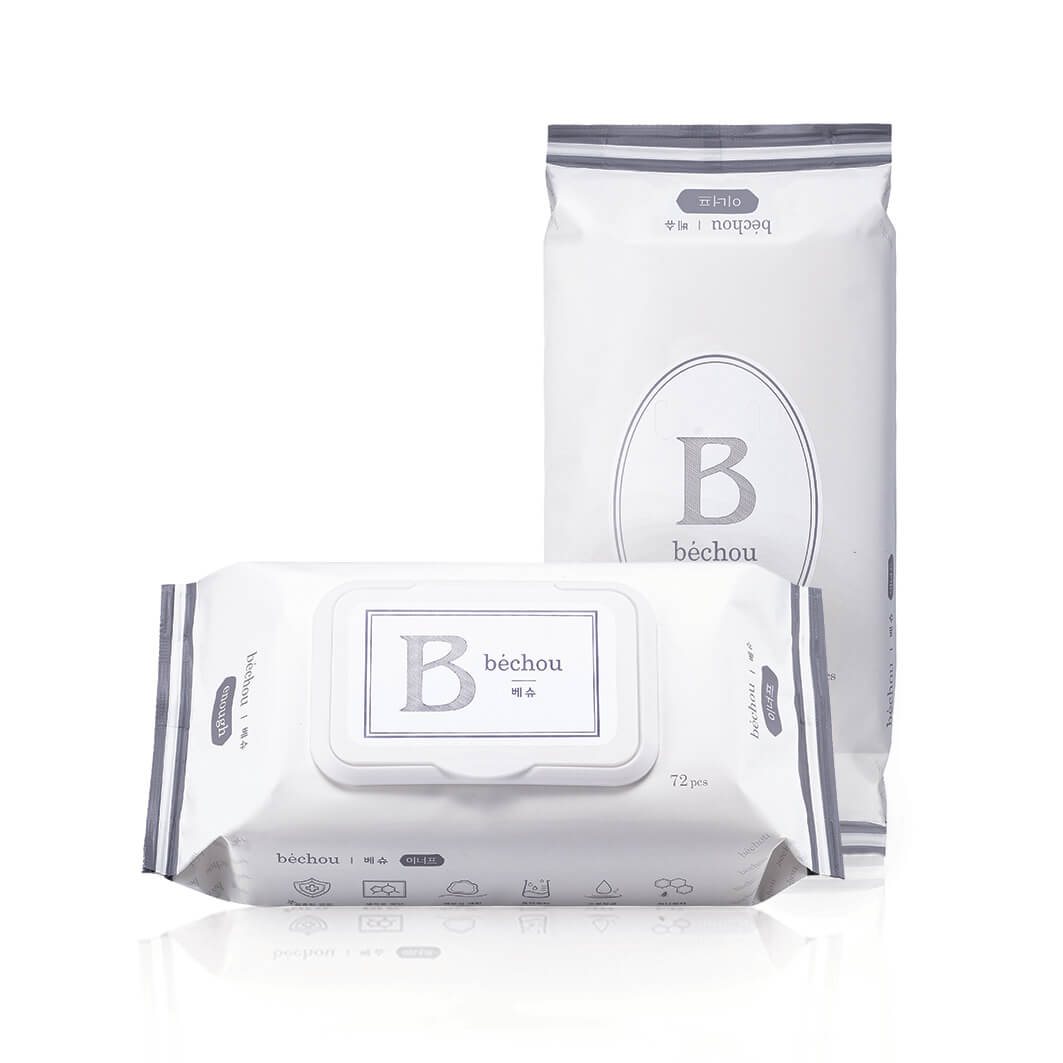
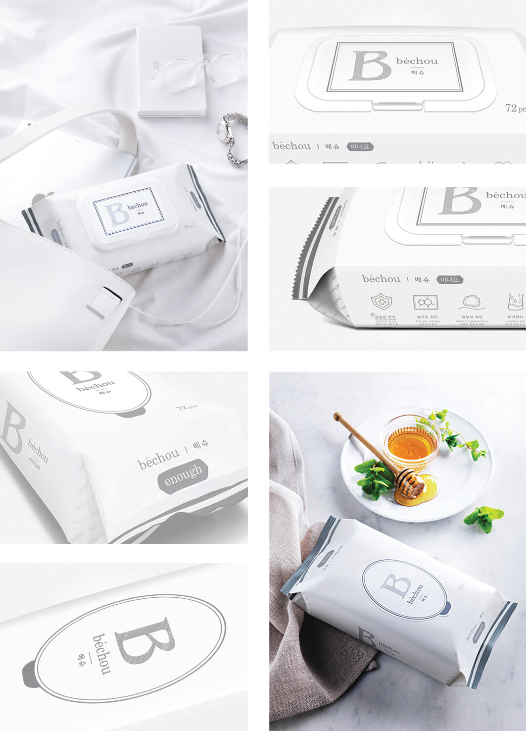
Bechou introduces new baby wipes 'Enough' consist of great ingredients and a suitable design for parents and baby. The typographic logo of Bechou was created with the classic typeface to embody the luxury brand identity, and all lowercase letters exude an approachable and casual vibe. The iconic logo 'B' represents the first initial of the brand name, and it harmonizes with the circular label. Two main cool gray colors best represent the placidity of the brand. The stripes on the edges and the watermark patterns on the sides are delicate and carefully designed.
Year
2016
Affiliation
Inverse Concept Project Design Lab
Designer
JACEY MIN, YOONNA OH, YOUNGEUN SO, DAHAM YOON
The copyright of this work belongs to K-DESIGN AWARD. No use is allowed without explicit permission from owner.

New user?Create an account
Log In Reset your password.
Account existed?Log In
Read and agree to the User Agreement Terms of Use.
Please enter your email to reset your password


Comment Board (0)
Empty comment