Project Background: Dark Horse Restaurant was established in 2017 and originated in Shenyang City, Liaoning Province. At present, there are more than 10 offline stores. It is a new Chinese food brand that innovates and integrates Chinese food, mainly for young people. Strictly express the attitude of "dark horse" through delicious, fast and standard production methods, and insist on innovating traditional culture. It focuses on traditional Chinese food and advocates that Chinese food is healthier and more humane than western food. Turn Chinese food with a history of more than 5000 years into a cultural symbol of Chinese trend.
User's demand: The product is positioned to integrate and innovate traditional Chinese food. The main consumer group is the age group between 20 and 40 years old, with office workers as the main customer group. The demand of this project is to upgrade the brand of Dark Horse Restaurant, turn Dark Horse Restaurant into a representative trend symbol, promote it to first-tier cities in the country, and prepare for the development strategy of Dark Horse Restaurant to enter first-tier cities in the country.
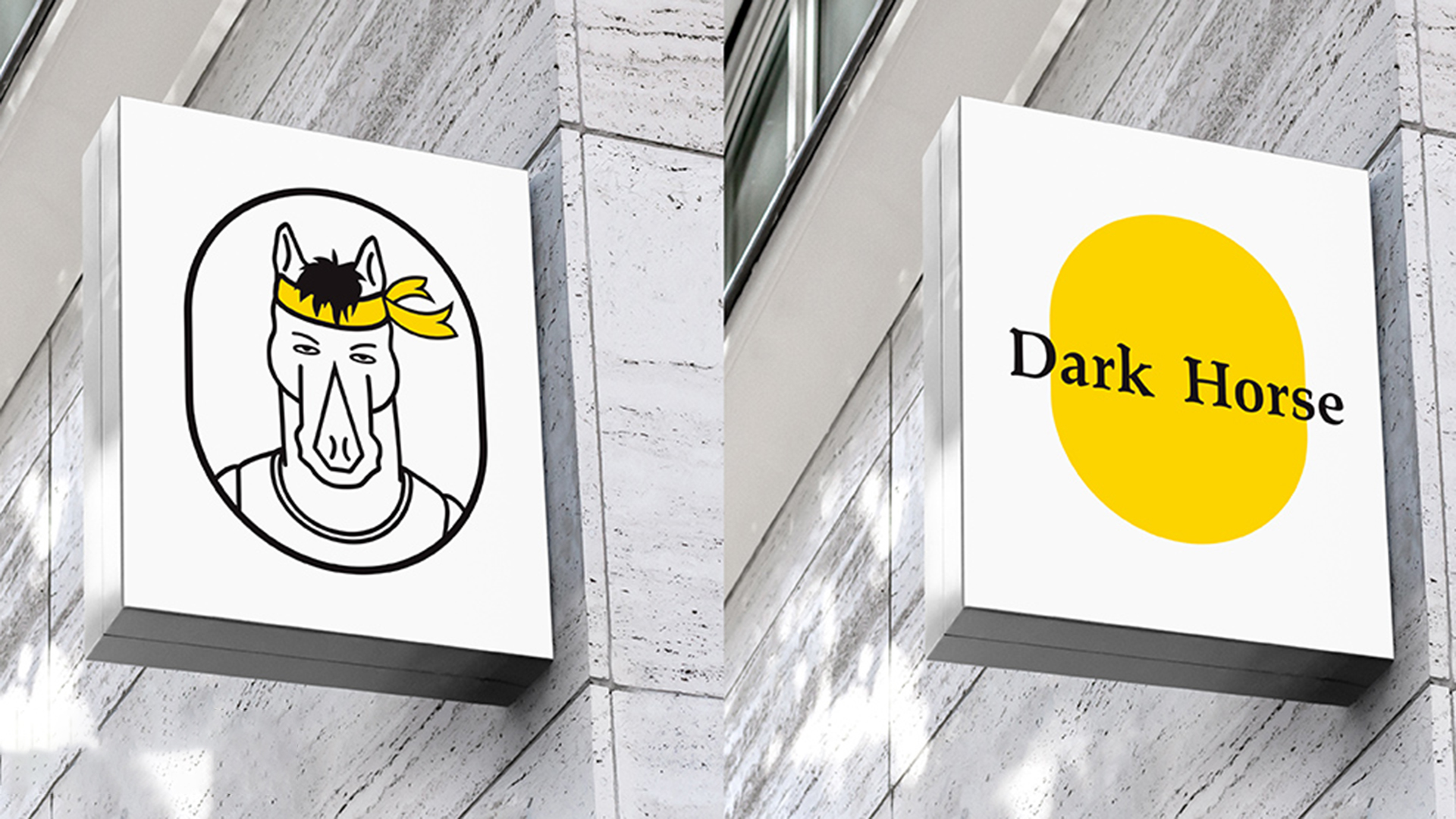
Logo Design: The main customer group of Dark Horse Restaurant is urban office workers. The original intention of the design is to establish an image that allows office workers to have a sense of substitution. The brand icon is based on the horse, with simple and realistic lines. In an anthropomorphic way, it presents the image of a dark horse with self-confidence, forge ahead and personality, shaping the mental state similar to that of young office workers in first-tier cities. The details of the icon are the concentrated expression of the image and personality of the dark horse. Among them, the most eye-catching tight yellow struggle hair band in LOGO is a symbol of the dark horse's fighting spirit and personality trend. The upper hair color and hair volume convey the young and healthy state of the dark horse. Closed lips and eyes looking straight ahead can clearly feel the determination and focus of the dark horse. A casual T-shirt, friendly and comfortable. This is the dark horse, and it is also a young man struggling in every first-tier city.
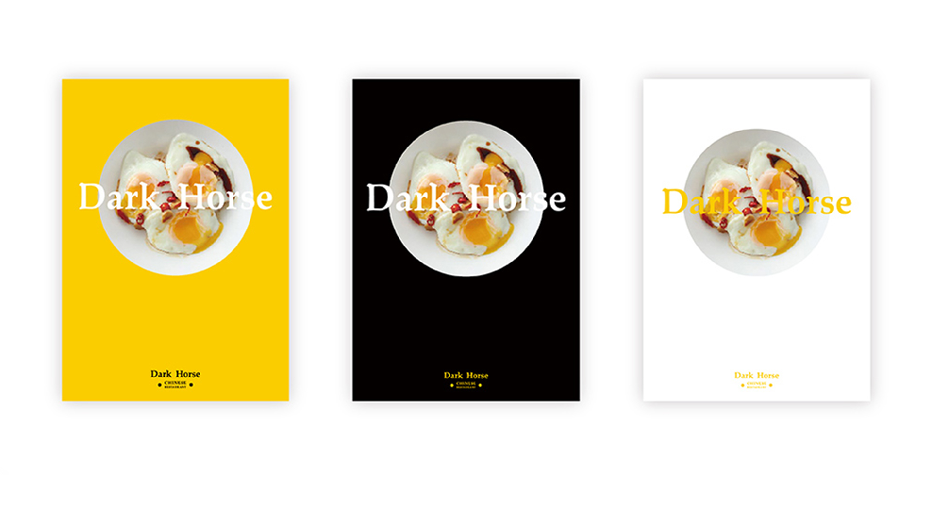
Brand upgrade: The brand color adopts bright and active yellow as the main color of the brand, which makes the brand logo have strong visual impact and brand recognition, and builds brand awareness of brand affinity, warmth, delicious and appetite. The brand logo design adopts classical calligraphy with Chinese characteristics as the logo design form, which reflects the brand attribute of dark horse restaurant, which is mainly Chinese catering. The font strokes are strong and strong to convey the concept of hard work of office workers. The overall brand logo is mainly Chinese and English. The English script adopts serif font, which makes the design of Chinese and English have a unified design DNA. The whole is strong and compact. The font details are elegantly simplified and designed to achieve the overall harmony and unity of the script.
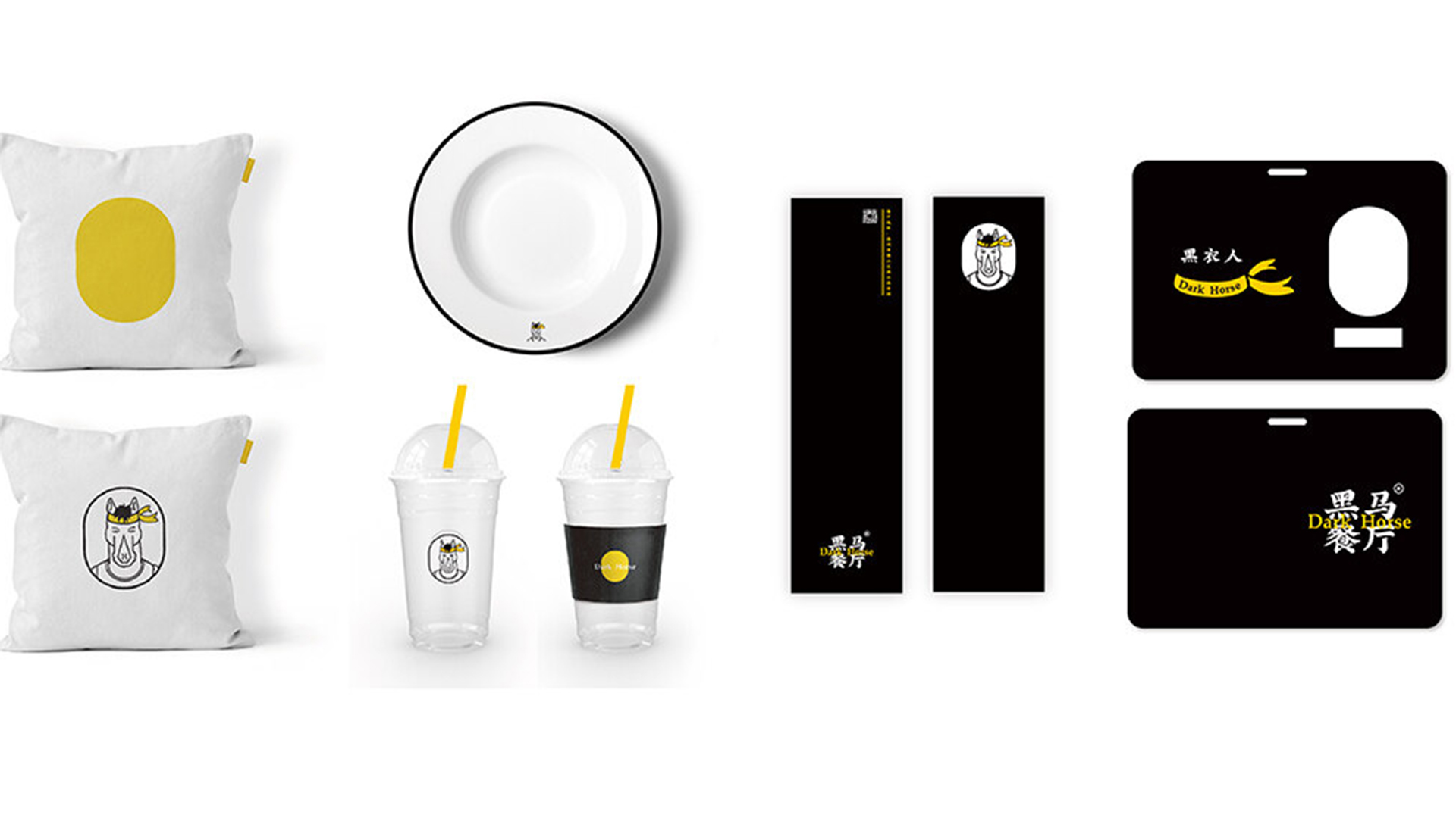
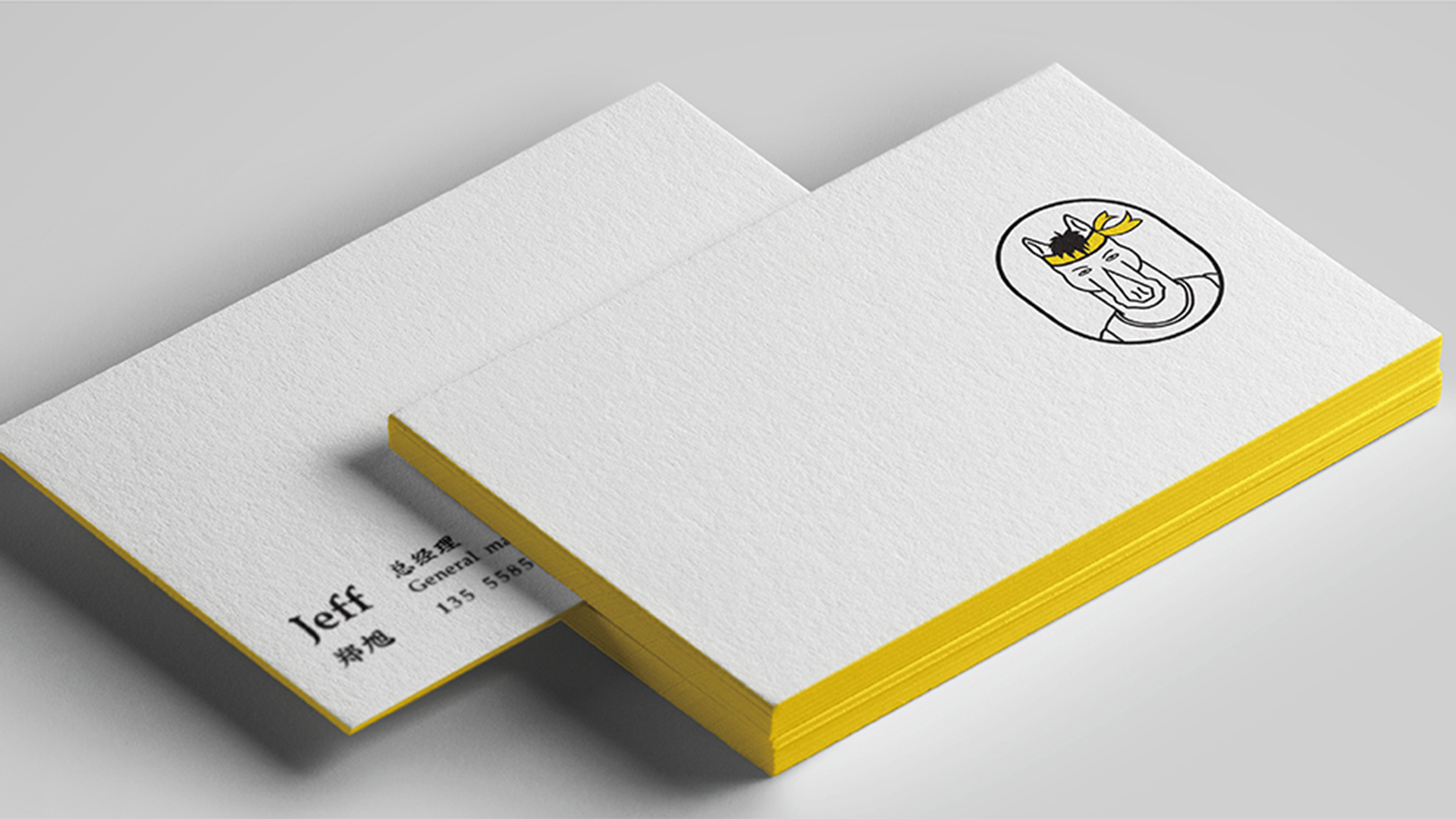
1. The application of Logo, standard words and standard colors is in line with the Logo design concept. At the same time, it is conducive to the establishment of unified visual communication of the brand, the use of customer brand image and the spread of the brand.
2. The Rococo team reconstructs the brand, starting from accurate crowd positioning and brand matching, and builds a brand-new brand. The brand vision system of Dark Horse Restaurant built by the Rococo team has been gradually used in product promotion, packaging and enterprise office, helping enterprises to establish a unified brand image, which is conducive to brand promotion.
The copyright of this work belongs to 洛可可咨询设计. No use is allowed without explicit permission from owner.

New user?Create an account
Log In Reset your password.
Account existed?Log In
Read and agree to the User Agreement Terms of Use.
Please enter your email to reset your password


At first glance, it has special taste.
Good name.