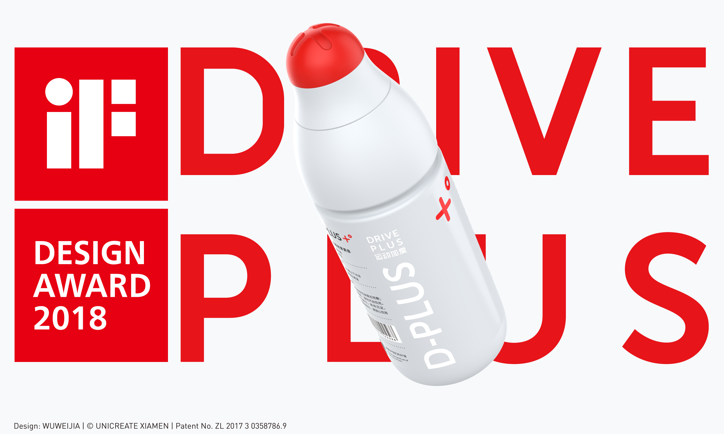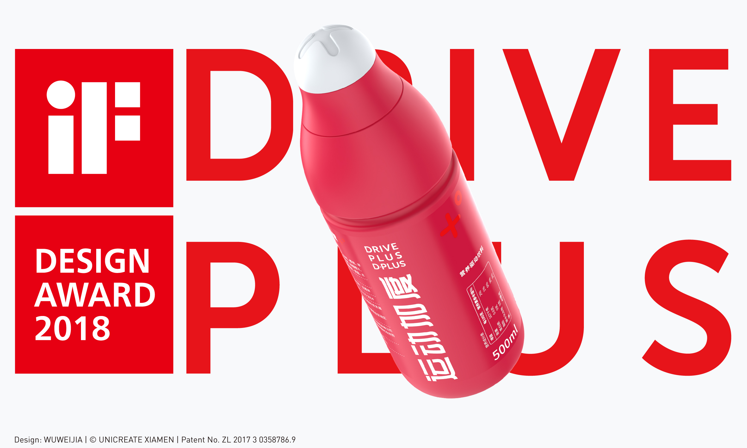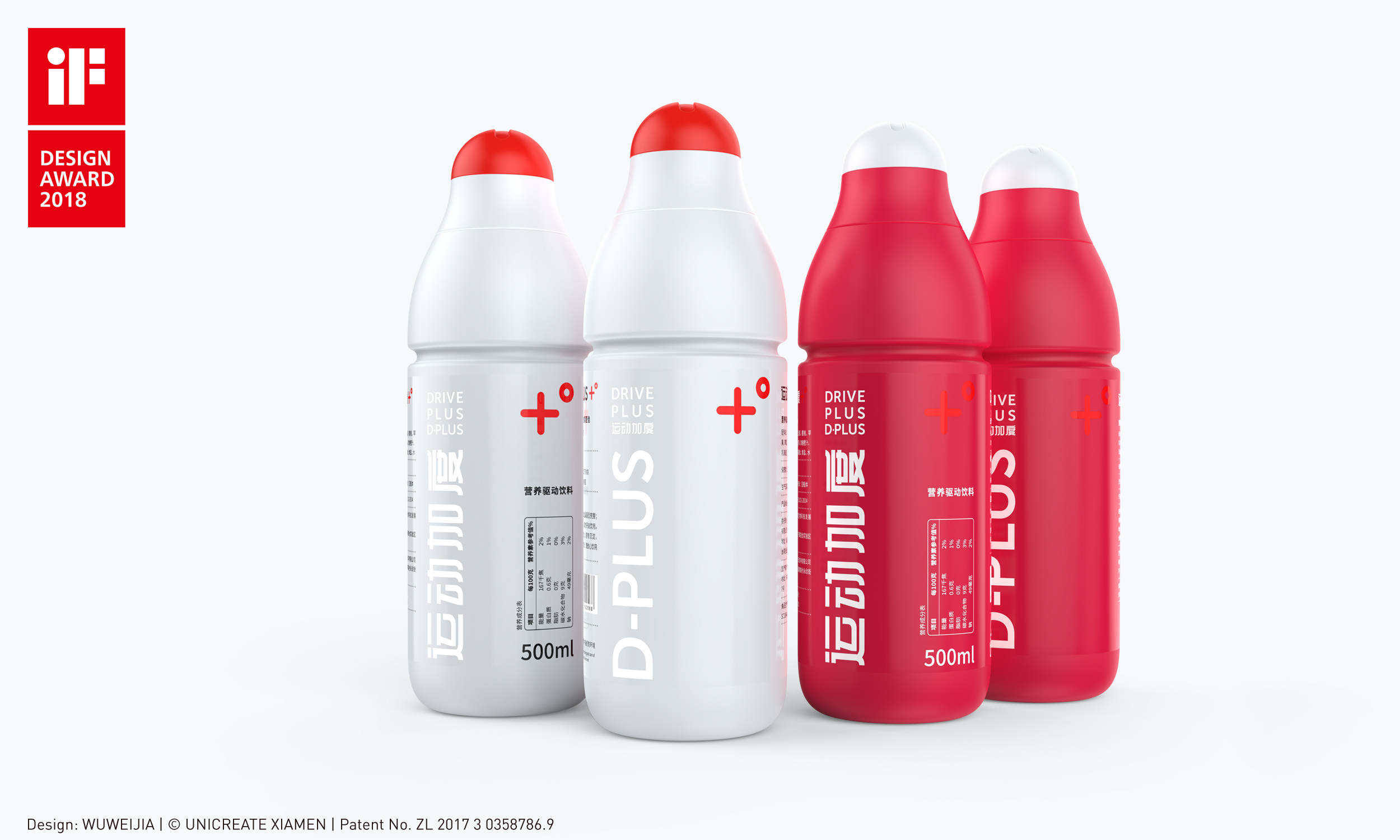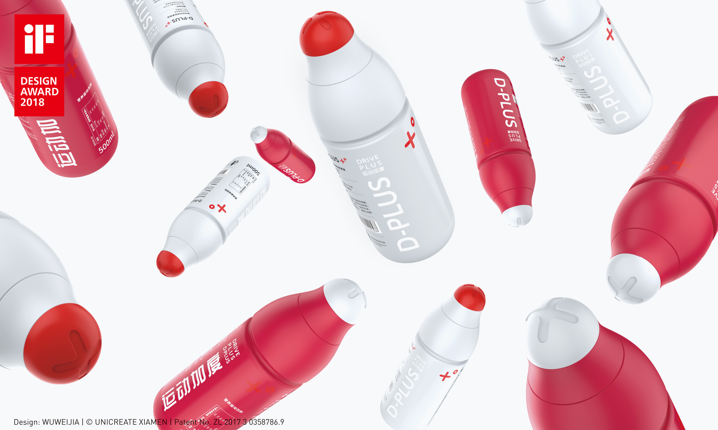
Xiamen Yunhe Brand Management Co., Ltd. won the 2018 iF Design Award, a world-renowned design competition, and the award-winning product [DRIVE PLUS] was recognized in the category of [PACKAGING] project [Beverages]. Germany's oldest independent design organization, the iF International Forum Design in Hanover, holds the iF Design Award every year.
[DRIVE PLUS] After being selected by the iF jury composed of international independent experts, it won the favor of 63 selection members because of its [integrated streamline shape and more flexible, labor-saving opening function]. The selection process of iF Design Award is highly competitive: contestants from 54 countries around the world submitted more than 400 entries, hoping to win the excellent design quality medal.
The original bottle design also obtained the appearance patent issued by the State Intellectual Property Office, patent number: ZL 2017 3 0358786.9


The copyright of this work belongs to v+. No use is allowed without explicit permission from owner.

New user?Create an account
Log In Reset your password.
Account existed?Log In
Read and agree to the User Agreement Terms of Use.

Please enter your email to reset your password
How to save effort
What is this? A bottle of a drink?
Netizens are really strict
Already disappointed with IF and Red Dot
As the people below said, at first glance, I thought it was a medical emergency or something... It was said that it was twisted, but it was not seen in the picture. On the contrary, it felt that there was no texture and it was small up and down, and it would slide.
It may be based on the cap of Watson's water bottle, but people also have undulations on the surface. Whether this design is untextured or not, it may only be known in kind.
Then, the bottom of the bottle is really arc, and it is estimated that it will fall badly ~
Then, as a sports drink package, ha ha sports products need to reflect aesthetic feeling, this can feel part of it, but sports drinks are to attract consumption, this design is really not so attractive, and then the one who said medicine.. It feels like a capsule, doesn't it..
I didn't see the vitality of sports. As a beverage package, I felt a little drug. I felt uncomfortable drinking it. For the appearance, it was stronger than the ordinary overall feeling. However, I really didn't see how the bottle cap was screwed well. It was necessary for texture to increase friction. Maybe you think adding it would destroy the overall streamline.
Not bad, the traditional cover is still easy to twist.
Sports type, if you sweat a lot on your hands, can you open it easily?
It looks like it's not too convenient to hold it.
Can you introduce a little professional? Only the picture information is a little less