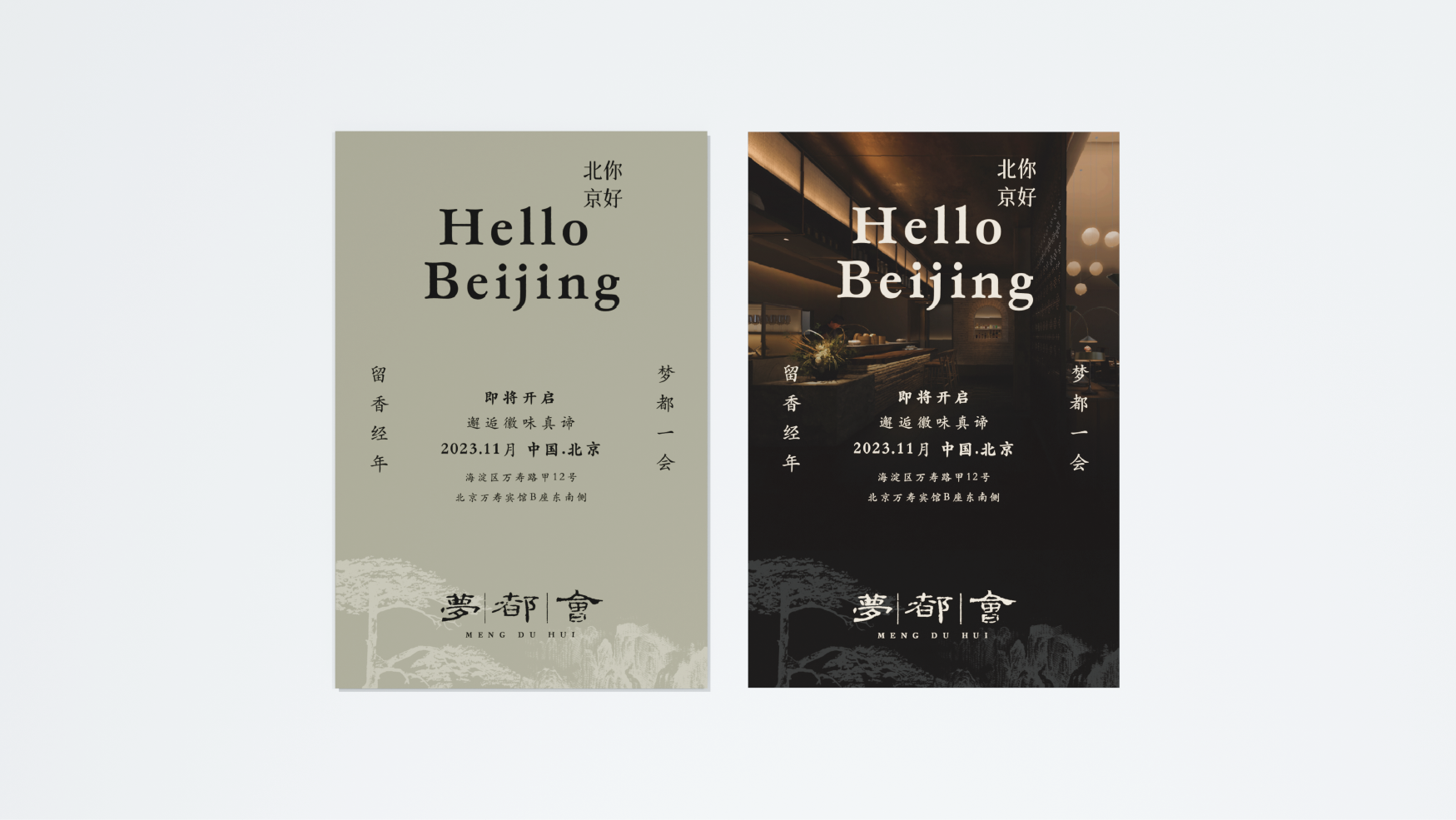
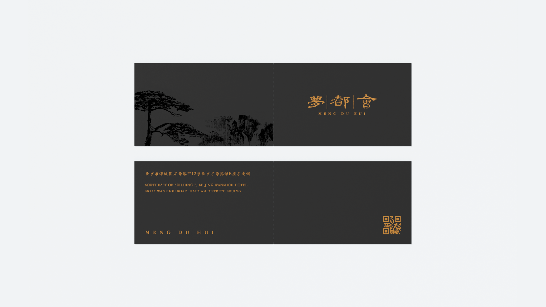
Project address: Beijing, Nanjing
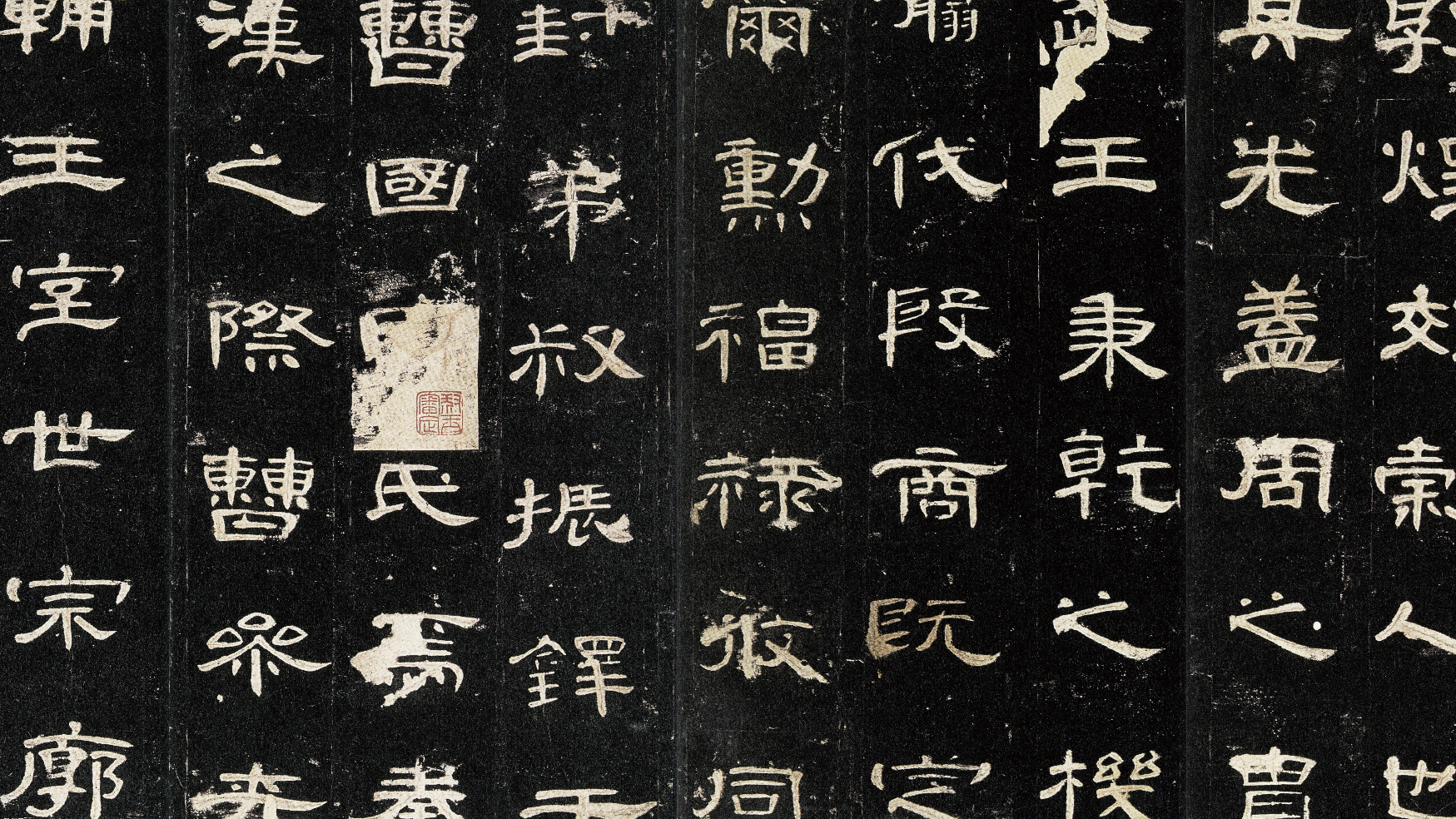
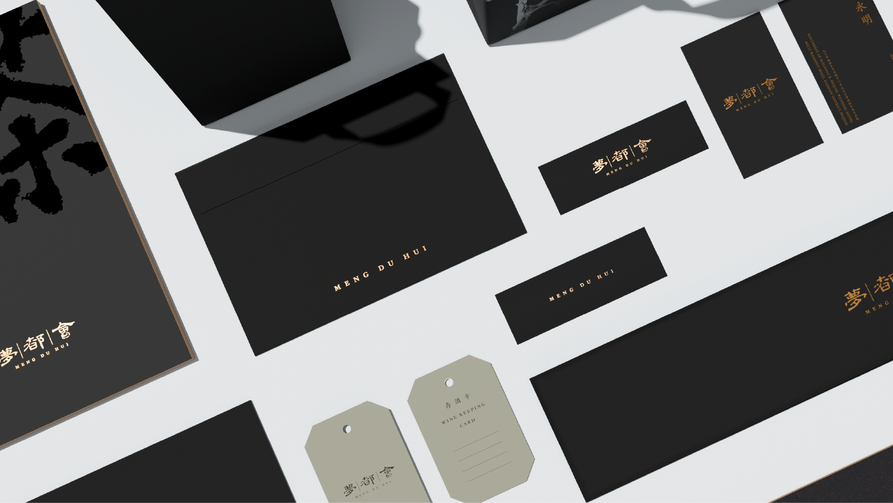
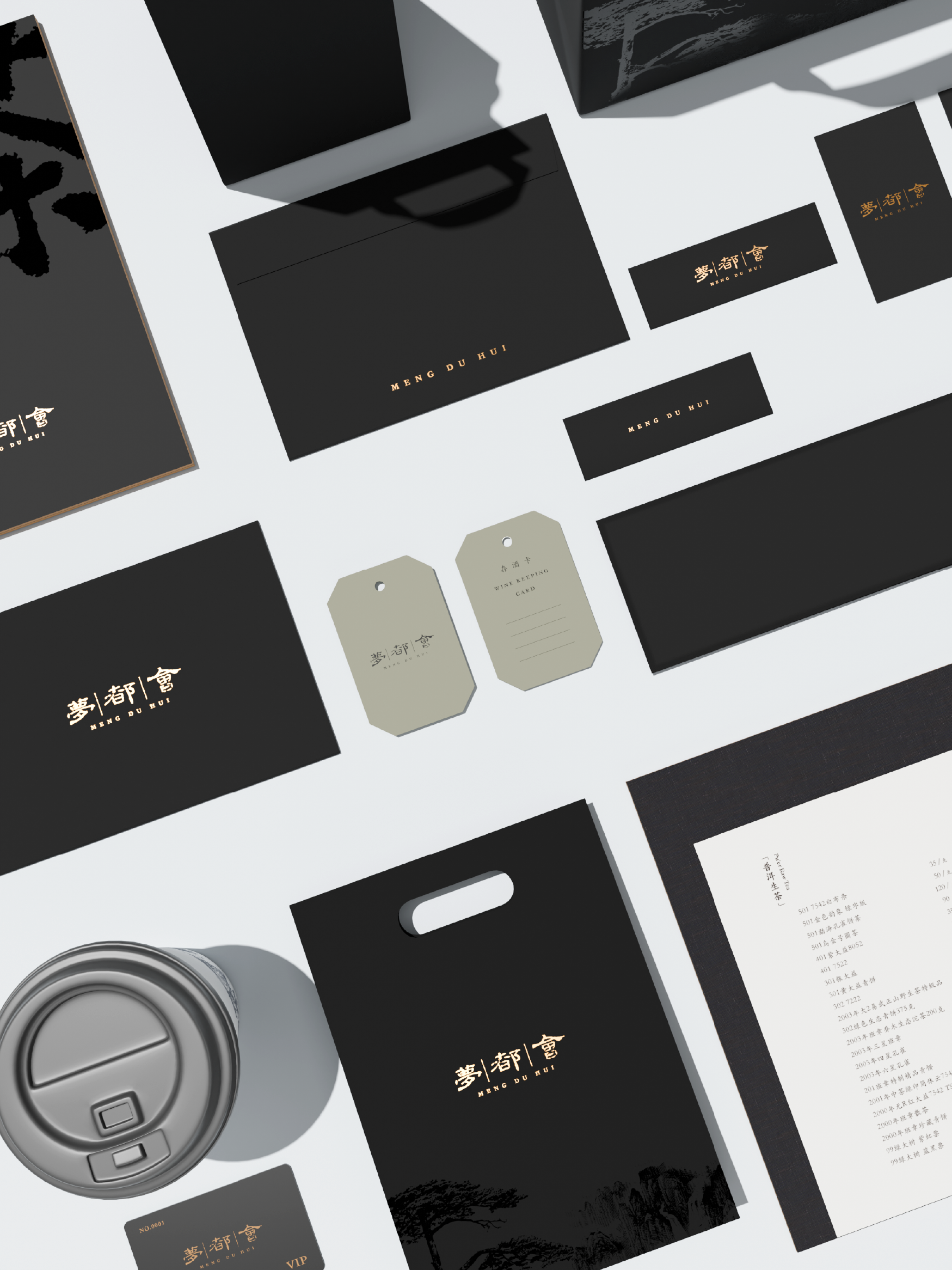
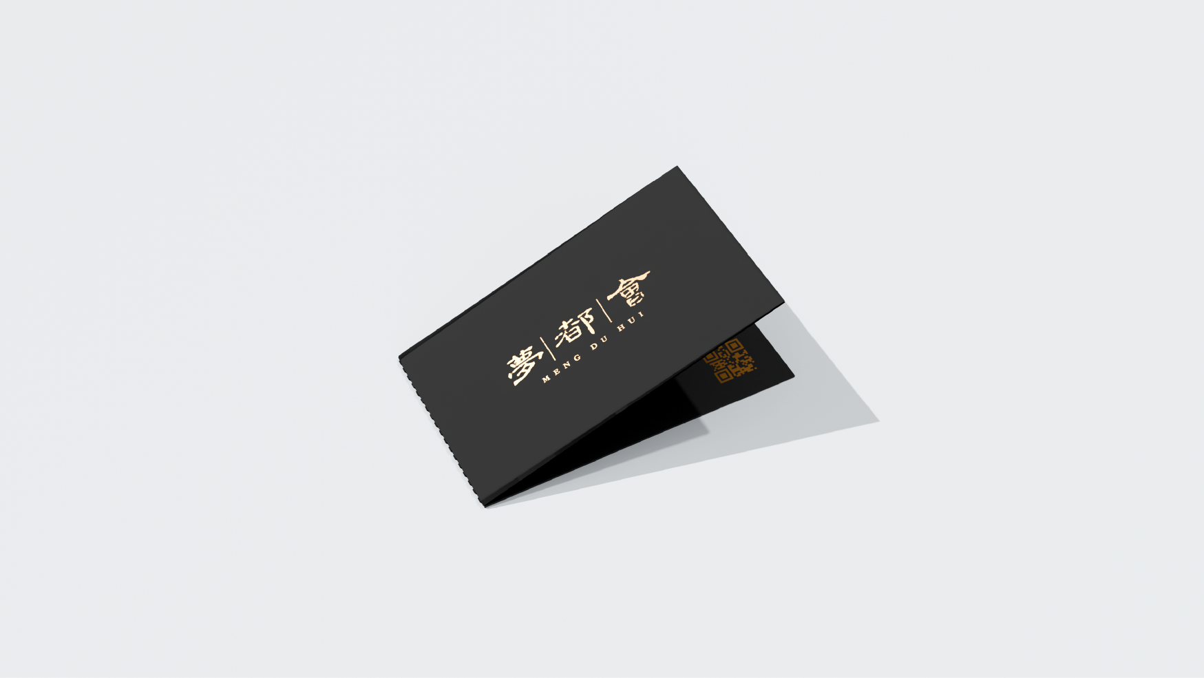
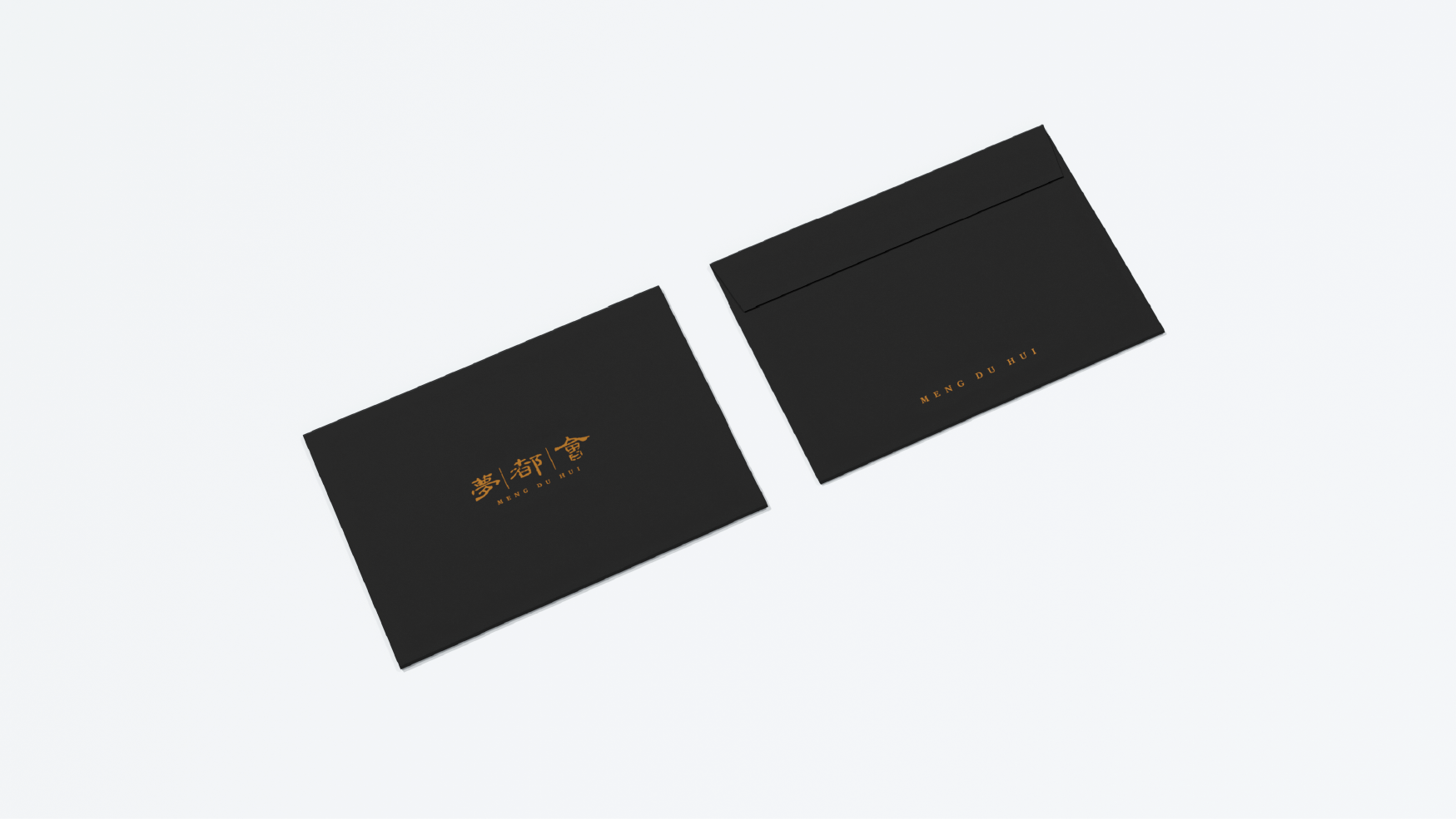
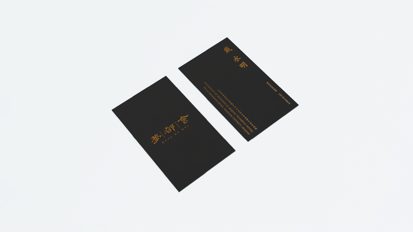
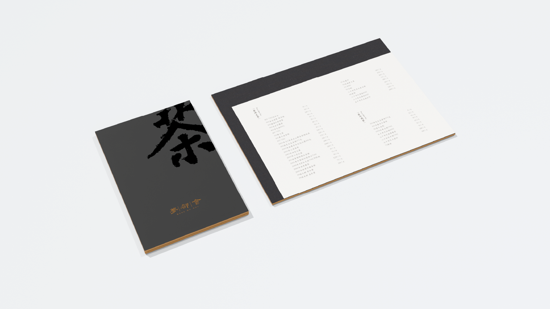
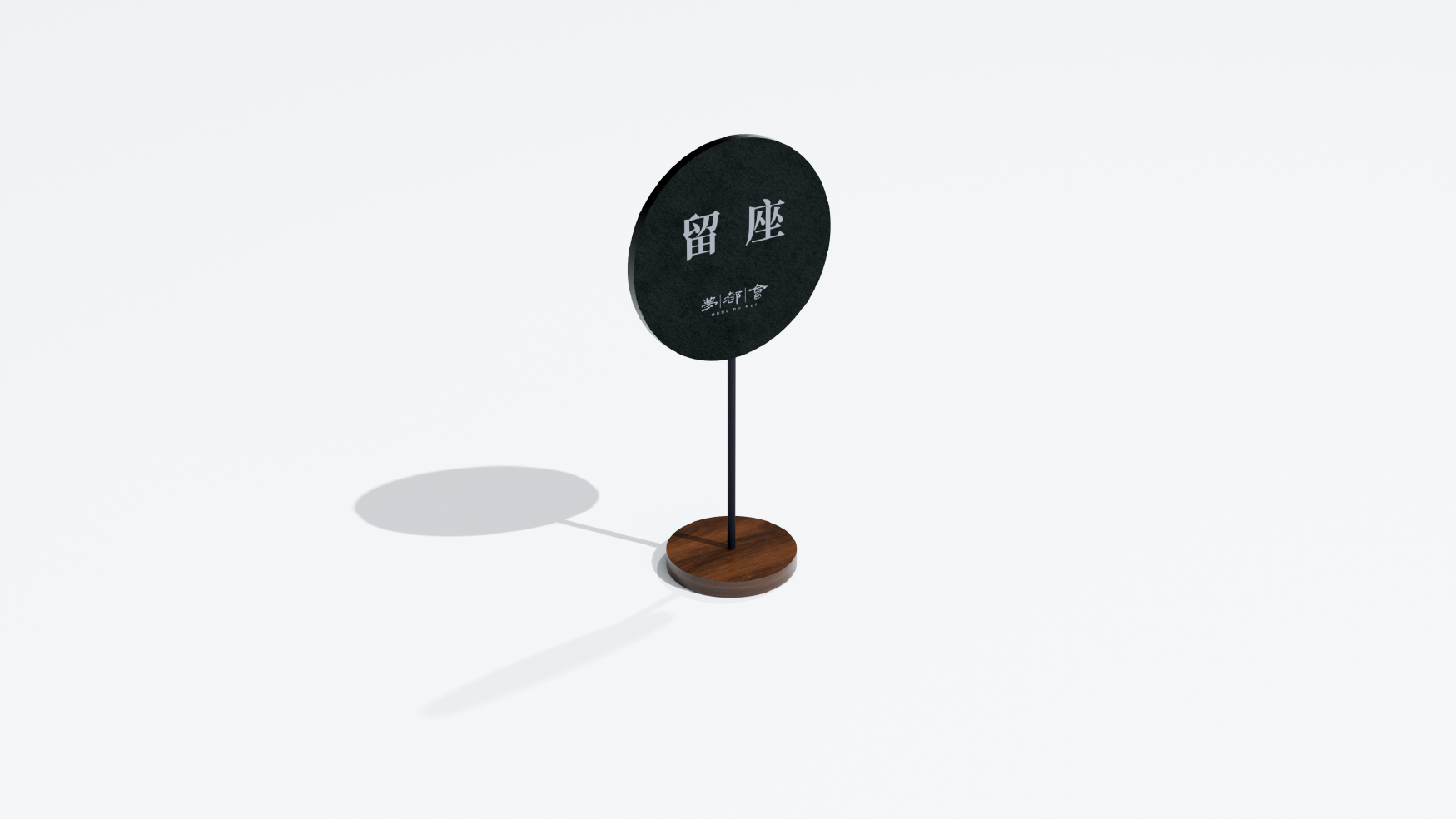
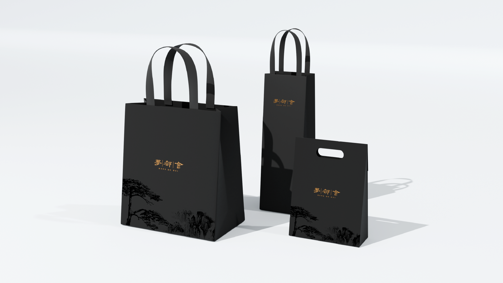
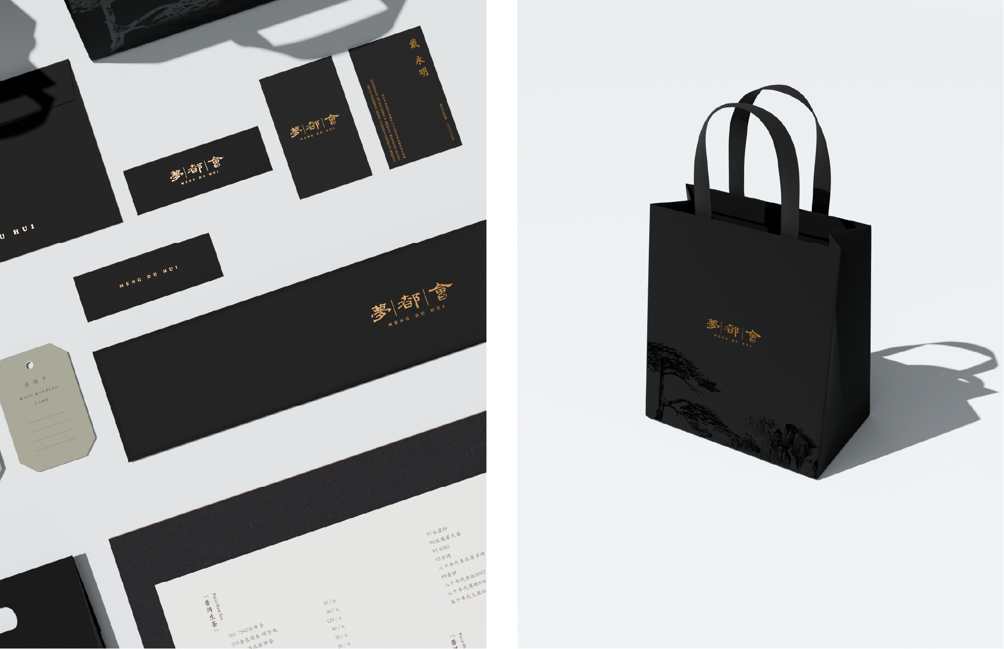
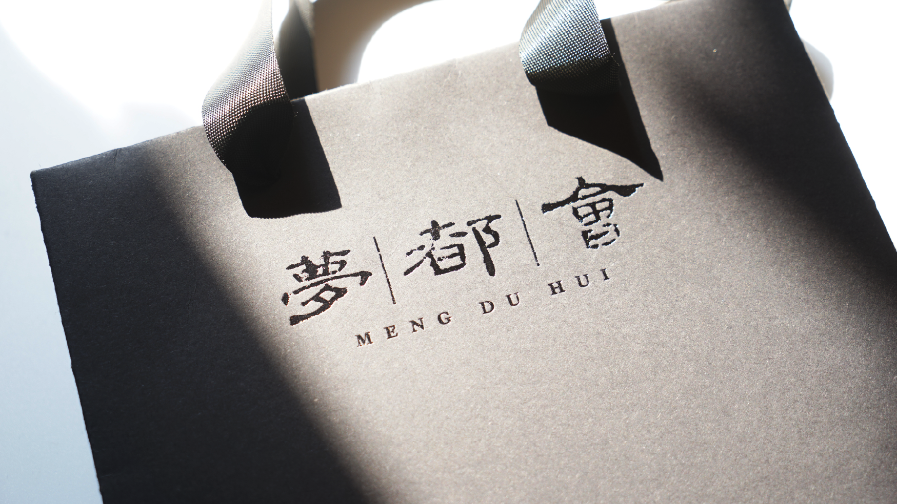
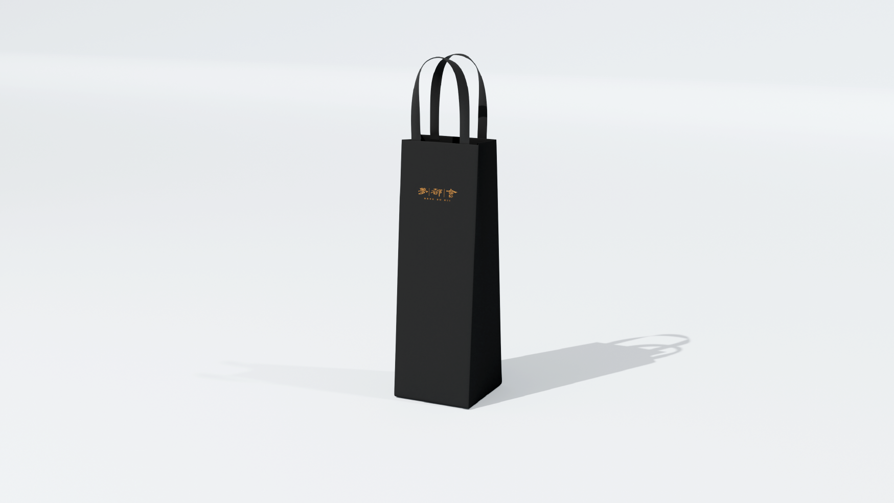
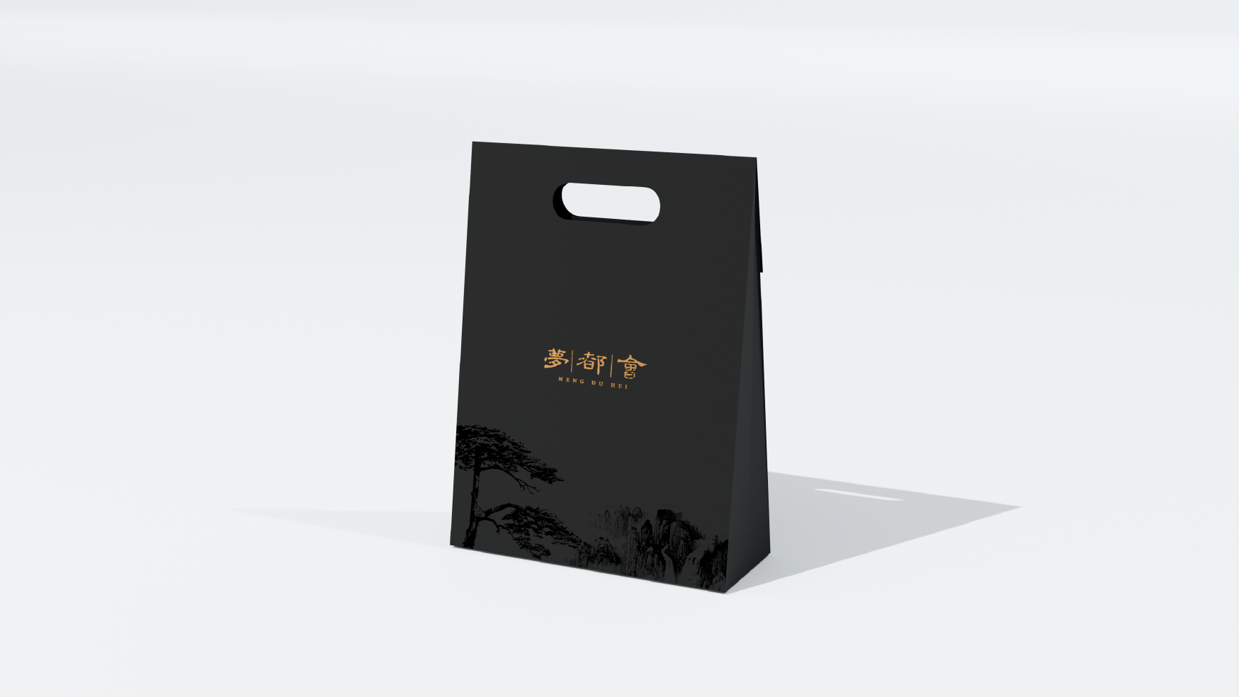
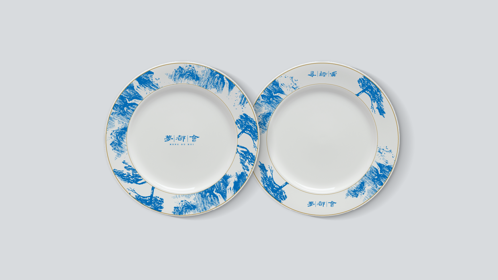
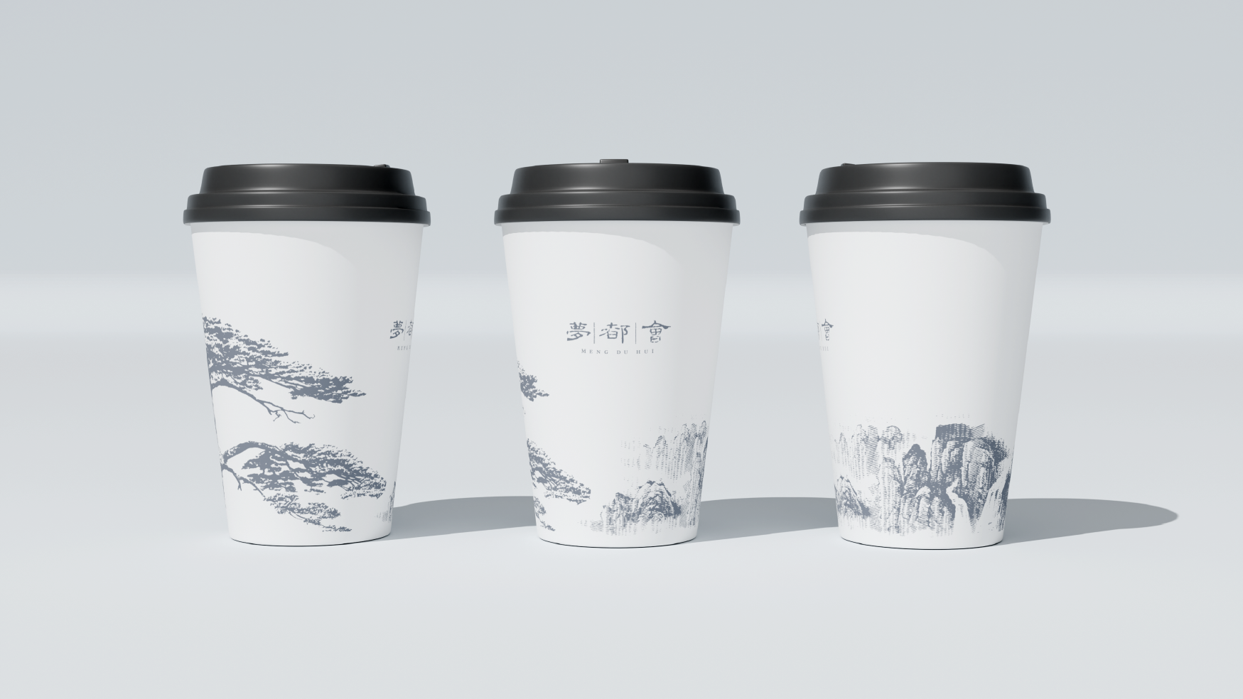
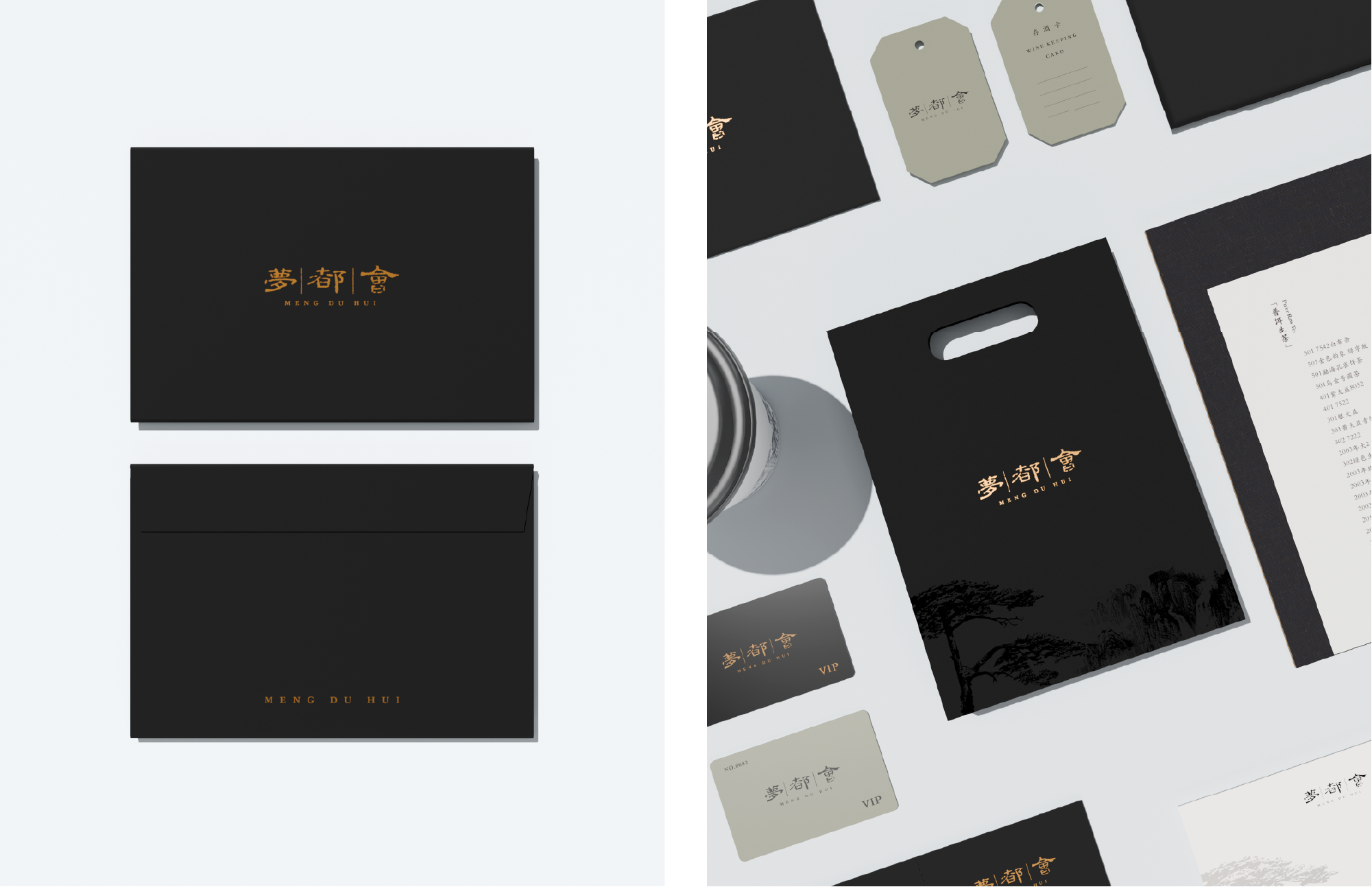
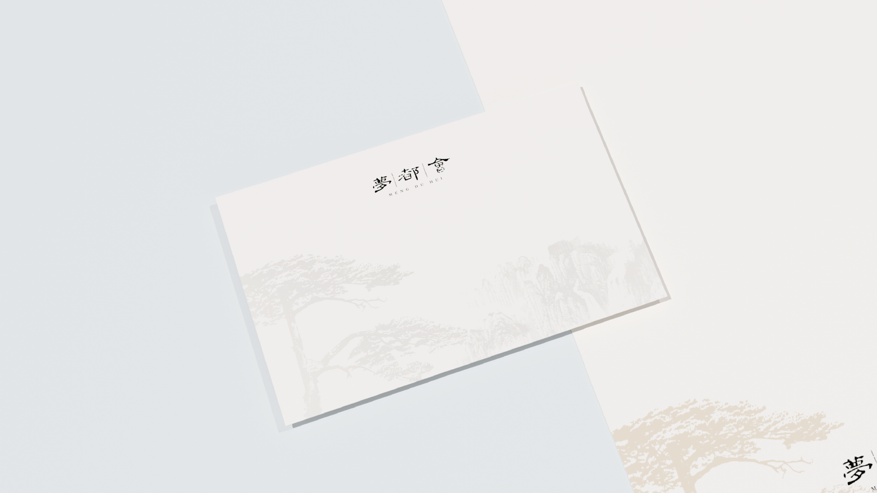
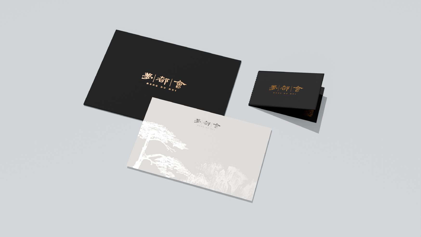
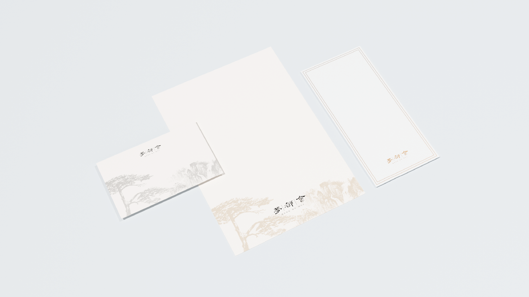
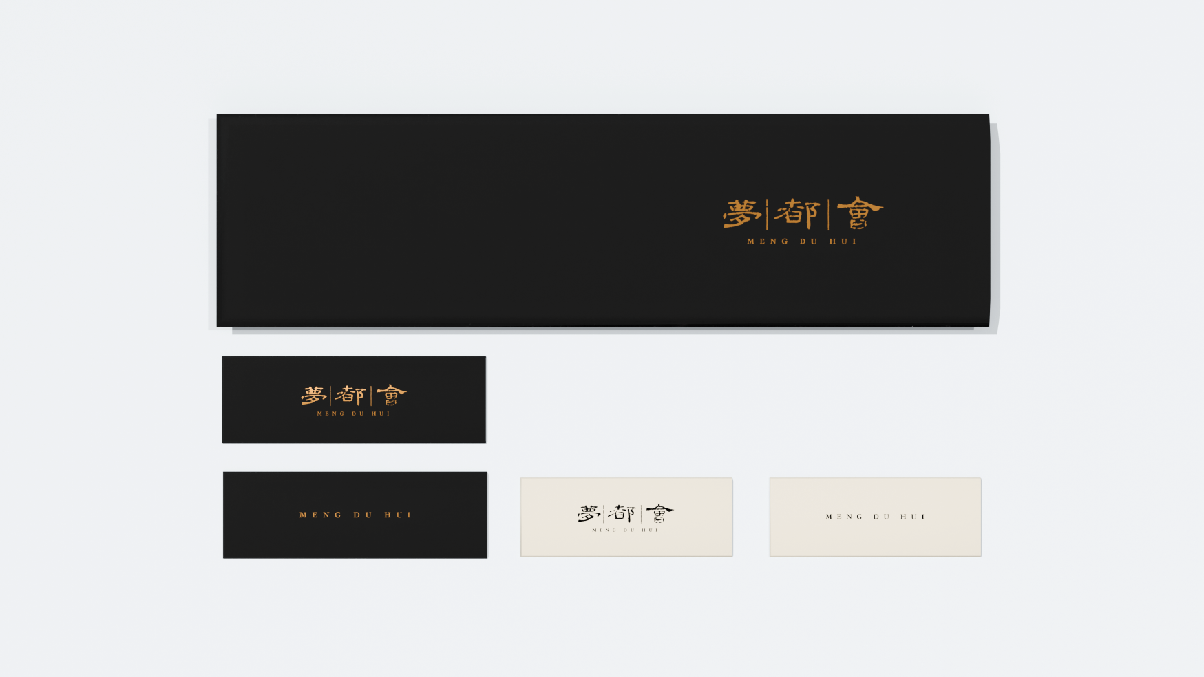
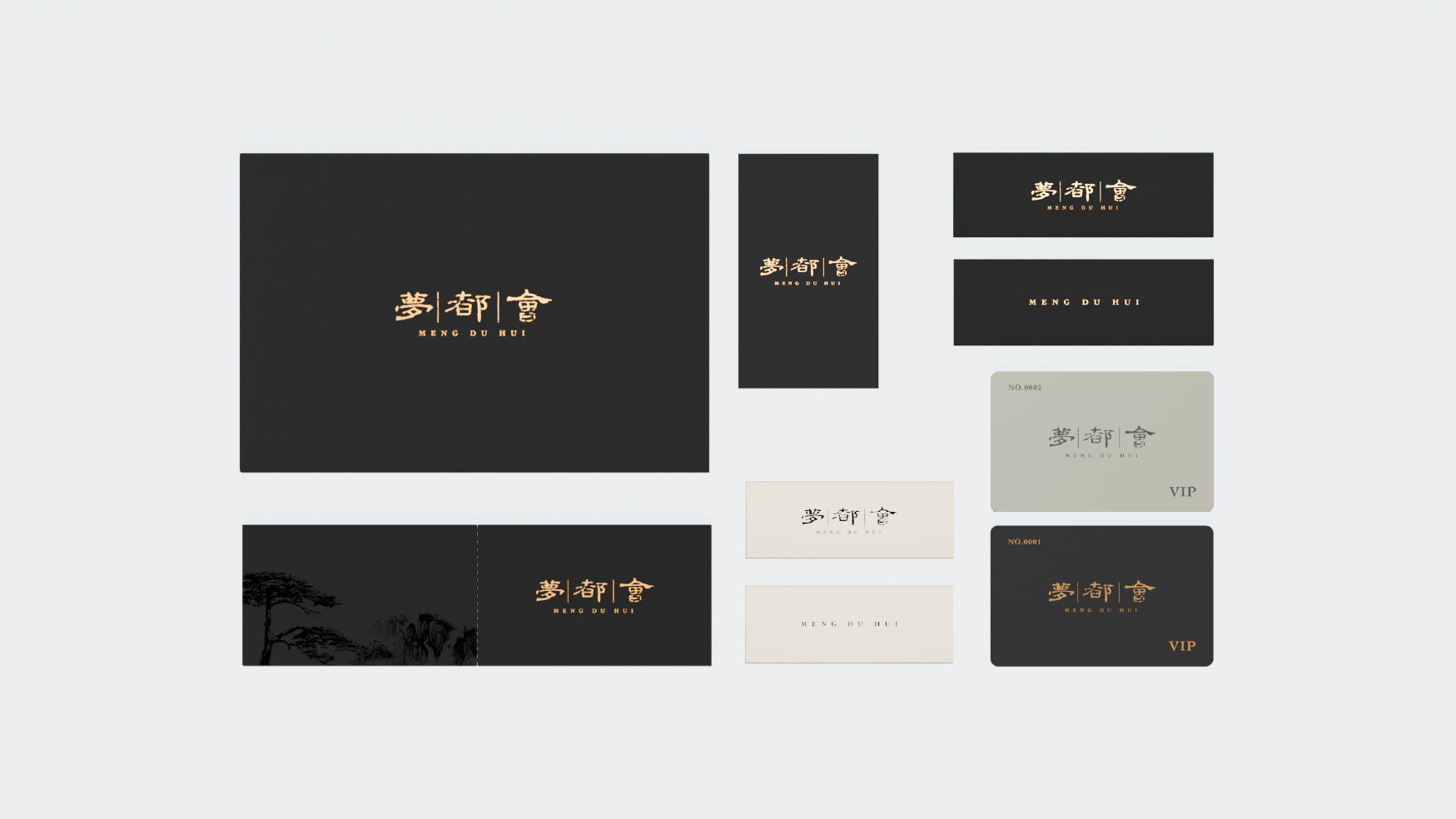
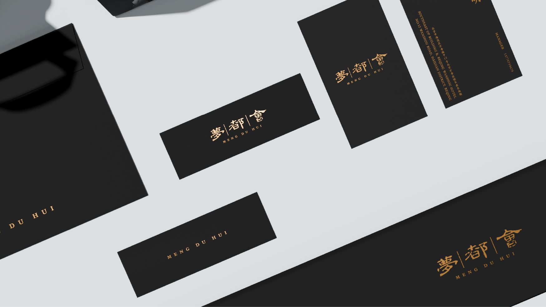
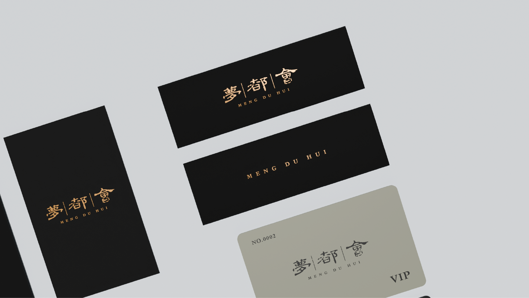
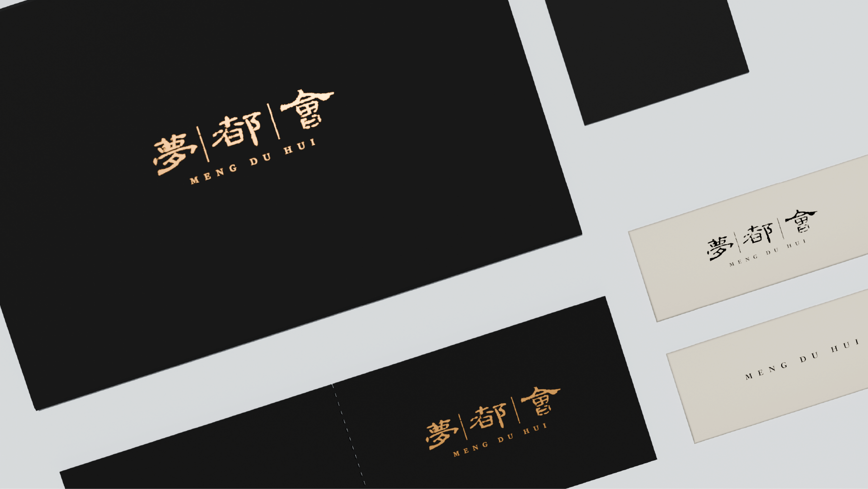
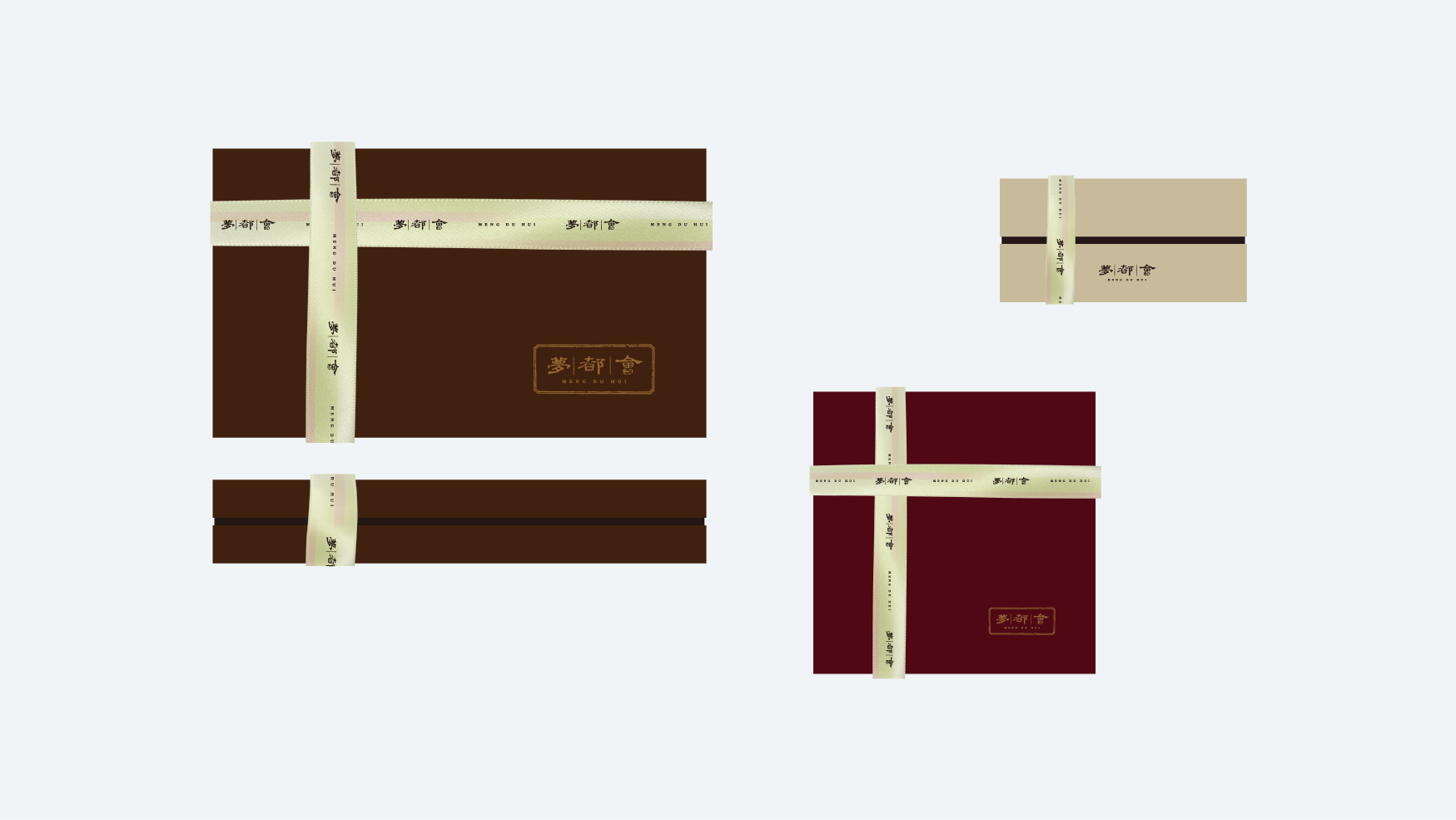
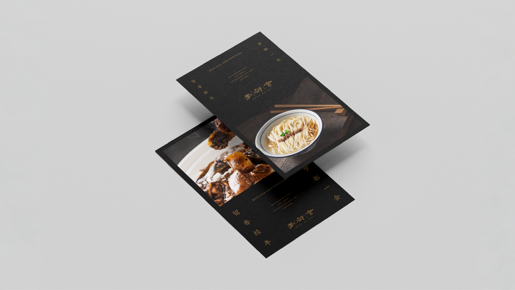
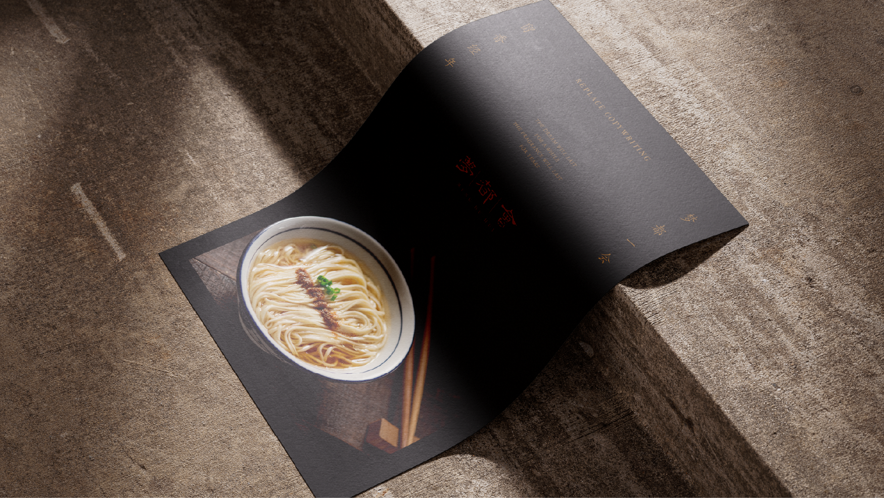
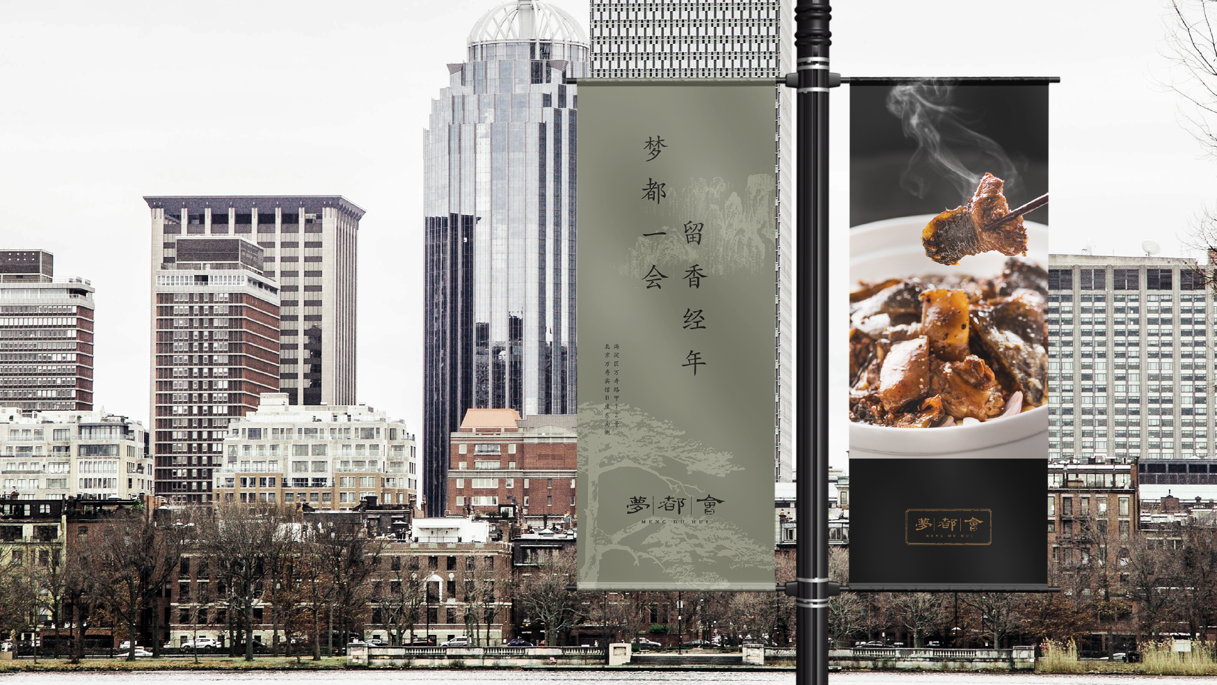
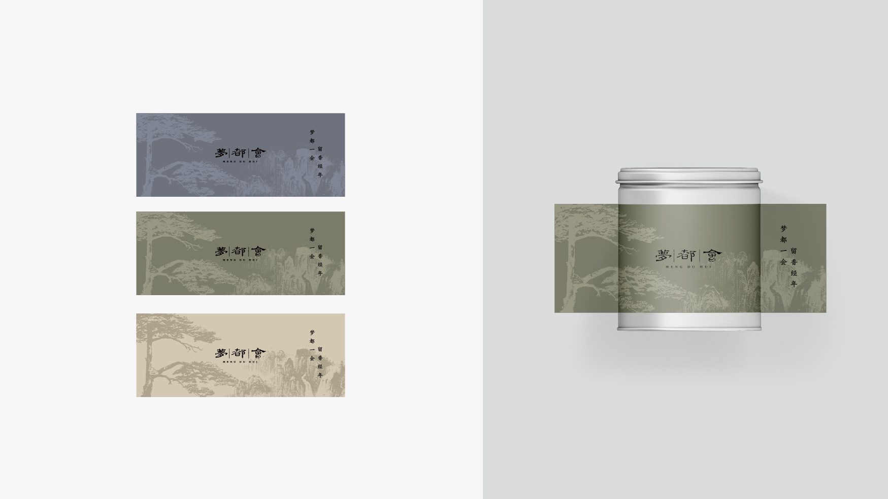
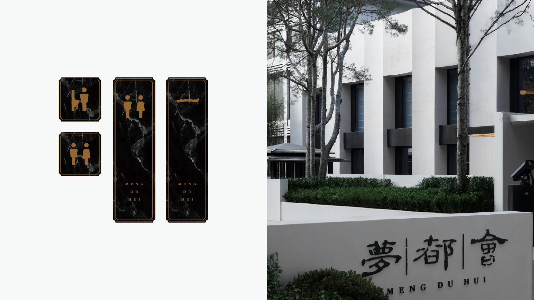
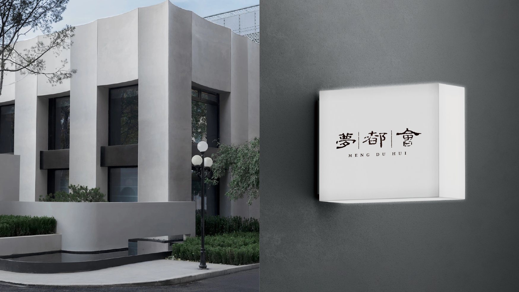
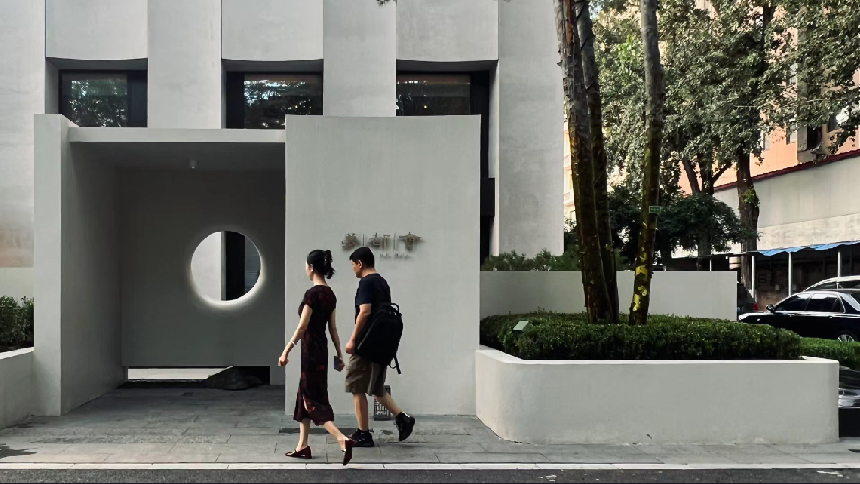
The logo abandons the original graphic elements, starts from the words with more communication cognition, abandons the original design fonts, returns to the tradition, starts from the classics, selects the framework of official script, extracts from the traditional Chinese stele, and retains the broken effect, allows it to retain the traces of time, and has the conditions to carry more humanistic flavor, so that the brand has a sense of inheritance and is more in line with the development of the new stage of the brand.
The logo abandoned the original graphic elements and started with words that are more communicative. It abandoned the original design font and returned to tradition. It started from the classics and chose the framework of official sc-ript, which was extracted from traditional Han steles and retained the broken effect. , allowing it to retain the traces of time and have the conditions to carry more humanistic atmosphere, giving the brand a sense of heritage and being more in line with the new stage of brand development.


The copyright of this work belongs to SONG AD. No use is allowed without explicit permission from owner.

New user?Create an account
Log In Reset your password.
Account existed?Log In
Read and agree to the User Agreement Terms of Use.
Please enter your email to reset your password


Yes, it is
Chinese style
have ideas
This is also beautiful