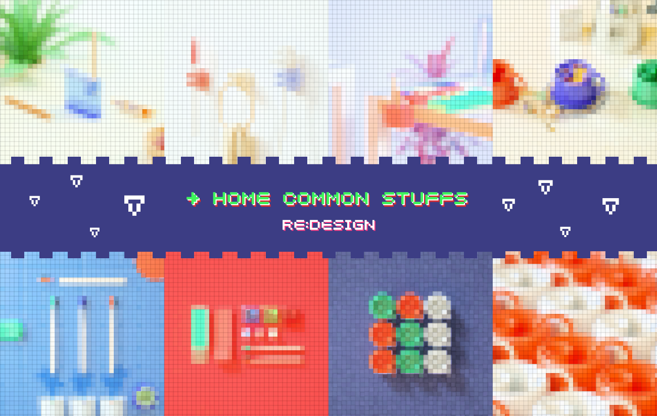
The work has been too busy in the past six months. I haven't shared my works for a long time!
The works brought to you this time are Re-Design for some common items in life.
Those who are familiar with Kenya Hara must be familiar with this vocabulary. Redesign refers to redesign the daily items in life to see if there is any possibility of improvement or optimization. In April 2000, Kenya Hara held an exhibition called "Redesign: Daily Articles of the 20th Century. At that time, he invited 32 top Japanese celebrities to participate in this design activity.
Daily necessities, a cup or a bowl. It seems that the appearance is simple, but in fact, the reason why they can maintain the appearance we see now shows that they have been repeatedly used by countless users and constantly tempered and improved before they finally exist in this well-known image. So the obvious Re-Design theme is not simple. In the original words of Kenya Hara, "This kind of object, even as a famous master, is difficult to surpass in a short time".
Recently, I have taken a break from my busy schedule. I have chosen 5 daily necessities for this theme with great interest, and improved their appearance, color and function. I will share them with you here.
Finally, welcome everyone to pay attention to my new public number "scratching your head", in which I will share with you what I see, hear, think and think in my daily work!
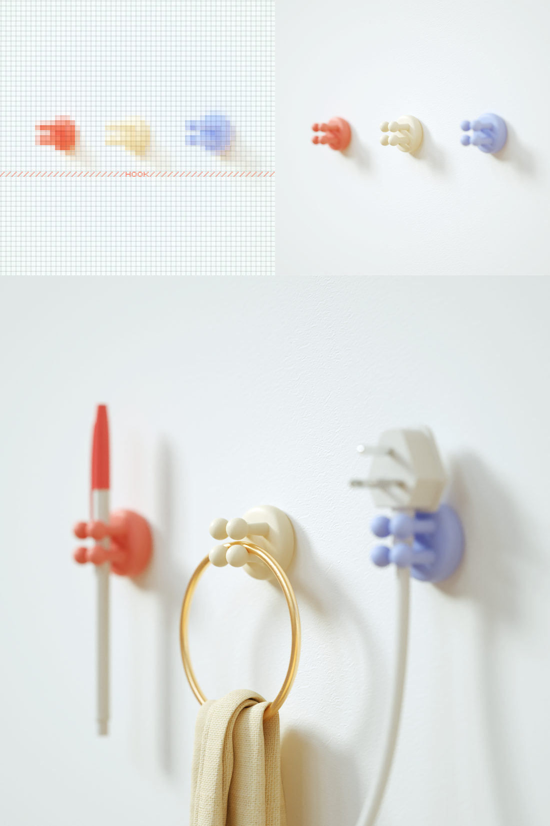
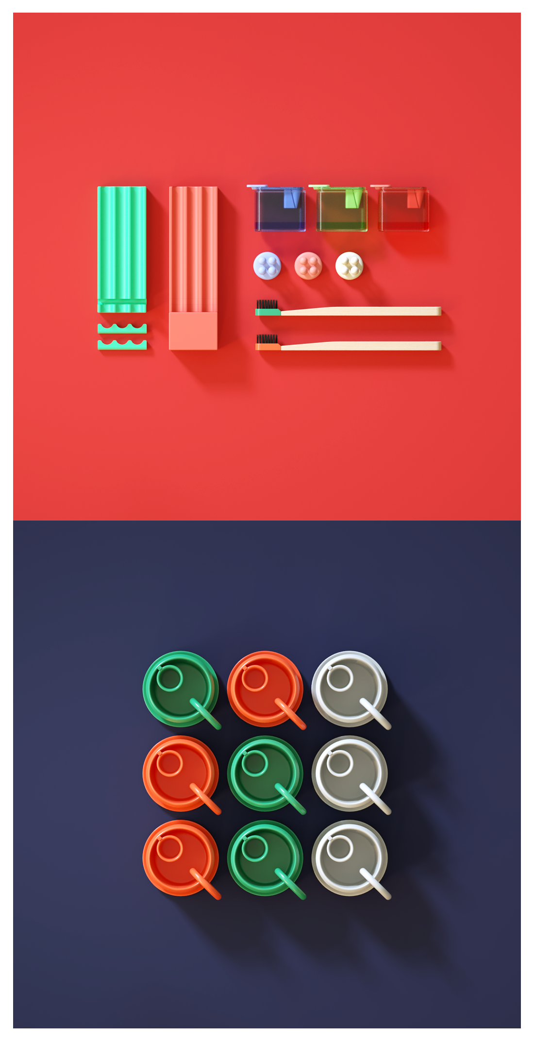
Hanger, inspired by a project previously handled. The product designed at that time has two protruding columns, which are mainly used for fixing plugs and hanging of daily necessities. But when I re-examined this work many months later, I found that although its suspension and fixing ability is very strong, it does not appear to be enough in longitudinal clamping force. When in use, the object may shake left and right in the middle. This is mainly due to the small contact area. So I redesigned this product, changing the fixed column from two to four, increasing the contact area in all directions, so that the article can be stably clamped without shaking or falling. At the same time, users can also choose to fix items horizontally, vertically or obliquely to meet certain specific requirements such as wall open line guidance, which greatly expands the possibility of use.

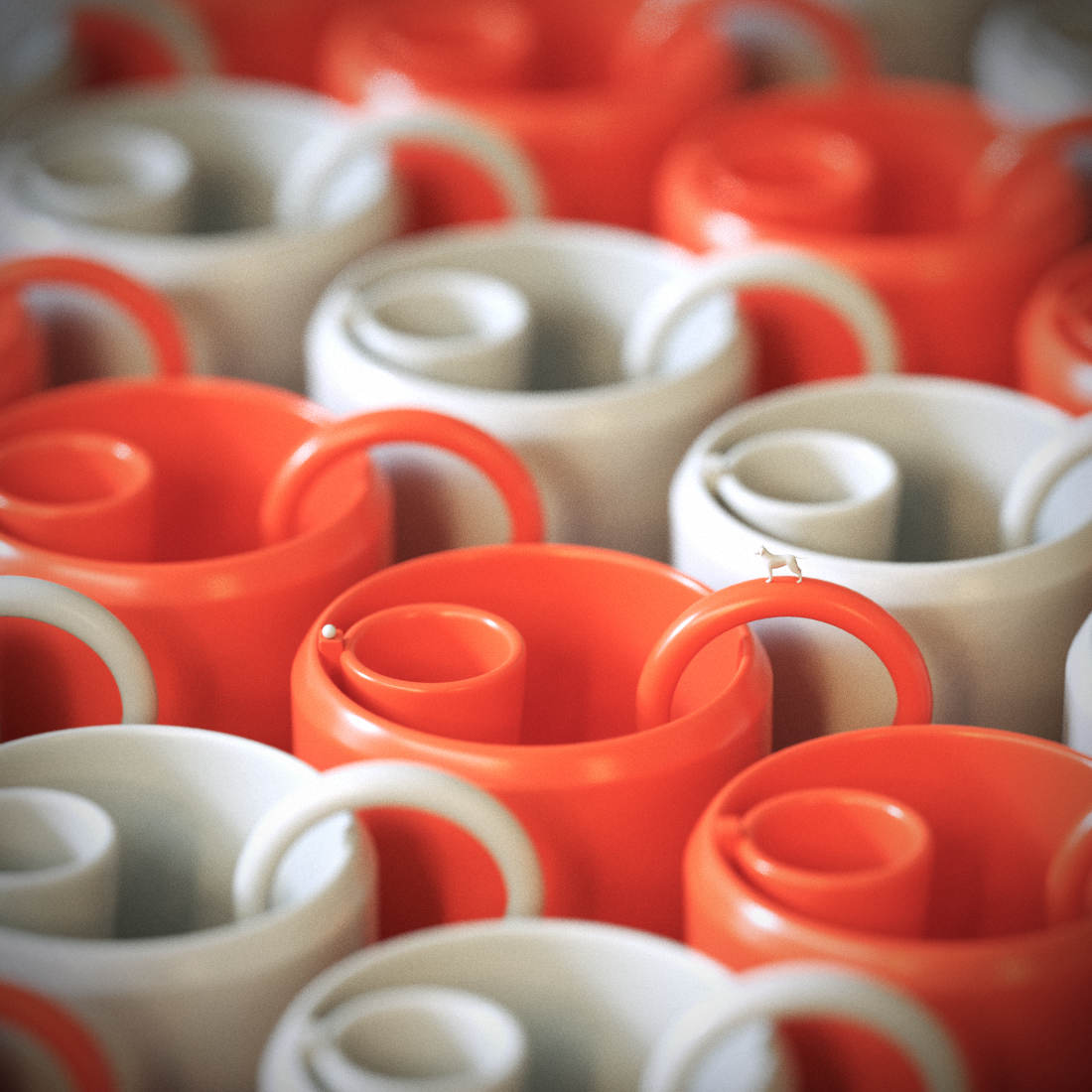
The tea cup is inspired by a coffee. When drinking coffee, there is always a coffee dish under the coffee cup to prevent the coffee from slipping down the cup wall. So I thought, why not design them together at the beginning? This is not only convenient for storage and cleaning, but also can satisfy some users like to pick up the cup together with the dish to drink.
In addition, I also designed a cylindrical structure specially for tea bags inside the cup. The structure is large and small, and the bottom is suspended, which can not only prevent the tea bag from running around in the cup, but also ensure that the tea powder is evenly dissolved in every corner of the cup. At the junction of the cylindrical structure and the cup wall, a moon-shaped groove with an upward protrusion of 3mm is also designed to fix the tea bag rope to prevent the rope from accidentally slipping into the cup.

The improvement of the toothbrush is clear at a glance, mainly the replaceable brush head. This kind of functional design seems to have been done by some people on the market, but it is often unsatisfactory in terms of expression and infection. In my opinion, brushing your teeth is an extremely boring but energetic contradictory activity. So I'm at the toothbrush's
Try to make a breakthrough in appearance, color and material. Strive to bring users a more simple but dynamic visual sensory experience.

People who believe that they love painting must have many "radish head" pencils. These emotional little things that are not willing to throw away seem inappropriate no matter where you put them. Put it in a pen container and often forget it because the pencil is too short to take out again or simply forget it. Just put it on the table and it will roll around. It's hard to clean up. To solve this problem, I designed this two-stage desktop storage box. On one side of the storage box is an ordinary wave structure, which is used to place normal pens, erasers and other debris. On the other side is a longitudinally suspended shallow pen container, which is convenient for users to store and take radish head pencils. In the middle of the two, transparent soft glue that can be restored and disassembled is used for soft fixation. Users can adjust the fixed length or disassemble the longitudinal pen holder according to actual usage. It not only solves the storage problem, but also saves space and increases the fun of life.
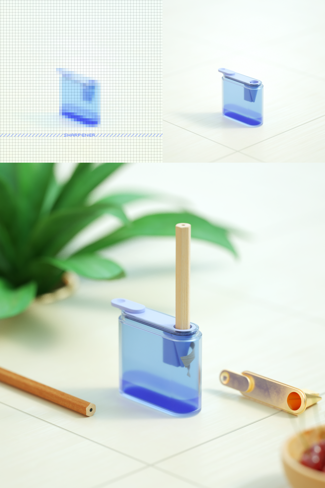
Finally, there is a pencil sharpener with a simple European style. In my mind, a pencil sharpener is the grave of a pencil. The process of sharpening a pencil should have a sense of ritual. Therefore, in the design, I used a translucent box body to facilitate the observation of the accumulation of internal strokes, giving users a sense of accomplishment that slowly accumulates.
At this moment, the life of the pencil, from long to short, seemed to be observed and recorded in this small translucent box.


The copyright of this work belongs to 挠头阿吉丨龚允吉. No use is allowed without explicit permission from owner.

New user?Create an account
Log In Reset your password.
Account existed?Log In
Read and agree to the User Agreement Terms of Use.

Please enter your email to reset your password
It's a good design, but the original design of the coffee coaster was because the coffee was too hot to be poured into the coaster to cool and drink.
H ha ha, there is a mosaic, like, so cute, mosaic how to make ah, big a
I feel that if the coffee flows into that dish, it seems that I can't drink the coffee in a tilted dish and pour it out!
Interesting products are real objects with souls.
Is the cup made of ceramic or plastic? If it is plastic, there seems to be a problem
Stick
It's really talented and I like it very much.
Can I say that the dish and the cup are served together to look elegant and drink coffee?
I like ~ ~ ~ especially emotional design, seeing a pencil in my life ~ ~
This feeling is very good ~ ~
I didn't think life's small objects can also be interesting.
I like the color of the product designed by the landlord very much.