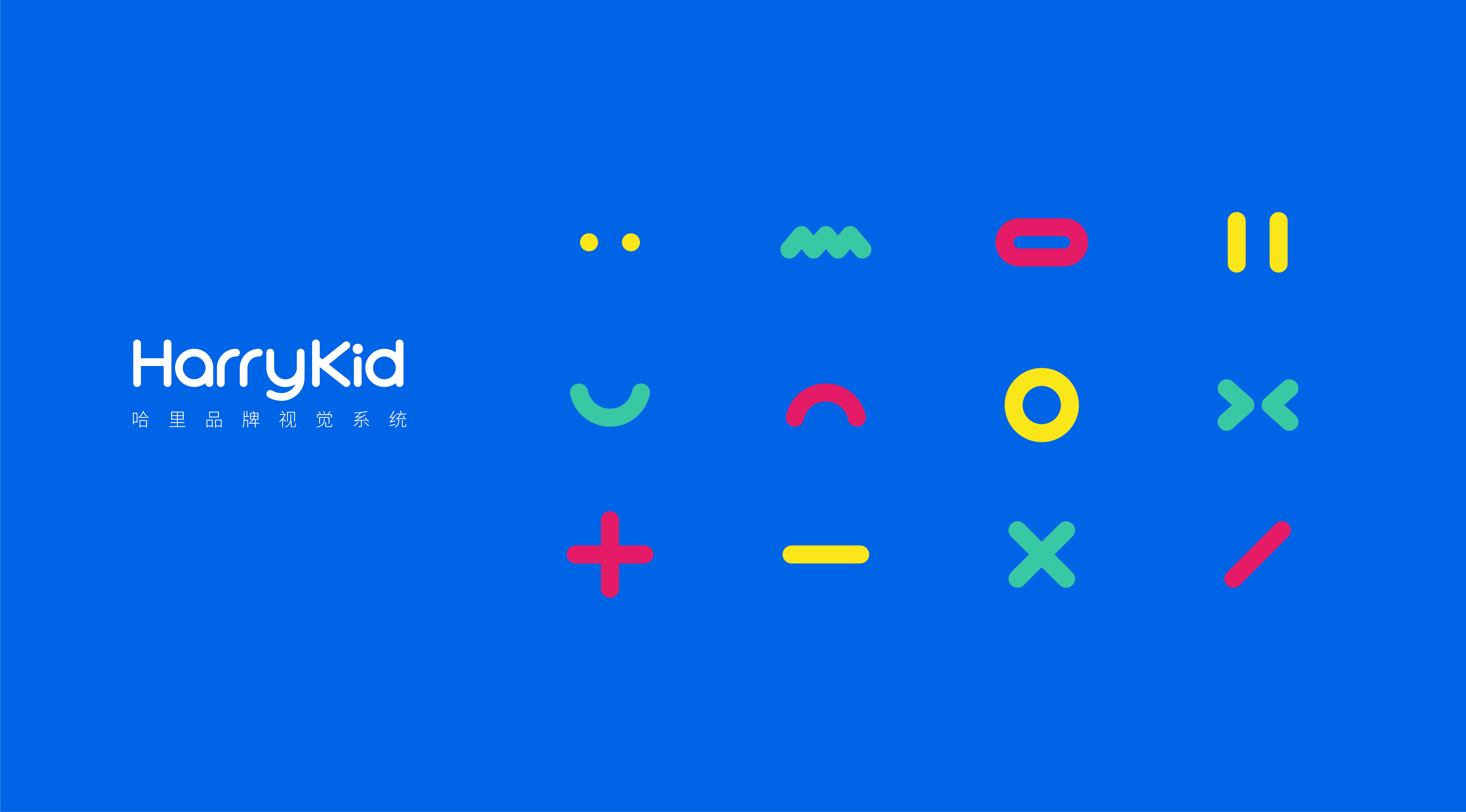
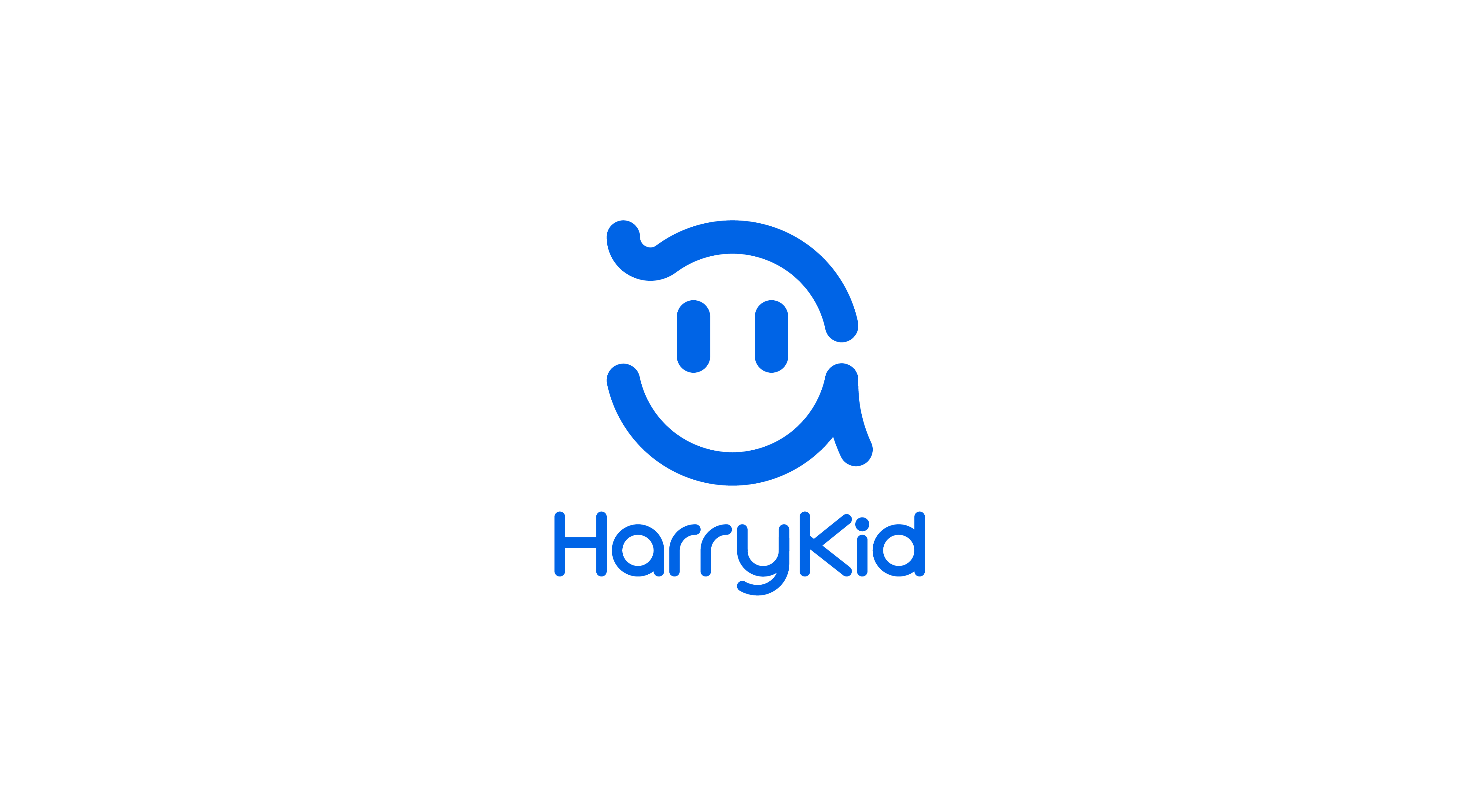
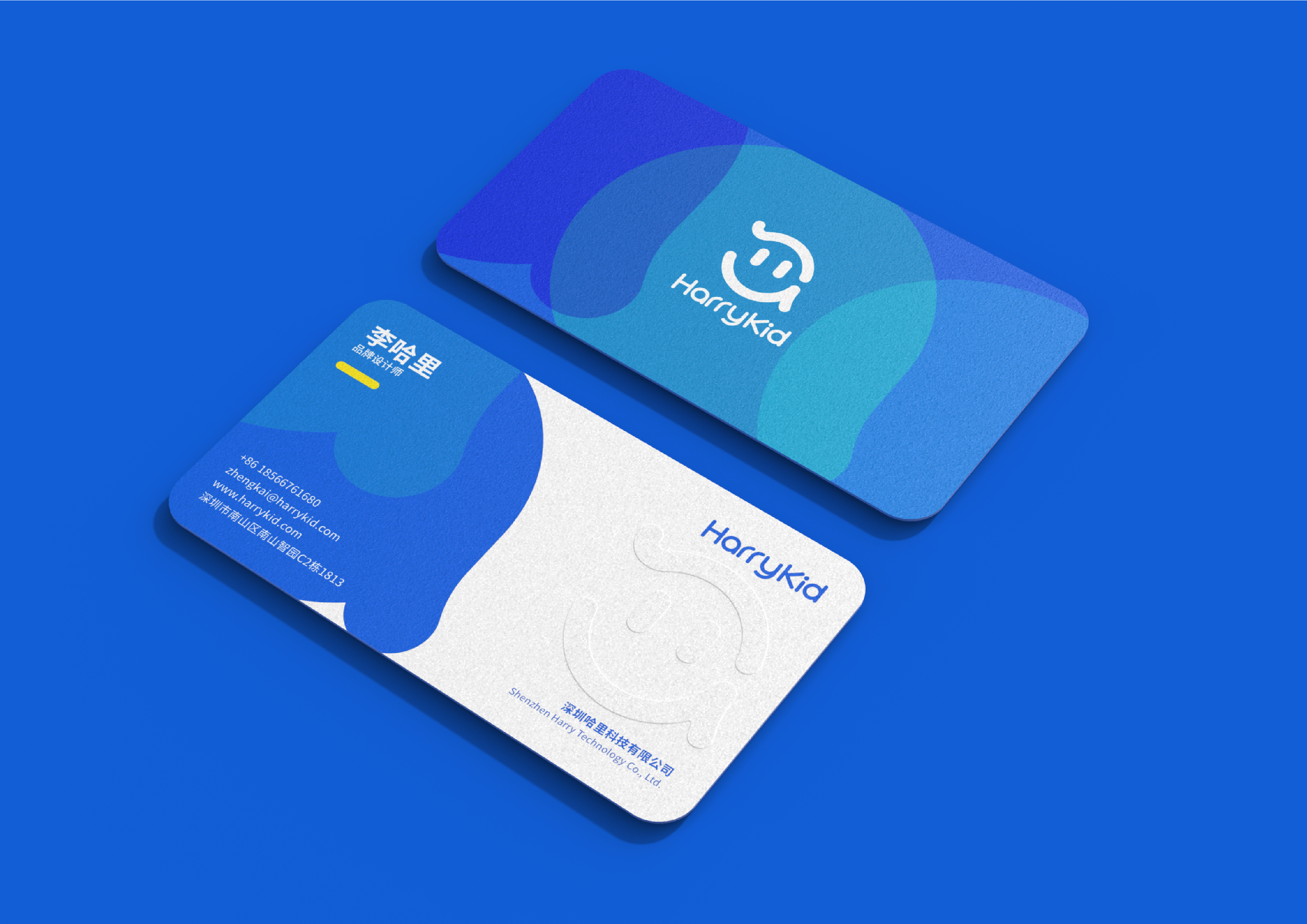
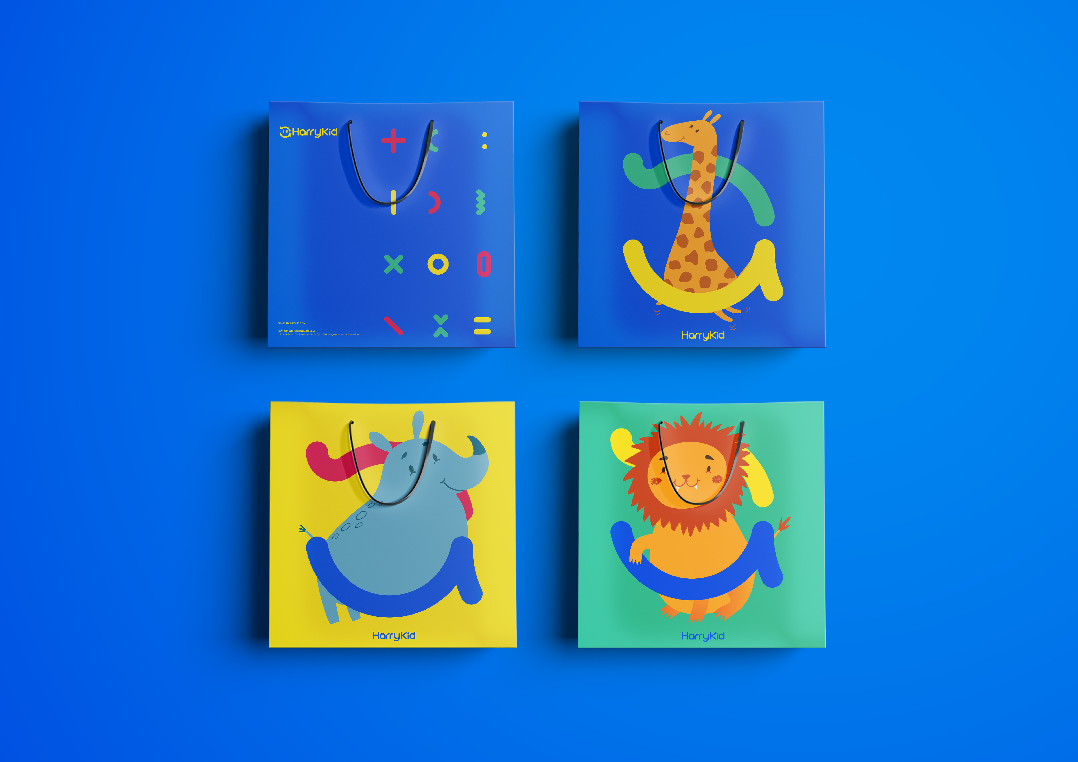
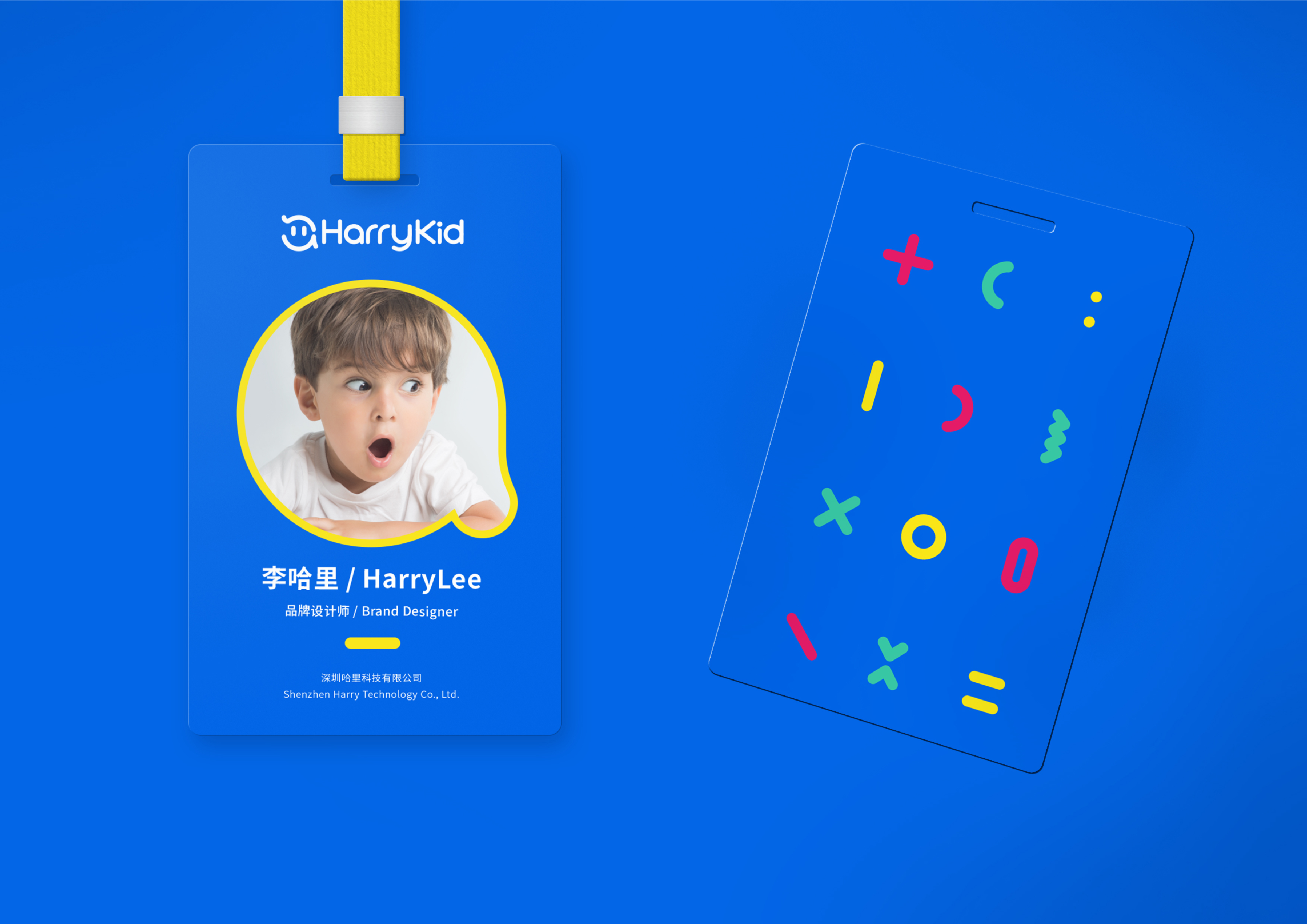
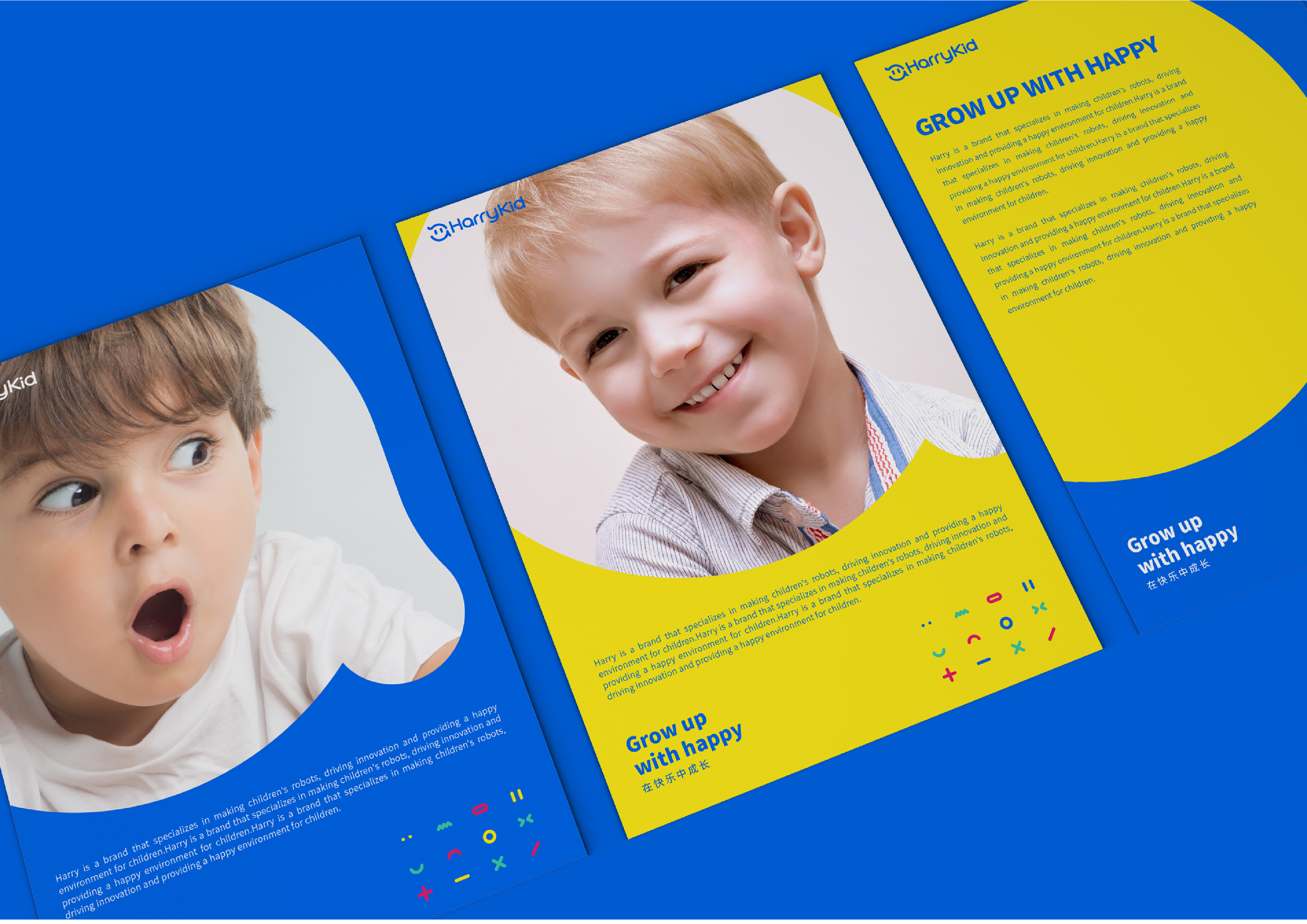
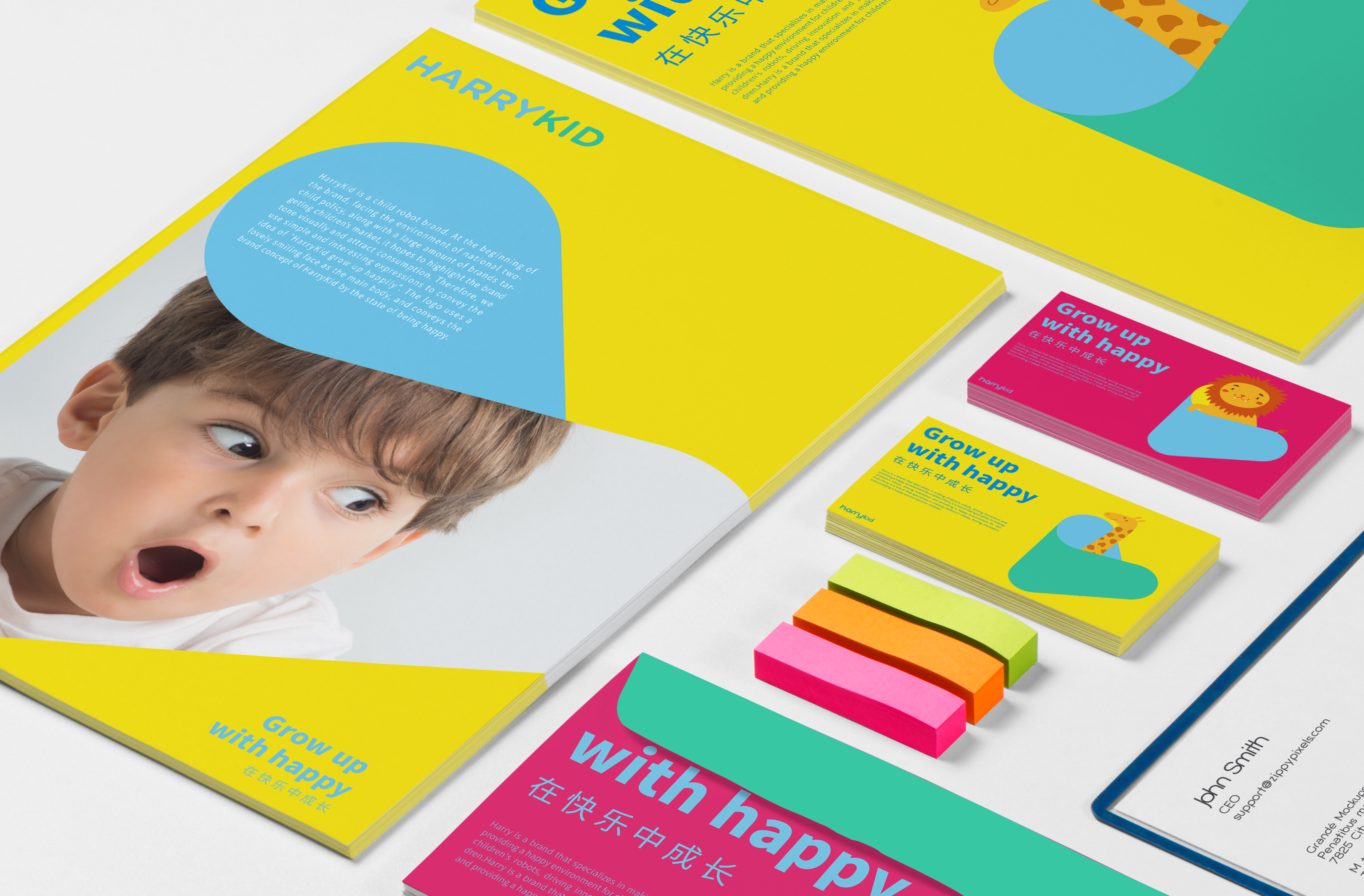
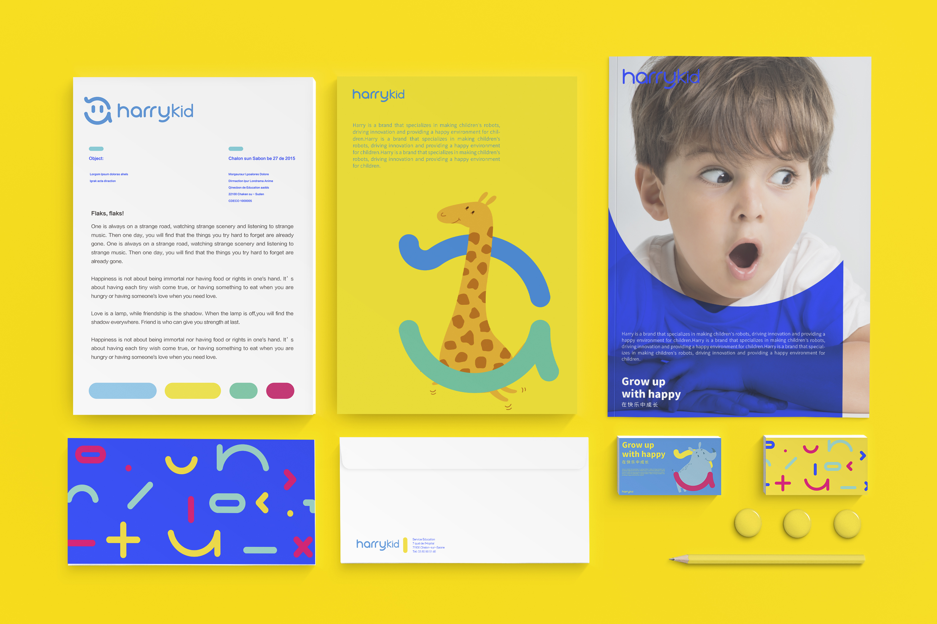
HARRYKID--LOGO & VI BRAND DESIGN HARRYKID (Harry Children) is a brand of children's robots. In the initial face of the national policy of opening up two children, a large number of brands are aimed at children's market players. Jiajian hopes to visually highlight the brand tone and attract consumption. Therefore, we use concise and interesting expressions to convey the concept of "Harry children grow up happily. LOGO uses a lovely smiling face as the main body and conveys Harry's children's brand concept with the concept of happiness. The slightly raised hair also represents a kind of immature and lively. The overall graphic logo is combined with Harry's children's English name "harrykid", which makes letters appear in the graphic logo. The brand logo has uniqueness and specificity. Harry Children will become an indispensable part of the field of children's education, helping children's future with the concept of happy growth. In the extension of VI, we have carried out a series of deformation and expansion of LOGO to form a variety of graphics with different expressions to increase the interest and vitality of Harry's children's overall brand. At the same time, different industry attributes can also be expressed through the combination of different expressions.

The copyright of this work belongs to 佳简几何XIVO. No use is allowed without explicit permission from owner.

New user?Create an account
Log In Reset your password.
Account existed?Log In
Read and agree to the User Agreement Terms of Use.

Please enter your email to reset your password
The color matching is light and harmonious, very good.
The whole VI design is very good, it is in line with the brand image.
The expression of the little model is too in place
What a lovely VI ~