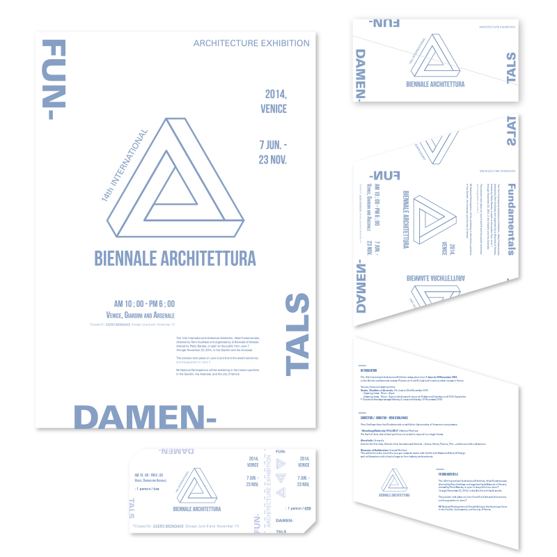
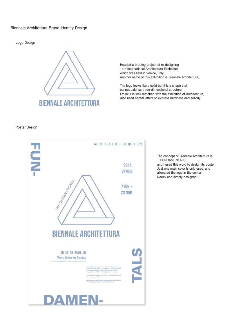
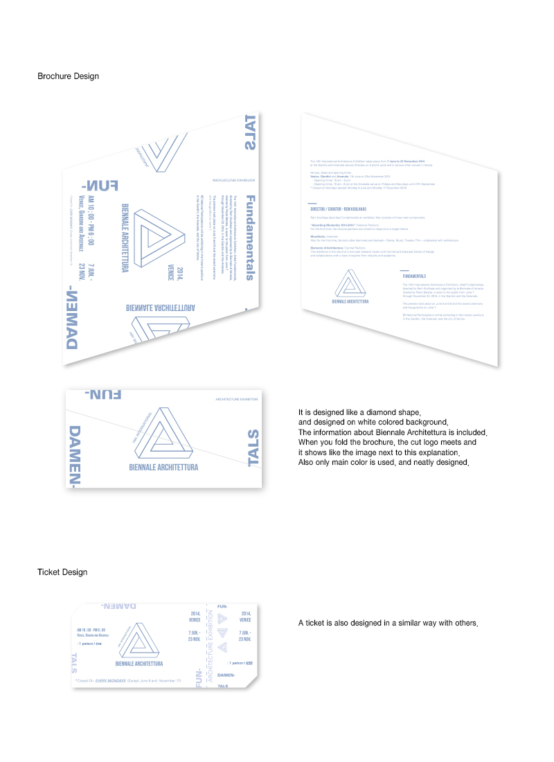
Headed a brading project of re-designing 14th International Architecture Exhibition which was held in Venice, Italy. Another name of this exhibition is Biennale Architettura. The logo looks like a solid but it is a shape that cannot exist as three-dimensional structure. I think it is well matched with the exhibition of Architecture. Also used captal letters to express hardness and solidity. Re-designed a logo, a poster, a brochure and a ticket. Used only one main color and white colored background for the neat design. A new logo is allocated in the center of every single design.


Year
2015
Designer
JIYUN PARK
The copyright of this work belongs to K-DESIGN AWARD. No use is allowed without explicit permission from owner.

New user?Create an account
Log In Reset your password.
Account existed?Log In
Read and agree to the User Agreement Terms of Use.

Please enter your email to reset your password
Comment Board (0)
Empty comment