A set of process design presentation for the serialization of culinary products with the theme of health and fun.
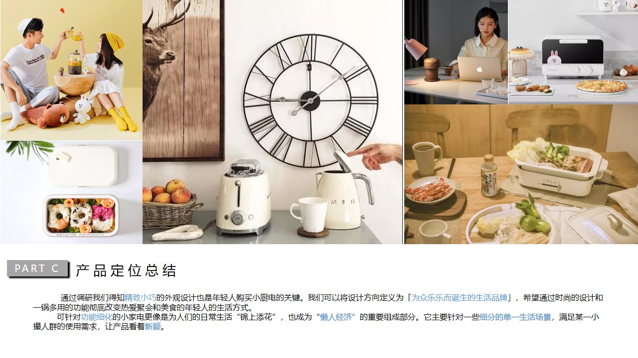
This is this semester's special product design course. It is a small team of five product design professionals. According to the topic, we have chosen cooking products with the theme of health and happiness. Instead of competing for research on a cooking product, we should change our thinking and carry out detailed functional design for how to make a beautiful food.
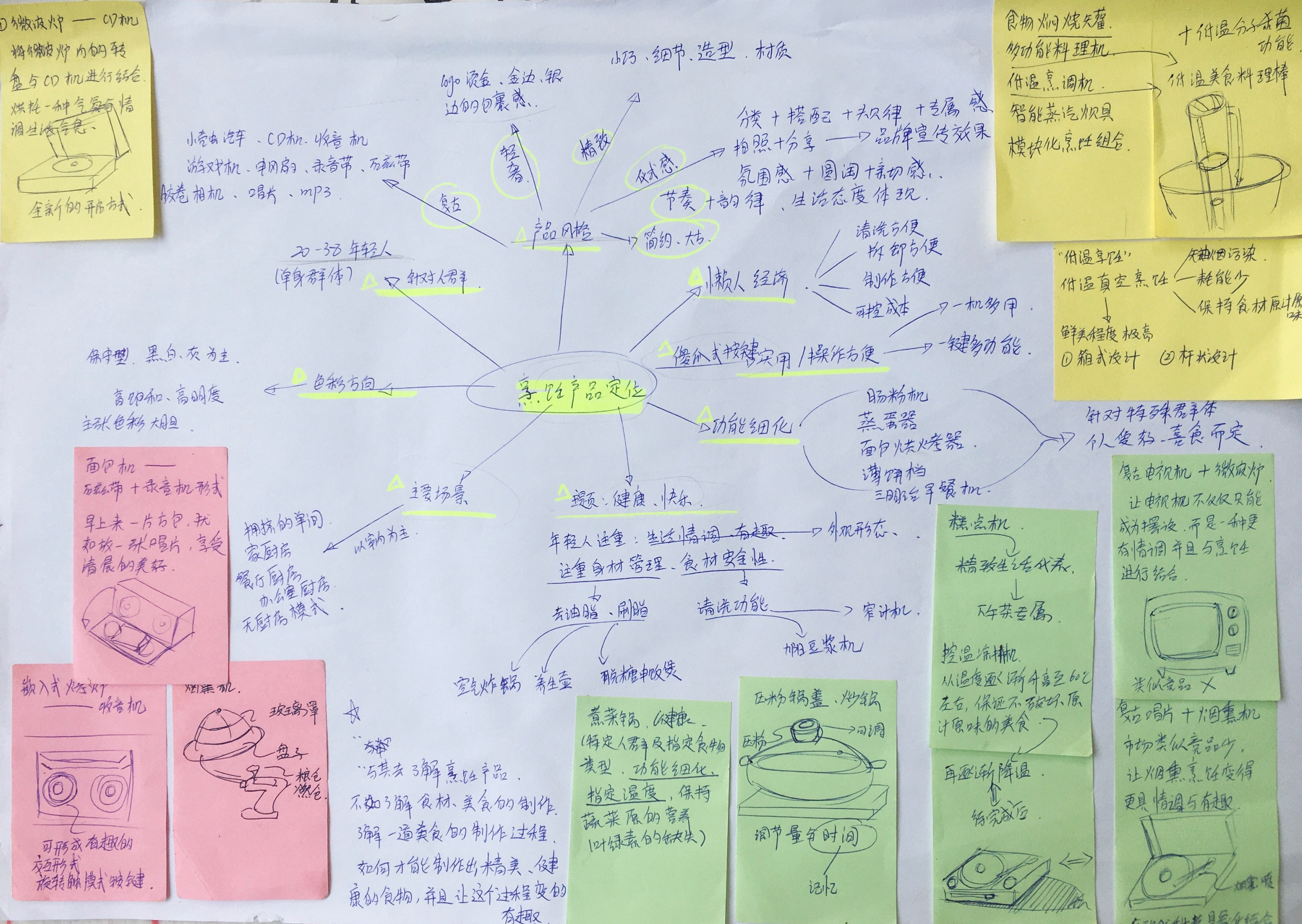
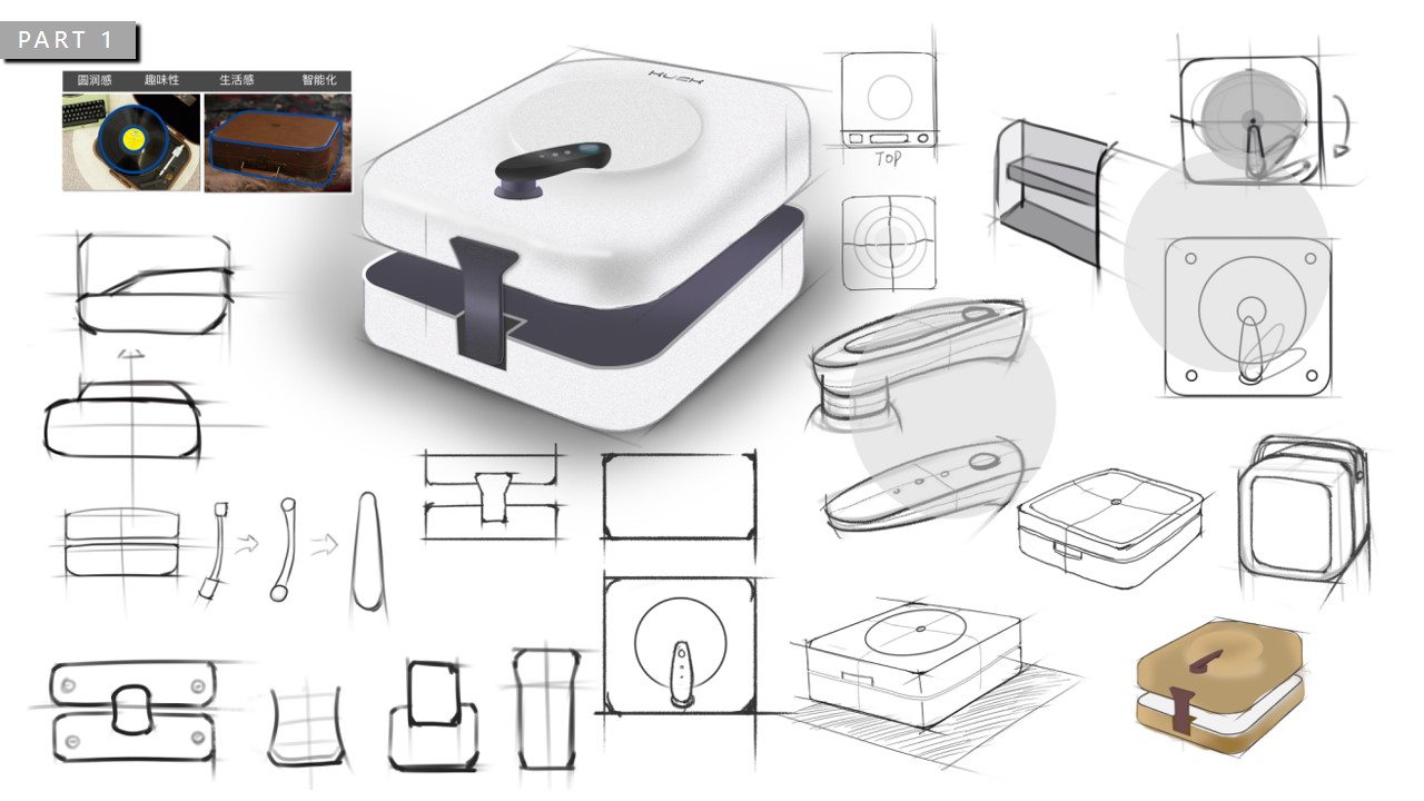
According to our theme, we have carried out in-depth thinking divergence, and the team also put forward their different views under the guidance of such keywords, and began to have the prototype of the product.
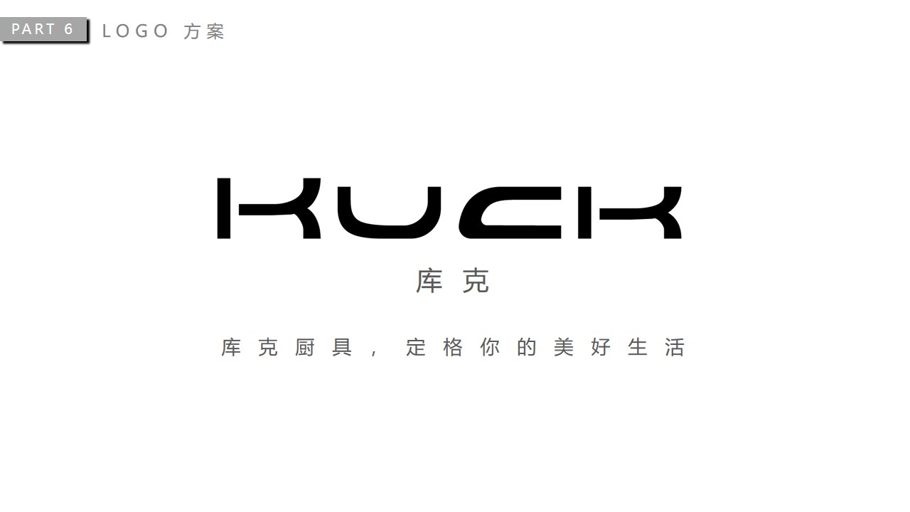
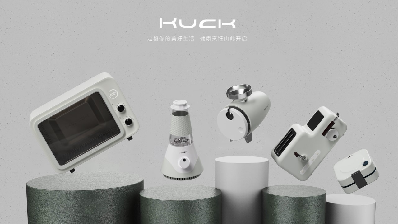
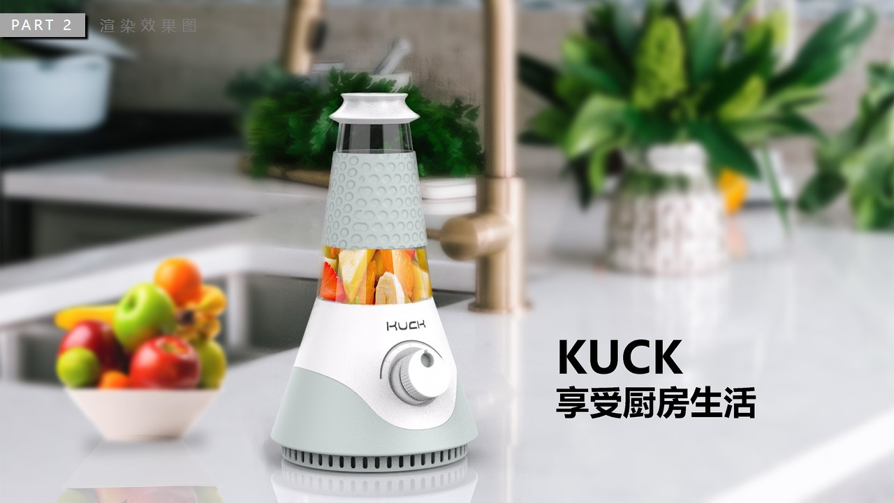
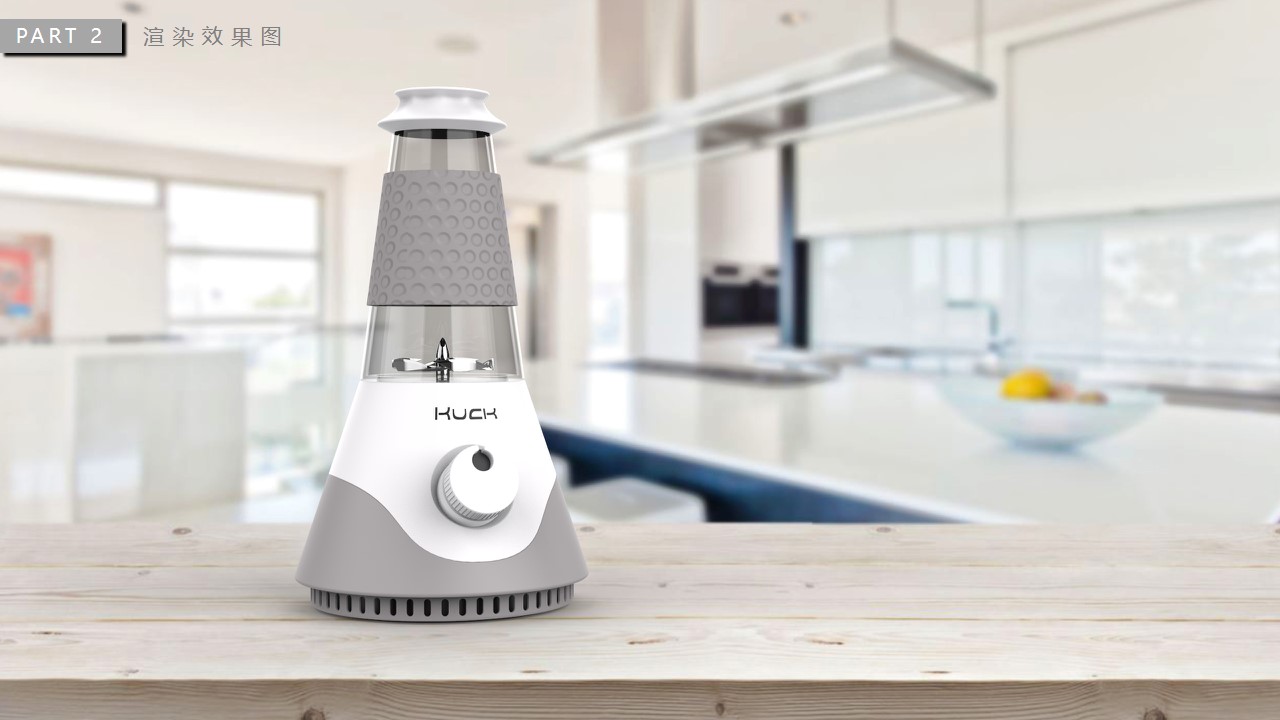
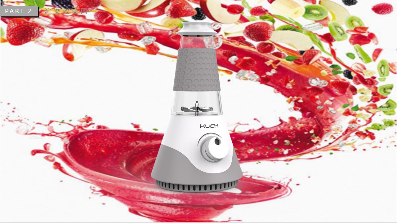
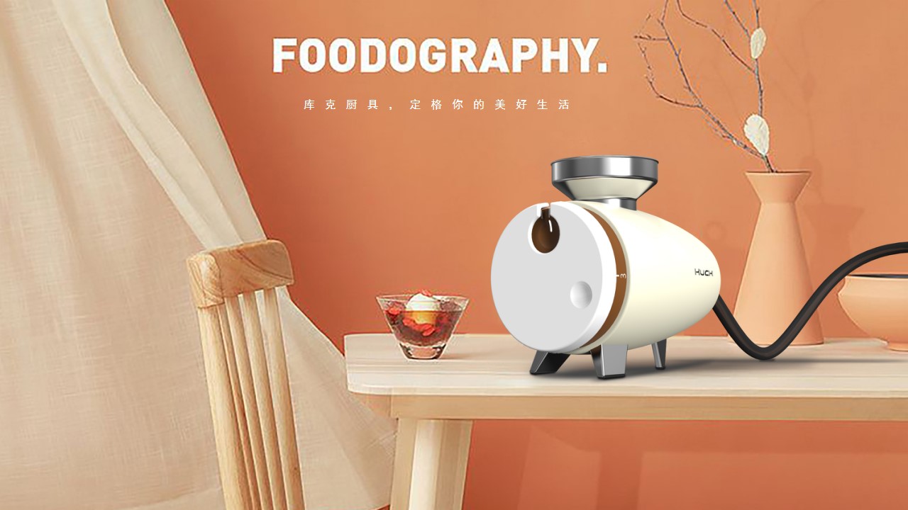
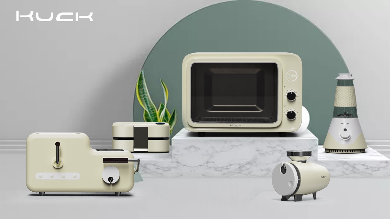
After clarifying the products we want to make, we began to delineate the brand design and concept. Cuck is similar to the English "cooker" pronunciation, which is also in line with our cooking product design. Not only that, it is also similar to the Chinese homophonic "Kuke", but it also reflects a kind of life attitude of young people now, and also shows that the group we are facing is young people with exquisite life. Logo's font design, simple appearance and outline are also very consistent with the product intention we will do later. In such a logo design that gives such a meaning, I believe it is a more suitable symbol for both the Chinese market and the foreign market.
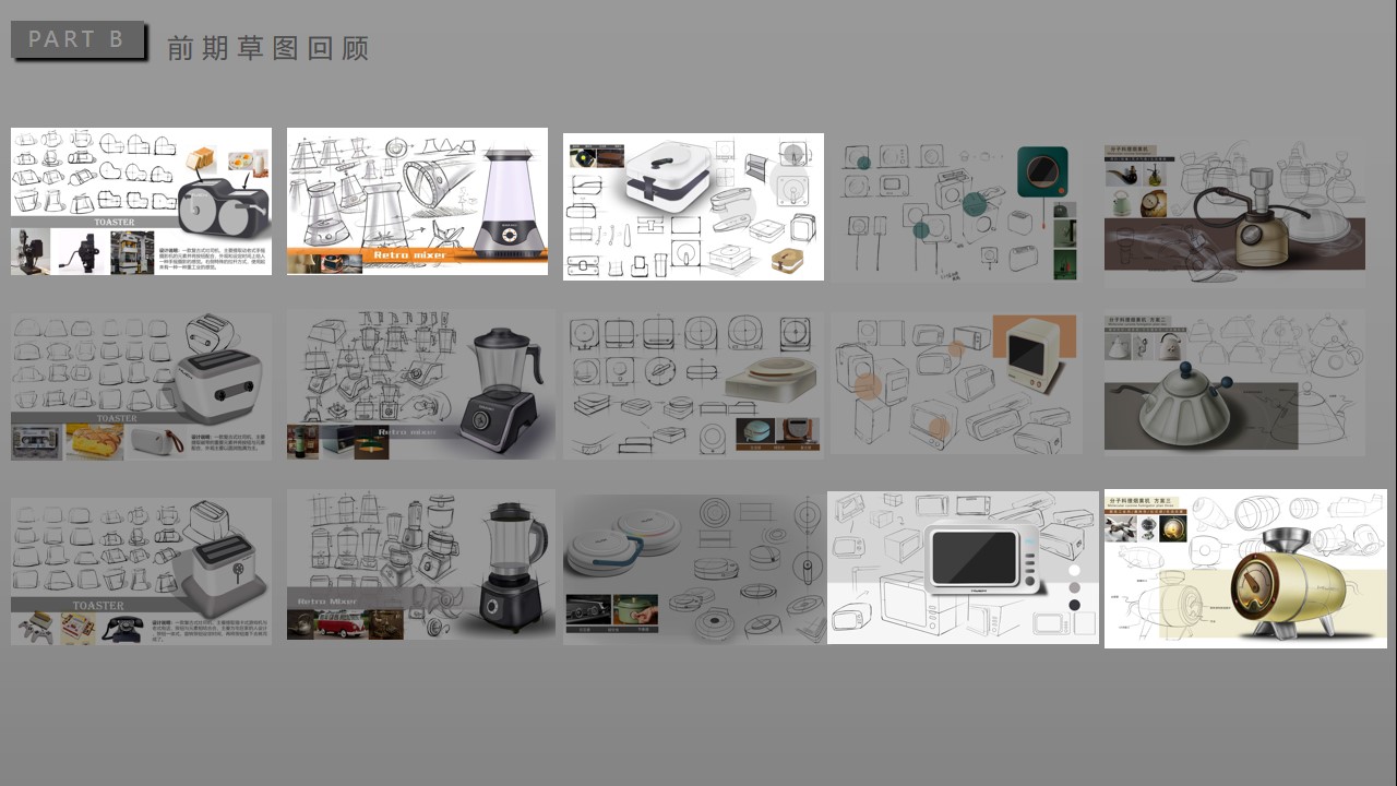
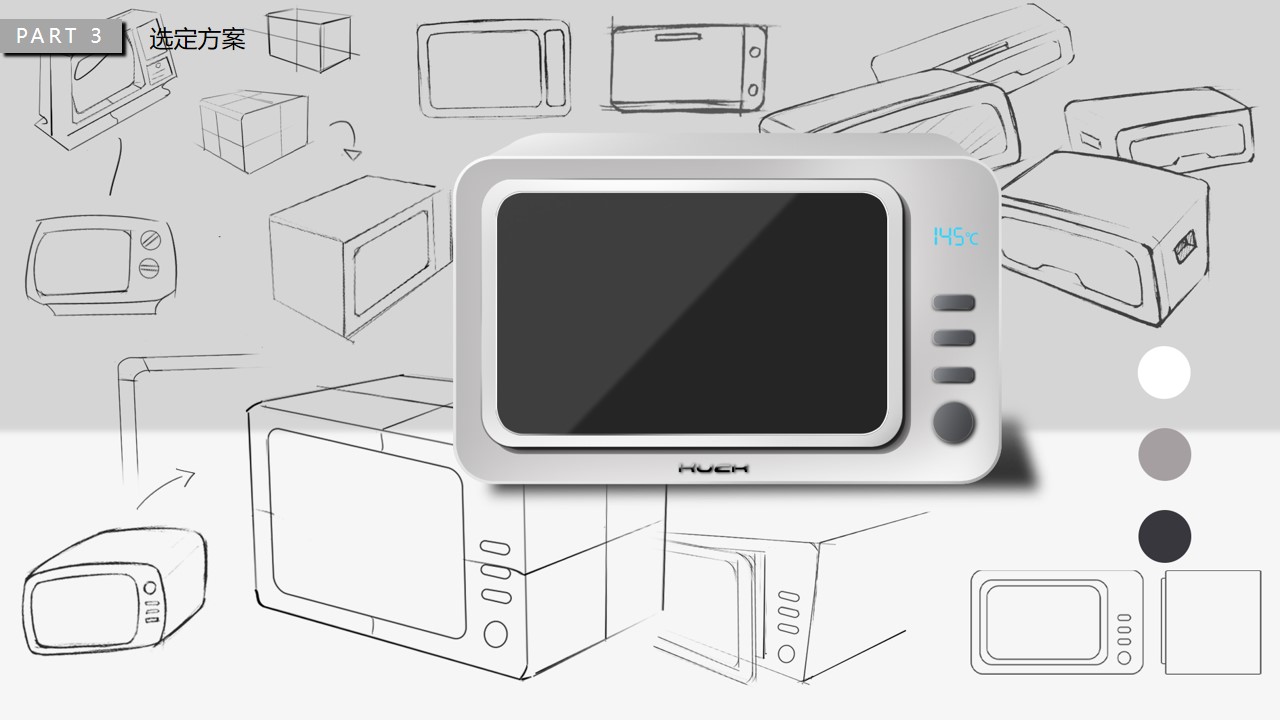
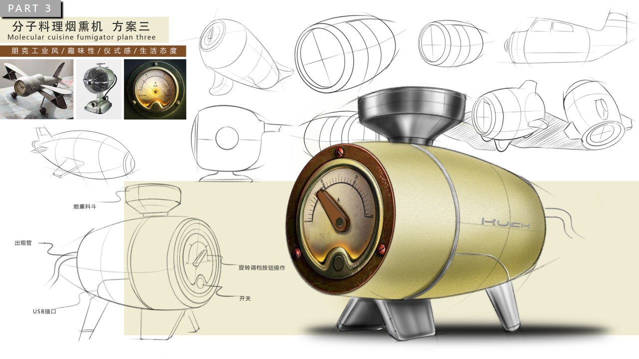
After the team members had a certain understanding of the products they wanted to design, everyone focused on one product and put forward three different forms of design schemes. After that, each student chose one of the schemes for in-depth refinement, that is, the later 3d modeling.
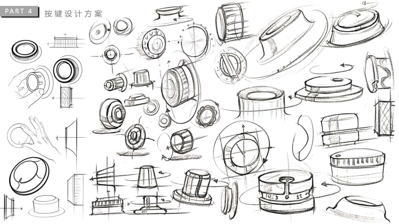
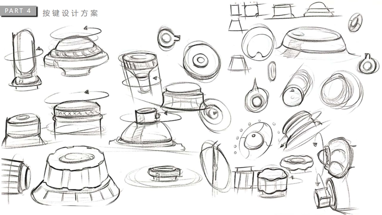
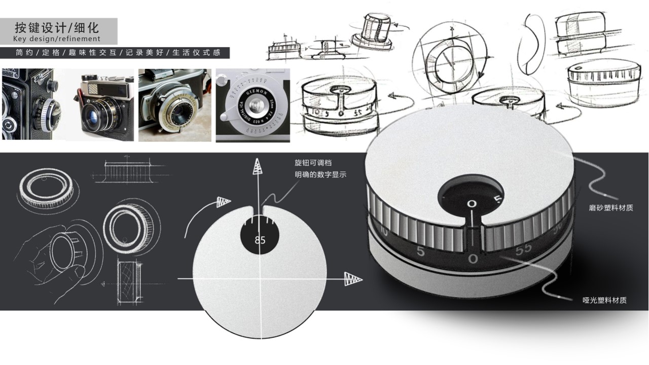
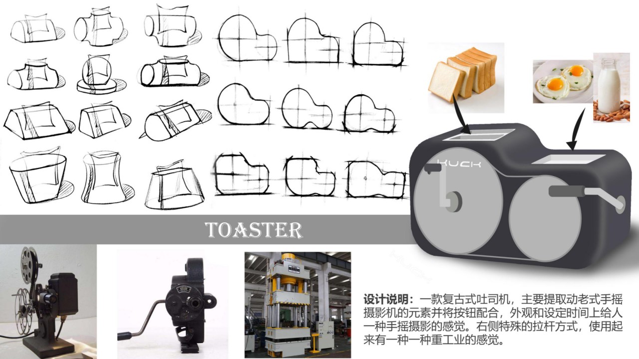
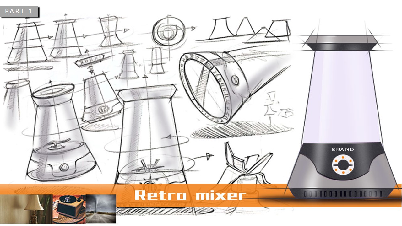
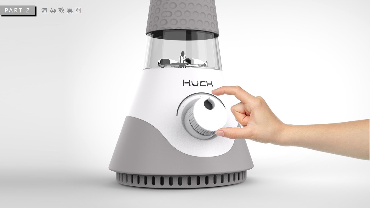
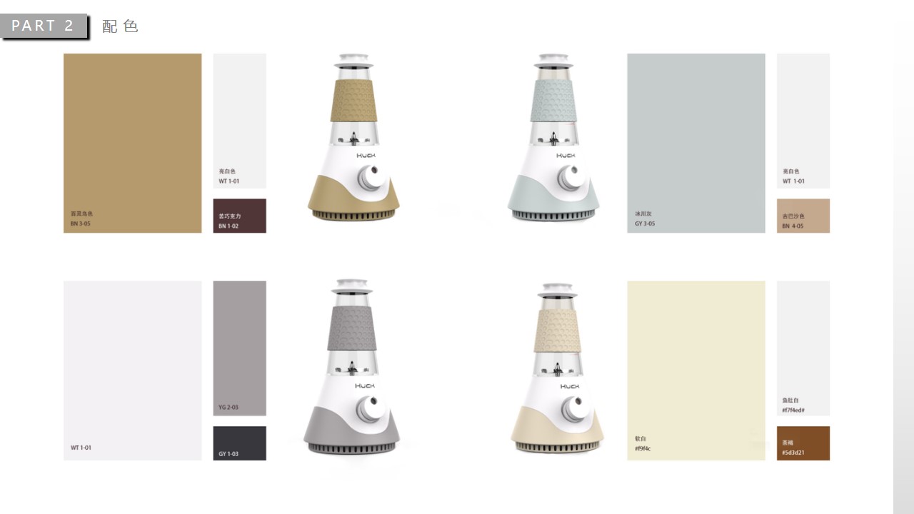
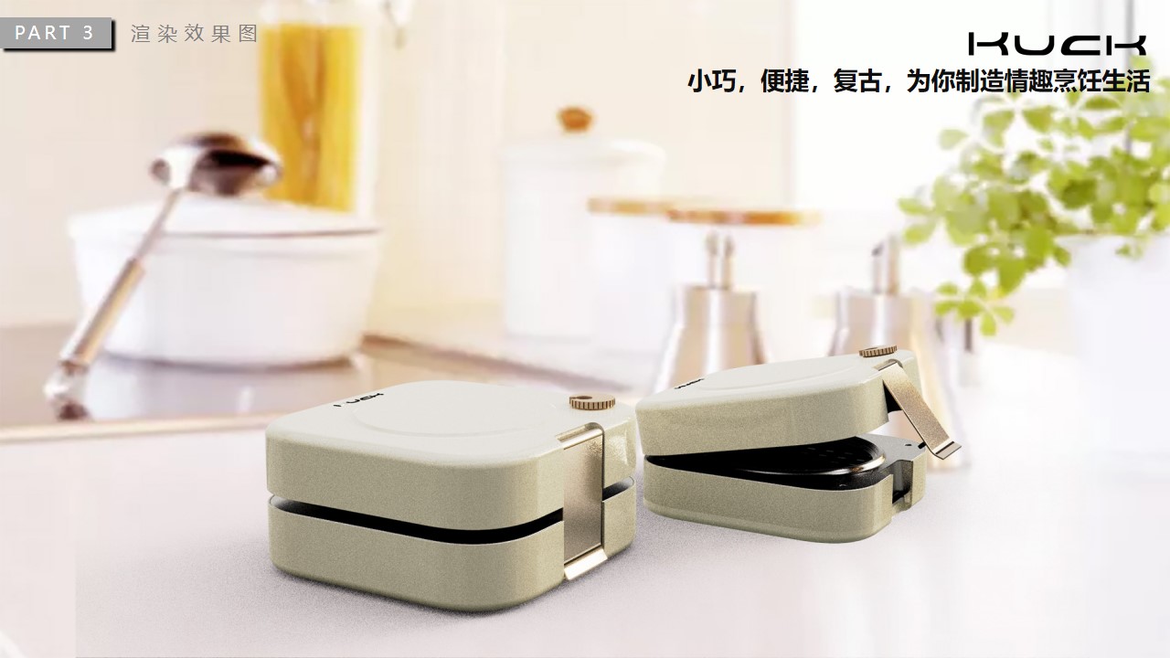
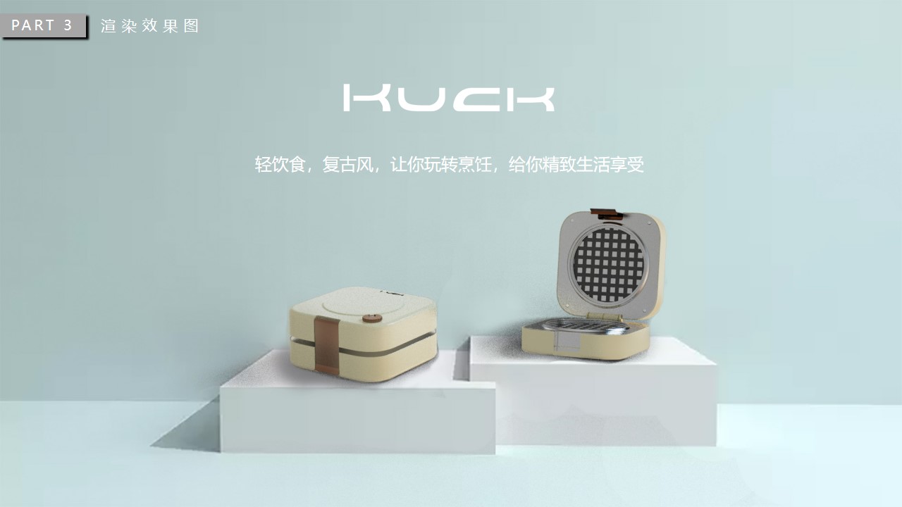
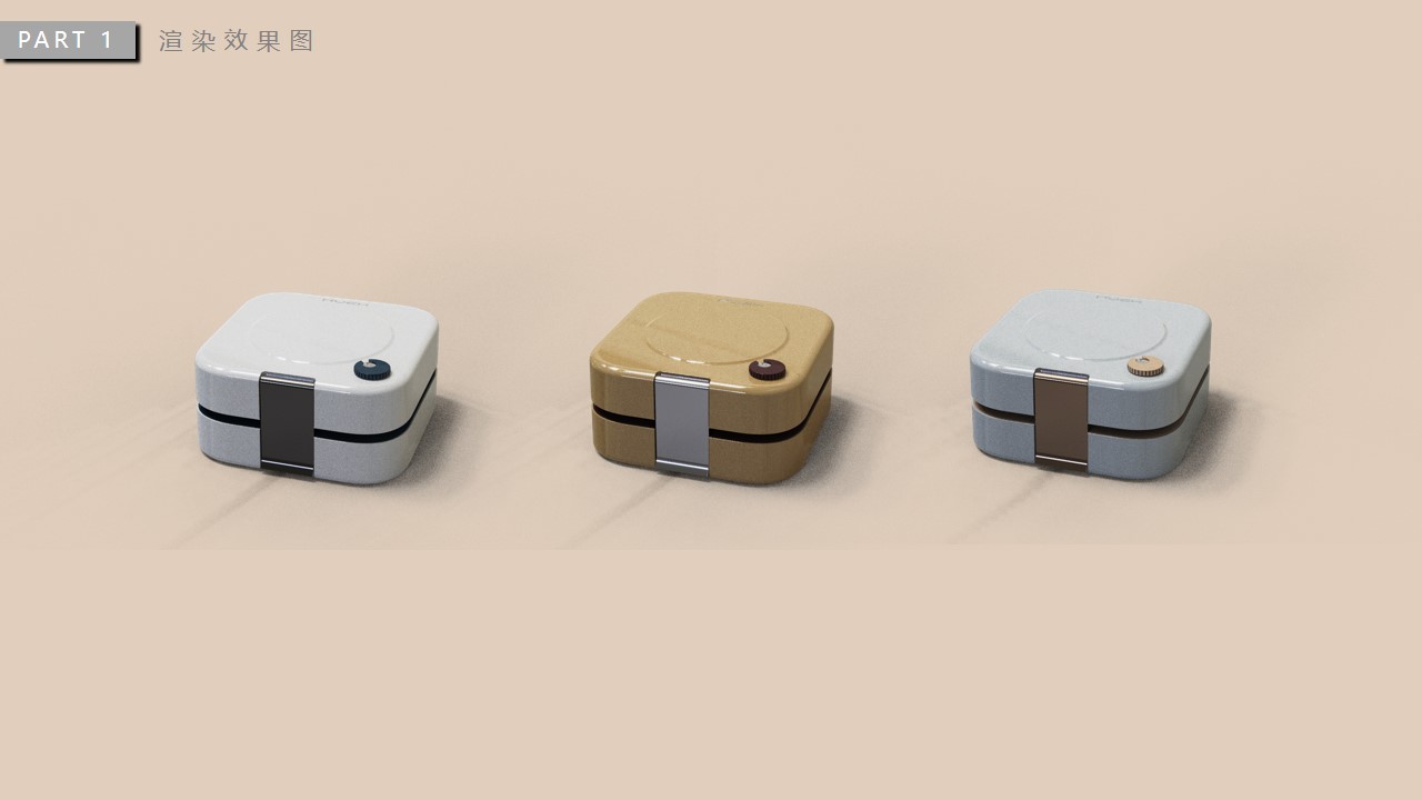
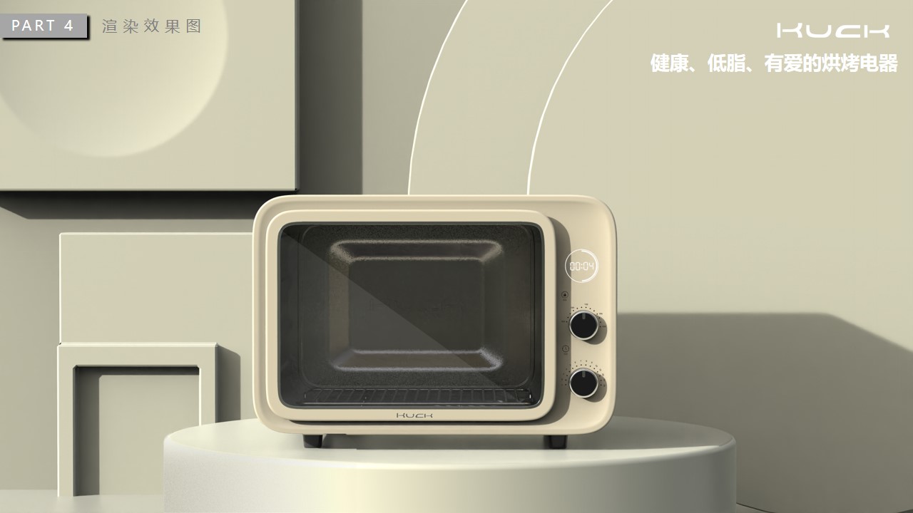
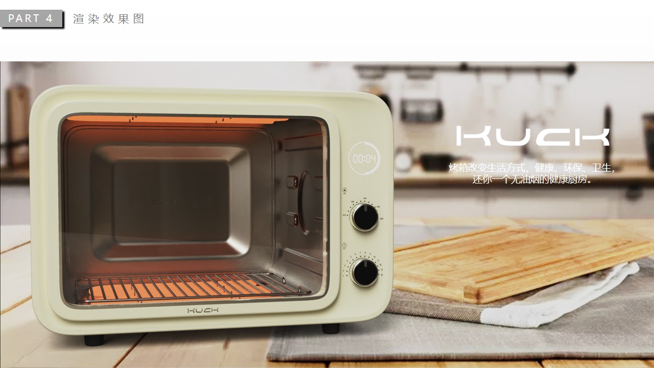
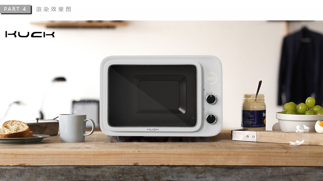
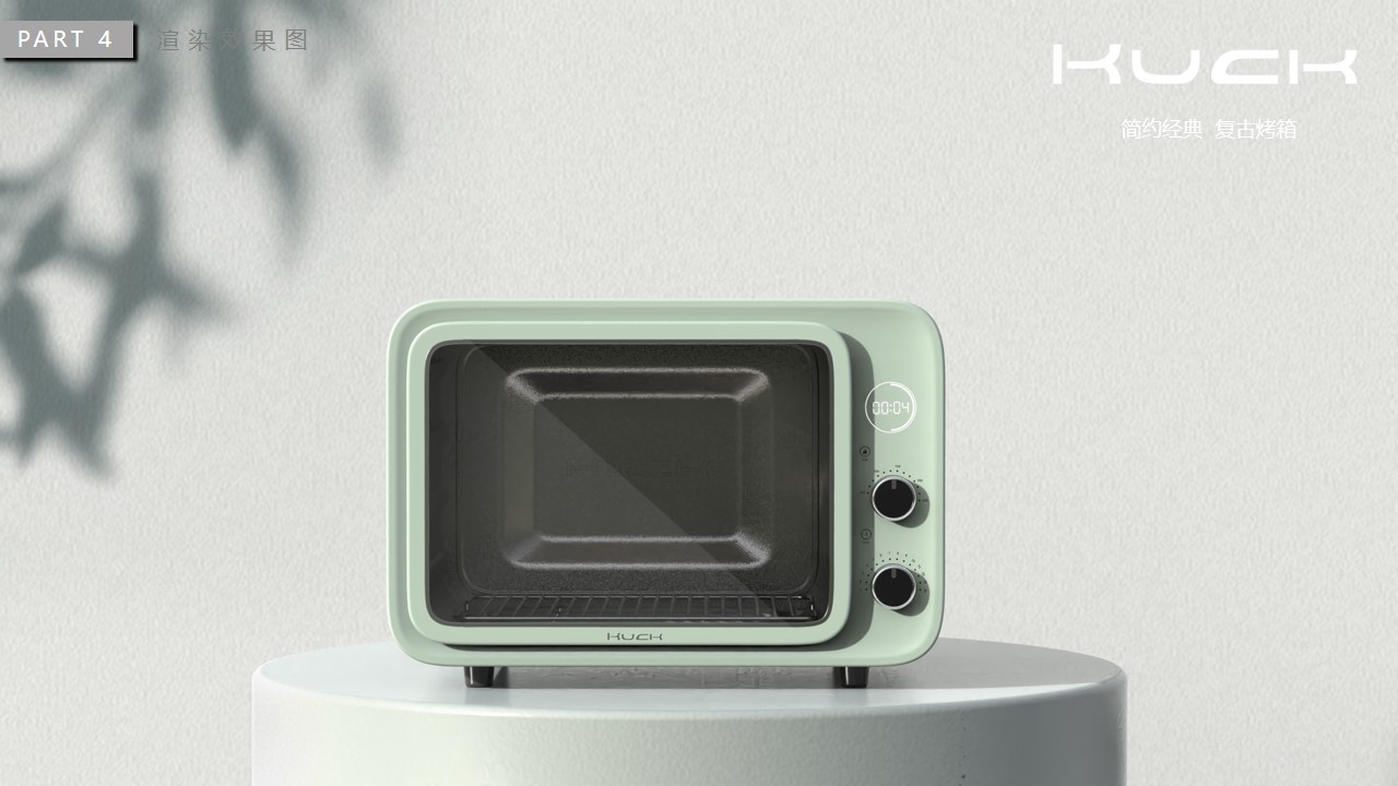
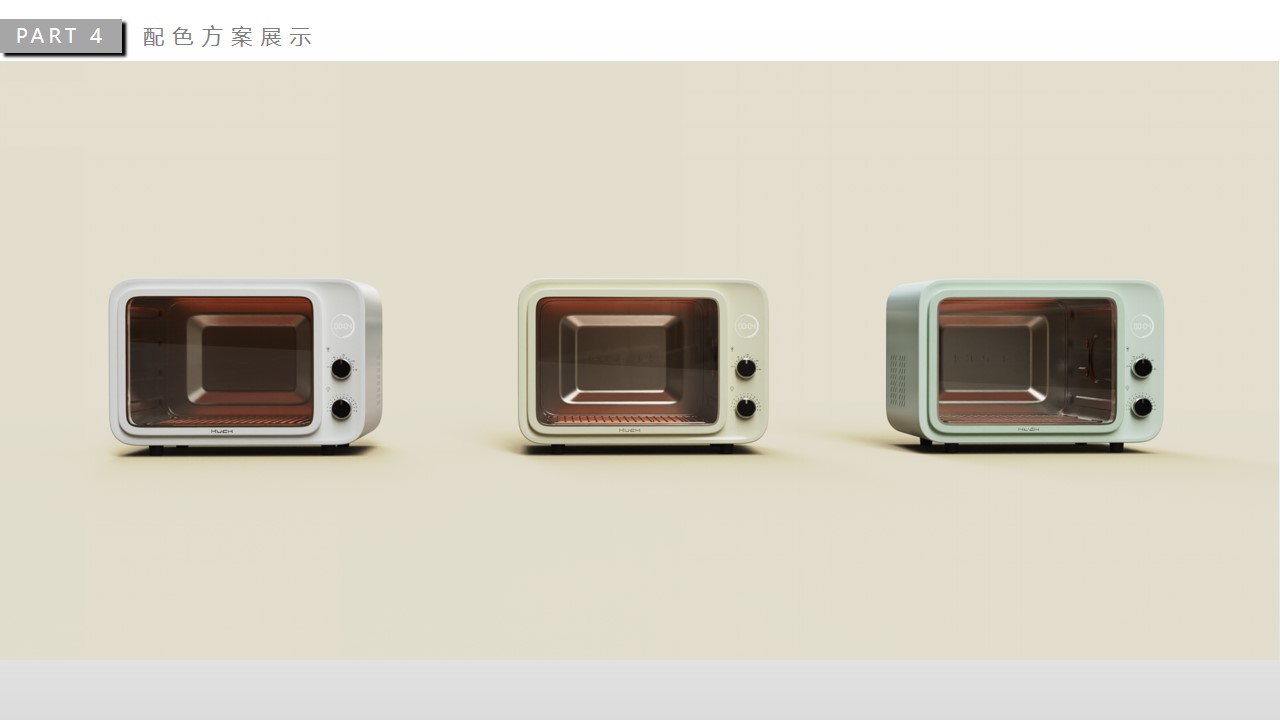
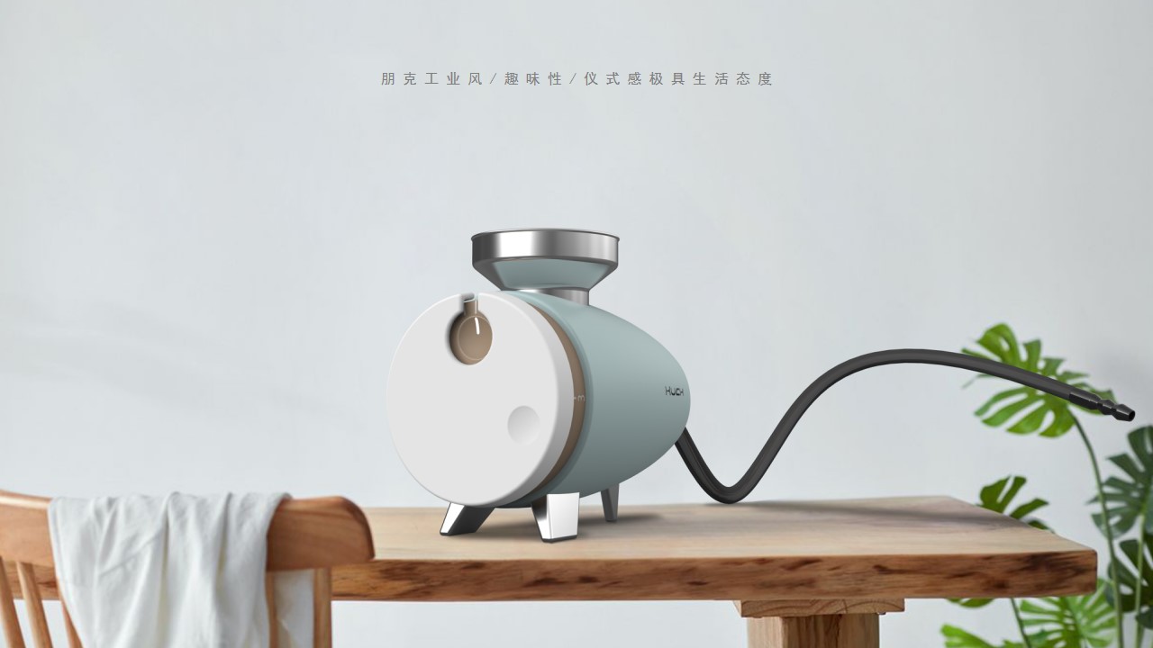
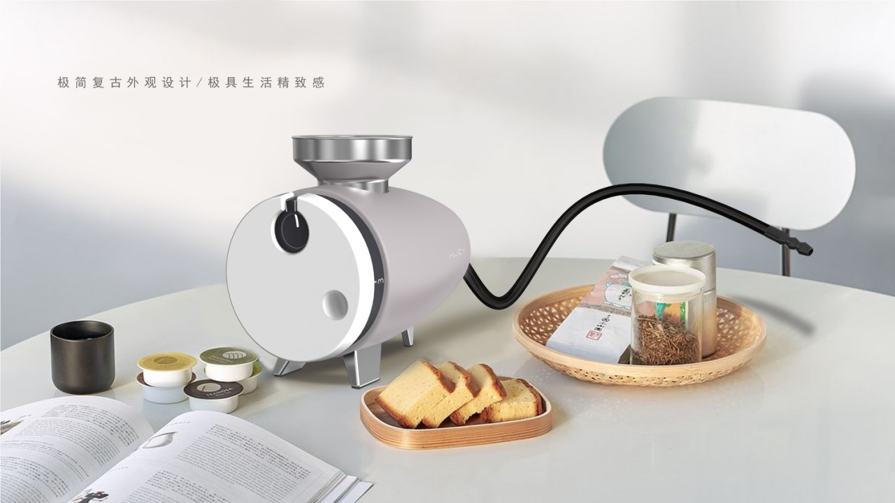
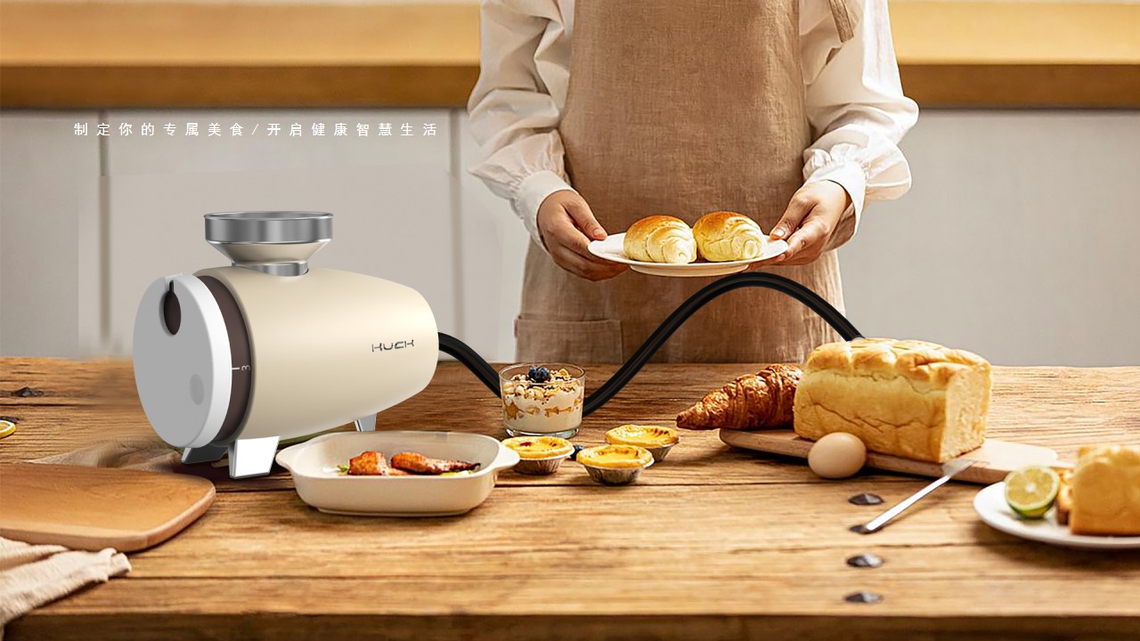
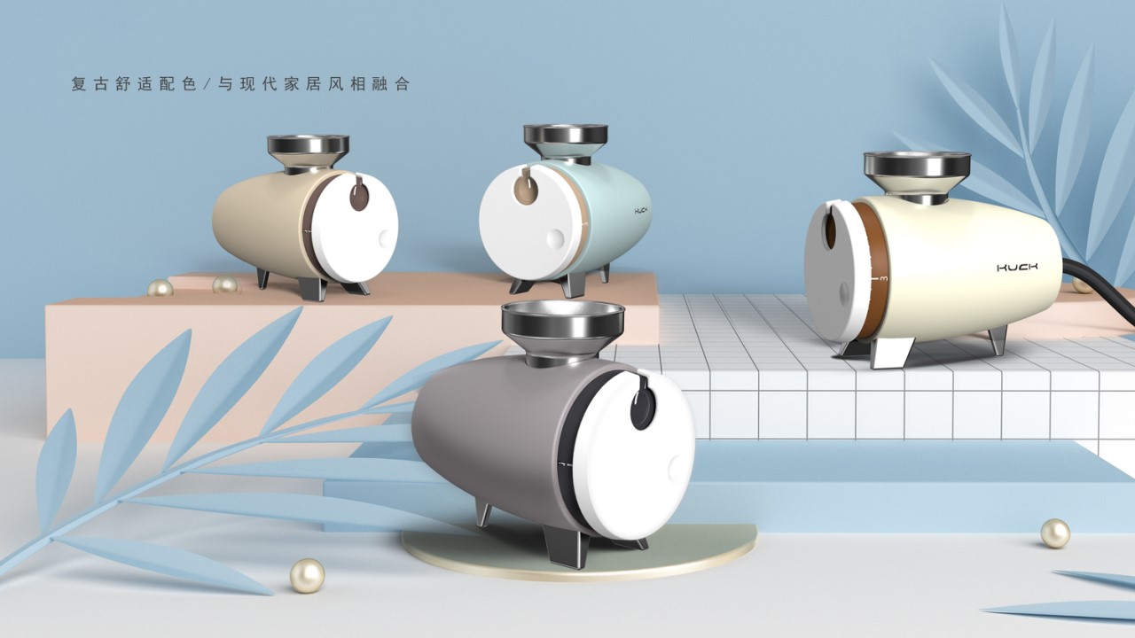
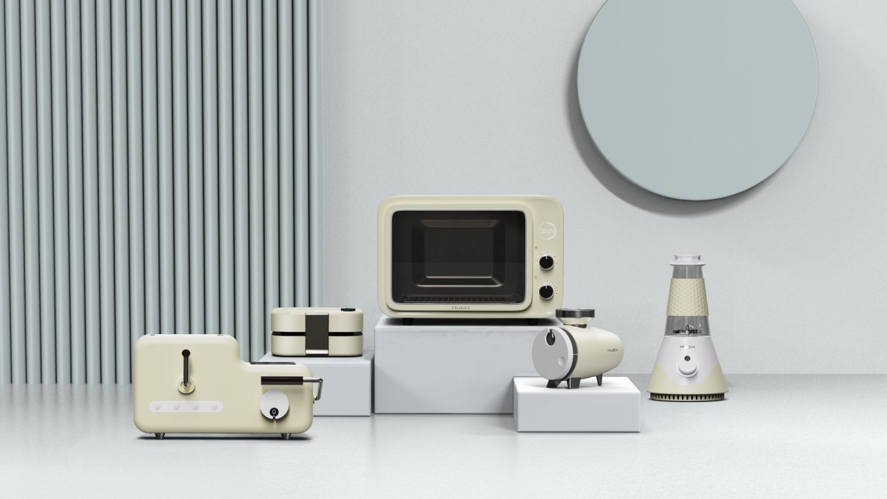
We hope to serialize our cooking product design family through buttons and color matching, so we brainstormed a variety of button graphics in the early stage, and finally selected a design that best conforms to our design concept. That is, the shape embodied in the picture, which extracts the knob form of the retro camera to create a lifestyle for users to record/turn on healthy cooking. The following product plan display will reflect the integration of the button design.


Finally, thank you for your support! After that, we will make persistent efforts.
The copyright of this work belongs to DeeDeeBii. No use is allowed without explicit permission from owner.

New user?Create an account
Log In Reset your password.
Account existed?Log In
Read and agree to the User Agreement Terms of Use.
Please enter your email to reset your password


Except the oven is very ordinary.
Except for the product, everything else is OK. oh the product should be strengthened
It feels good
I just felt good.
Details still lack of heat!! Come on! The oven is nice!
Two points are discussed. A whole white part of the head of the molecular yan fumigator is a knob? When several products are put together in the tail picture, the yan fumigation machine feels like a group of chickens and cranes, which is a bit clumsy. In addition, for the cooking machine, one of the themes of this series is retro, but I personally learned from the picture that the decoration of the previous household appliances is basically made of a little different material, or simple functional aesthetics, or draw a little pattern, and return to the cooking machine, silicone/plastic parts on the neck, such a big texture, I feel is the possibility of destroying the retro feeling.
Good design only uses pictures to speak, does not need more words to explain!
The oven is quite good, and I like it personally.
Emmm product details and lack of integrity
How do you say, the project promotion is very interesting, but the finished product effect is a little bit that what, stupid? Stupid? Maybe the retro style in your expression, I don't know the audience geometry
The typesetting feeling needs to be strengthened
The tonality of the first picture feels a little gray, you can refer to it. https://www.puxiang.com/galleries/8a4071b23949ae73c1bf559bb9fc059b
The layout is very good
It feels good