Rice Elephant Design | Hair Dryer
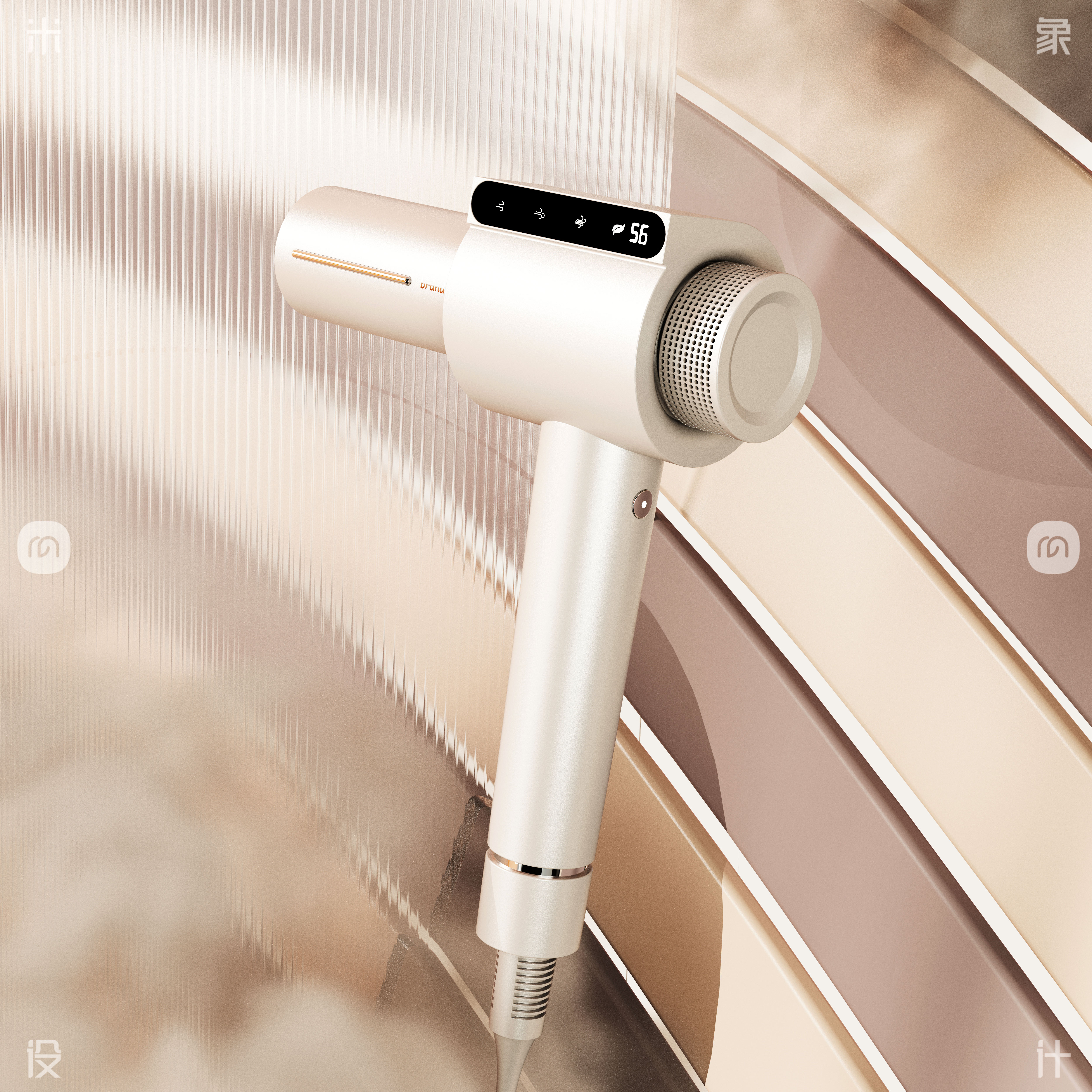
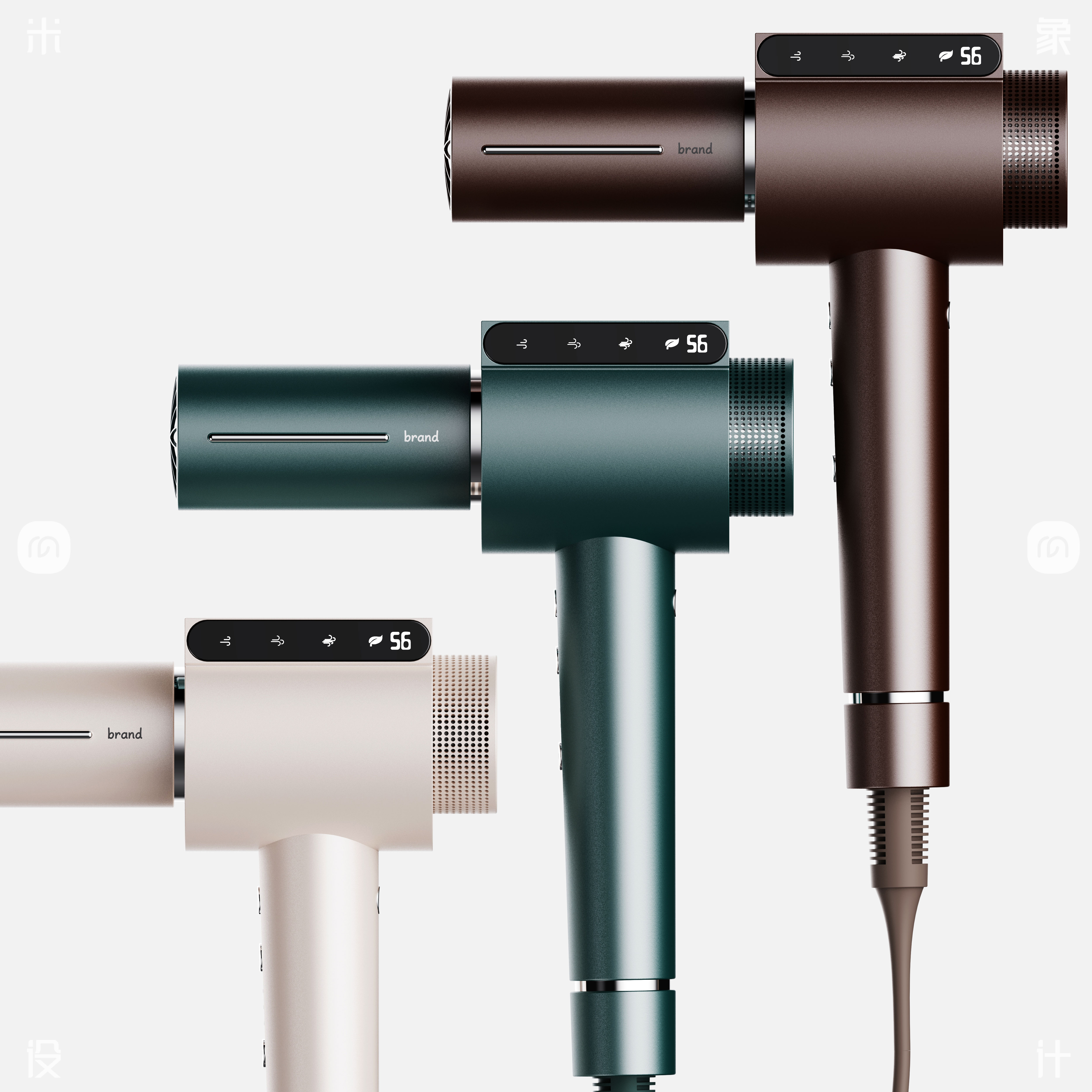
This hair dryer is inspired by the perfect fusion of technology and fashion. In the fast-paced modern life, people not only pursue efficient hairdressing tools, but also desire a personalized experience.
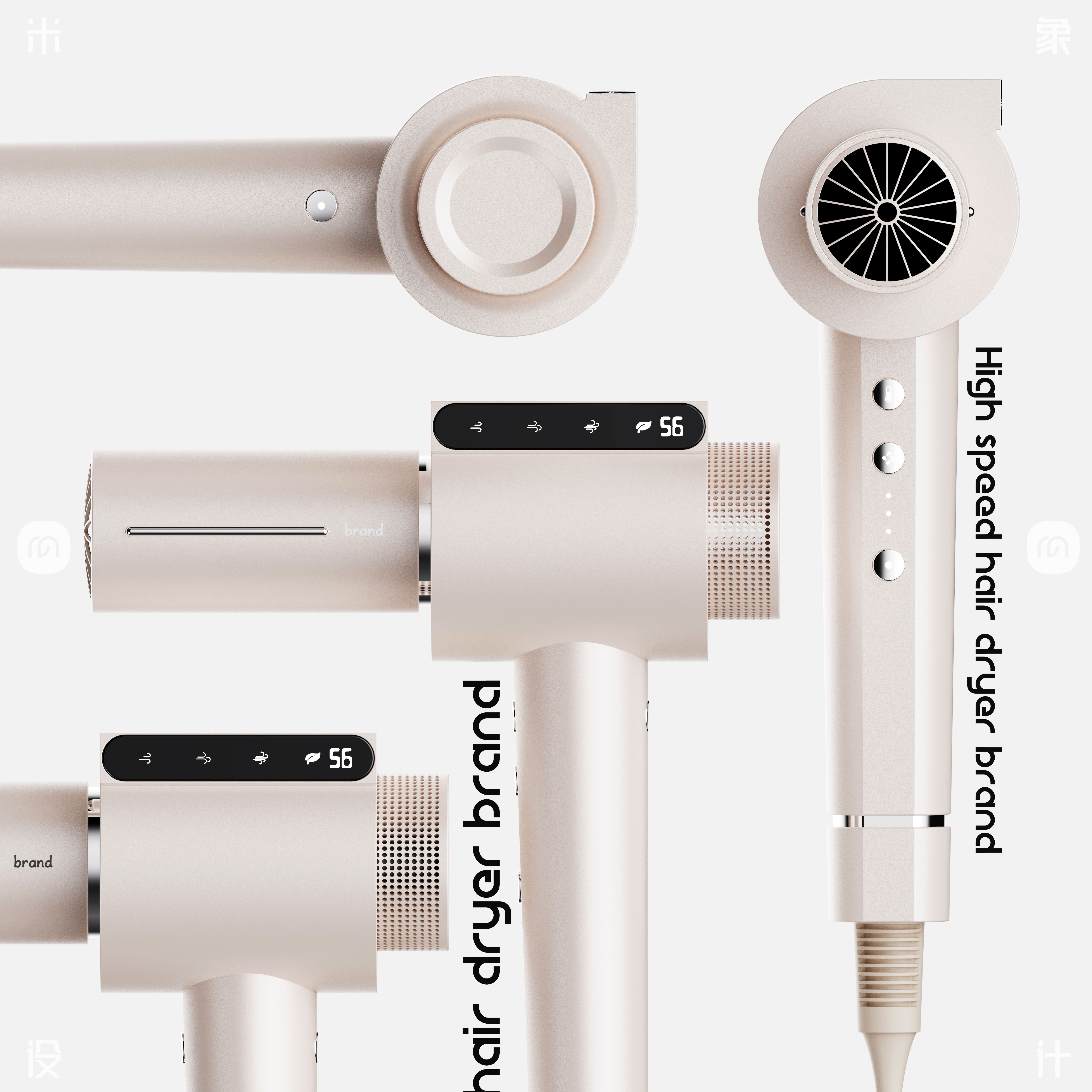
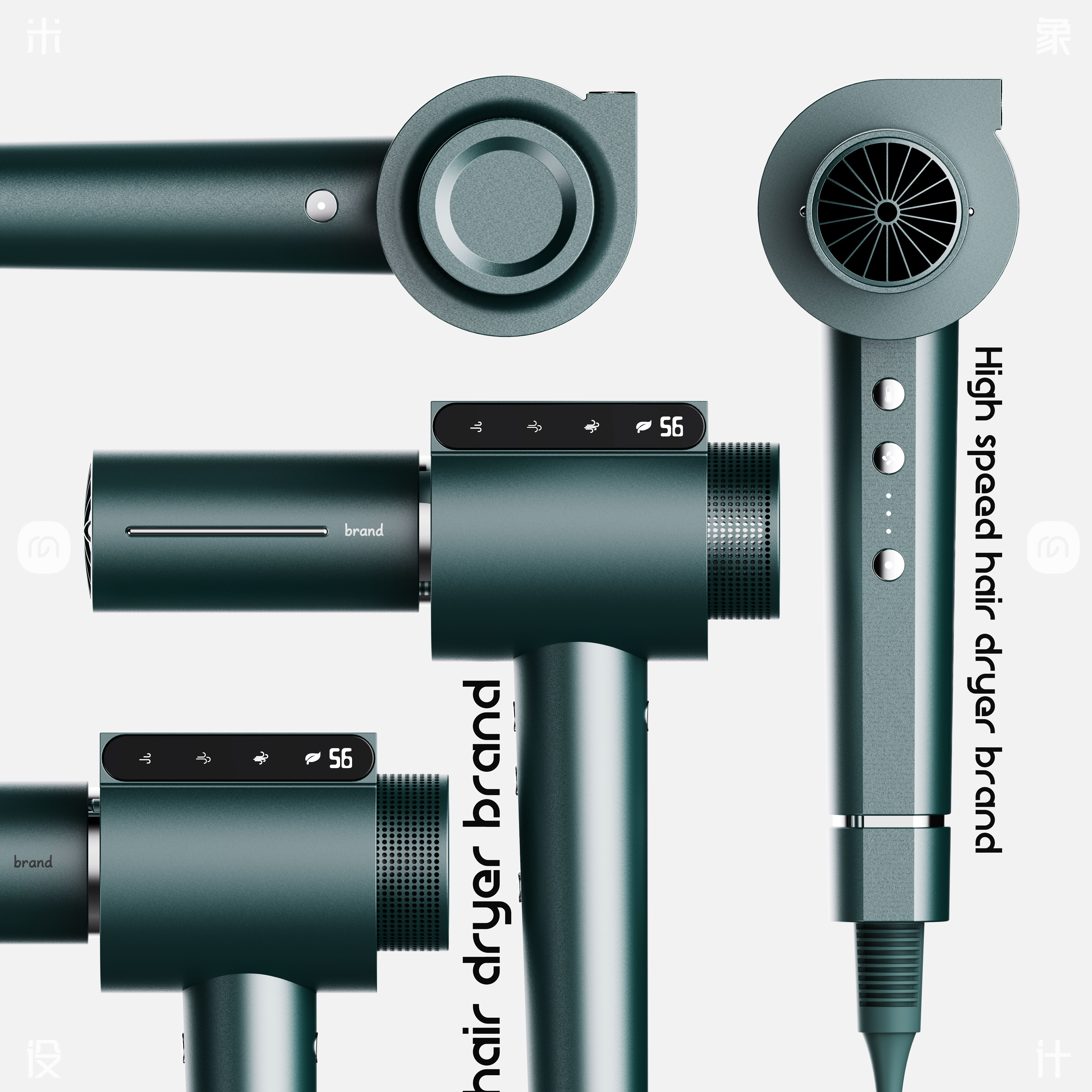
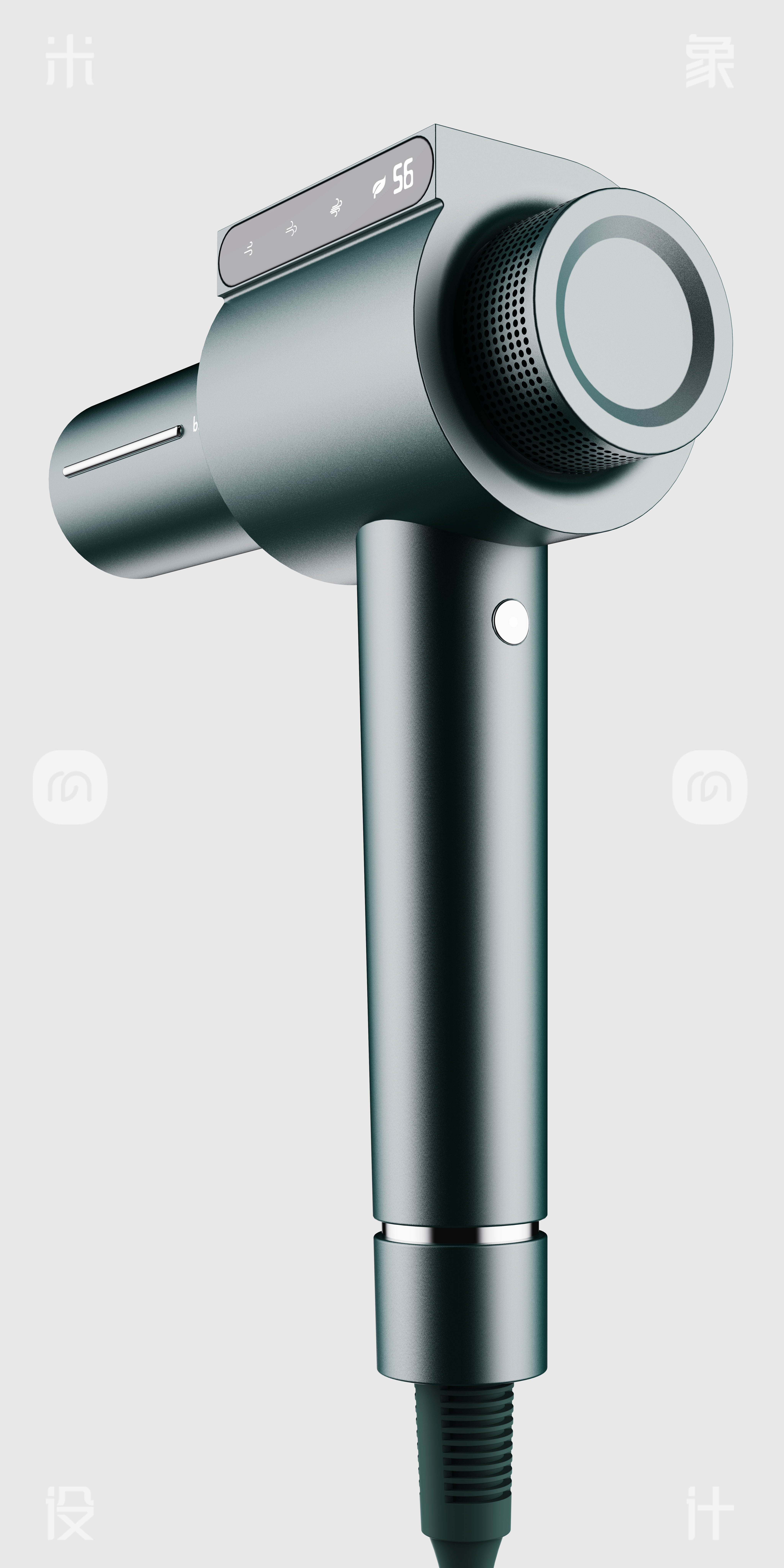
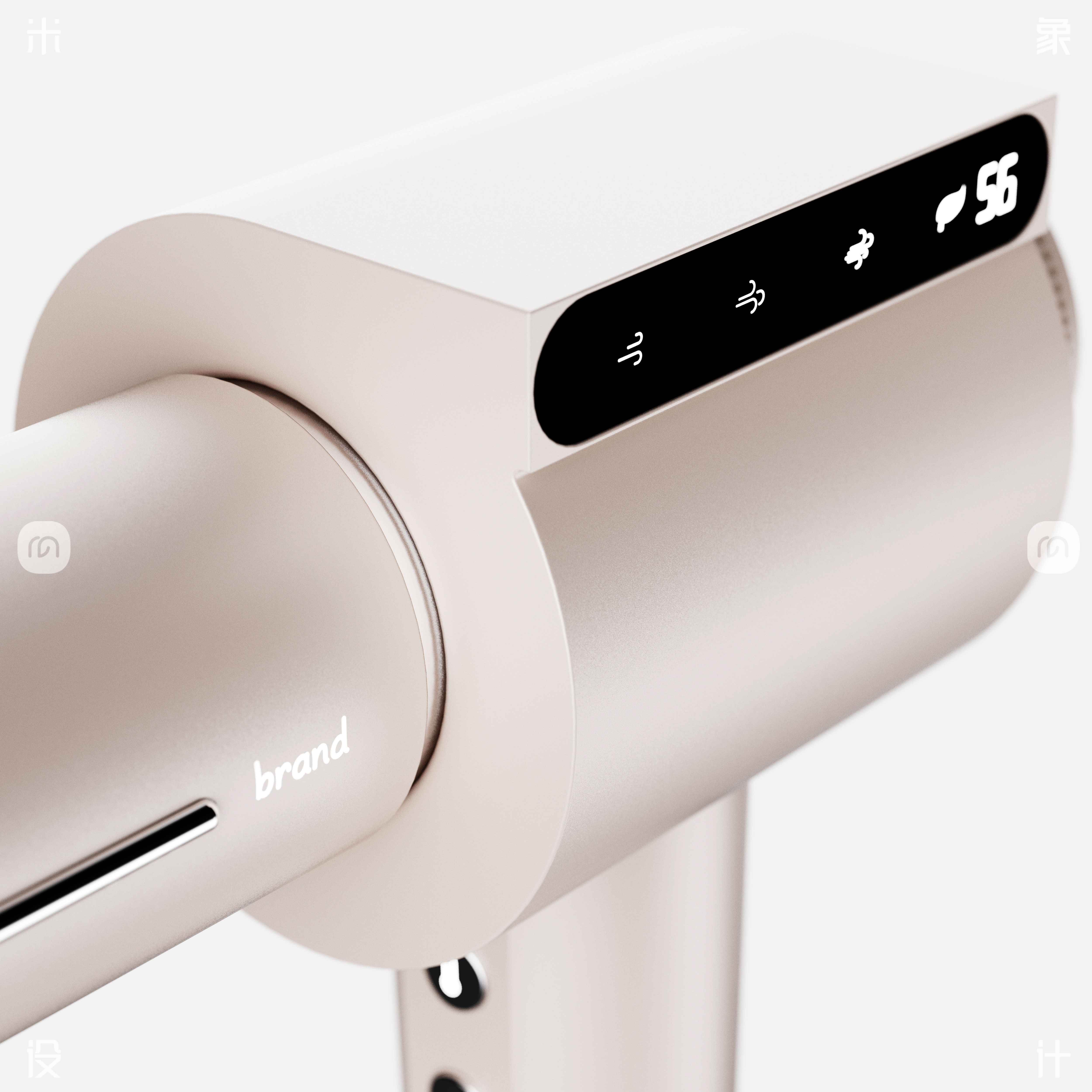
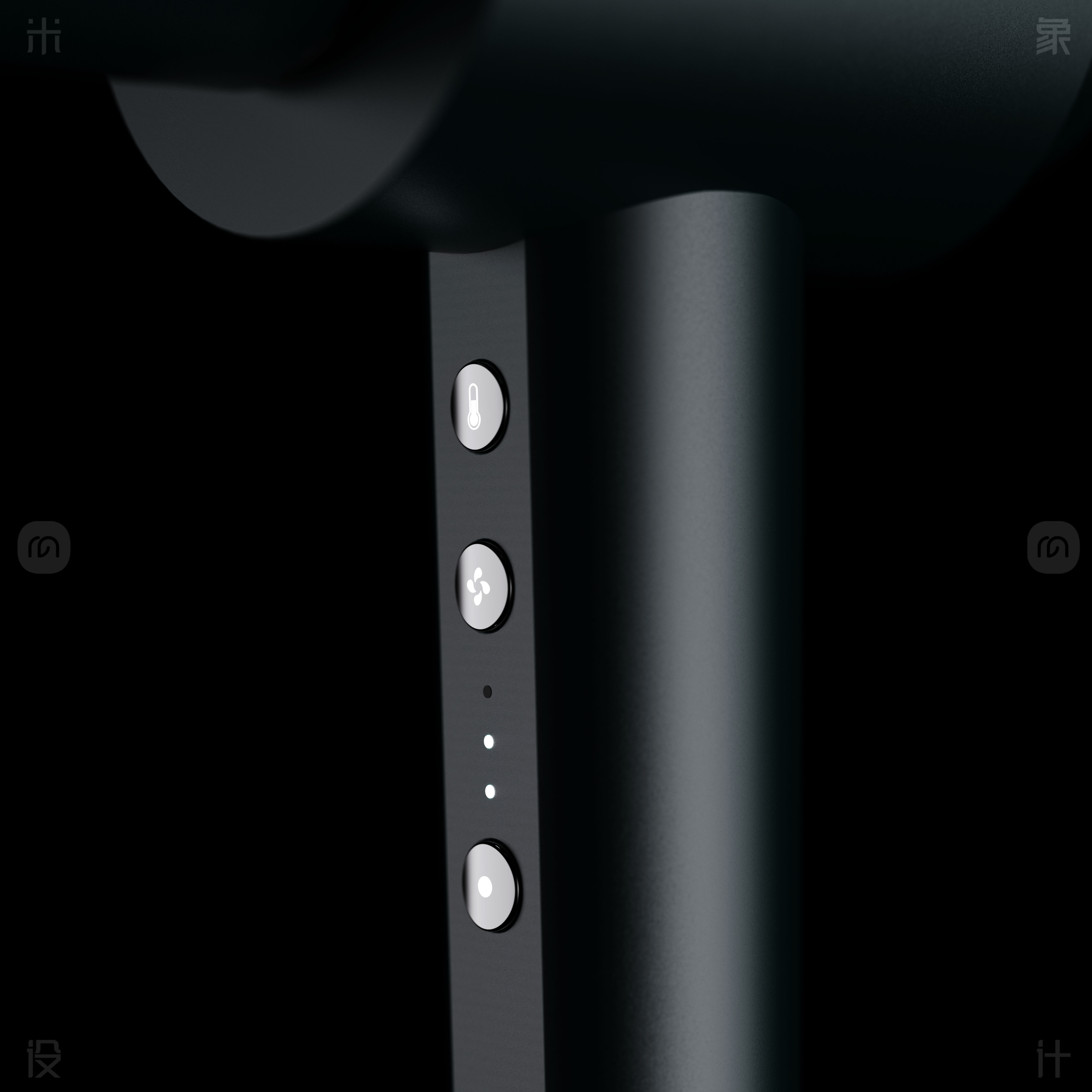
The display on the side is like a window to the future, which gives the hair dryer a new vitality. The design inspiration for this display may come from the innovation of smart phones, which integrates advanced technology into everyday hairdressing tools. It can display the temperature, wind speed and other parameters of the hair dryer in real time, so that you can accurately control it during use, like a professional hair stylist carefully guiding you.
Imagine that when you pick up this hair dryer, the side display instantly lights up, and clear numbers and icons are displayed in front of you, giving people a visual impact with a full sense of technology. It is not only a functional embodiment, but also a fashionable decoration, so that your hairdressing process is full of fun and surprise.
Whether in a busy morning or a leisurely night, this hair dryer with a display can become your right-hand man, creating a perfect hairstyle for you and showing unique charm.
Product Design | Brand Design | Innovative Structure Research and Development | Animation Video Production
Scene Rendering | Graphic Design | Product Modeling
@ rice elephant design-wang xujin


The copyright of this work belongs to 米象设计-王续锦. No use is allowed without explicit permission from owner.

New user?Create an account
Log In Reset your password.
Account existed?Log In
Read and agree to the User Agreement Terms of Use.

Please enter your email to reset your password
I would like to know how to deal with the mold opening, mold closing line and mold parting line in the later period.
There are a few points I want to ask. First of all, I have to say that the rendering is really beautiful. What kind of shading is used? keyshot, I feel that if I can produce this effect, I really need to spend more time. In addition, the air inlet feeling of this hair dryer is not enough, and have you considered the built-in circuit board or something? The appearance is pretty good, but I don't know if this appearance can support the operation of the internal structure when it is really used.
The overall feeling is quite good, but the screen is so hard to see the details that suddenly feel bad.
The screen design is good, but the feasibility is not high. The heat accumulation in that position is serious, and the circuit board and wires are not suitable, otherwise the cost will be high. Also, this kind of long-mouth hair dryer can be completely made into an integrated streamlined type.
Personally, I think it is redundant and complicated. It is better to do extreme and subtraction for this kind of products......
The sharp corners in the shape are more prominent and are not friendly in use. May be too want to highlight the differences in shape, while ignoring the user's psychological feelings and actual experience in use.
Wonderful, it's Piggy Page
The rendering is good, the modeling is a bit wordy, it feels strange, add that circle, just for modeling
This product must have spent a lot of thought, alas, the appearance is very characteristic, in line with people's habit of looking at the screen, the function and appearance have made a strong combination, including other places do very layered, is this kind of screen you are to save materials or how. I really didn't want to understand that this PVC board is shaped like a runway circle. Personally, it doesn't look as good as a square. If you want to enrich the elements, it is a bit eye-catching and abrupt.
I almost saw Xiaomi's logo
How did you see the figure of Piggy Page?
This kind of large right angle without R value is actually not suitable for home care products, so I'm afraid I won't evaluate it if I don't hit myself on the head and the appearance is too subjective.
Is this look really good, guys?
It's so beautiful, can you use your products to do modeling and rendering exercises?
It's really simple