Qi Design Office is located in 4F, Qucheng Building, Dongping Street, Suzhou Industrial Park. It was designed by Qi Design Interior Space Group. The whole design started in 2016 and was put into use in 2017. The whole space is about 600 ㎡. The shooting was completed by Sheng Su Architectural Photography. Qi Design Office is a design company that pursues individuality and creativity. Its office space design mainly considers how to make the use of space suitable for designers to get a better play in their working conditions, and various departments cooperate with each other. And can show the company's image and design results.

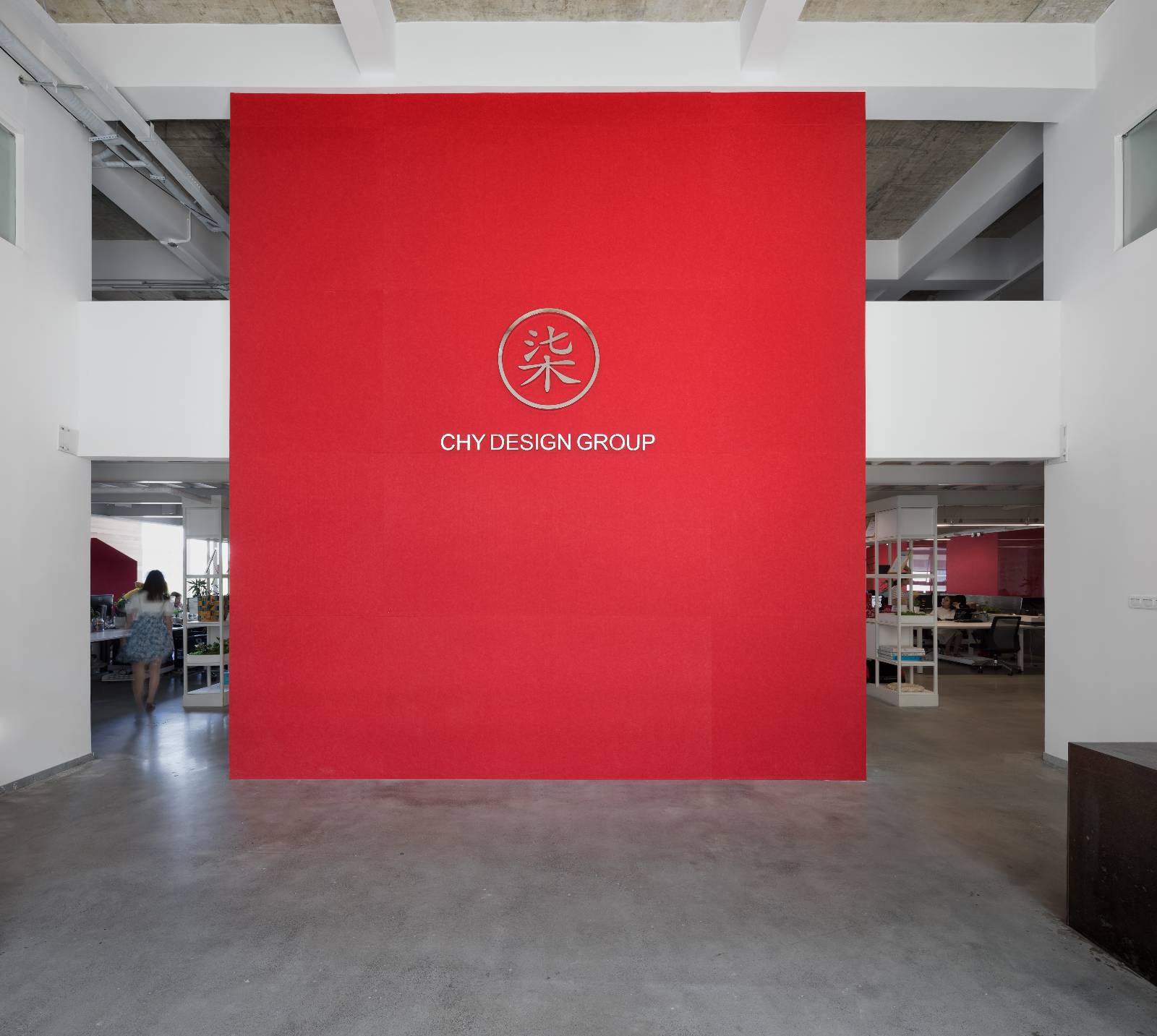
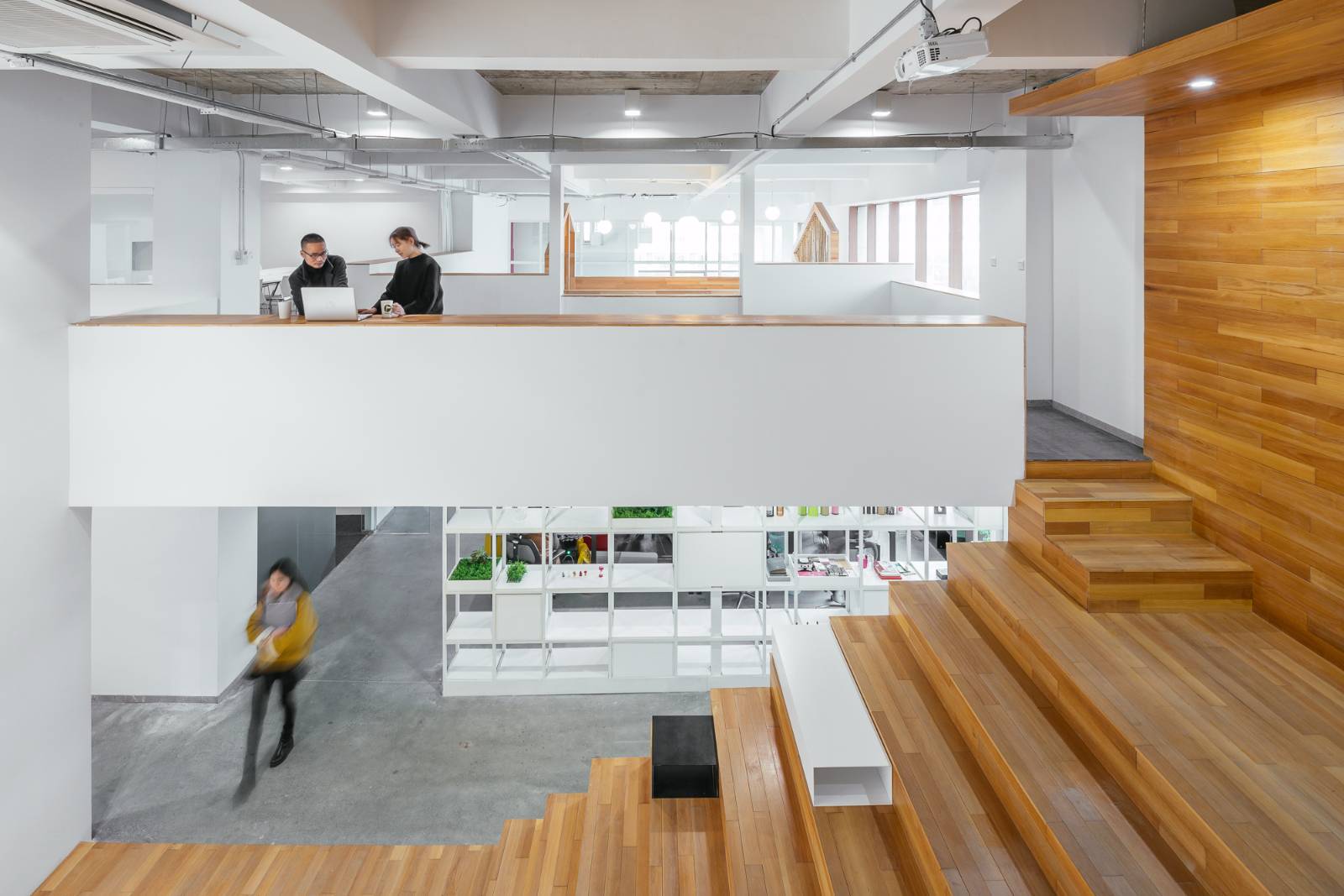
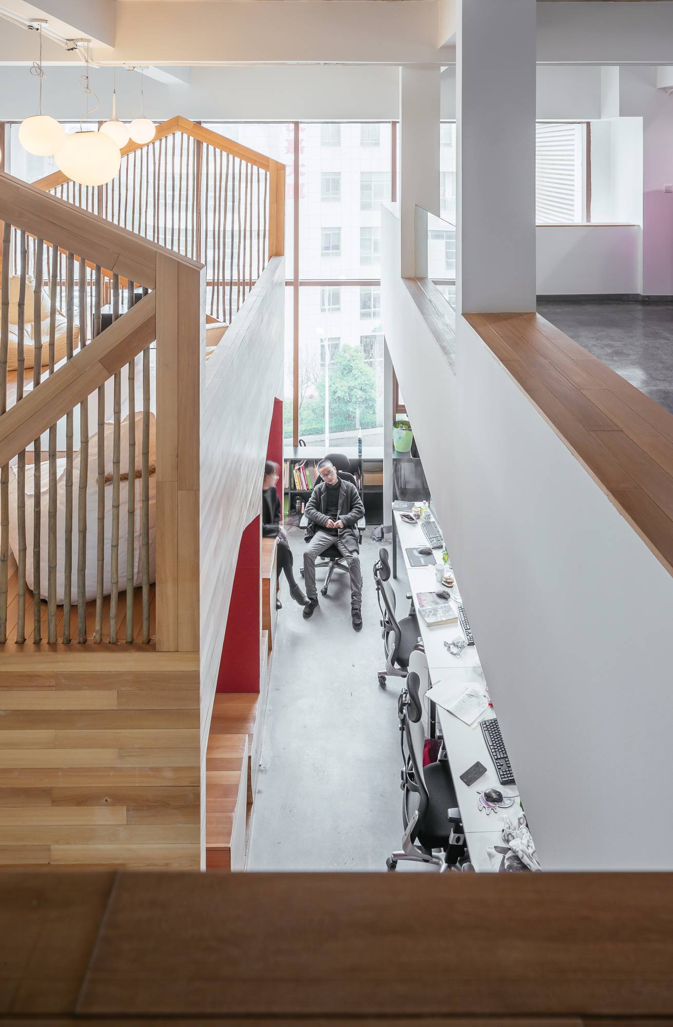
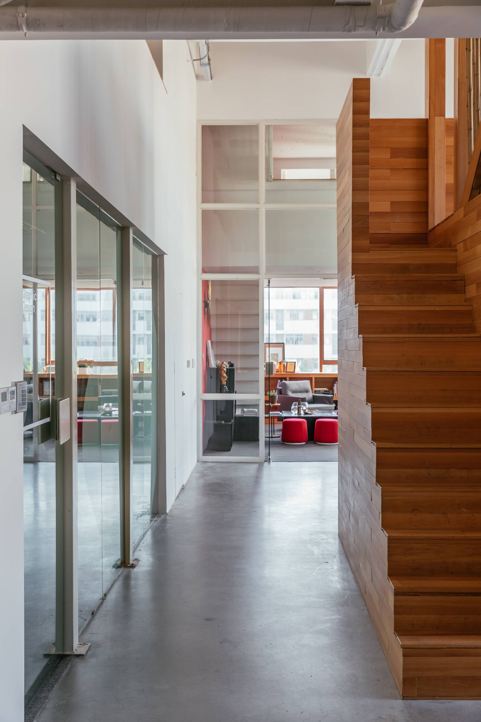
Office space is mainly divided into office, work area, meeting room, classroom and other regional office space. The red image wall entering the door, with the company's LOGO, is very eye-catching and gives people a strong visual impact. The wooden staircase behind the image wall is not only a passage to the second floor, but also a staircase for designers and students.
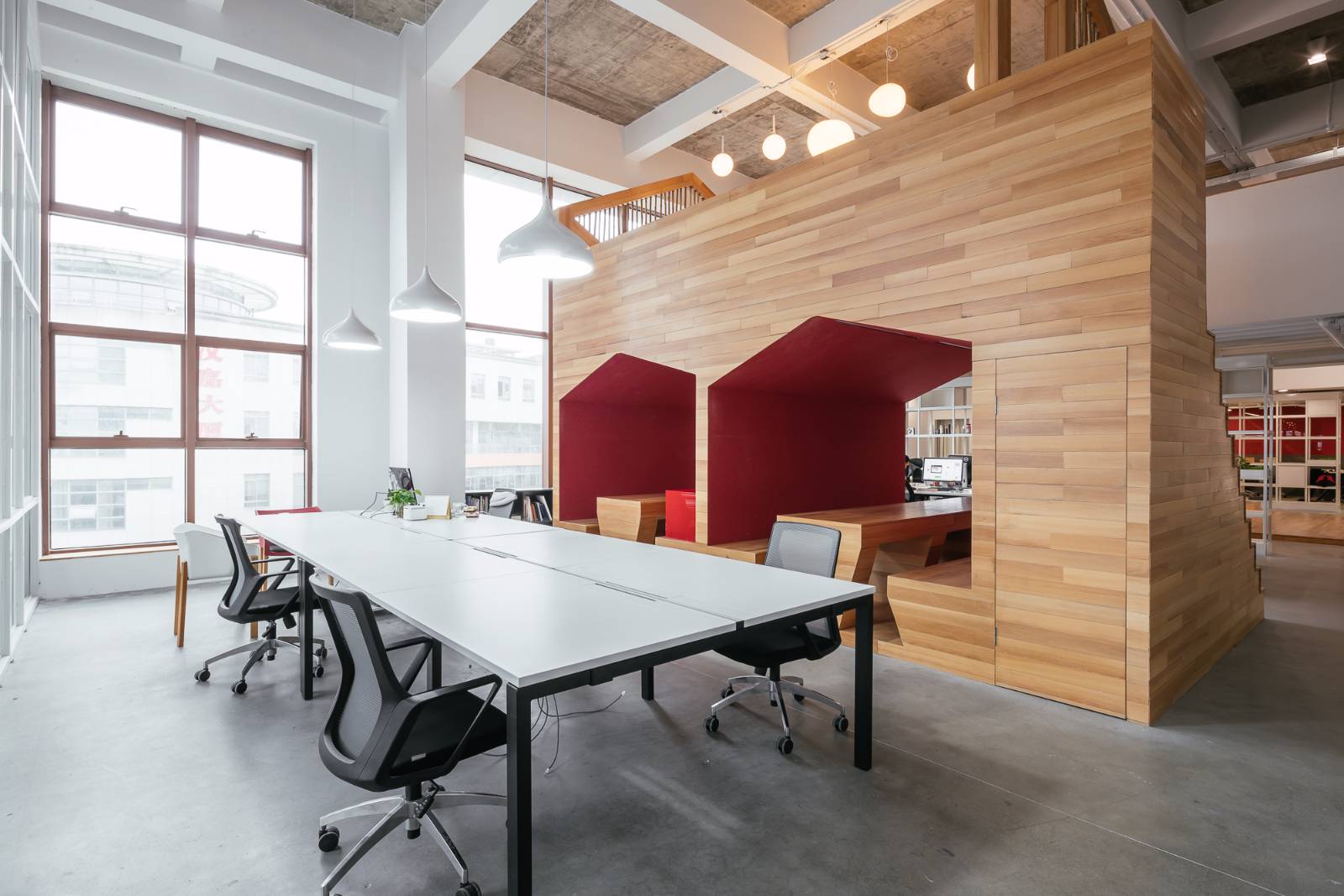
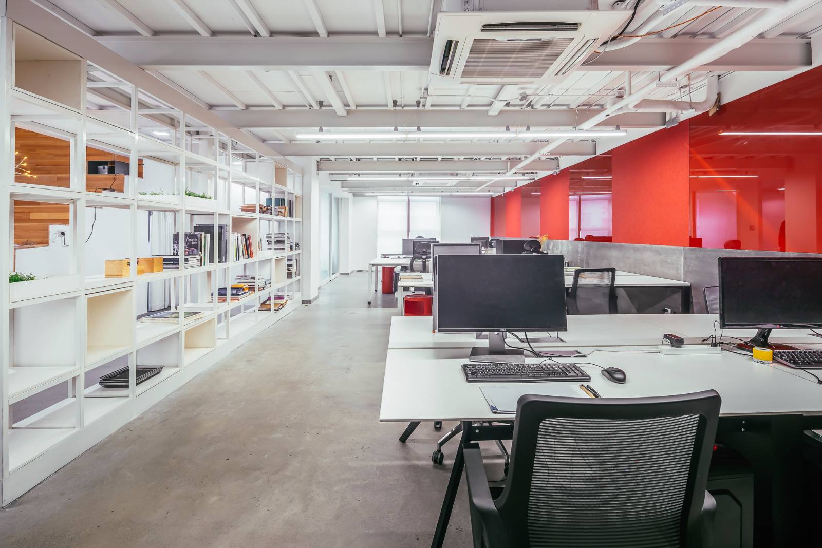
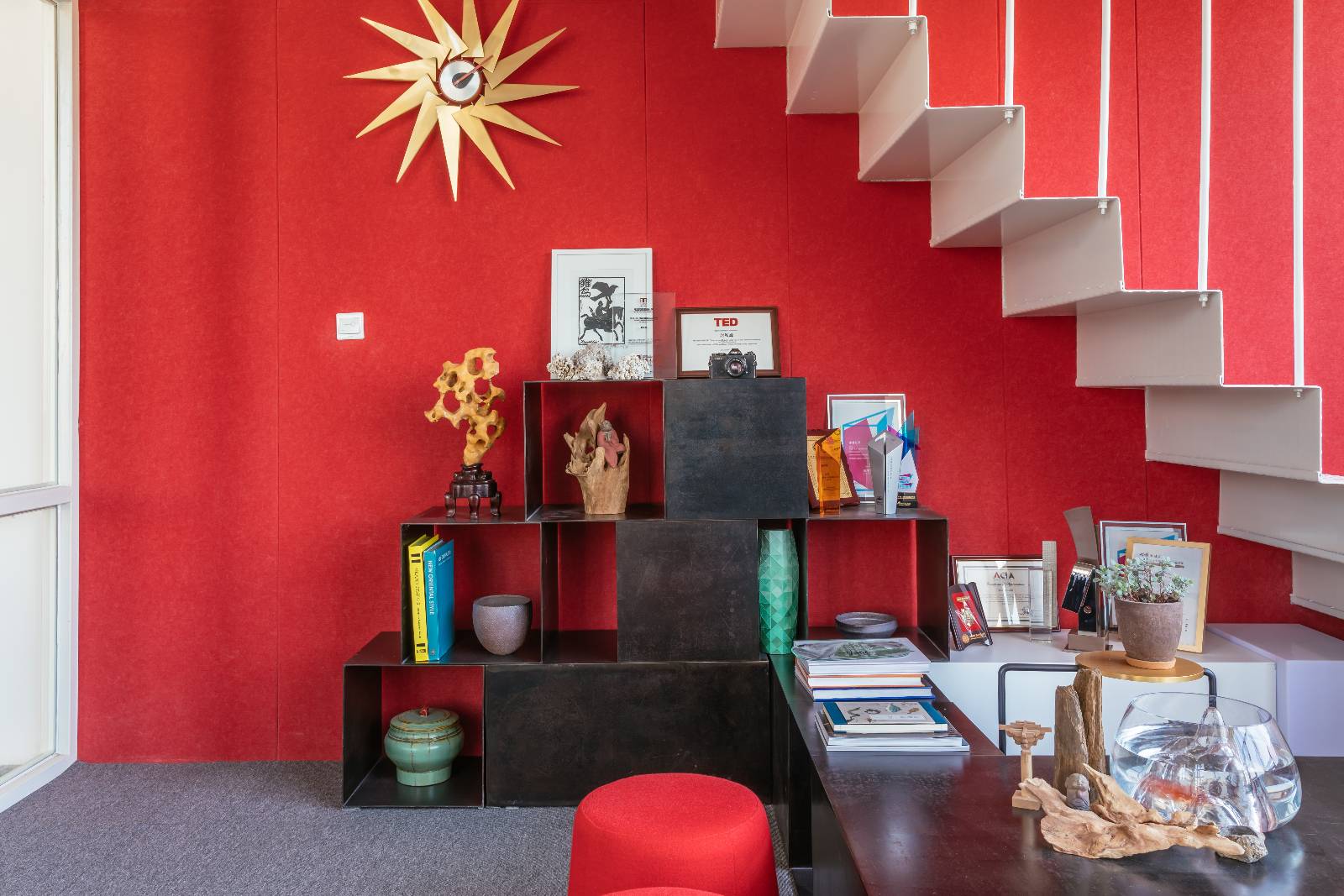
The white wall behind the image wall is a projection wall for preaching. The work area adopts an open design, and the design of sharing and supporting collaboration spaces between the districts is recombined to adapt to the changes brought about by work and business development. The red felt board and tempered glass allow the designer's ideas and achievements to be fixed on it, so as to show and embody the working status of the company's employees and the company's image.
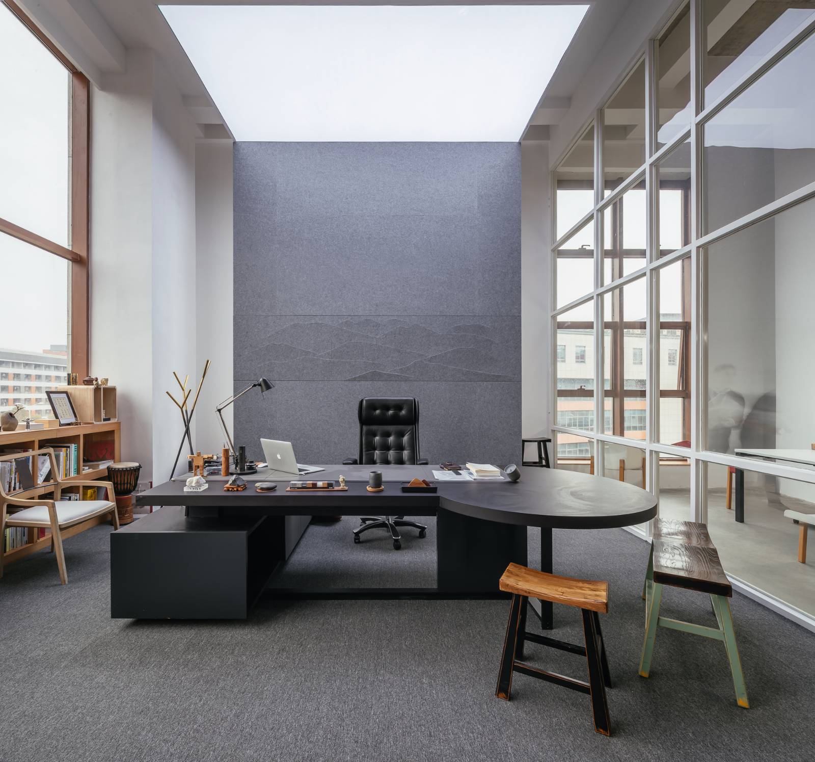
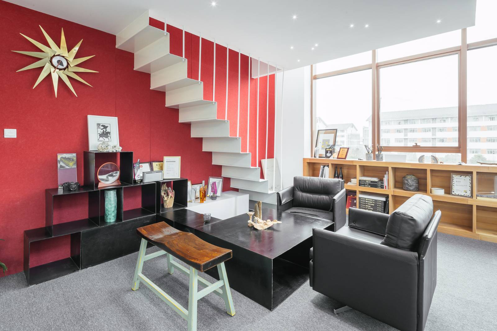
The style of the office is based on modernist design. The main colors are red, white and log colors. Landscape elements can be used in space decoration, reflecting the humanistic feelings of the person in charge. The whole space passion, personality, publicity and imagination are the pursuit of design companies.
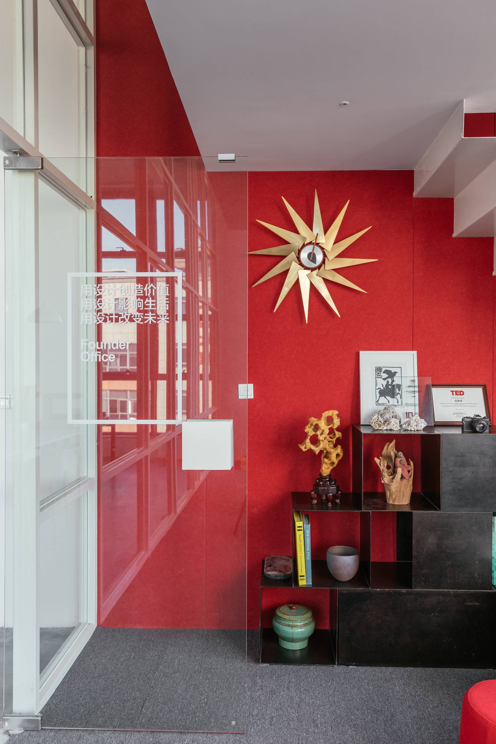
The sense of hierarchy in space is not only a visual impact, but also a imagination. An entertaining office space can relieve people's pressure after stressful work. It explains the changes of new office space in modern cities. The integration of space and the diversity of levels can stimulate people's inspiration and enjoy the imagination brought by creativity in space.
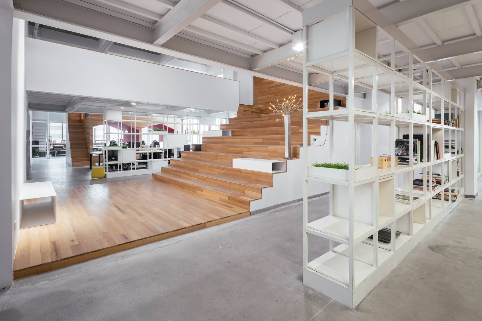
A variety of techniques are used in space design. The flexibility and jumping at the space level make the whole space poetic. The strong contrast between red and white is bold and flexible, ostentatious and not exaggerated. Metal products, tempered glass, etc. are widely used, which can bring people an avant-garde and unfettered feeling.

For details, please go to: http://successfuldesign.org/work/599a9455593921198f618045
The copyright of this work belongs to 成功设计平台. No use is allowed without explicit permission from owner.

New user?Create an account
Log In Reset your password.
Account existed?Log In
Read and agree to the User Agreement Terms of Use.

Please enter your email to reset your password
Full of vitality and innovation