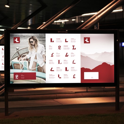
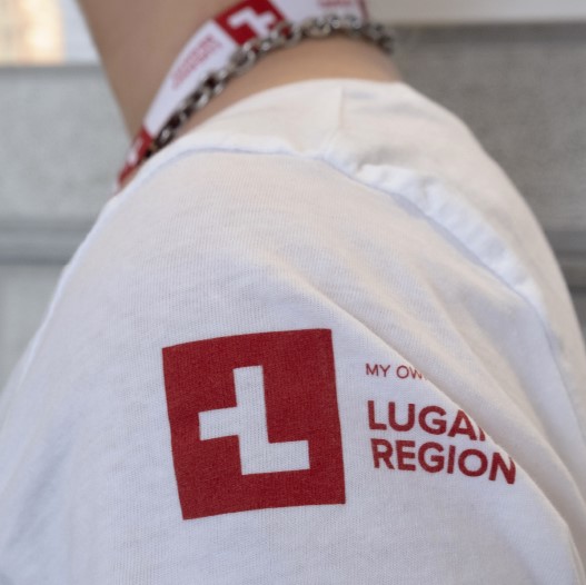
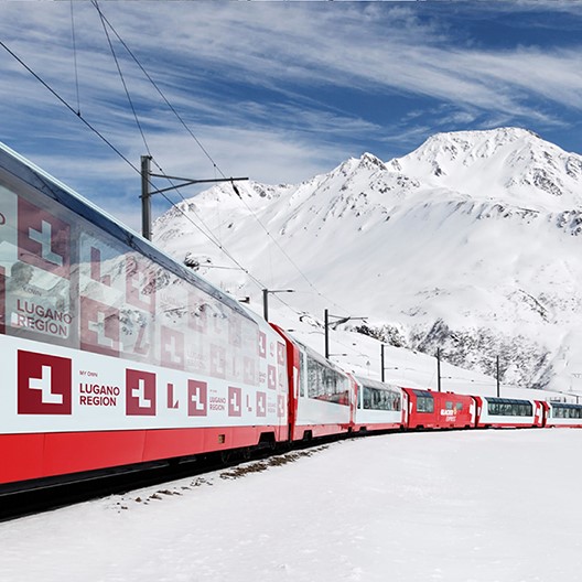
With its mix of cultures, Lugano represents a very atypical destination within Switzerland: palm trees, olive oil, Mediterranean weather and cuisine can all be found in a safe, quiet and efficient Swiss environment. The brand essence that emerged from this context is "differently Swiss" which has been translated visually in an alteration of the Swiss flag to form the letter "L" of Lugano. A graphic system that aims at displaying the variety of the regional offer has been conceived by designing for each category a specific font in order to give each time a different connotation to the letter “L” of Lugano.
Country
Switzerland
Year
2019
Client
Ente Turistico del Luganese
Affiliation
Caselli Strategic Design
Designer
FabioCaselli
The copyright of this work belongs to K-DESIGN AWARD. No use is allowed without explicit permission from owner.

New user?Create an account
Log In Reset your password.
Account existed?Log In
Read and agree to the User Agreement Terms of Use.
Please enter your email to reset your password


Comment Board (0)
Empty comment