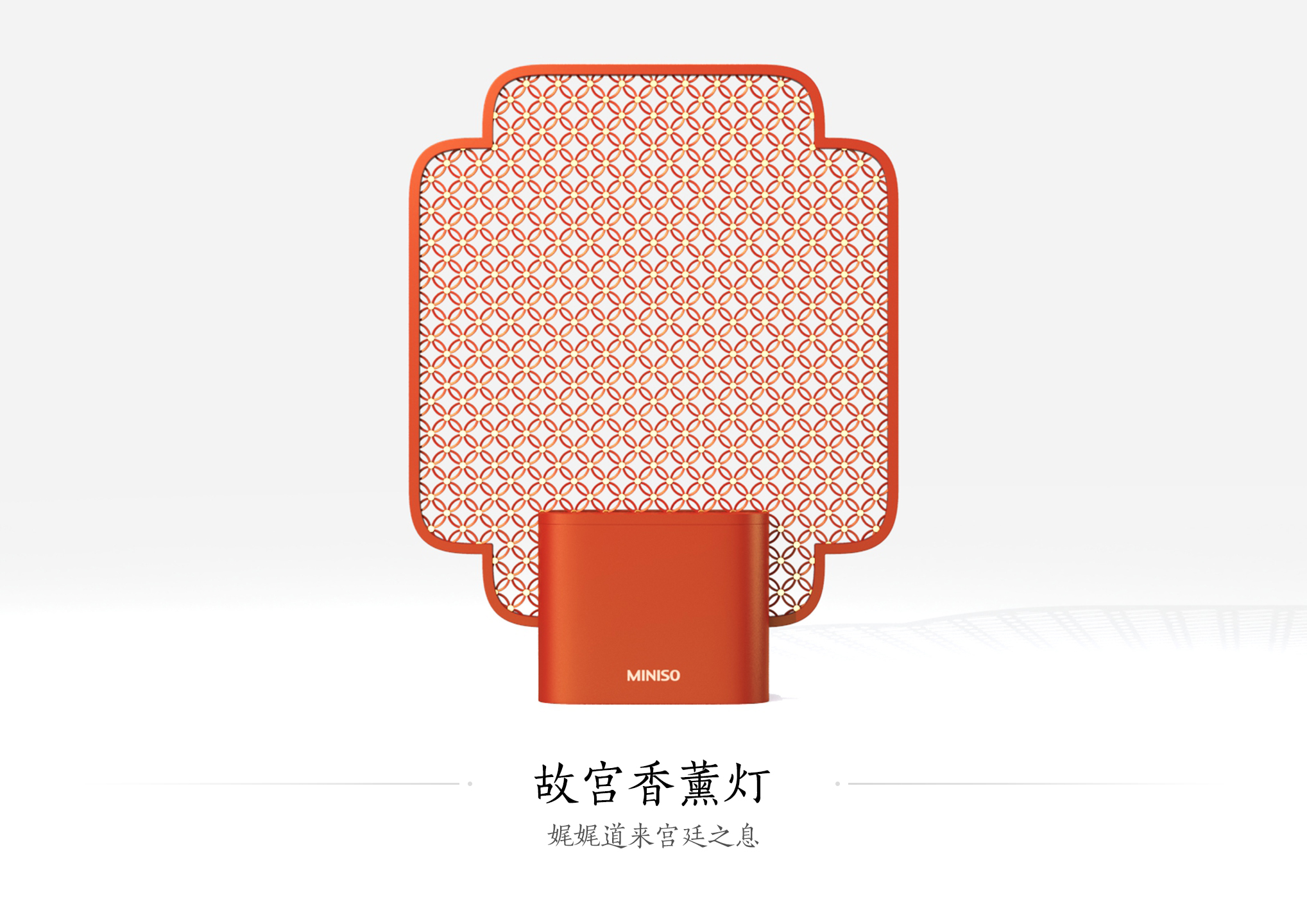
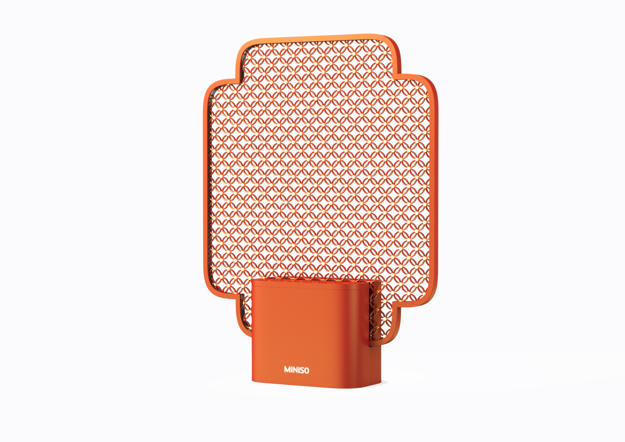
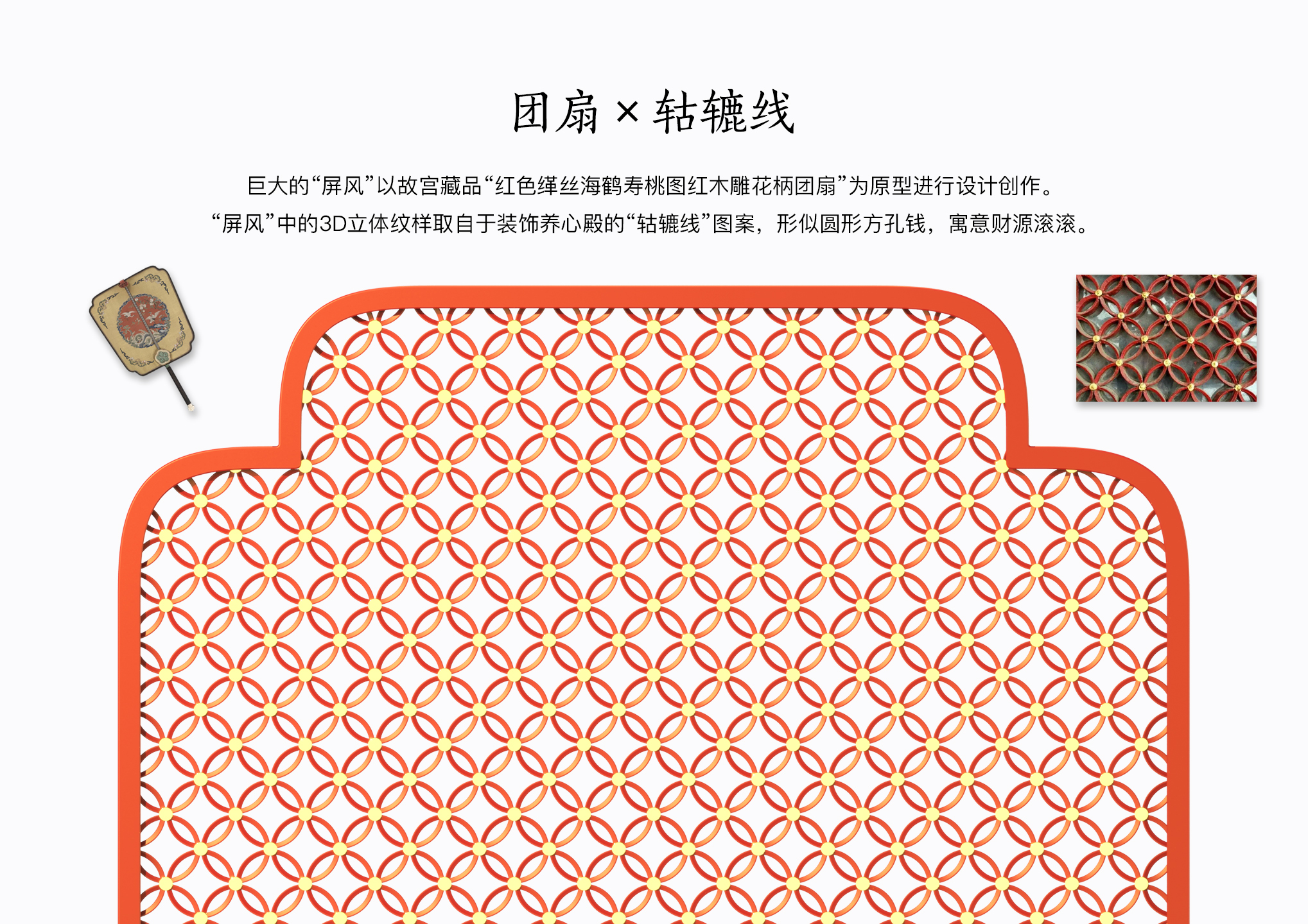
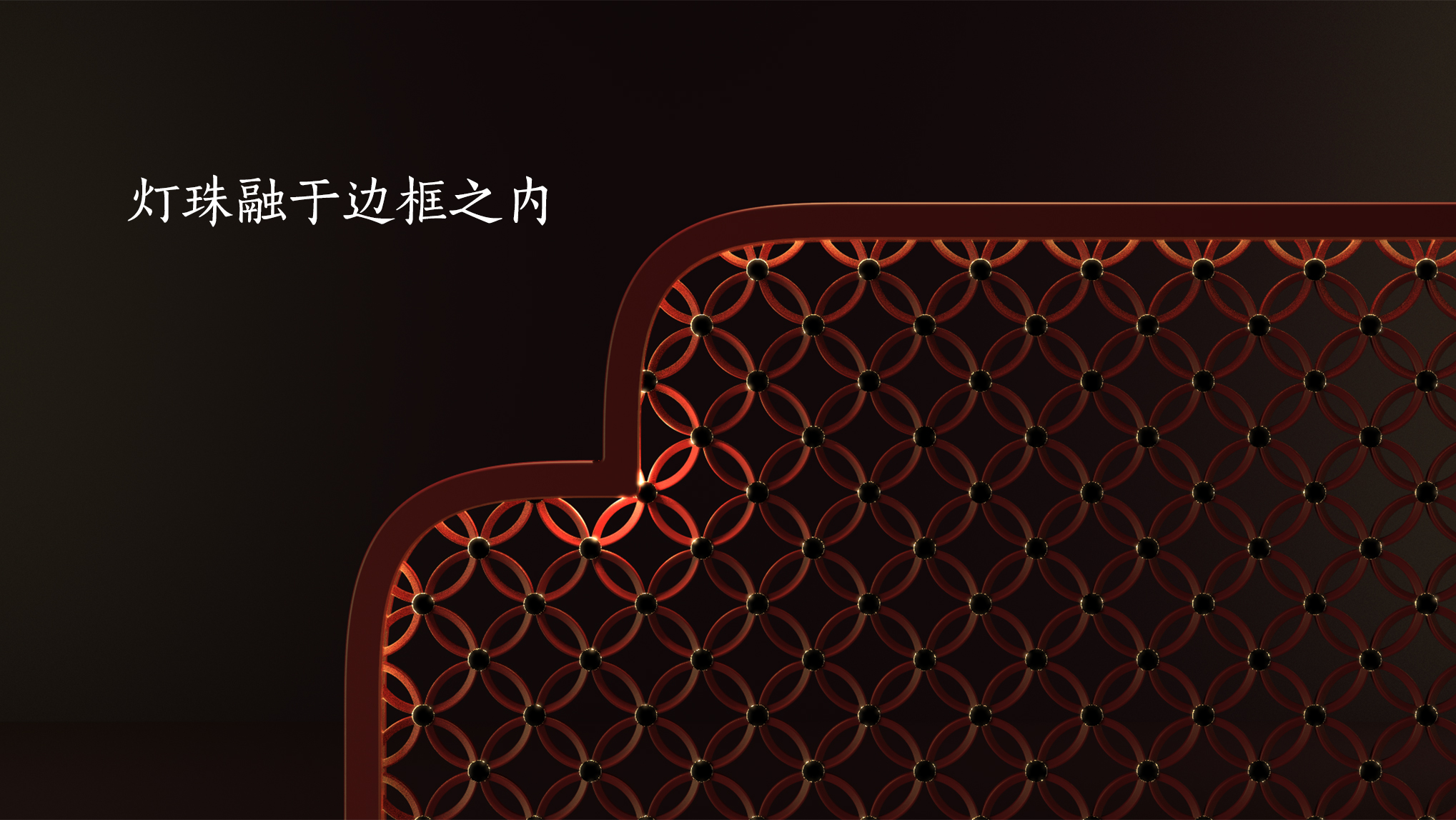
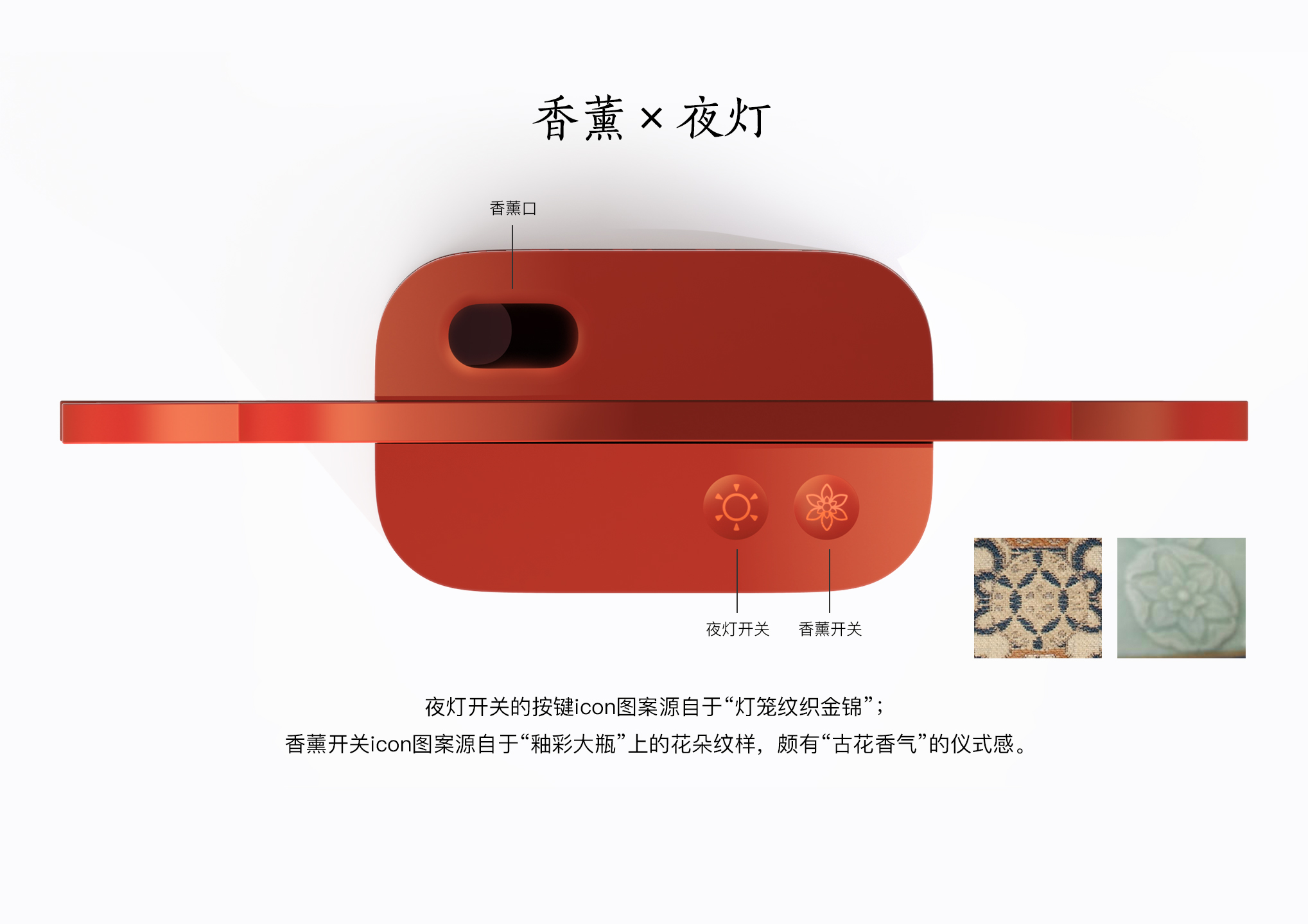
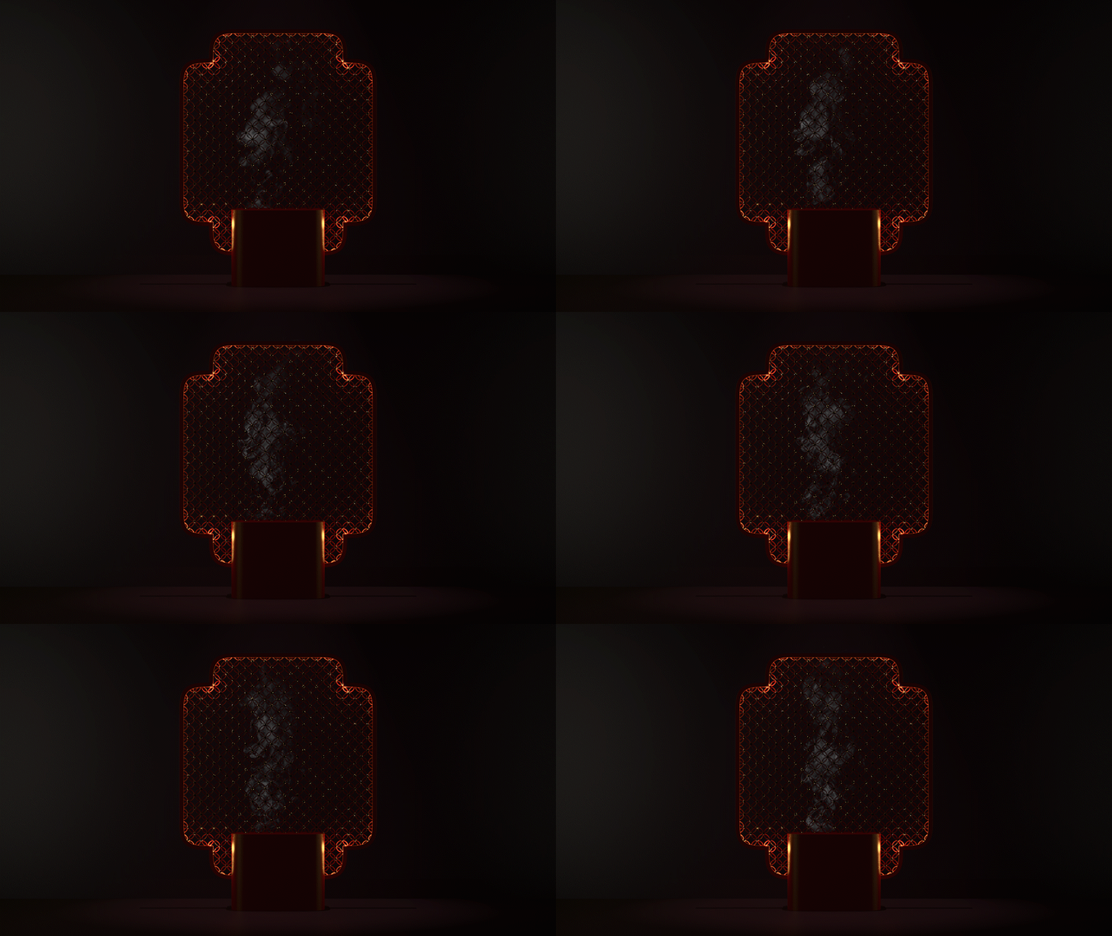
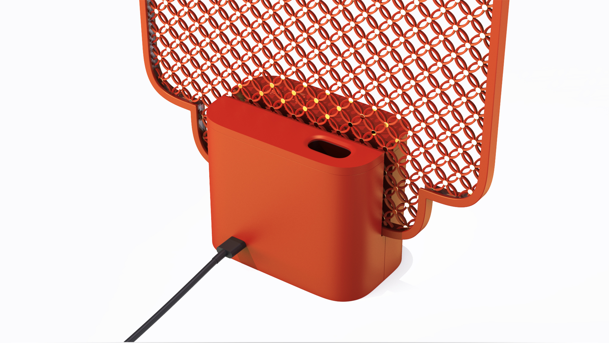
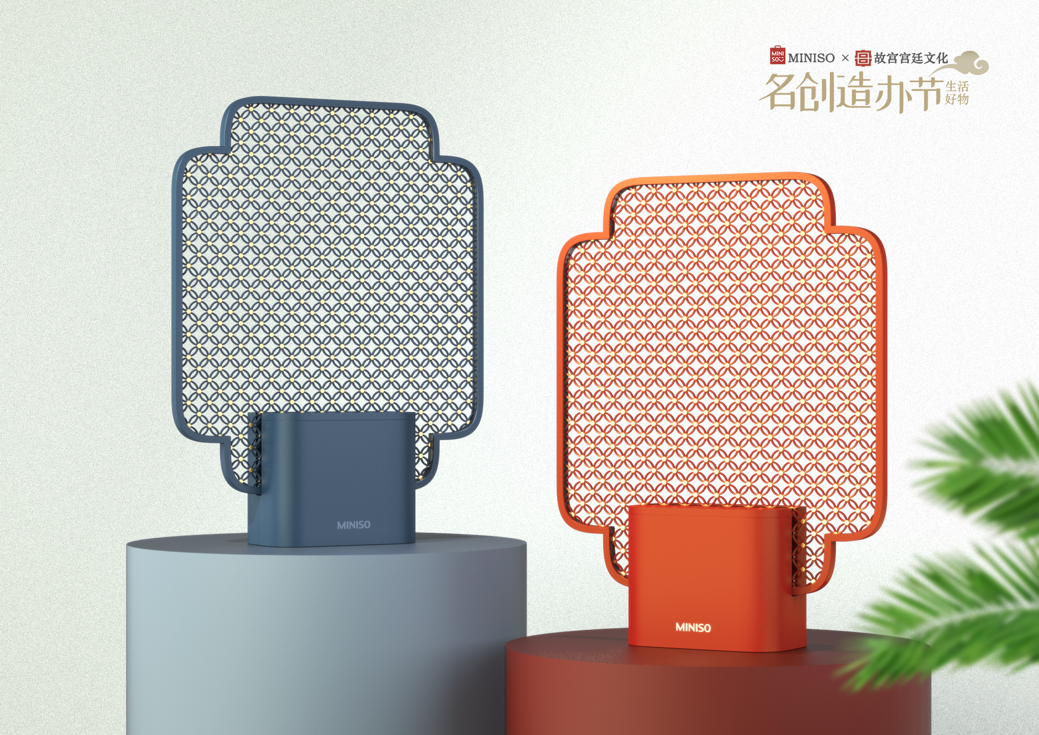
The Forbidden City aromatherapy lamp designed for the "Original Design Competition of the Ming Creation Festival. As a product of Chinese Forbidden City culture, the majesty of the palace becomes the core of shaping the temperament of the whole product. the huge "screen" full of the window grilles of the hall of nourishing the heart sends out a strong signal to the surroundings like a peacock opening the screen-a kind of the forbidden city cultural creation became the icon in this space. The rising aromatherapy smoke, with the lighting and texture of the "screen", seems to be narrating the history of the Forbidden City leisurely.
The copyright of this work belongs to Xing志yuan. No use is allowed without explicit permission from owner.

New user?Create an account
Log In Reset your password.
Account existed?Log In
Read and agree to the User Agreement Terms of Use.

Please enter your email to reset your password
Reminiscent of a fly swatter...
Beautiful, but the production process is a little difficult.
great work!
amazing!
Not bad, not bad. This idea and atmosphere are very good.
Cool, brother
Oh, this is originally the work of a big boss ~
There are ways to make up for the mass production and volume. I feel that this is a proper gold medal in all works.
Is that smoke animation made of keyshot?
Meowed, great
Like
The texture design is very beautiful, but there are too many gold dots on it, the cost is too high and the position of the lamp is too small to fit the lamp beads.
How do you install the golden yellow dots? One by one? There is also a little bit of classical original elements used too bluntly. If you want to think that the ancients made this model, it has its significance at that time. Our current design casually puts an ancient element, regardless of whether it has its significance in the current product. I think it is still not at a very advanced level. Of course, this is basically the fault of all Chinese style designs, I think this is the problem that our current designers have to solve.
This is not a gold award.
This is a really good combination with classical original elements.
I like this design idea! The picture is also very delicate and the color matching is also very comfortable.