Familiar brands are safer, which is the weakness of human nature. Even customers who dare to try new products again are willing to give priority to the brands they have heard.
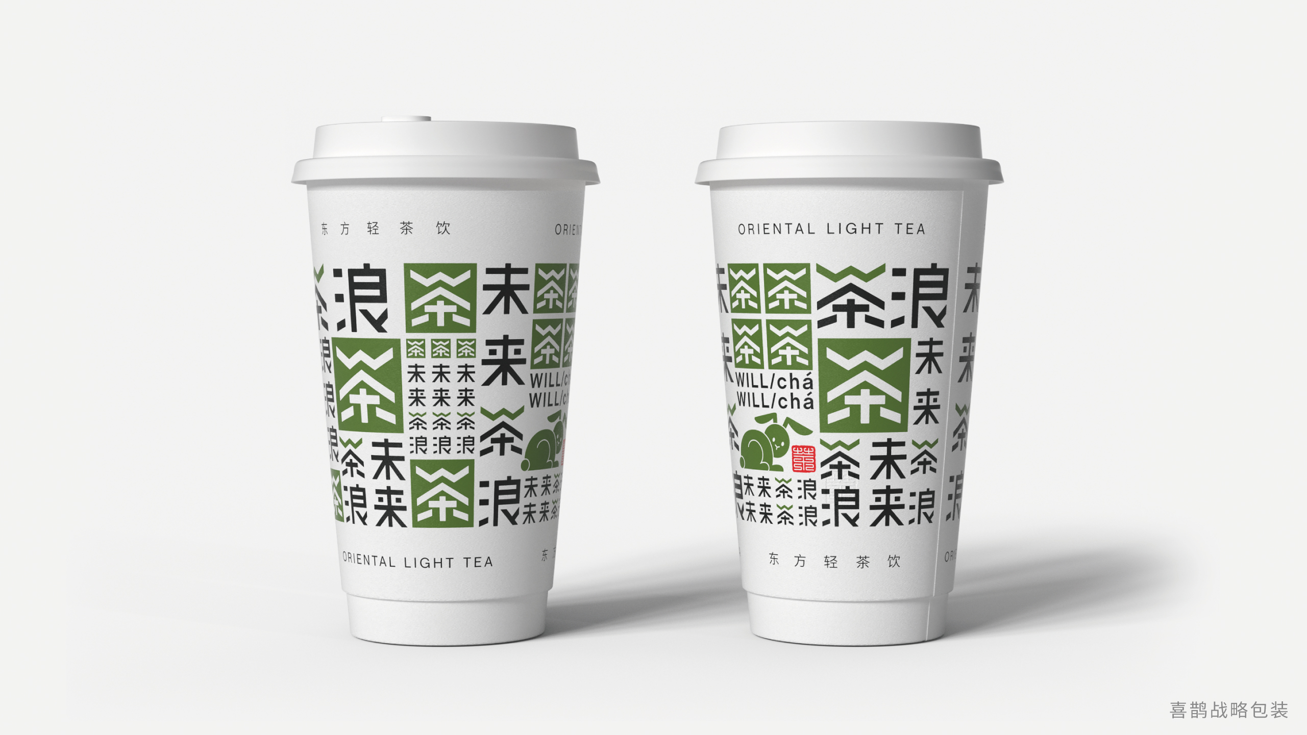
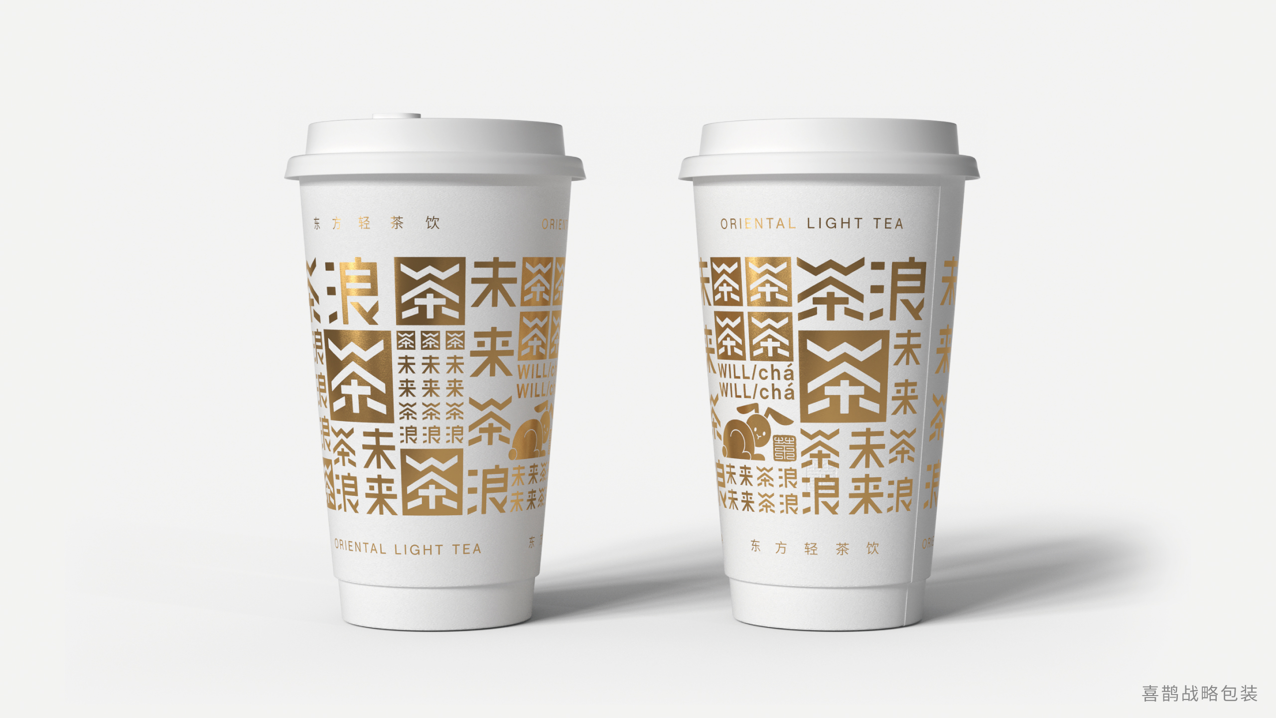
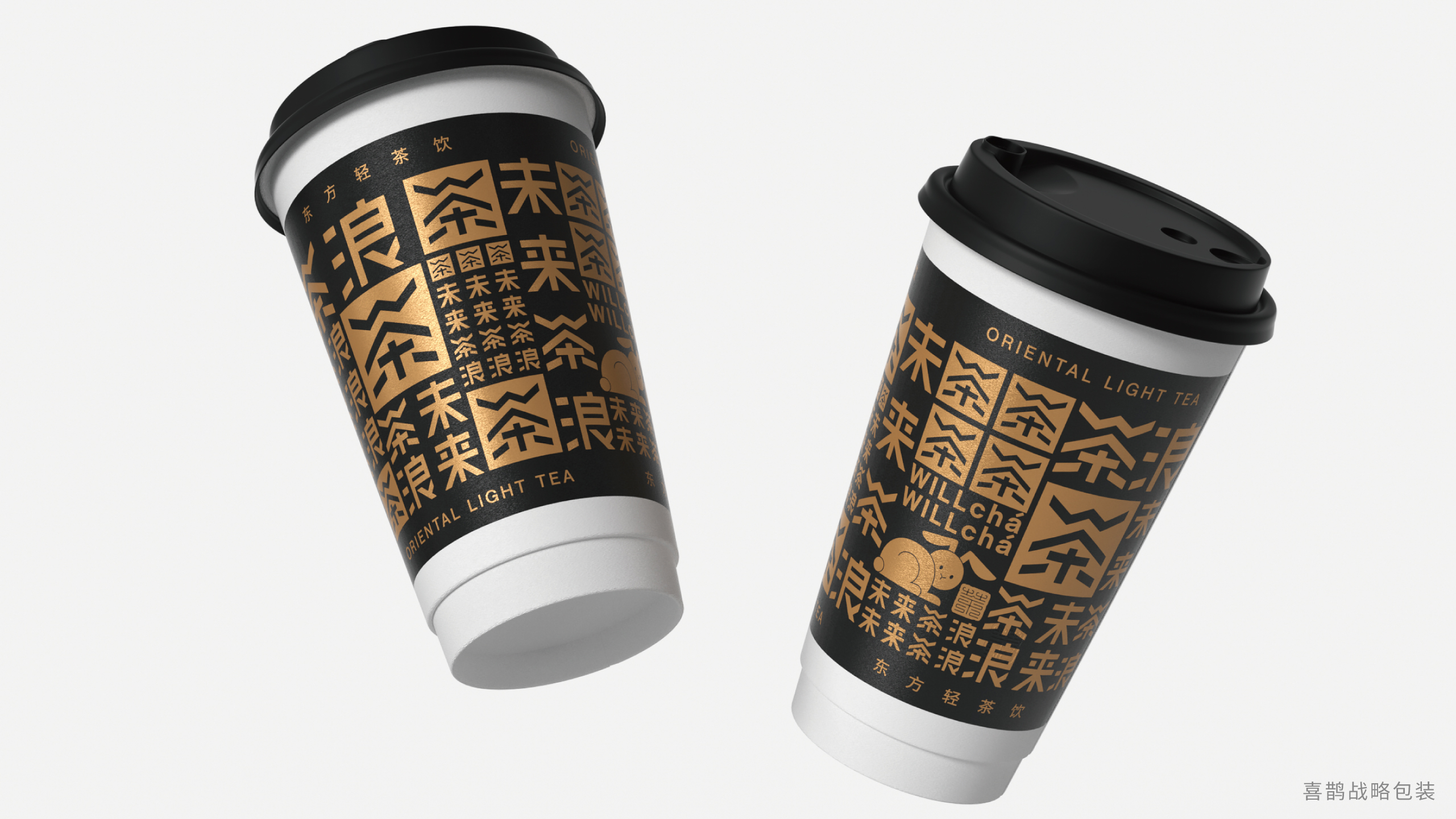
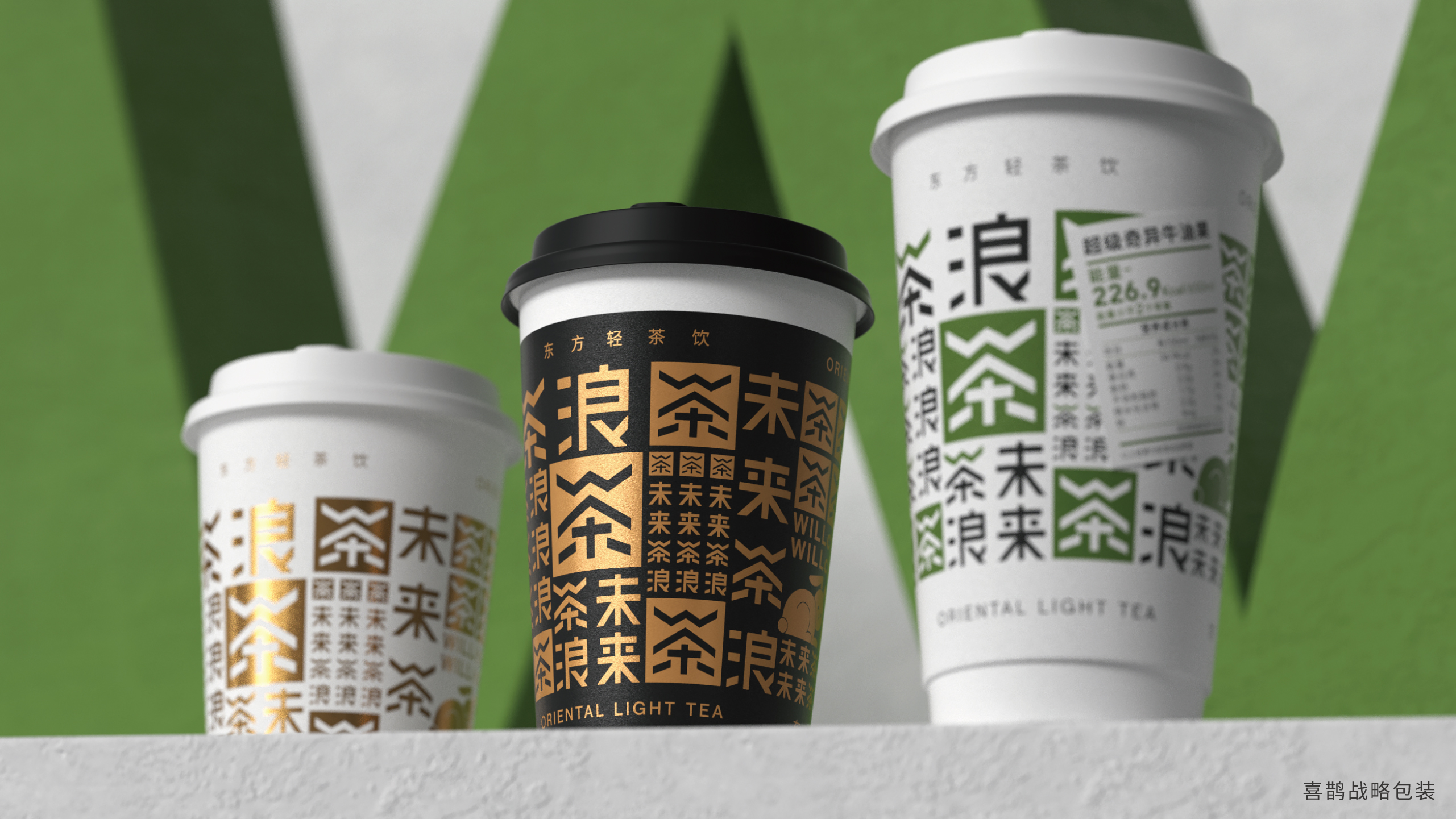
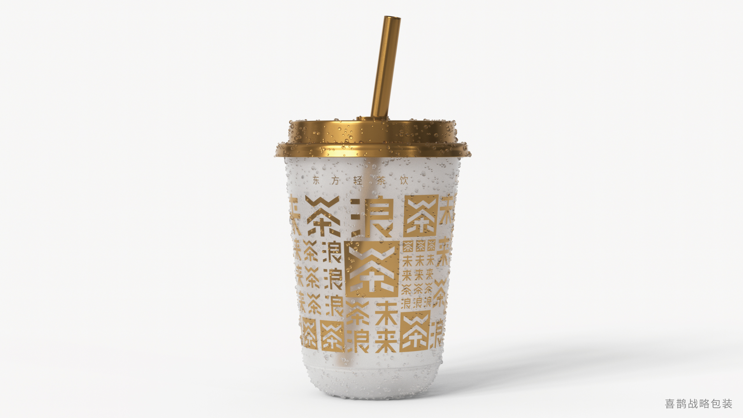
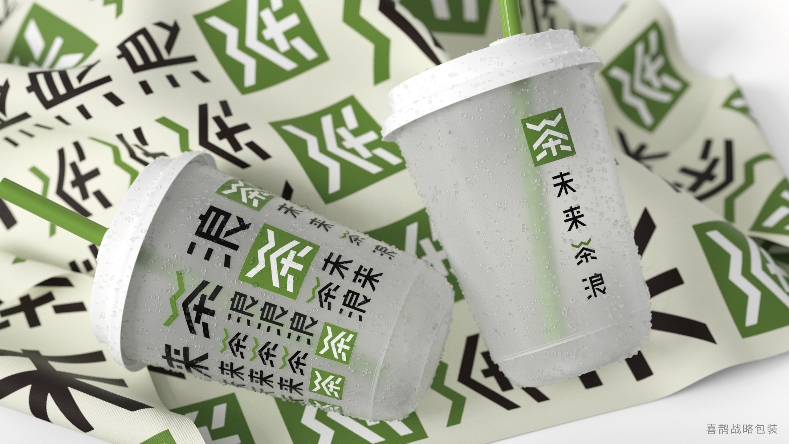
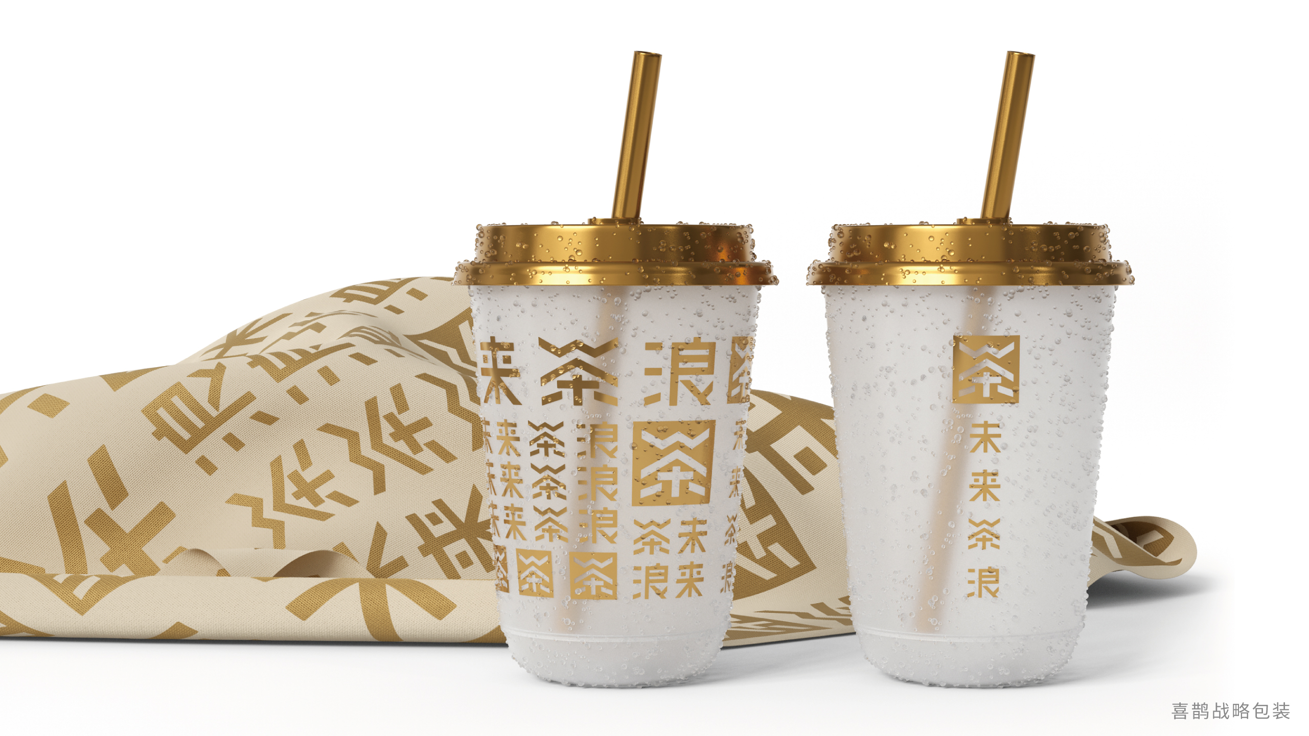
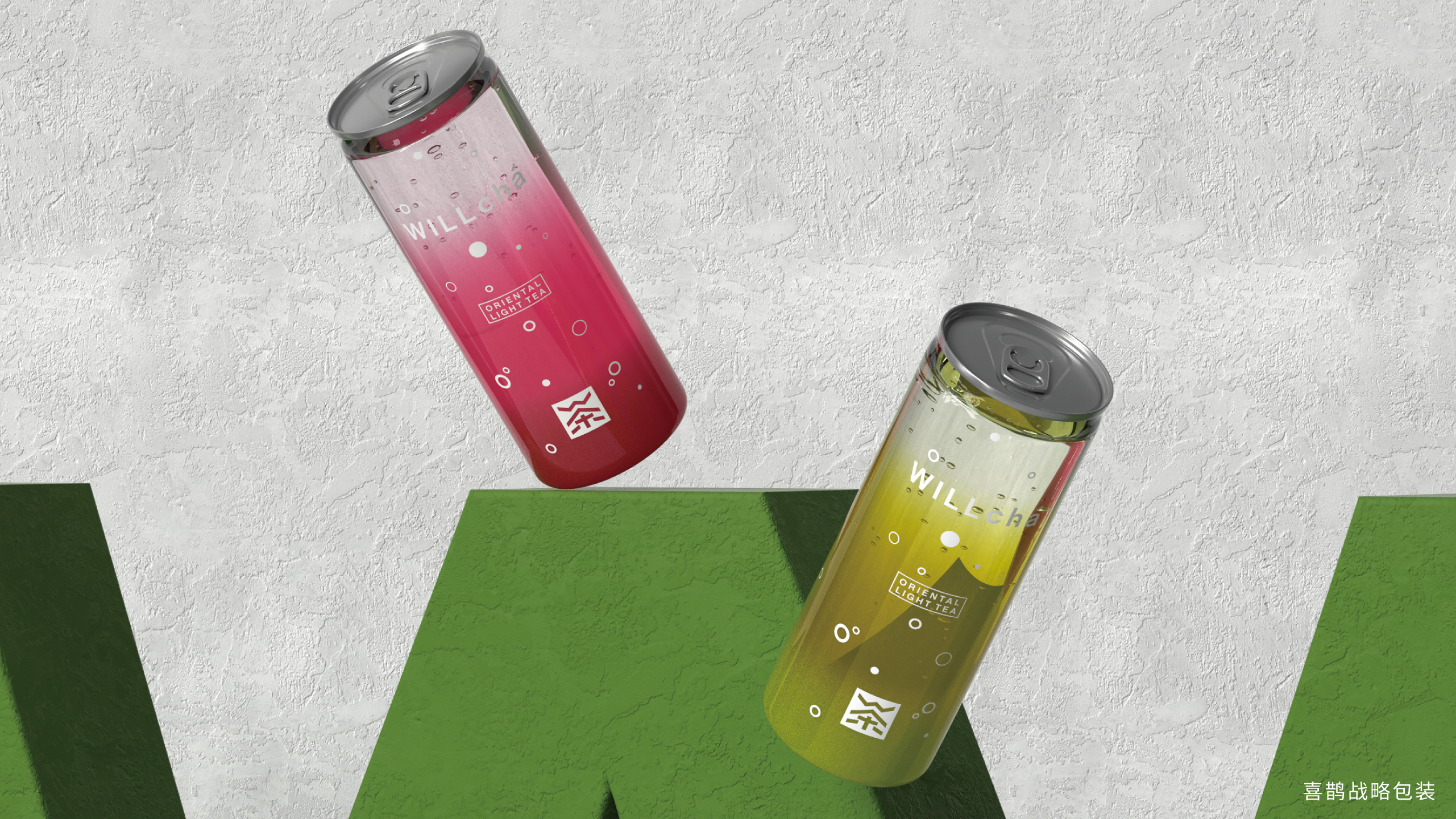
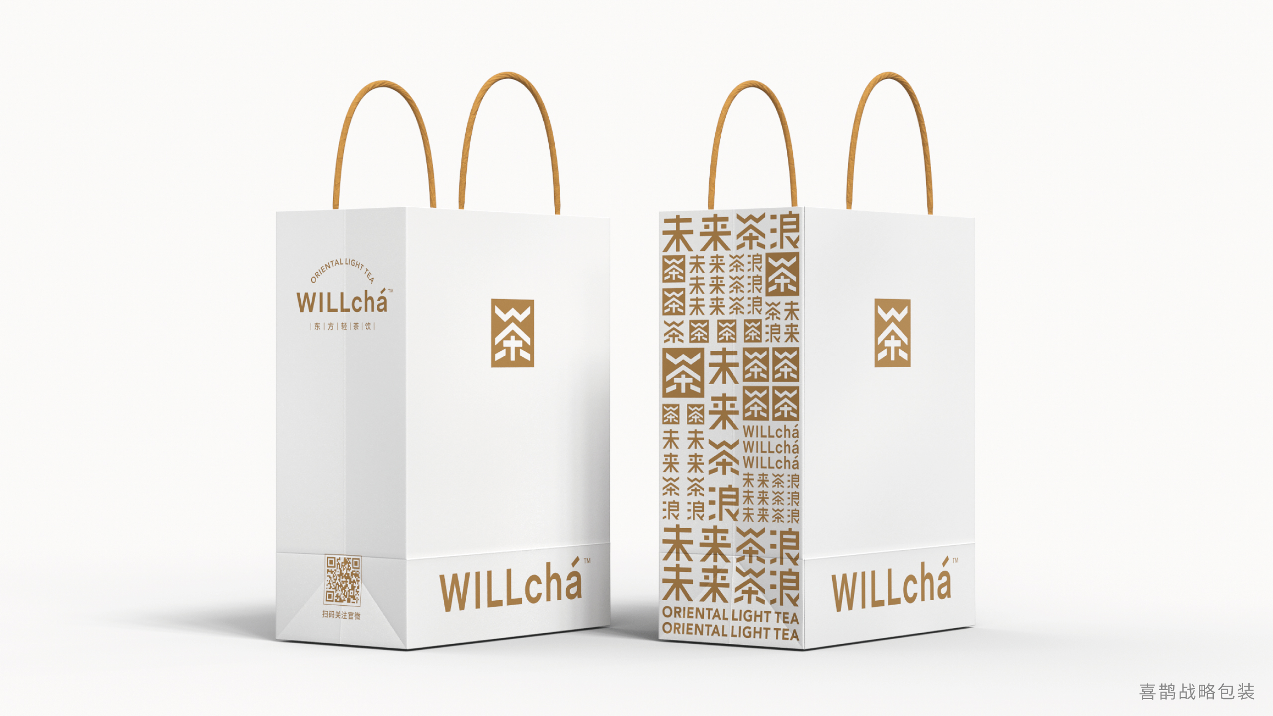
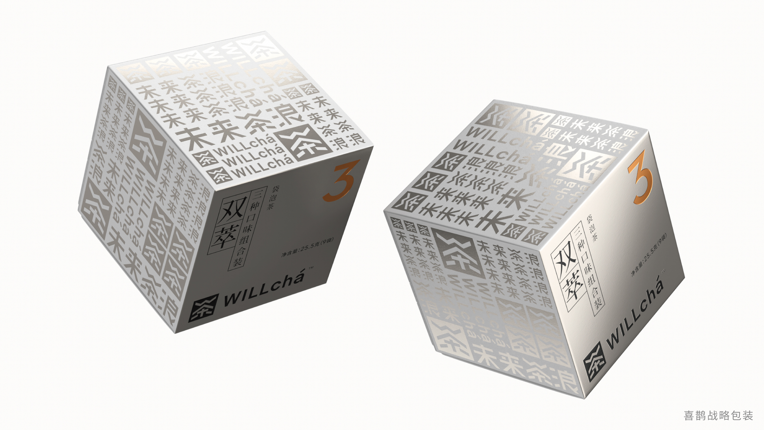
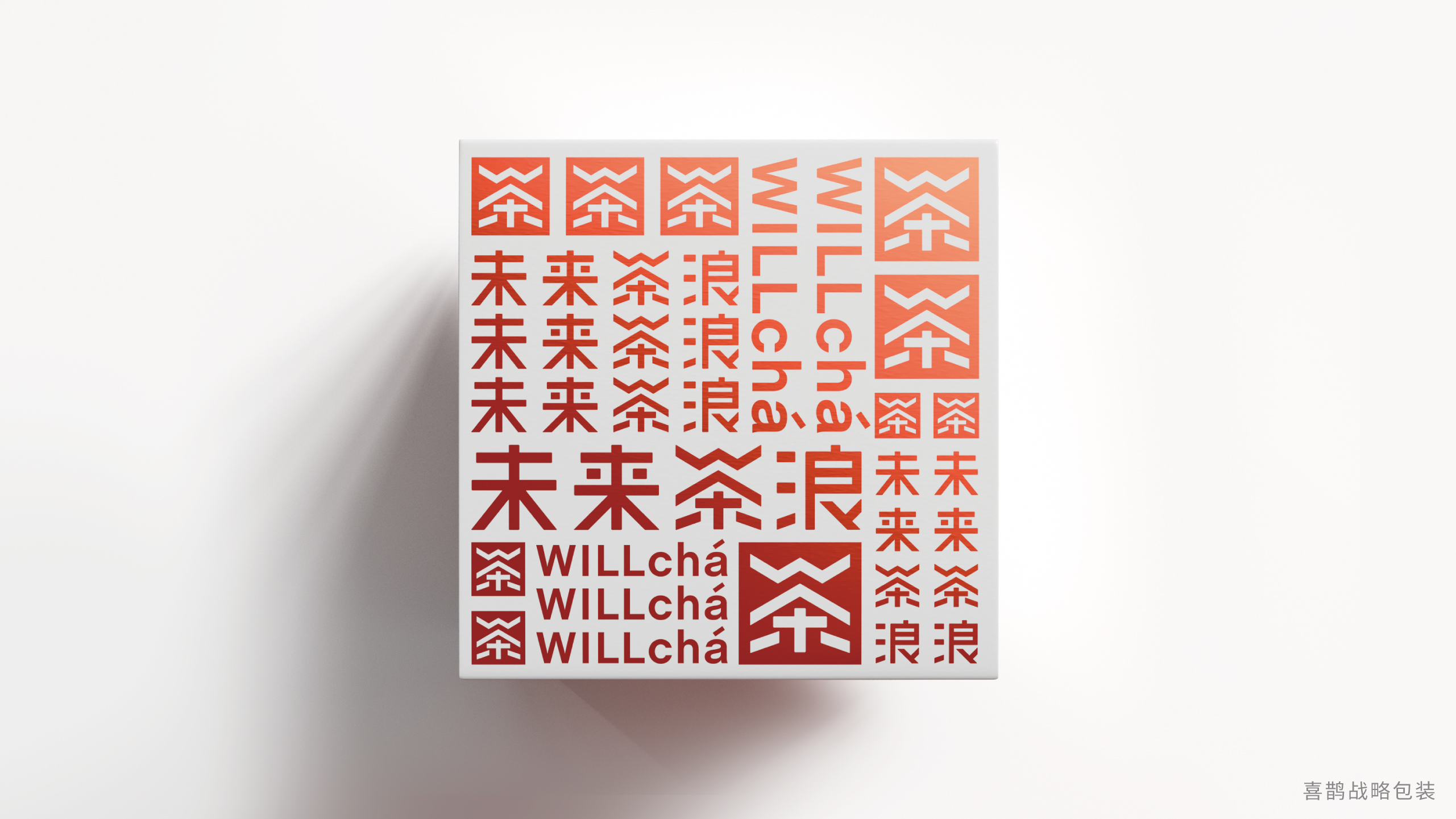
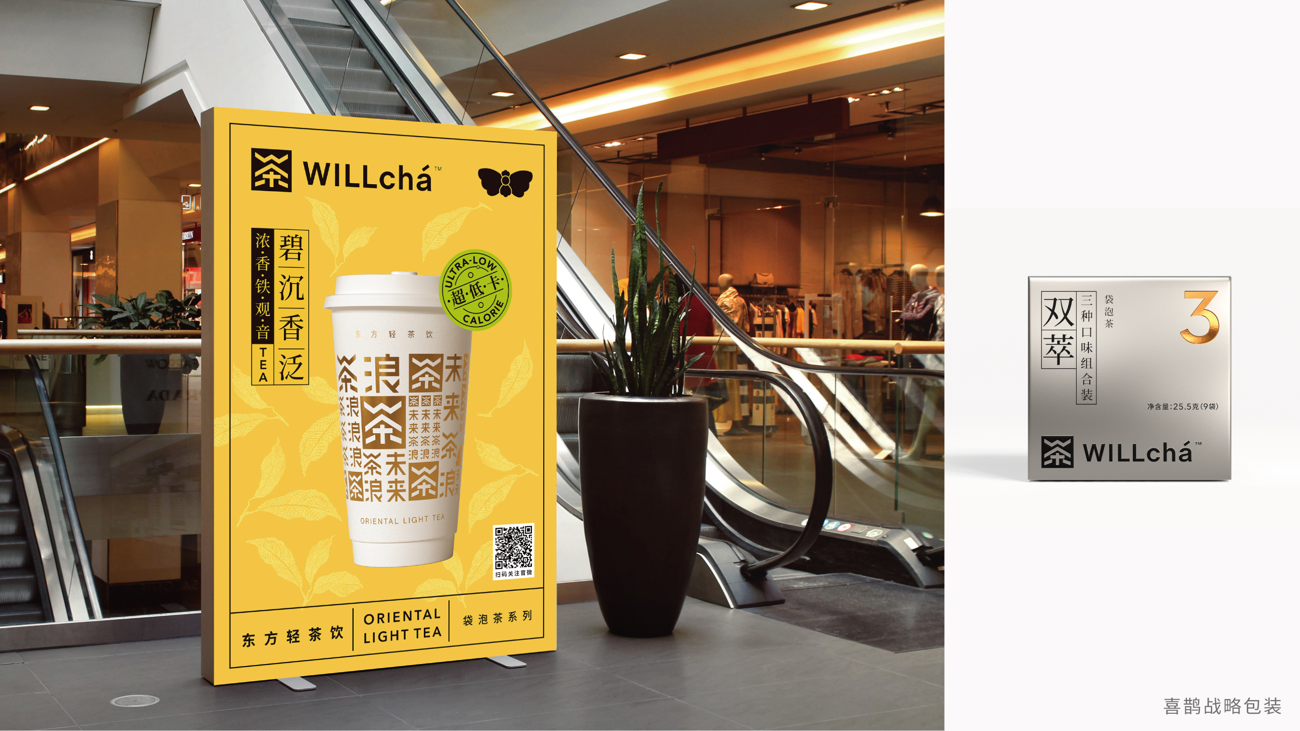
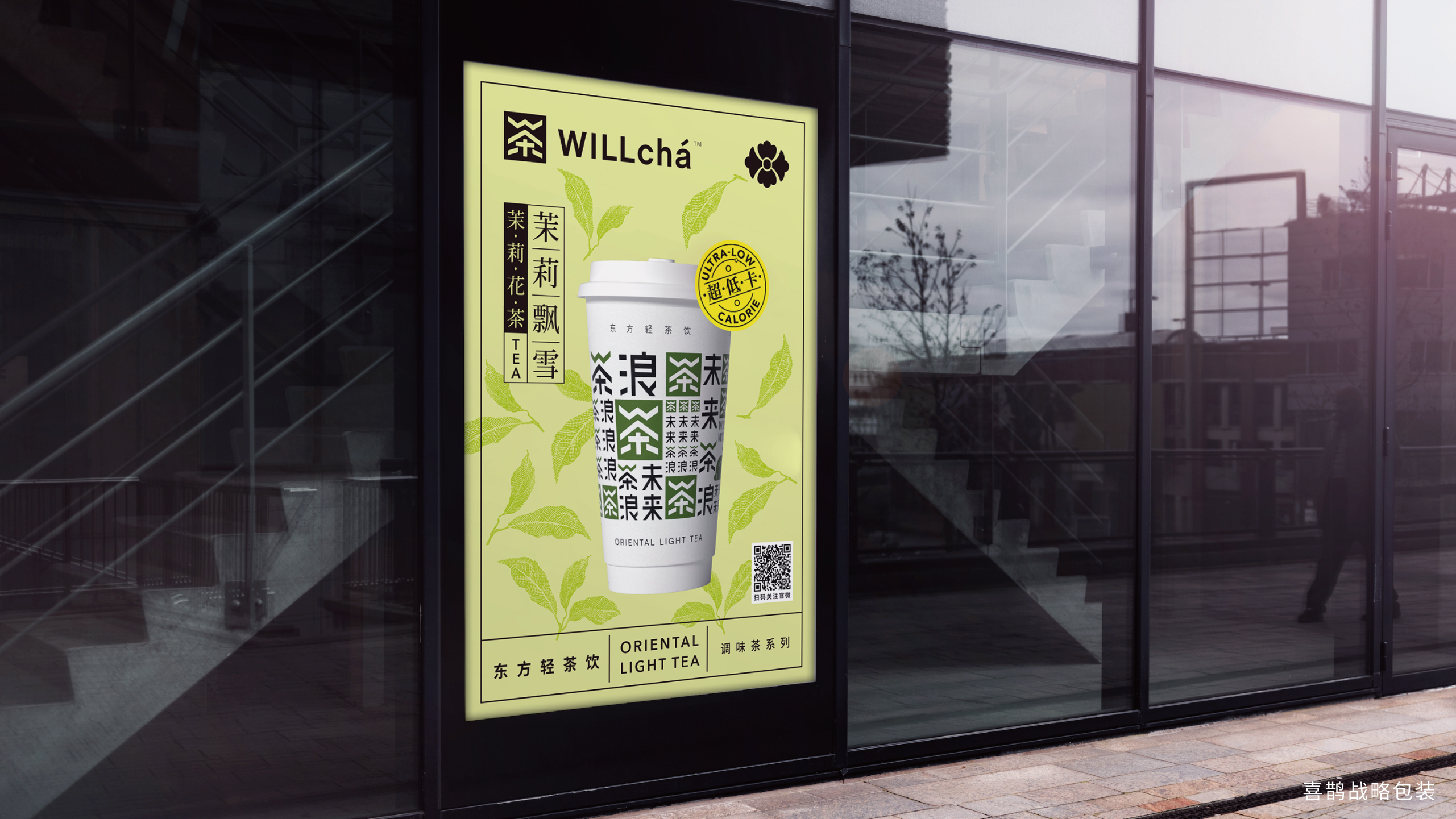
The WILLcha before the revision is not easily linked to Chinese tea, burying the core features. It is difficult for everyone to describe where it is good, and consumers cannot take the initiative to spread it. Positioning as "Oriental Light Tea Drink", consumers can easily describe the benefits of drinking WILLcha-authentic, refreshing and unburdened. The brand-new image scheme also solves the communication problem. Whether it is the Chinese character "tea" in LOGO or the strong vision of the tea cup, it meets the association between brand and tea, and then imagines that good tea can be drunk in WILLcha places.




The copyright of this work belongs to 喜鹊战略. No use is allowed without explicit permission from owner.

New user?Create an account
Log In Reset your password.
Account existed?Log In
Read and agree to the User Agreement Terms of Use.

Please enter your email to reset your password
The word wave is very conspicuous, ha ha
What a good design
very good
It seems that I can't afford to drink.
High-end