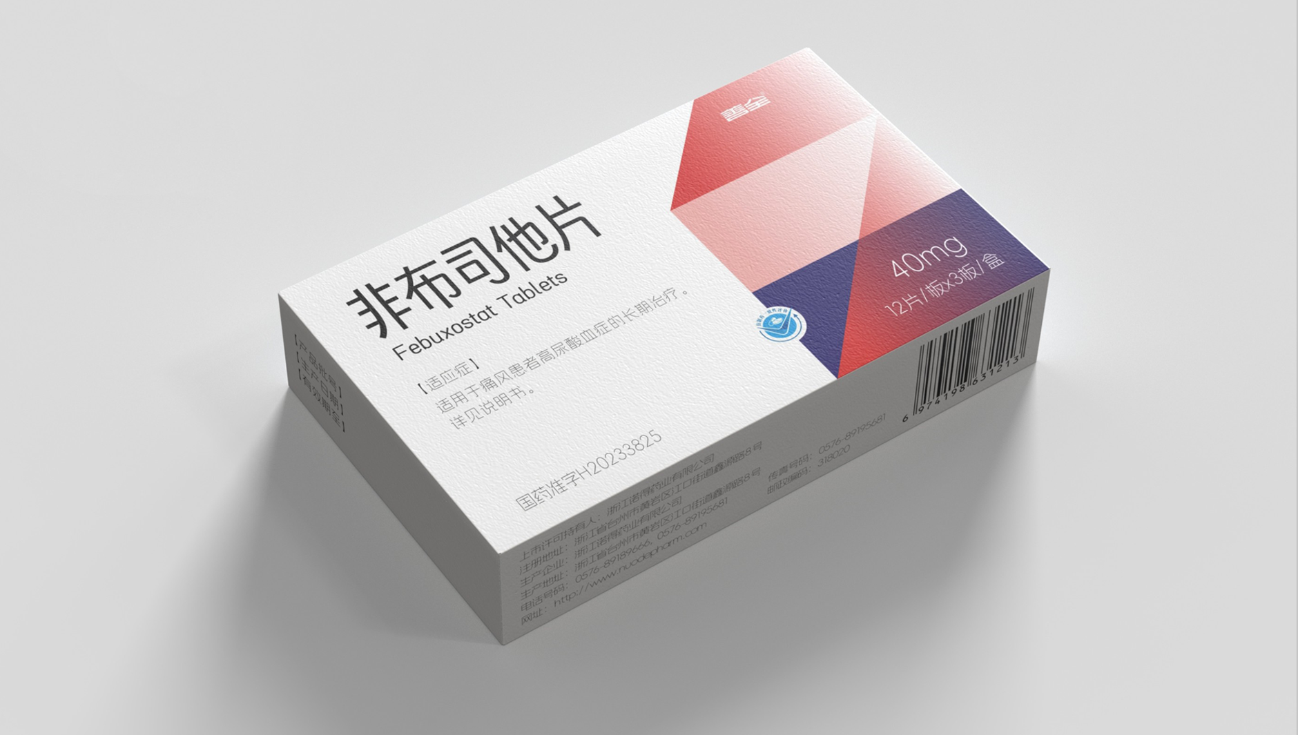
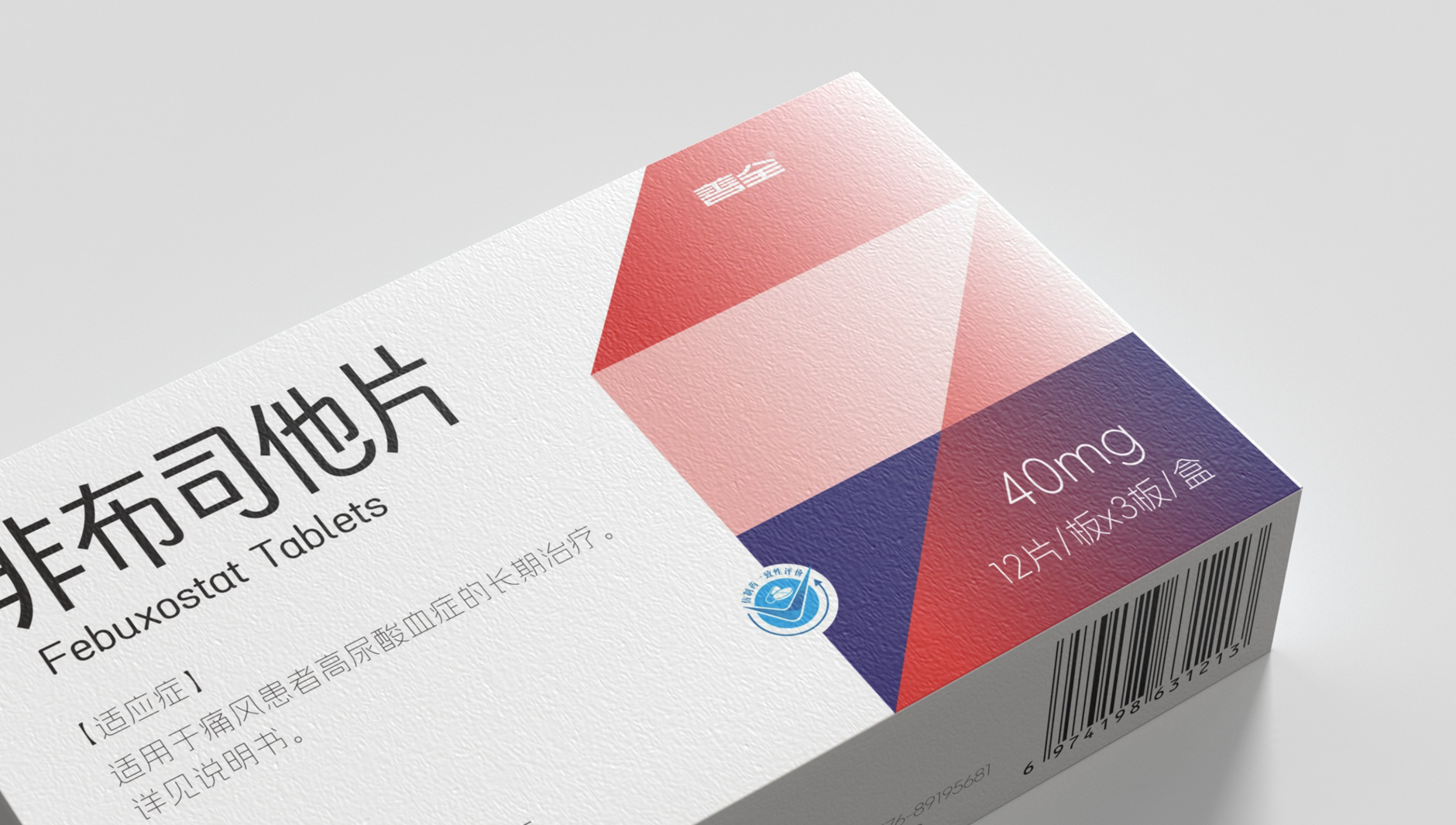
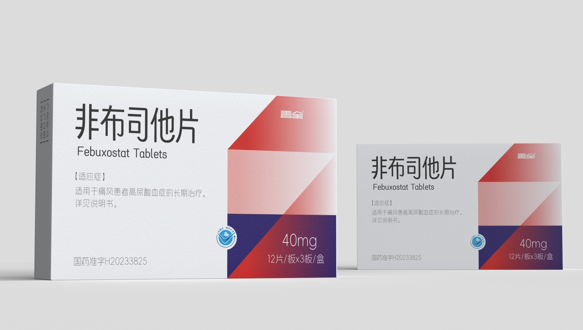
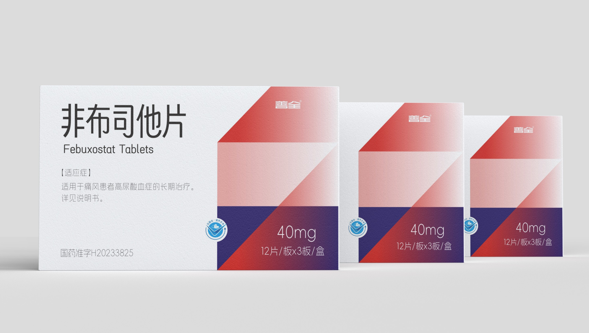
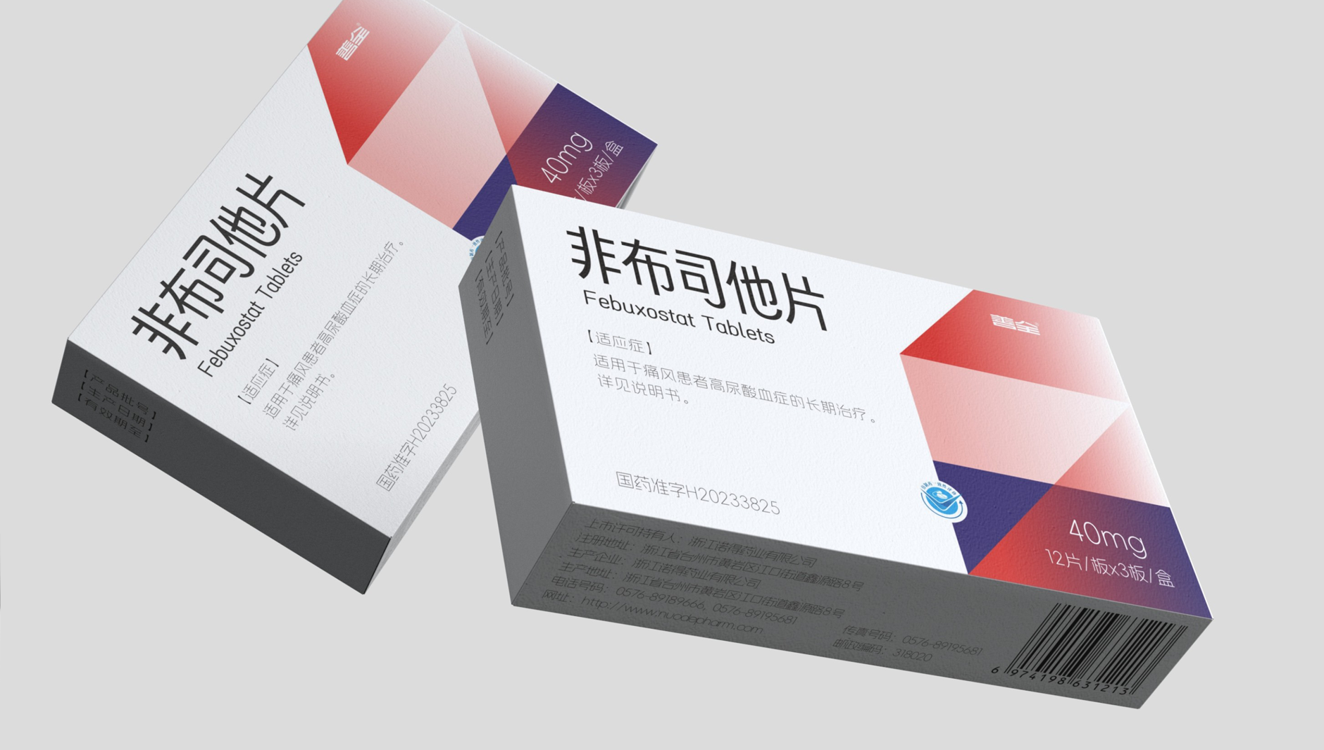
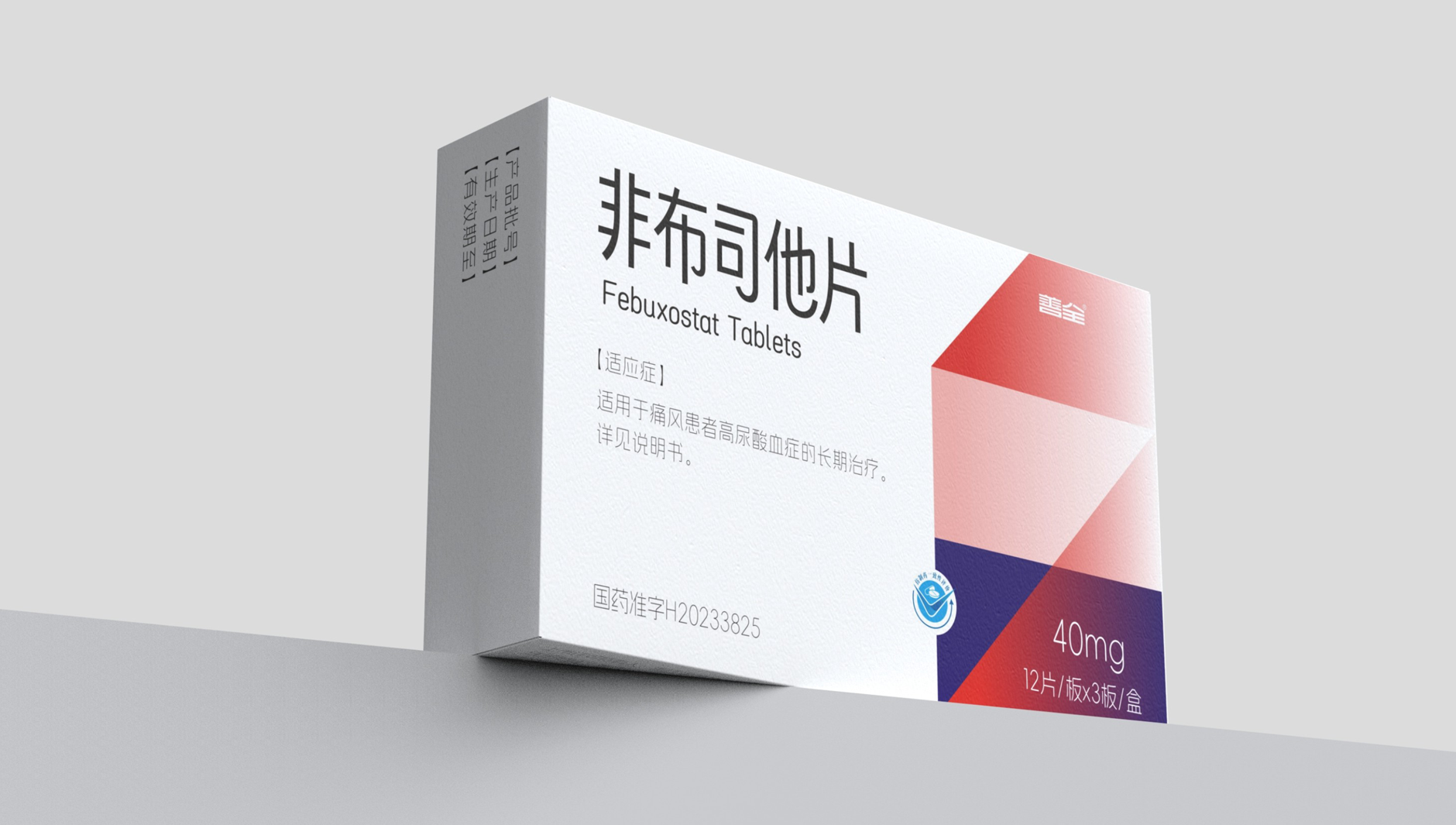
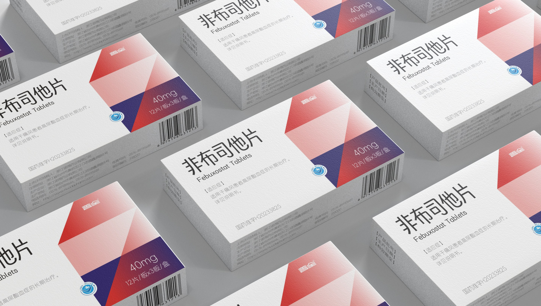
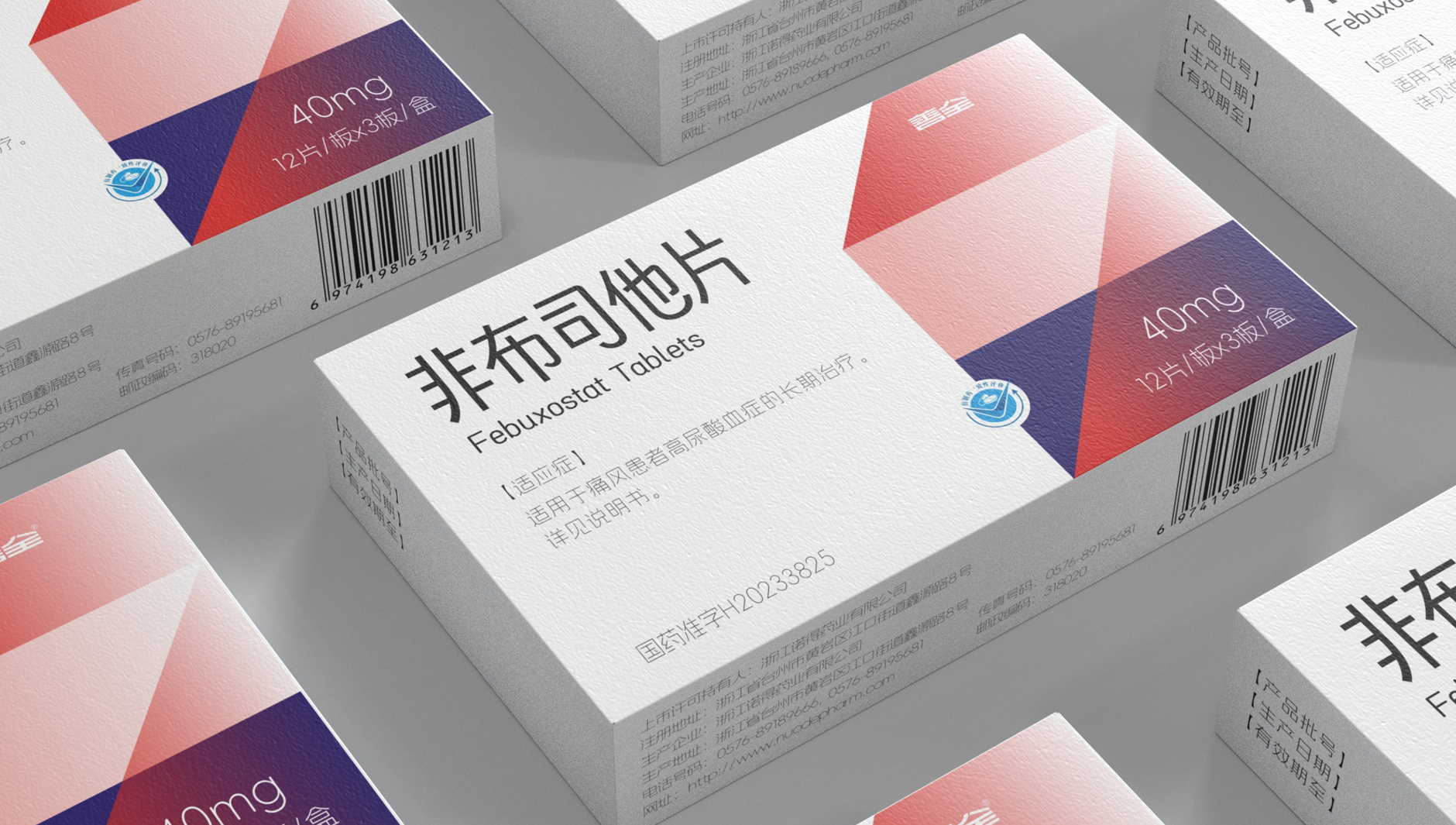
When medicine packaging meets light luxury wind
The design of this gout medicine subverts your cognition!
In the impression of most people
Drug packaging is always the same-blue on a white background
The densely packed instructions have no aesthetic feeling at all.
This piece of non-cloth, but with bold design language
Redefining the "Yan Value Standard" of Pharmaceutical Packaging"
Design highlights:
Color revolution: awakening vision with color block collision
Farewell to the monotonous color matching of traditional medicines
Febuzostat tablets use a combination of bright and energetic color blocks.
Orange and blue collision, both to convey the health of vitality
And retain a sense of professionalism in pharmaceutical products
People can find it in the medicine cabinet at a glance
Minimalist Typography: More Efficient Information Transmission
Packaging Abandons Redundant Text
through clear hierarchical typography
Make key drug information at a glance
The font is round and comfortable, and the reading experience is comparable to a fashion magazine
Tactility upgrade: from "taking medicine" to "experience"
Matte material with delicate touch
This detail design
virtually enhance the ritual sense of medication
The copyright of this work belongs to 深圳智圆行方包装设计. No use is allowed without explicit permission from owner.
New user?Create an account
Log In Reset your password.
Account existed?Log In
Read and agree to the User Agreement Terms of Use.
Please enter your email to reset your password
It's not good to eat there
Is using this medicine
It hurts
particularly excellent
very good
nice packaging