The failed works of the electric competition......................................................................................................................................
The copyright of this work belongs to 我有只猫叫啊丑. No use is allowed without explicit permission from owner.

New user?Create an account
Log In Reset your password.
Account existed?Log In
Read and agree to the User Agreement Terms of Use.

Please enter your email to reset your password
Why do you have a Blue Sky in every work? Are you going to open a personal brand?
Great design
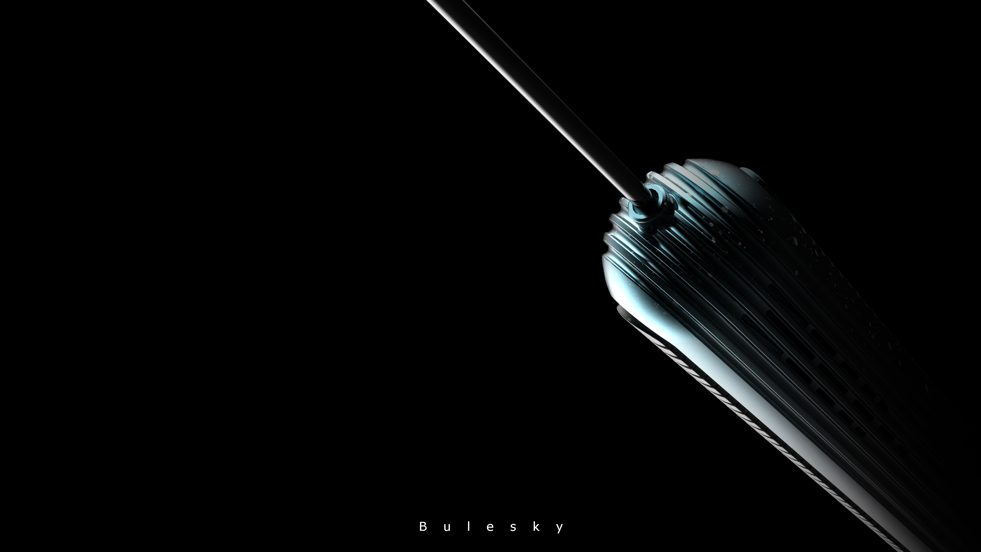
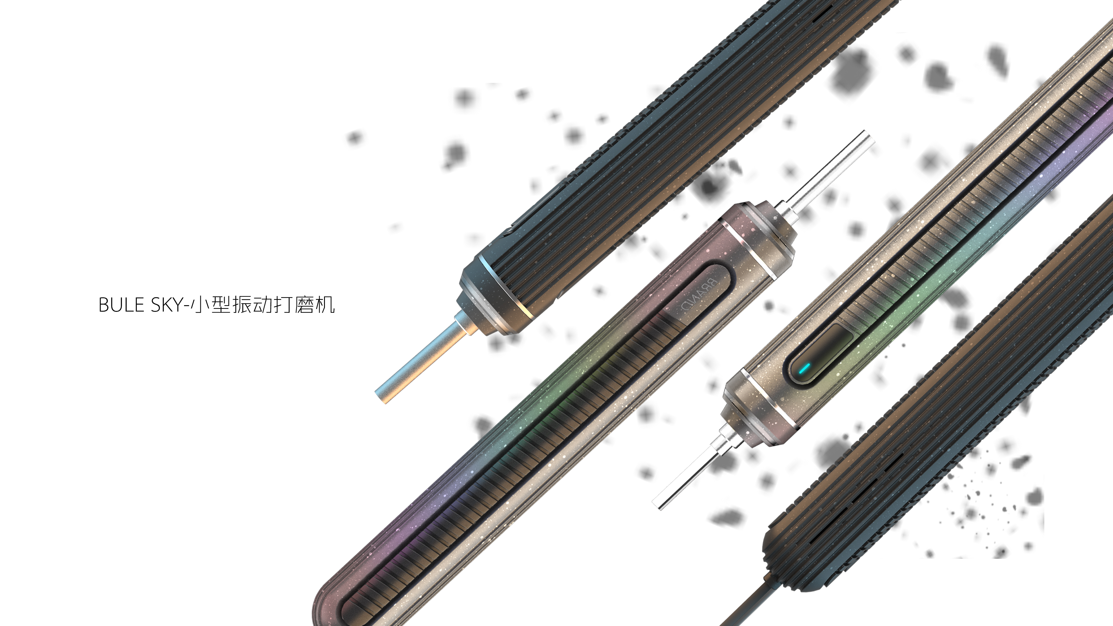
Are these miscellaneous points on the product maps? Or is it the material that comes with the renderer? "I class =" expression-icon expression-type15 "title =" question ">/I>
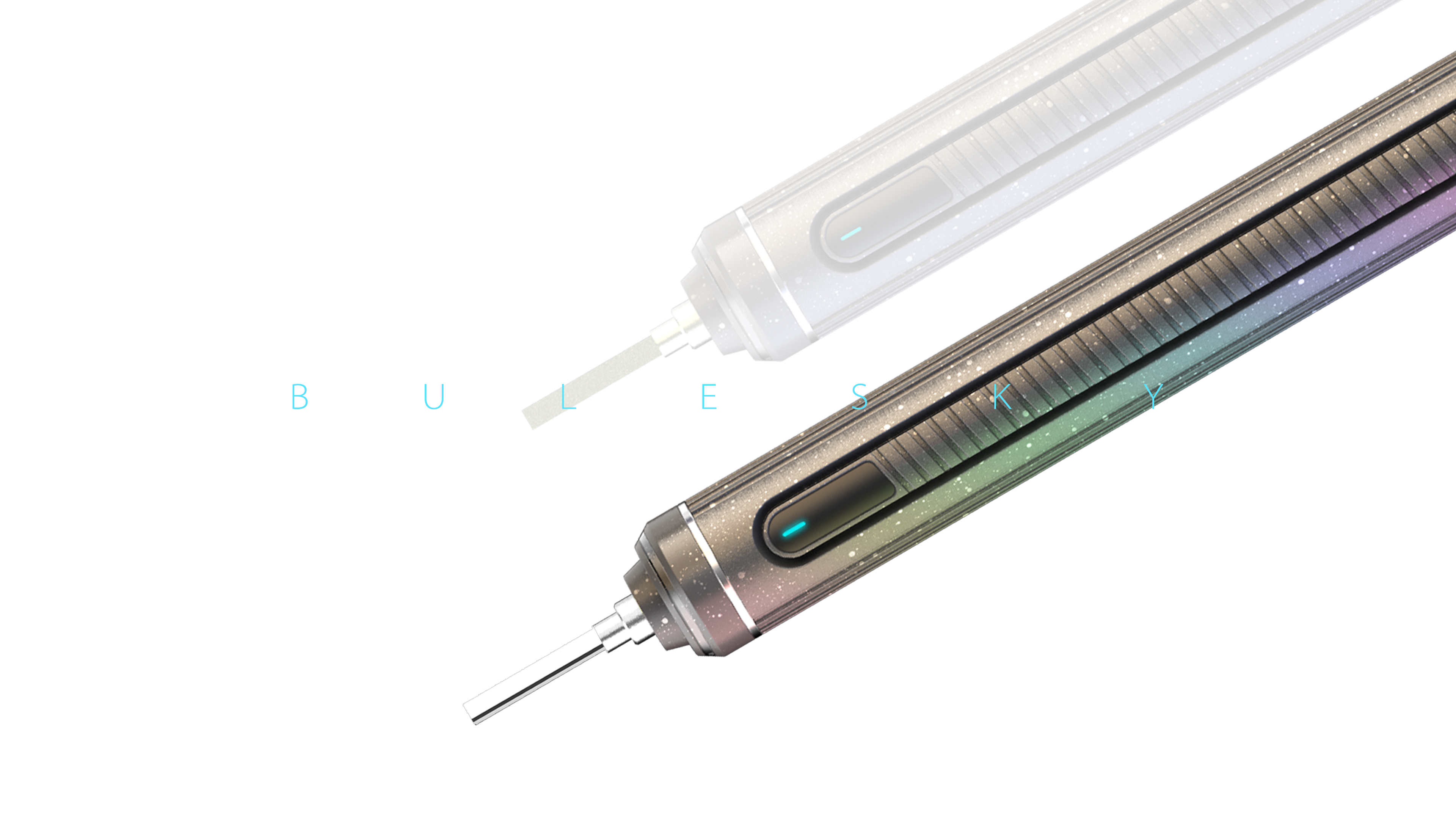
The gradient is a bit expensive, Brother Hua
The picture is very nice, but I don't know the miscellaneous use.
I like this picture
The gradual color change is very beautiful.
It is the overall shape of the work that can't be seen clearly. I always feel that I am partially covered.
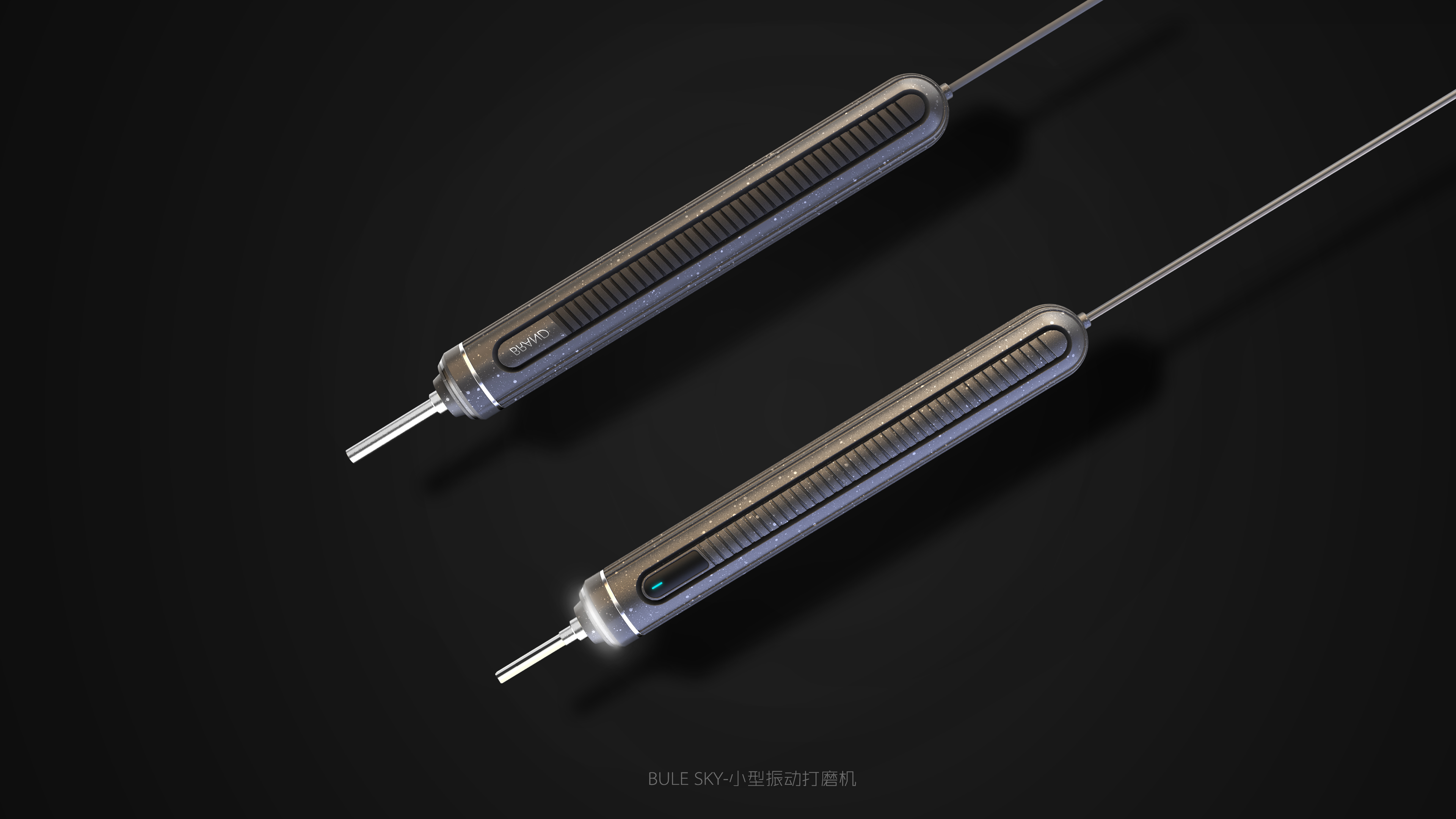
The rendering effect is very good.
Such a good work, how can you fail the list (O(∩_∩)O) you are going to hit shi again