Mulinsen Co., Ltd. was established in 1997 and listed in 2015. It is a leading domestic comprehensive enterprise integrating LED packaging and LED application products, and its total output is the first in China's LED market. In recent years, following the development trend of the times, Mulin Sen has not only continued to deepen the B- end market, but also gradually opened up the C- end field, vigorously promoted the two major brands of "Landvance" and "Mulin Sen", and received good feedback in the market.
In the post-epidemic era, health consumption has become a rigid demand. At the same time, with the comprehensive promotion of the "Healthy China 2030" strategy, the market scale of the large health industry continues to expand, which contains rich blue ocean business opportunities. Mulinsen took the lead in laying out this trillion-dollar golden track, focusing on providing solutions for air quality and safety in public space, and opening up a new track under the new economic situation!
Mullinsen's sub-brand, "Mellinsen", has worked hand in hand with the Maimang design team to upgrade the brand's brand strategy, target young and middle-aged users, rebuild the VI system, launch the first IP image, improve the packaging system and enhance the disassembly experience, and build a brand-new consumption experience for users.
-
Brand Planning: Vincent
Project coordination: Elaine
Brand Design: Pony/Little
Packaging structure: George
Service Customer: Mulin Sen
Service Team: Maimang Design
Service content: brand planning and positioning | LOGO design | VI application design | IP design | packaging visual design | packaging structure design
-

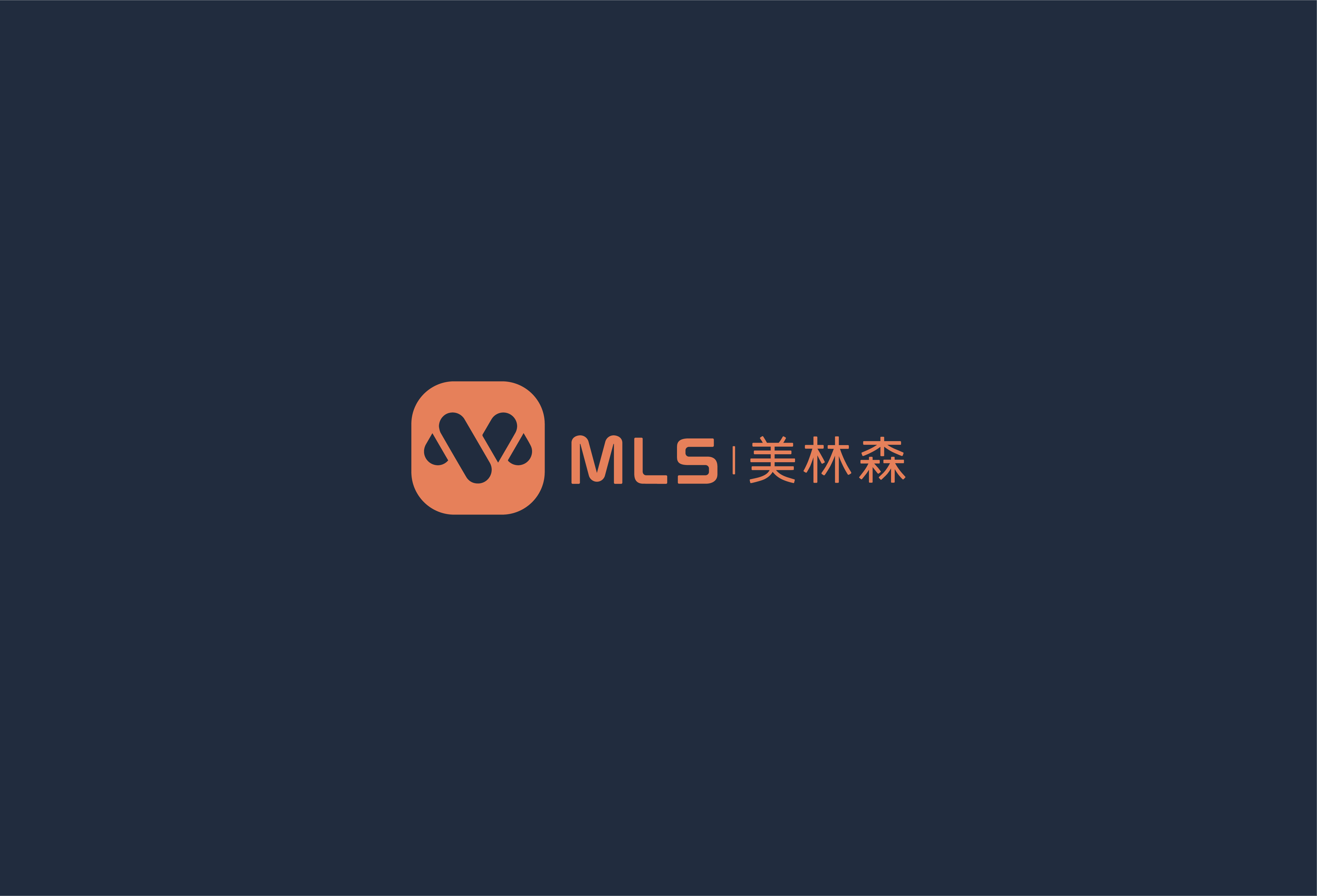
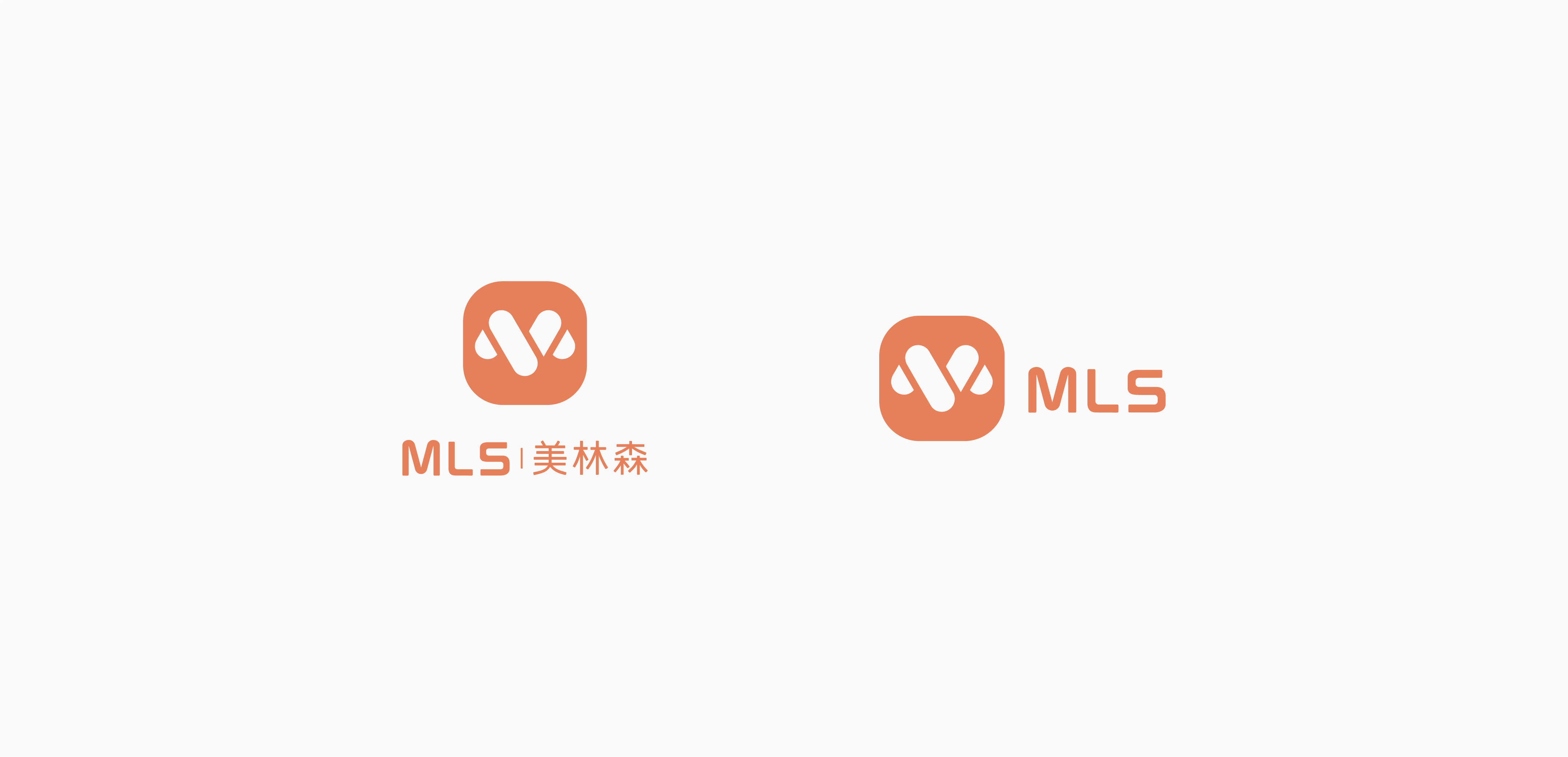

The Mellingsen brand focuses on home health products and faces children, housewives and the elderly. Its round and friendly image is more conducive to consumer communication.
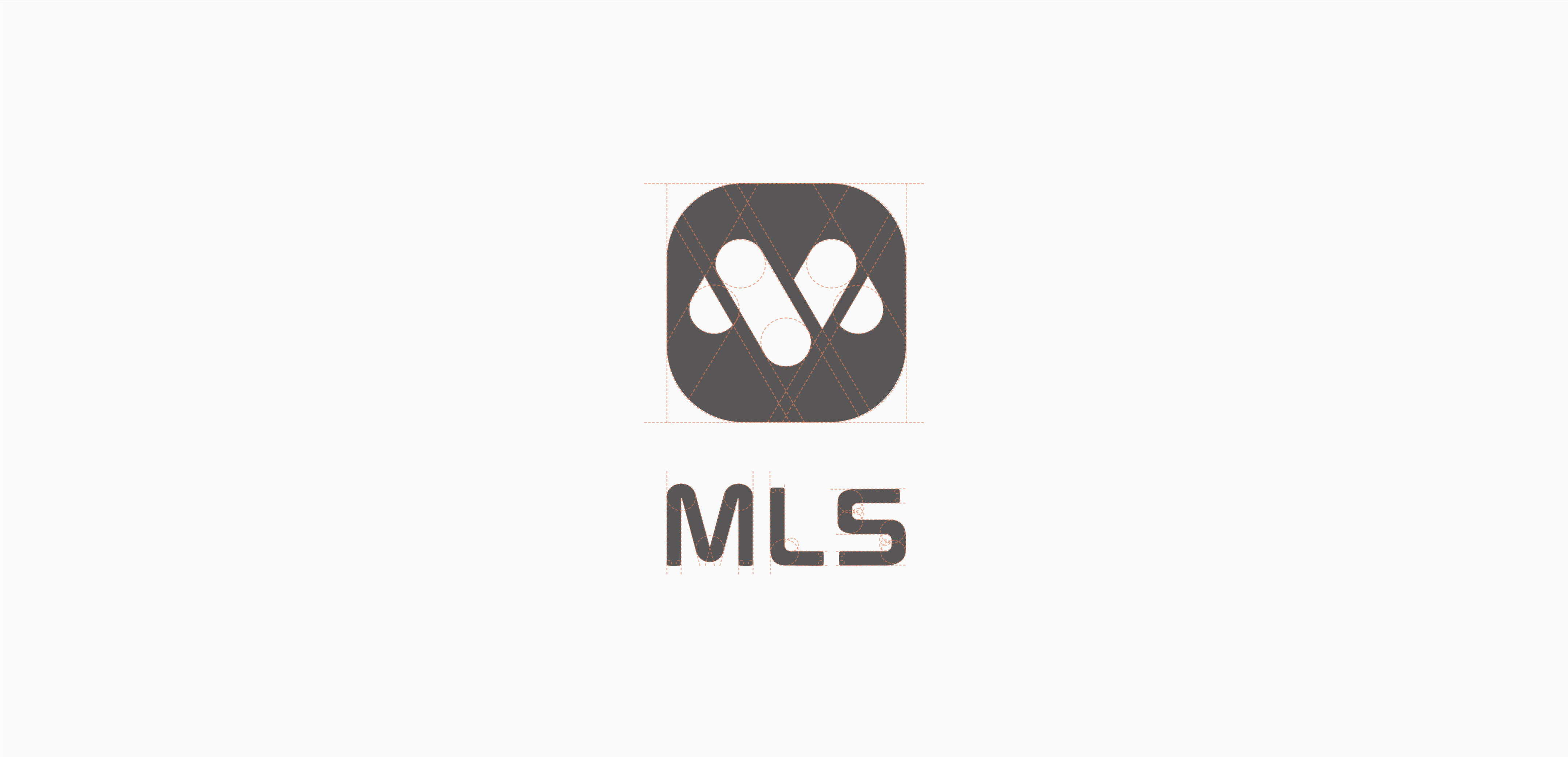
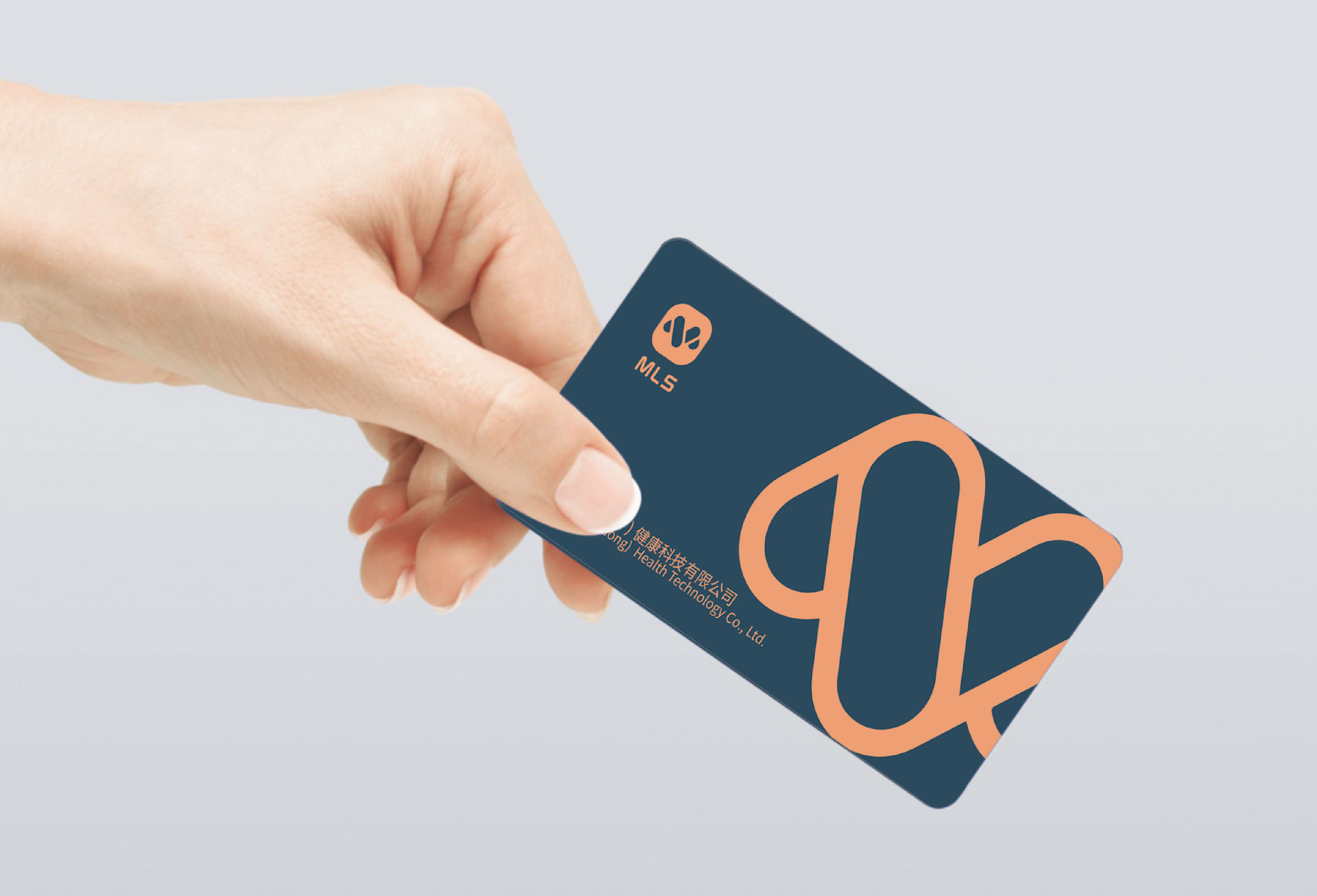
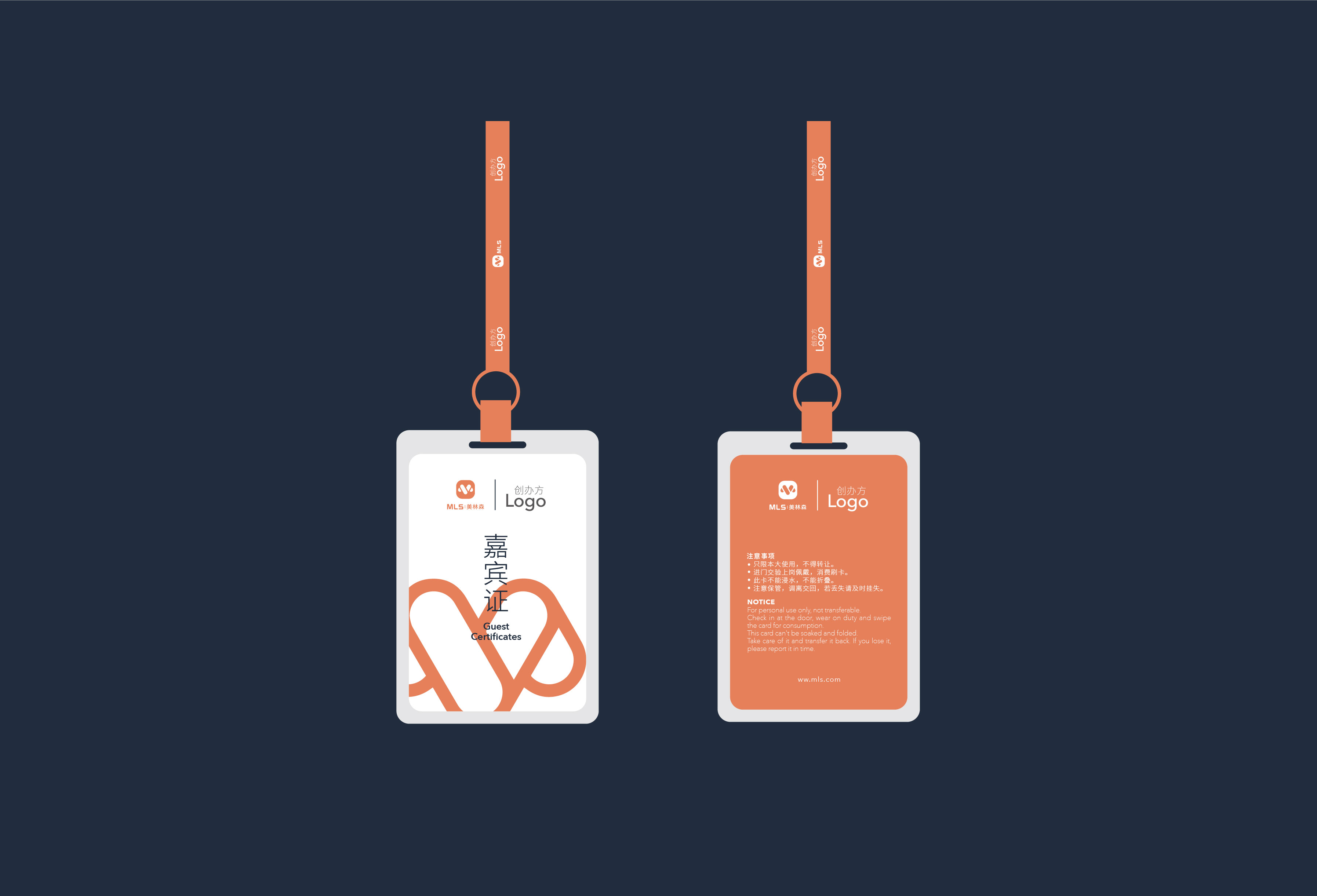
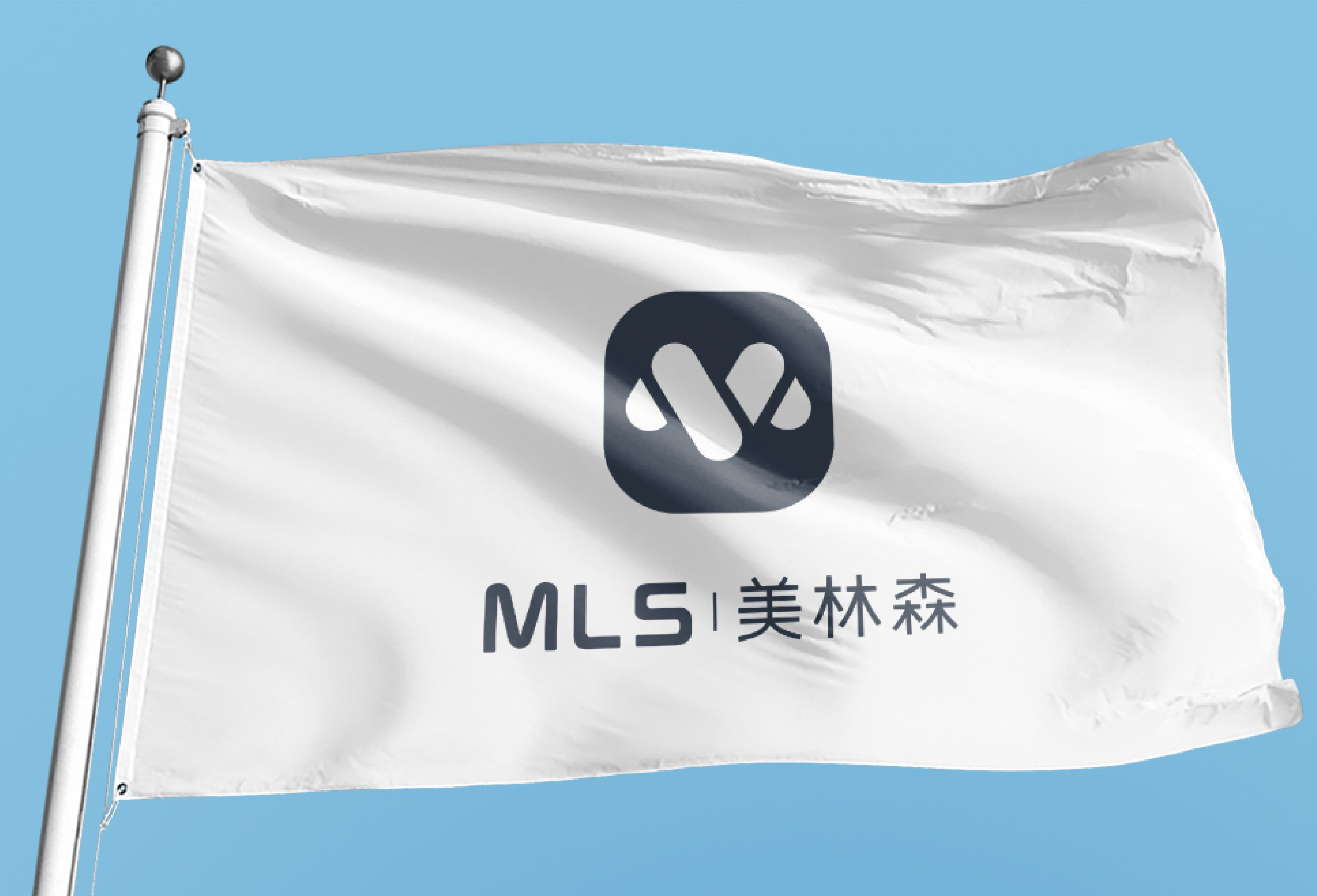
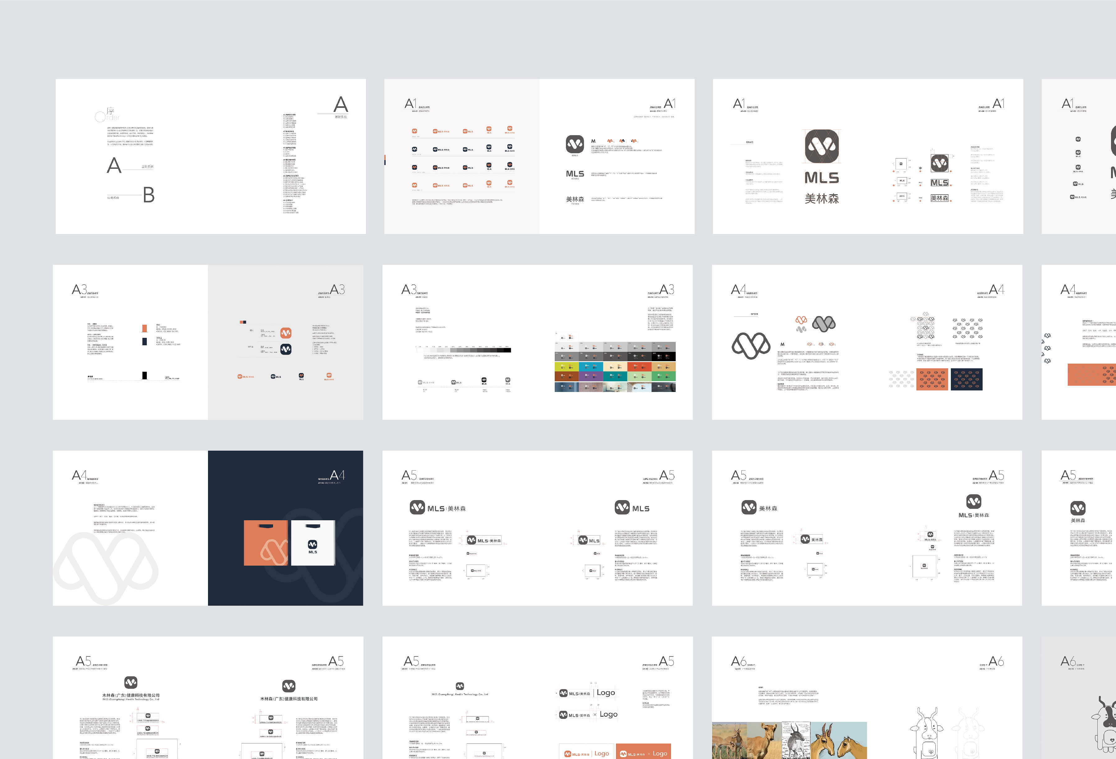
The Mellingsen graphic logo is designed around the three letters "M", "L" and "S". It uses a single ellipse as a unit to form a plurality of unit spaces, and forms an English letter "M" with a sense of space by means of abstract splicing of lines and surfaces. The logo is simple and easy to understand. The English letters and Chinese names are outlined with rounded lines, which echo the rounded and soft design of the logo and have a strong integrity.
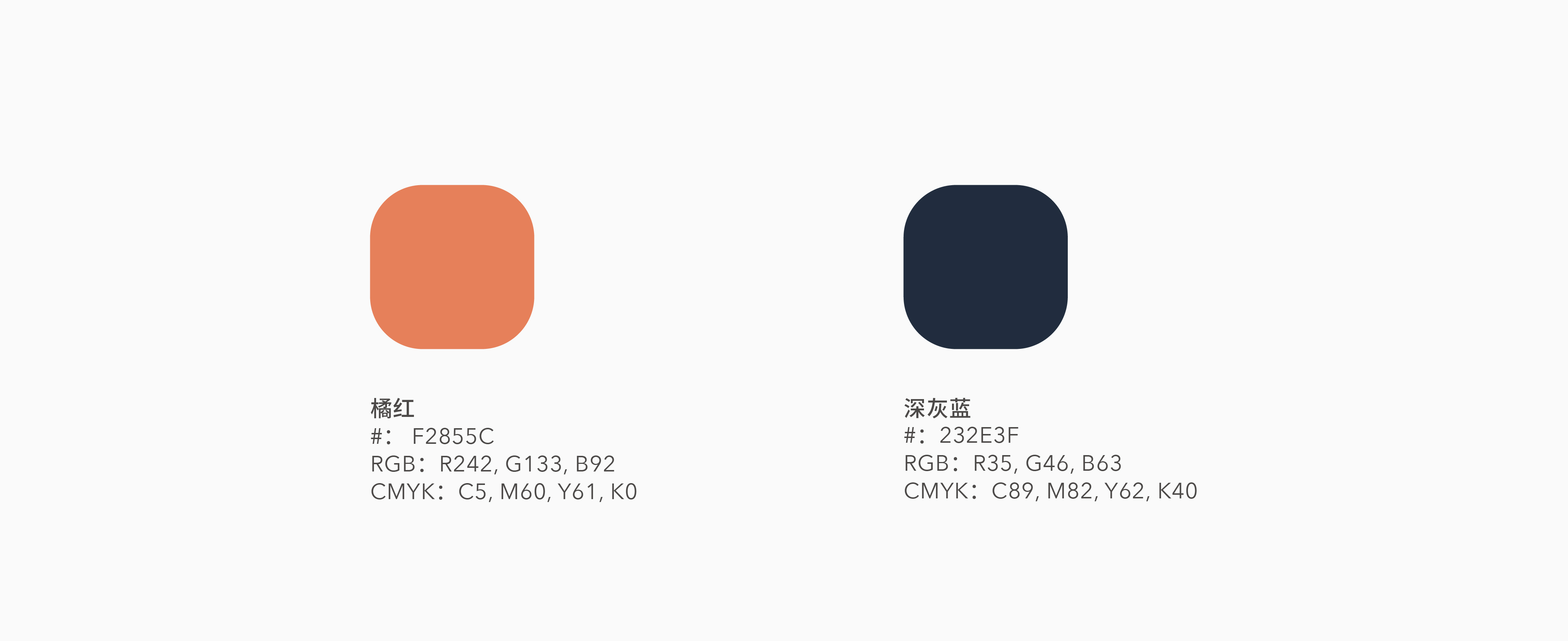
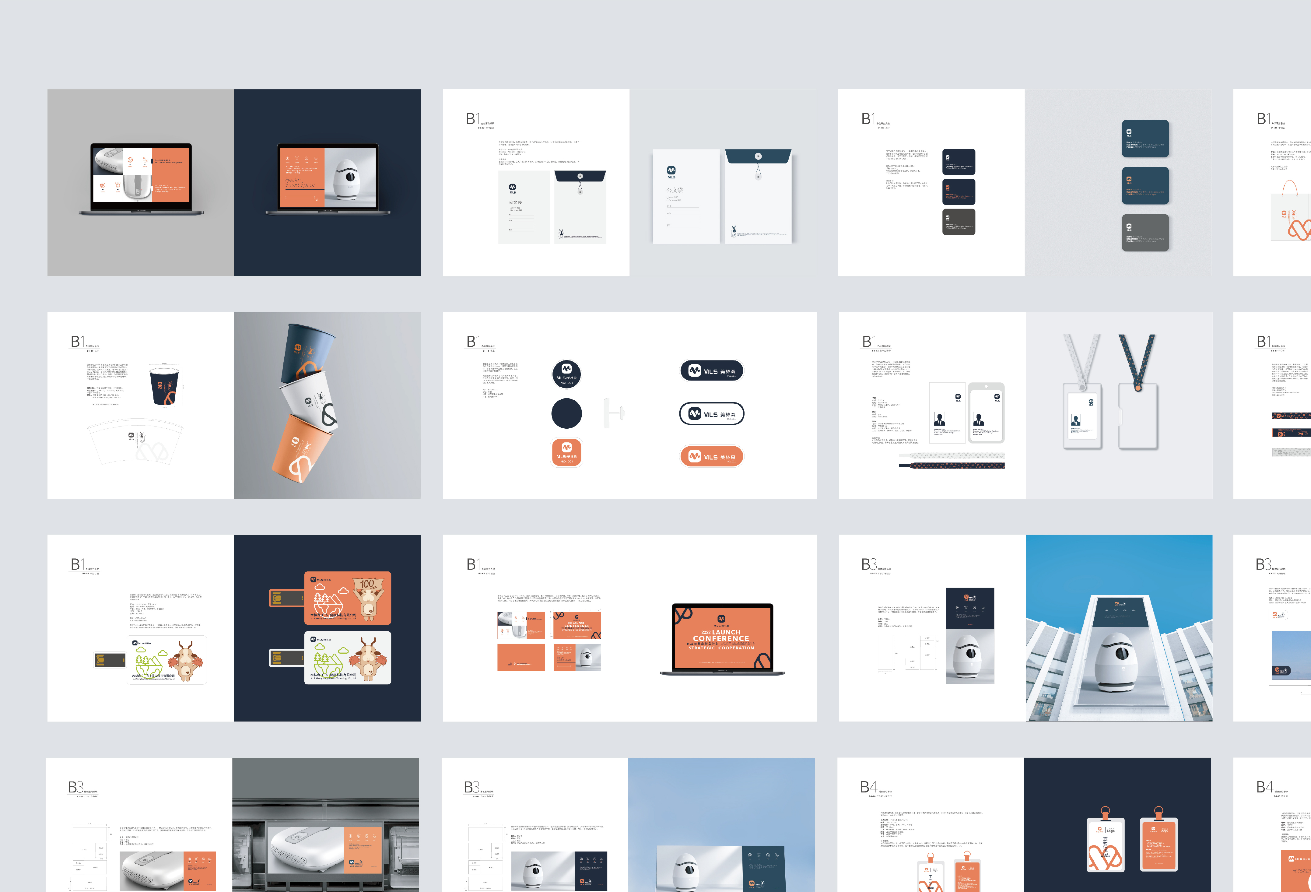
In order to further strengthen the attributes of the brand, we choose dark blue and orange as the main colors. Blue is stable, rigorous and technological. Orange represents vitality, youth and hope. The contrast between warm and cold colors makes it easier for consumers to have visual stay and enhance brand recognition.

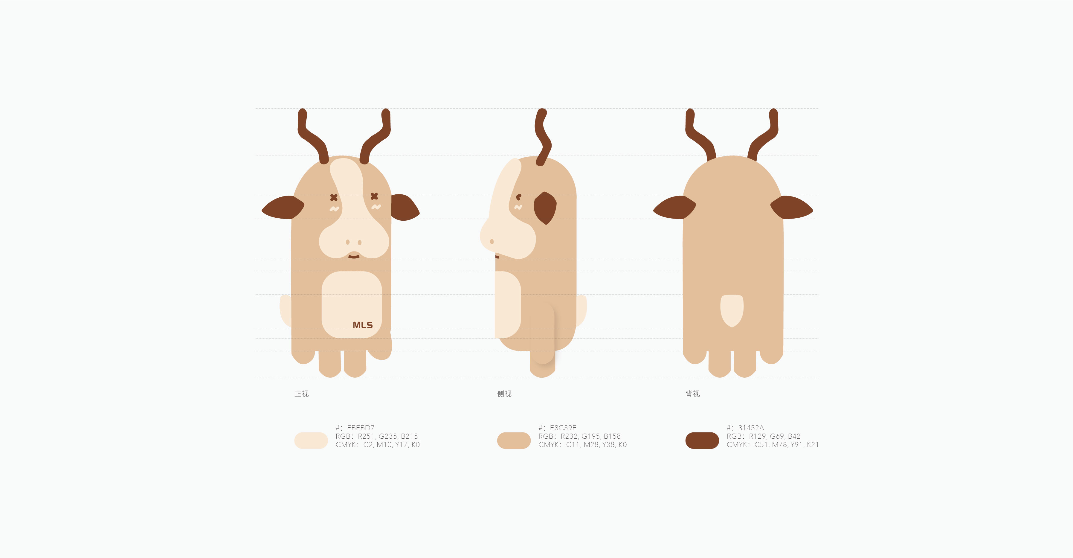
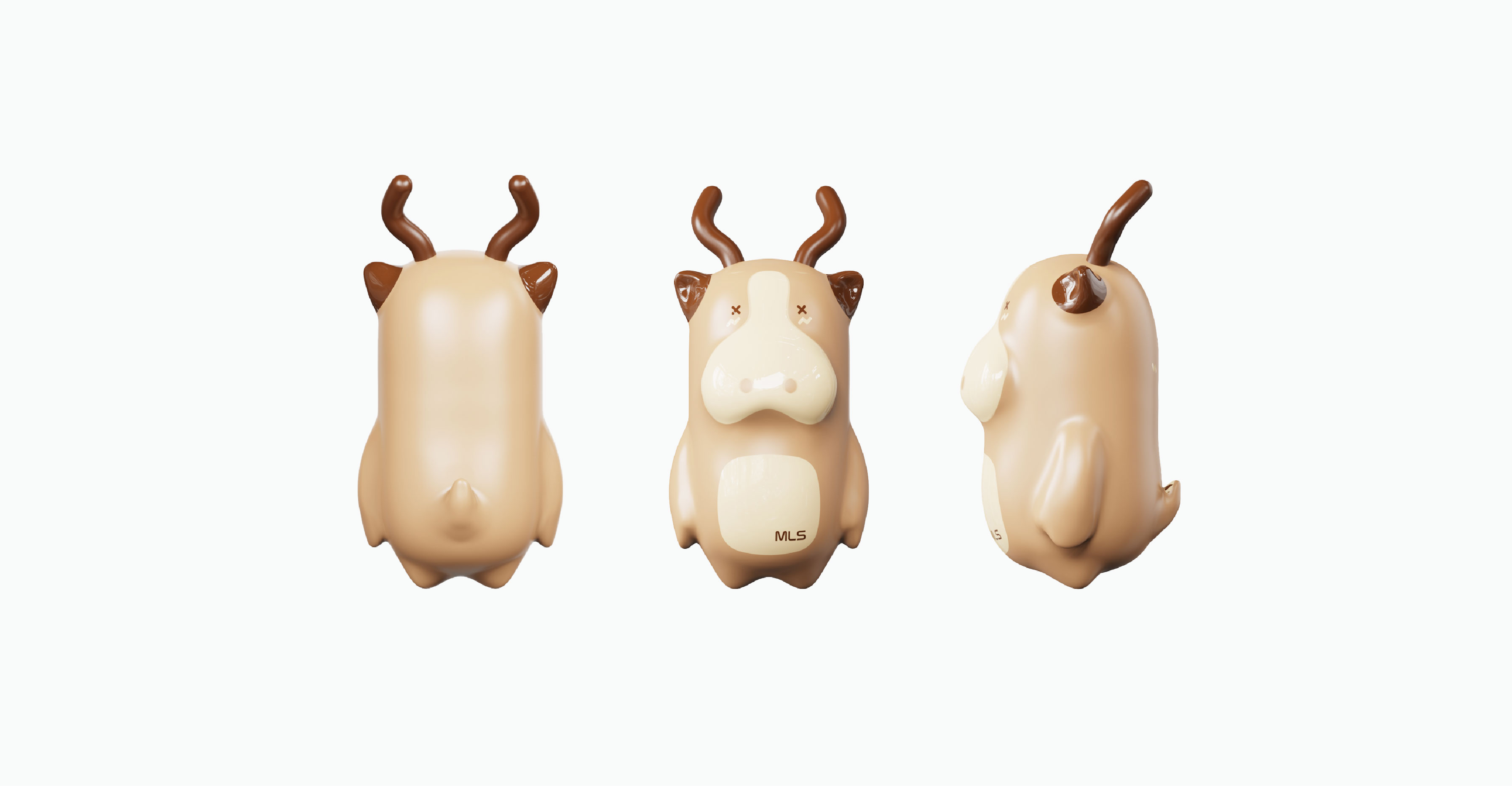
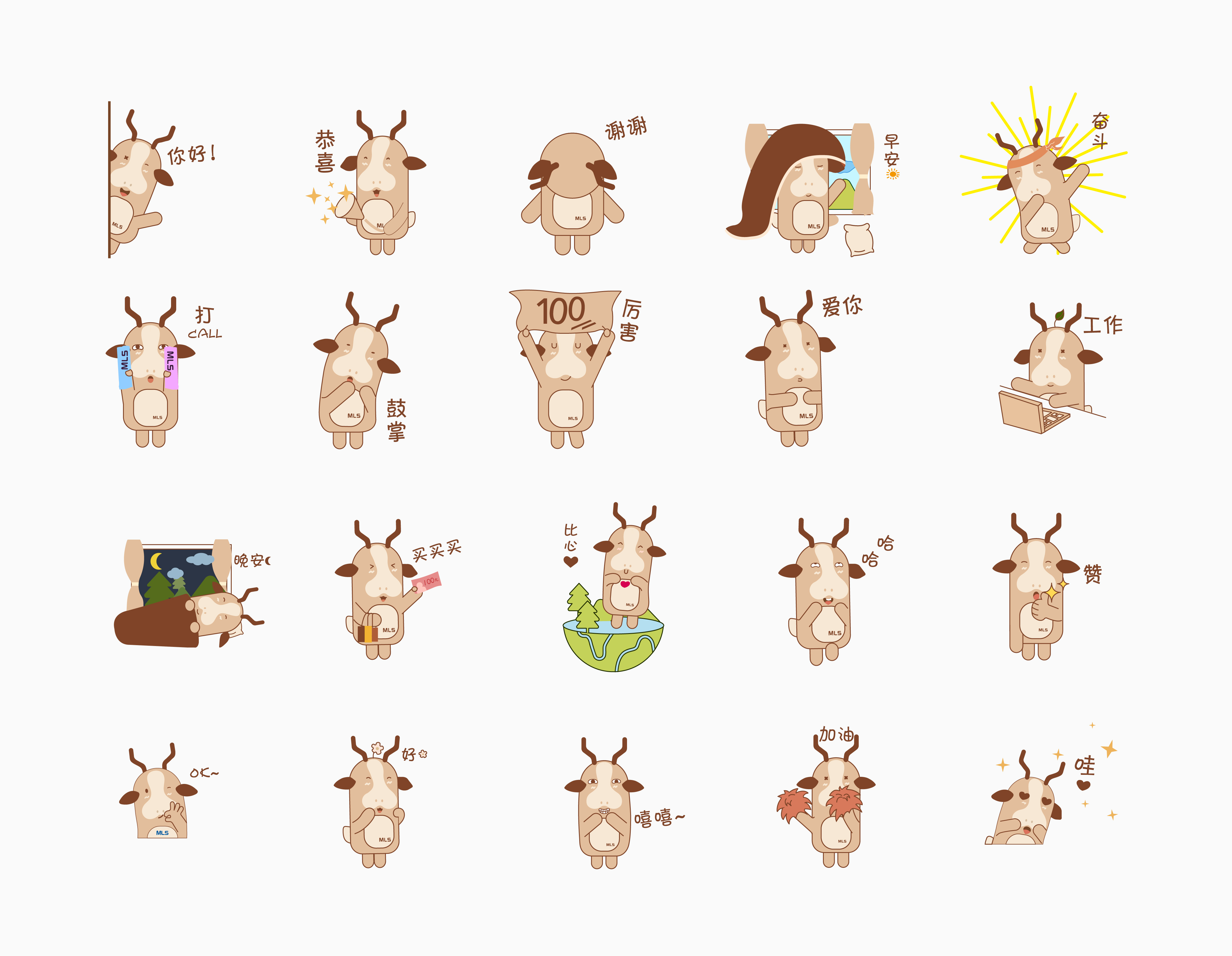
Based on this main IP image, we have also extended the design of 20 expression packages, which incorporate different emotions, actions, words and objects into the design to enrich the IP image, make it more lovely, interesting and resonate with the audience.
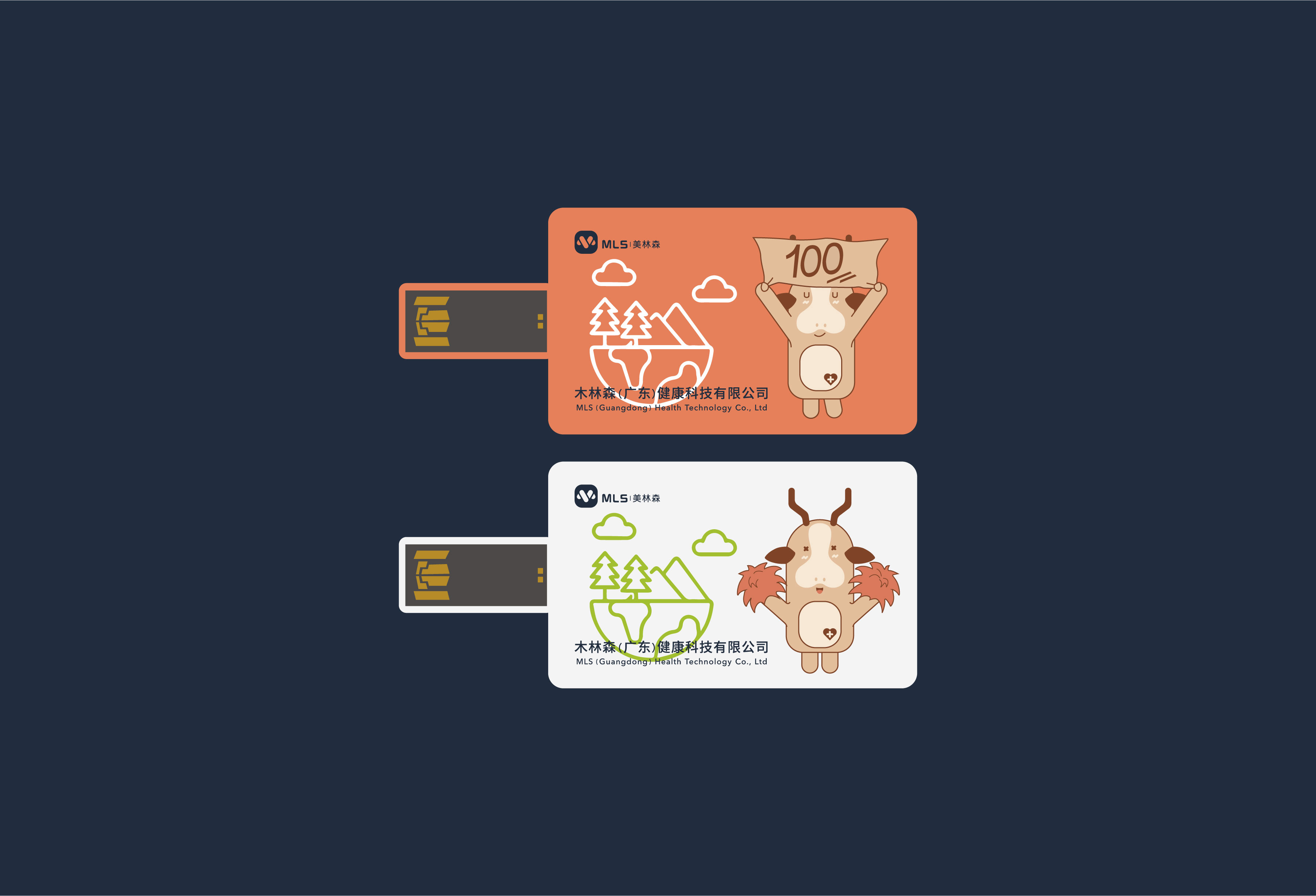
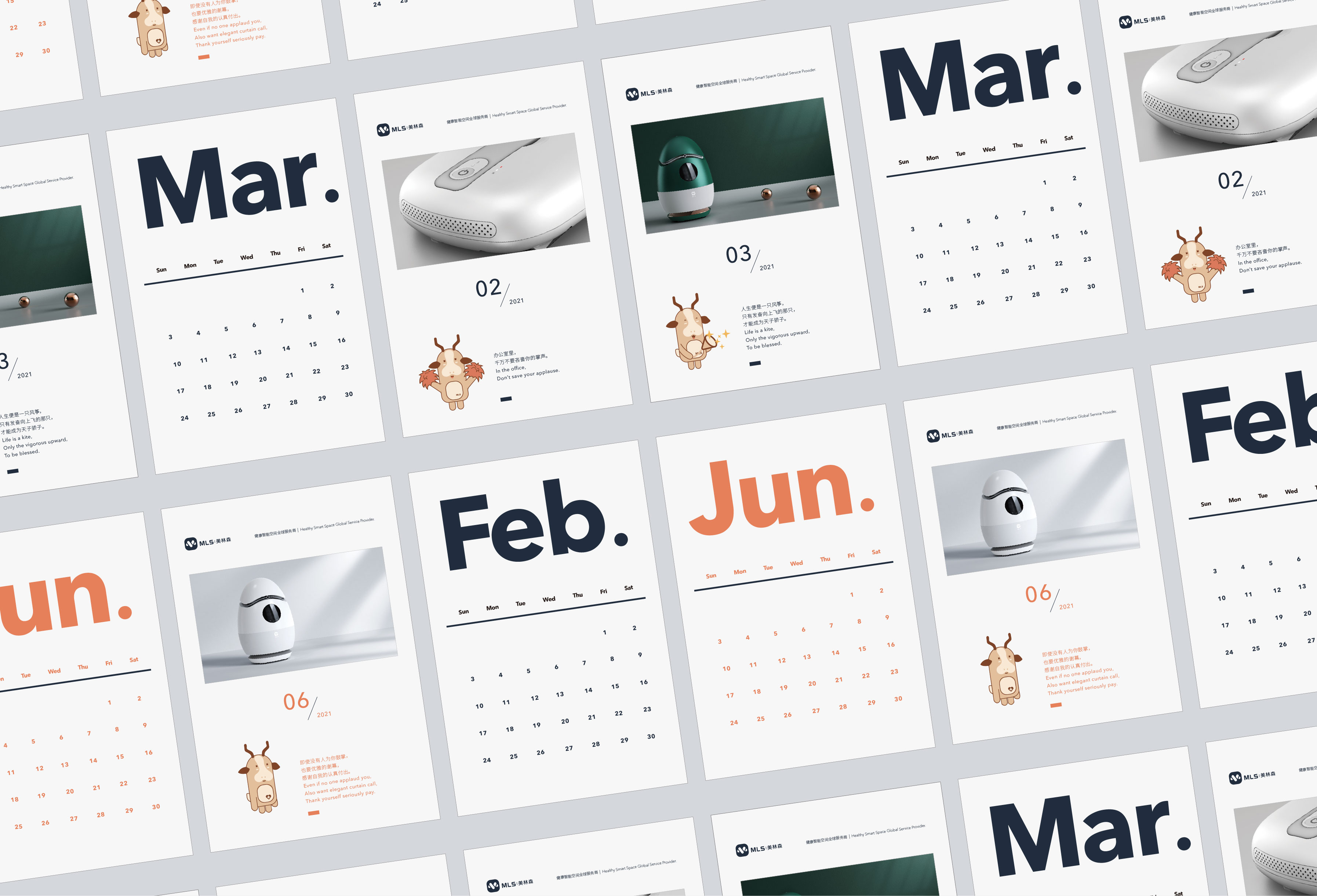
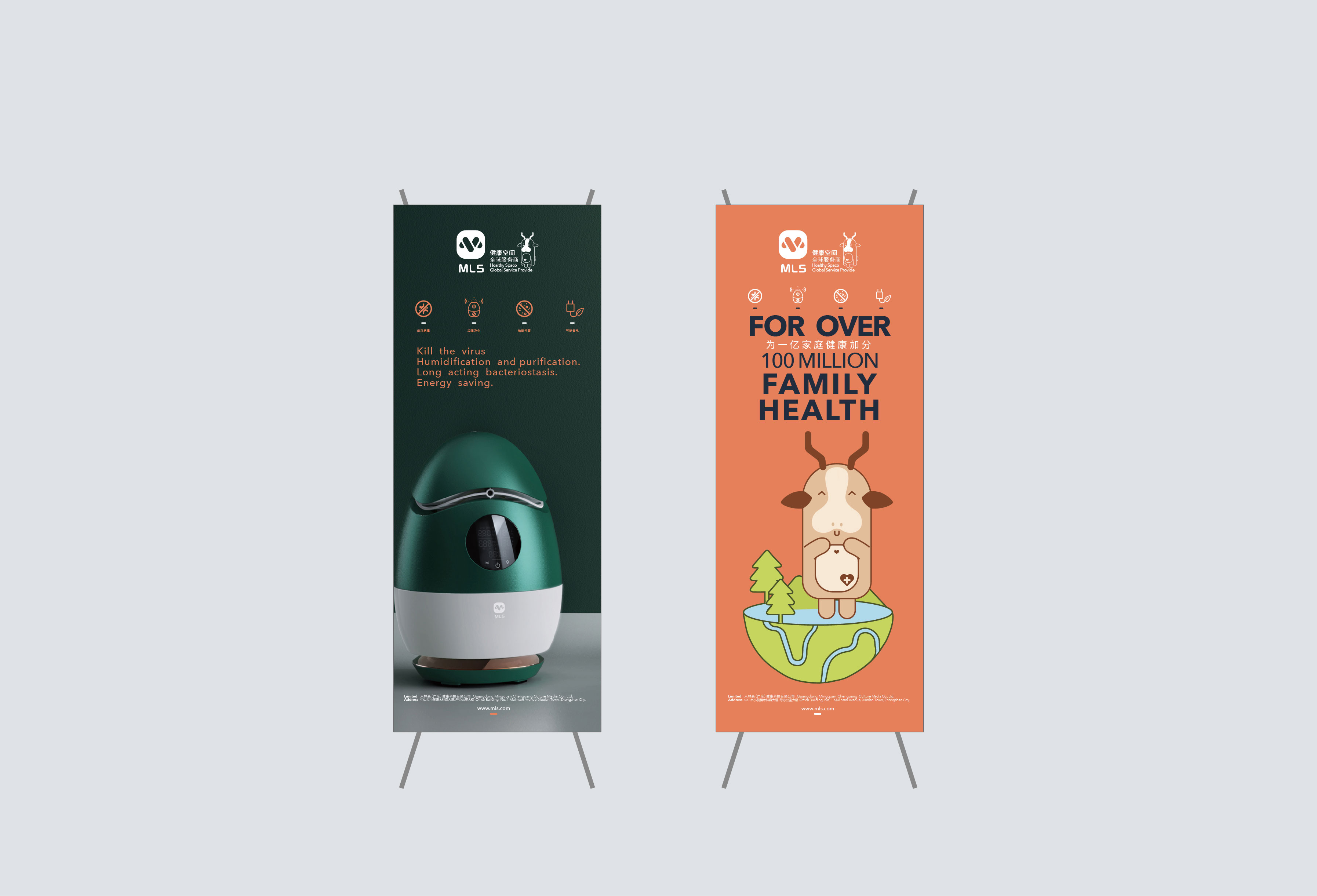
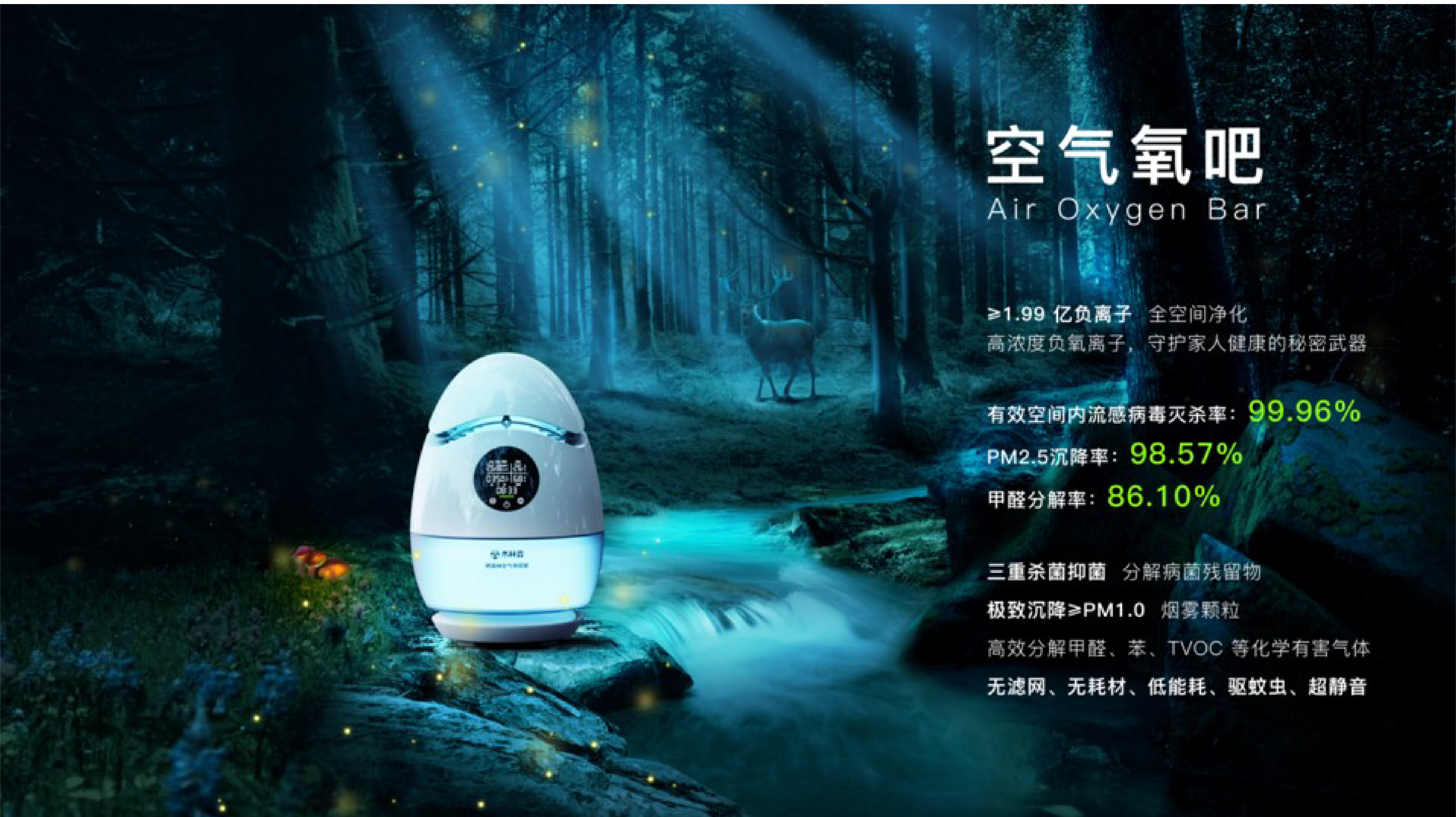

We define a theme for each product, air oxygen bar-forest system, American cube-mountain forest system, humidifier-mountain spring system. By using the main KV map in a large area, it can effectively enhance the atmosphere, strengthen the main vision and drive the consumer mood.
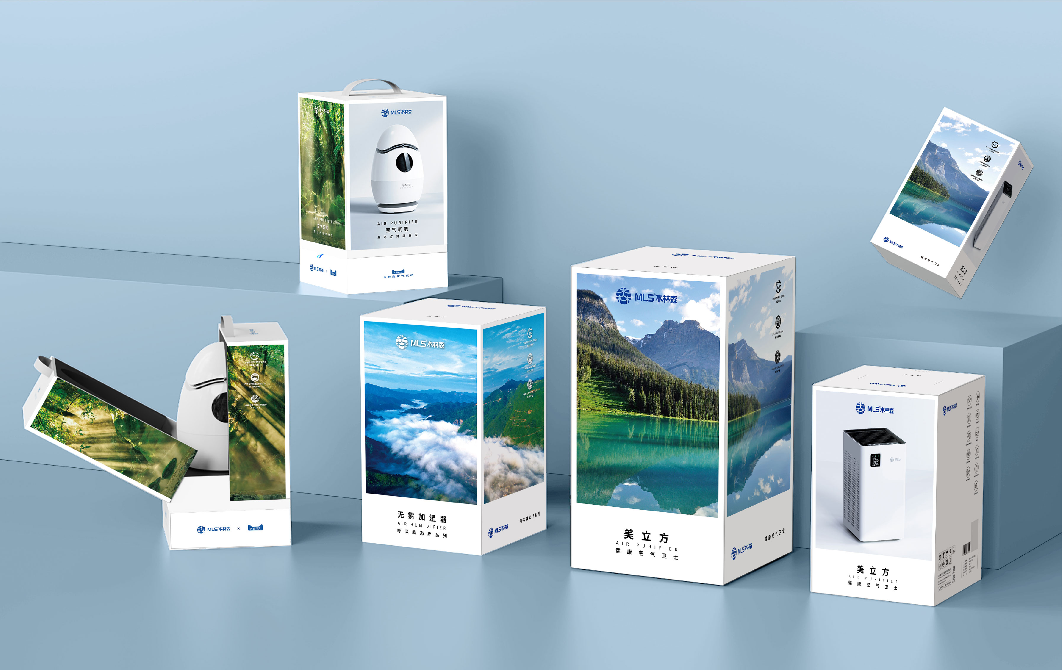
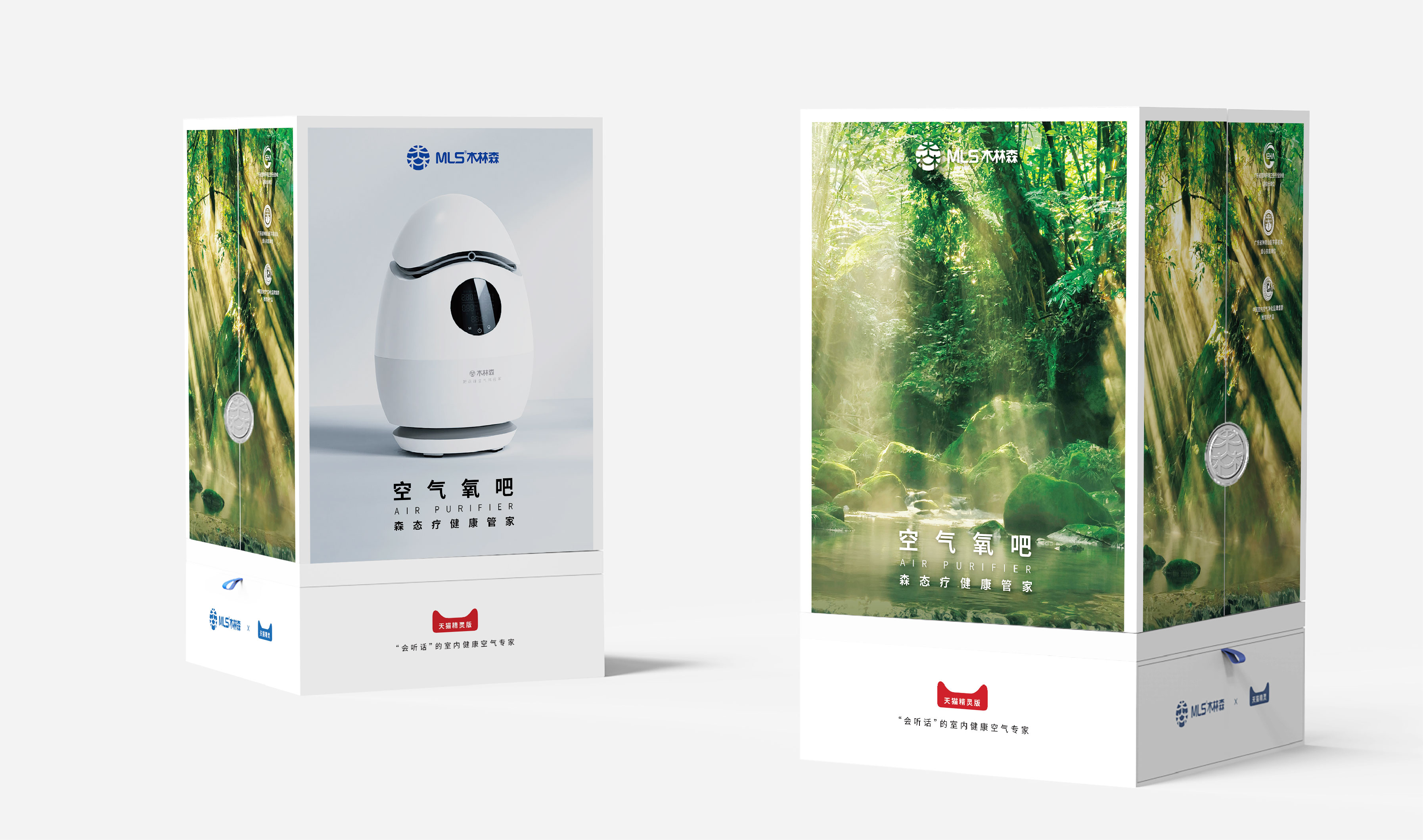

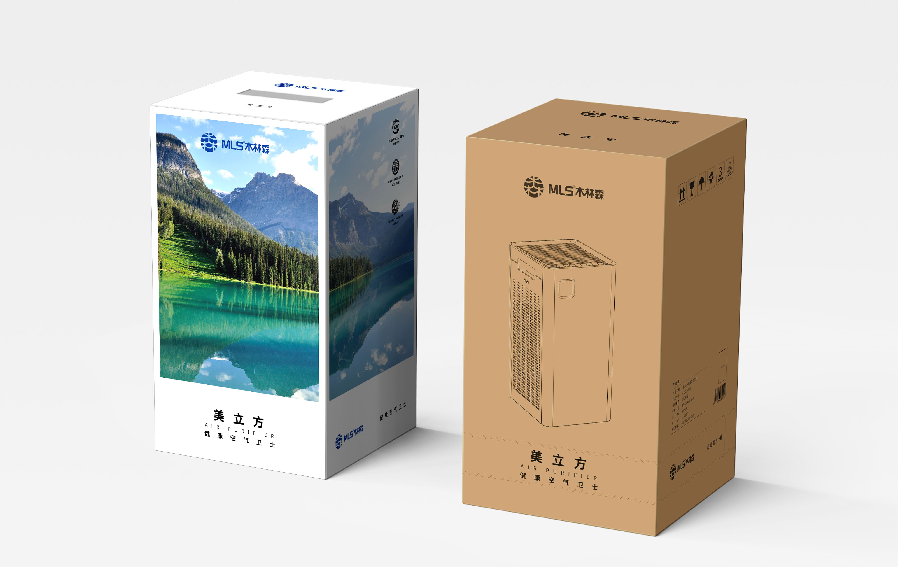
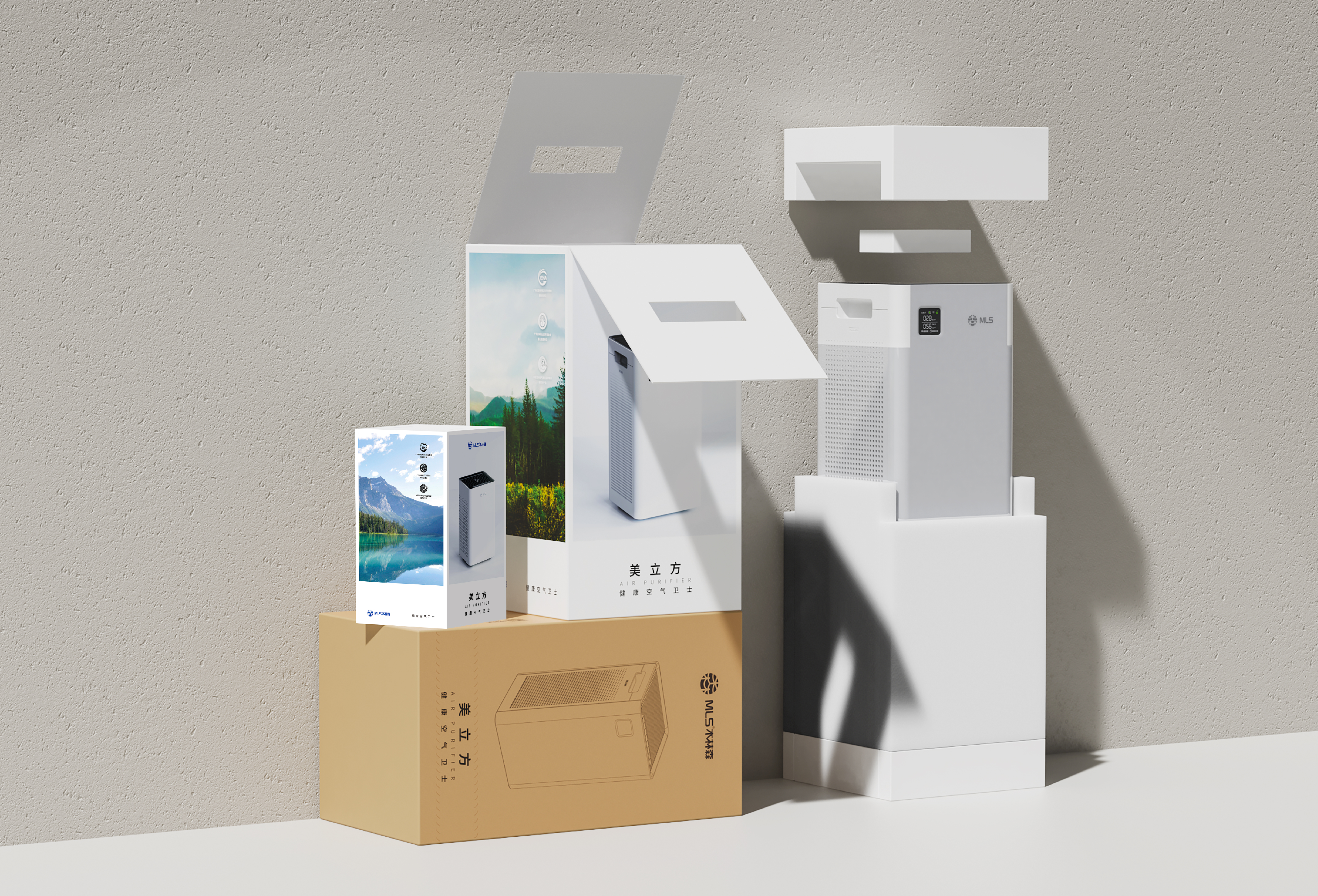
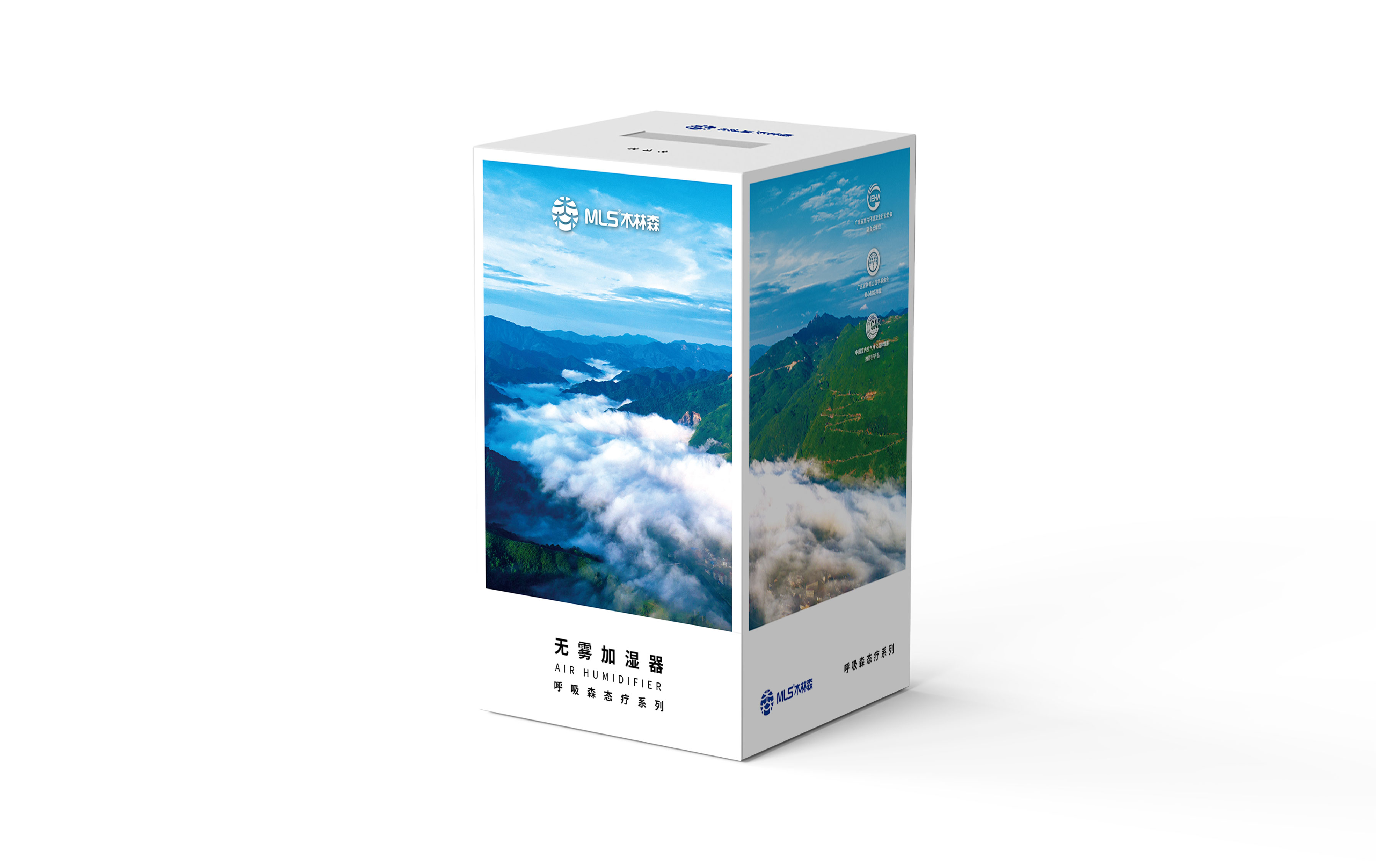
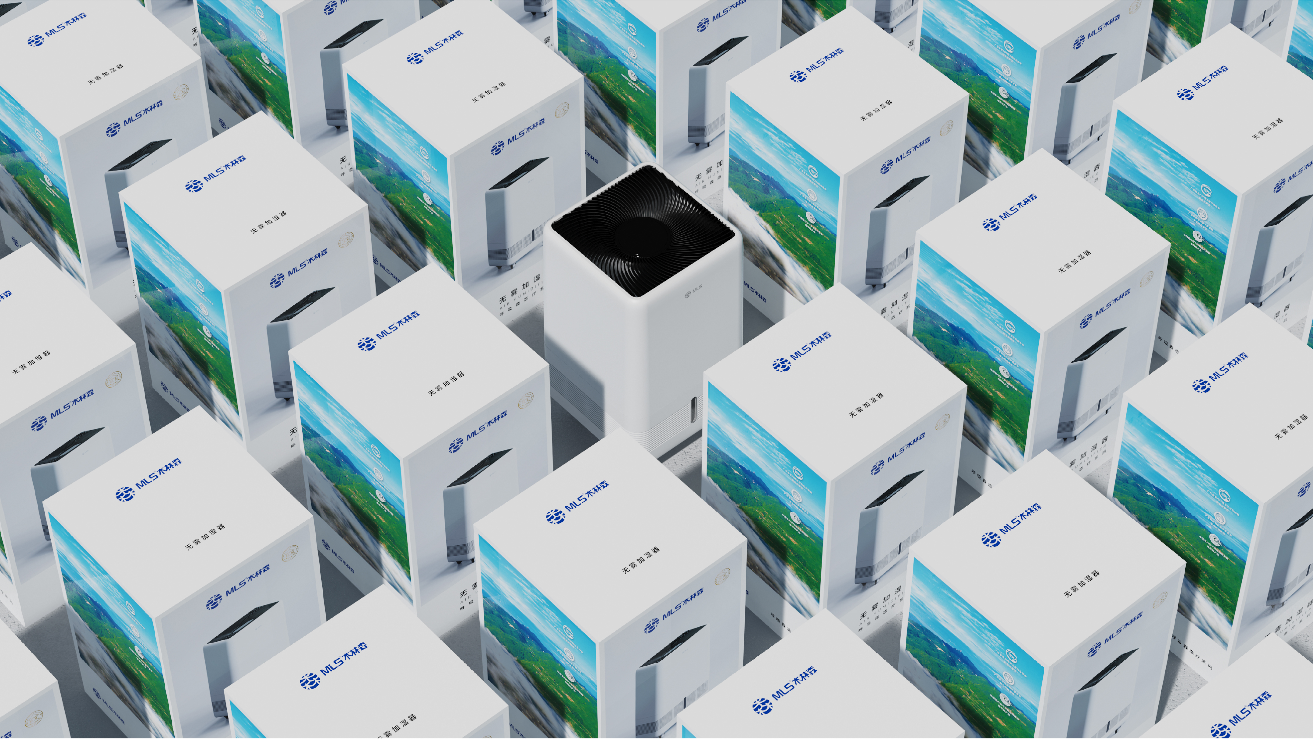
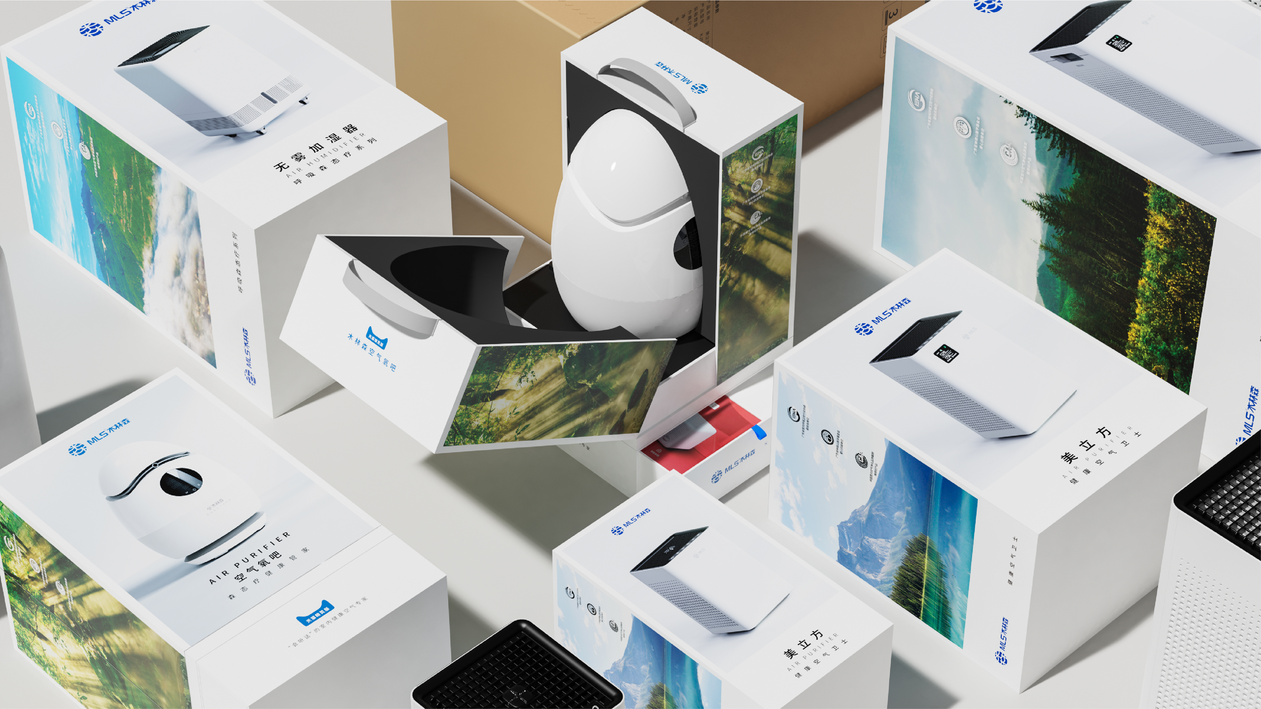
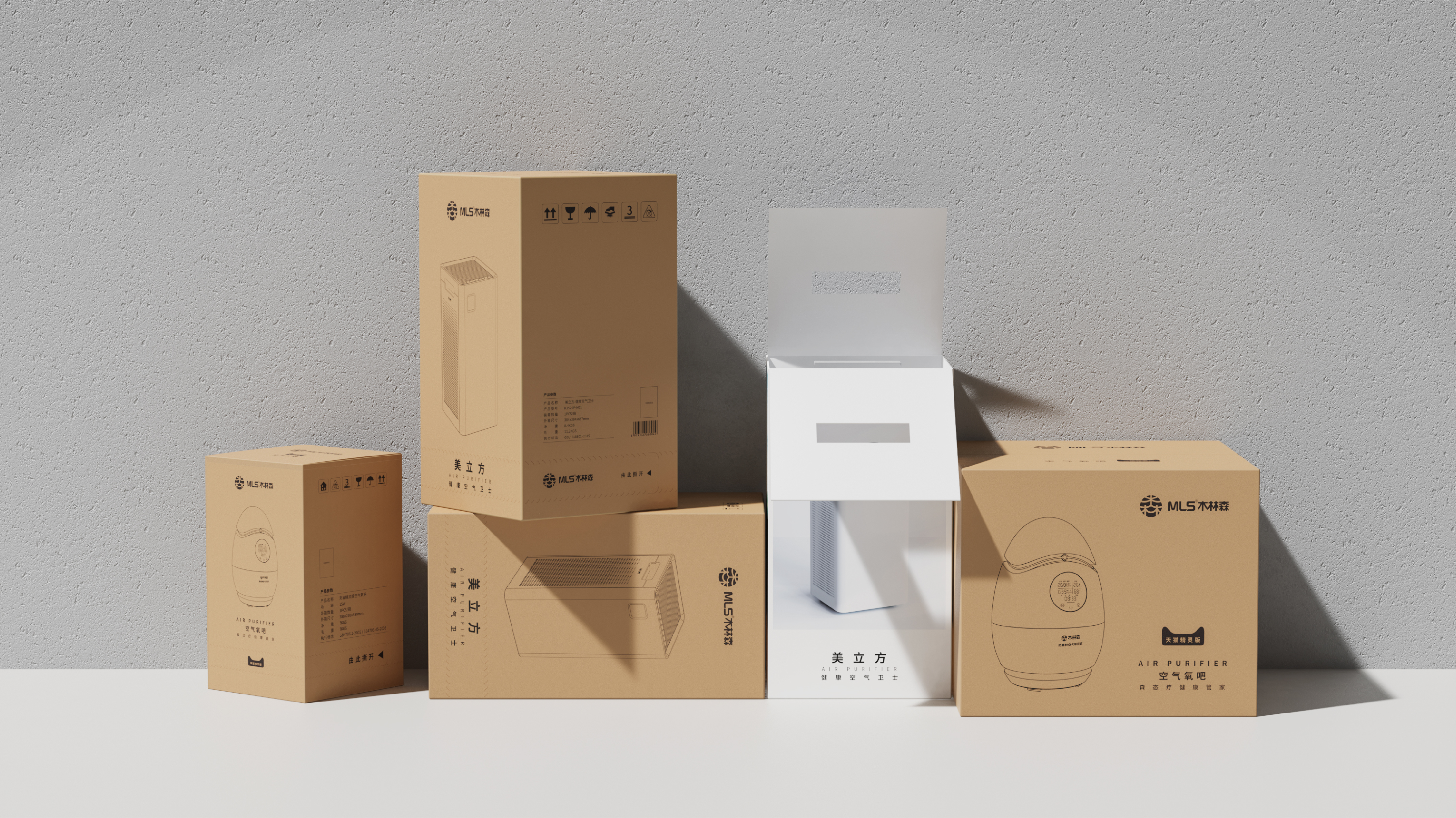

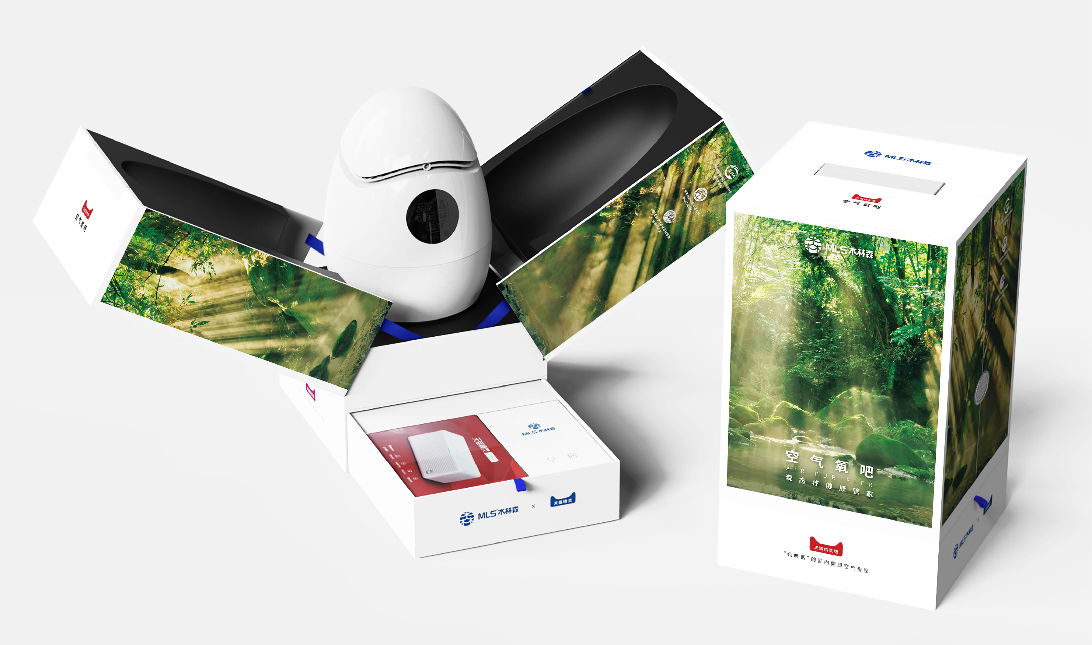
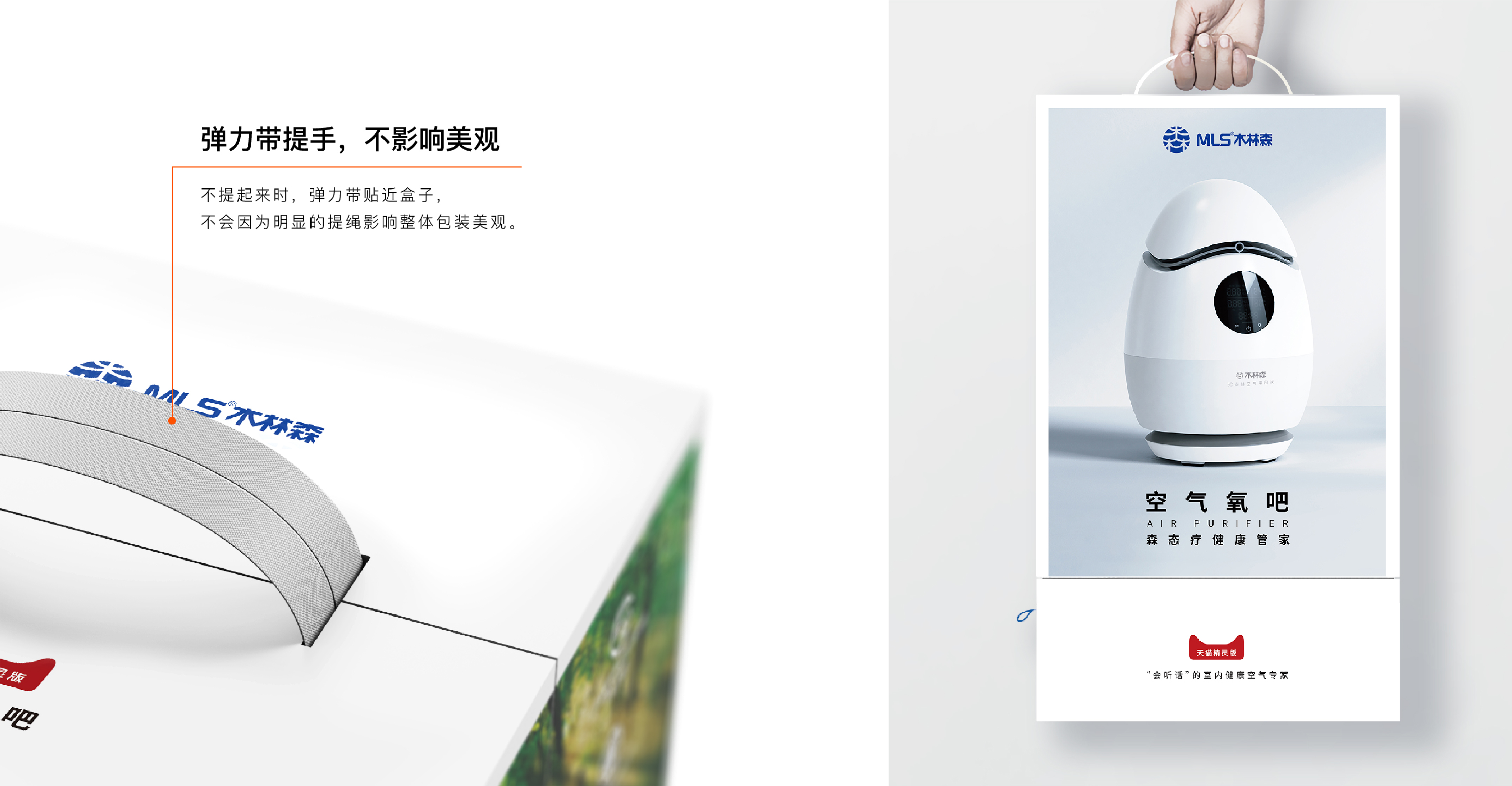
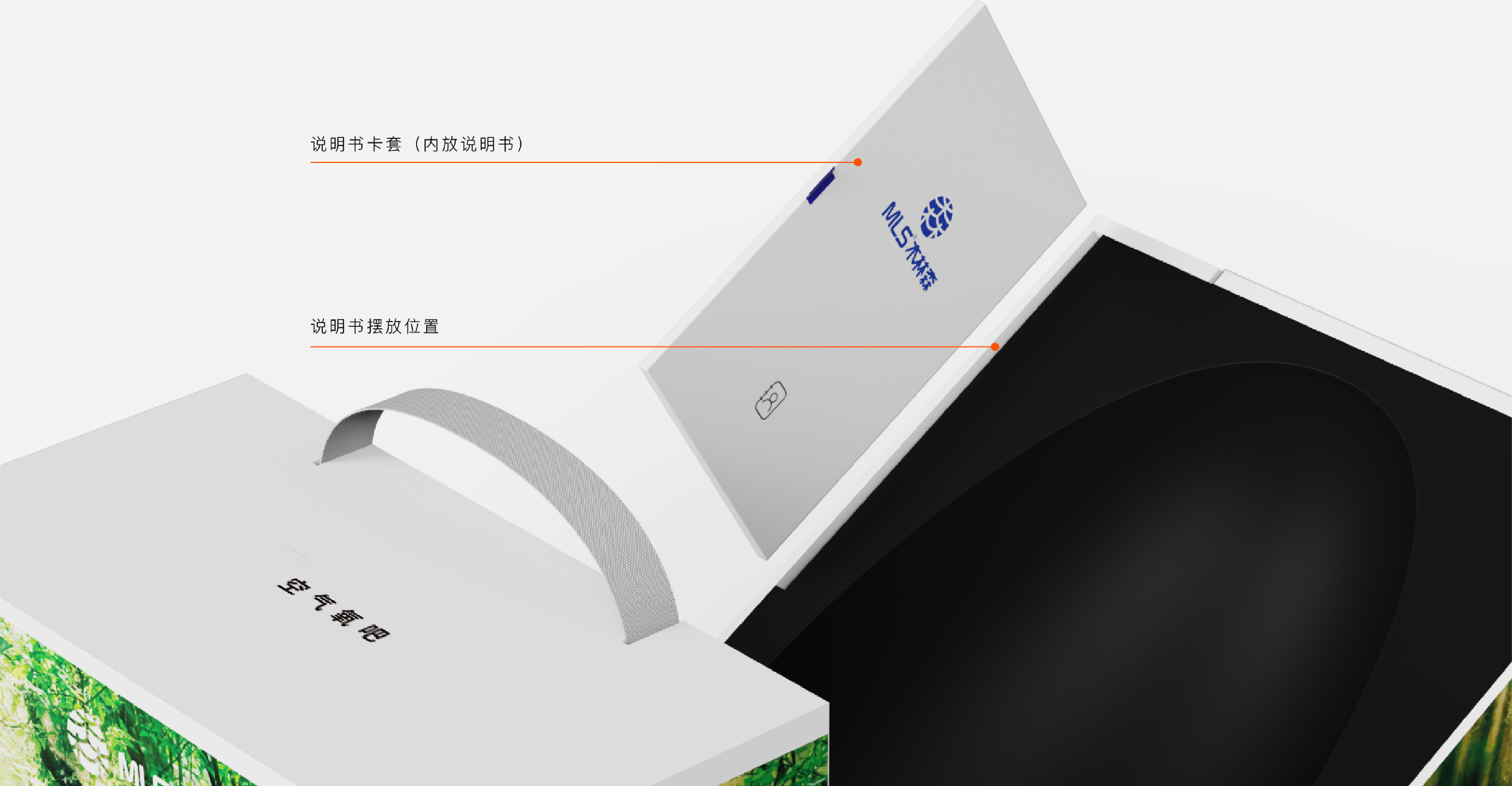
With simple and ingenious structural design, the side can accommodate instructions and charging power supply, making full use of the core space, which is both high-end and innovative.
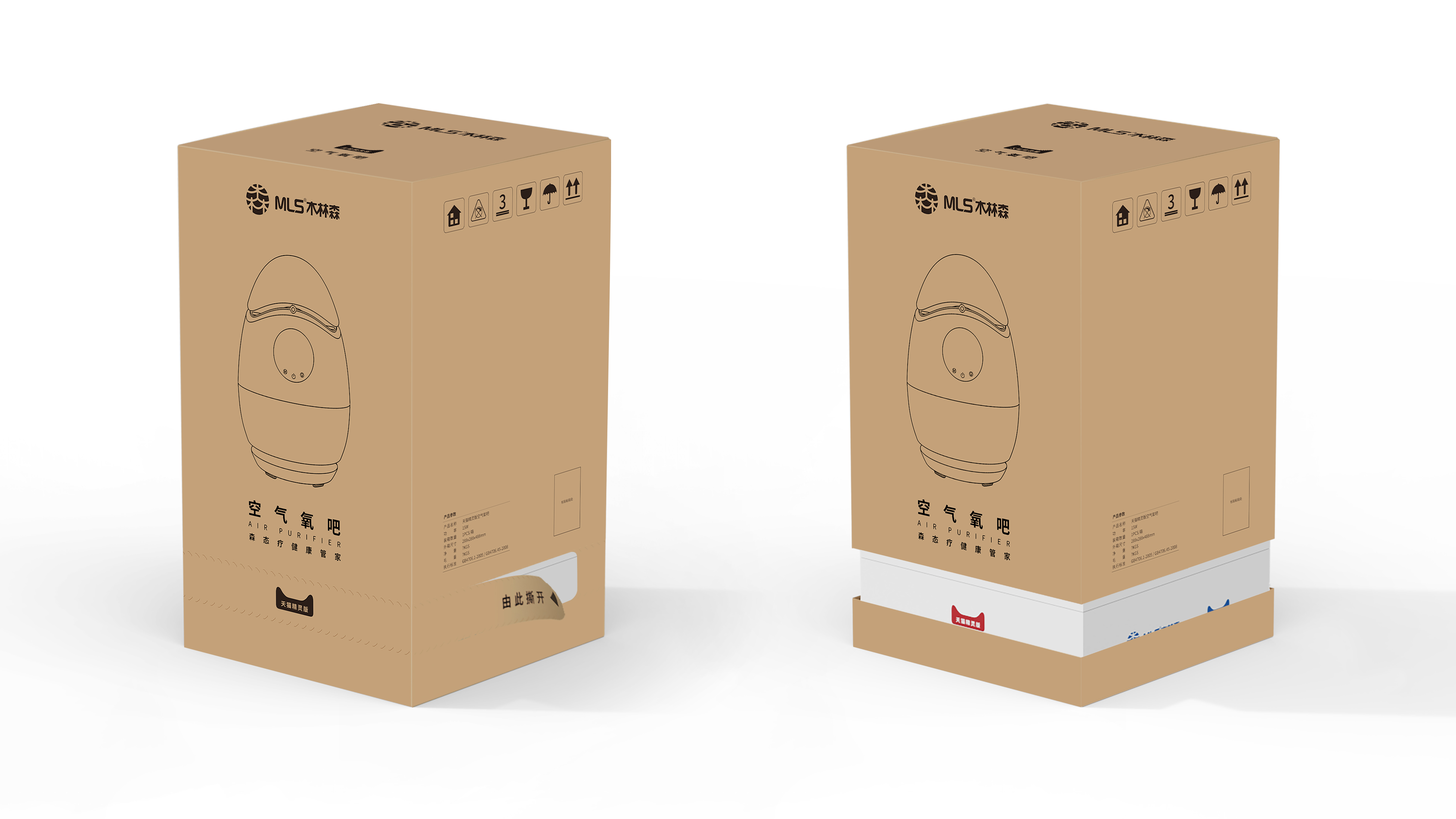
In the design of the outer packing, the air oxygen bar needs to be sold with Tmall Genie. Considering the convenience of transportation and taking, the packaging is easy to tear and pull, and the products are stacked up and down, which not only saves space, but also is convenient to take and transport.


The copyright of this work belongs to 麦芒工业设计. No use is allowed without explicit permission from owner.

New user?Create an account
Log In Reset your password.
Account existed?Log In
Read and agree to the User Agreement Terms of Use.

Please enter your email to reset your password
Strong alliance
Cow
I have heard of this brand
Like
It looks really classy.