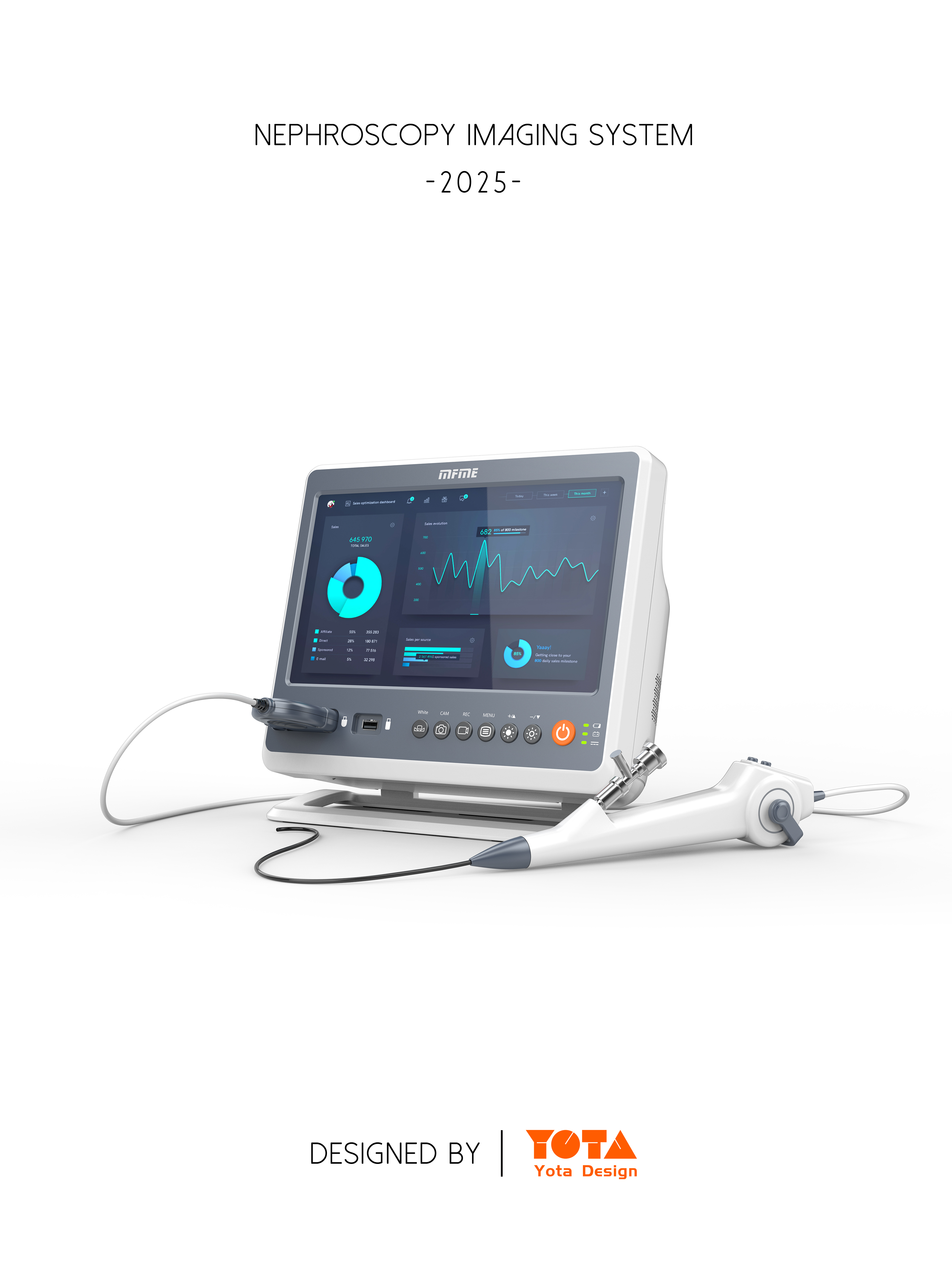
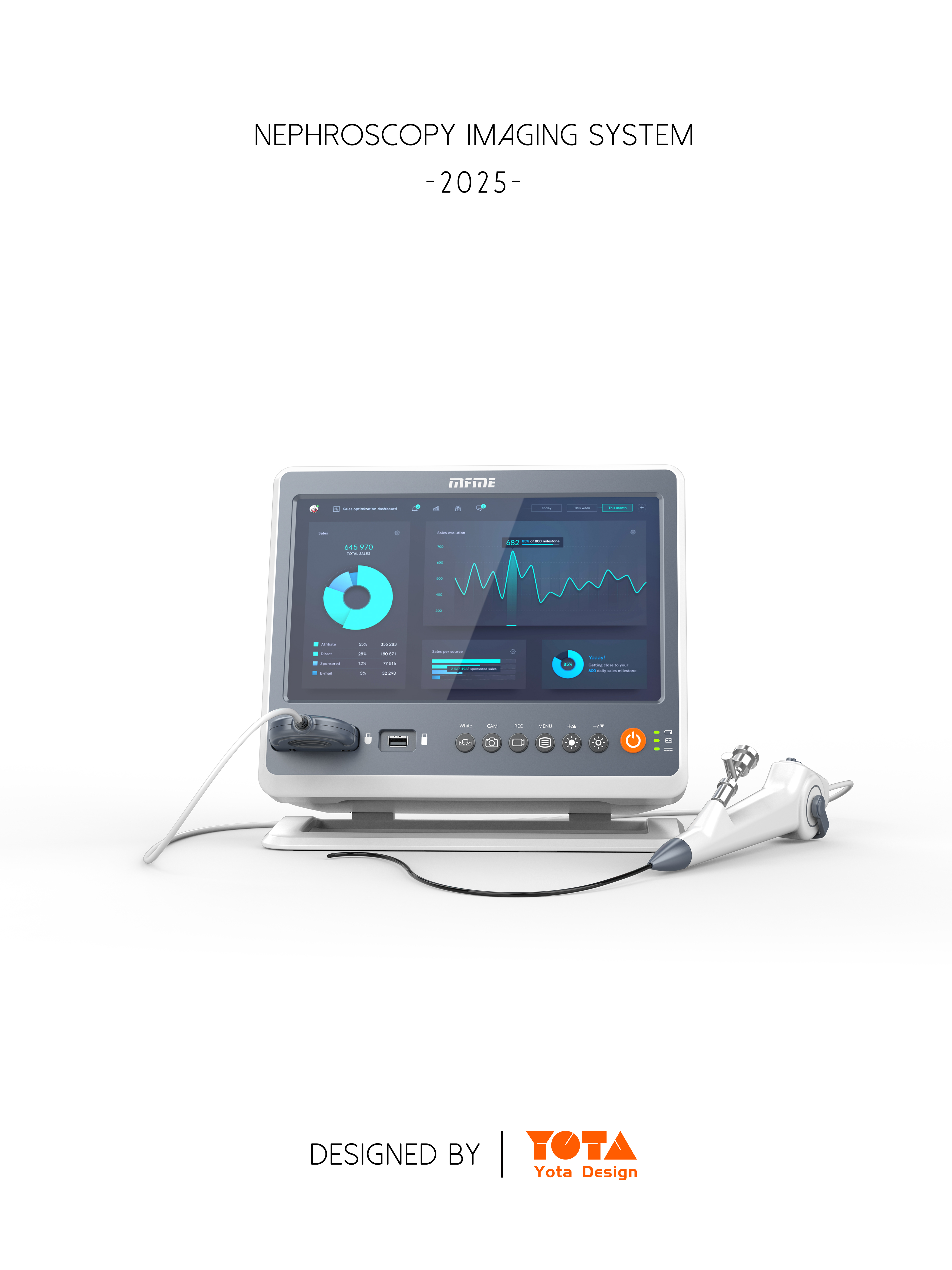
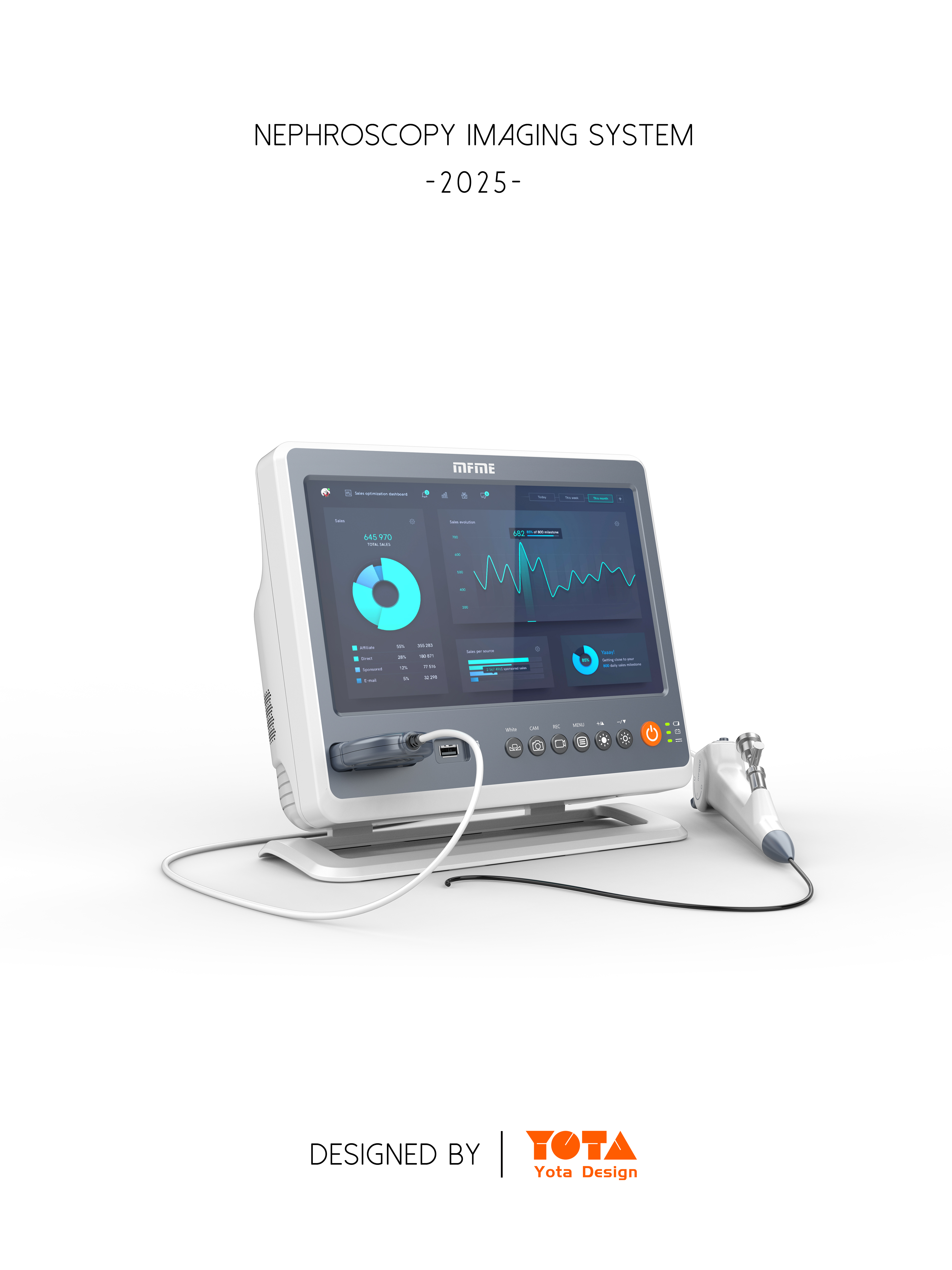
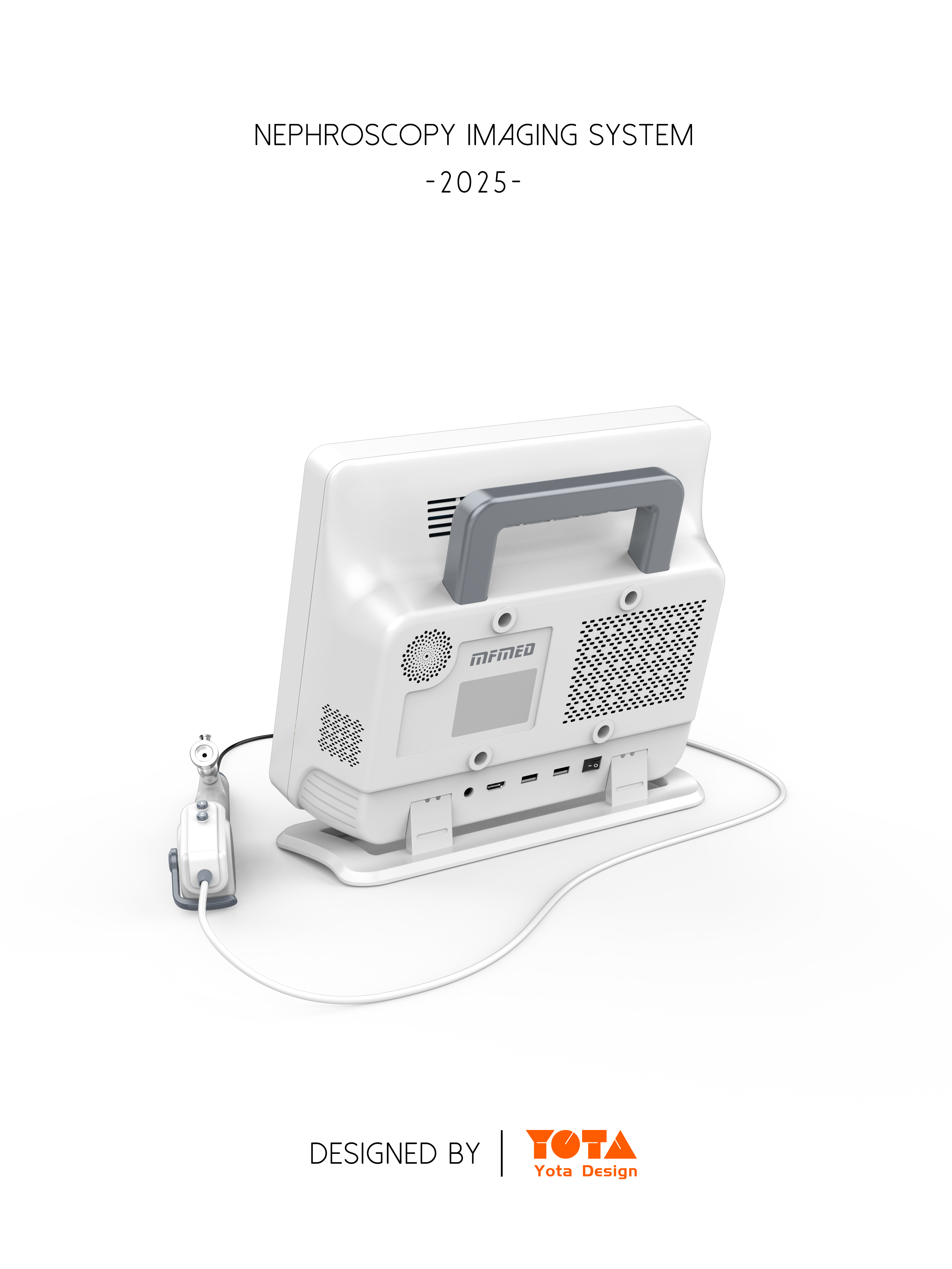
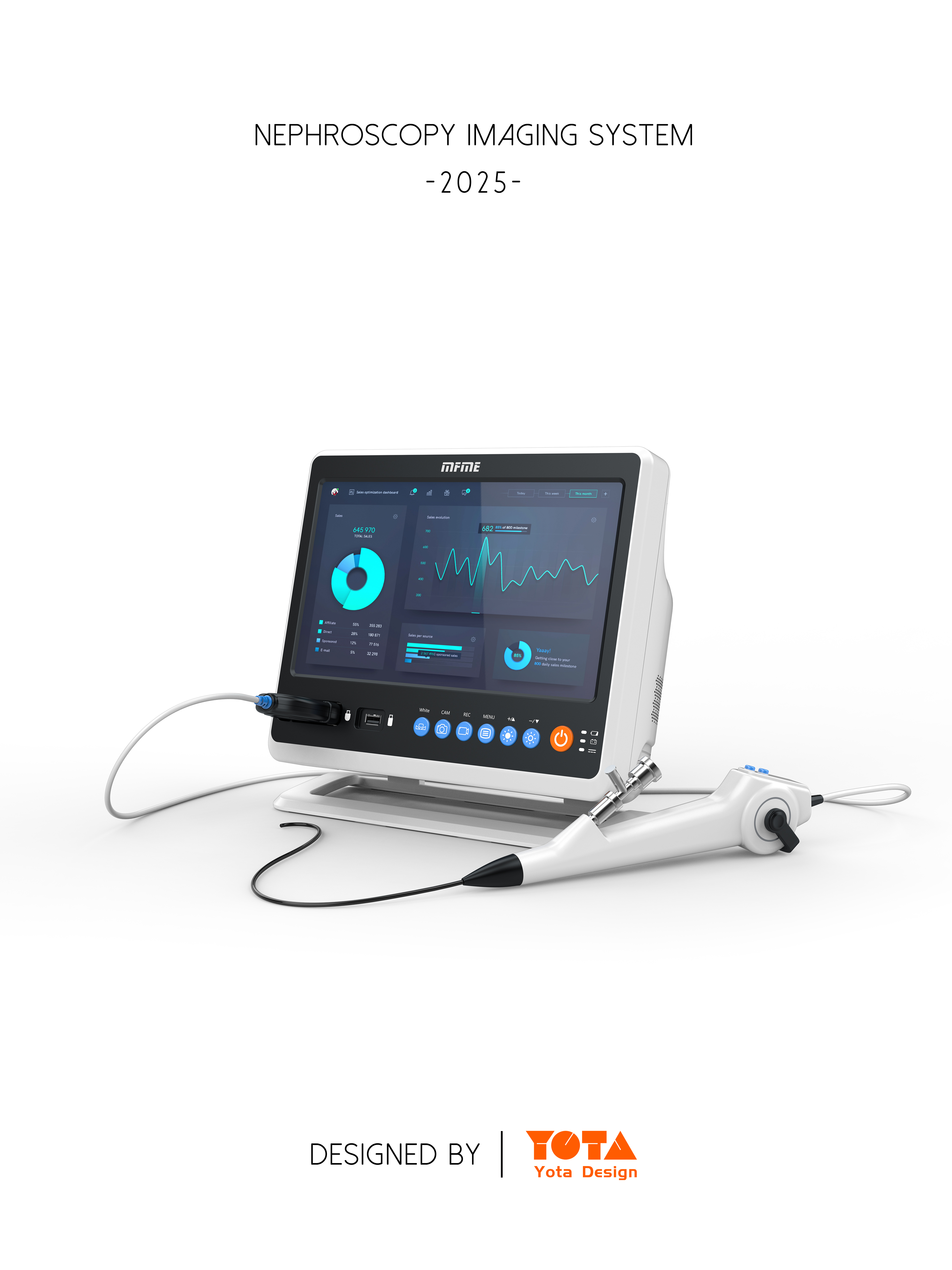
When designing the appearance of the nephroscope equipment project, the circular tower design considers ergonomics, safety, ease of use, aesthetics and other aspects. The following are some design points:
overall modeling design
1. The lines are simple and smooth: The overall lines of the nephroscope equipment are designed to be simple and smooth, avoiding overly complicated shapes and decorations. This not only conforms to the aesthetic trend of modern medical equipment, but also facilitates cleaning and disinfection, and reduces the risk of bacterial growth.
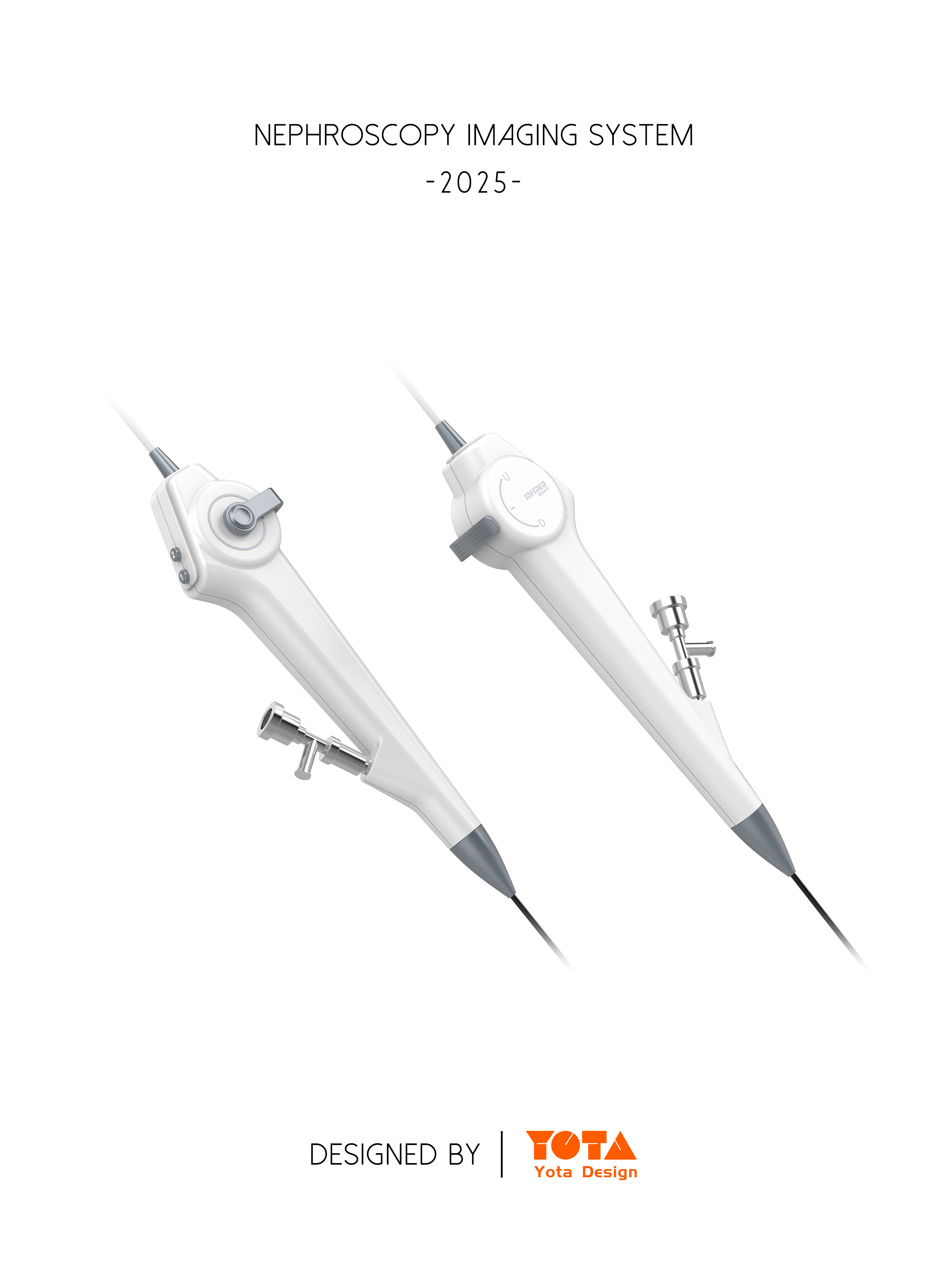
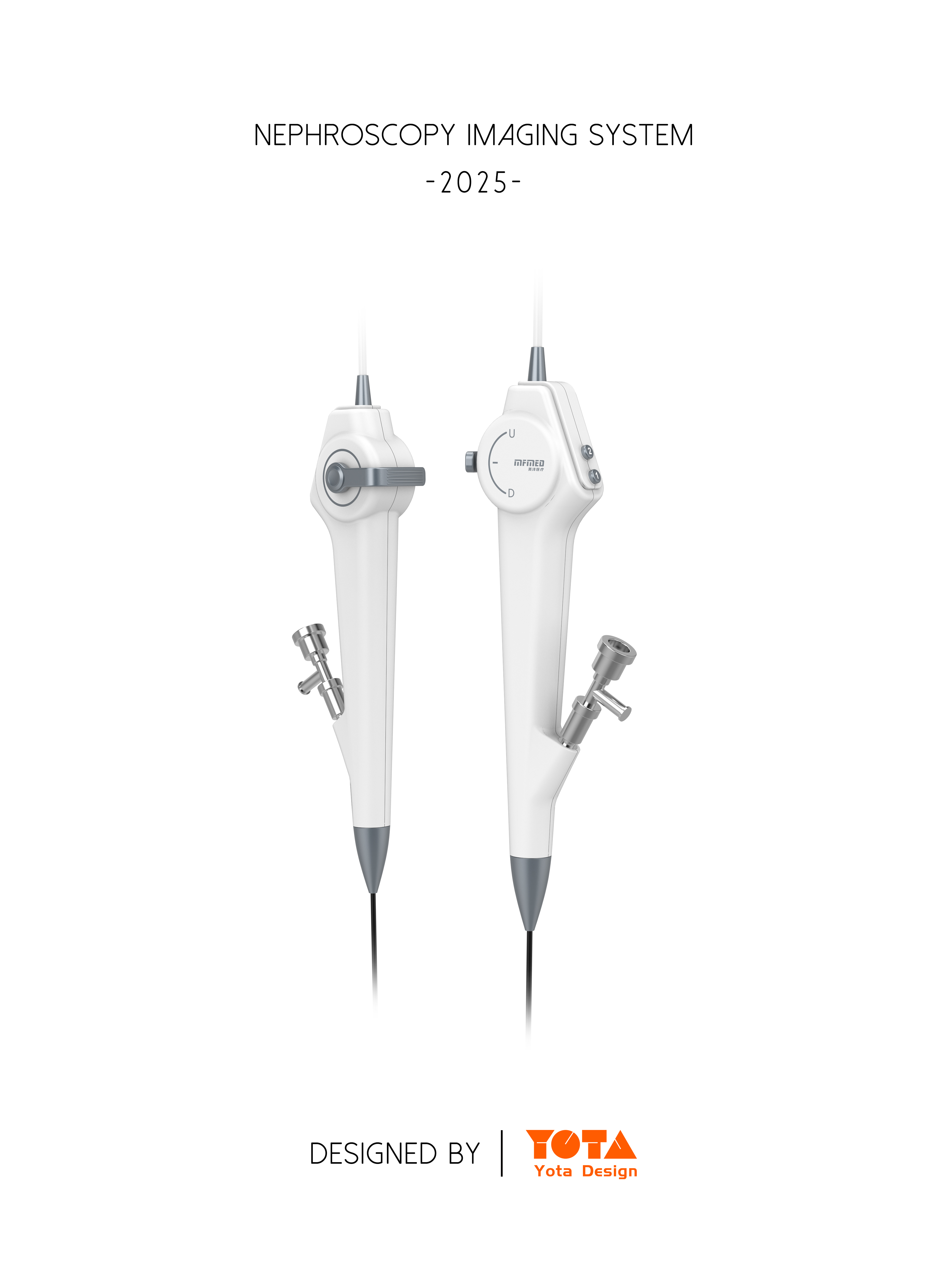
2. Comply with handheld operation: Nephroscope equipment requires long-term handheld operation by medical staff, so we consider the comfort of holding when designing. The handle part can be used in the shape of the human palm curve to ensure that the medical staff can easily and stably hold it and reduce the operation fatigue.
3. Consider device integration: We integrate the various functional modules of the nephroscope device reasonably to make the device look compact and coordinated. At the same time, each component is also designed to disassemble the structure to facilitate repair and maintenance.
Detail design
1. Corner treatment: In order to prevent patients or medical staff from being injured during use, all corners of the nephroscope equipment are rounded to ensure that the surface is smooth, without sharp corners, and achieve high safety standards.
2. Color matching
3. Choose soft colors: We use soft and soothing colors for this nephroscope device, mainly white with light gray blue. These colors can create a quiet and professional medical atmosphere, help to relieve the tension of patients, and also conform to the overall aesthetic style of the medical industry.
4. Differentiation of functional areas: We distinguish different functional areas of nephroscope equipment through different colors, which is convenient for medical staff to quickly identify and operate.
Operation interface design
1. Reasonable layout: The buttons and display screens on the operation interface have a reasonable layout, and we design and arrange them according to the frequency and importance of use.
2. Clear logo: The logo on the button and the display screen is clear and easy to understand. We use simple and clear graphics or text symbols to avoid the use of overly complex or vague logos to reduce the learning cost of medical staff and the possibility of operational errors.


it looks good
very good
It looks very professional.
Excellent
Give a compliment to the big brother