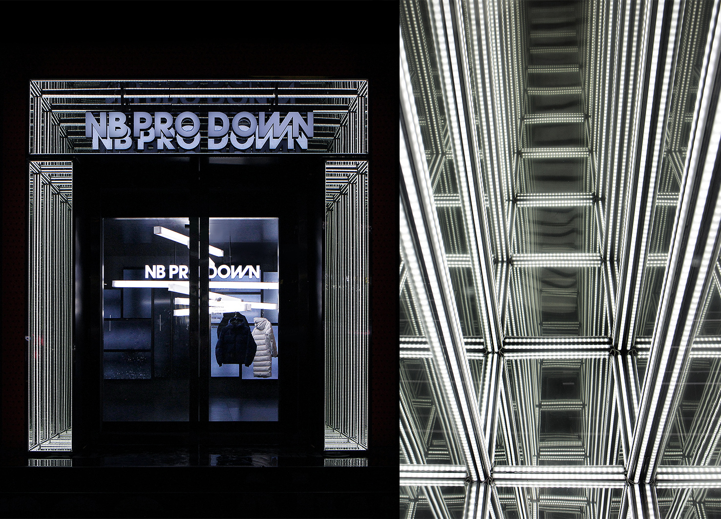
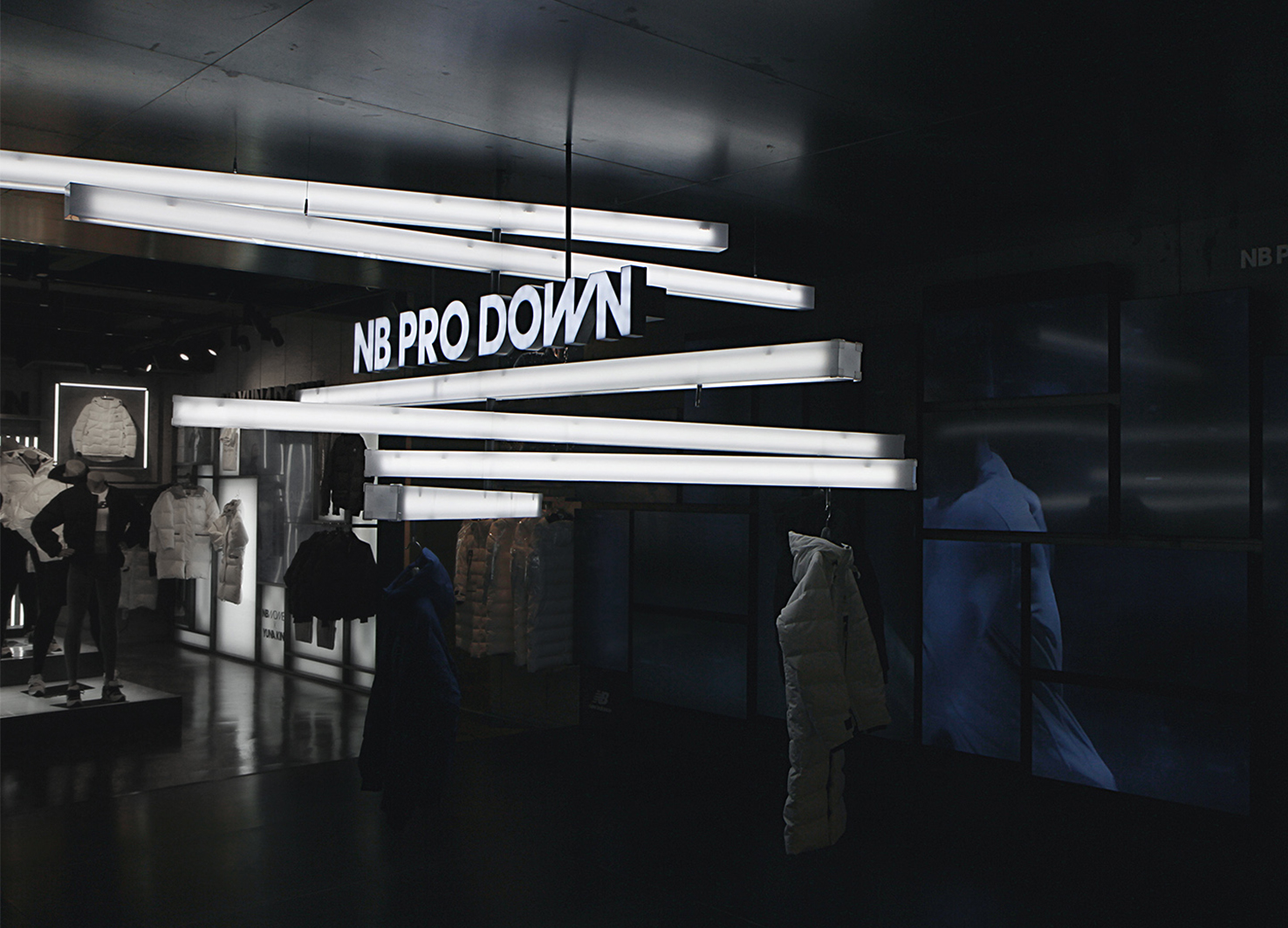
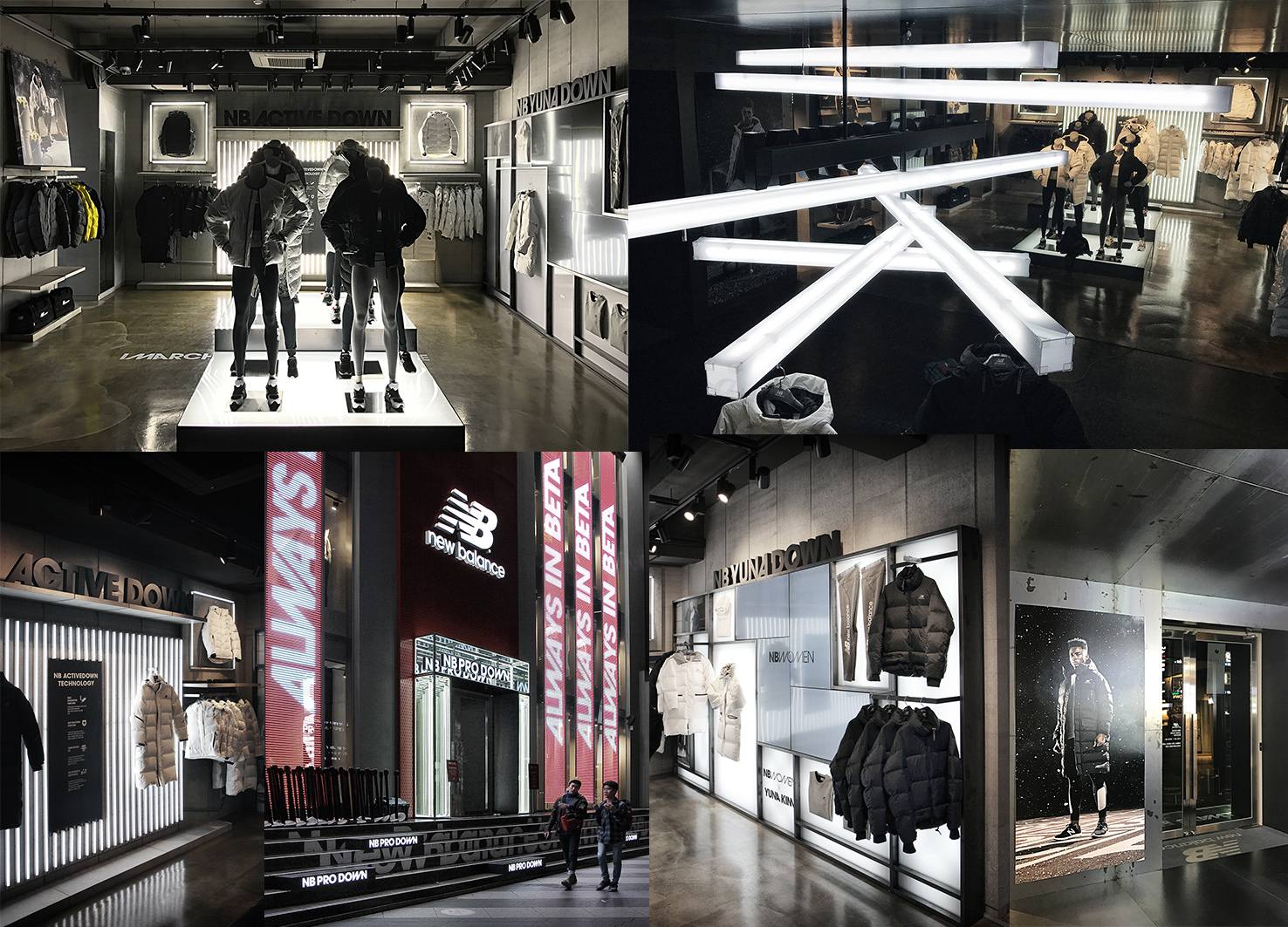
The store designed the space ba-sed on its key words. In order to express the "degree of gravity," the store used a low-powered motor to set up a mobile installation, directly displaying how the product reacts to air and wind to appeal its lightness. The facade and overall space ambiance was shaped via contrasting light and shade to express a difference in temperature. By using glass that expressed the saturation of light and dark me-tallic texture that contrasts the light clearly defined the concept, uniting the overall display into a single context.


Country
Korea
Year
2017
Client
NEWBALANCE KOREA
Affiliation
WDYW
Designer
DON KIM, HYOJUNG LEE
The copyright of this work belongs to K-DESIGN AWARD. No use is allowed without explicit permission from owner.

New user?Create an account
Log In Reset your password.
Account existed?Log In
Read and agree to the User Agreement Terms of Use.

Please enter your email to reset your password
Comment Board (0)
Empty comment