A new brand, what to grab attention?
The answer is "younger more accurately",
Today's young people have long been tired of fancy, soft adoration, exaggeration, pile of expressions,,,,,,
They believe more in a stable, clear, measured expression.
Consumers sweep the shelves in just 0.67 seconds: color is the lowest-cost, fastest-working strategic weapon.
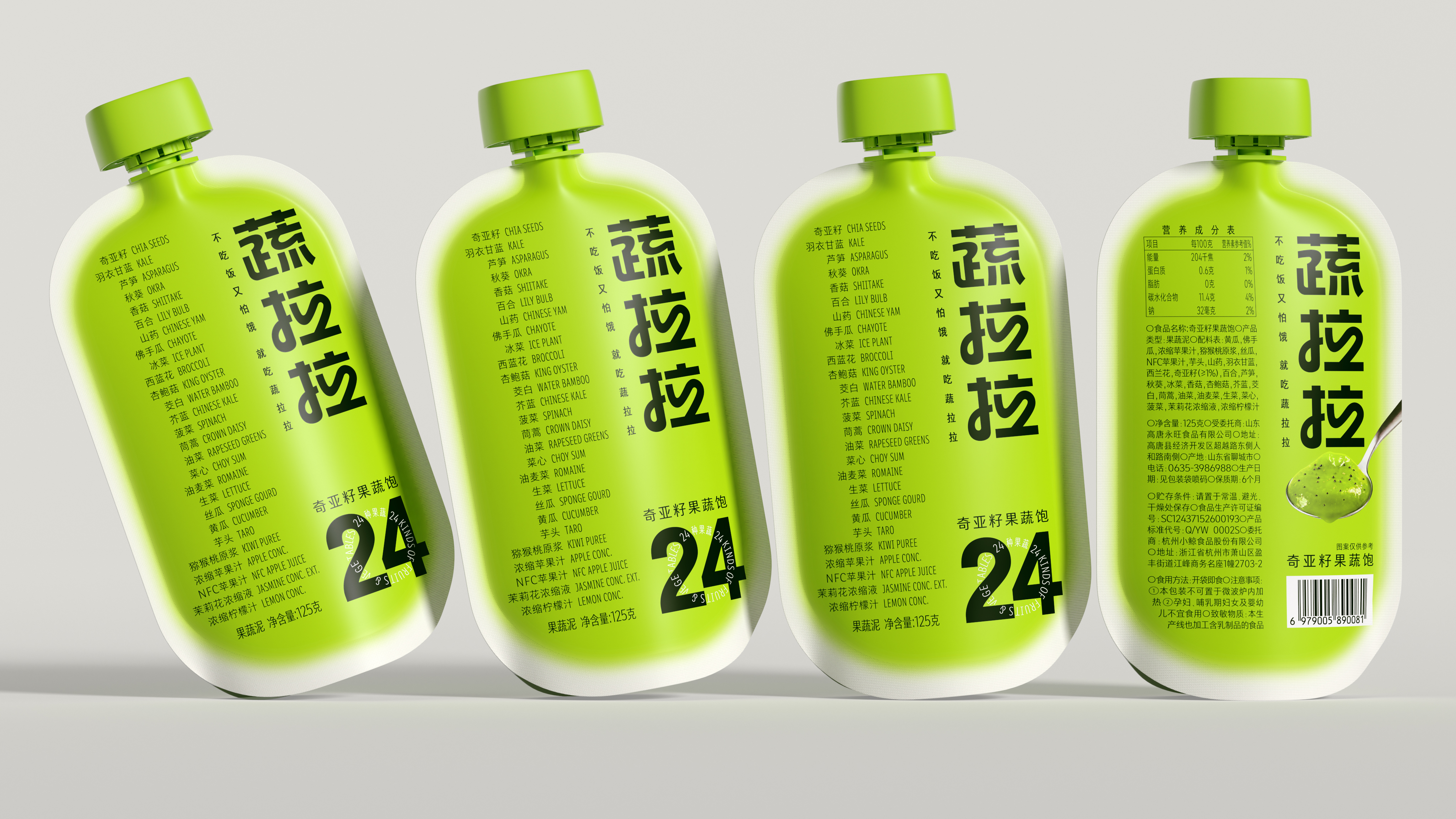
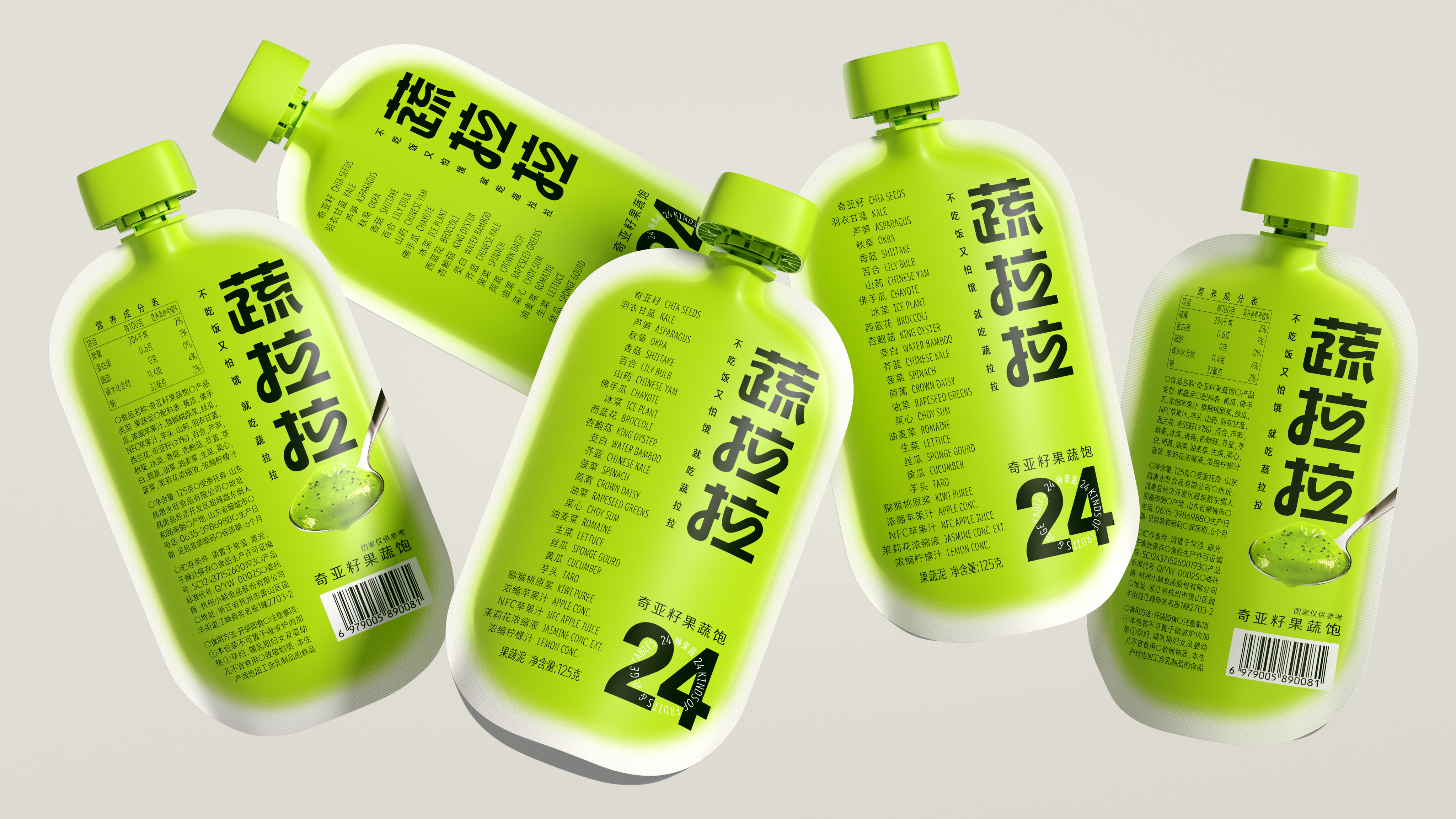
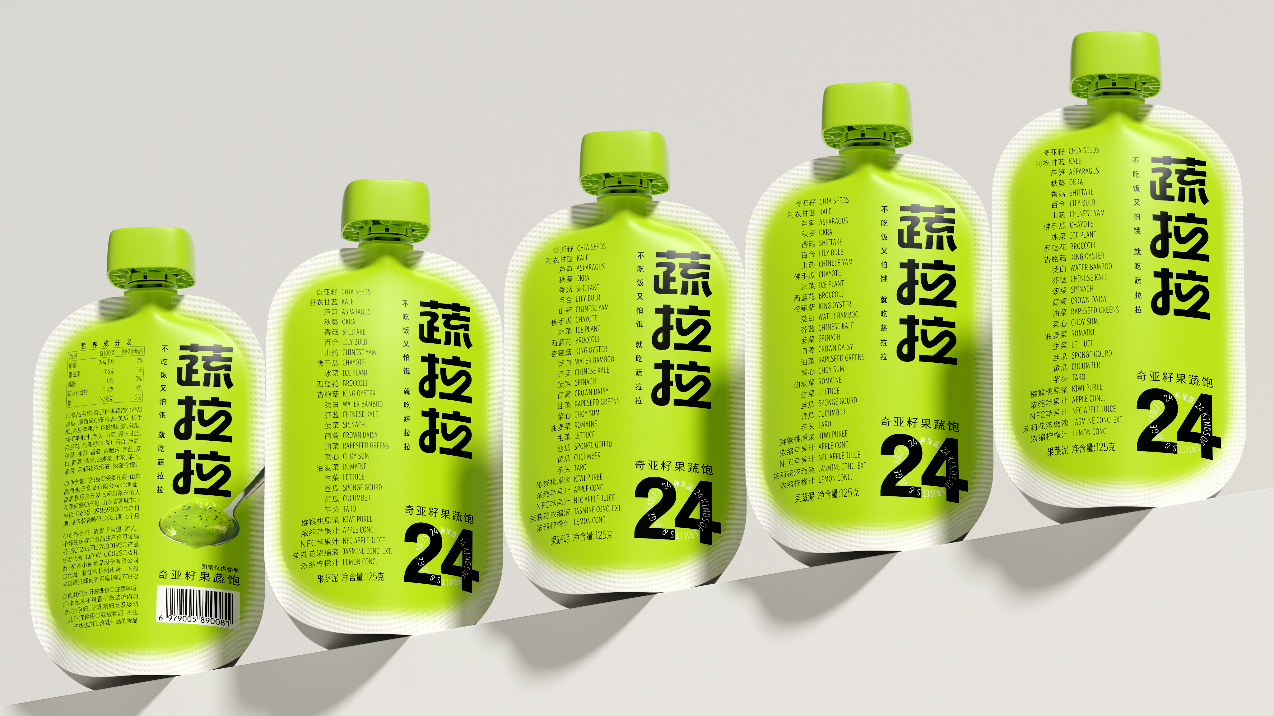
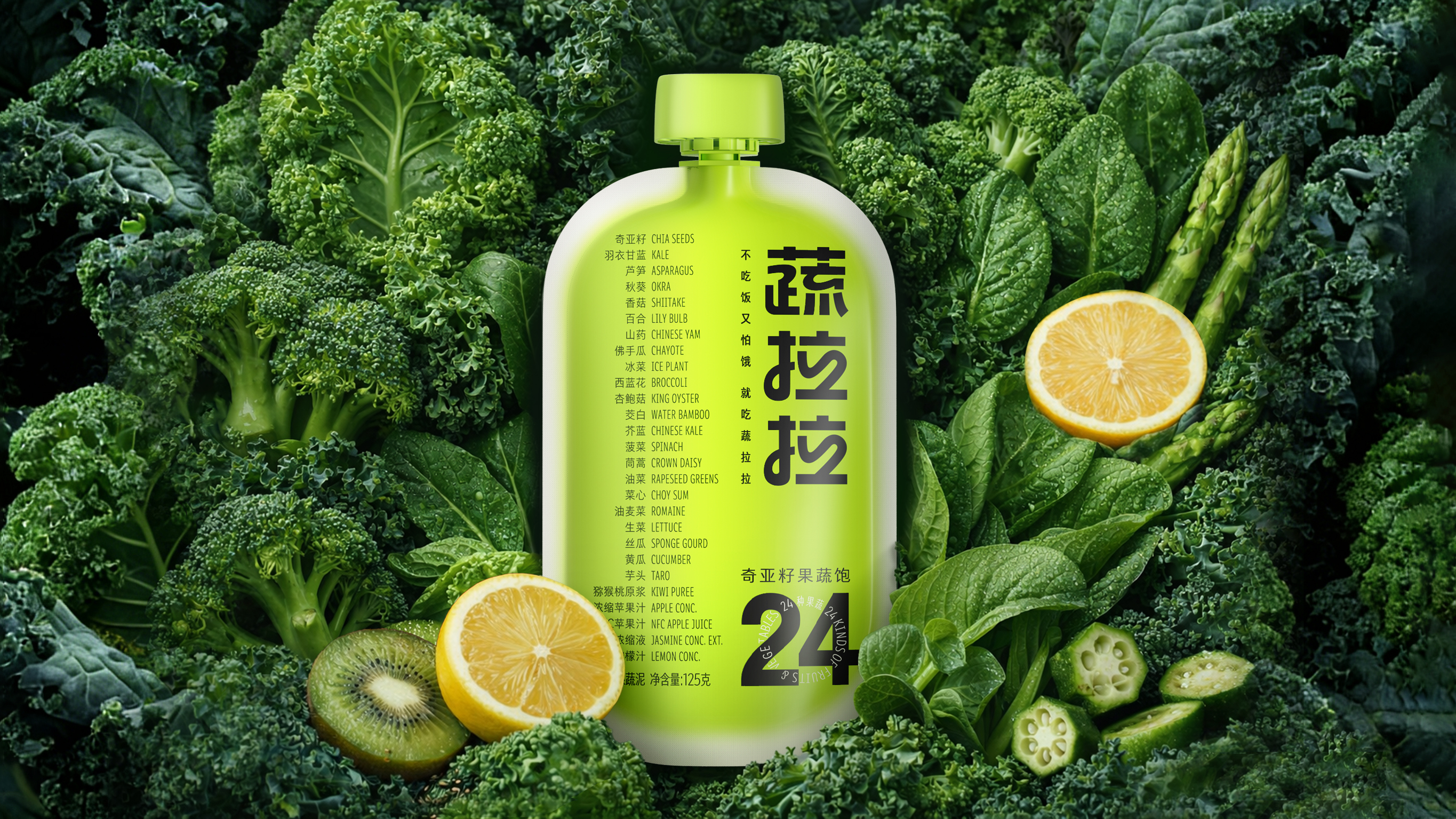
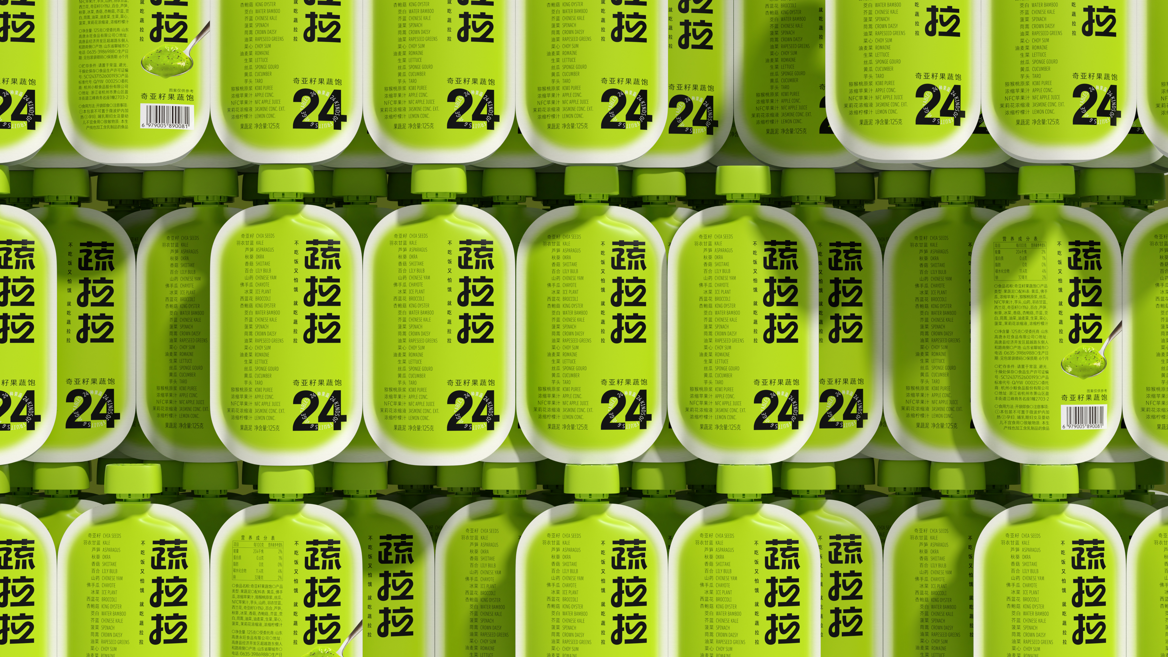
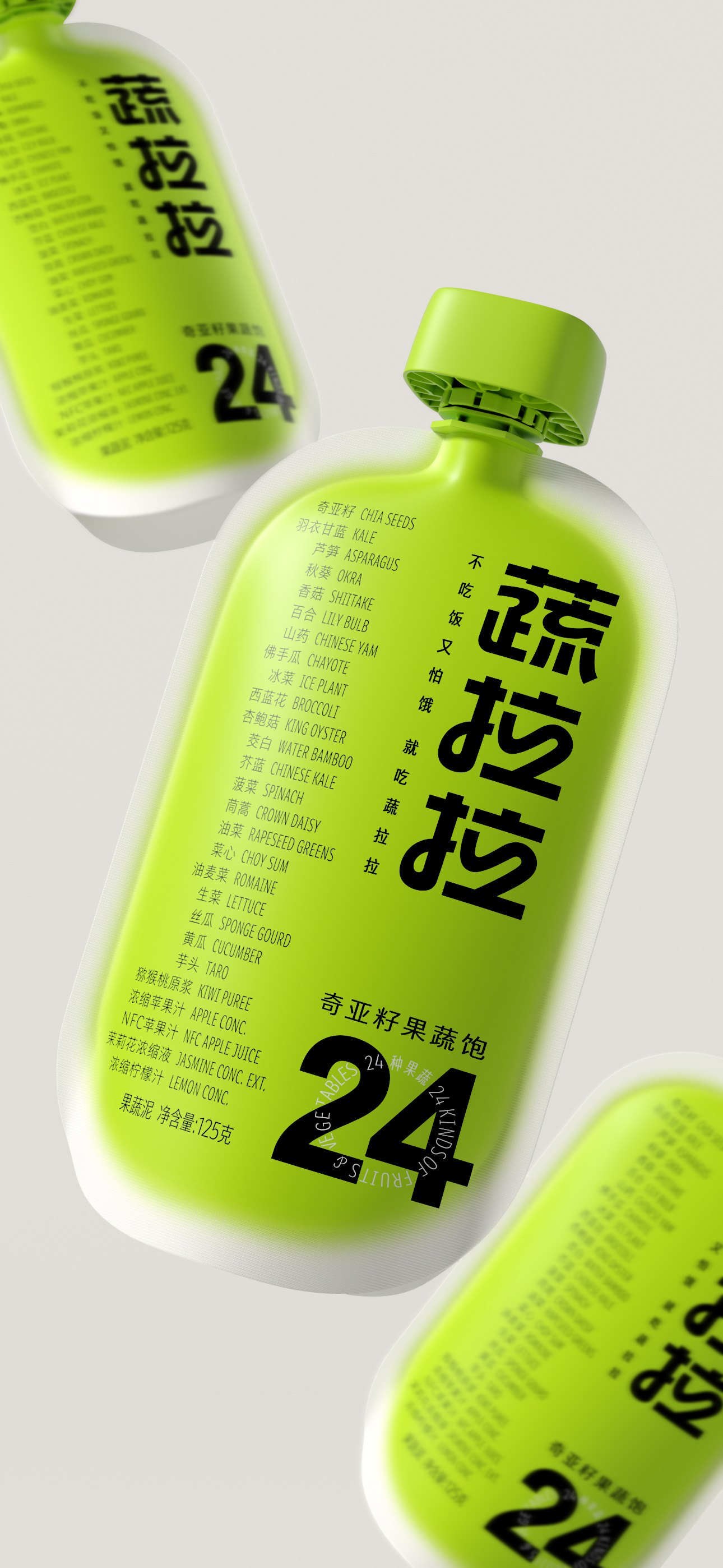
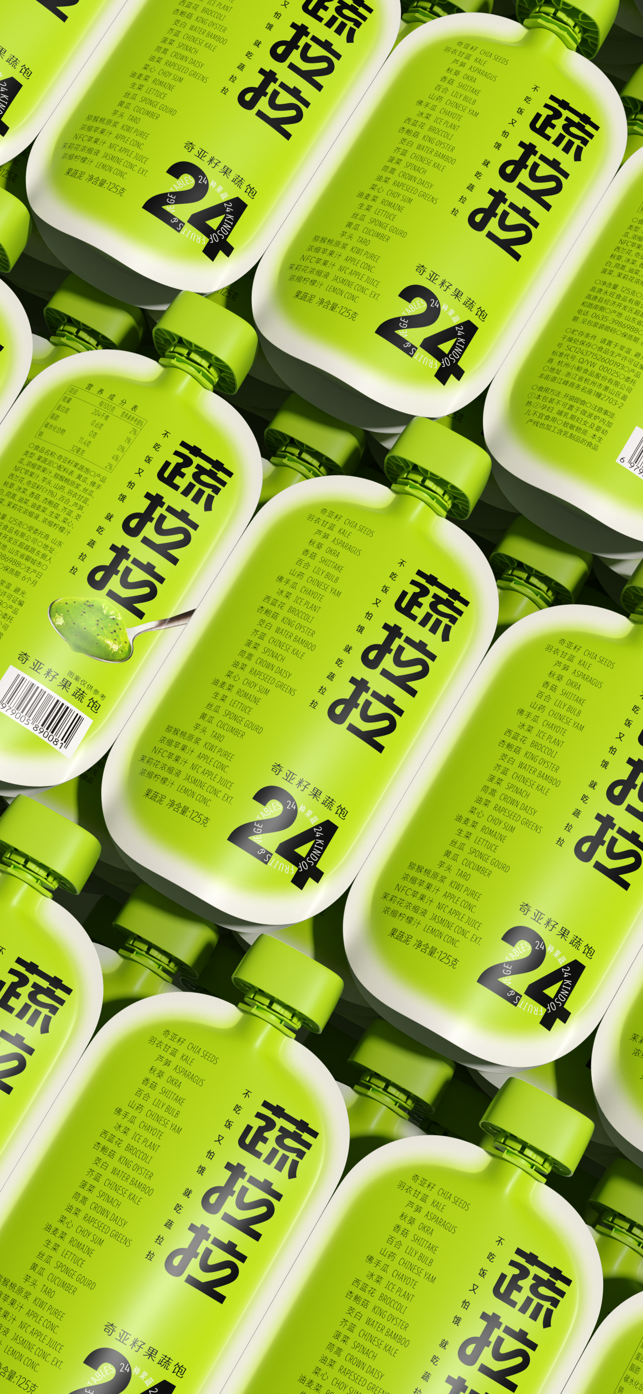
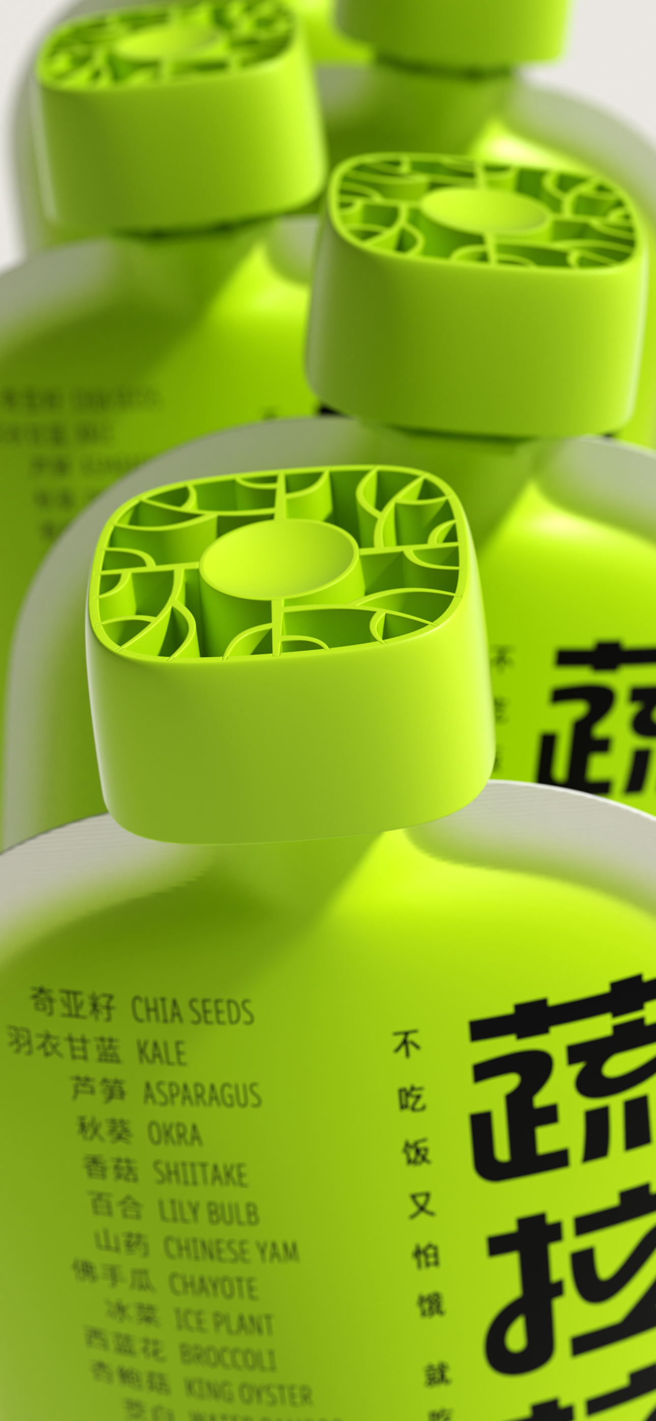
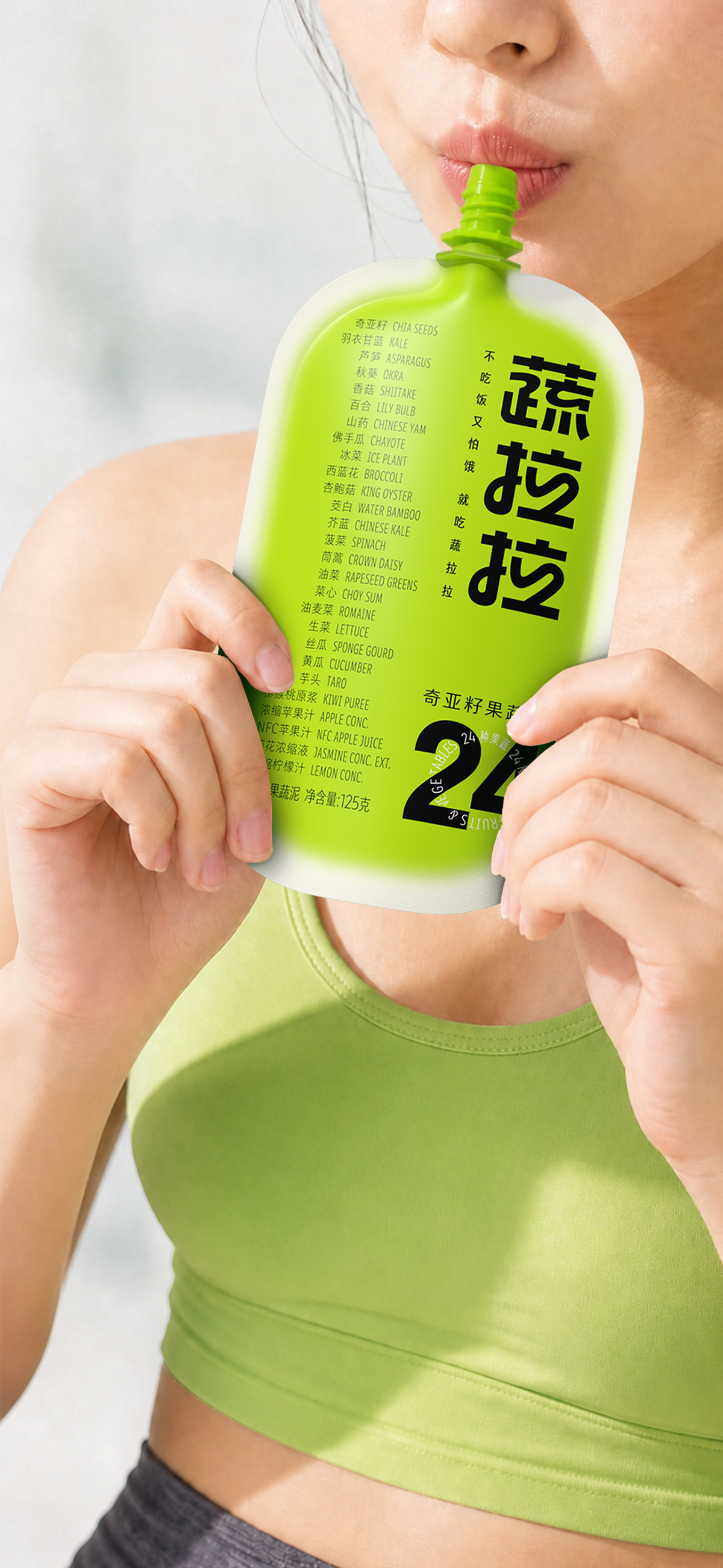
The visual core of the vegetable Lala: simple and clear colors, suitable fonts, we chose a healthy "bean green",
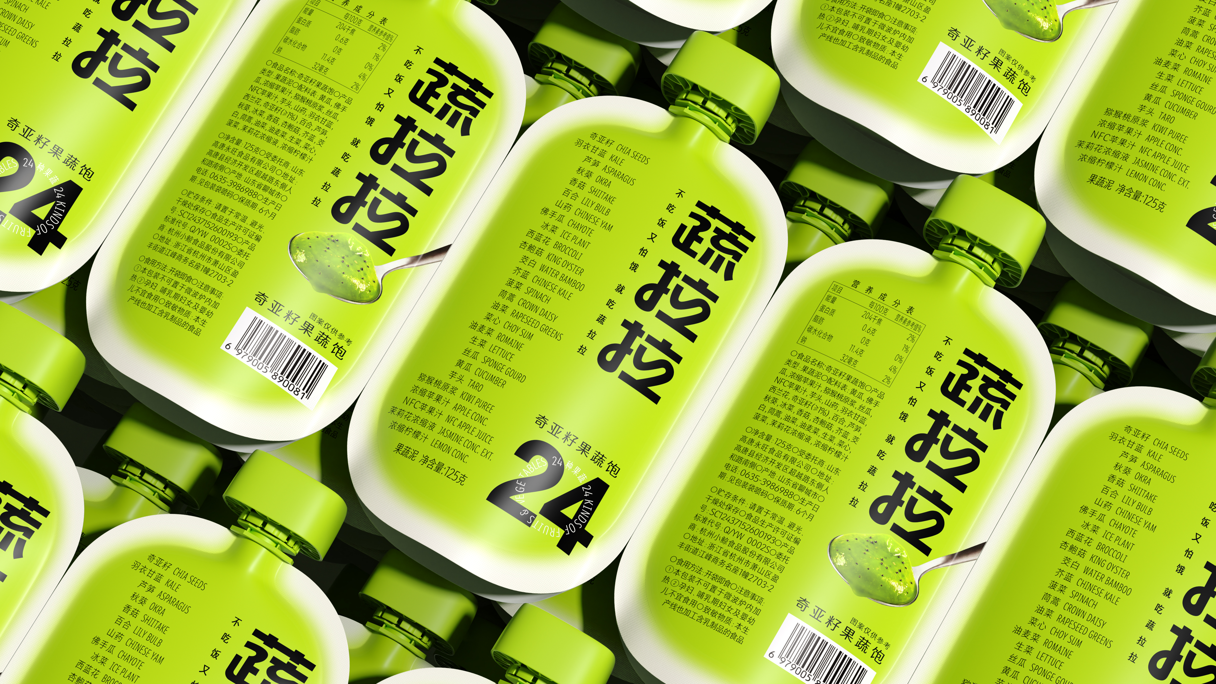
This green smear on the packaging presents a state of gathering towards the center and blooming around,
It is very similar to the viscosity and freshness of high-concentration fruit and vegetable puree when it is stirred, which is the infinite vitality of the brand.
To a soothing mood, relax the temperament to convey to consumers,
A pack of fruits and vegetables full, can be relaxed, daily, no burden.
Name of Work | Vegetable Lalachia Seeds Fruits and Vegetables Full
Brand Hold | Shandong Gaotang Yongwang Food Co., Ltd.
Original Design | Tiger Pan
Executive Design | Xia Xuedan Chen Xiaoyue
Visual Presentation | Zhu Yuling
Craft Presentation | Xie Zhangkun and Lu Miaorong
Project Management | Peng Lei
Media Relations | Xiang Lingli

The copyright of this work belongs to 潘虎设计实验室. No use is allowed without explicit permission from owner.

New user?Create an account
Log In Reset your password.
Account existed?Log In
Read and agree to the User Agreement Terms of Use.
Please enter your email to reset your password



Interesting
This look is old and nutritious.
Comfortable packaging