CONCEPT
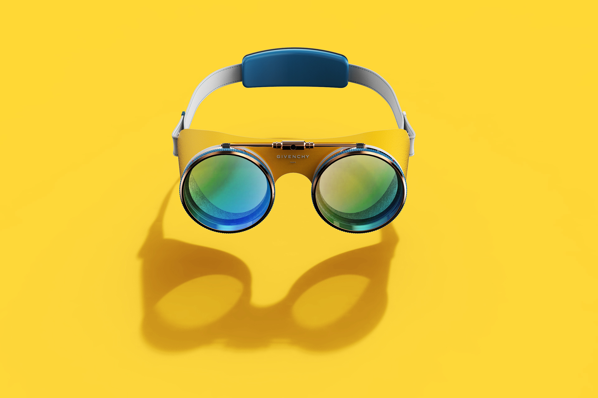
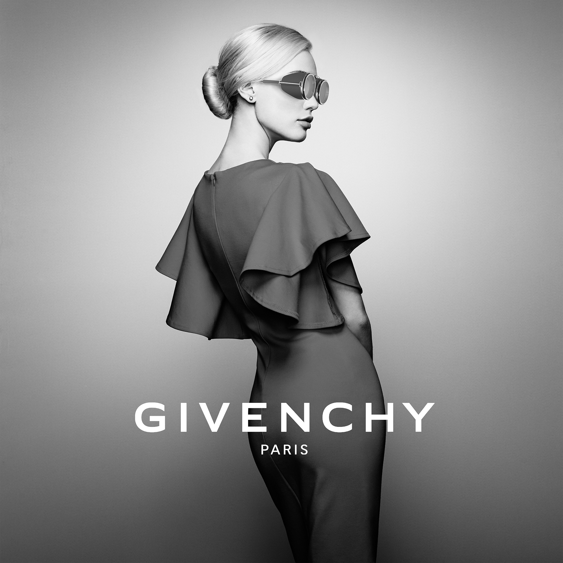
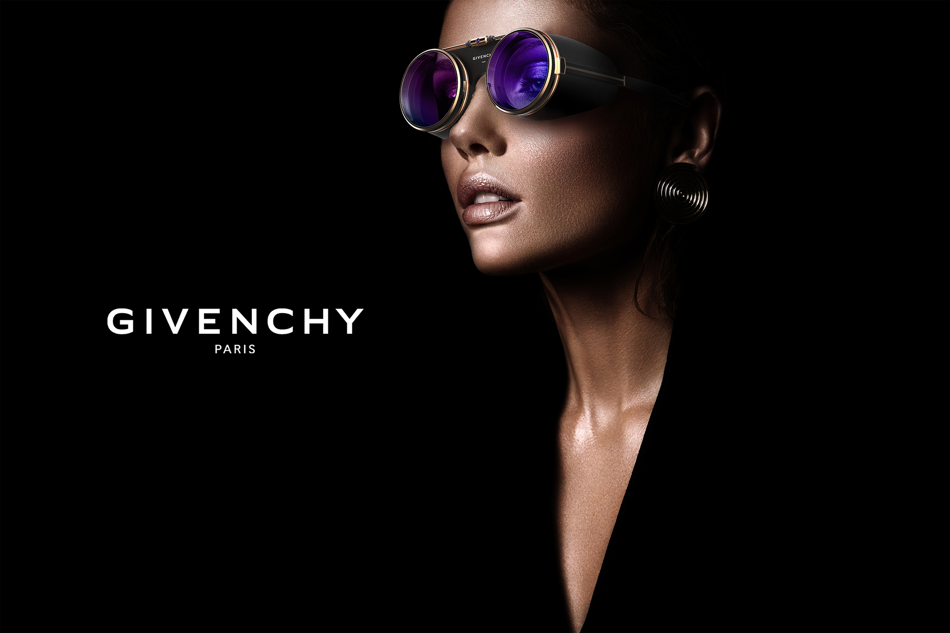
Givenchy x VR
KEYWORD
Reversal / Contrast / Mixed Match / VR & AR
STORY
This product, which contains the charm of Givenchy, can experience both VR and AR simultaneously.
Combining virtual reality and augmented reality allows you to enjoy content more realistically and
look stylish when viewed from outside.
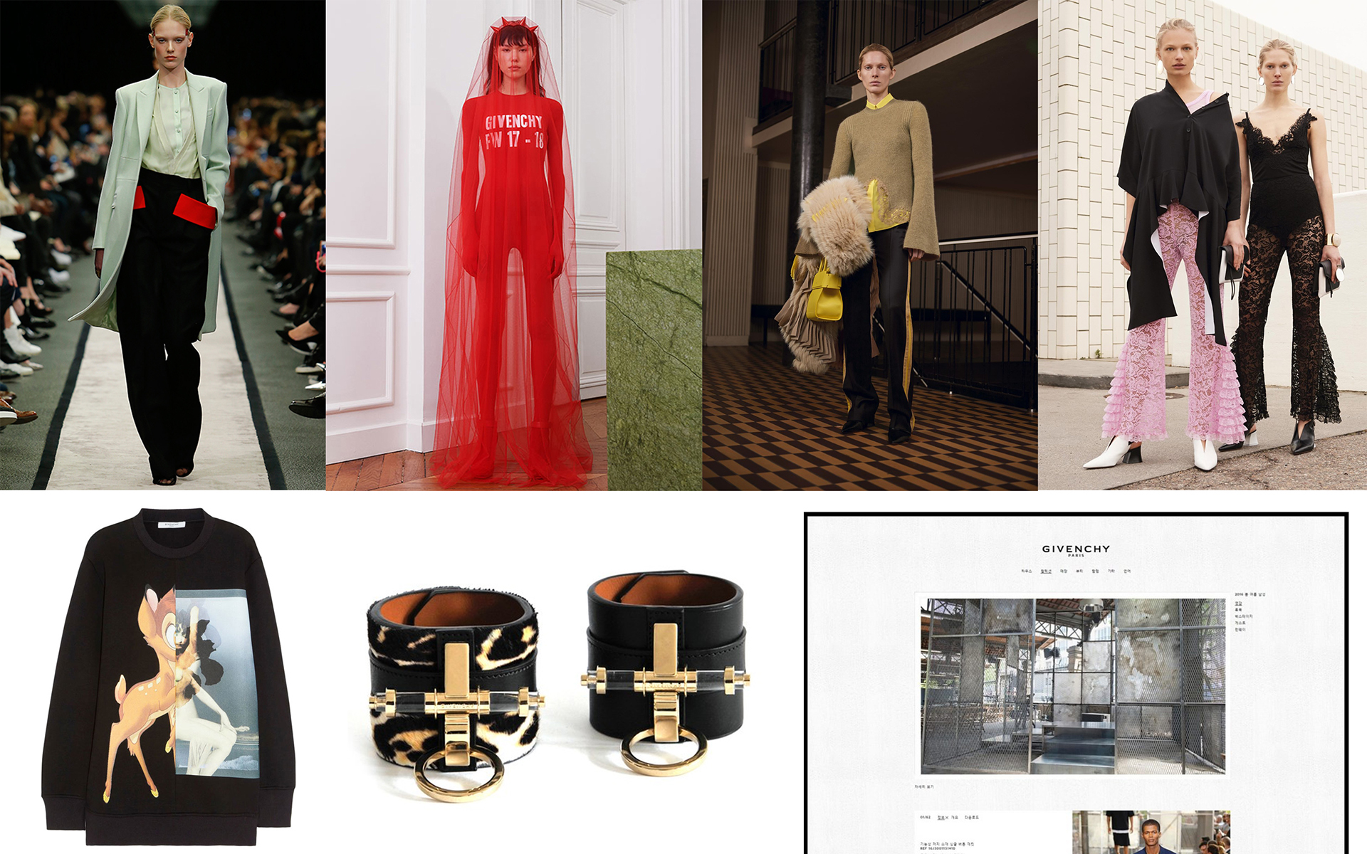
Modern Givenchy presents a contrasting element in terms of material, color, and product characteristics.
For example, the material prepared for see-through and span, a intense color in a comfortable color,and linear shape in a streamlined shape etc.
Givenchy's website also emphasized the contrast between the white colored background and the thin black colored frame.
So I went ahead and focused on this sort of contrast and mixing match.
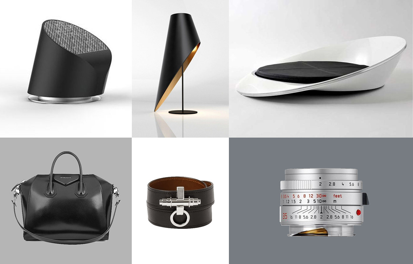
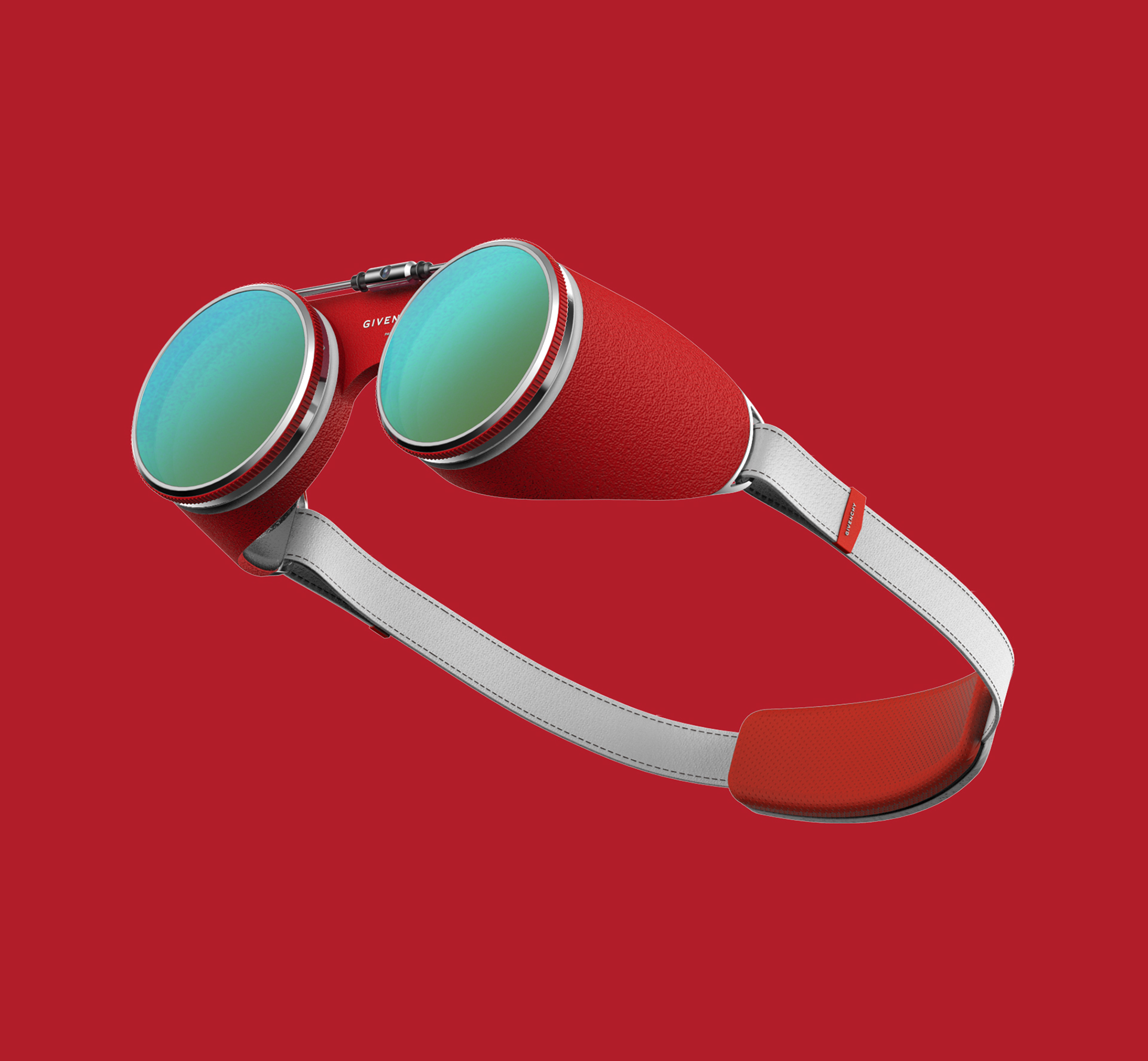
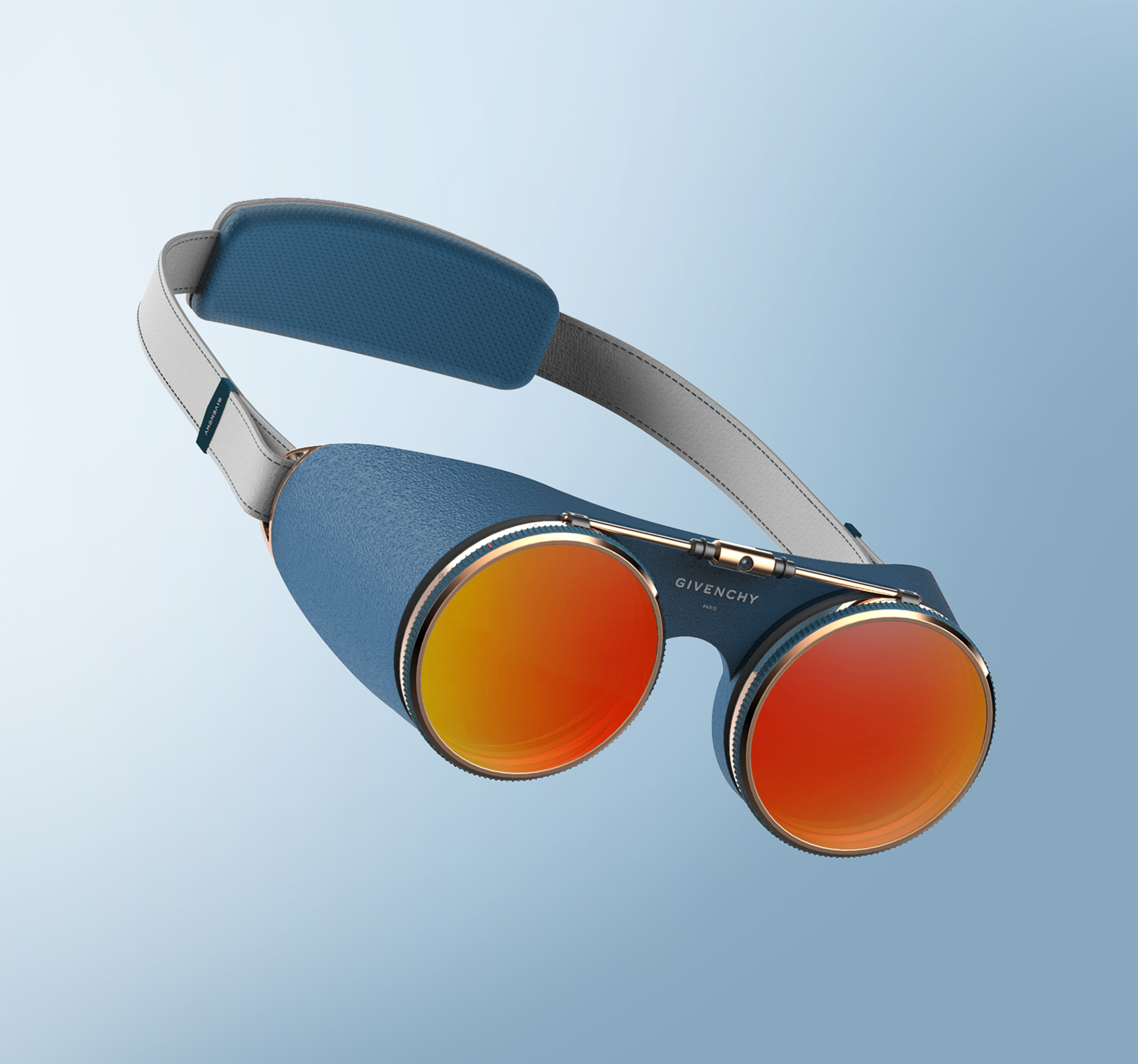
Shape: Asymmetric form, Enclosing form
Material: Leather, me-tal, Fluorescent plastic, Fabric
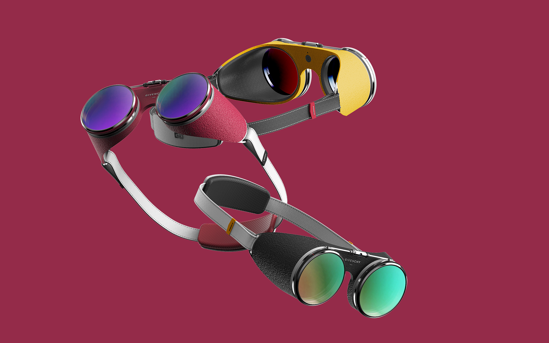
Color: PANTONE Black C, PANTONE Blue Aster, PANTONE True Red, PANTONE Freesia
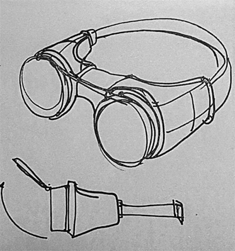
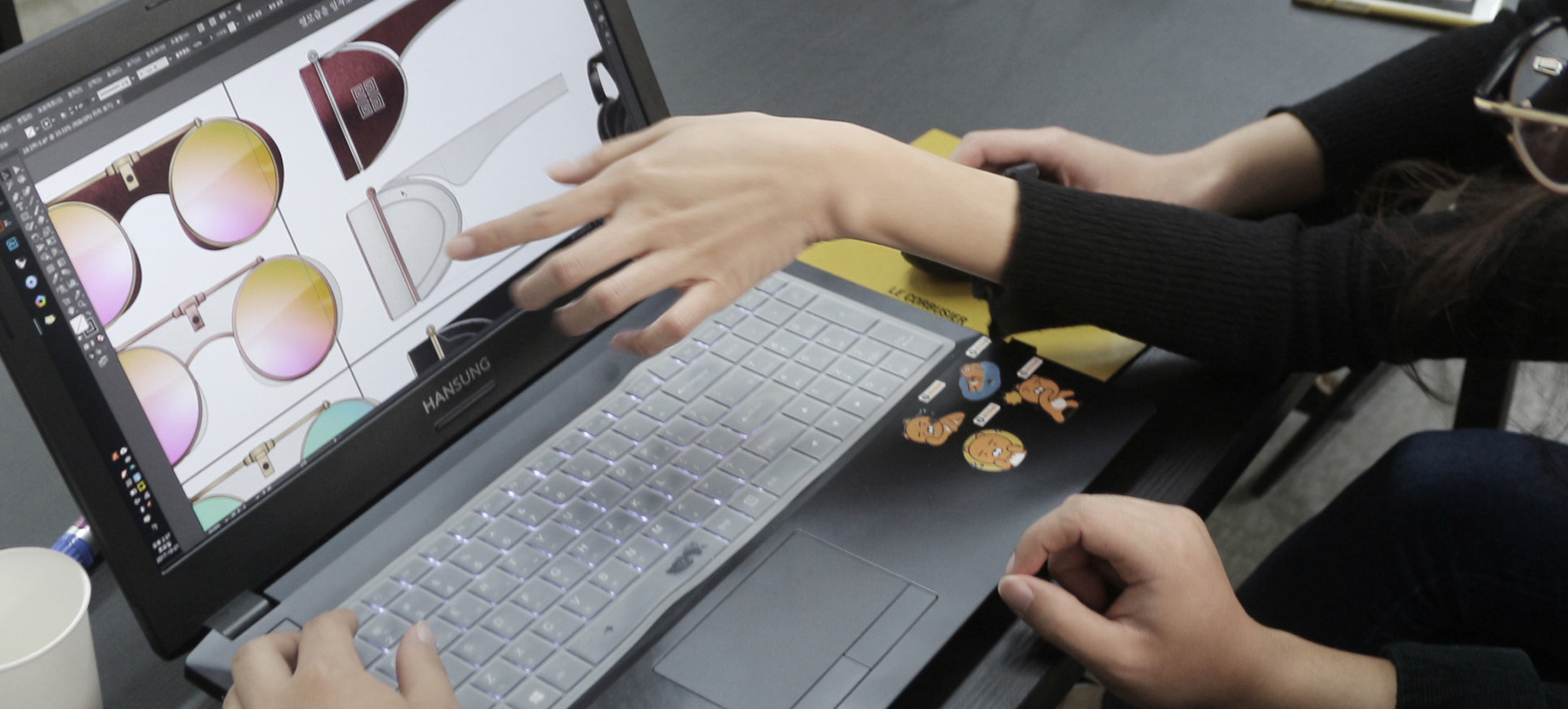
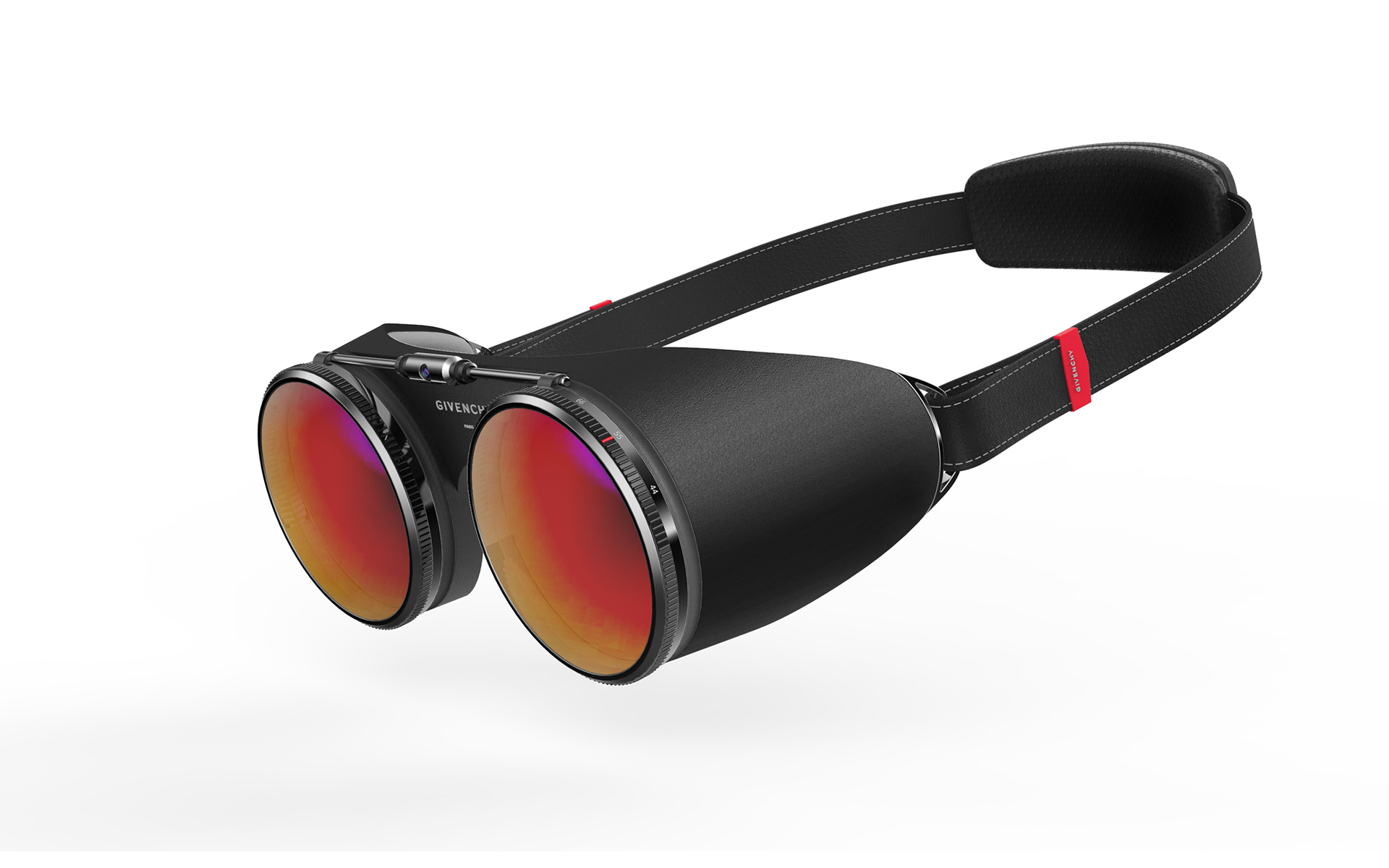
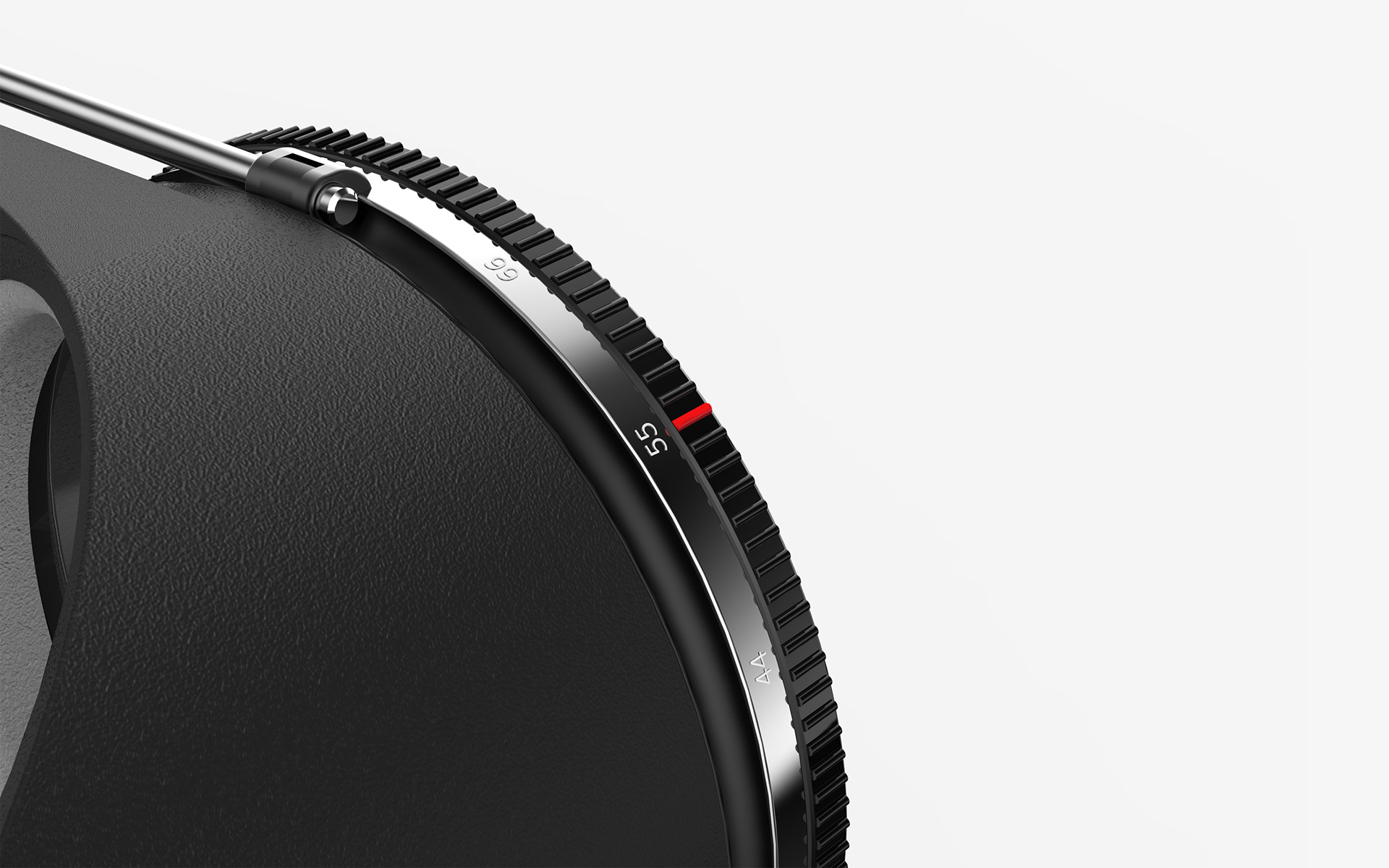
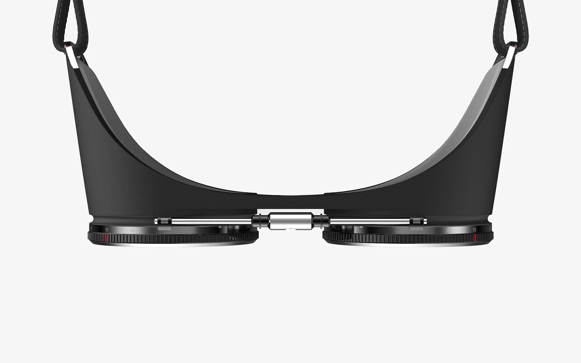
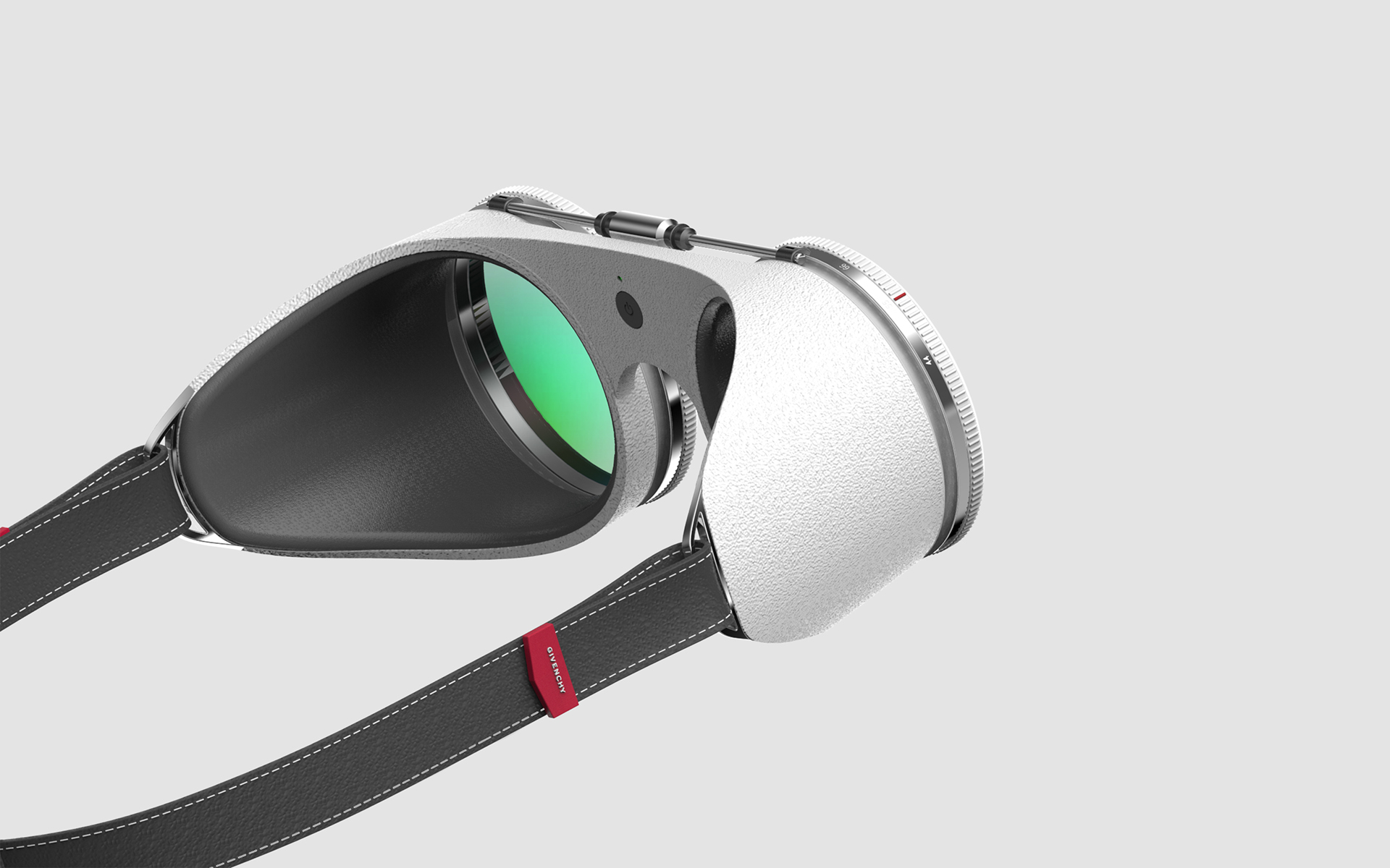
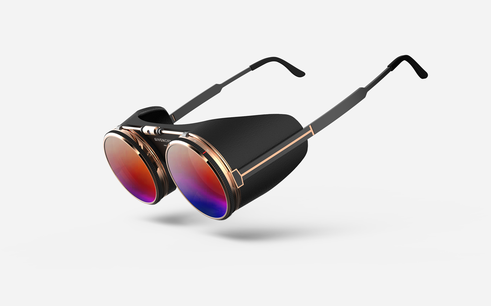
There is a type 2 that gives you more natural like glasses.
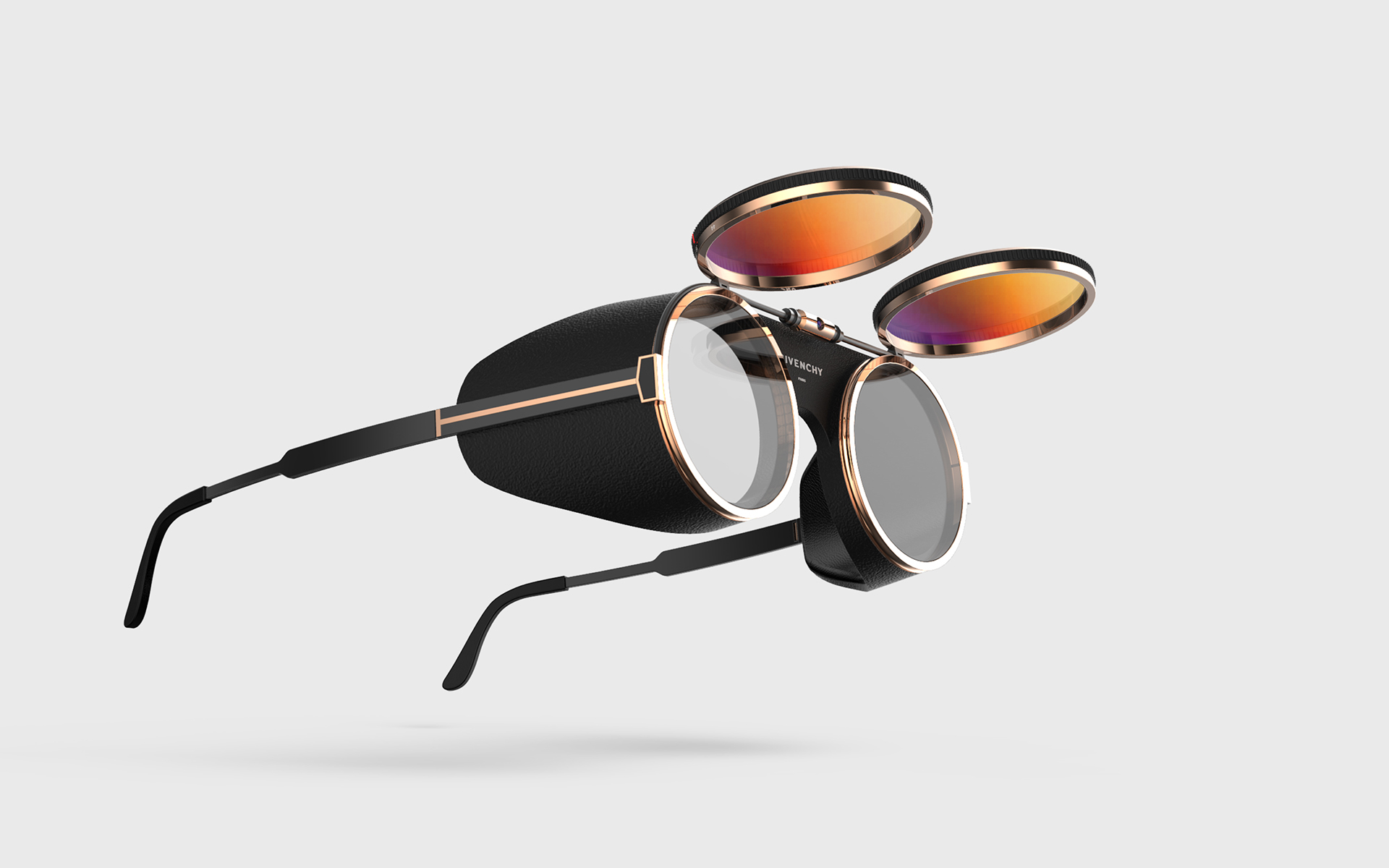
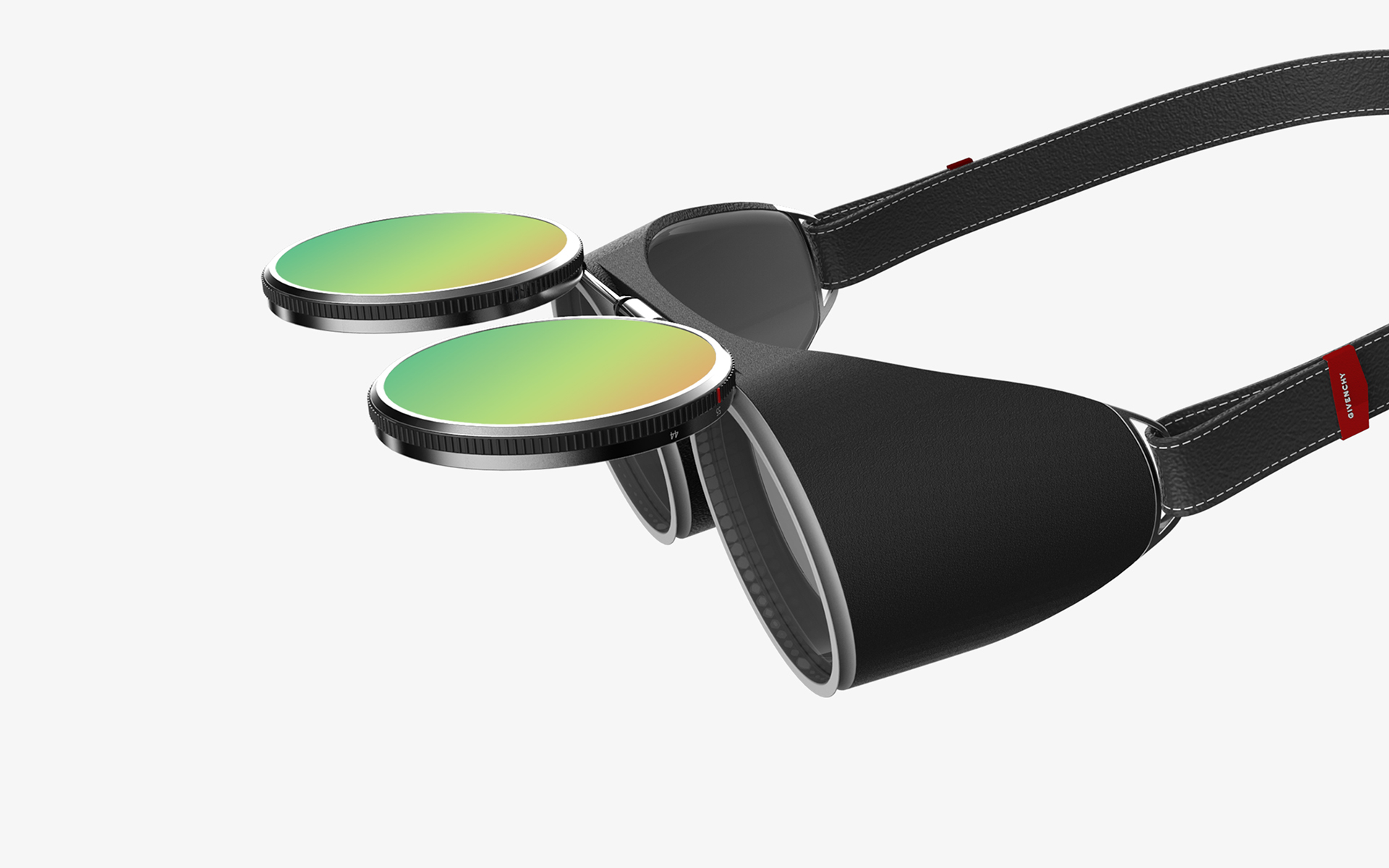
If the VR lens is raised, it is only available for AR.
I considered changing the accessibility options while experiencing content, gaming, and training.
VR does not see the presence of an actual environment in use. If you can't see ahead, people feel anxiety and fear. Also, most of the present VR attempts to solve the problem by simply raising the lens, which is inconvenient to wear and remove.
The copyright of this work belongs to PDF HAUS. No use is allowed without explicit permission from owner.

New user?Create an account
Log In Reset your password.
Account existed?Log In
Read and agree to the User Agreement Terms of Use.

Please enter your email to reset your password
I like this design and have a strong sense of fashion.
I saw it at be station.
It's also beautiful. I like this product very much.
The head map is super amazing.