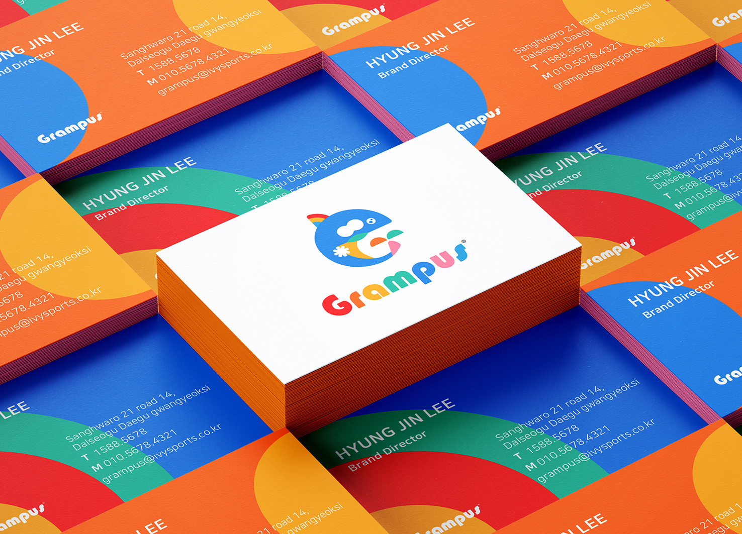
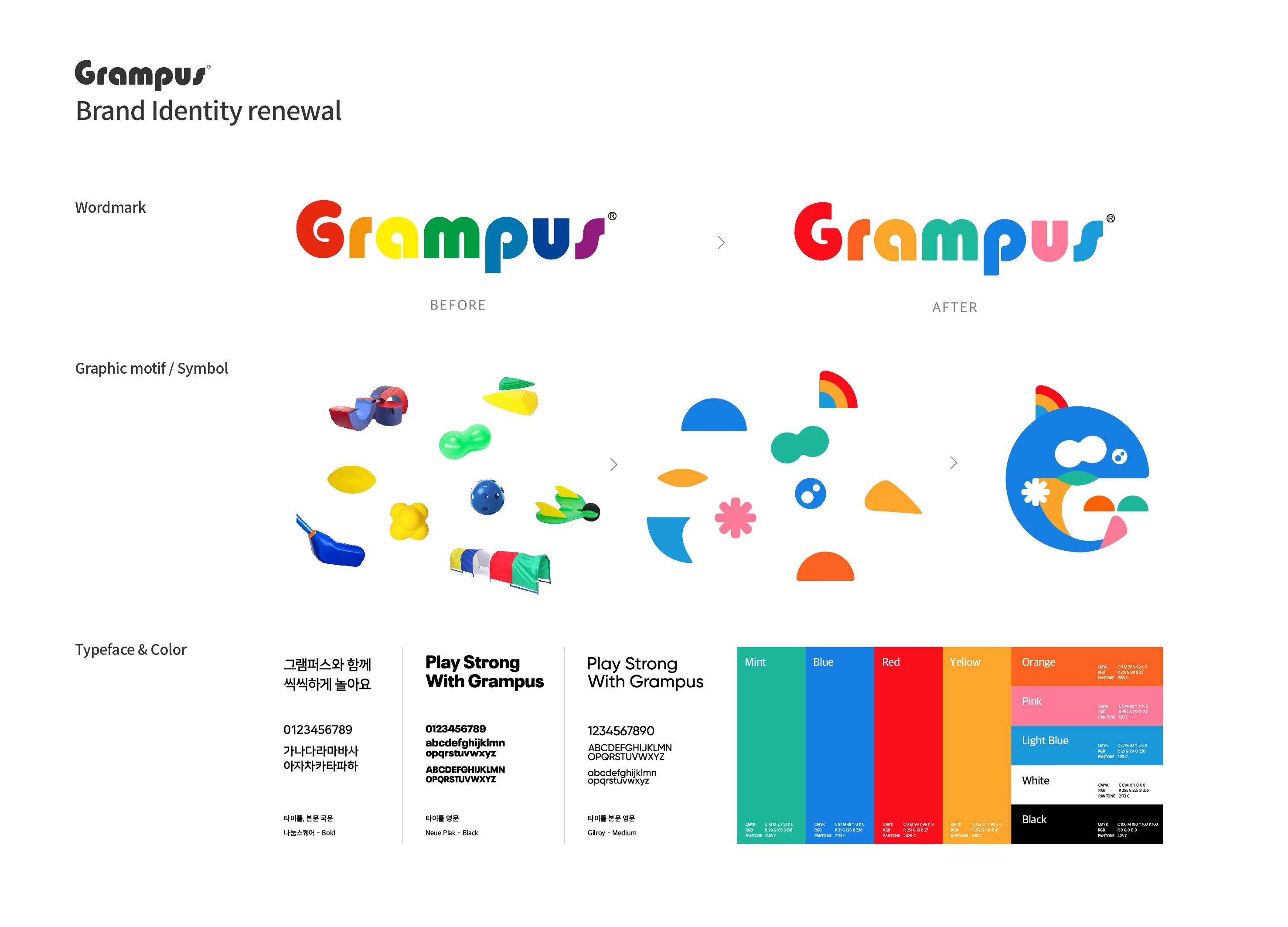
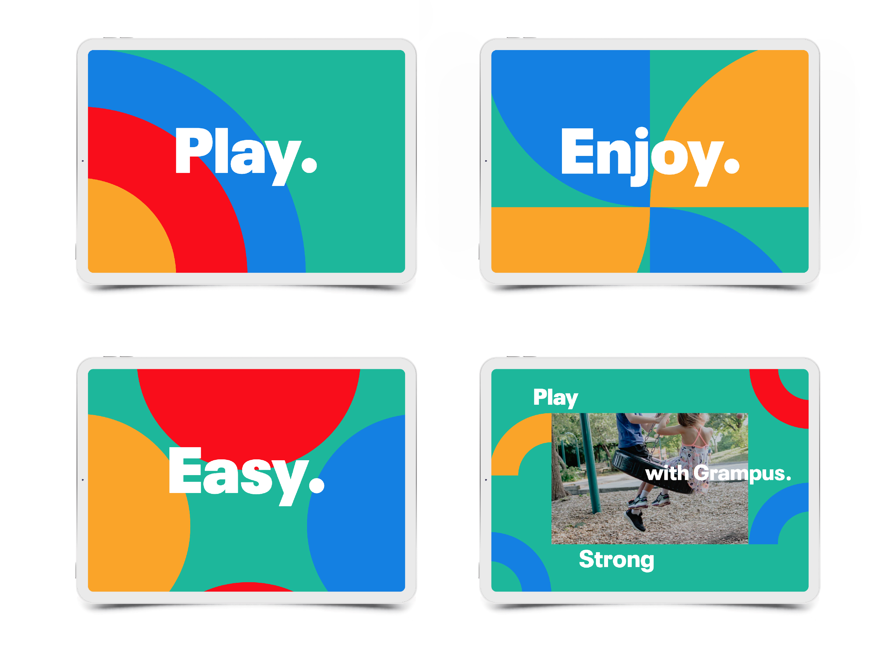
GRAMFERS is a brand that develops and sells a variety of children's teaching aids to enhance children's motor skills and health. In order to cater to the consumer trend of looking for convenient and practical teaching aids, and pay attention to the diversity and potential of brands, GRAMFERS need to actively reshape the brand image. To this end, we consider the morphological characteristics of GRAMFERS teaching aids and the sensibility of the target group of children, and re-establish a brand image of sports, vitality and fun. The Killer Whale themed master emblem combines the various graphic elements of the unique morphology of the teaching aid. The text logo changes the original square corners to rounded corners, emphasizing the safety of children's products, and reflects the various colors of teaching aids, which improves the symbolism of the brand. By combining the graphic theme and brand keywords "PLAY", "ENJOY", "EASY" obtained by GRAMFERS teaching aid forms, we have established the overall style of the brand. In the design of GRAMFERS packaging boxes, tapes, business cards and other applications, the combination of graphic themes and logos is flexibly used to ensure brand consistency and recognition.
Korea
Award : WINNER
Client : IVY SPORTS
Affiliation : YNL DESIGN
Designer : YOONA LEE, SANGMI PARK
www.asiadesignprize.com/133147


New user?Create an account
Log In Reset your password.
Account existed?Log In
Read and agree to the User Agreement Terms of Use.

Please enter your email to reset your password
Excellent
the effect is quite good