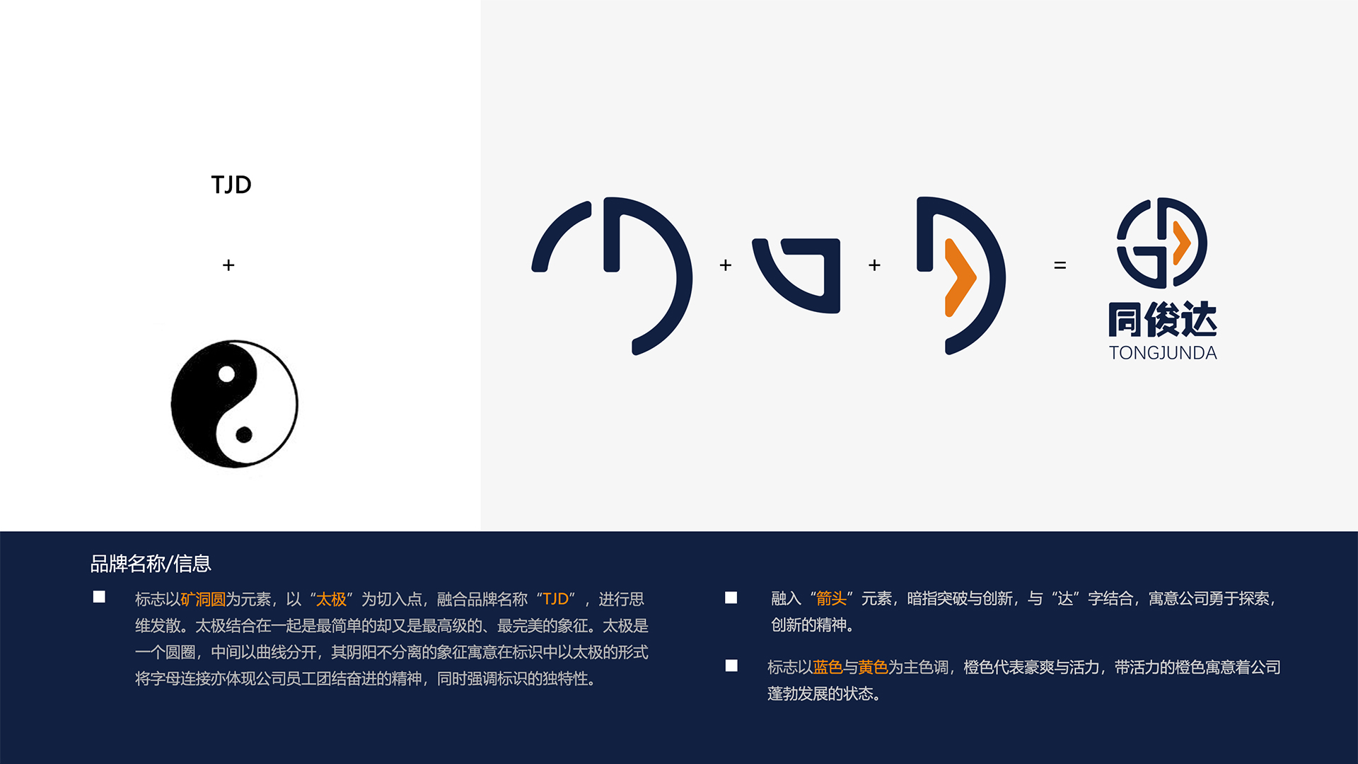
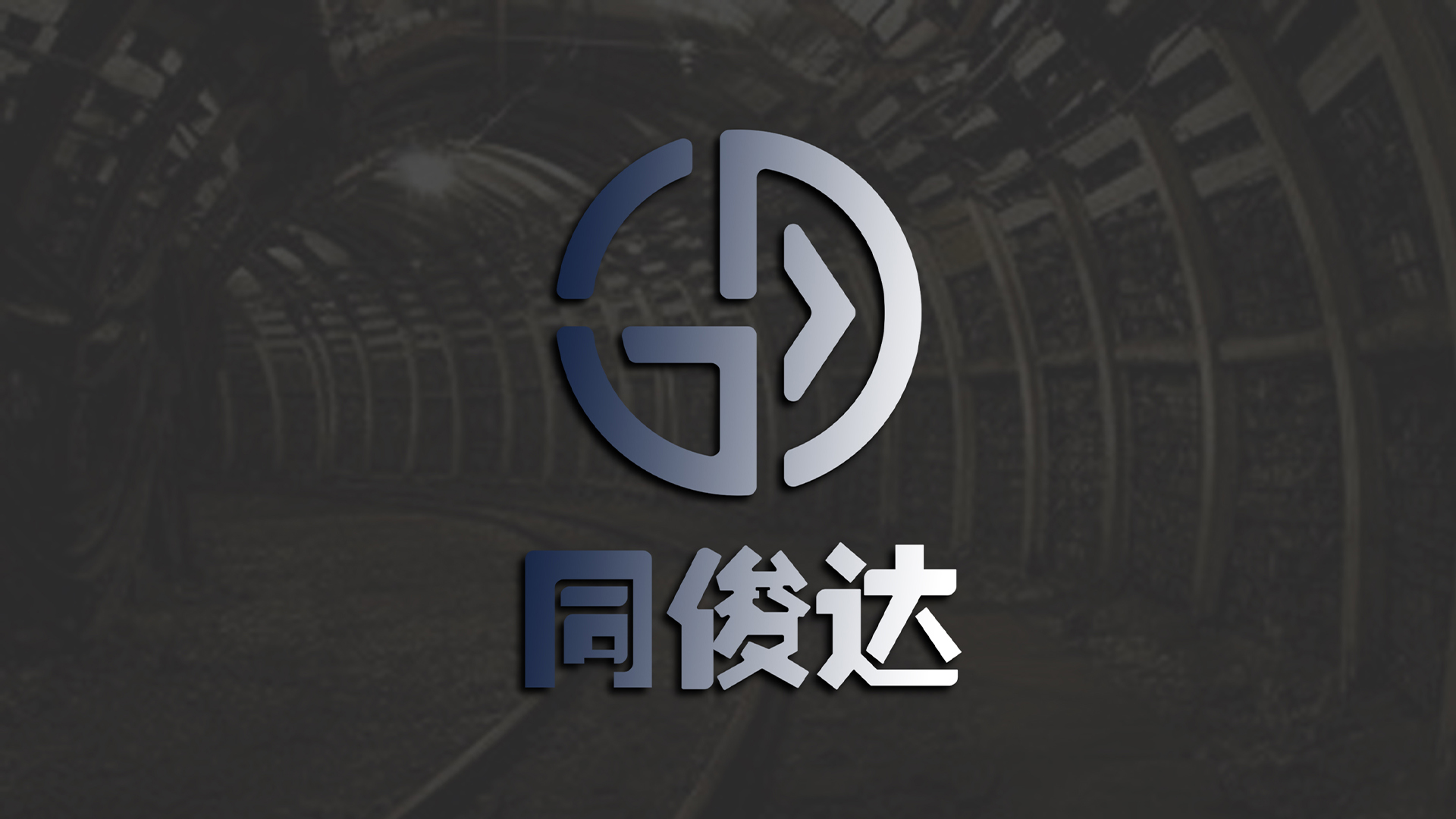
The logo takes "mine circle" as the element, takes "tai chi" as the starting point, and integrates the brand name "TJD" to diverge thinking. Combined with Tai Chi, it is the simplest but most advanced and perfect symbol. In the logo, Tai Chi has the symbolic meaning of "yin and yang are not separated". The connection of letters also reflects the spirit of unity and forge ahead of the company's employees, while emphasizing the uniqueness of the logo.
The logo incorporates the element of "arrow", implying breakthrough and innovation, combined with the word "da", implying the company's innovative spirit of exploration. The logo is mainly blue and yellow, orange represents boldness and vitality, and the vibrant orange implies the booming state of the company.

The copyright of this work belongs to 韵博设计. No use is allowed without explicit permission from owner.

New user?Create an account
Log In Reset your password.
Account existed?Log In
Read and agree to the User Agreement Terms of Use.

Please enter your email to reset your password
Recognized
It's quite good
Not bad
This, the first picture, in what language?