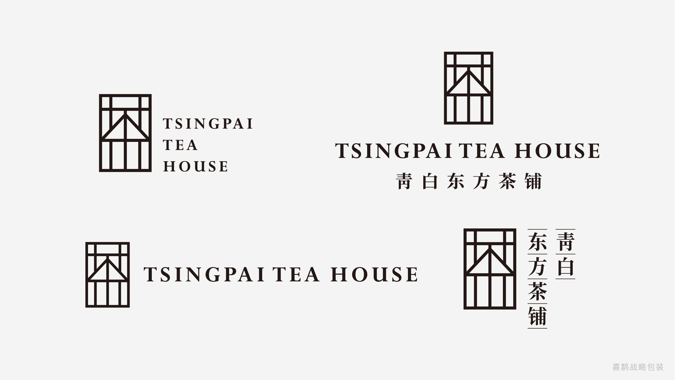
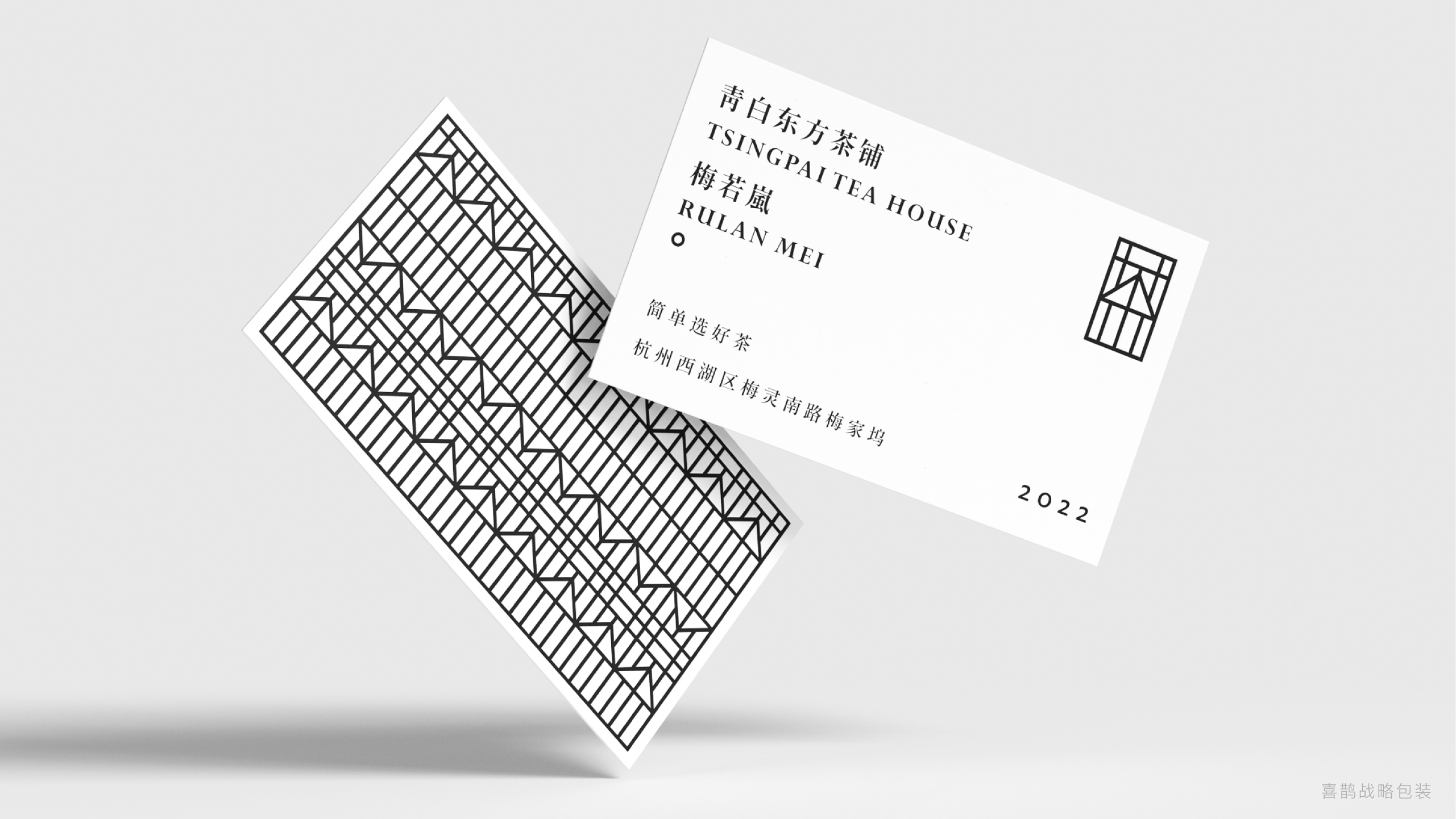
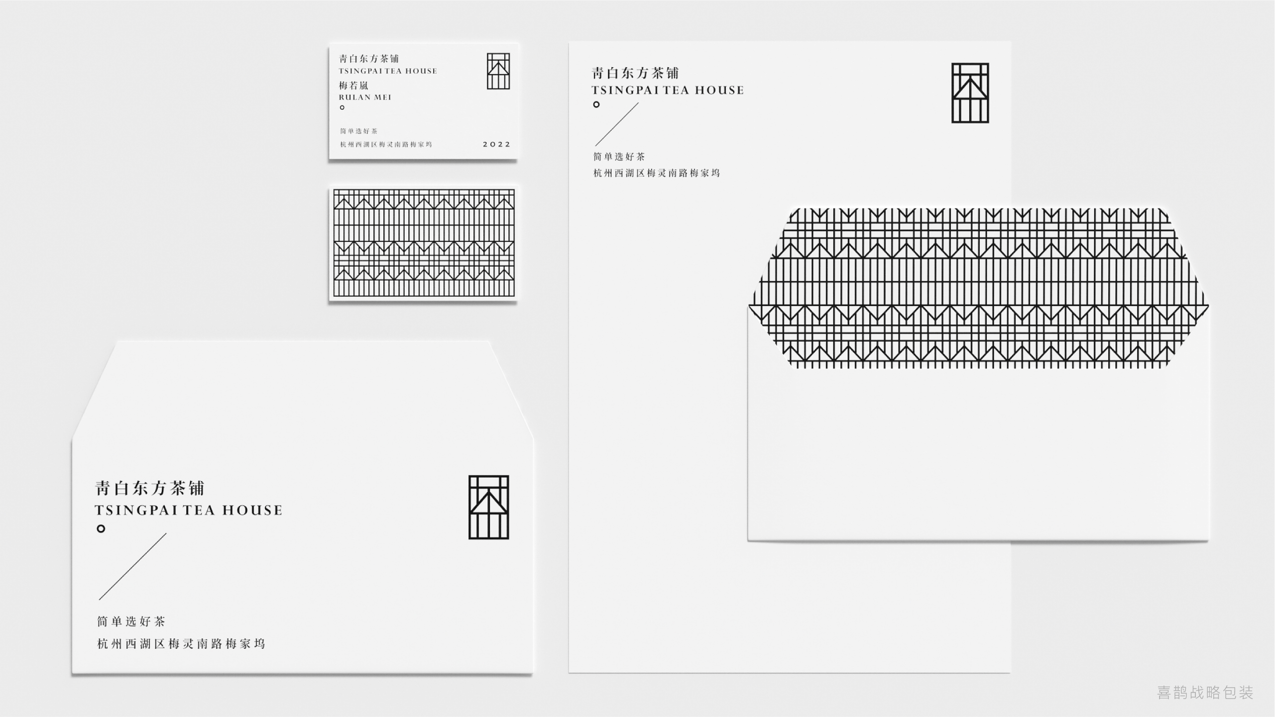
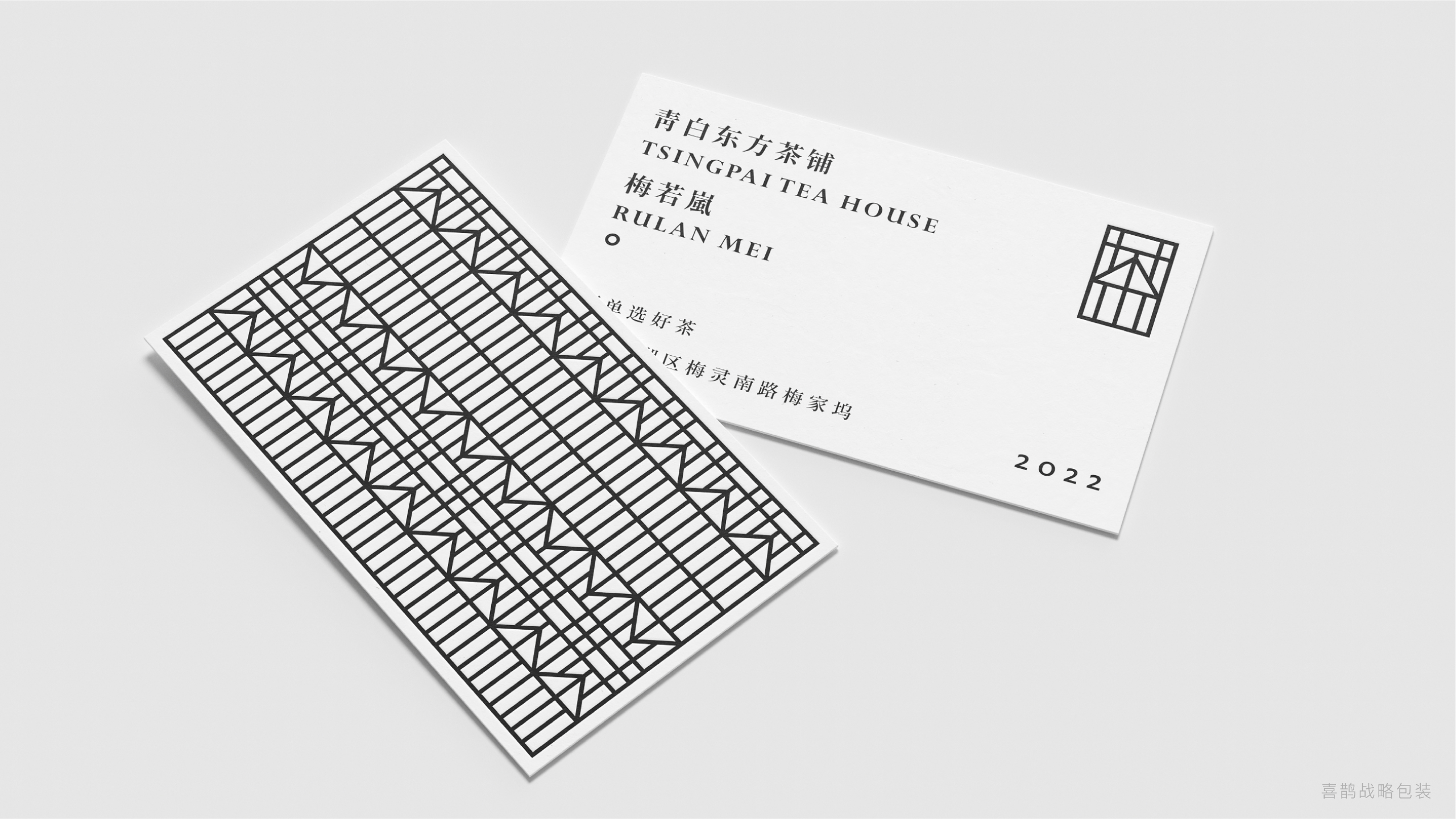
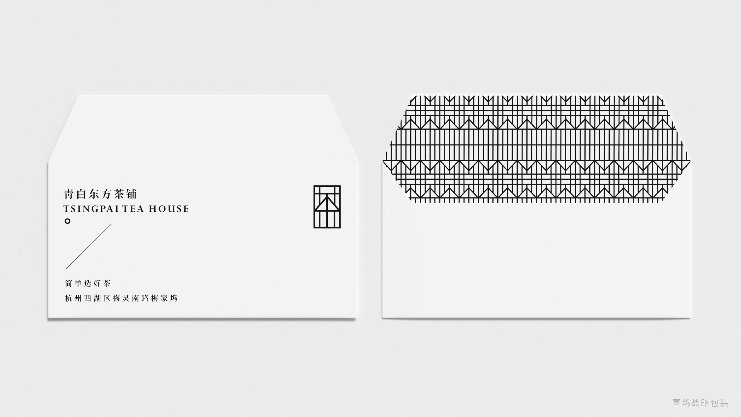
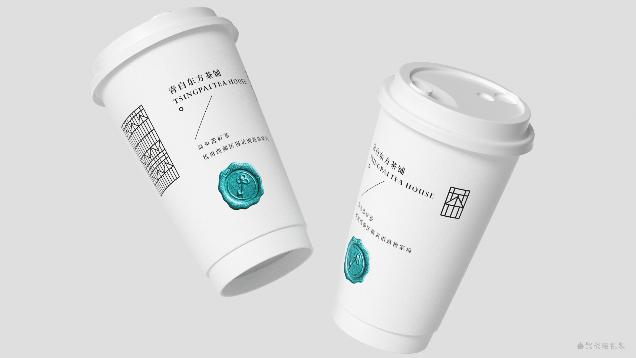
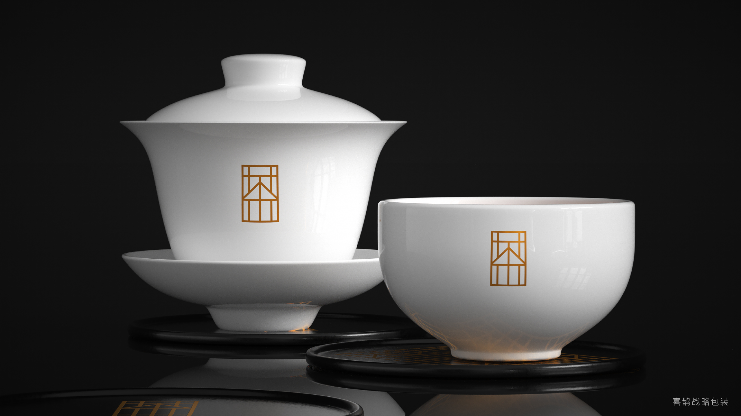
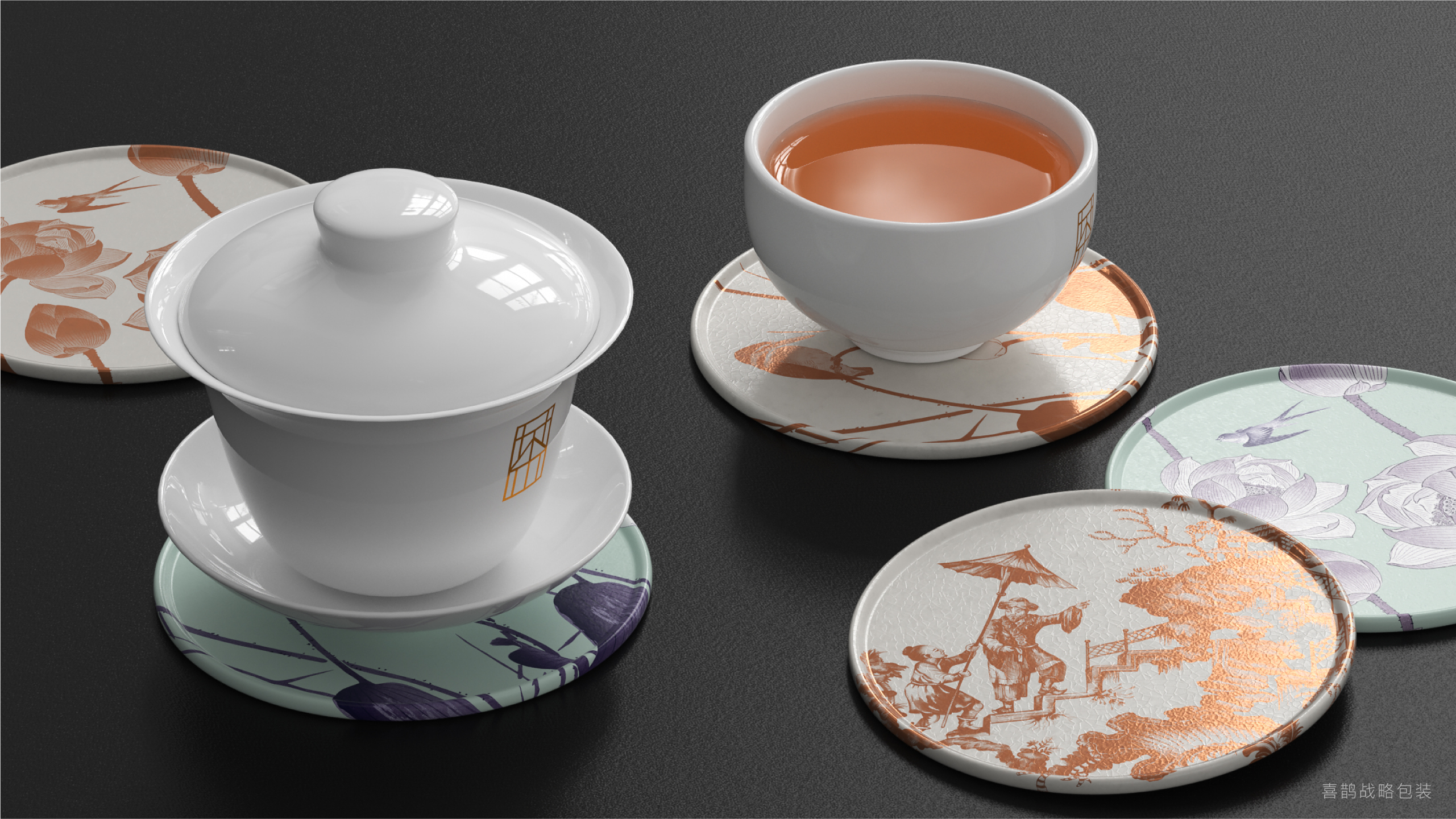
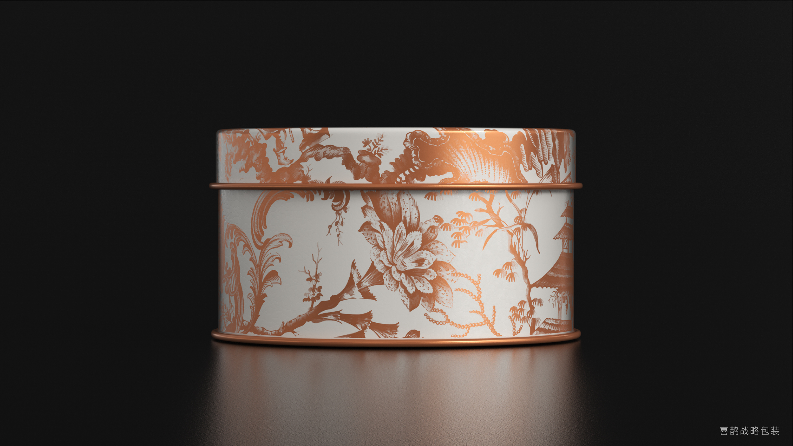
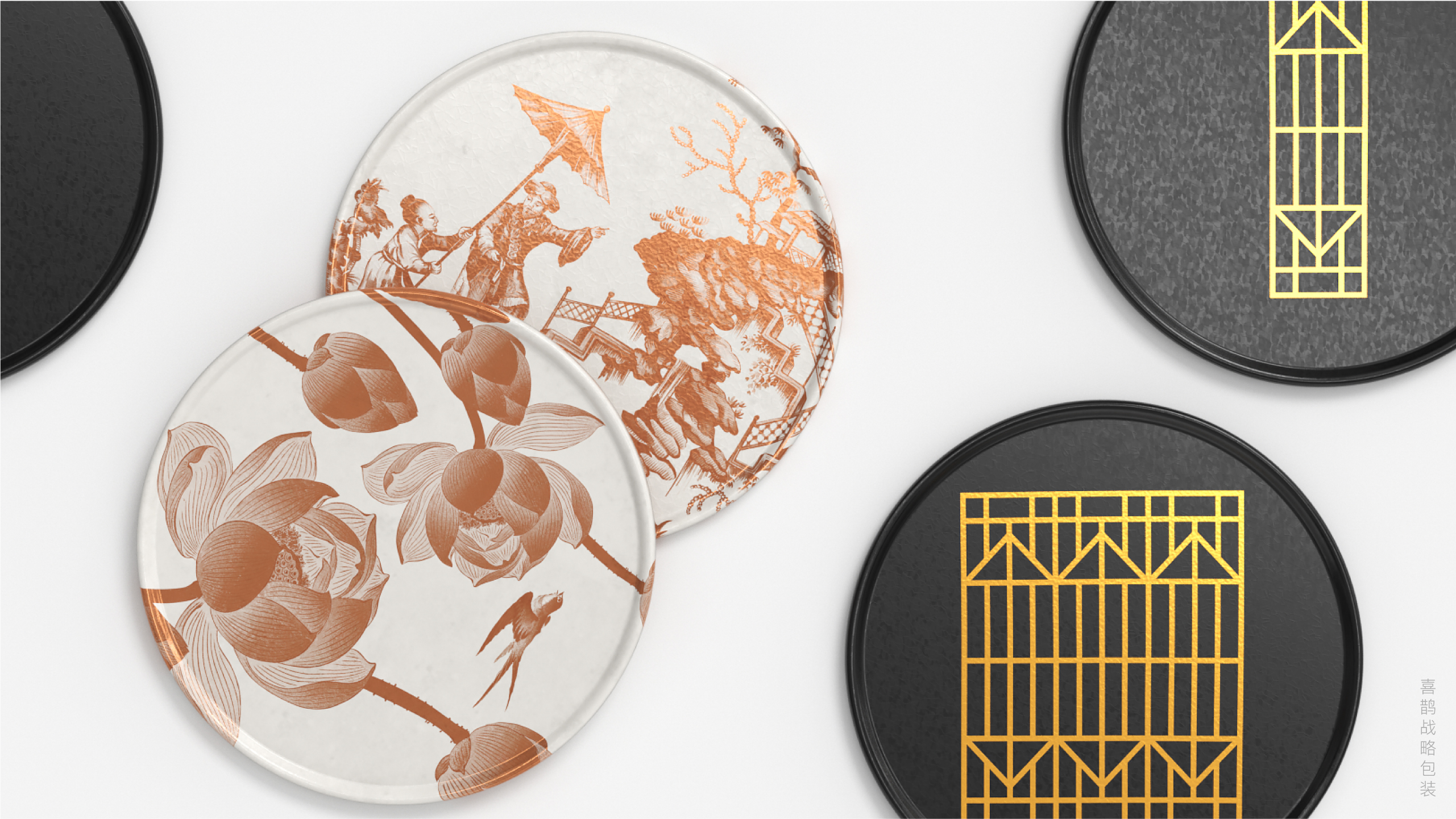
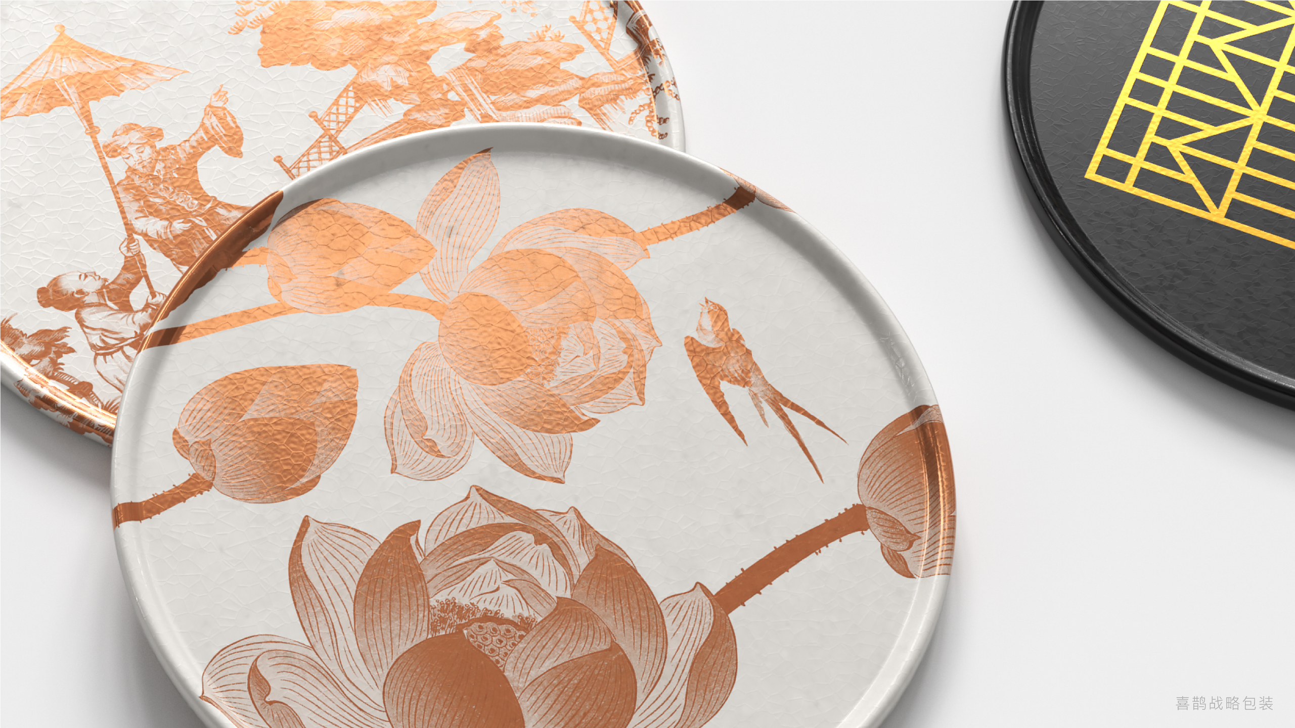
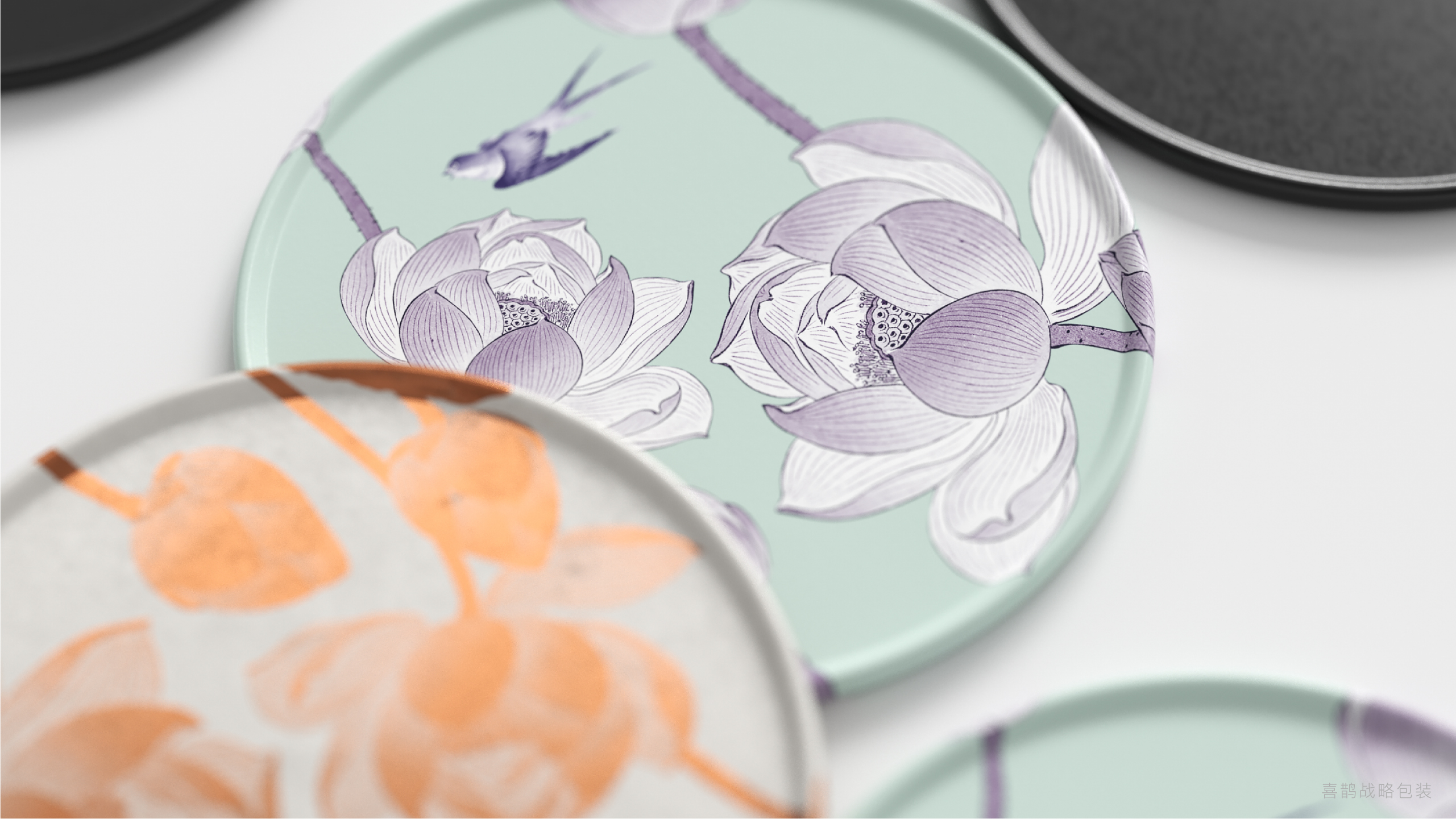
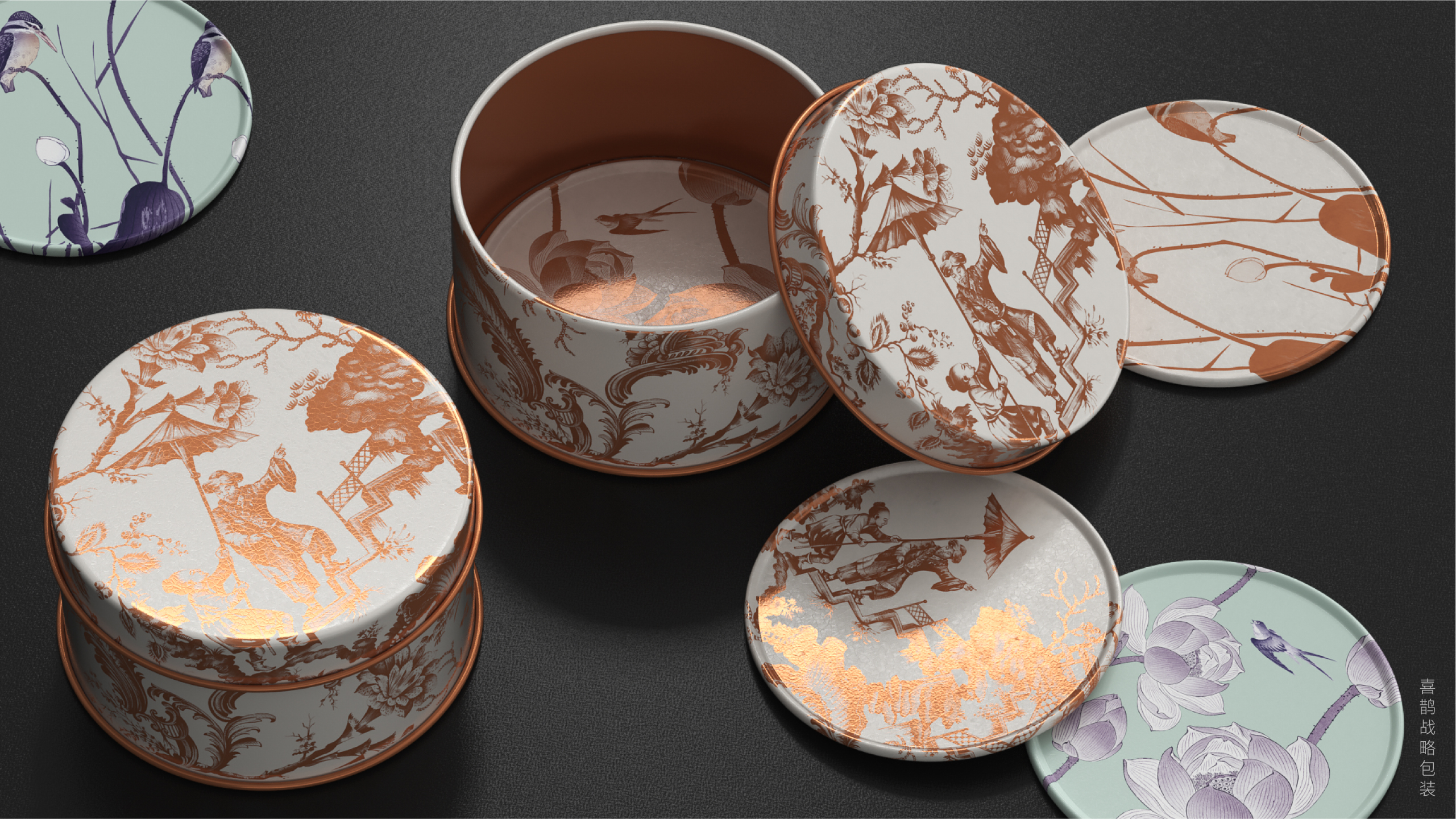
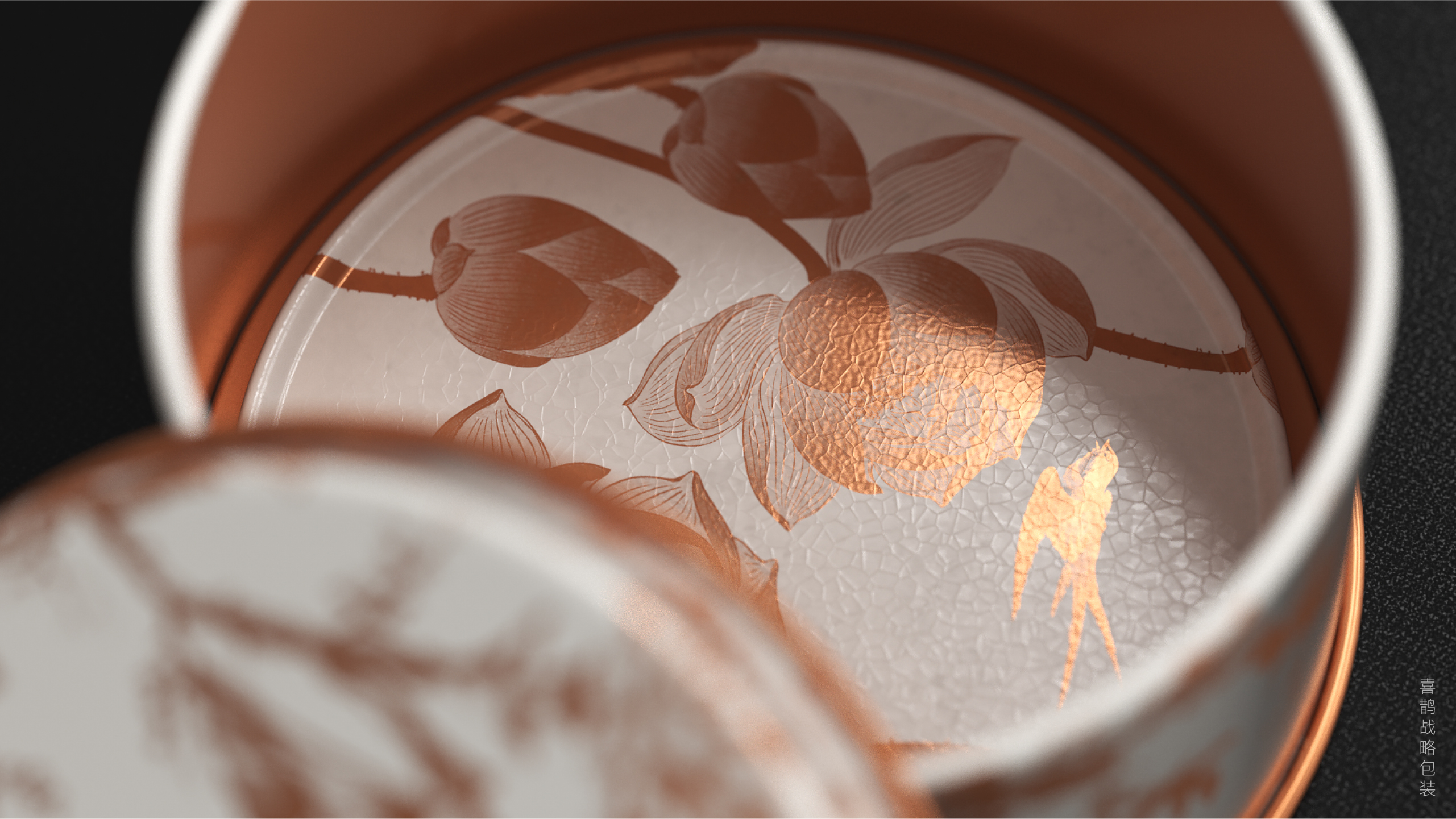
Magpie broke the topic of "green and white" aesthetics again, and conveyed a new brand concept in minimal text arrangement on the original paper-green and white are no longer Xiaoqing and Xiaobai on the edge of Hangzhou West Lake, but a clean product line behind an oriental tea shop, rigorous tea selection standards and the concept of tea supremacy......
The copyright of this work belongs to 喜鹊战略. No use is allowed without explicit permission from owner.

New user?Create an account
Log In Reset your password.
Account existed?Log In
Read and agree to the User Agreement Terms of Use.

Please enter your email to reset your password
It's beautiful. There's wood.
It's so artistic.
Chinese style
It's beautiful
I like the packaging style of your home very much.
It's really nice
Big Brother Big Brother