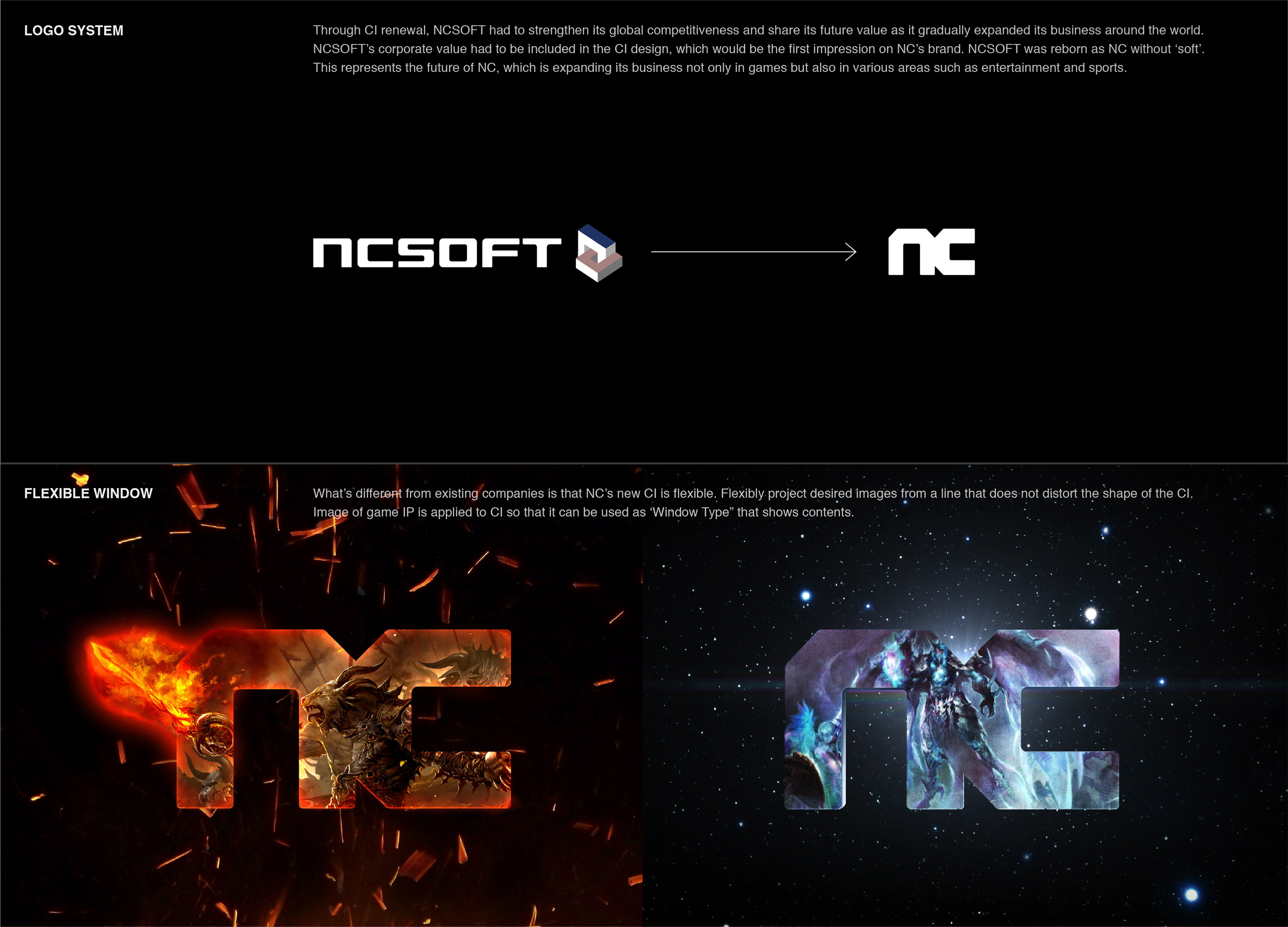
NCSoft removed the "Soft" part and was reborn as "NC". This not only represents the game, but also reflects the future vision of NC in entertainment, sports and other fields to expand business. In the design, the corners of the letters are cut sharply at 45 degrees, which symbolizes the rigorous craftsman spirit of NC based on cutting-edge technology and aiming at creating masterpieces. In addition, the bold design conveys the enthusiasm and challenge spirit of NC's constant pursuit of innovation and bold attempts. The seamless connection of N and C contains the value of "connection" to the new world. NC's new CI has flexible applicability. You can freely cross boundaries or project desired images without distorting the CI morphology. The design of the new CI also allows images of the game IP to be applied to the CI as a window type for displaying content. Due to the limitations of using CI alone on various external contact points, graphic elements are designed to expand usability. This incorporates the "cutting edge" design element of CI and can be applied more flexibly. Anyone can adjust the shape and proportion according to their needs, and use it in various design fields such as patterns, image frames, layouts, etc. to display a consistent brand image.
Korea
Award : GOLD WINNER
Affiliation : NCSOFT
Designer : Heunsaem Oh, Jaehee Jang, Eunjeong Yang, Hong Kim, Juyeon Hong
www.asiadesignprize.com/133570


New user?Create an account
Log In Reset your password.
Account existed?Log In
Read and agree to the User Agreement Terms of Use.

Please enter your email to reset your password
It's not easy
Passing