There is an old Chinese saying that "words are like people". Learning to write is not only an encounter between brush strokes and paper notes, but also a preface to wisdom. The correct writing posture can guide children to better express themselves and step into a deeper cultural hall.
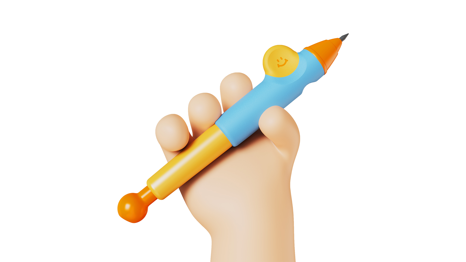
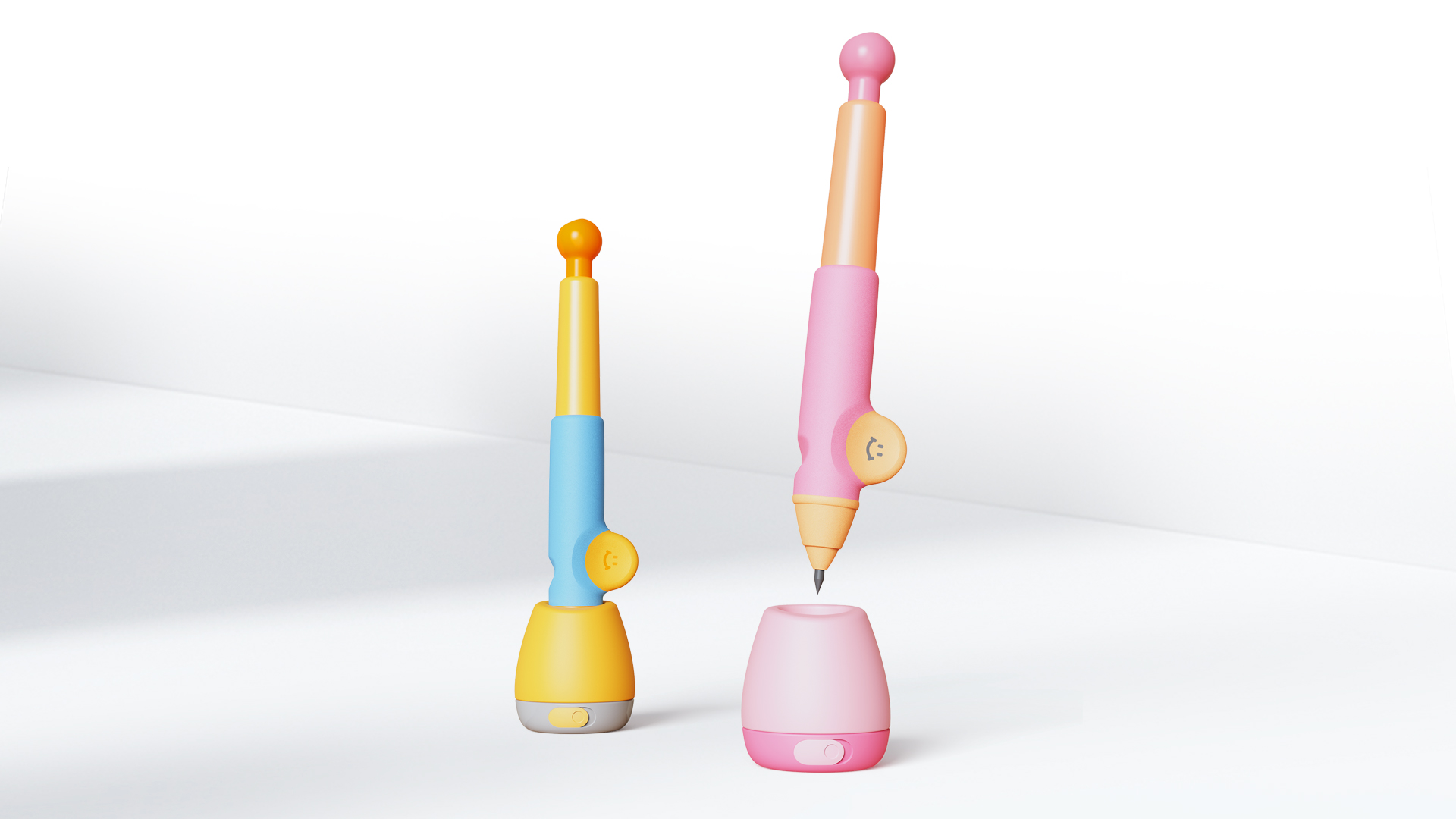
In this project, Ming Rui Design joined hands with the well-known children's aesthetic education brand Meile Childhood to face the needs of users and the pain points of use, to create a personalized posture pen that combines differentiated appearance and ergonomics, and to open a breakthrough for this category through design.
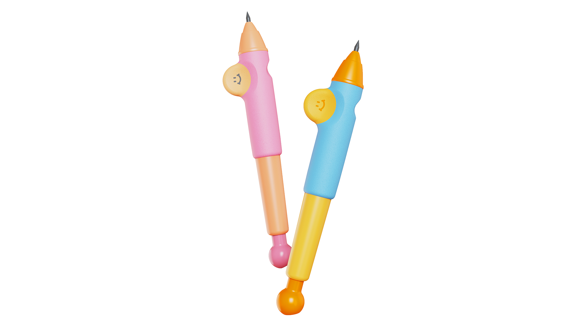
Since the introduction of Zhengzi Pen, the form and style are monotonous, and there is still no leading product with absolute advantages; in addition, most of the products have a single material, poor texture, and there are certain safety risks.
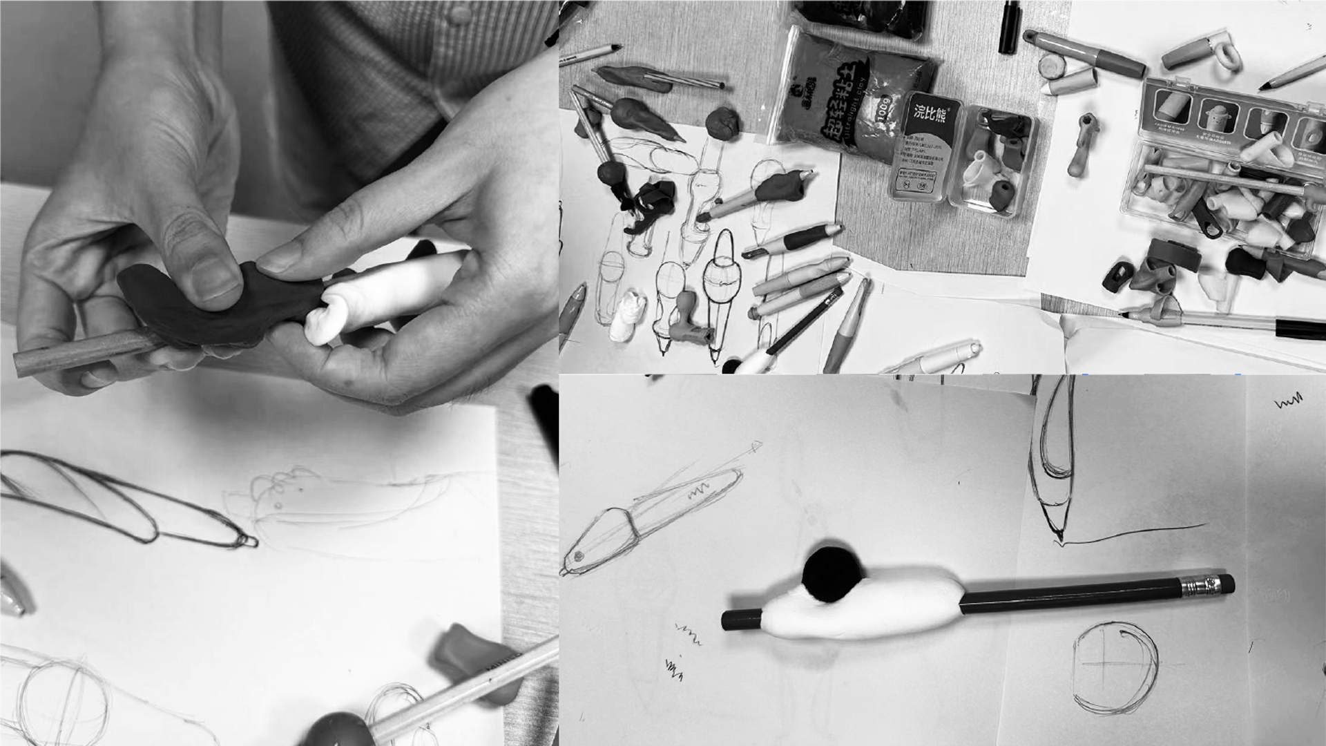
In the process of sketching, the design team kneaded a large number of models with the help of clay and tested the grip one by one. We found that the traditional three-finger design of the current mainstream correction pen can easily lead to finger displacement and tightness, and long-term use is easy to cause joint development and deformation.
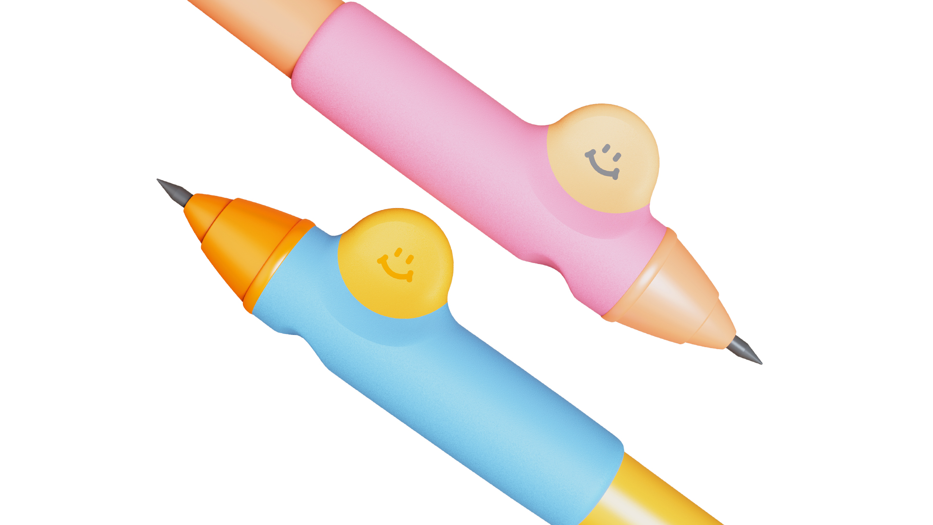
After deliberation and screening of a large number of schemes, we choose to extend a large area of oblate circle in the pen holding area to avoid the overlap of index finger and thumb and guide the correct force.
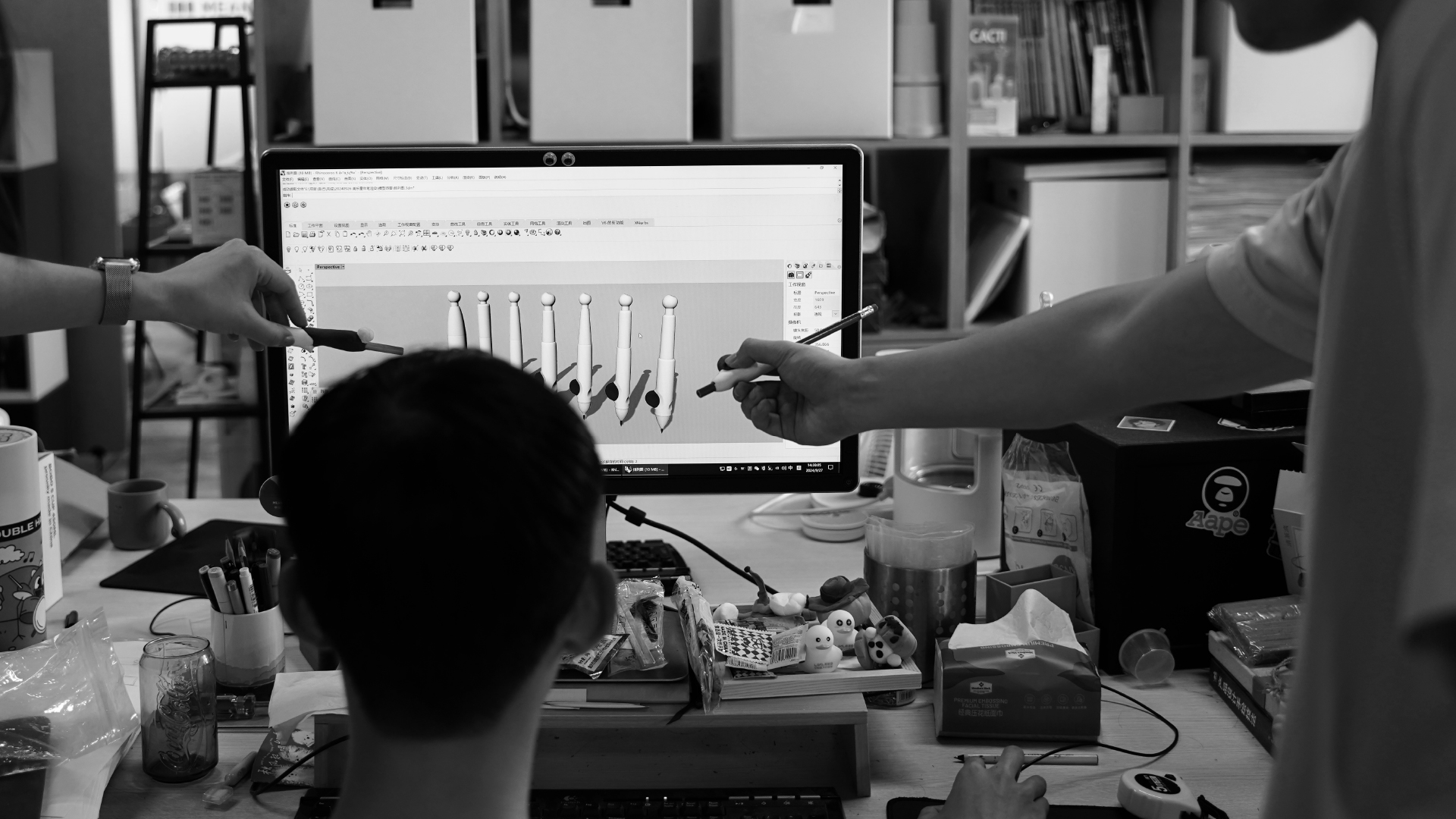
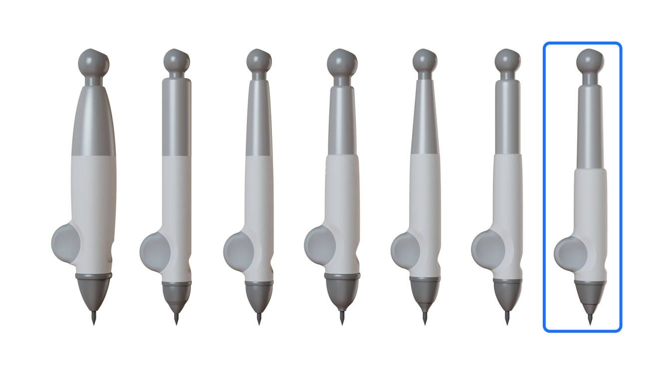
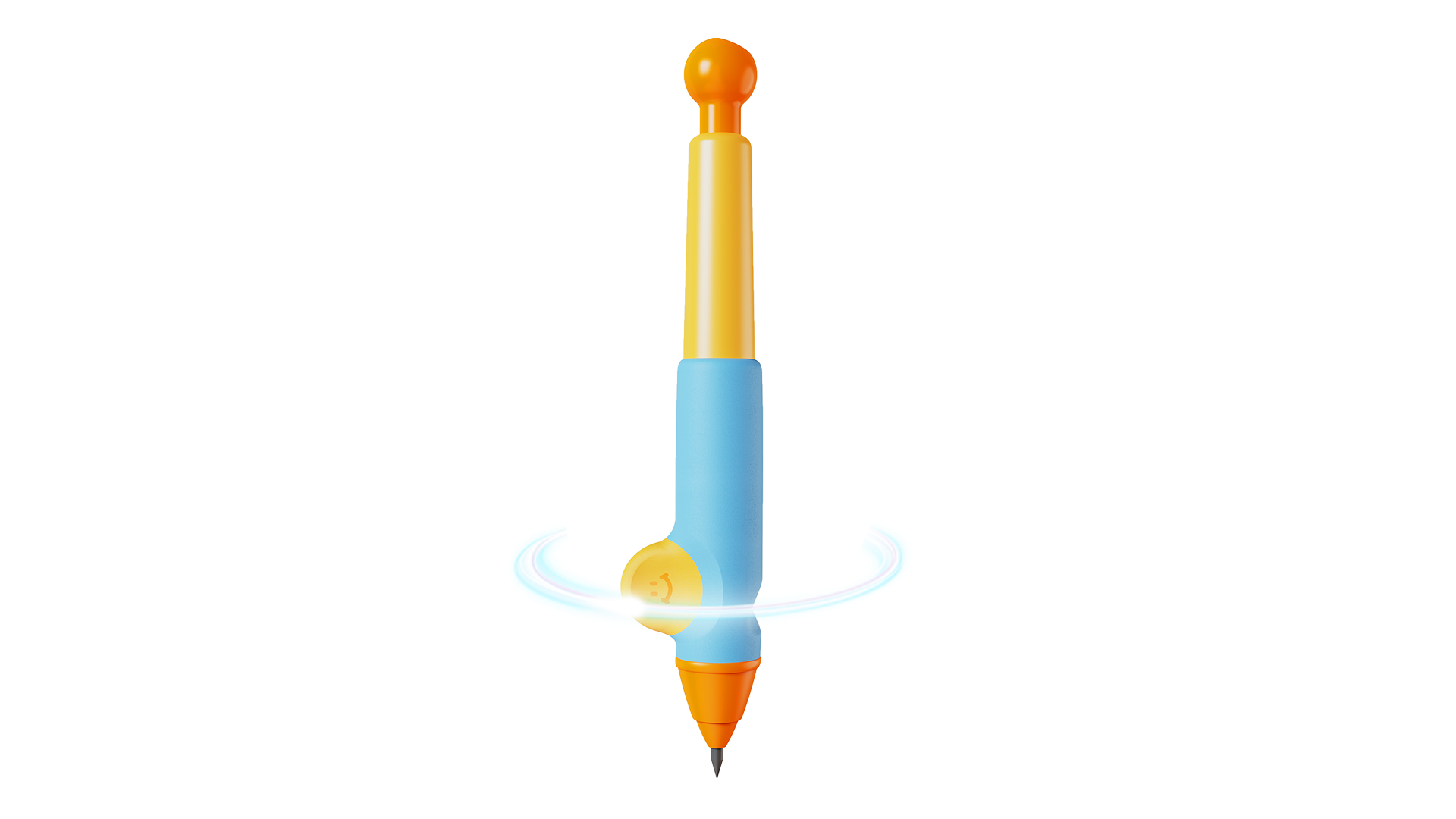
Due to the weak hand strength of children, a heavy pen body will increase the burden on the hand when writing, and a light pen body may affect the stability of writing. At this time, the importance of the balance of the pen body is highlighted. A well-balanced positive posture pen can reduce the extra force on the hand muscles, improve comfort and reduce the risk of finger deformation.
Based on the above problems, we conducted a variety of tests with different proportions of the pen body, and finally chose the type of pen body with the center of gravity down, which effectively enhanced the stability of the control pen.
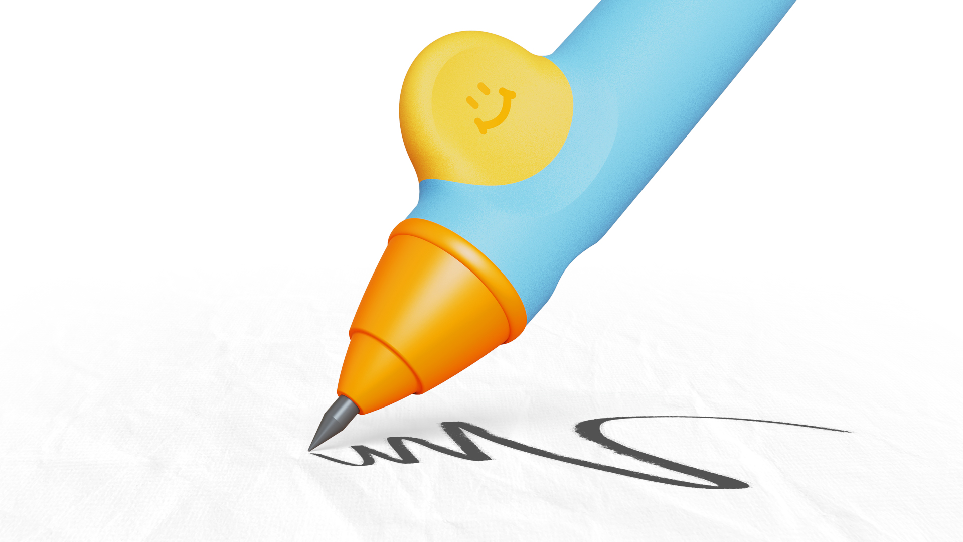
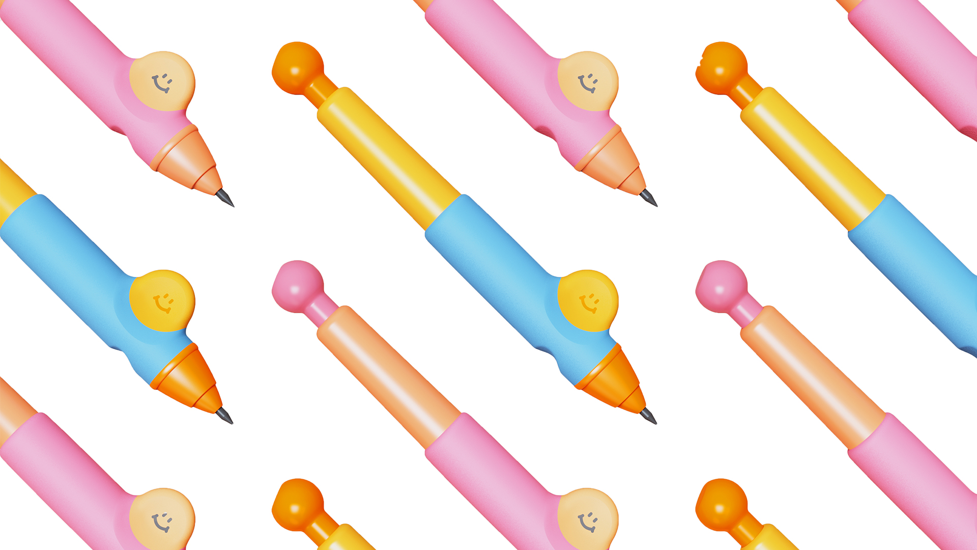
In the cognition of most adults, the shape of the pen is mostly limited to the linear appearance; but for children, the unknown can have unlimited imagination. The design of children's products should be highly free, dare to break through the traditional framework, integrate innovative thinking and personalized elements, so that the products not only meet the basic functional requirements, but also be unique in form, material, color and user experience, which is significantly different from the market products.
The copyright of this work belongs to 明锐设计. No use is allowed without explicit permission from owner.

New user?Create an account
Log In Reset your password.
Account existed?Log In
Read and agree to the User Agreement Terms of Use.

Please enter your email to reset your password
I don't usually drink less lemon tea. There are so many ducks on the table.
nice shape
Suitable for children
It's cute.