With the popularity and popularity of entries such as "crispy young people", there is also a wind of health preservation among young people. Natural, healthy and health-care products have gradually entered the vision of young people, and a number of new consumer health brands have emerged. Through the visual design to share their brand concept and product characteristics, WHIMLAB is one of them.
Ming Rui design has brought a brand-new brand design to WHIMLAB probiotic series products. The core of this design lies in how to help WHIMLAB stand out in the new health track full of vitality and competition through minimalist design language and highly visual symbols.
WHIMLAB logo design inspiration, from the probiotics under the microscope and is known as the "cell energy factory" mitochondria. The designer symbolized the appearance of the two, as the basic combination elements, forming a LOGO text full of fashion sense and sense of science and technology.

The WHIMLAB auxiliary graphics are drawn through rounded lines to abstract and artistically process the digestive system of the human body. After copying, tiling and filling, they can be flexibly applied to packaging, posters and other materials.
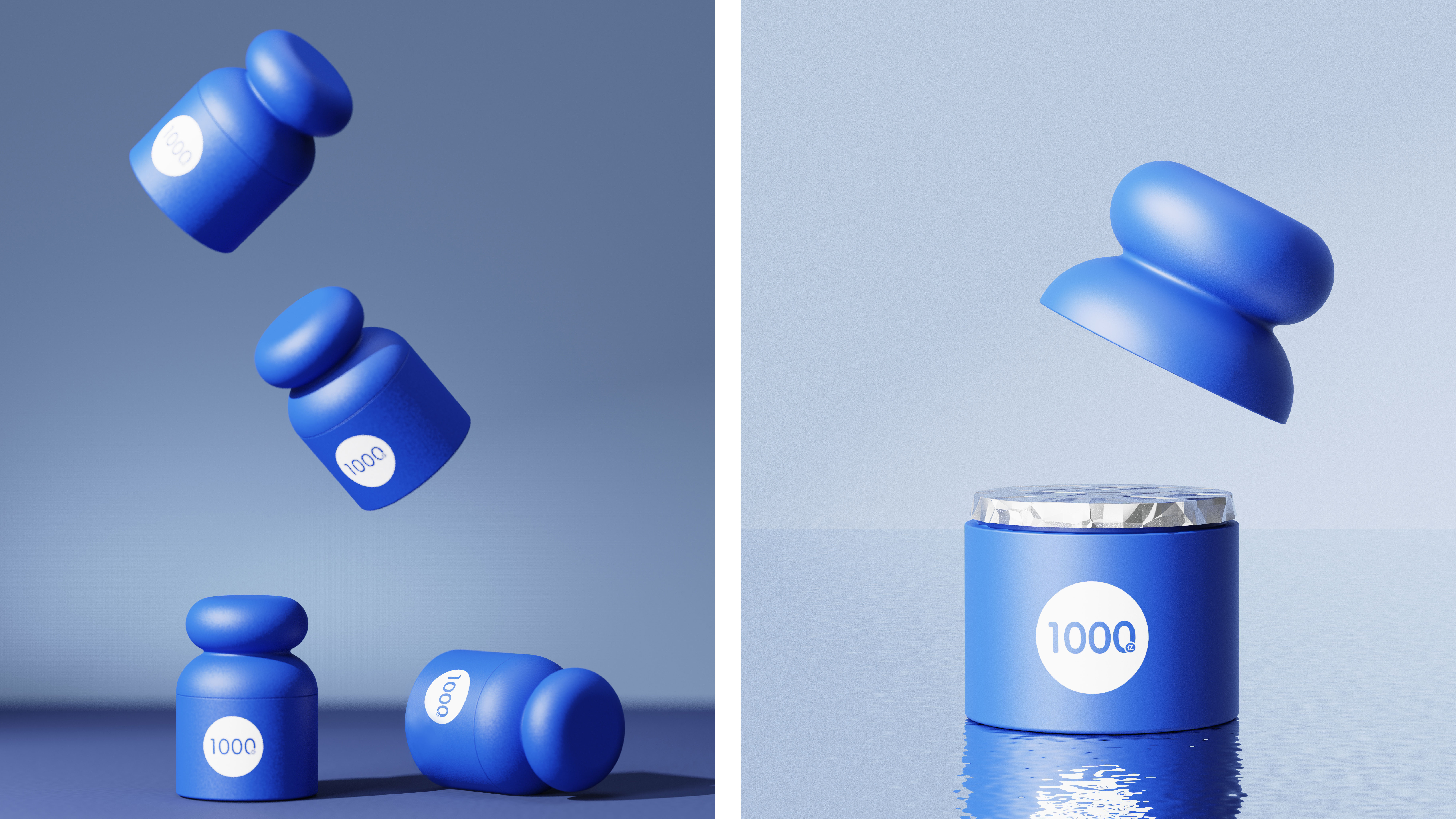
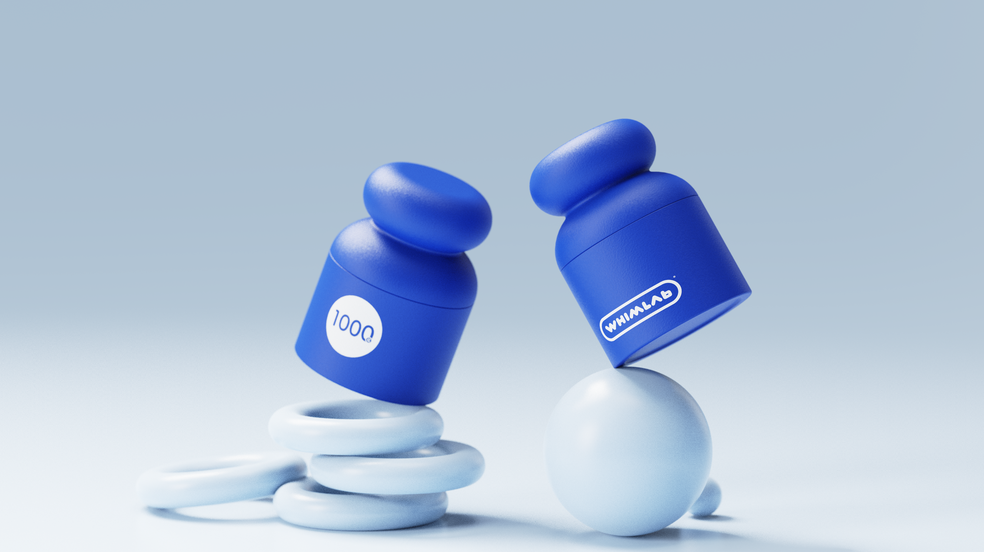
In the successful cases of global brands, a high degree of symbolization is a common feature that cannot be ignored. We have created a visual logo for the WHIMLAB bottle-"weight bottle", which is intended to pry the sub-health burden of current life and achieve a healthy balance.

The copyright of this work belongs to 明锐设计. No use is allowed without explicit permission from owner.

New user?Create an account
Log In Reset your password.
Account existed?Log In
Read and agree to the User Agreement Terms of Use.
Please enter your email to reset your password


Your previous general image number was canceled, isn't it, is this a new number?
It must be very smooth after drinking it.
Good advertising.