The two chemiluminescence analyzers diagnosed by Comey, one is a medium-sized desktop product and the other is a larger ground-based parallel product. Although the two products are not the same product line, they are not designed in series on the whole. It is still necessary to maintain some serialized features in the design.
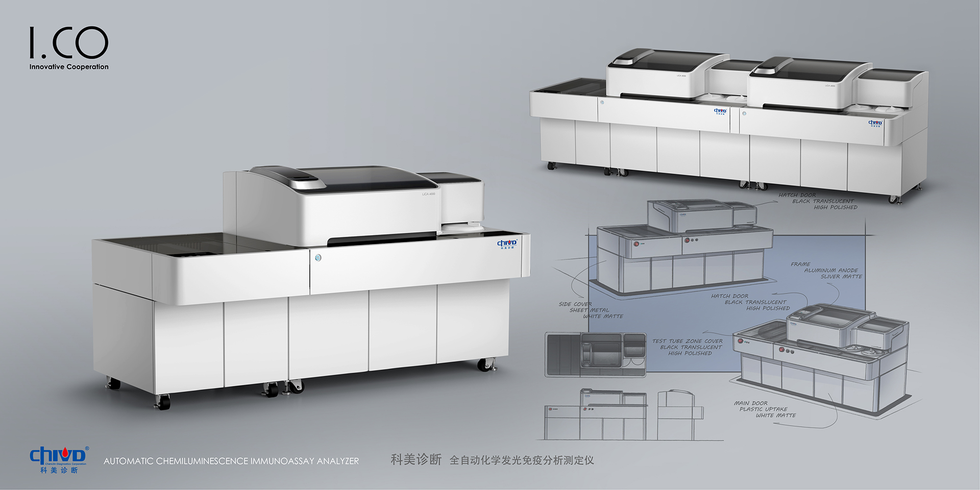
Customers position their products as mid-to-high end, hoping to break through the trend of pursuing high efficiency and precision in the industry through unique appearance and advanced technology, and create a new product line.
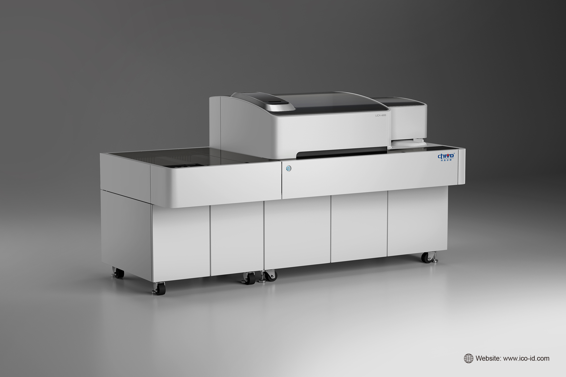
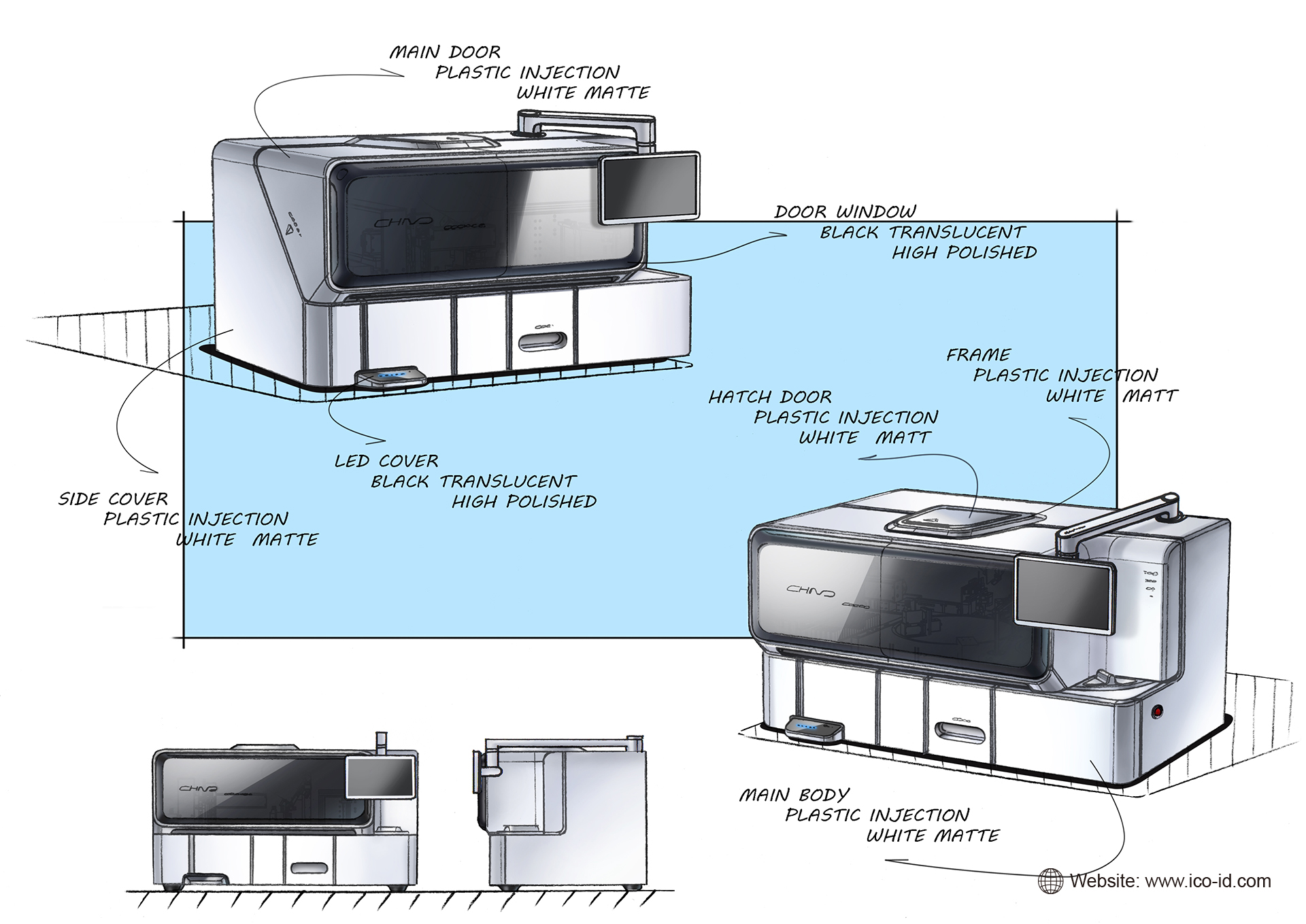
The laboratory is mostly a cold, messy environment, too much emphasis on efficient, scientific and technological products, easy to bring the operator the feeling of being ignored. The designer gives the product elegant and soft temperament through soft shape and simple color block division: the whole product adopts white as the main body color, and the rounded corners on the four sides are soft and friendly; The top operation area is translucent acrylic as a whole, with a large area of color distinction, which is not only cleaner and more regular in vision, but also easier to form the designed visual identification point. The reaction cup door surrounds a circle of matte silver borders and makes layers in color and material, make the hatch like a floating island, quietly parked on the dark surface, giving people a sense of tranquility and peace; the emergency stop switch indicator, the main cabin door handle and other parts also adopt an arc shape, adding a touch from the details. Smart and delicate feeling.
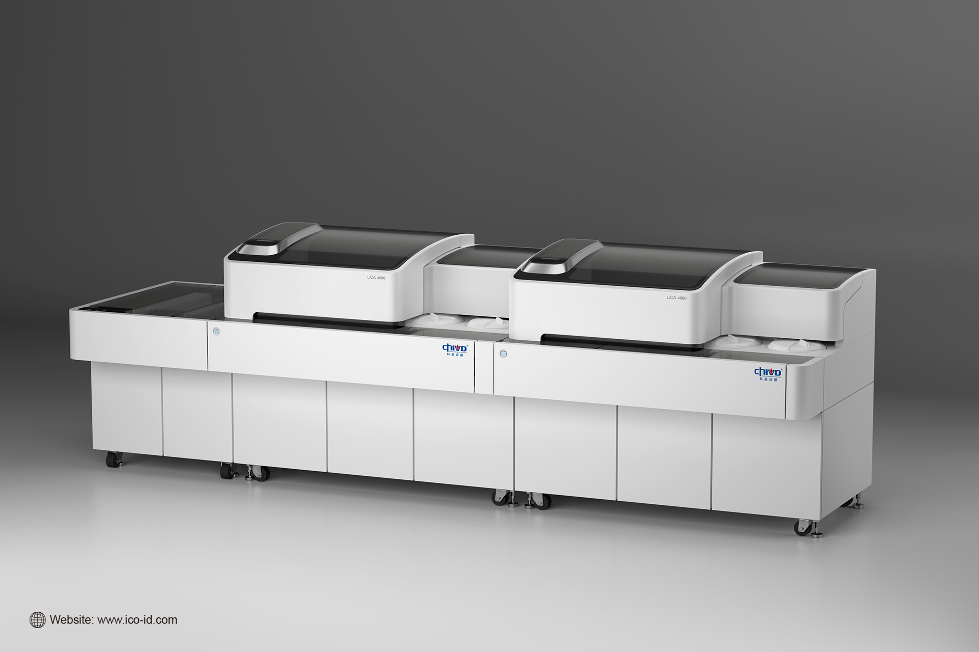
The front of the product is connected to the assembly line, connecting multiple products in series to meet different needs, enriching testing items, effectively improving efficiency, and saving laboratory space and procurement costs

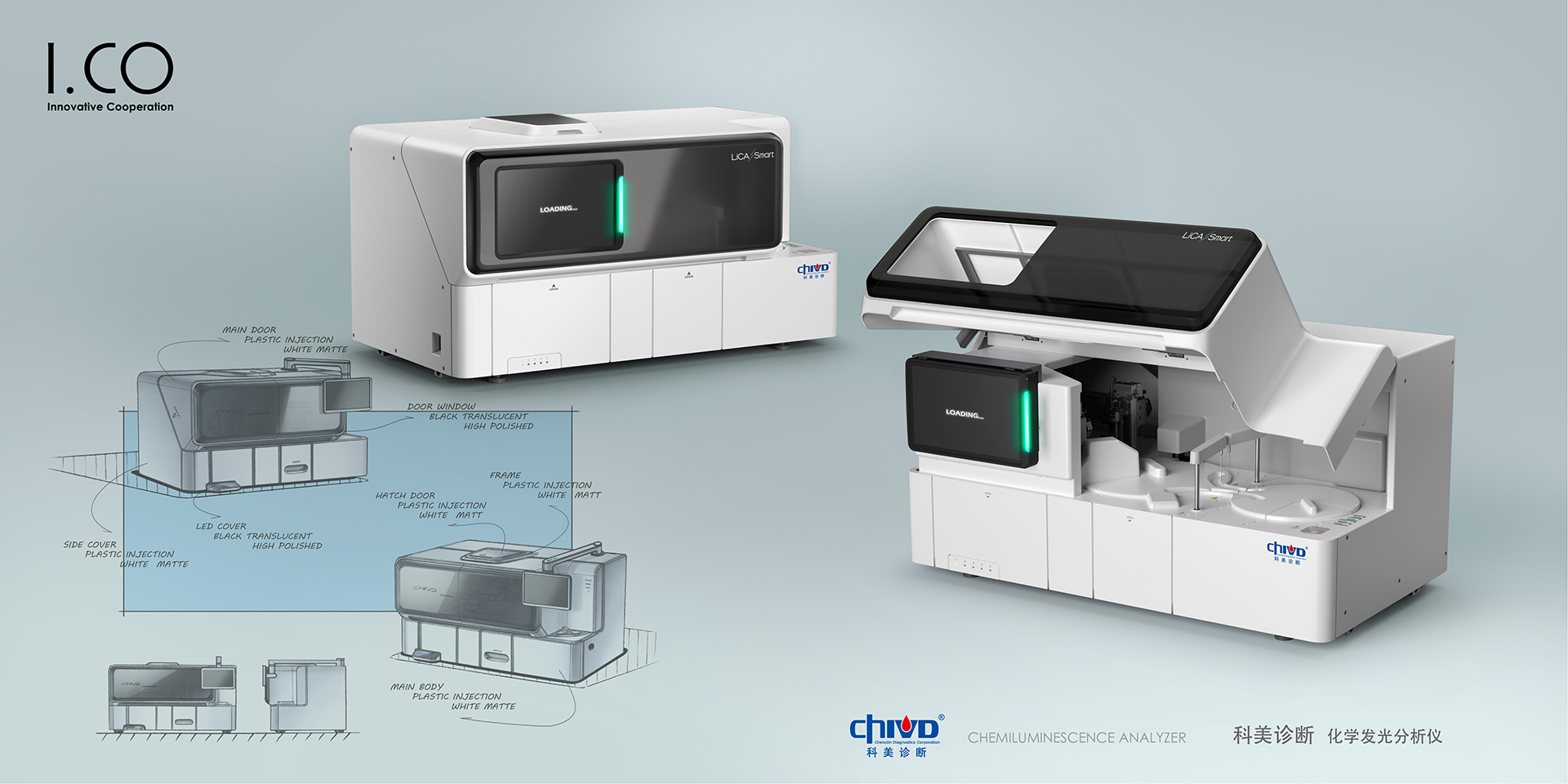
Different from the full-automatic analyzer, the table-top analyzer has very strict size requirements, so the scientific and compact layout, convenient and fast operation process, and at the same time maintaining serialization characteristics with the Lica4000 of the preceding paragraph are the focus of this project.
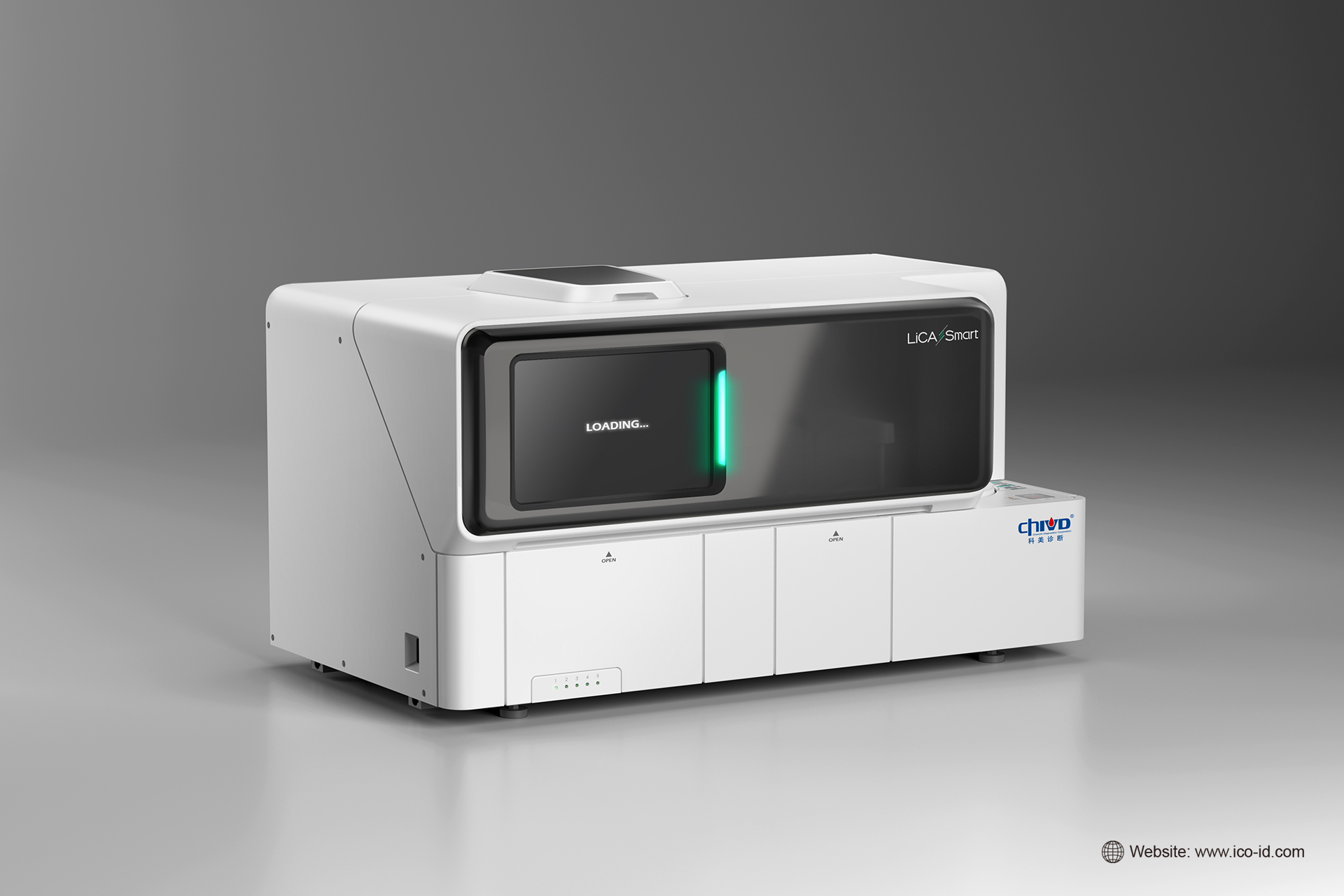
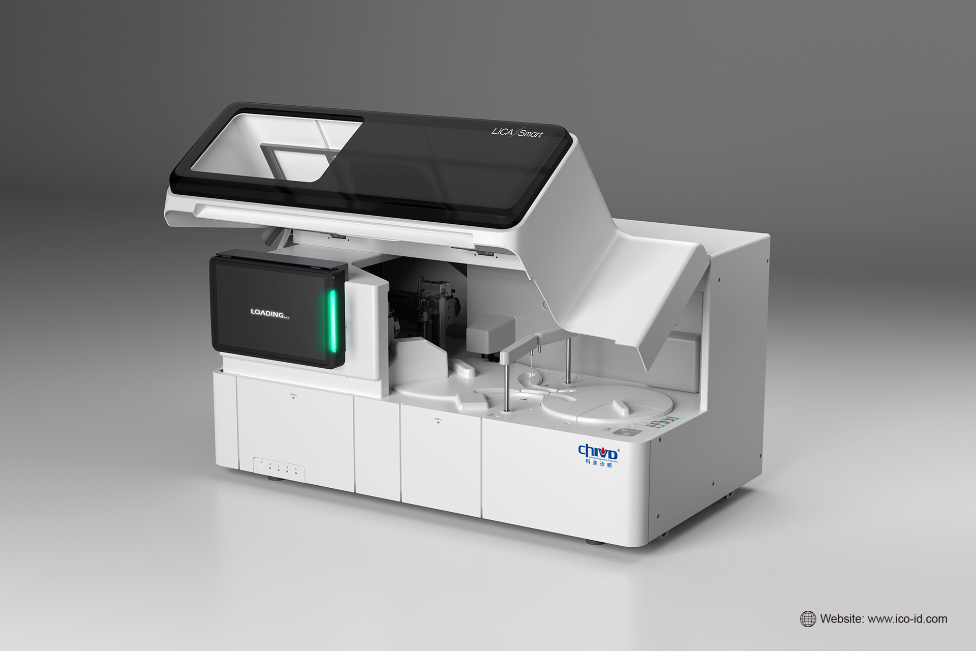
This design continues Lica's 4000 precise and emotional positioning. The front looks like a retro TV. The smooth and flat dark window becomes the visual center. The convex shape of the window increases some retro interest and makes the product look more delicate. The large-area color separation is simple and regular, easy to identify, and the translucent window is convenient to observe the running state of the product at any time. Color separation and material application echo Lica 4000's design language, but Smart is more square in shape, it reflects its compact, efficient and flexible product positioning; the touch screen is located on the left side of the product, which is convenient for users to operate; the vertical status indicator increases the sense of technology.
The copyright of this work belongs to ICO-爱谷设计. No use is allowed without explicit permission from owner.

New user?Create an account
Log In Reset your password.
Account existed?Log In
Read and agree to the User Agreement Terms of Use.

Please enter your email to reset your password
I'm addicted to passing eyes.
666
100 points
This big screen design is very handsome.
Praise one
Not bad
The design is great. Hand-painted display is a feature.