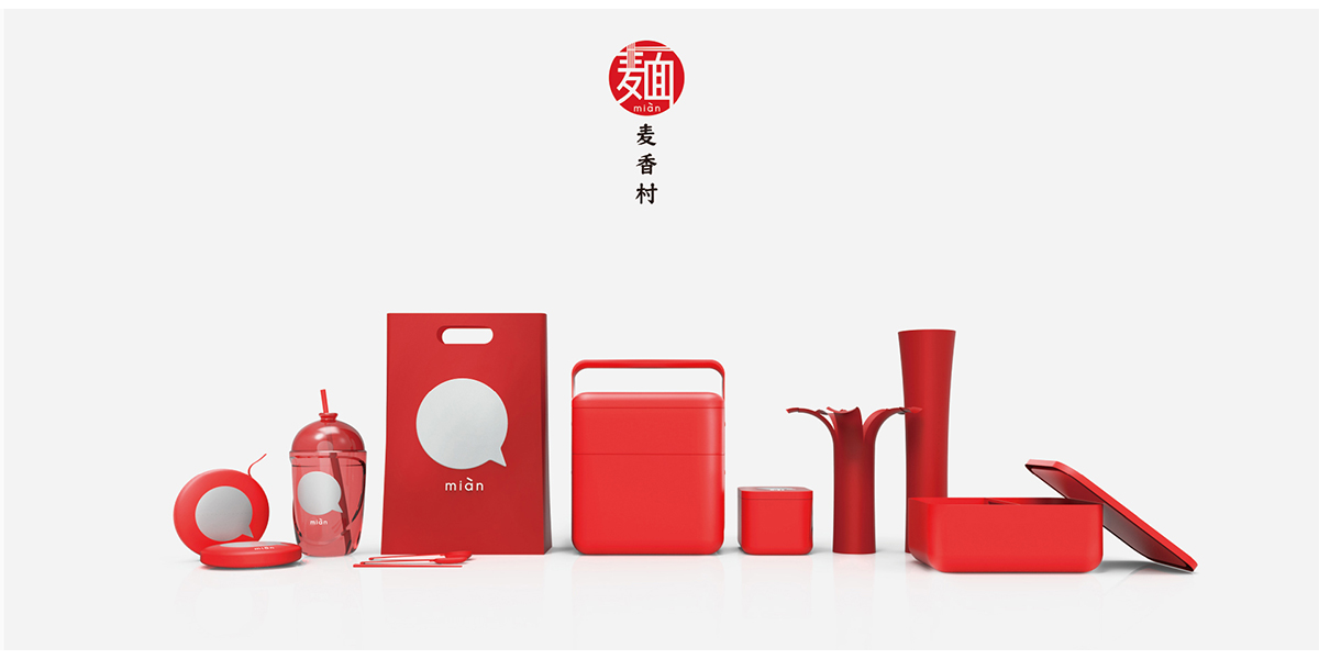
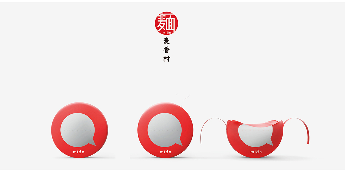
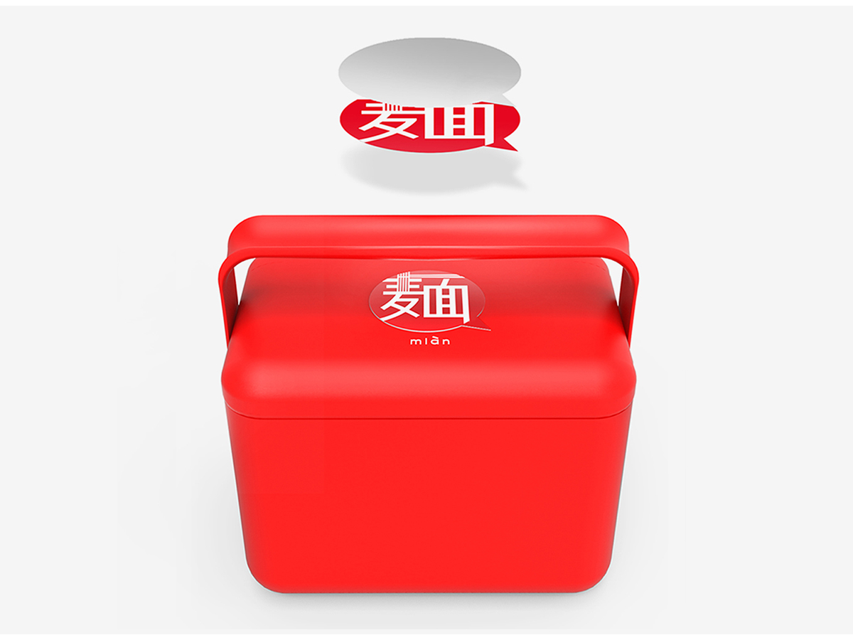
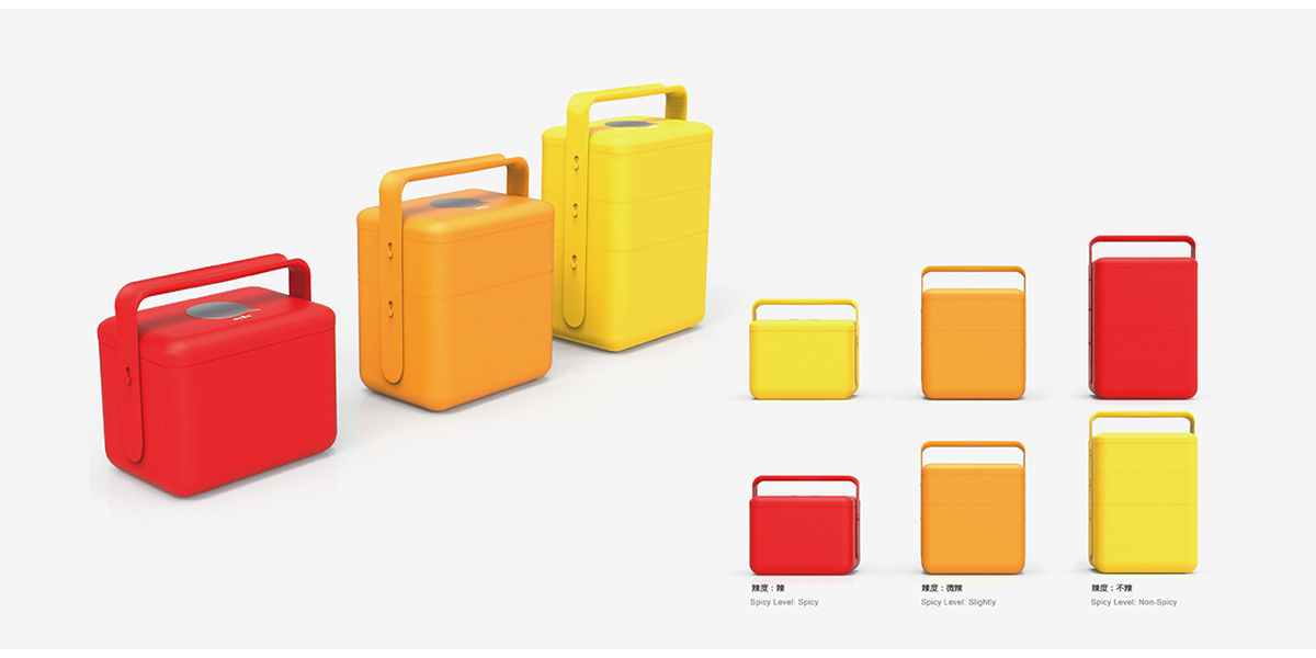
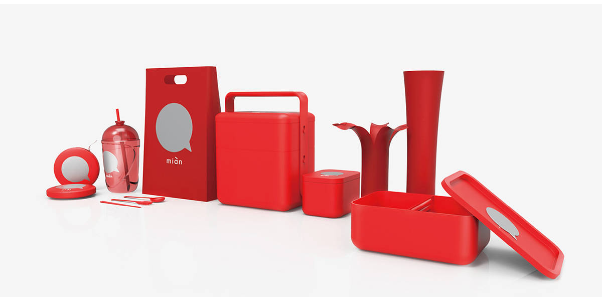
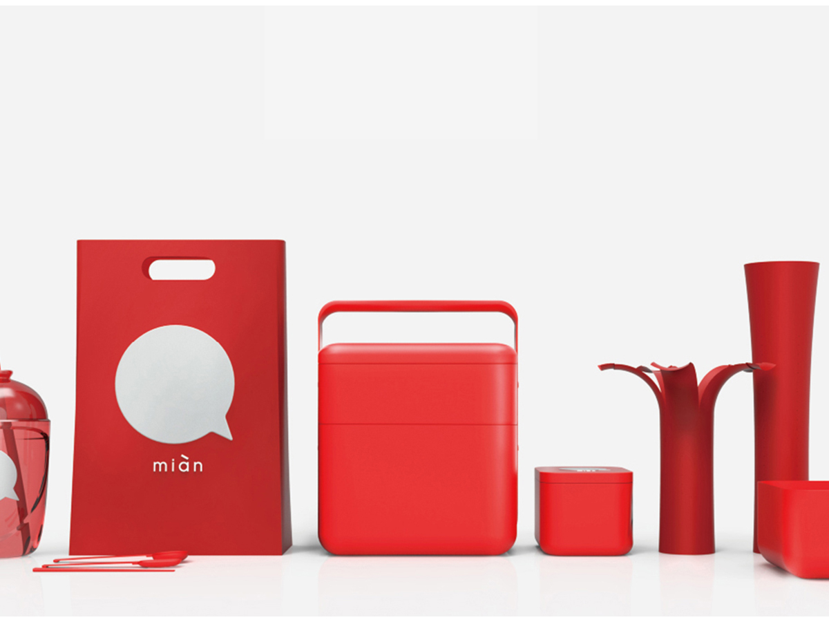
The design appearance of Maixiang Village's take-out series is derived from the modern elements of ancient food boxes. The red packaging design is consistent with the brand's main visual color. In terms of structural design, the designer adopts the design concept of separation of noodles in soup to minimize the cooking time and the waiting time of users, thus providing consumers with a convenient and comfortable eating process.
The copyright of this work belongs to 合木设计. No use is allowed without explicit permission from owner.

New user?Create an account
Log In Reset your password.
Account existed?Log In
Read and agree to the User Agreement Terms of Use.

Please enter your email to reset your password
It's very festive
Advanced packaging
GOOD JOB
This package is very festive.
Red looks really good.