Differential Break Bureau
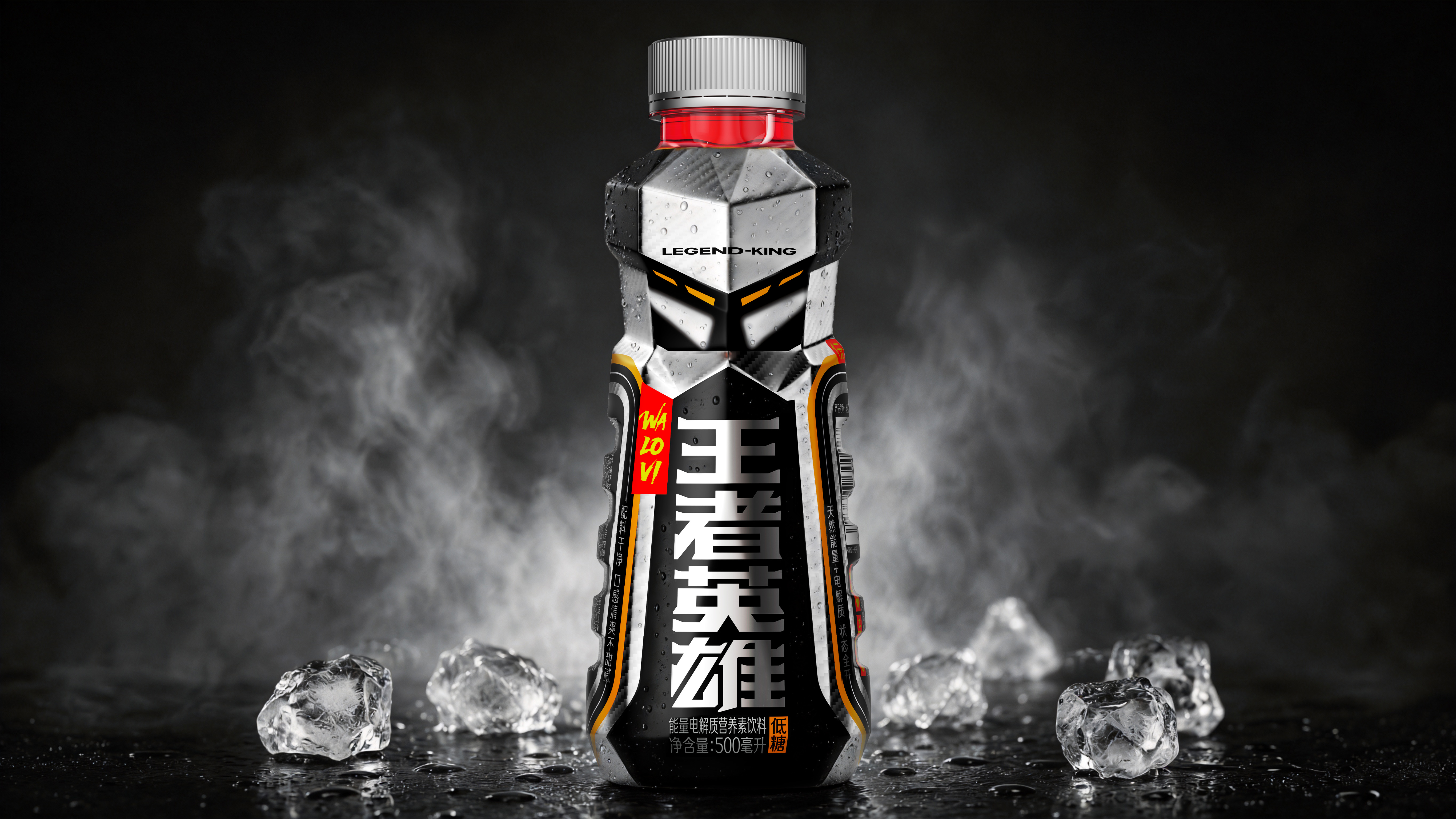
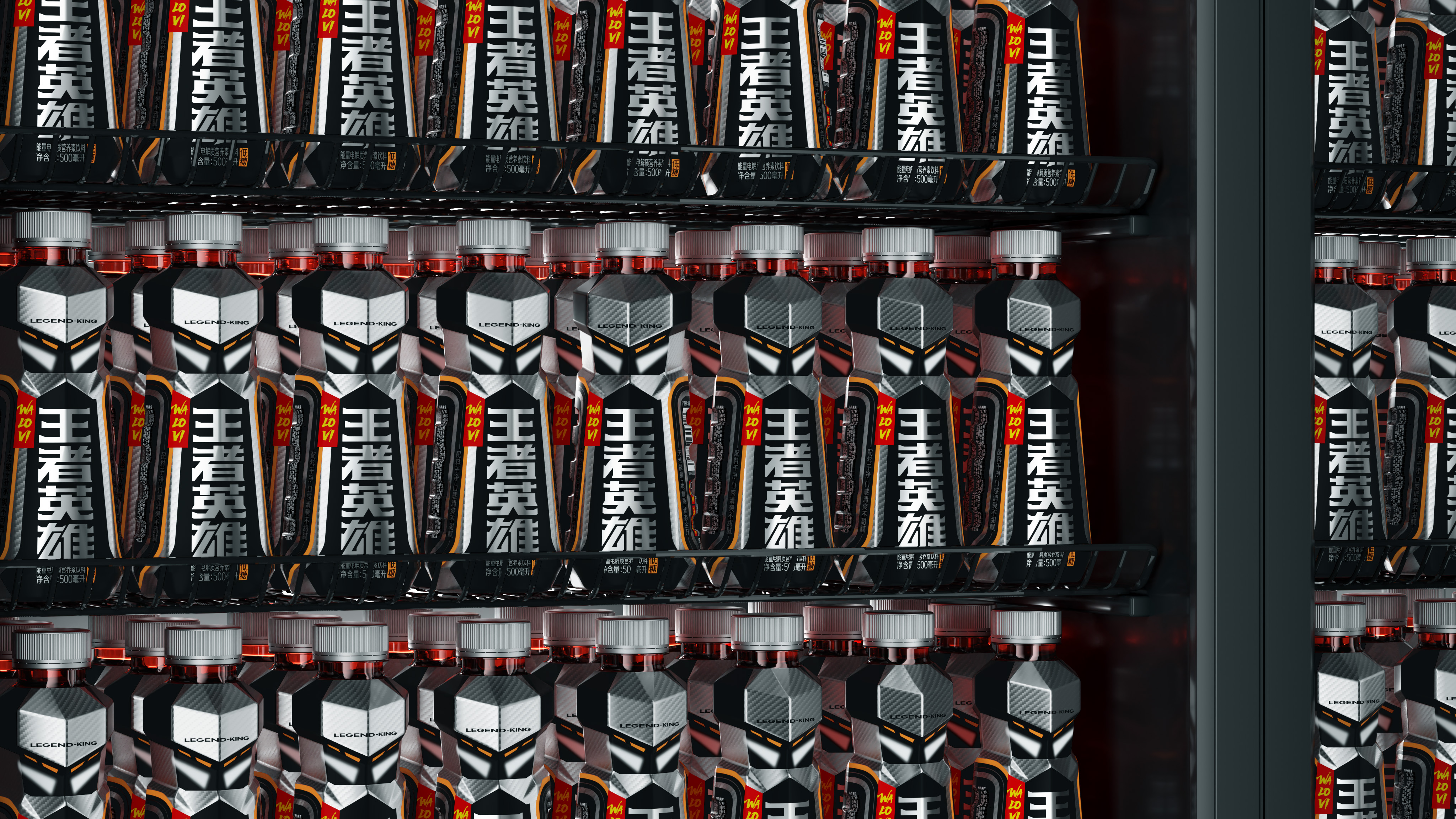
To stand out in the Red Sea of high-saturation energy beverages, new products must be "seen first, then selected, and finally remembered".
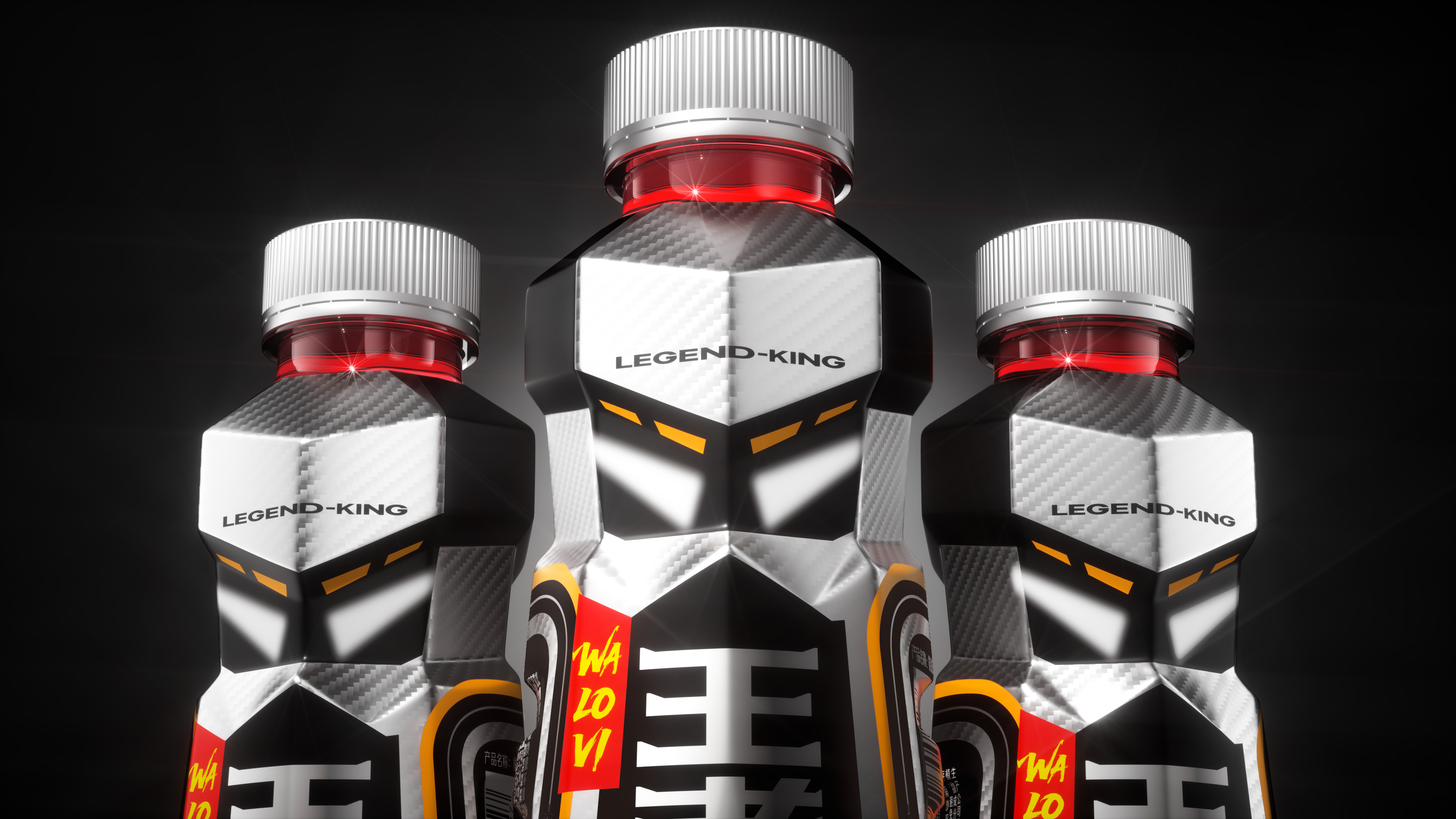
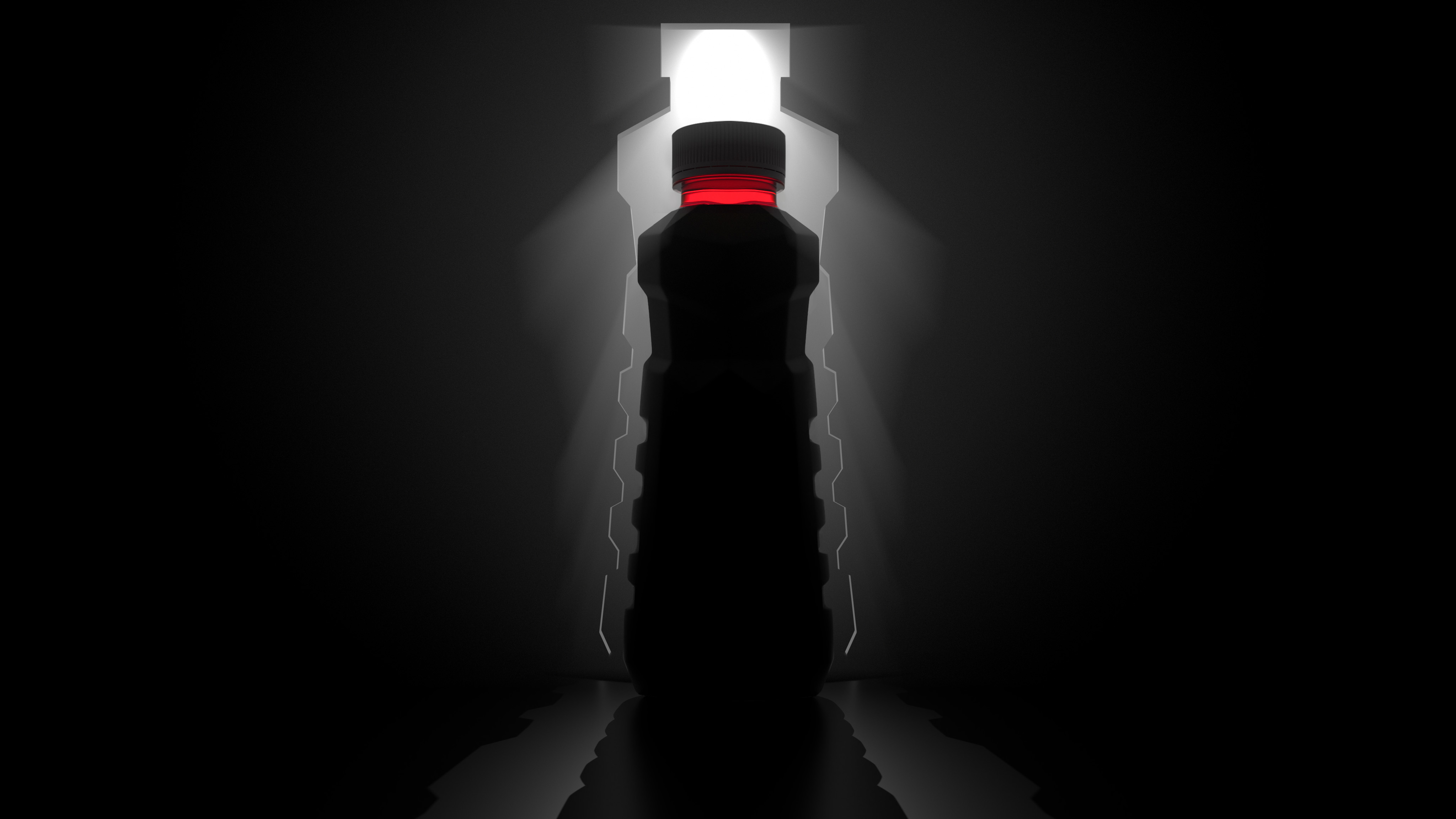
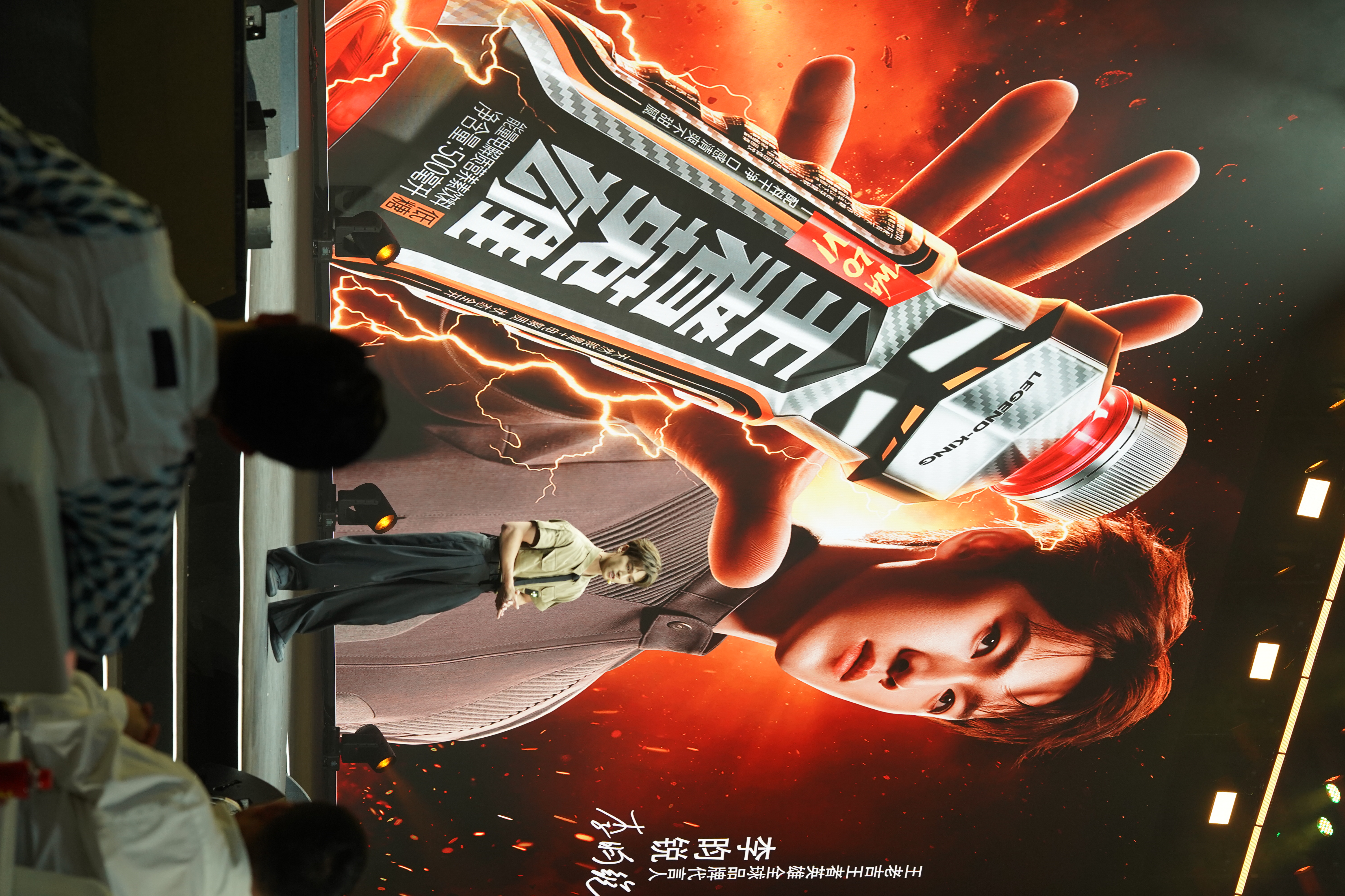
Super Symbol and Visual Recognition
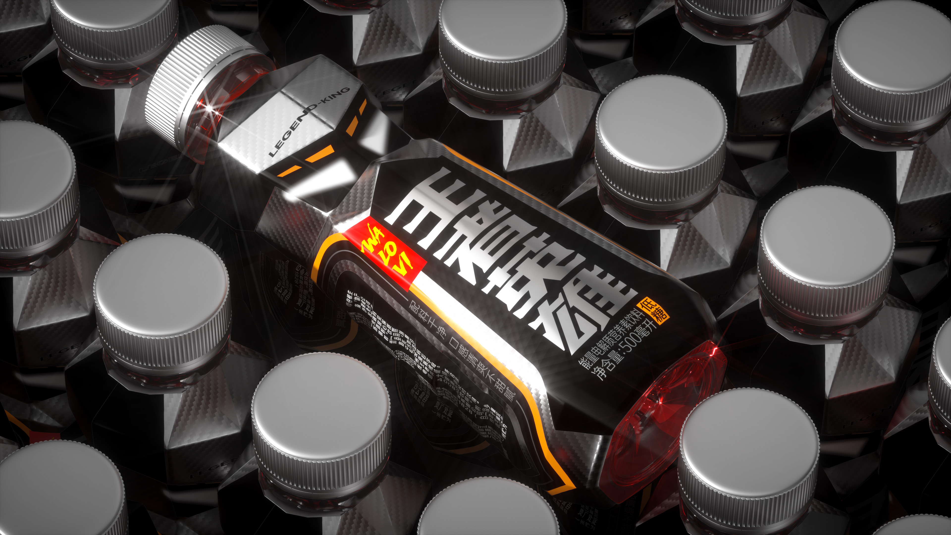
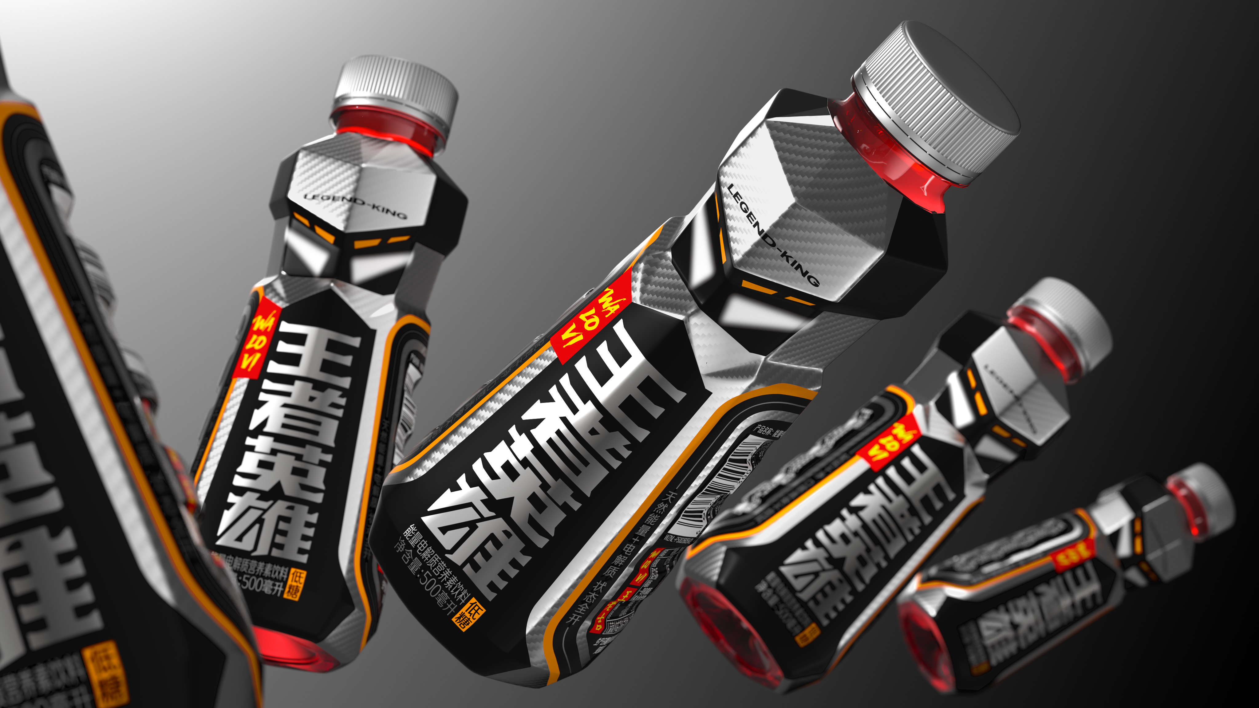
and. The sharp outline is clear and the details are full. It is an exclusive type of body that is different from conventional energy drinks.
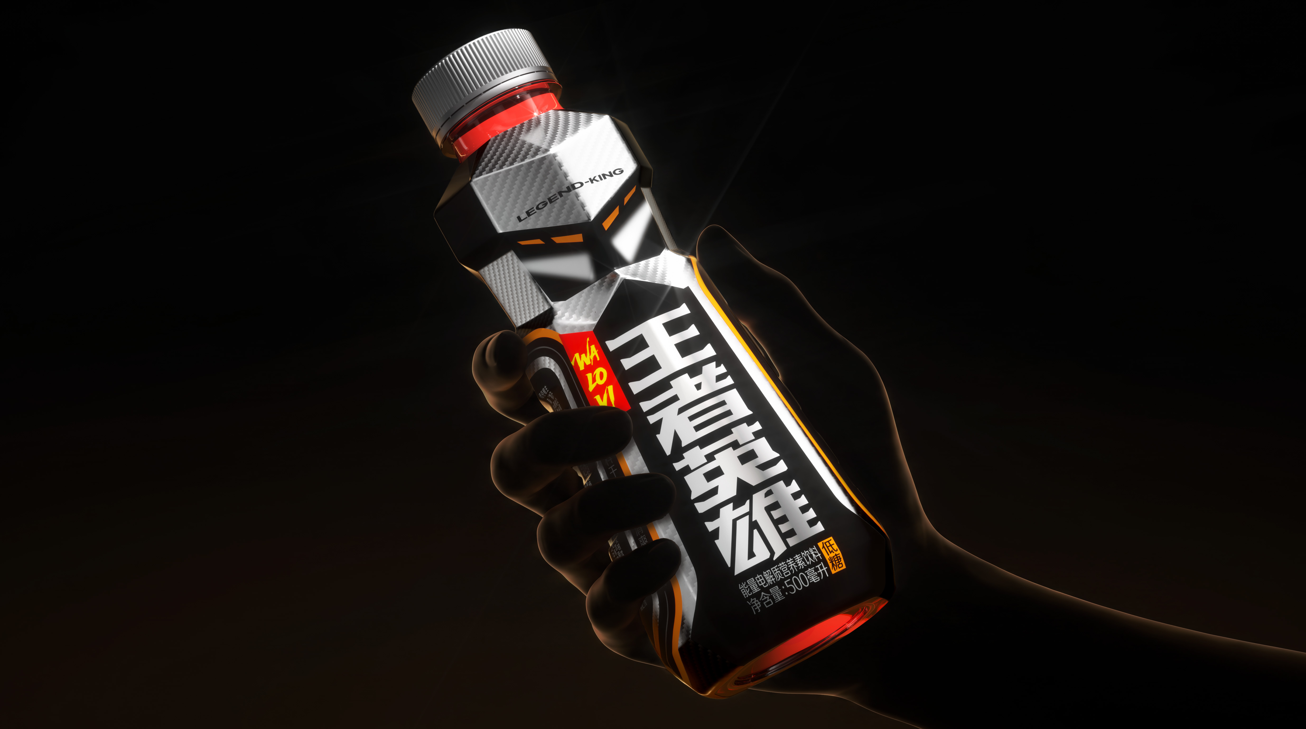
Man-machine engineering and holding experience
Bottle size, side details, let the styling not only stay in the visual impact.
Colour Collision and Brand Language
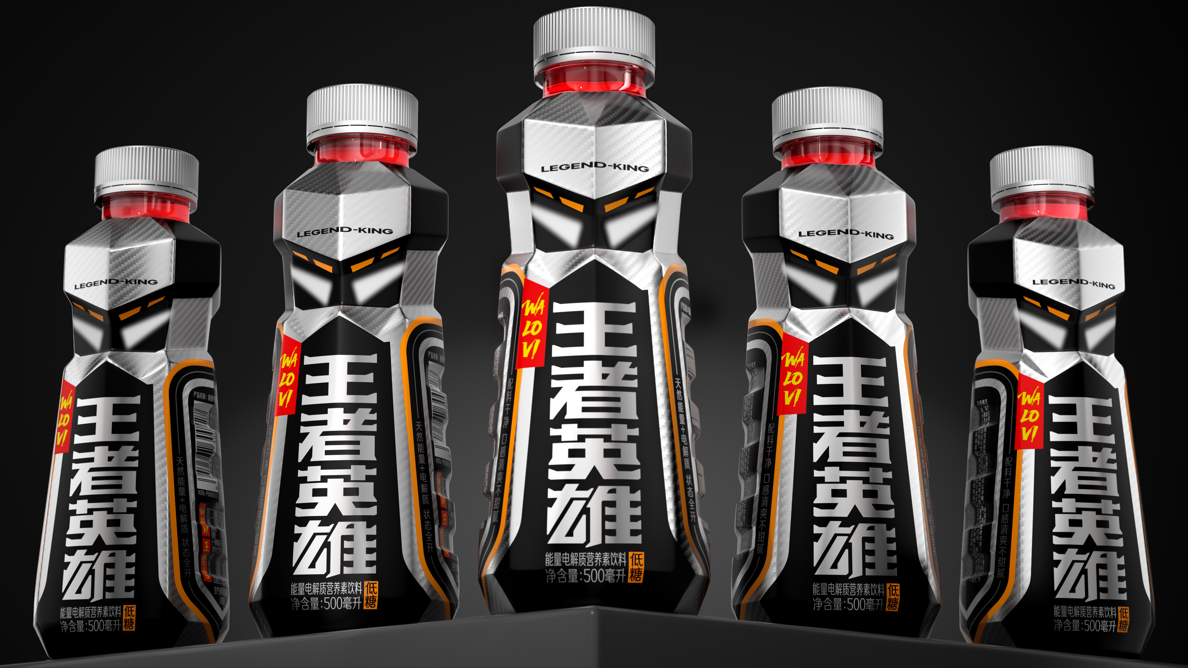
Break the usual high-saturation color paradigm of the product class, use black and silver color collision high-energy orange, and superimpose carbon fiber shading; font design integrates speed sense and aggressiveness, and the full direction is a powerful energy expression.
Trans-morphological extension and unified cognition
Canned products continue to be the same set of visual language, making the brand cross the different forms of bottling and canned, and still have a clear terminal recognition.
Name of Work | King Hero Packaging Design
Brand Holding | Guangzhou Wanglaoji Pharmaceutical Co., Ltd.
Original Design | Tiger Pan
Executive Design | Xia Xuedan Liu Qiang
3D Rendering | Zhu Yuling
Visual Presentation | Wang Qichang
Process Design | Xie Zhangkun and Lu Miaorong
Project Management | Peng Lei
Media Relations | Diao Xia

The copyright of this work belongs to 潘虎设计实验室. No use is allowed without explicit permission from owner.

New user?Create an account
Log In Reset your password.
Account existed?Log In
Read and agree to the User Agreement Terms of Use.
Please enter your email to reset your password



Will Tencent not send a letter? Ha, ha, ha
It's too personal, isn't it
Master Pan's Works