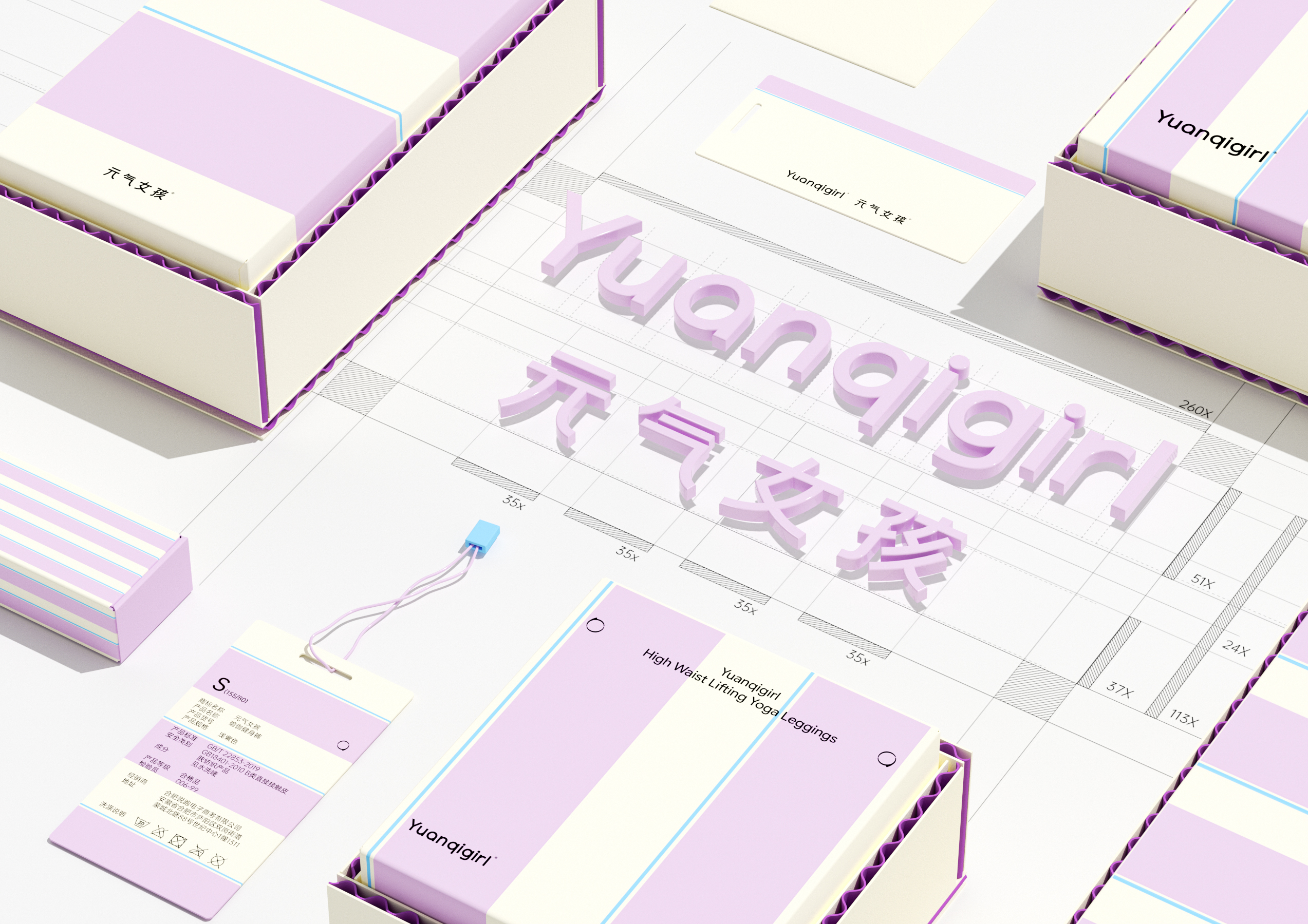
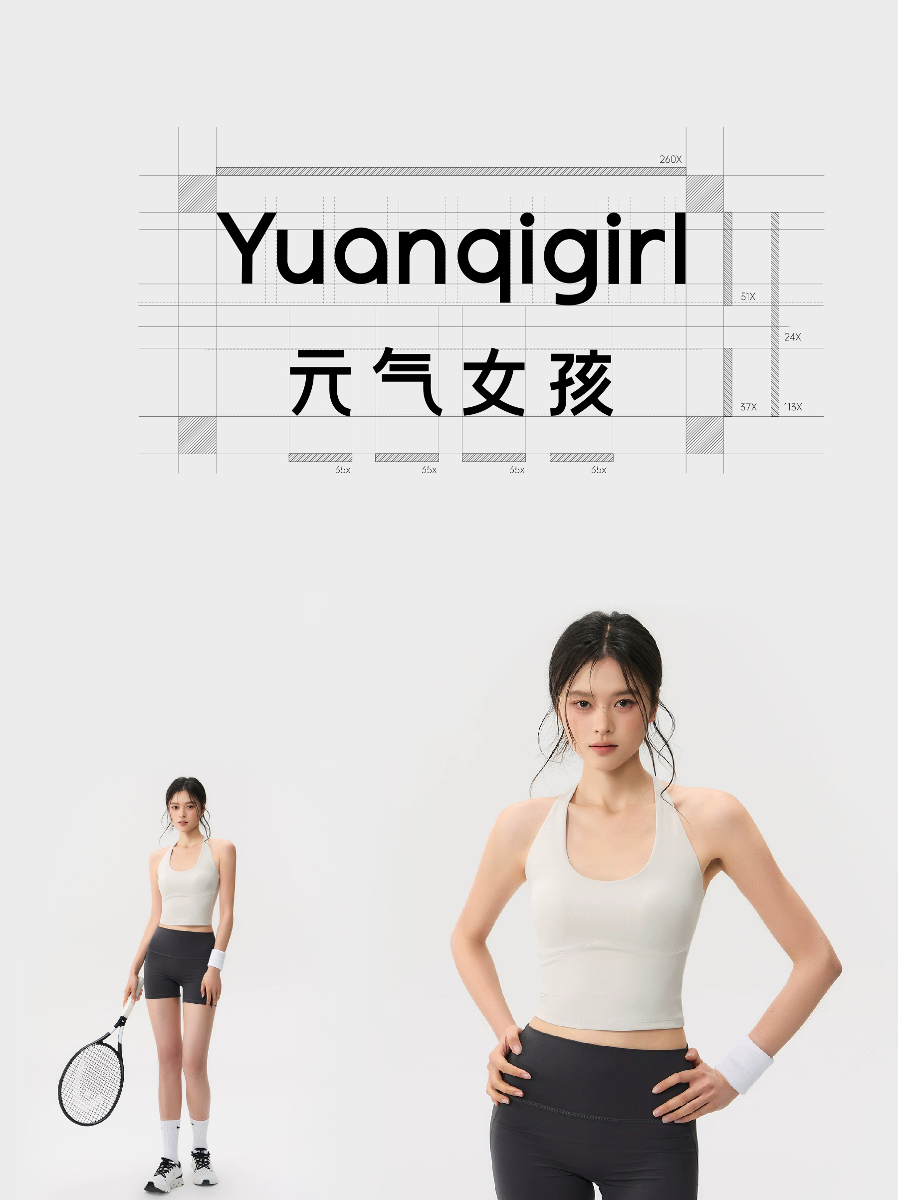
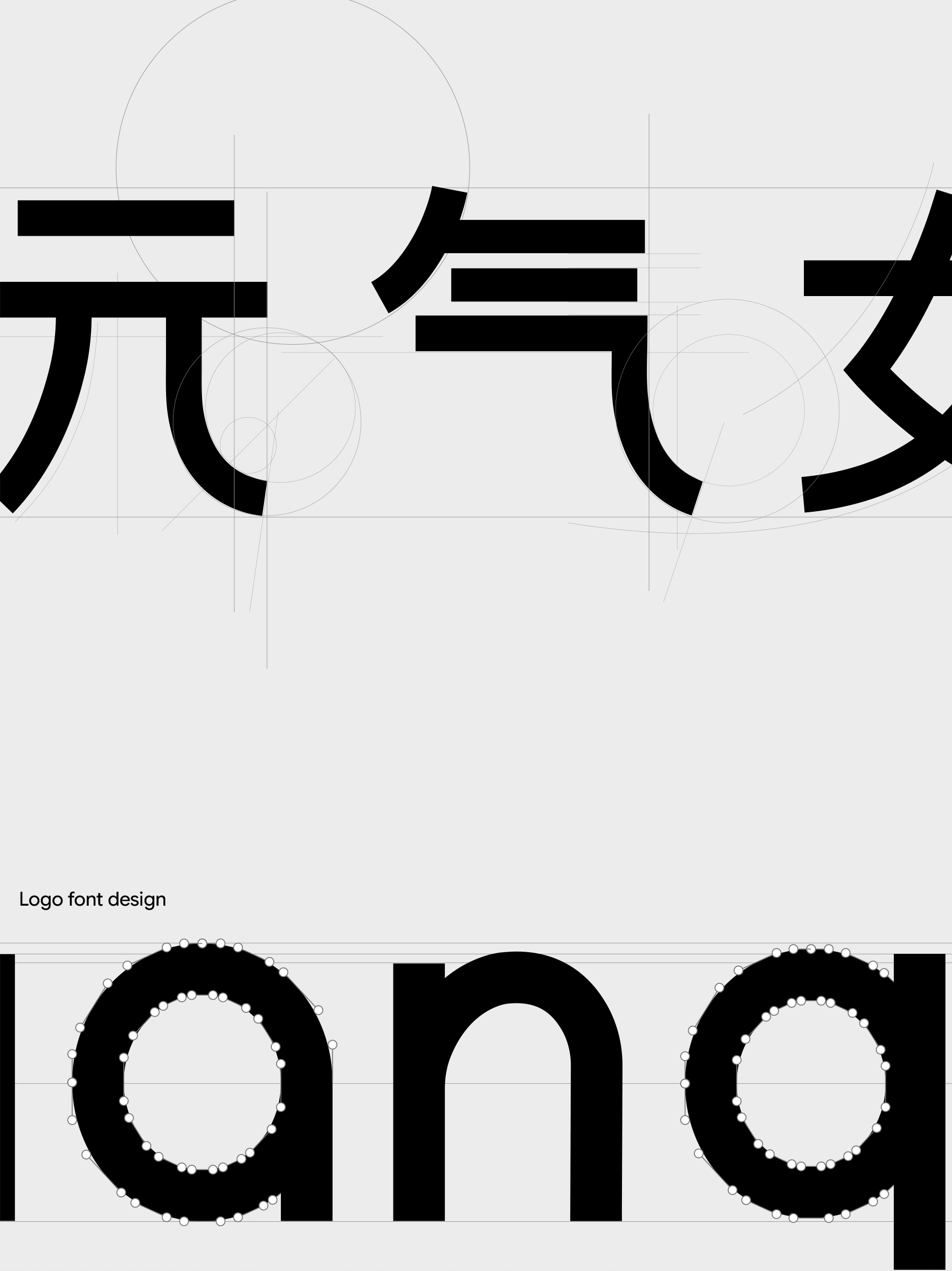
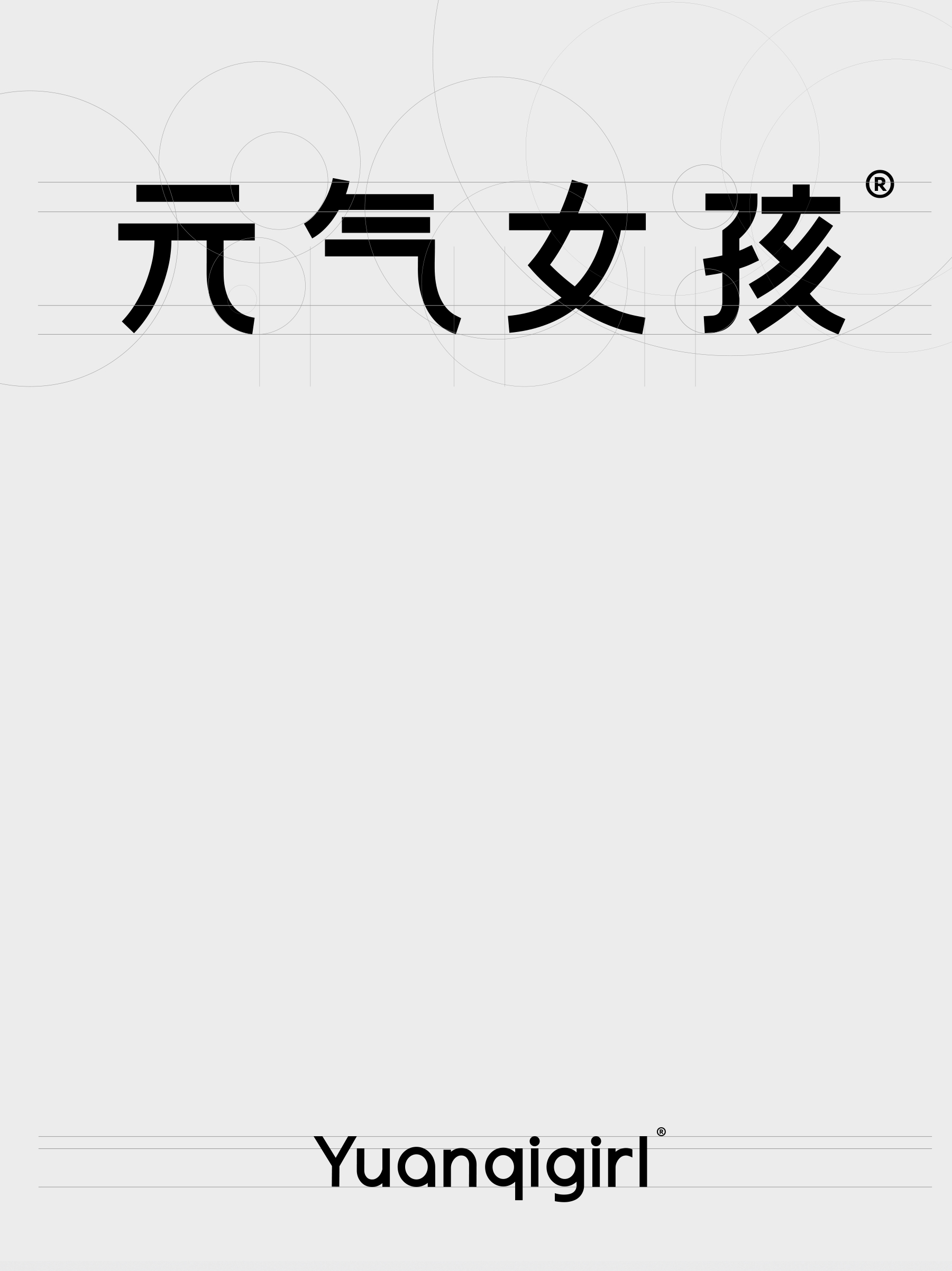
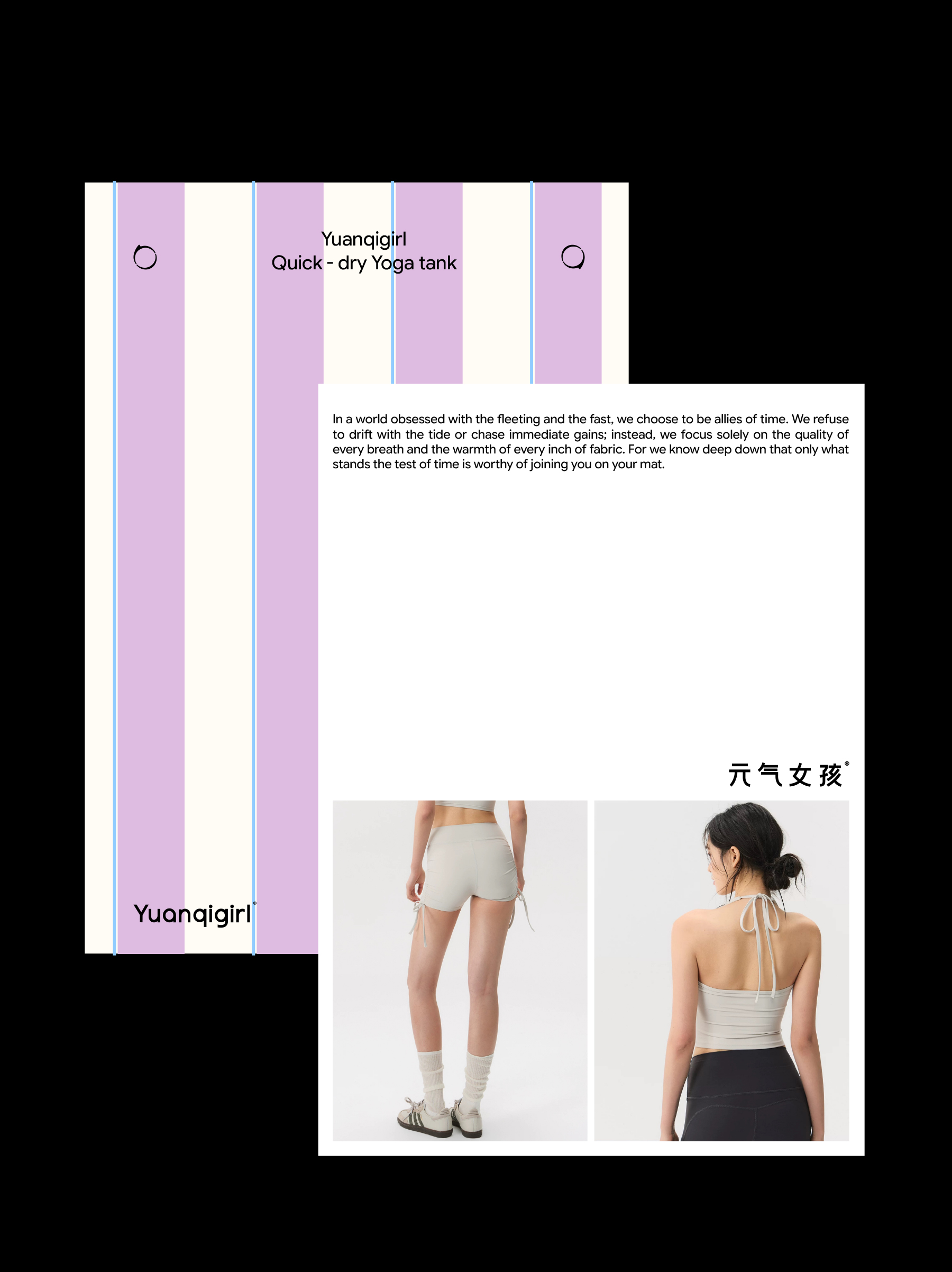
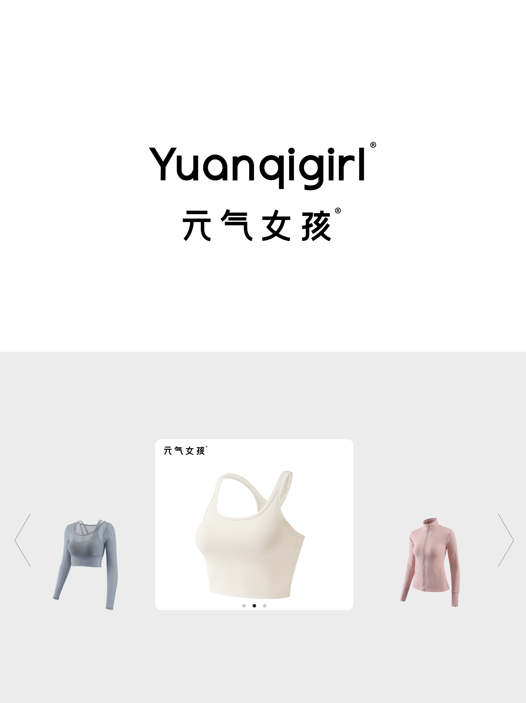
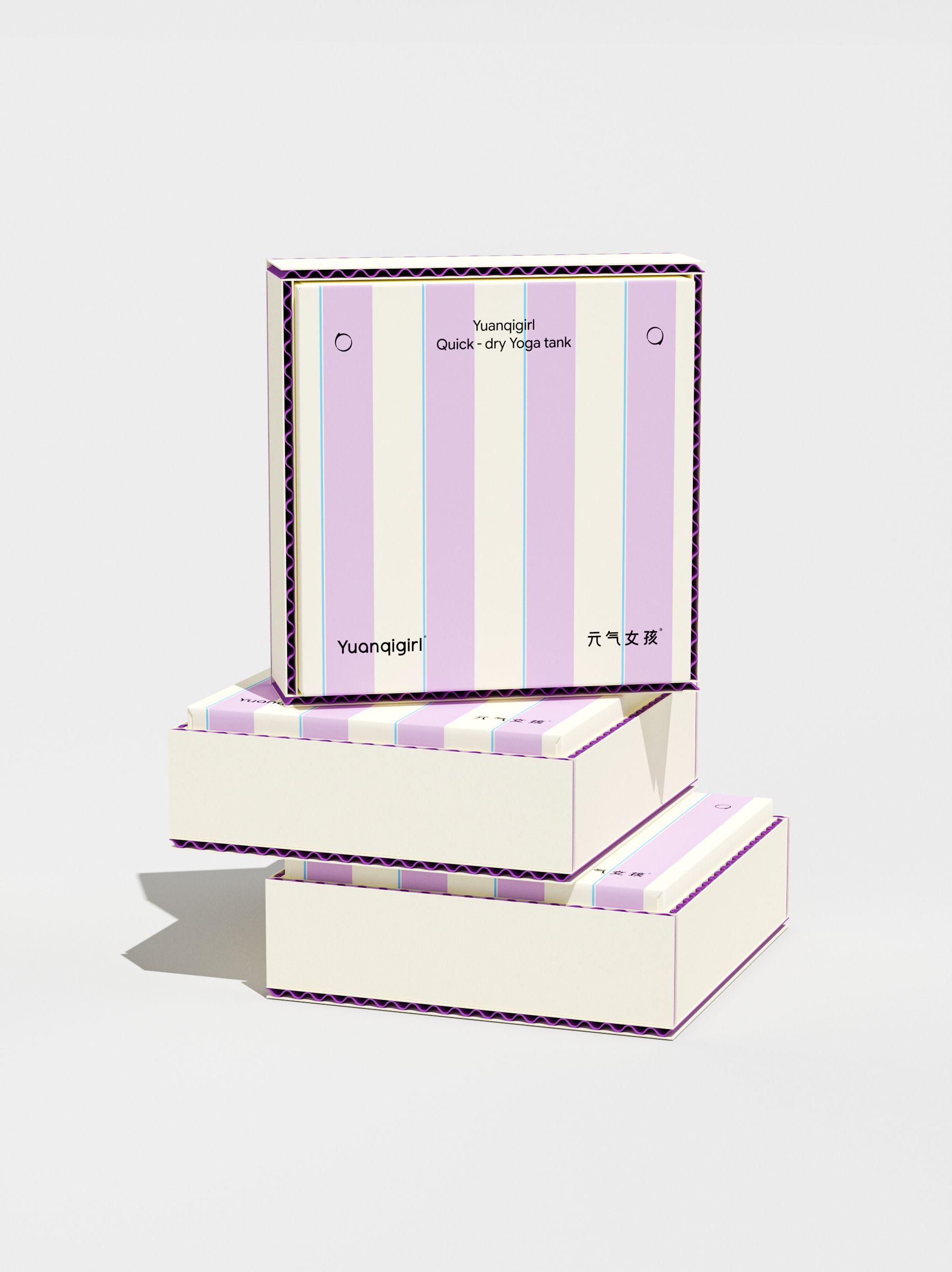
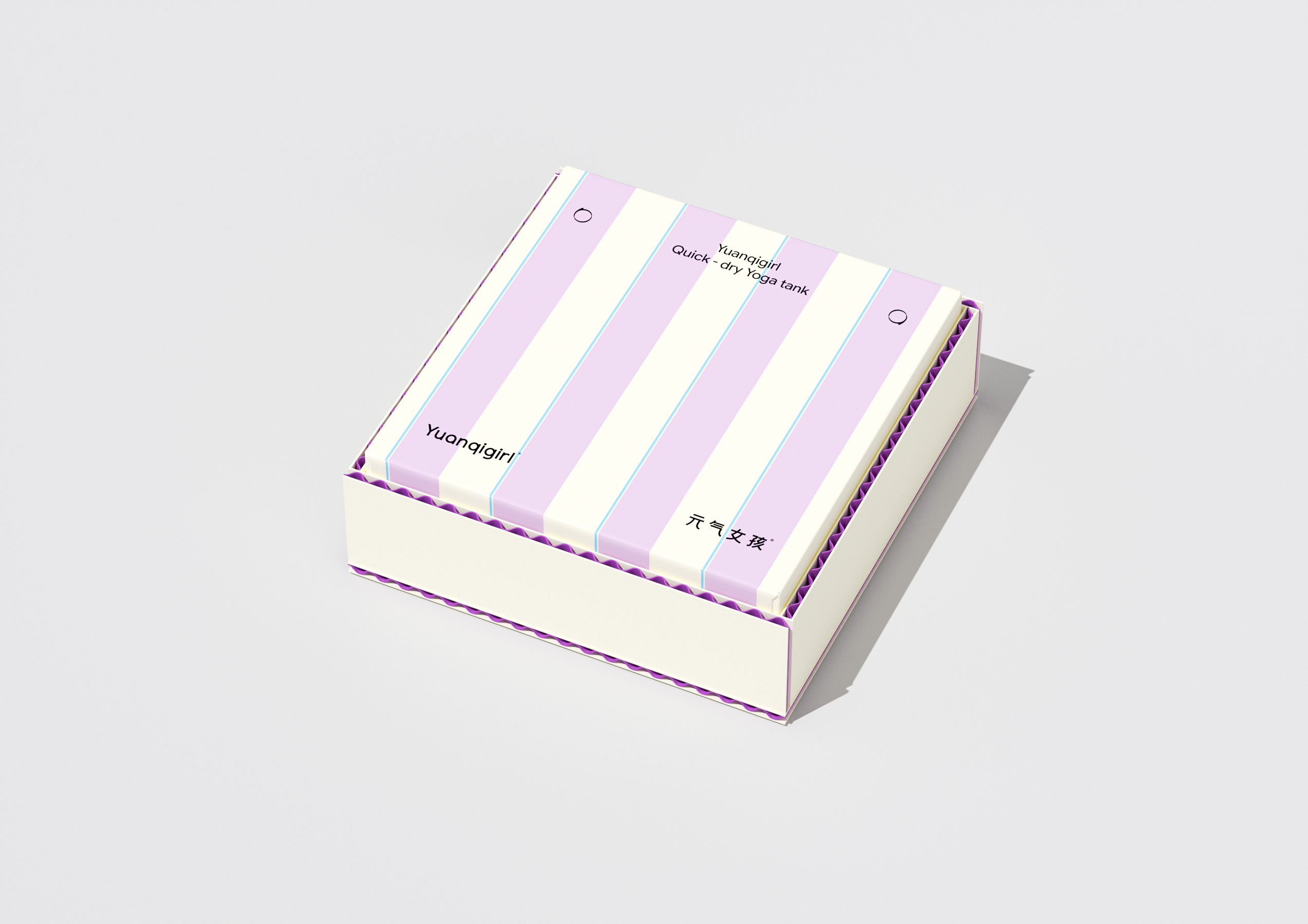
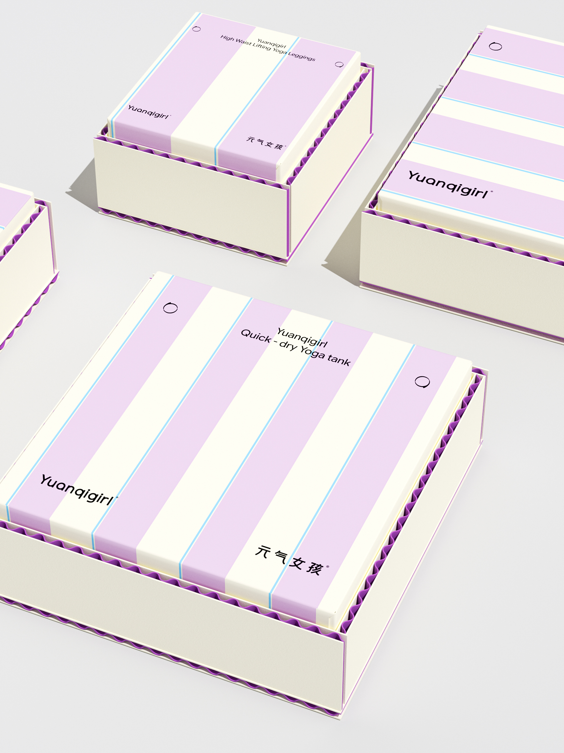
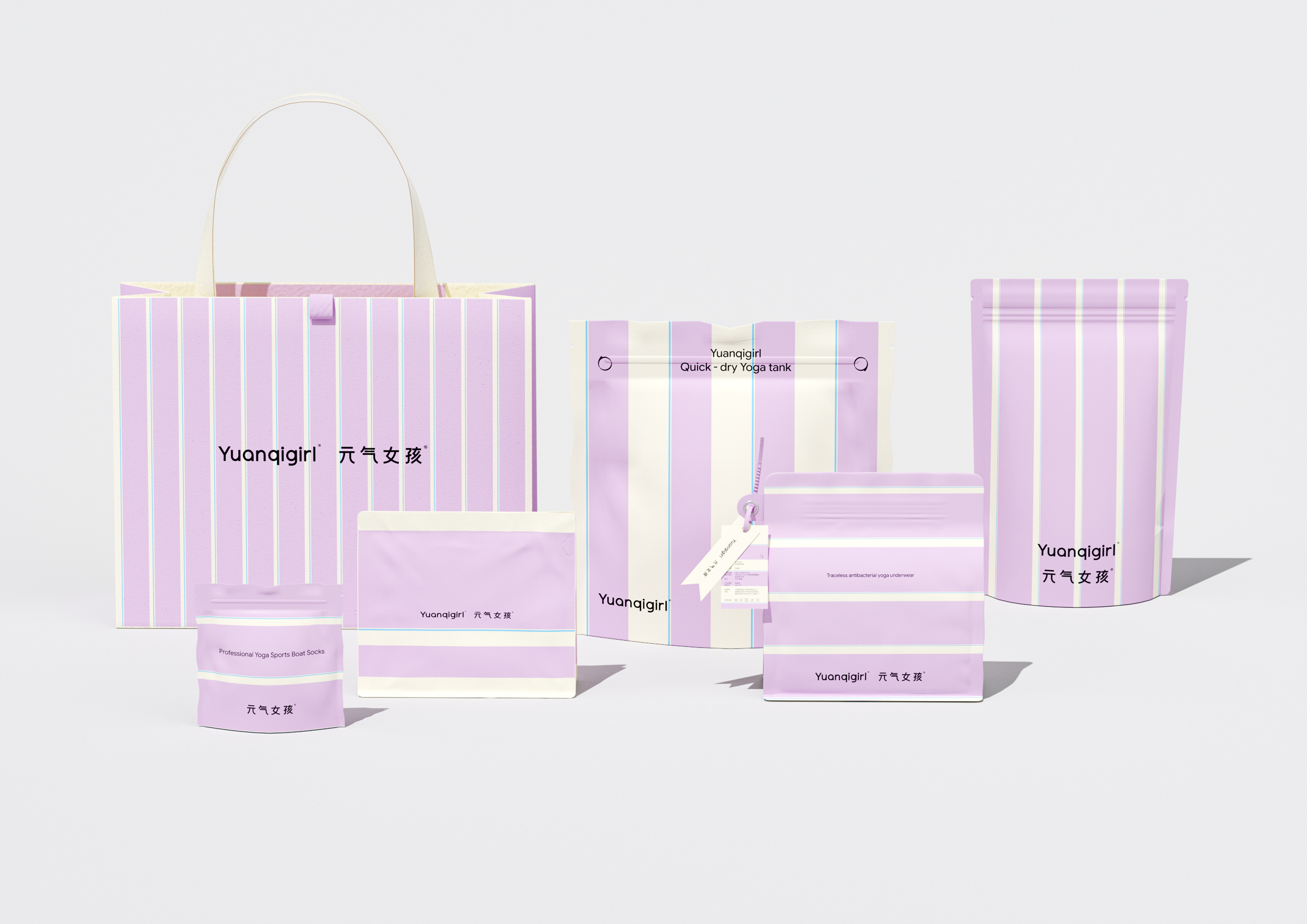
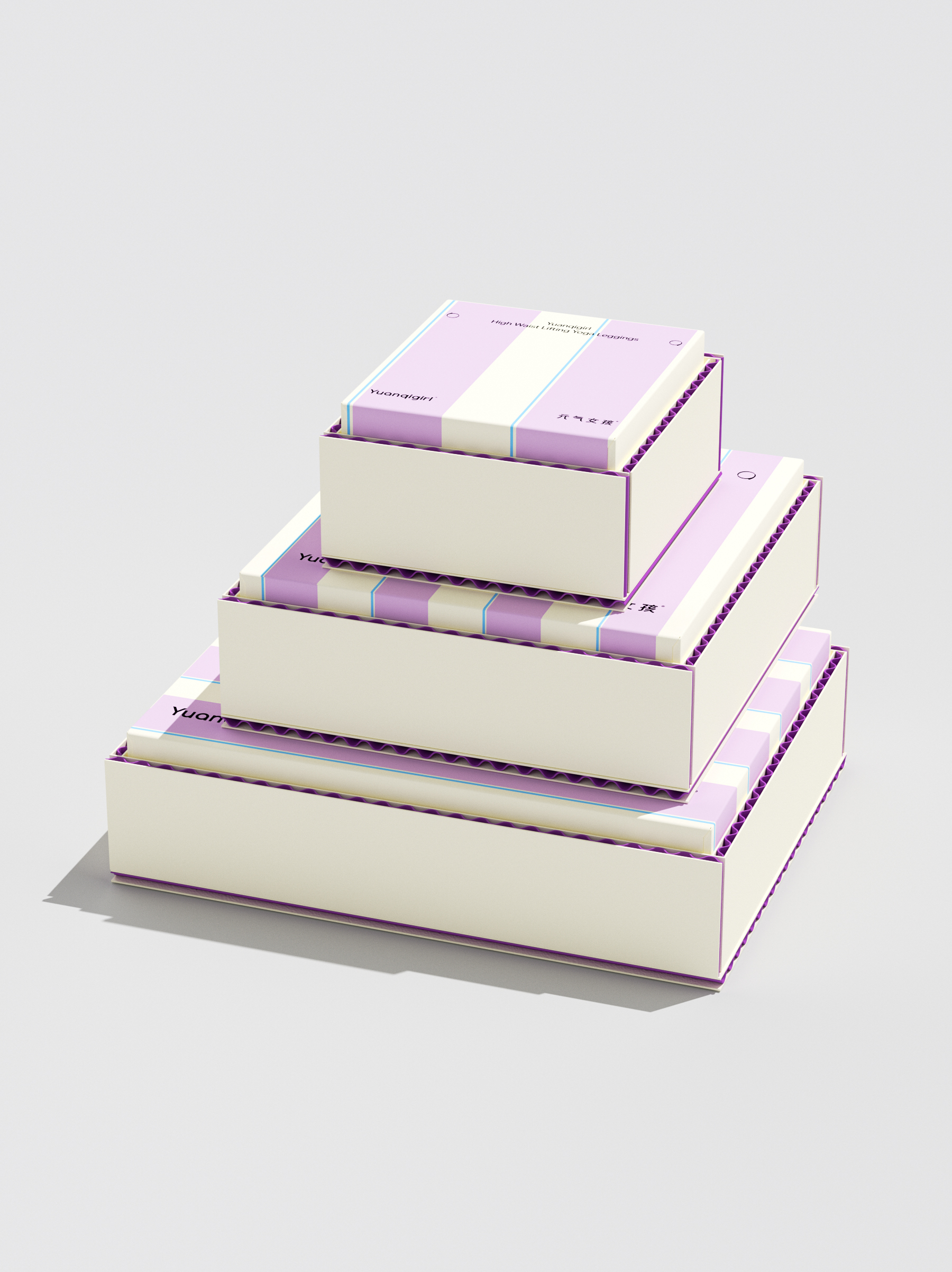
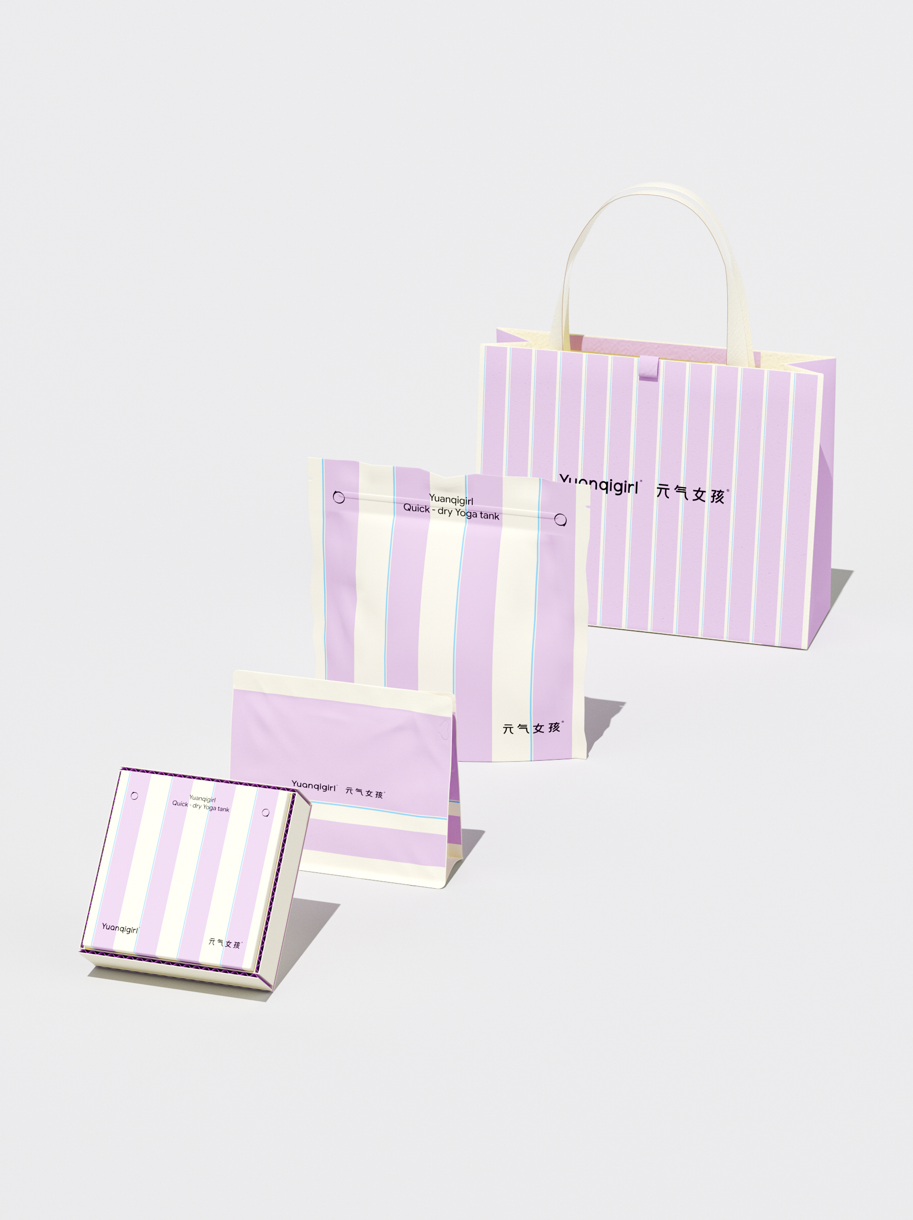
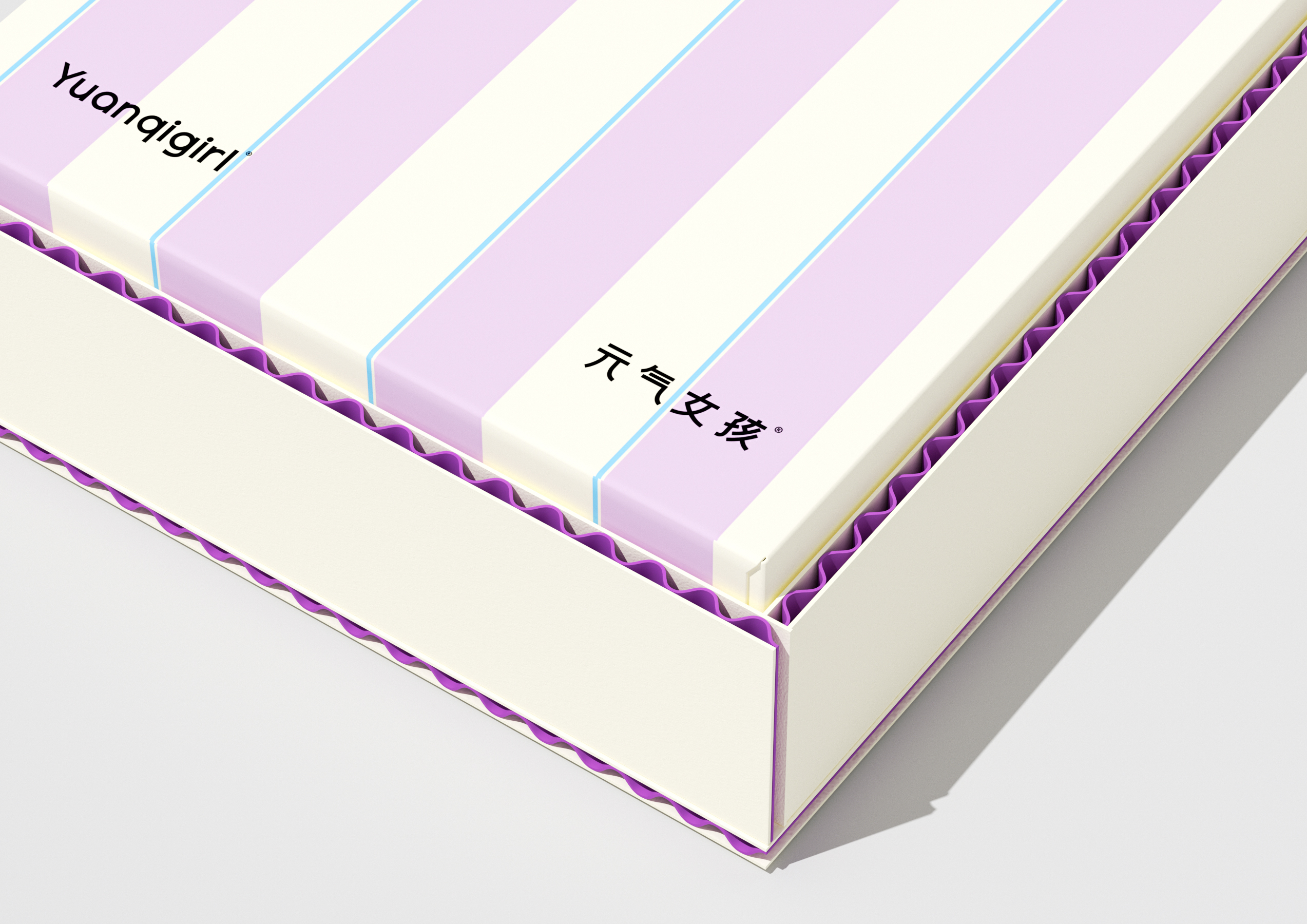
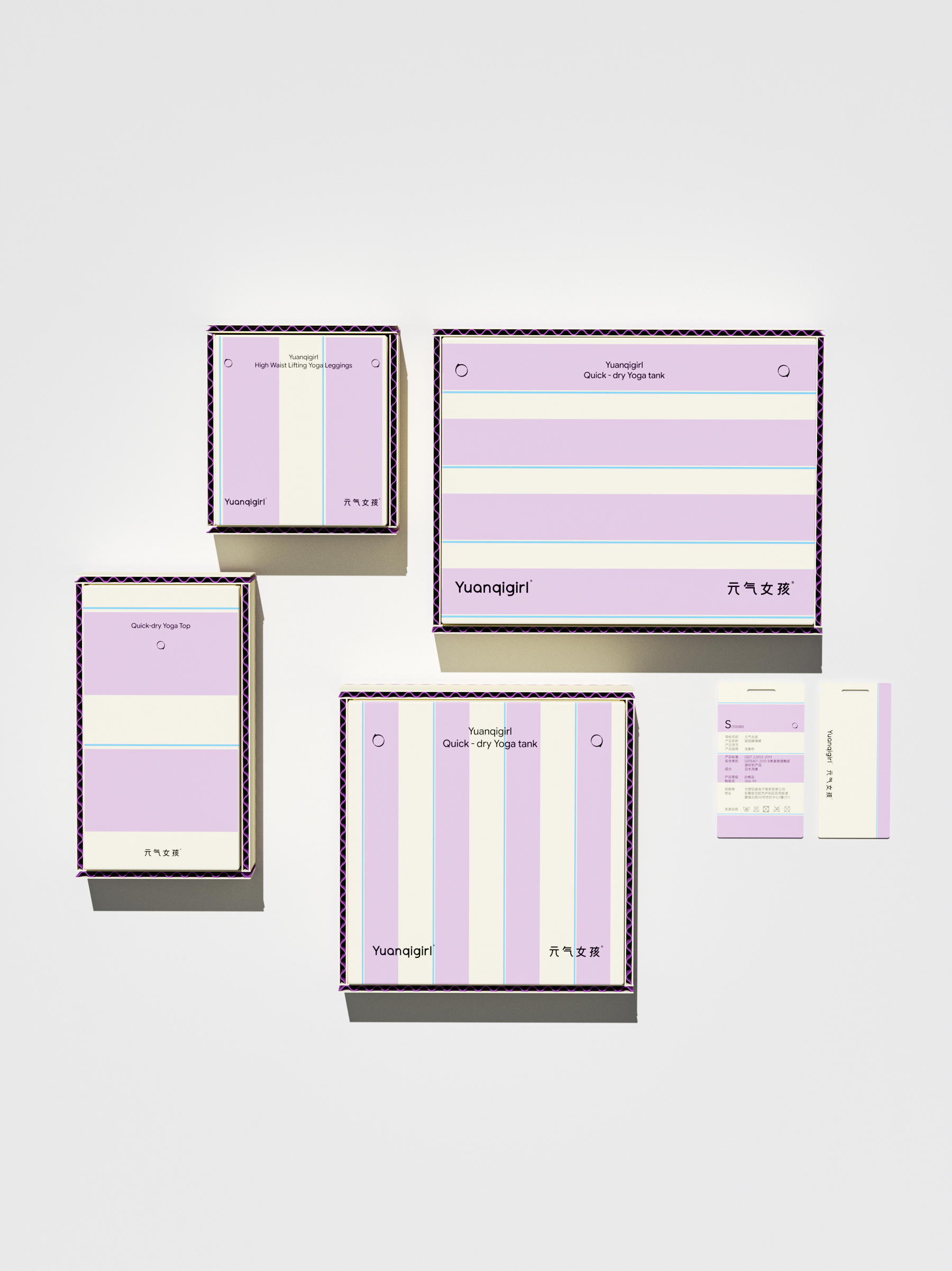
When a brand name is sufficiently recognizable and legible, there is no need to add any symbols to dilute the recognition. The vitality girl-takes yoga clothing as the starting point, integrates the aesthetics of wearing and fitting, and advocates wearing relaxed and good-looking clothes in the fast pace, making exercise a small matter that continuously nourishes herself. In this brand image renewal upgrade, we carried out the design logic of "symbol as the identification, restraint as the benchmark, and ease as the main tone", and reorganized and planned the visual system of Yuanqi girl. The brand font design integrates the natural curve of yoga posture, connects the brand with the humanities, and is based on the framework of traditional Chinese calligraphy. The font is stretched and easy to be extended and applied in various media. The packaging part of the main series uses delicate corrugated materials to match neon colors derived from recycled waste paper, balancing coarse and delicate, modern and classic, and sustainable design concepts. The alternating stripes of different thickness echo the breathing sensation of yoga movement, creating subtle and gentle rhythm in the still plane. Color matching adopts lilac main color plus 3% sky blue, bright, smart and balanced. Shuttle in the fast-paced present, return to the most simple and pure interpretation of me, the maturity of a brand lies in not expressing too much. Restraint is to set aside a clearing in a crowded world, where the wind comes and goes freely, and the heart follows lightly.
The copyright of this work belongs to 造物起异. No use is allowed without explicit permission from owner.

New user?Create an account
Log In Reset your password.
Account existed?Log In
Read and agree to the User Agreement Terms of Use.
Please enter your email to reset your password


feeling full of vitality
the packaging is really nice
Really nice!