Printbelle Brand Symbol & Visual Identity for Cross-Border E-Commerce
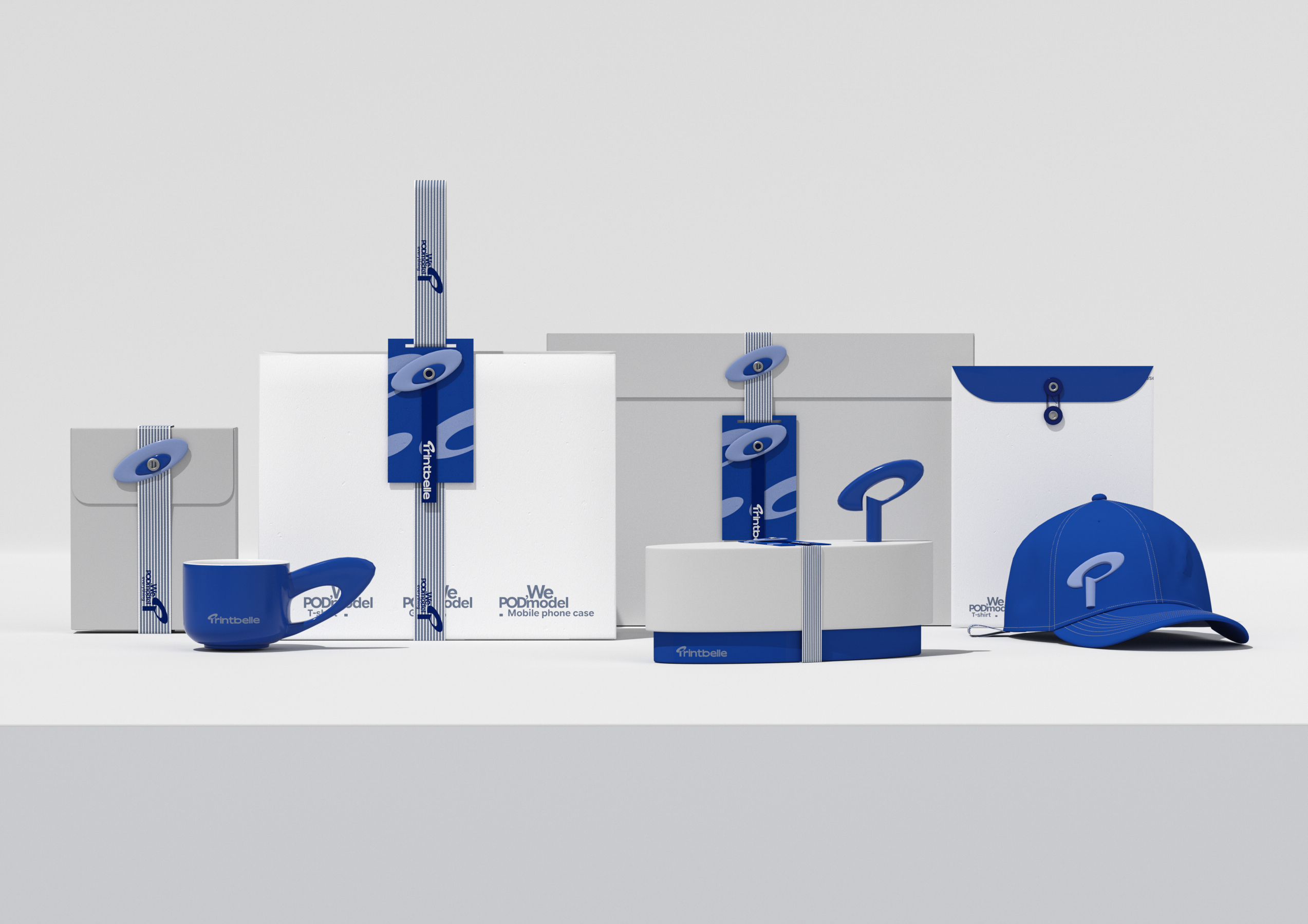
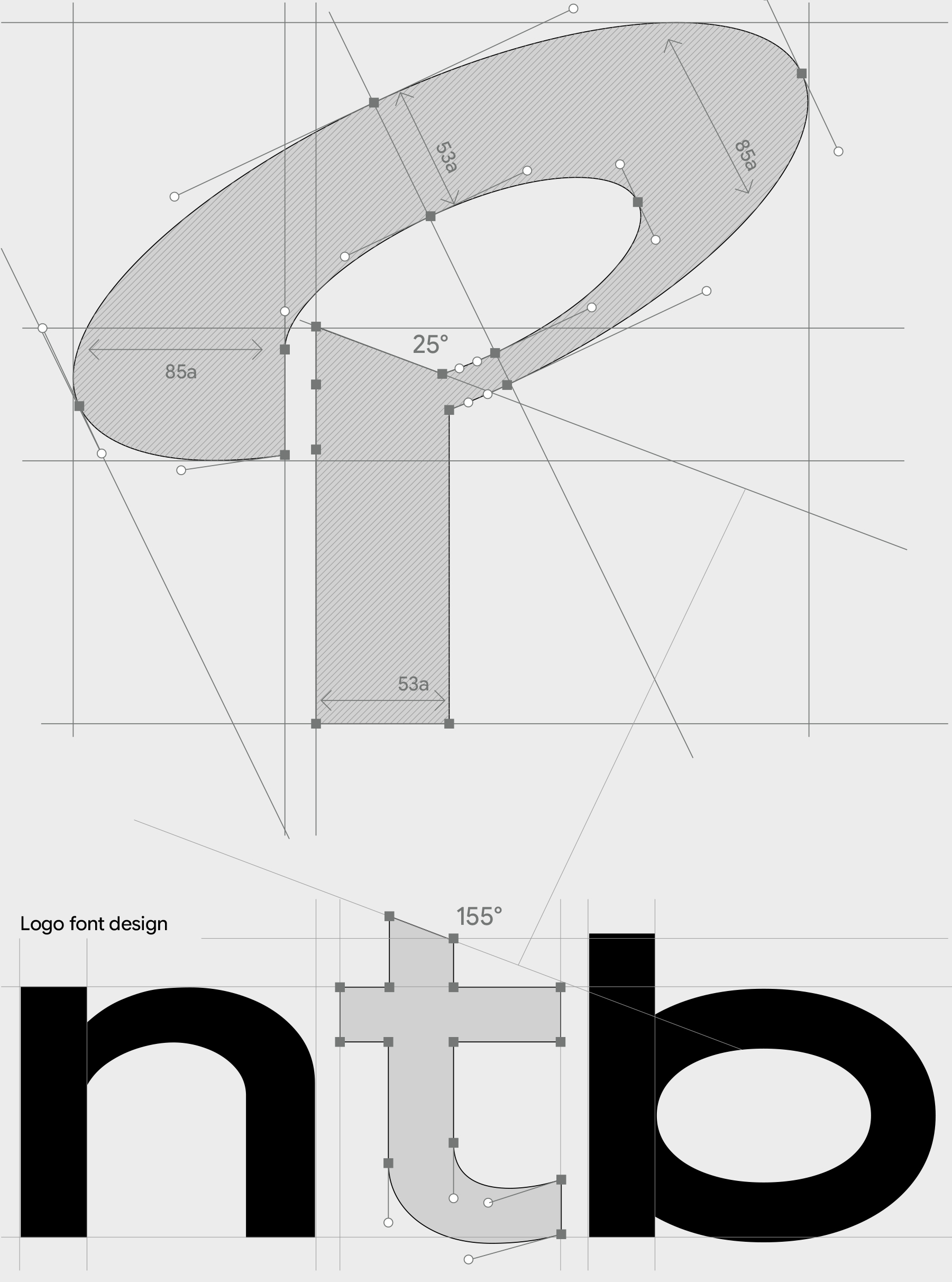
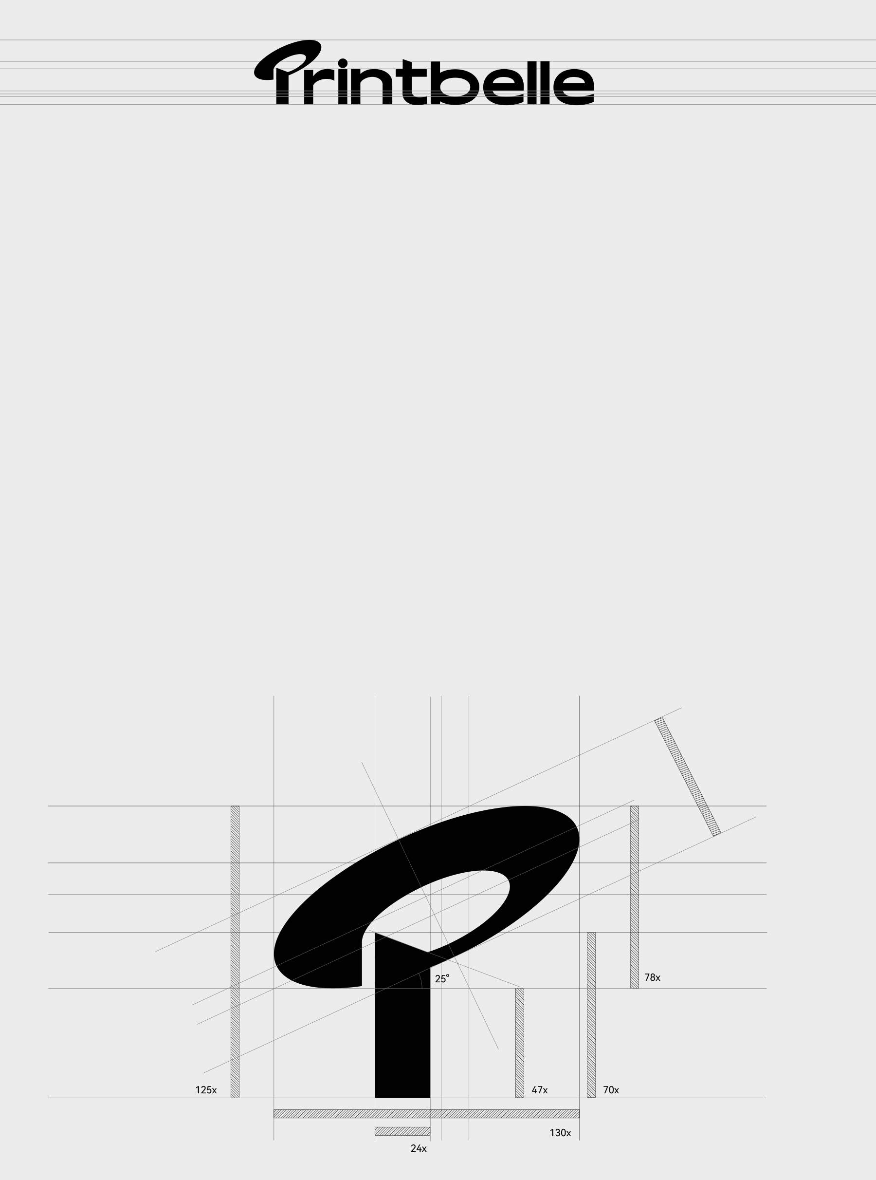
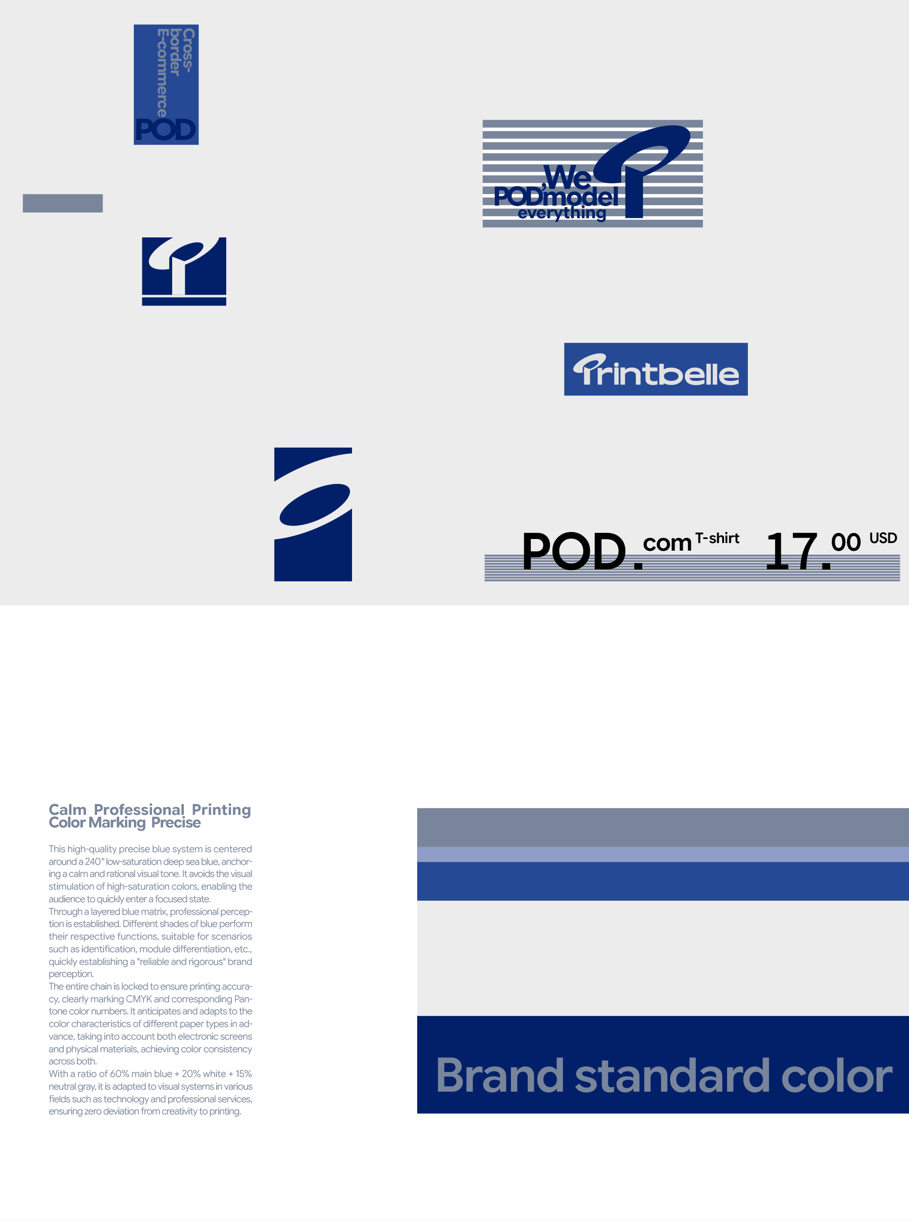
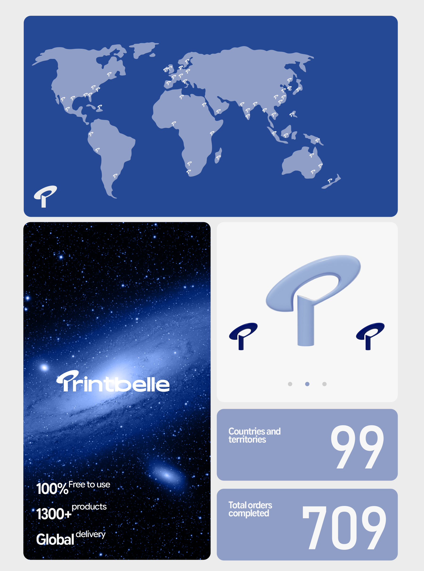
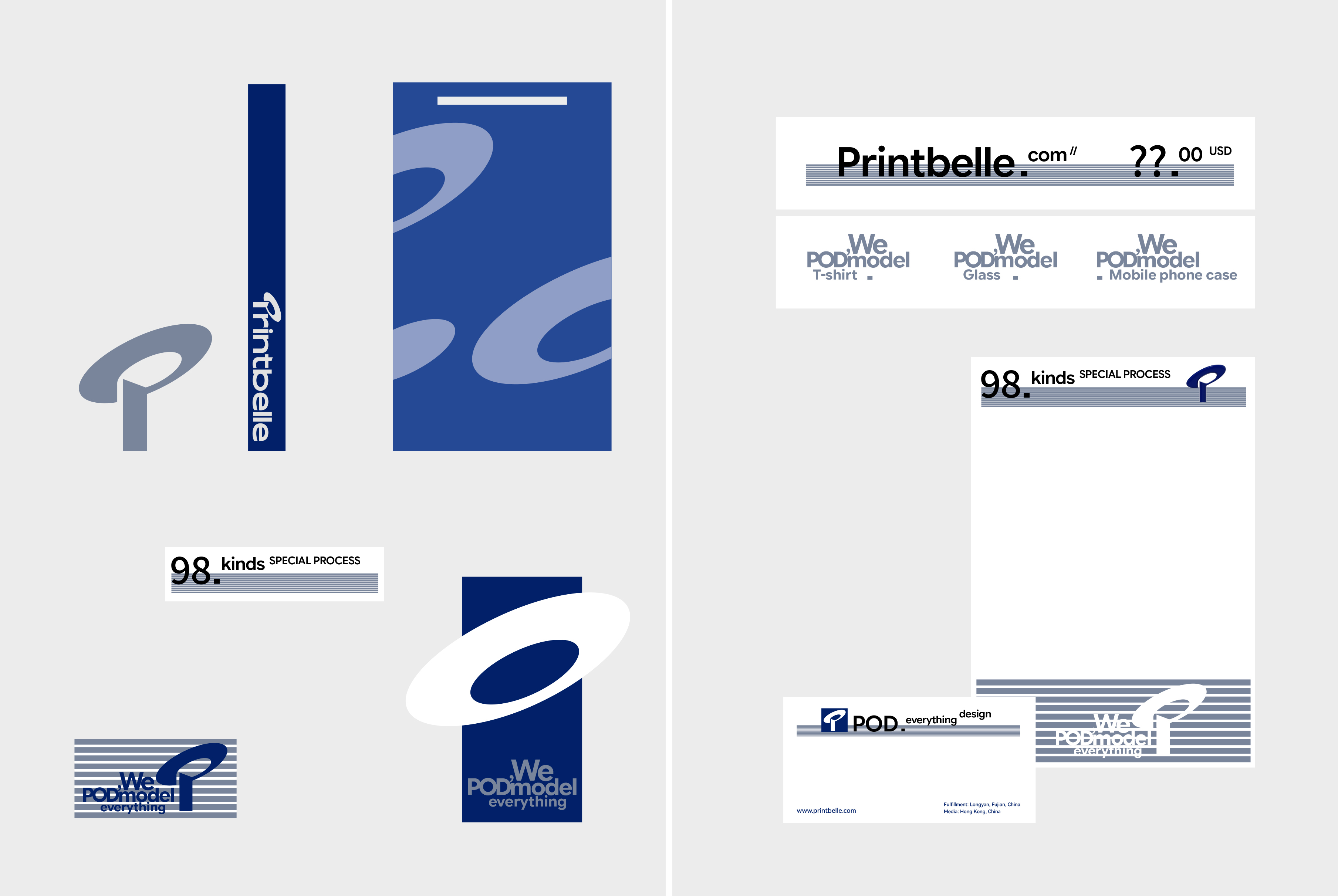
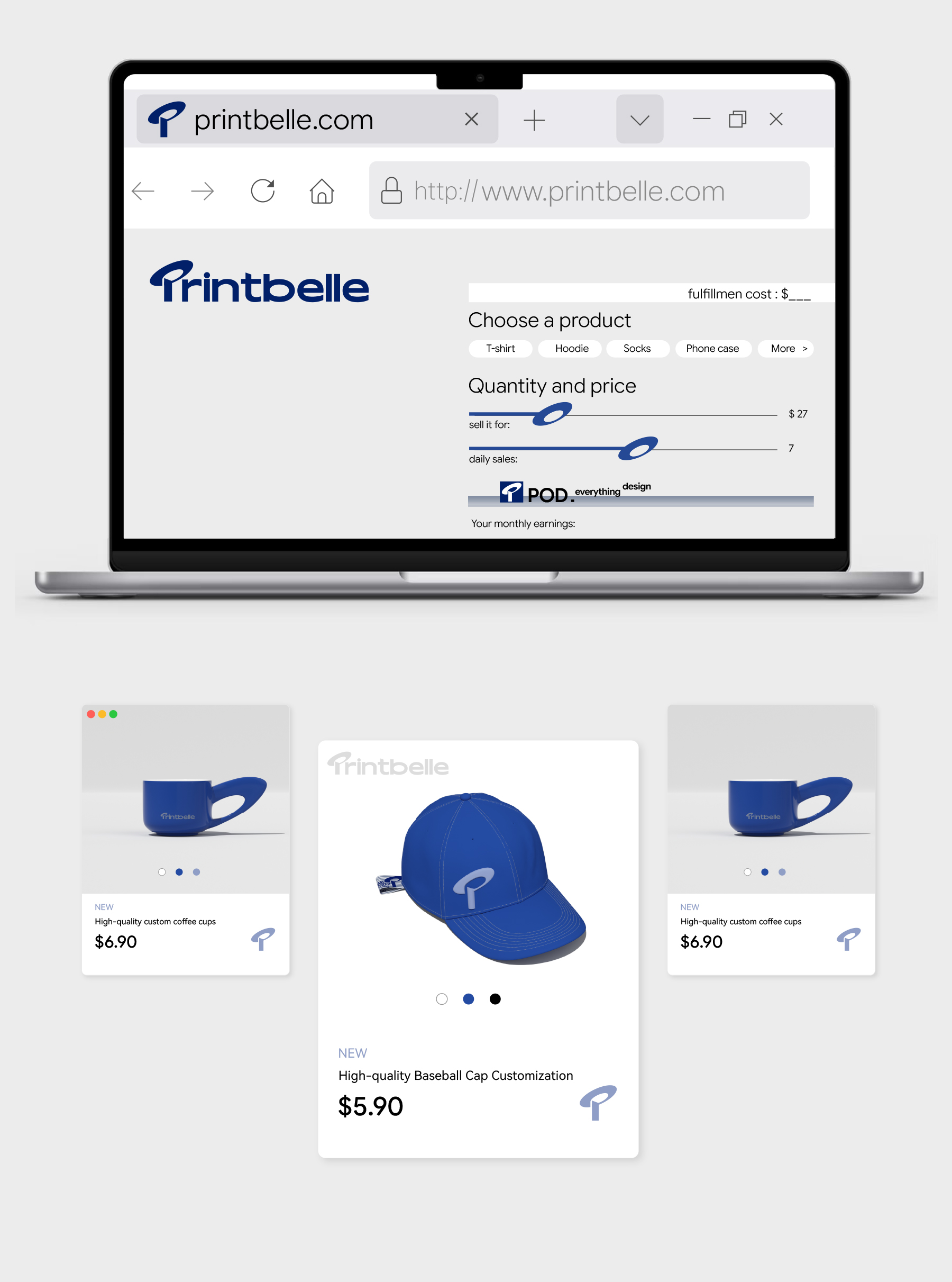
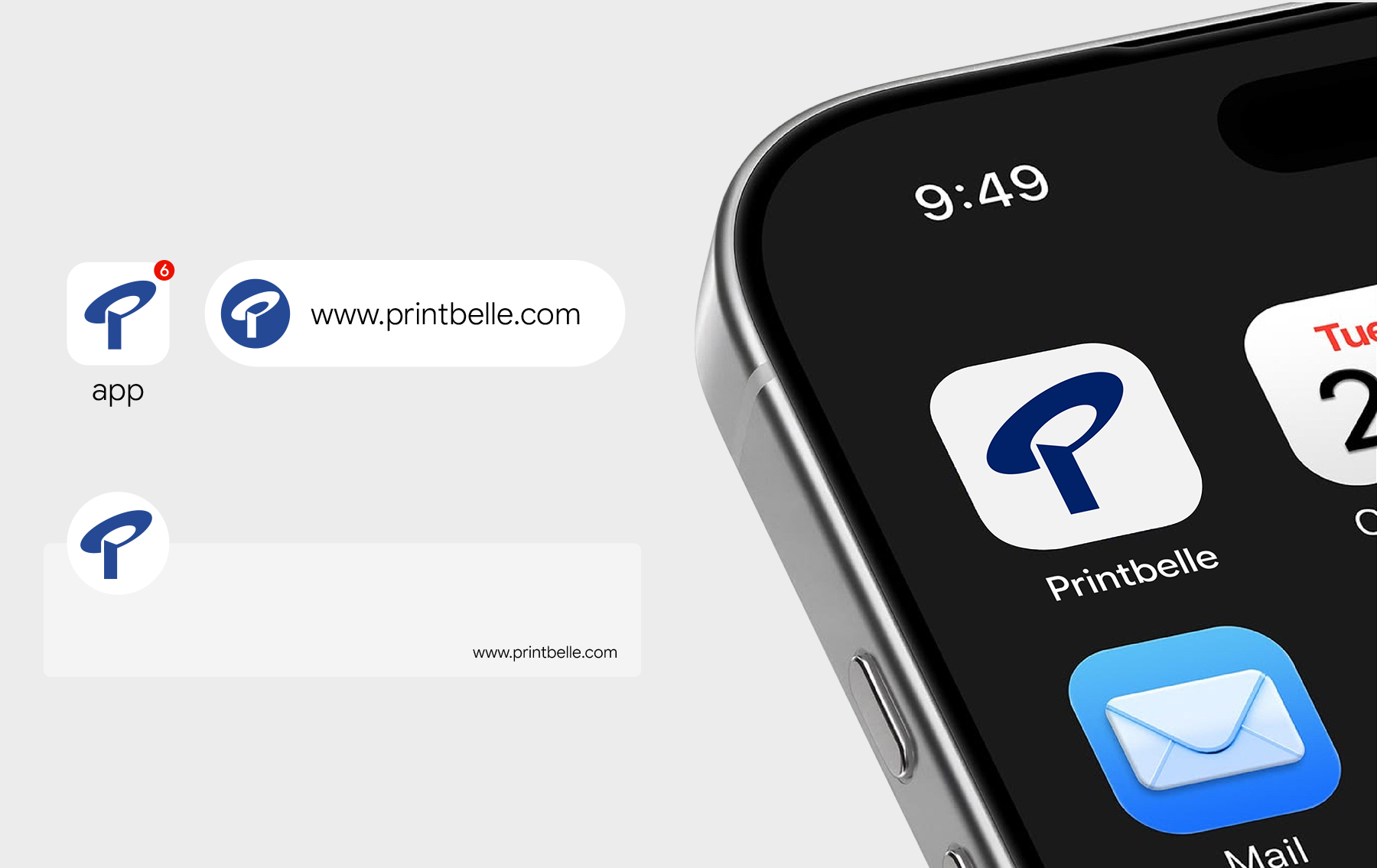
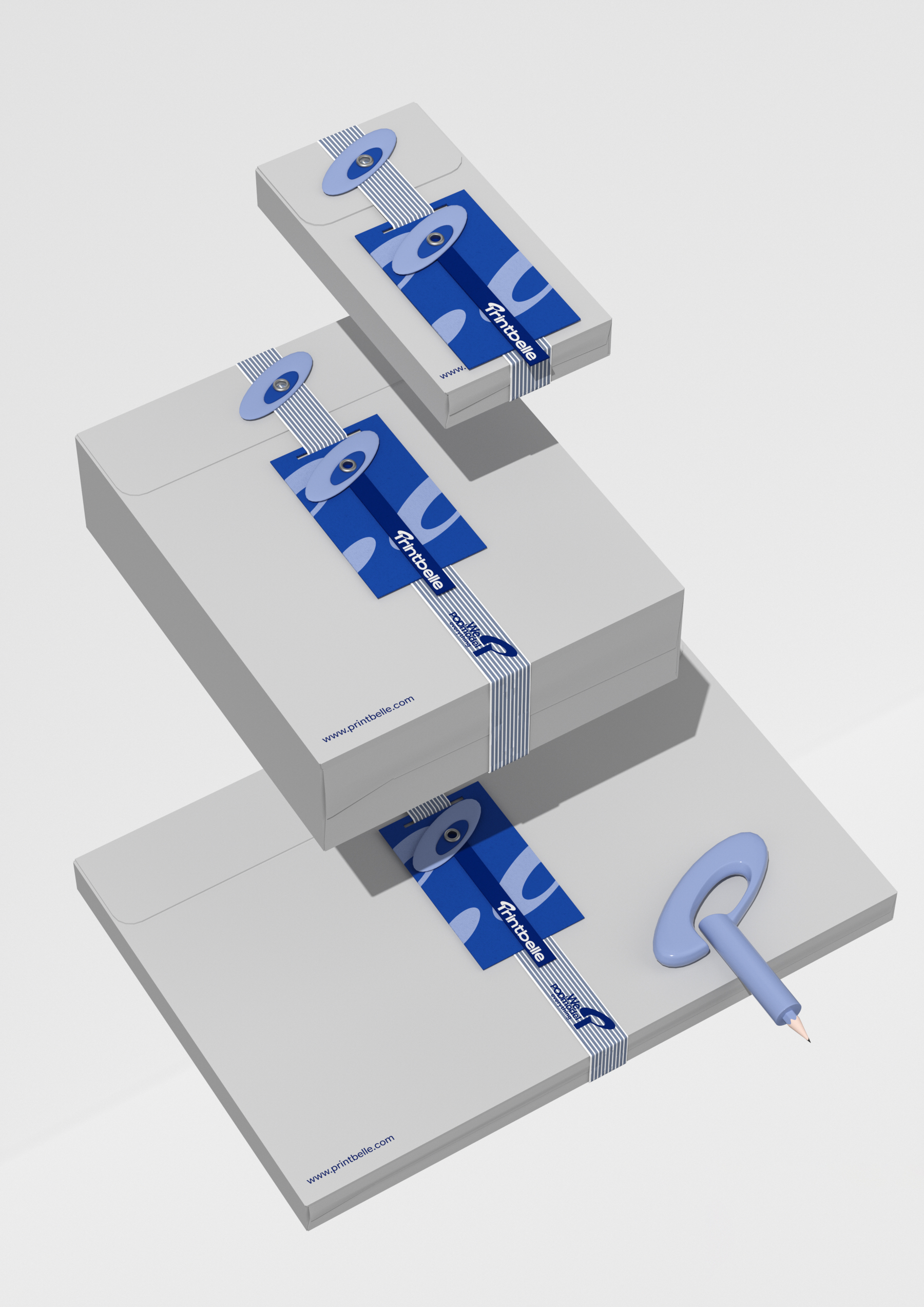
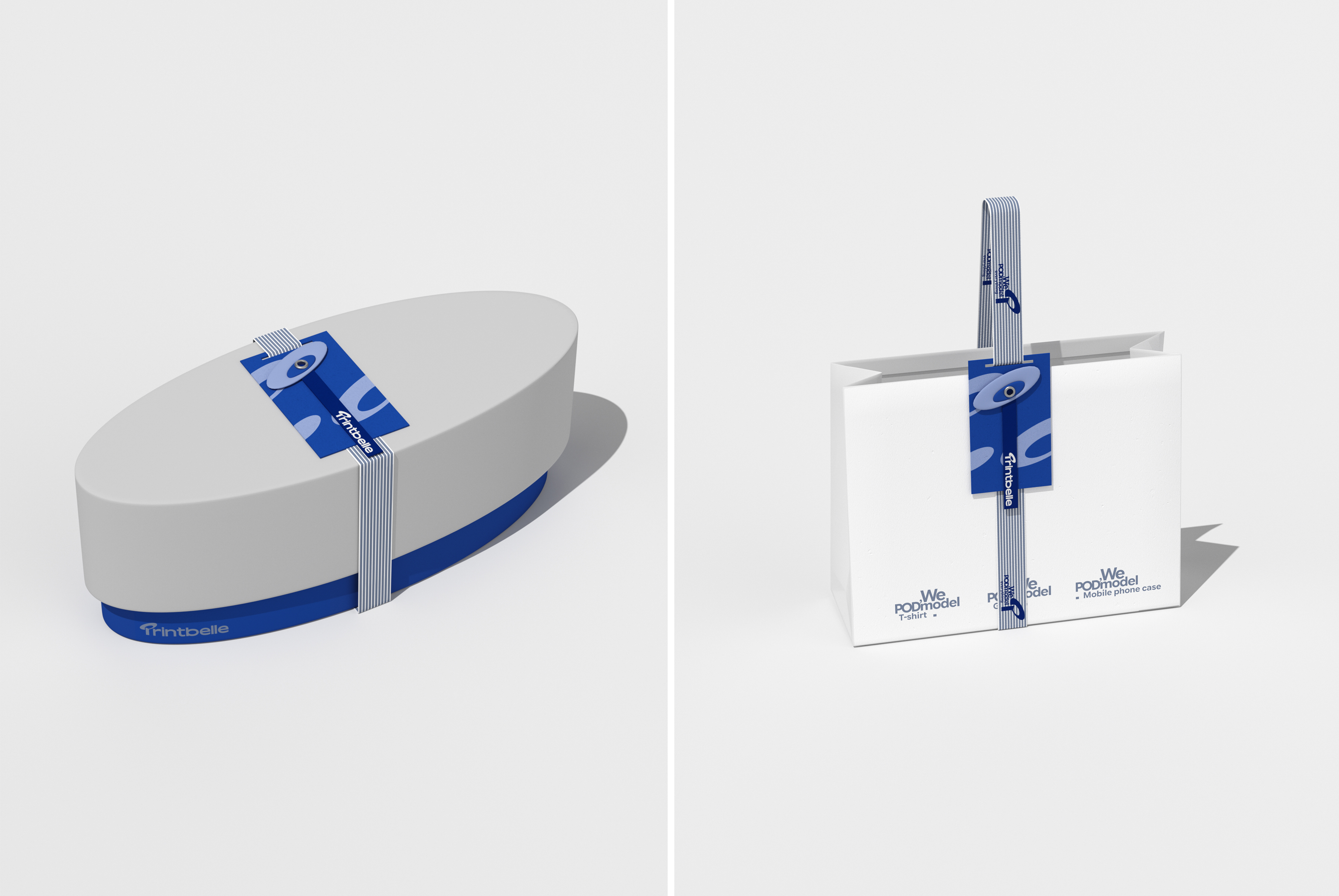
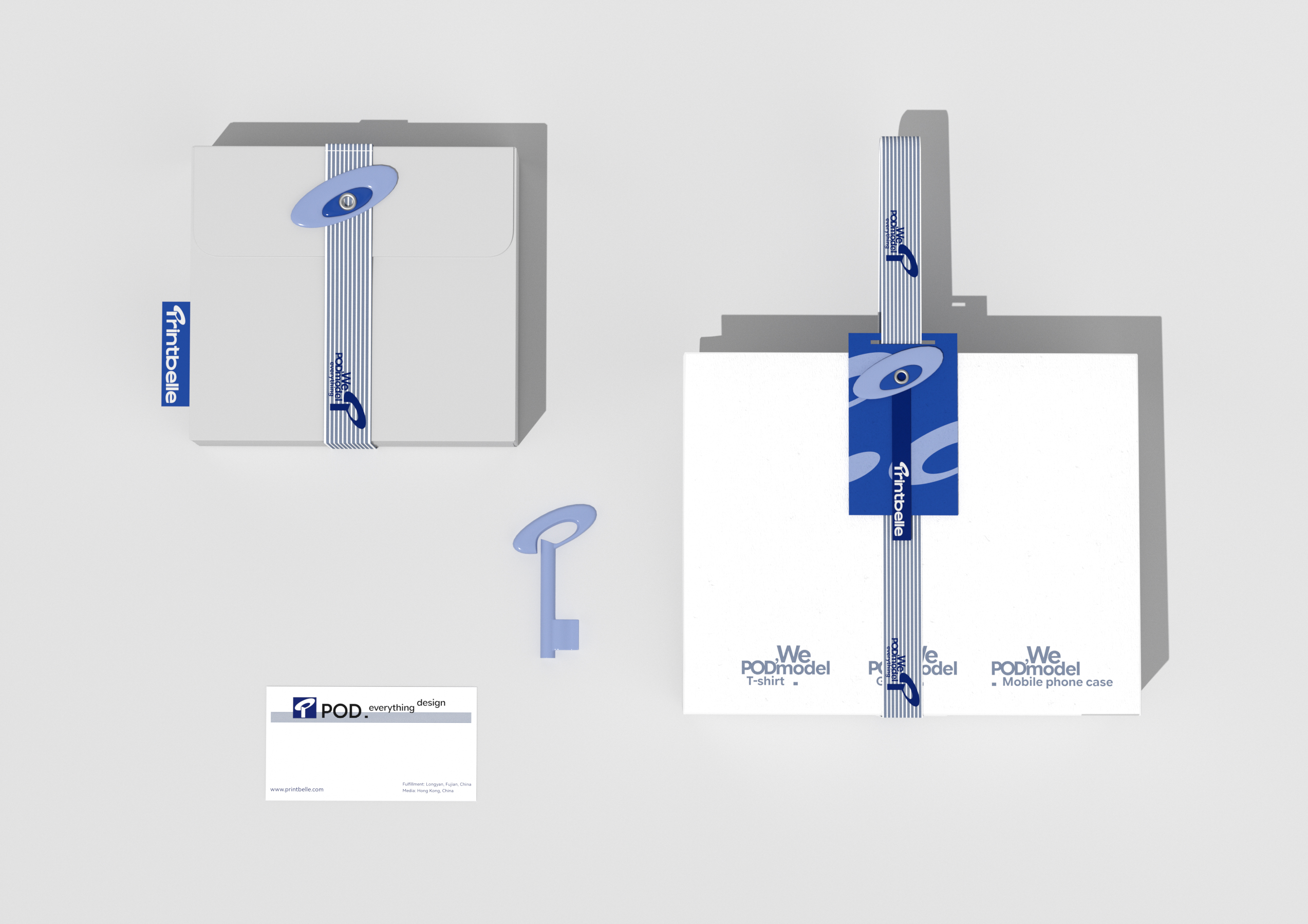
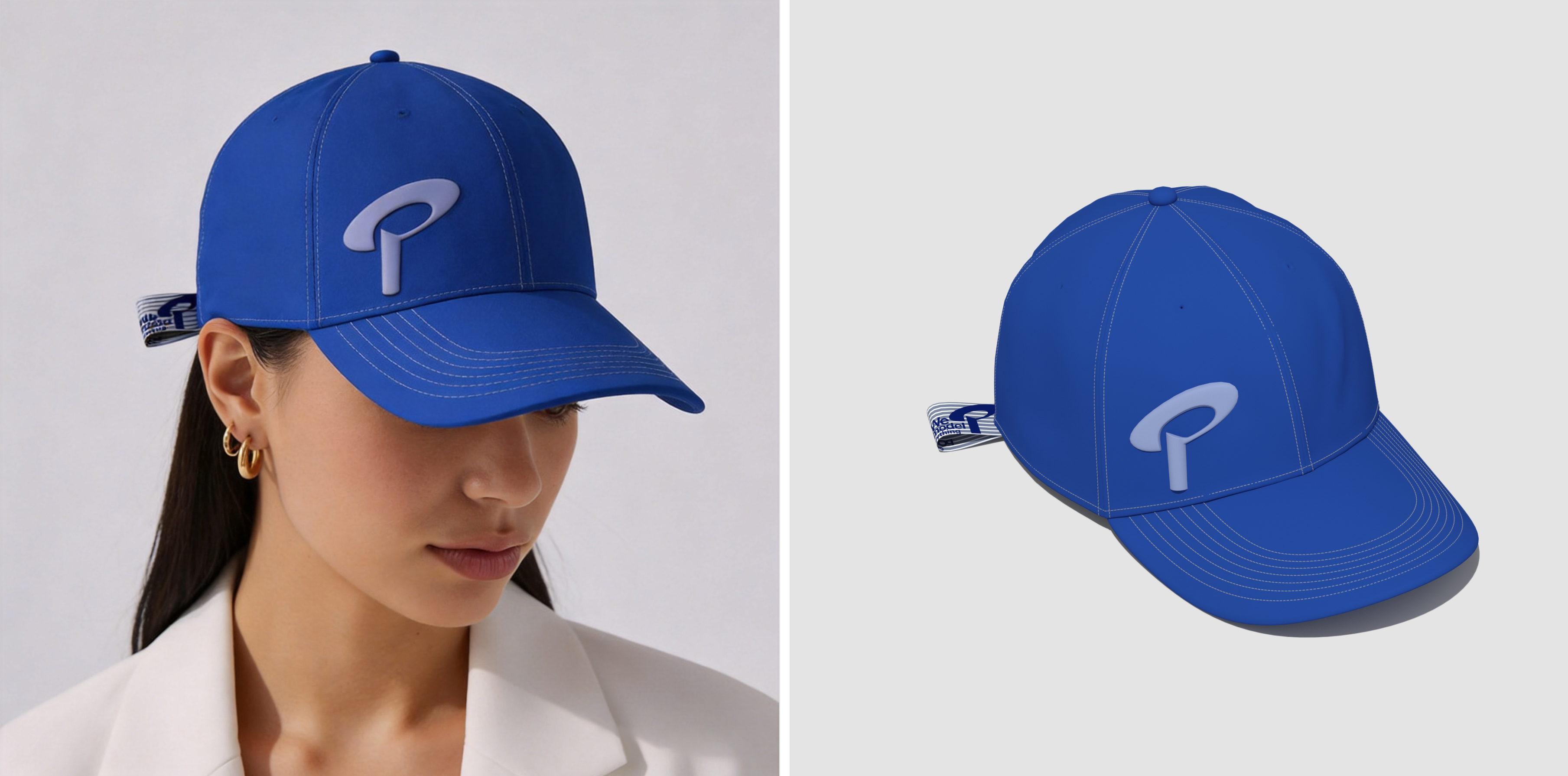
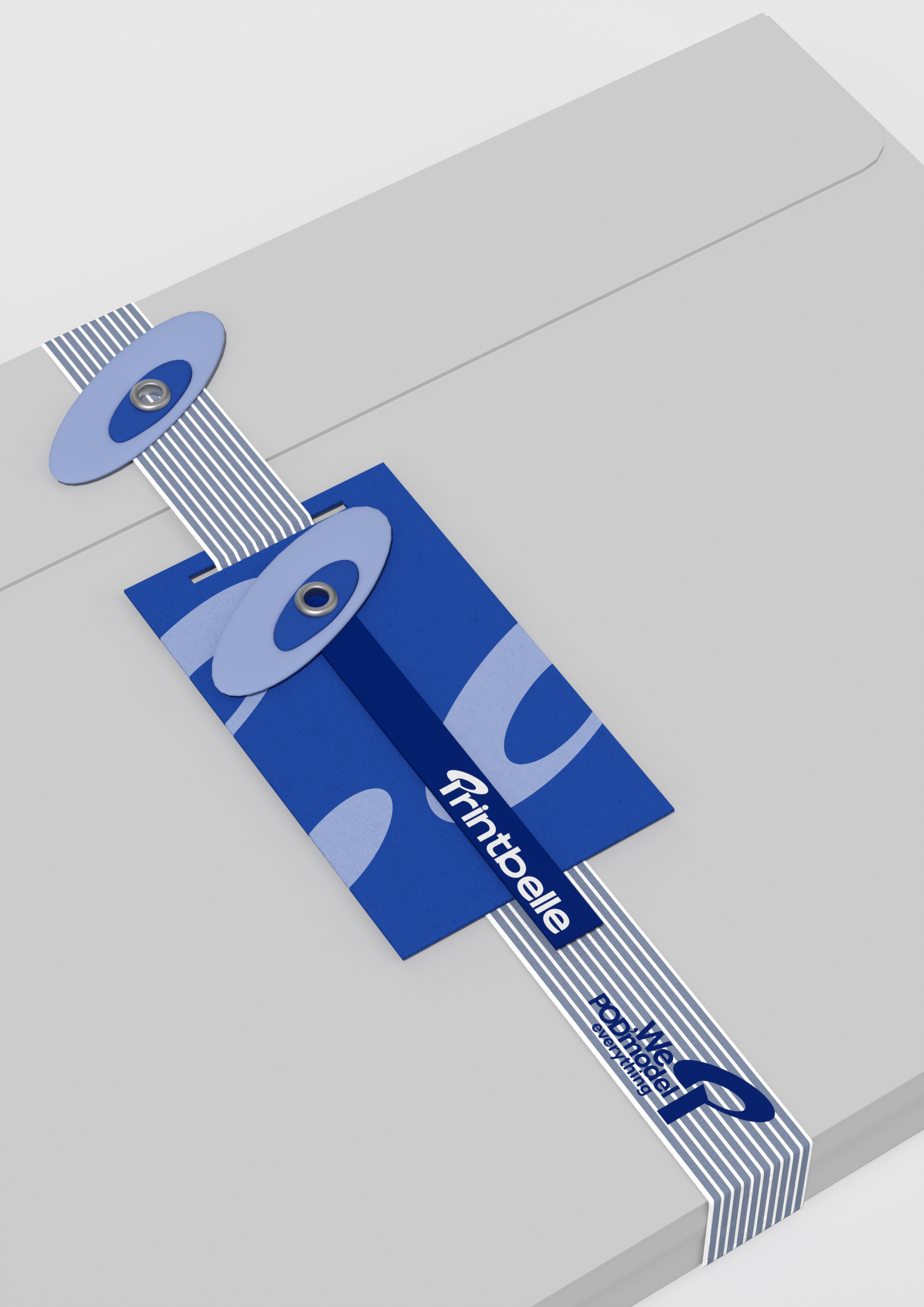
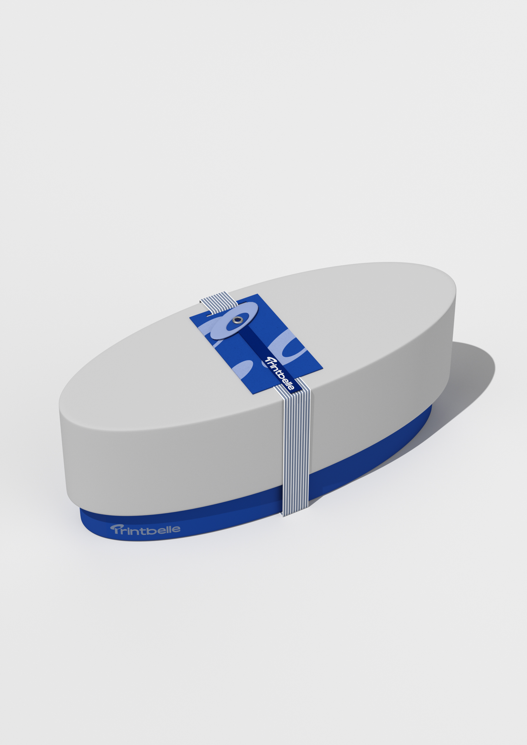
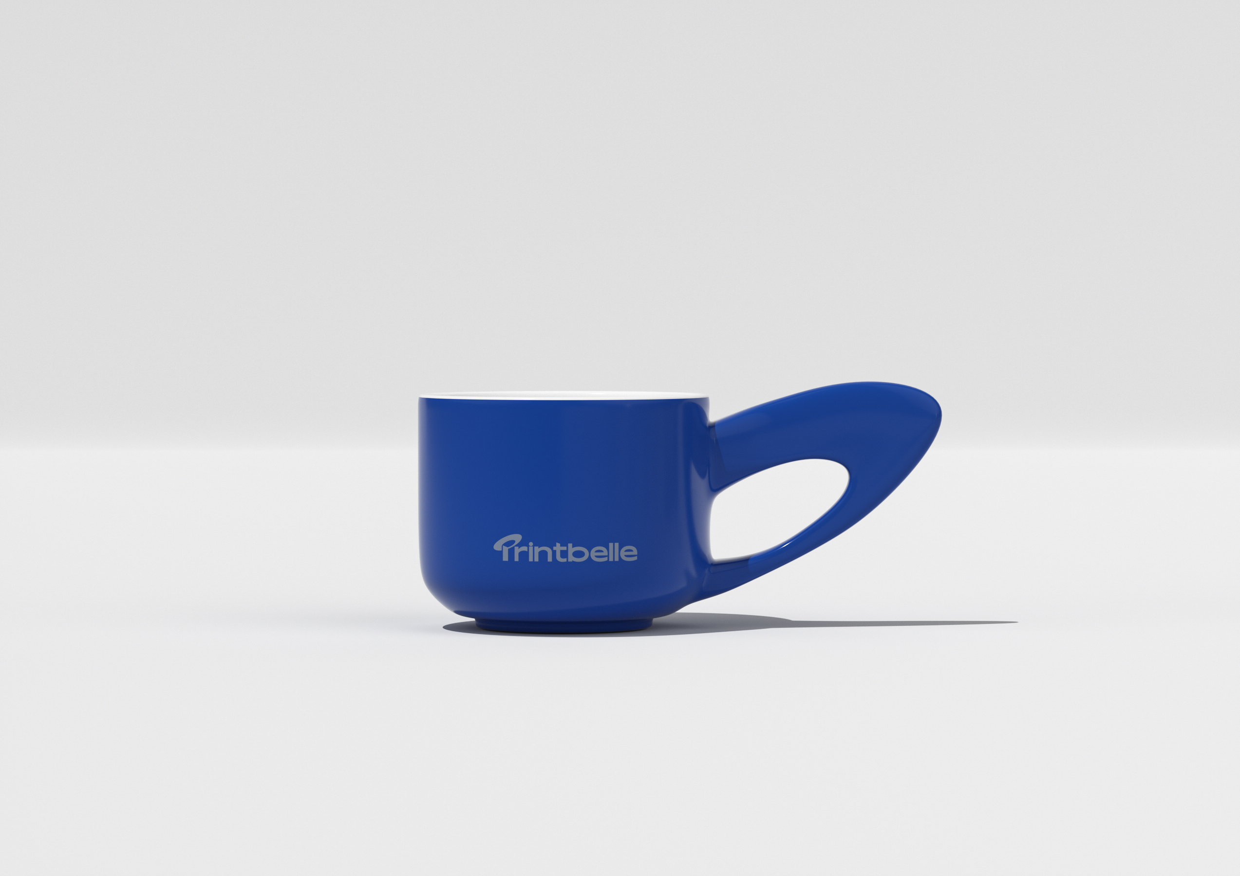
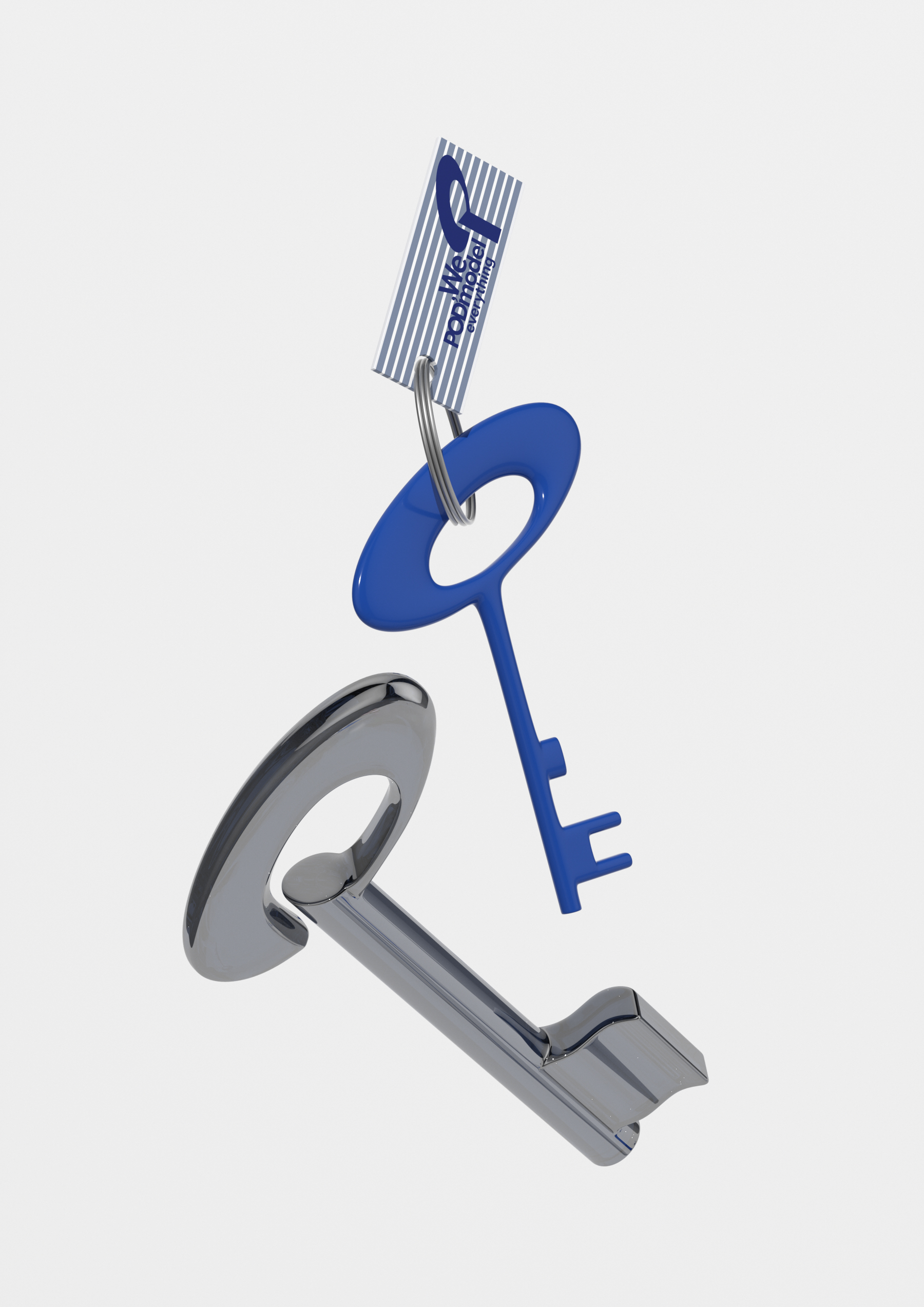
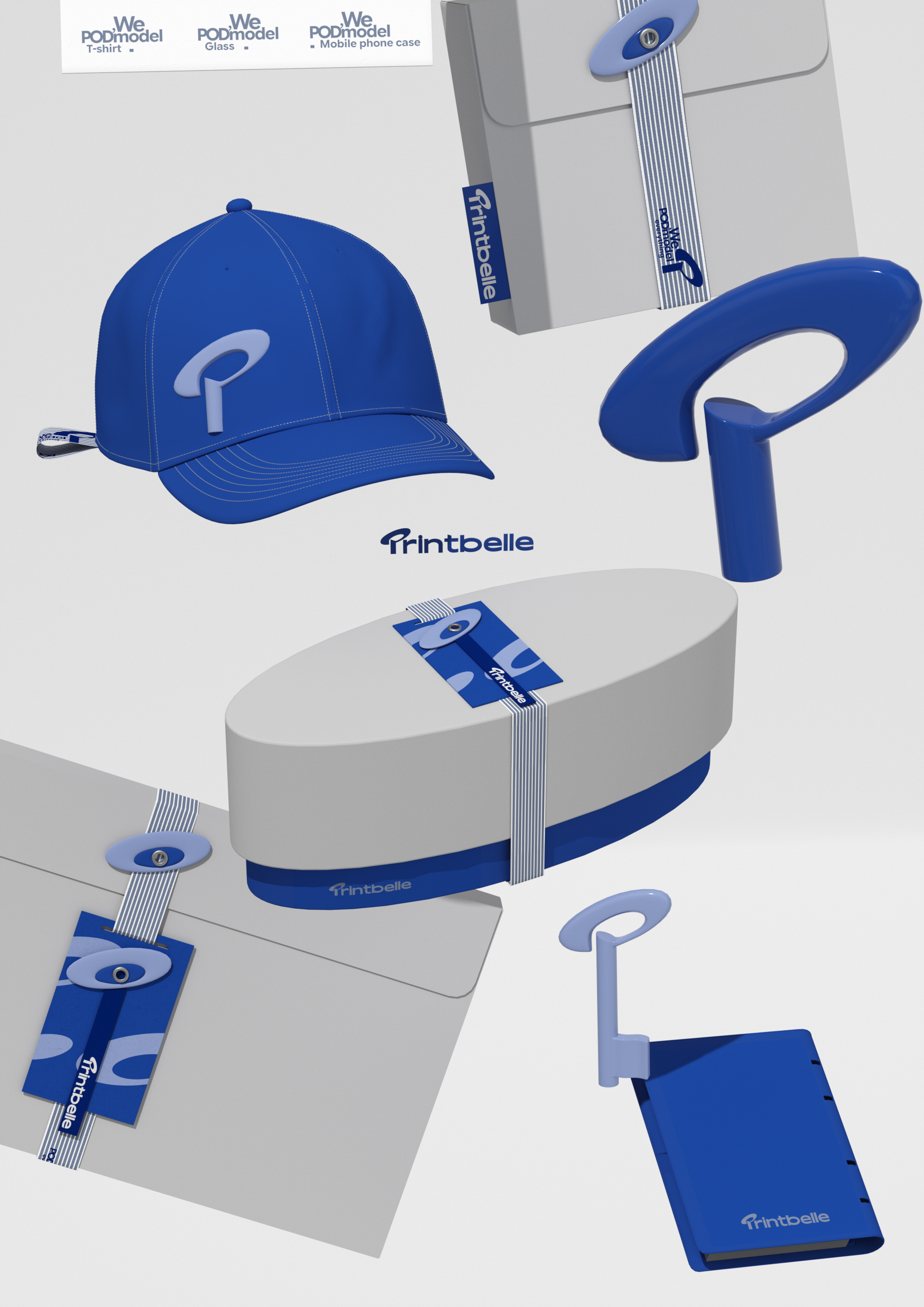
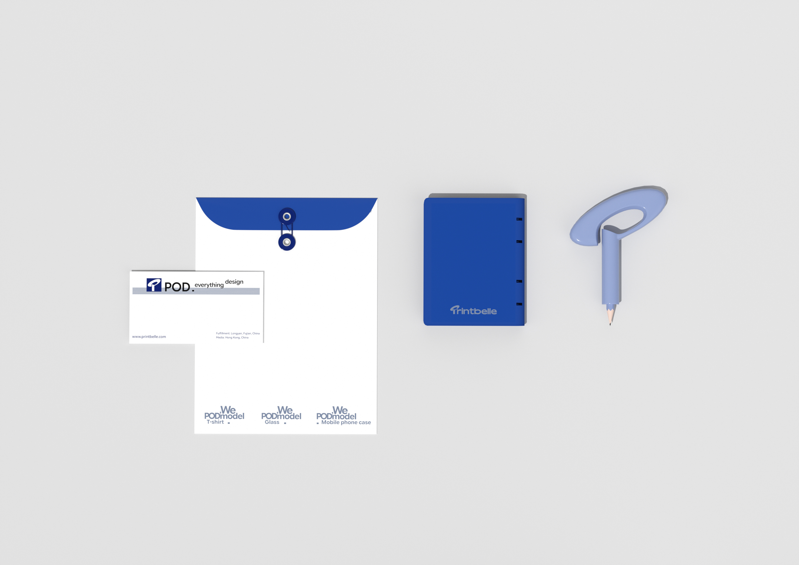
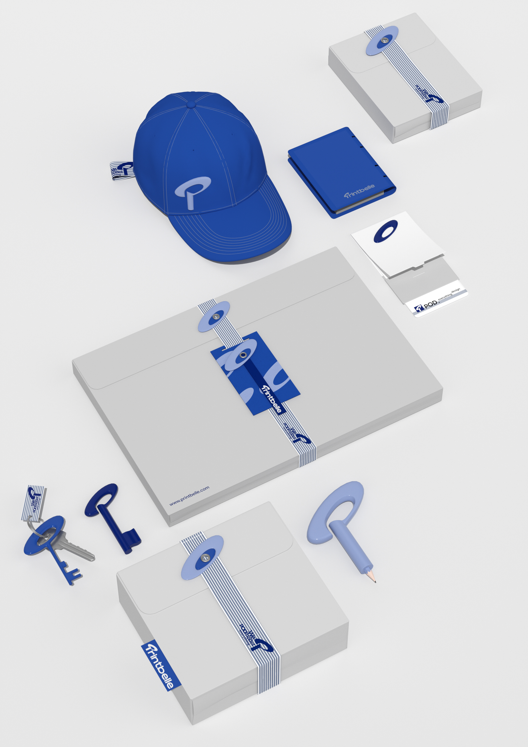
Inspired by the Kuiper Belt, we fuse the brand initials into a core symbol that embodies globally-reaching creative customization. As a POD-driven creative entity, we approach design from multiple dimensions - transcending media, nations, cultures, and product categories. Through a unified global service network, we connect intelligent platforms across diverse ecosystems, bridging with you at every touchpoint. Through systematic adaptation across contexts, the symbol ensures consistent brand communication across channels and cultures.
Printbelle visual symbol brand design, we take inspiration from the Kuiper belt ring in the universe, integrate the brand initials to build the core symbol, express the creative customization that radiates the world, POD model creative body, cut into the creative field from a multi-dimensional perspective, cross media, region, culture and product differences, link multi-ecological intelligent platforms with the same global service network, and connect with you. Through the systematic interpretation of symbols in multiple contexts, the stable output of brand vision in cross-channel and cross-cultural communication is realized.
Original Products of Creation Studio/
#
Creation is different.®zwqy▪lab-focused on the design and application of brand symbols





Full of personality
Not bad!
Still okay