Design by: scream (Guangzhou) product design co., ltd. WOW IDX
Service Company: CKPA
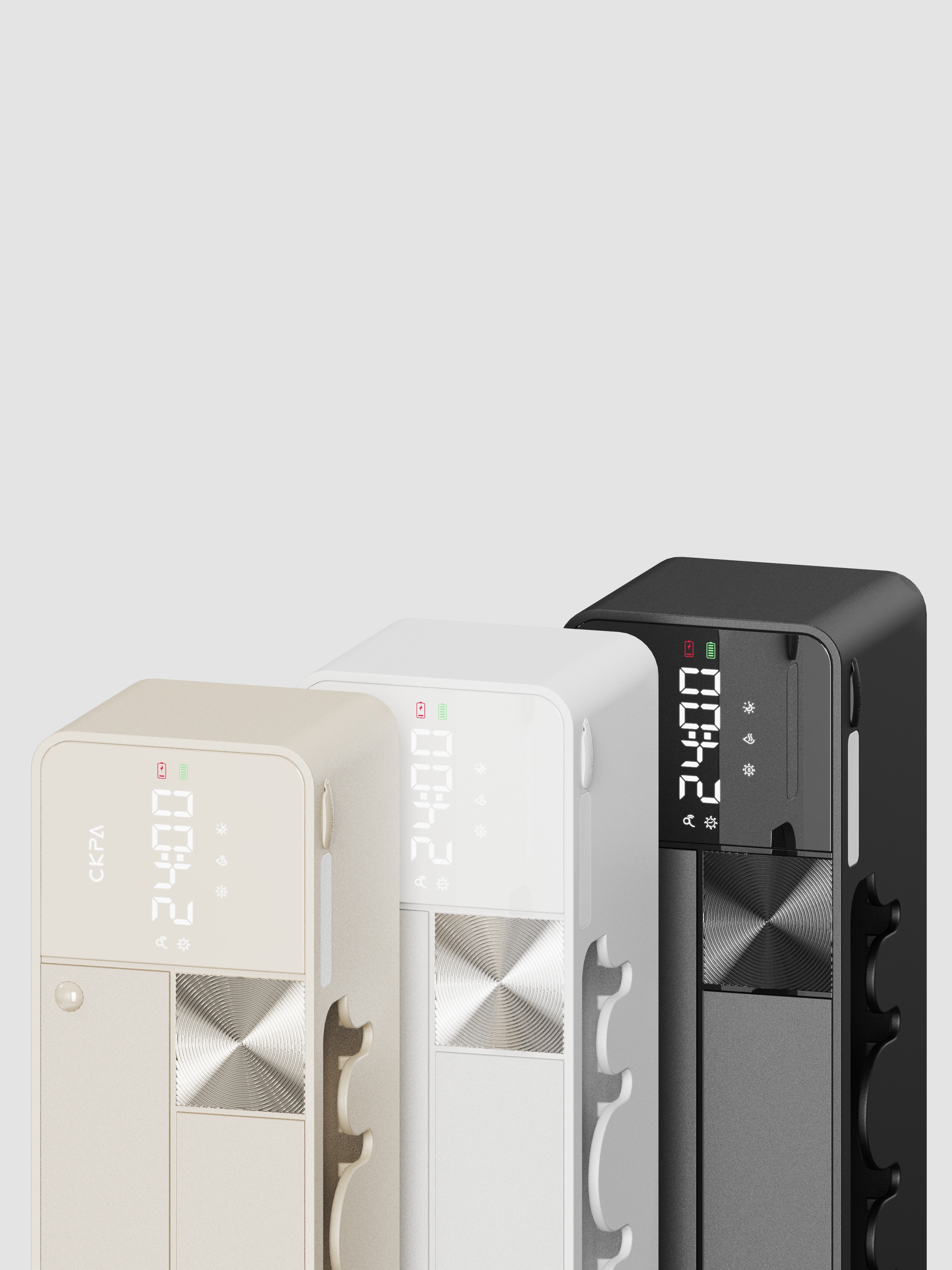
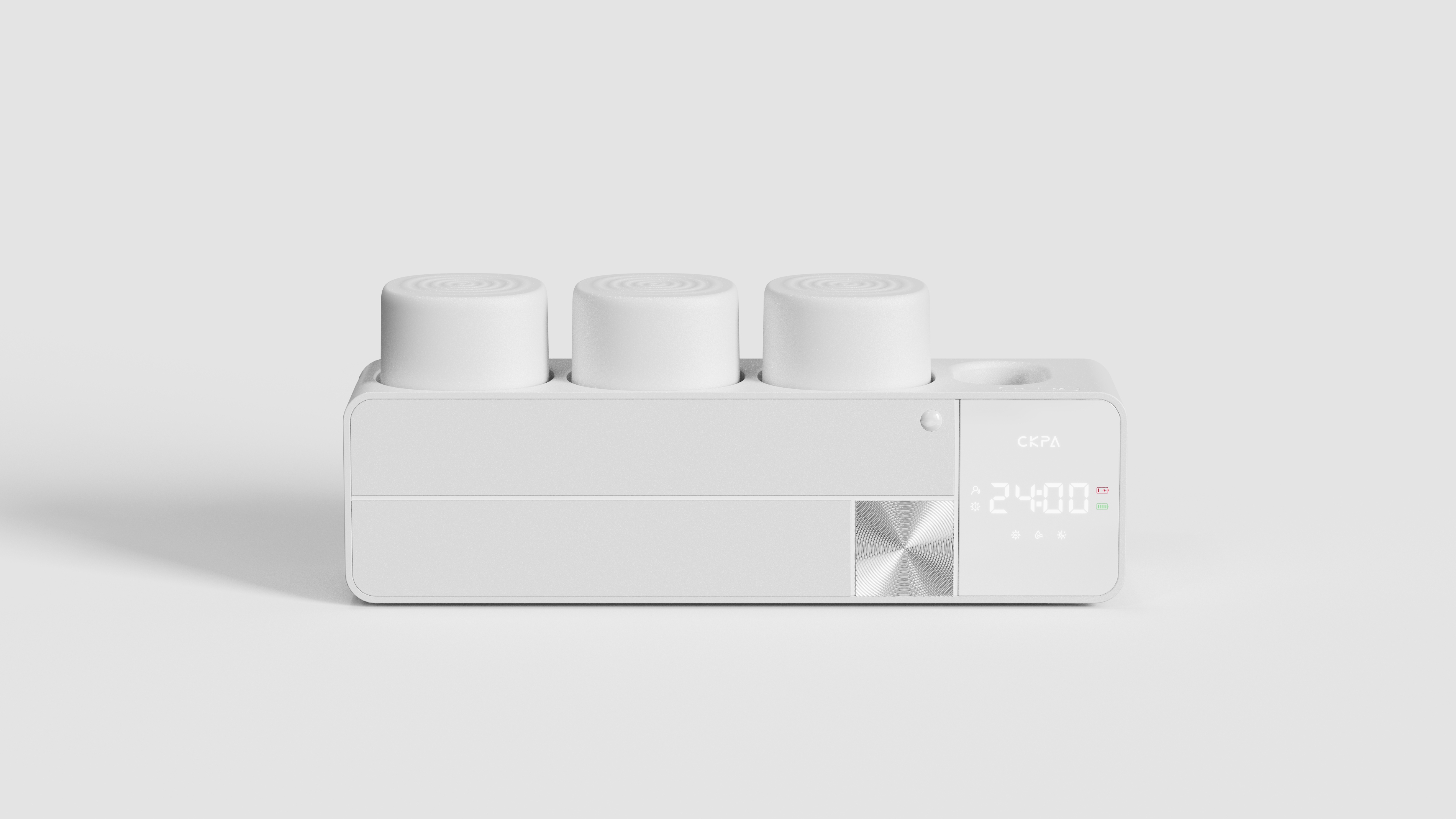
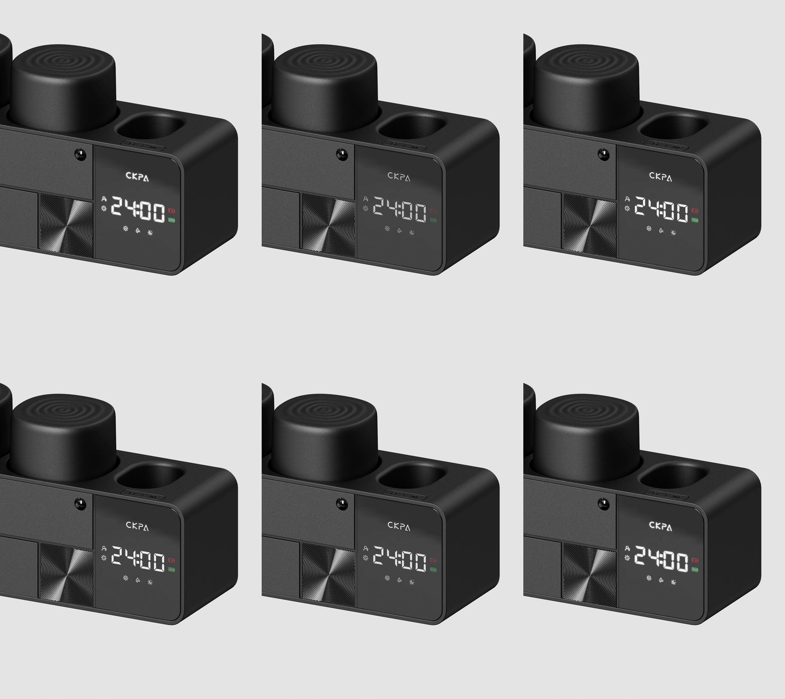
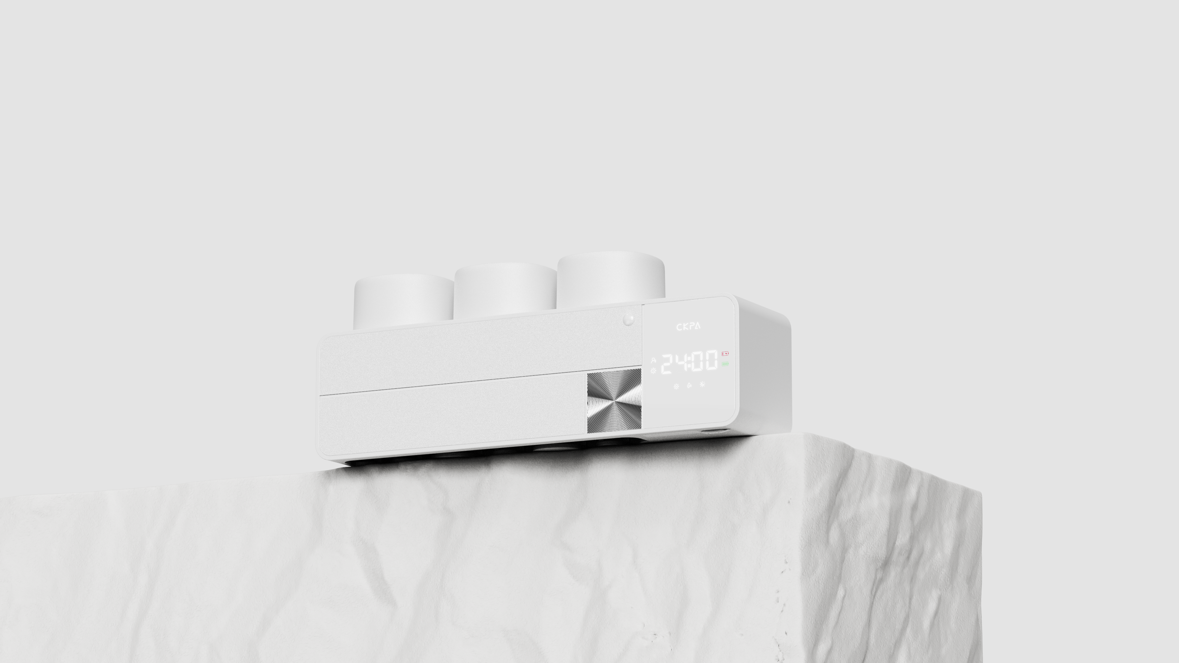
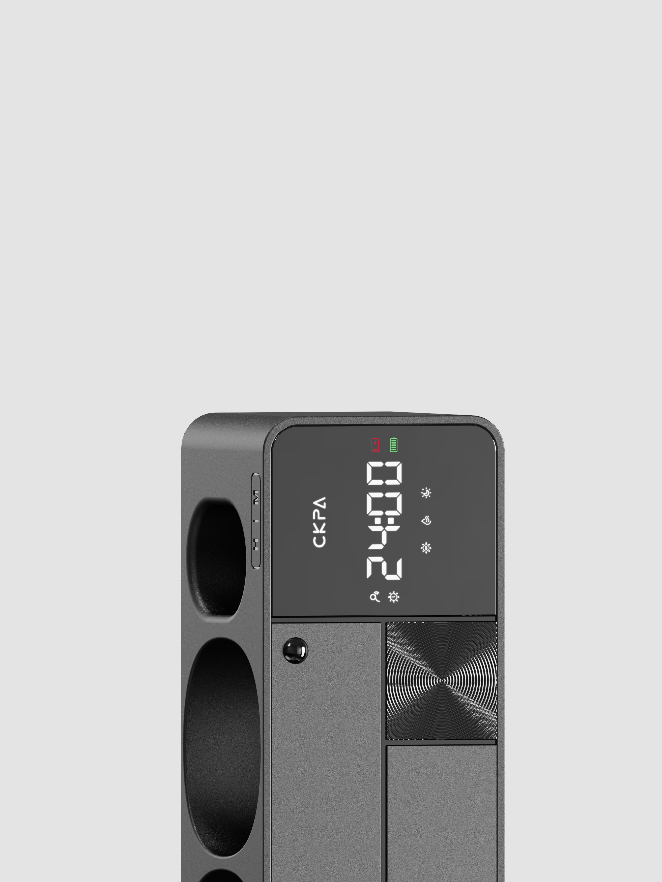
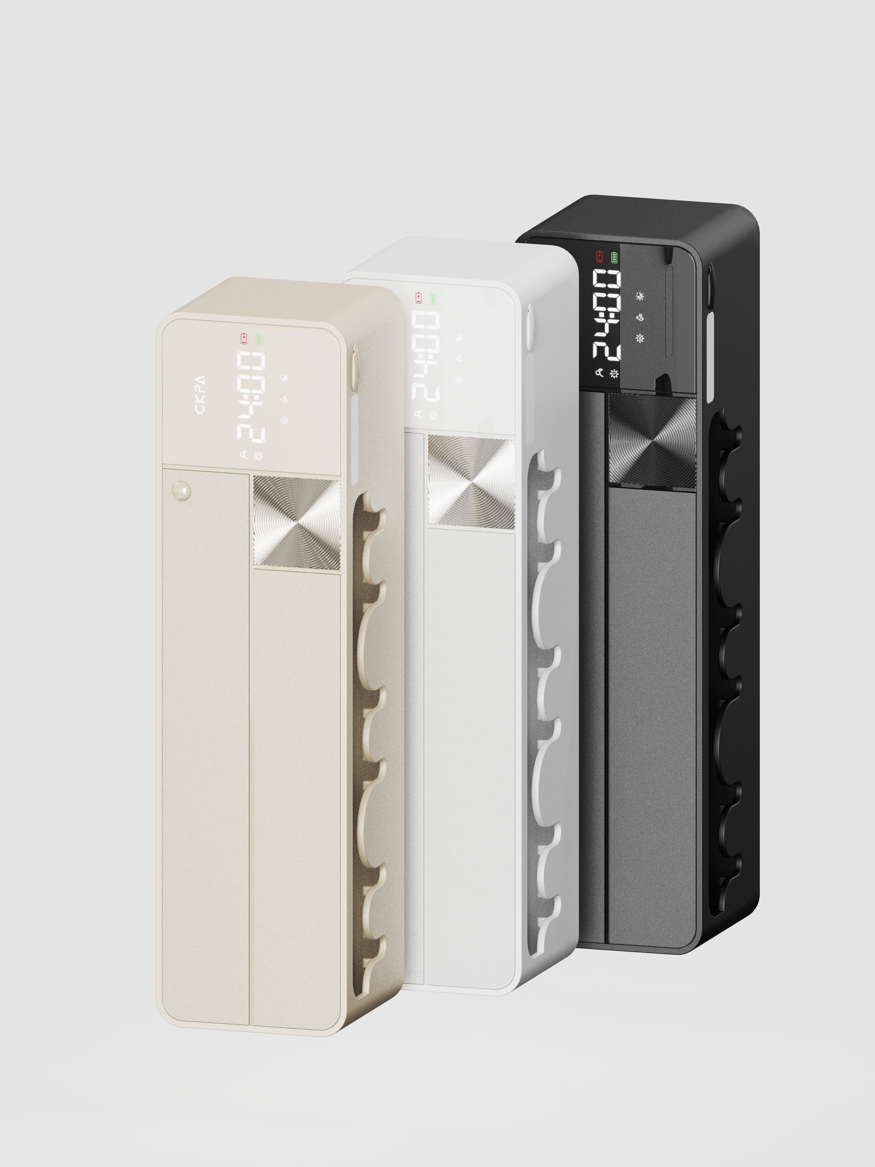
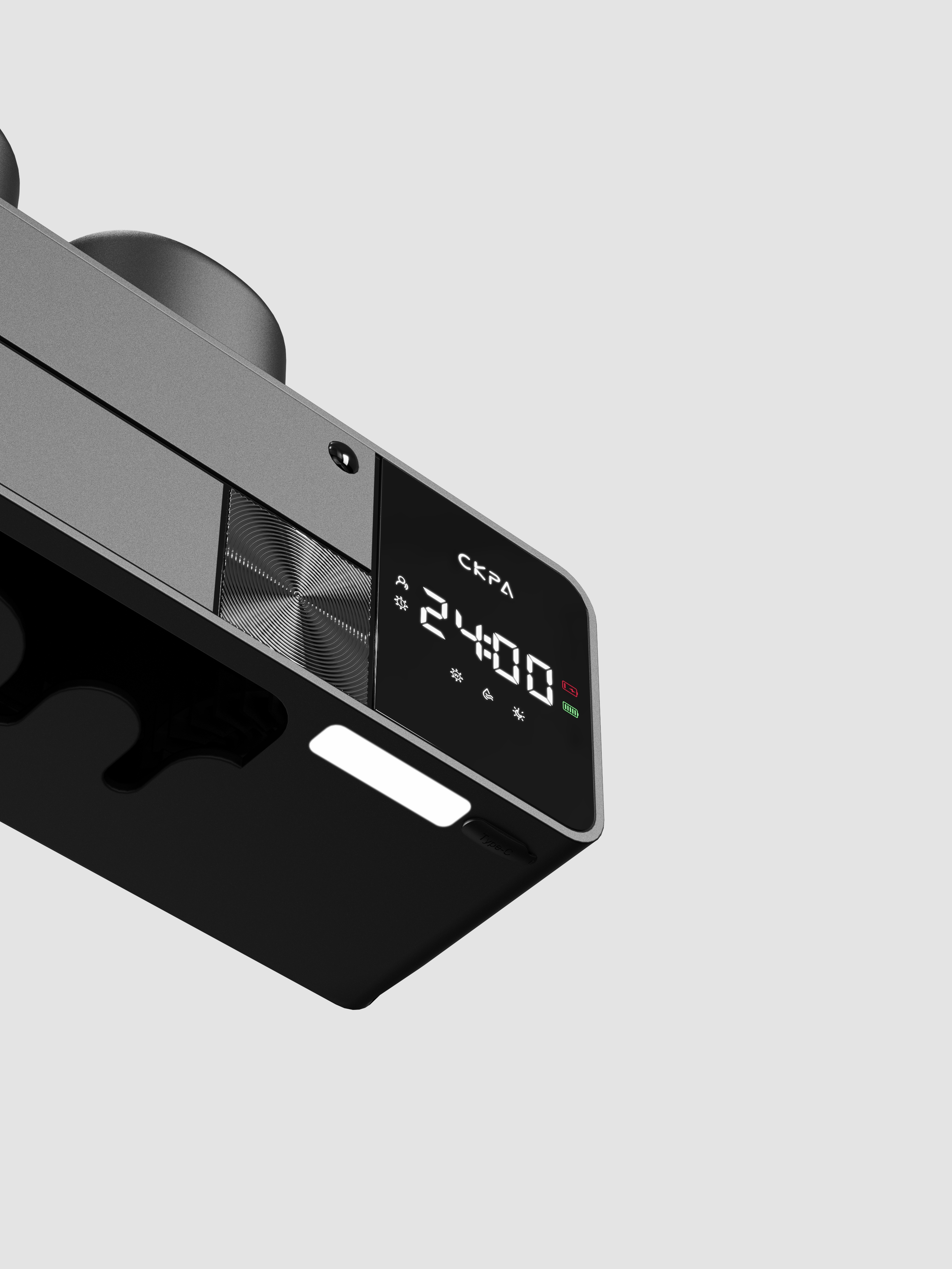
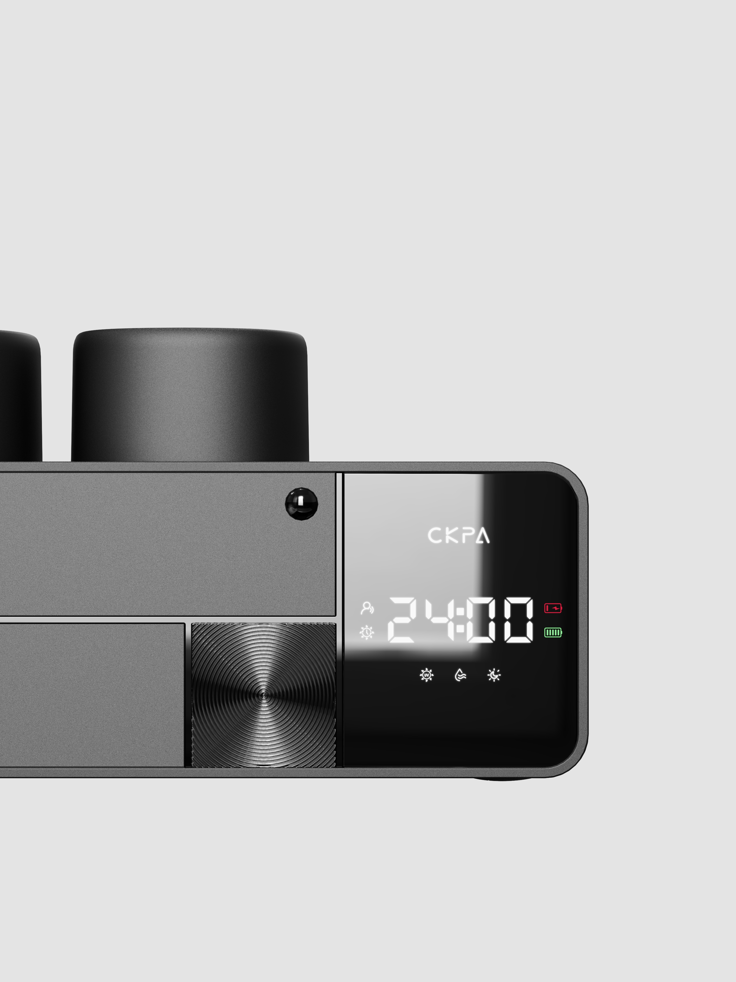
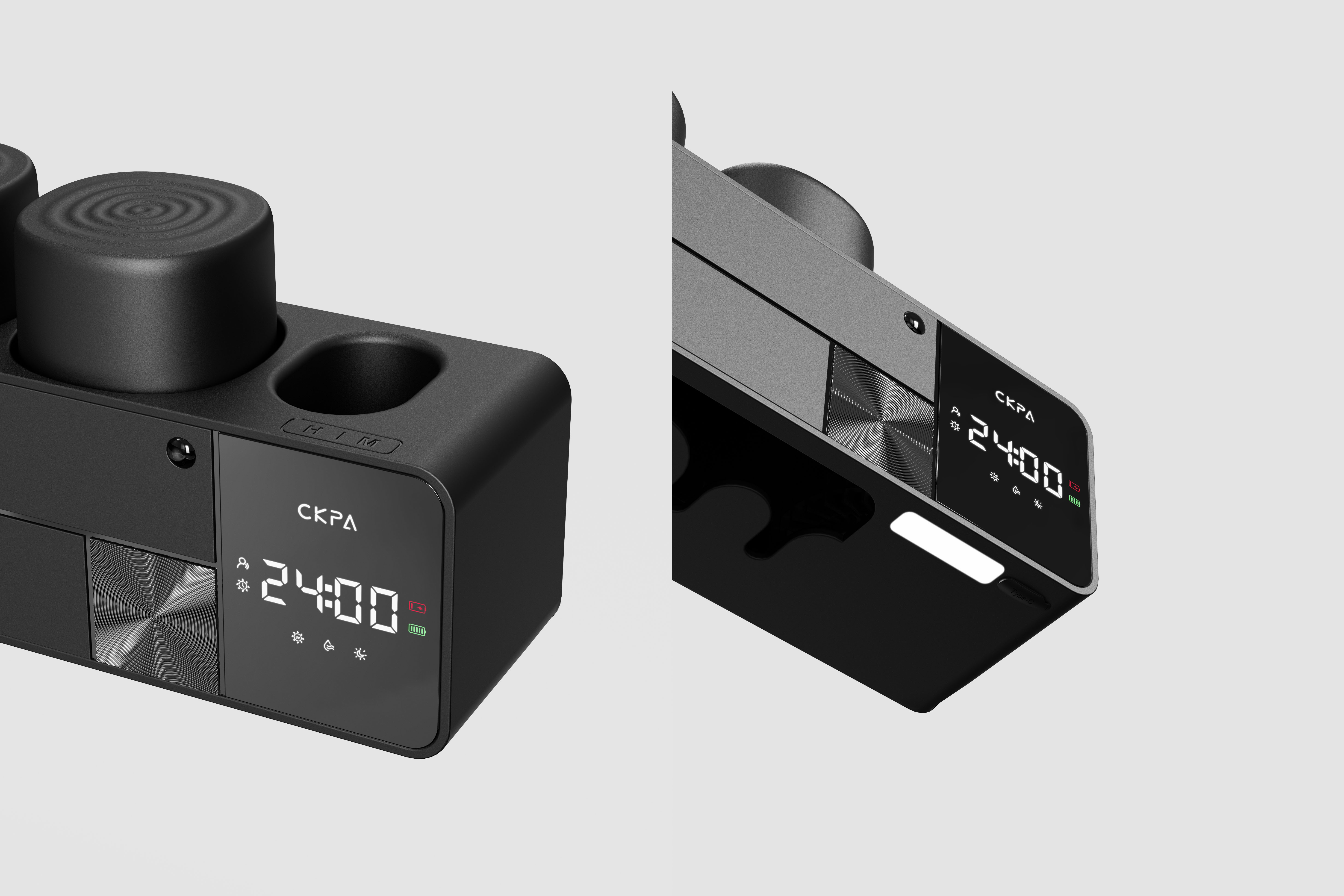
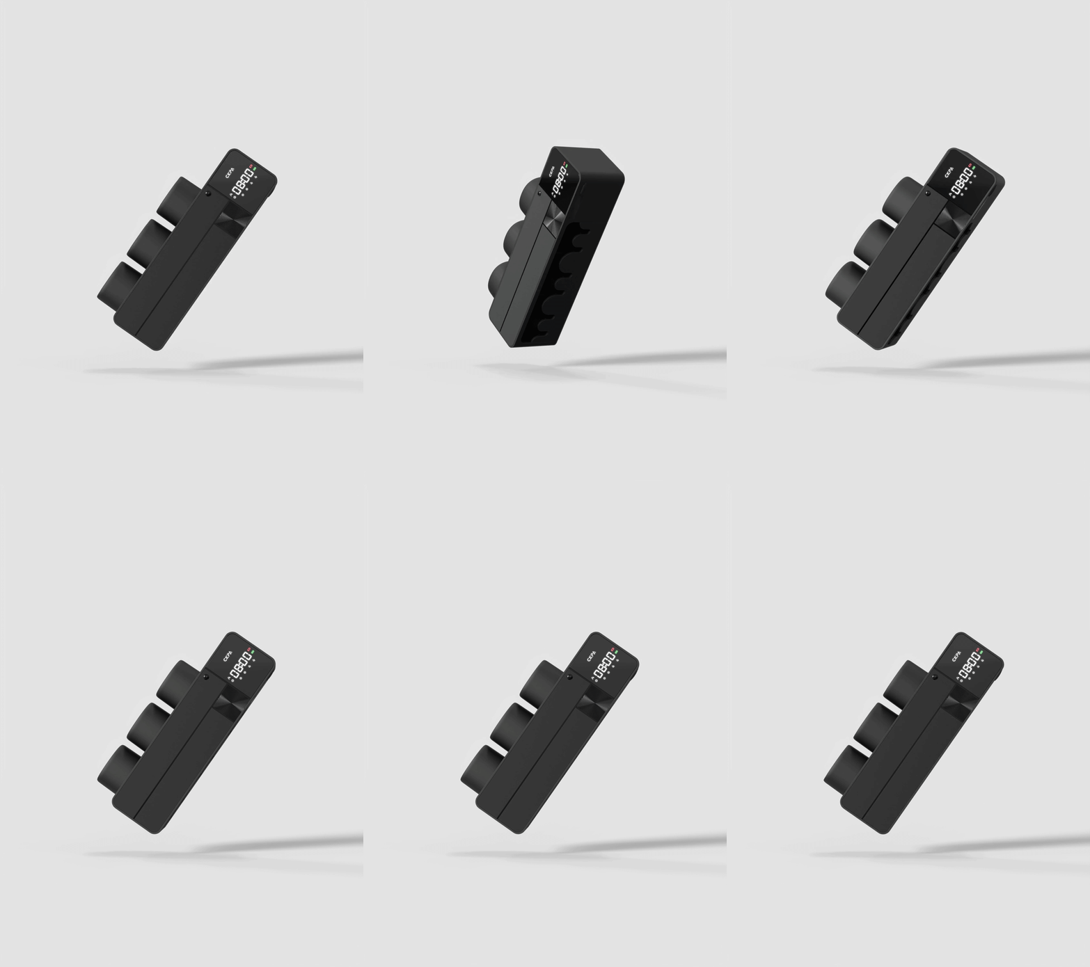
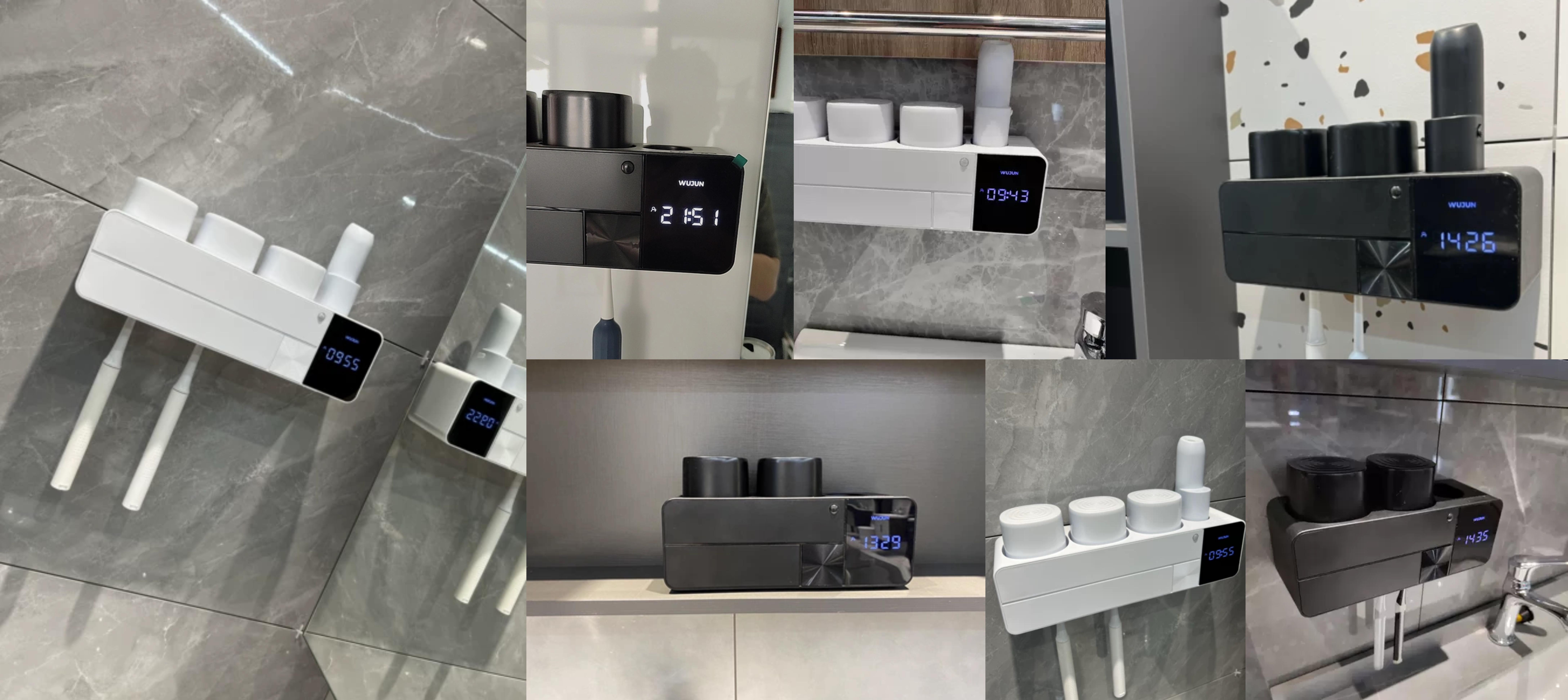
Product name: toothbrush sterilizer
Service Content: Product Strategy | Product Design
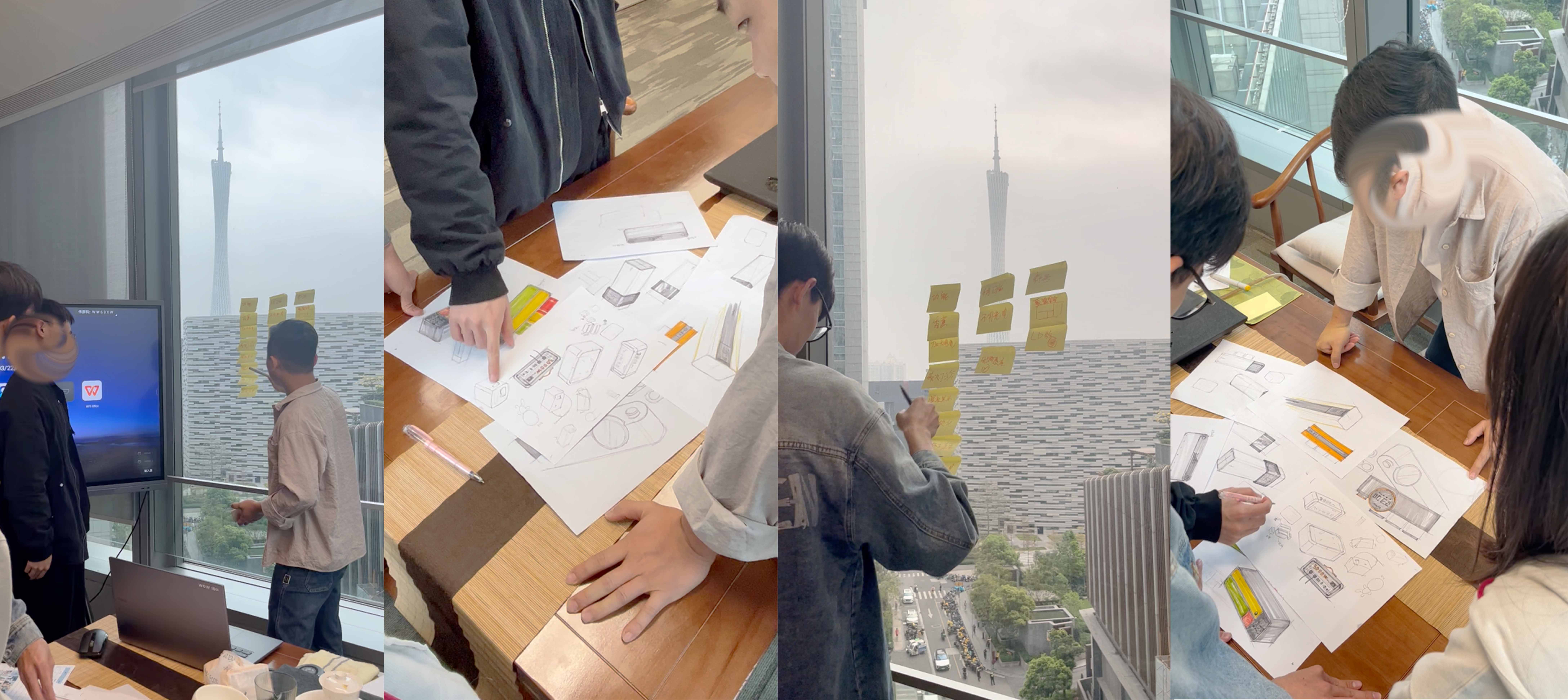
We advocate innovation from the inside out, through market insight into design opportunities, from the function, experience, appearance to enhance product competitiveness.
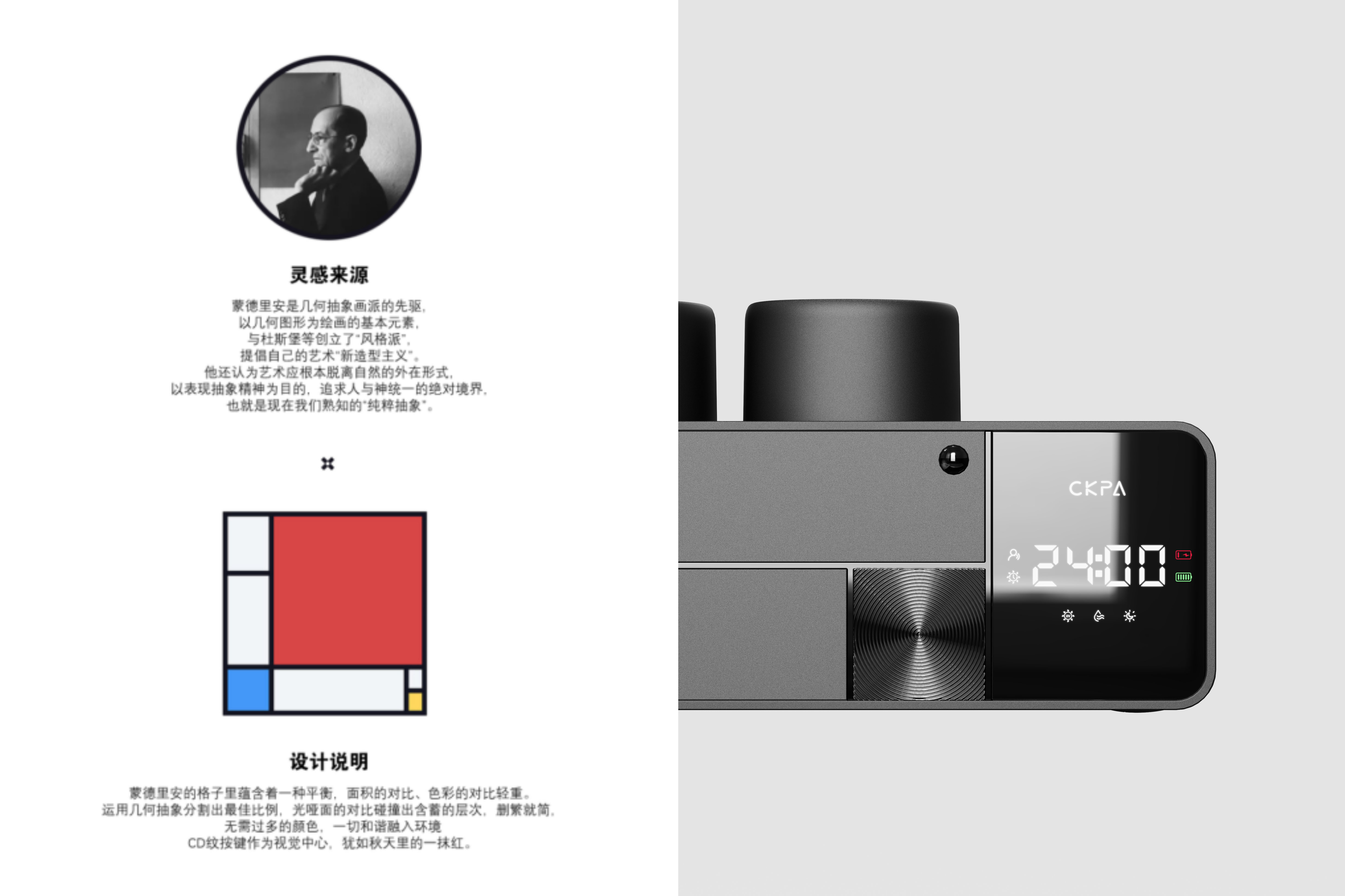
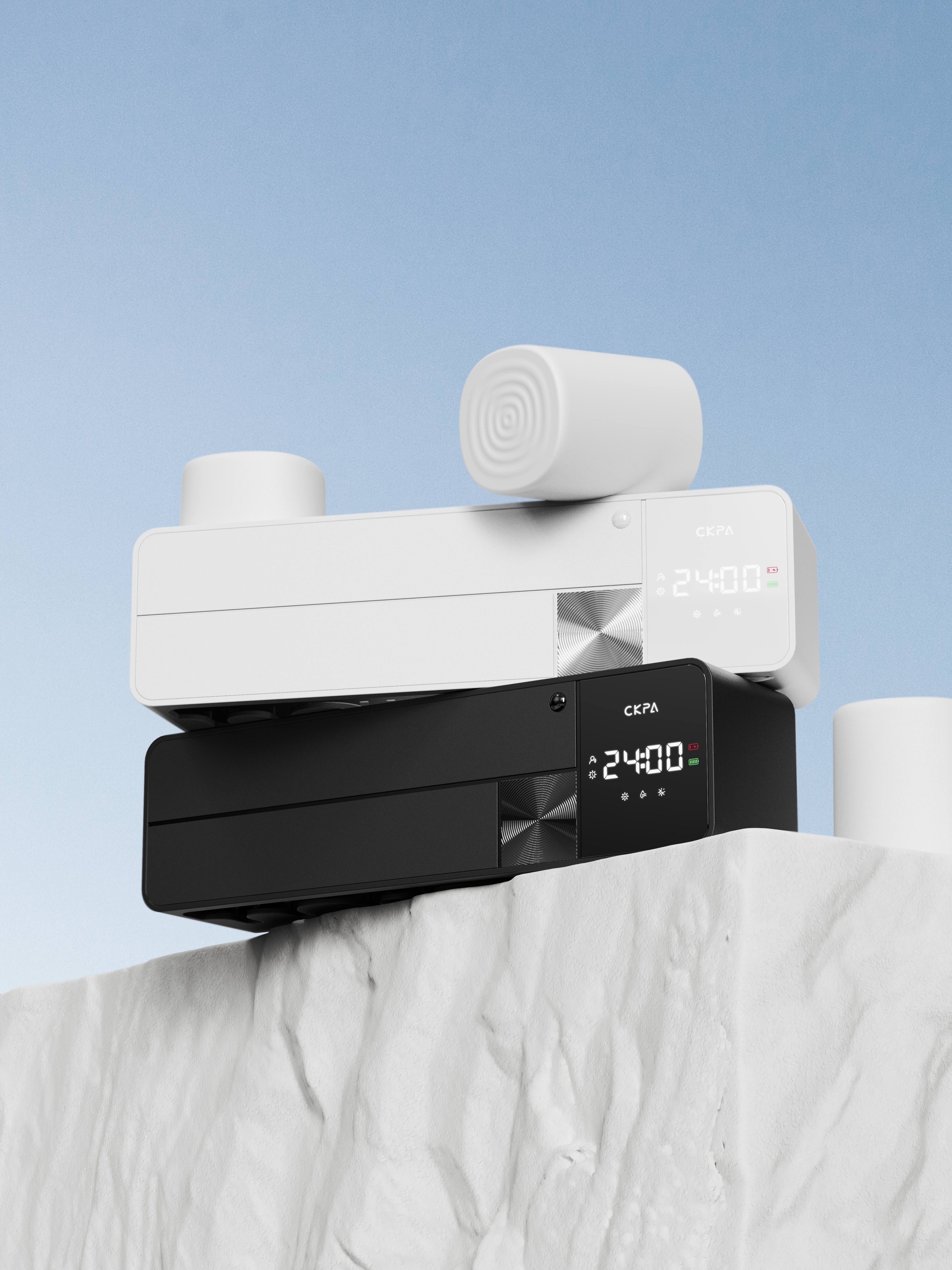
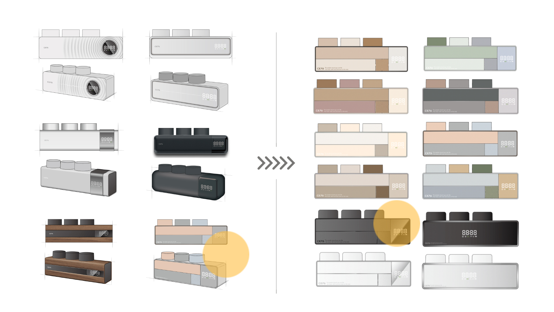
Extract strong symbols from Monde's geometric art "red, yellow and blue" to give familiar strangeness and create a unique product design language.


The copyright of this work belongs to 尖叫无限设计. No use is allowed without explicit permission from owner.

New user?Create an account
Log In Reset your password.
Account existed?Log In
Read and agree to the User Agreement Terms of Use.

Please enter your email to reset your password
Only now see
I feel that many products are spliced by geometry now, and then I work hard on CMF. It's a bit interesting to see too much.
CD lines feel very prominent
The small rounded corners in the 2D renderings look better
The time display is a bit useful, but it will be very troublesome to calibrate the time if it is not connected to the Internet automatically. The design of the nightlight at the bottom is not very practical because the first reaction when entering the toilet is to turn on the light and need to turn on the light. He cannot replace it when he does not need to turn on the light... The shape is very digital and feels very suitable for industrial design products. It takes some time to consider the functional design.
Two words are excellent. Does your company still recruit interns?
Advanced, sense of quality. The top list has reserved
Two words high-end!
Feel that other schemes in the sketch are better.
very nice
There is a certain level in it.
What do you think is an electronic product?
Design aesthetics, invincible golden section, awesome