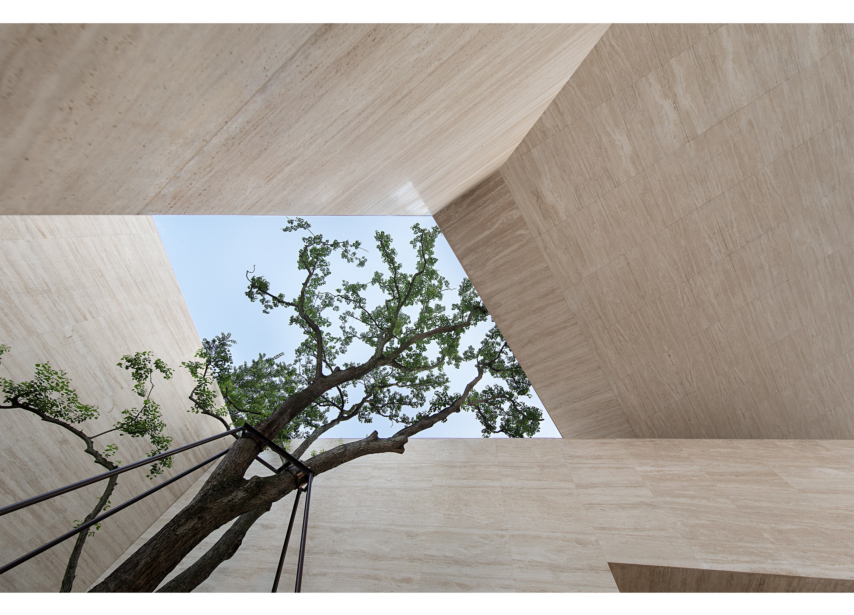
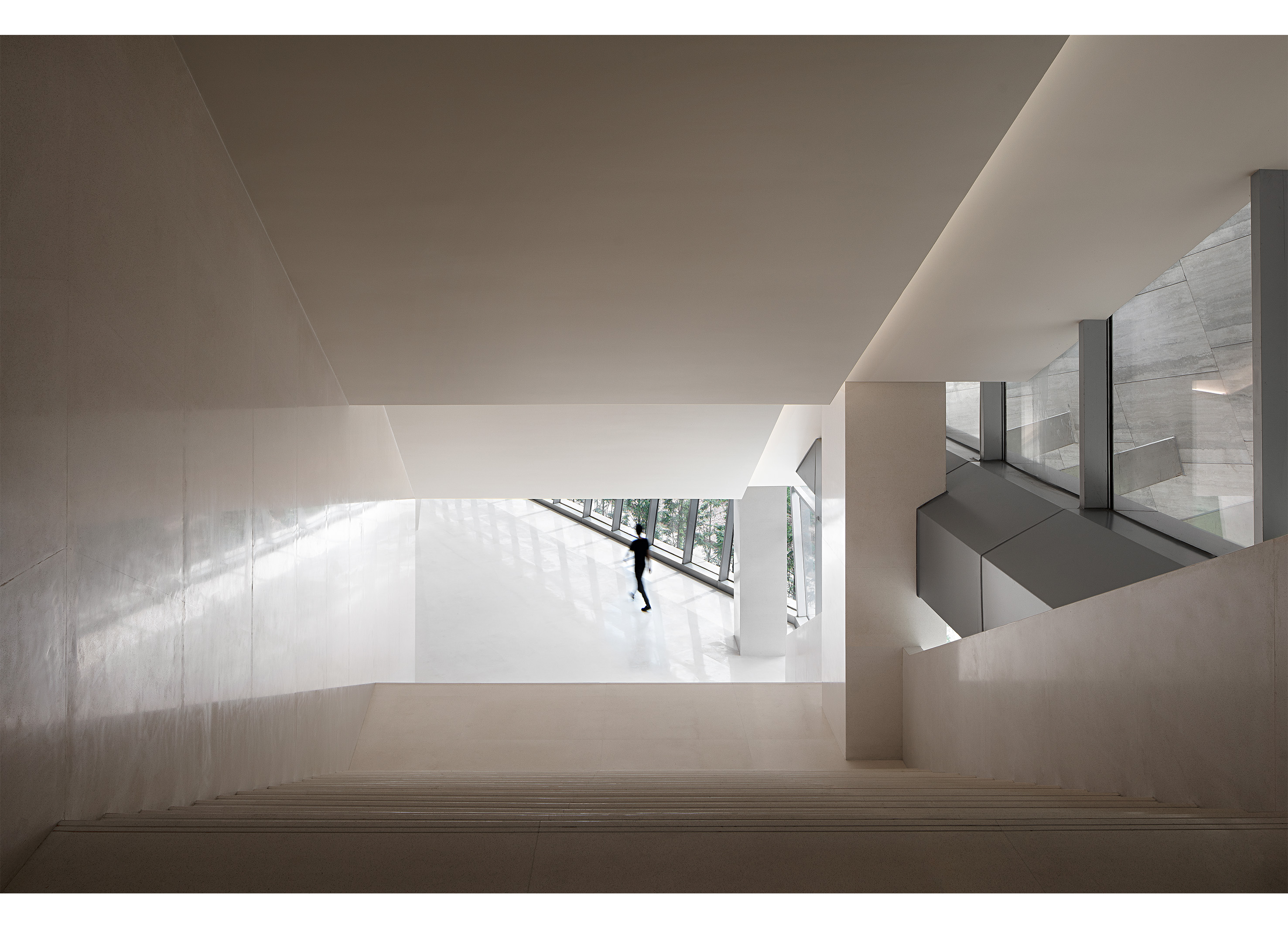
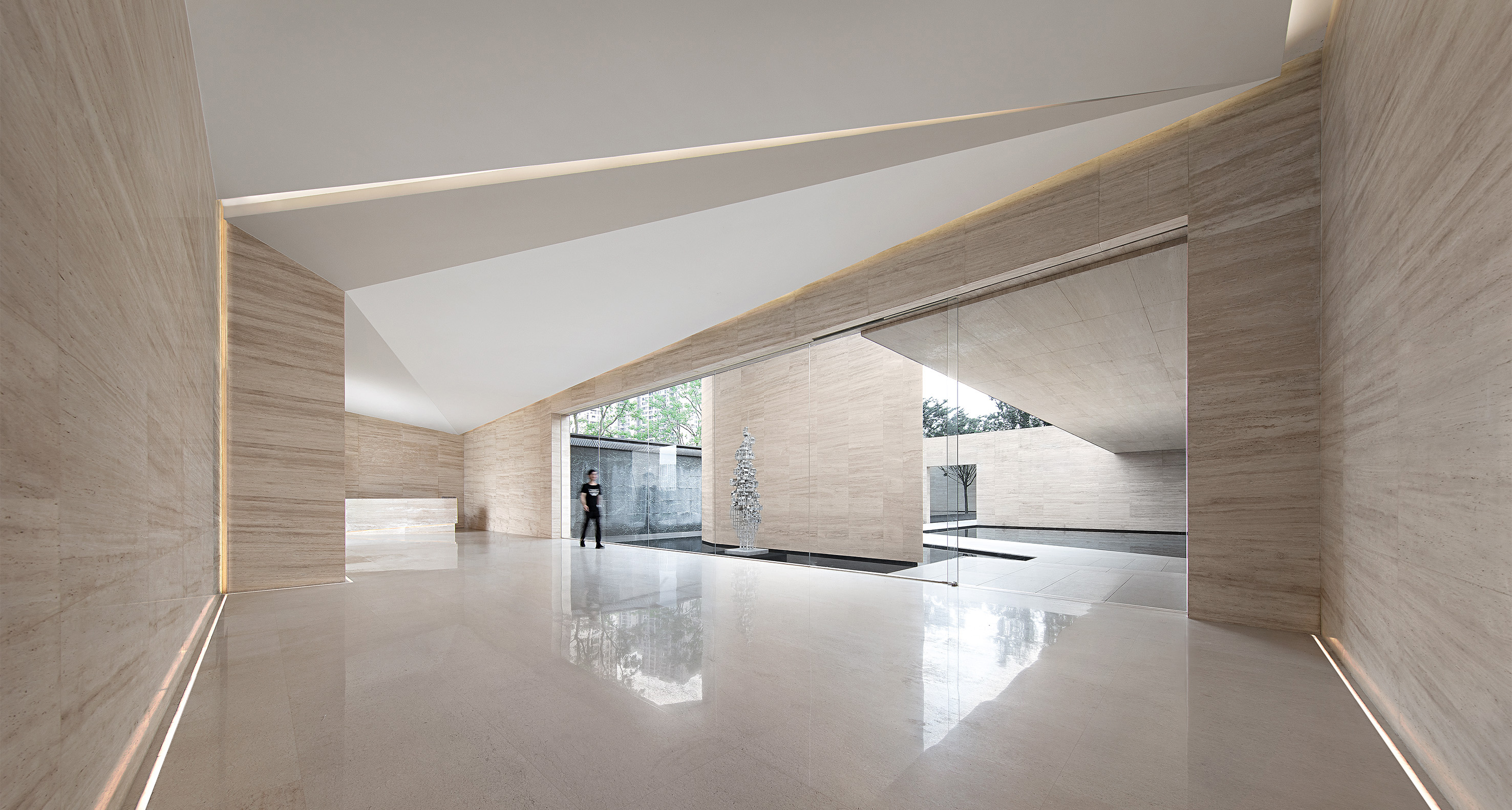
From the perspective of spatial dynamics and relationships, we do simplicity and openness to make the space bigger, shorting and accessible: through simple arrangement and combination, without mandatory limitation of functional space, we can achieve the effect of expanding the spatial boundary. The warm light-colored marble as the main material of space is actually more like a concept, and it also minimizes the interference to the state of space. The external facade lines of the building are divided twice. After the indoor deconstruction and density adjustment, they extend into the indoor space. We refine the level in the form of "folding board" at the division points of the space. Directly pointing at the huge inverted cone of the sky, the glass allows the divinity of light to pour out in front of people without reservation. The giant staircase extends to mid-air, and the end of the ramp leads to nowhere, like a cycle, focusing on the line of sight... The direction of the space, the line of behavior, and the direction of the ceiling ceiling all have a "folding surface" type of presentation, and the folding surface elements appear in the indoor space many times in a similar but alienated form, coupled with the mutual penetration of "light and shadow" in different interfaces, creating more possibilities for the place. The randomness of the line of sight when people walk will produce different visual paths. The interface between the internal space elements and the building body has a visual penetration relationship, and the space becomes complex and interesting. Part of the space-swimming pool, the structure of the building body is directly exposed, and the exposure of the structure naturally forms the most powerful order array in the related system of architecture and indoor space. At the same time, it emphasizes the integrity of the interior wall, such as the determination of the space tone and the direction of the stone groove. The penetration of light and shadow into space is also more textured. To some extent, it starts with the expression of "emptiness" and expands the boundary attribute of space intuitively and directly.
China
Award : WINNER
Client : SUNAC Group
Affiliation : Matrix Design
Designer : Wang Guan, IdmenLiu, Wang Zhaobao
www.asiadesignprize.com/133183


New user?Create an account
Log In Reset your password.
Account existed?Log In
Read and agree to the User Agreement Terms of Use.

Please enter your email to reset your password
This effect diagram is possible