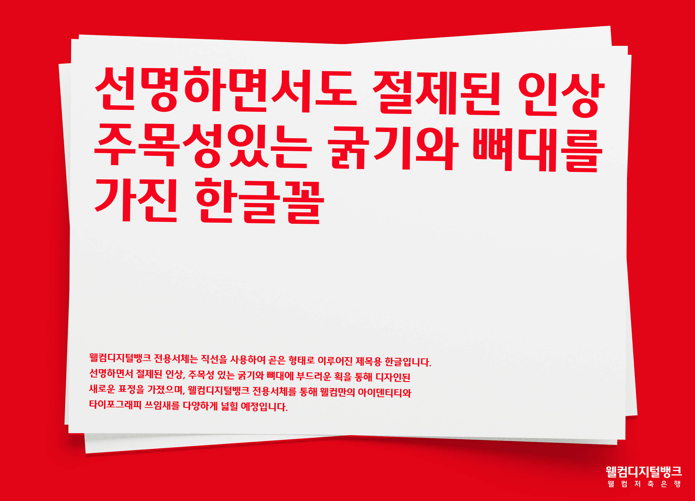
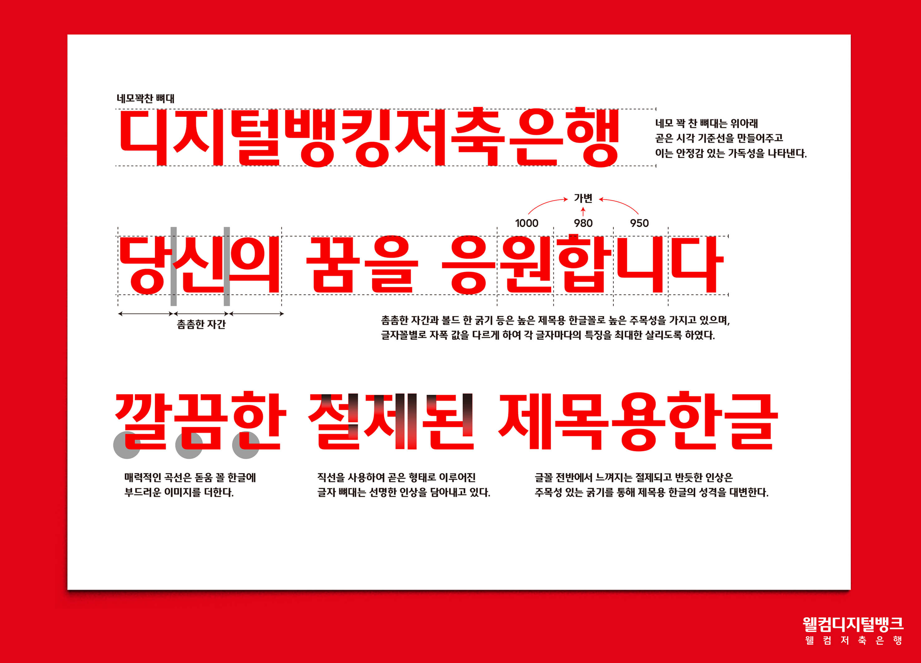
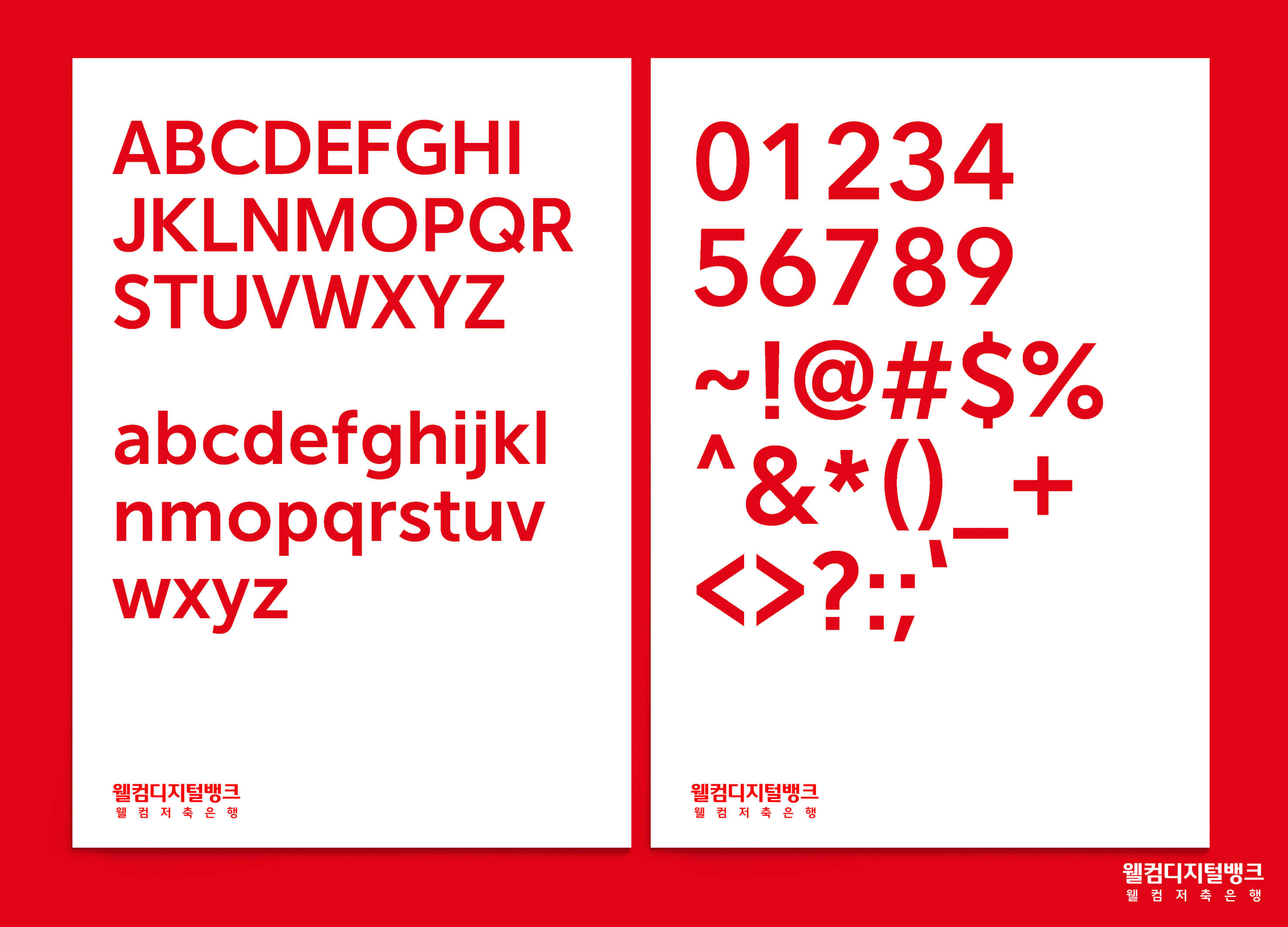
Welcome to the digital bank special font using a straight line composed of strokes, showing a concise and clear title Korean font. It presents a new look through clear and concise impressions, prominent thickness and skeleton, and soft strokes. The even vertical strokes emphasize the sense of geometry, as a symbol of numbers, reflecting the unique identity of the welcome brand. The compression module of the font expresses the sense of youth and speed, while the uniform curve (rounded corners) conveys the personality and soft impression of the font. In addition, the visual center is located at the top, which facilitates the movement and alignment of the eyes and has good readability. By welcoming digital bank-specific fonts, Welcome Brands will further expand its unique brand identity and typography applications.
Korea
Award : WINNER
Client : Welcome Savings Bank
Affiliation : Welcome Savings Bank BX Design
Designer : Lee ByoungOk, Im GyuRi, Jang GoEun
https://asiadesignprize.com/exhibition/160217
The copyright of this work belongs to ADP. No use is allowed without explicit permission from owner.

New user?Create an account
Log In Reset your password.
Account existed?Log In
Read and agree to the User Agreement Terms of Use.
Please enter your email to reset your password


Passing
Sofa