Since the release of WIN8, touch hardware has developed vigorously, and the cutting-edge technology of touch represents the technical level of the enterprise. In the past two years, first-line manufacturers have introduced touch products, such as Logitech touch mice (M600 and T630) and Lenovo's (Lingshi and N700). First, in order to consolidate the Lei Bai brand and market position, to create the field of top image products. Second, the design differentiation of the old product T6 is not obvious, and the materials are not exquisite, which cannot meet the requirements of current consumers. Third, appearance aesthetics and ergonomics need to be reinterpreted, and product identification needs to be reshaped. The newly designed T8 will be positioned as high-end image products, metal materials and simple design aesthetics. Focus on solving the current difficulties of touching the mouse (ergonomics). The difficulty lies in unifying and balancing ergonomics, aesthetics, product identification, materials and other elements at a thickness of 25mm. As early as 2012, I began to try the design of touch mouse, but failed several times. After accumulating enough experience, it was not until 2014 that an excellent design was produced. In this project, I served as the main creative designer, from the early stage of research and development to the mass production stage of the product, and the evaluation was good after the product went on the market. Won the German IF Design Award in January 2015 and the Most Influential Design Award in Asia in September.
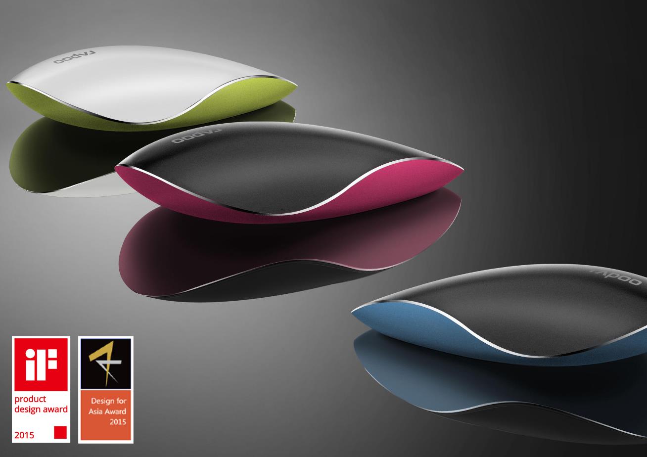
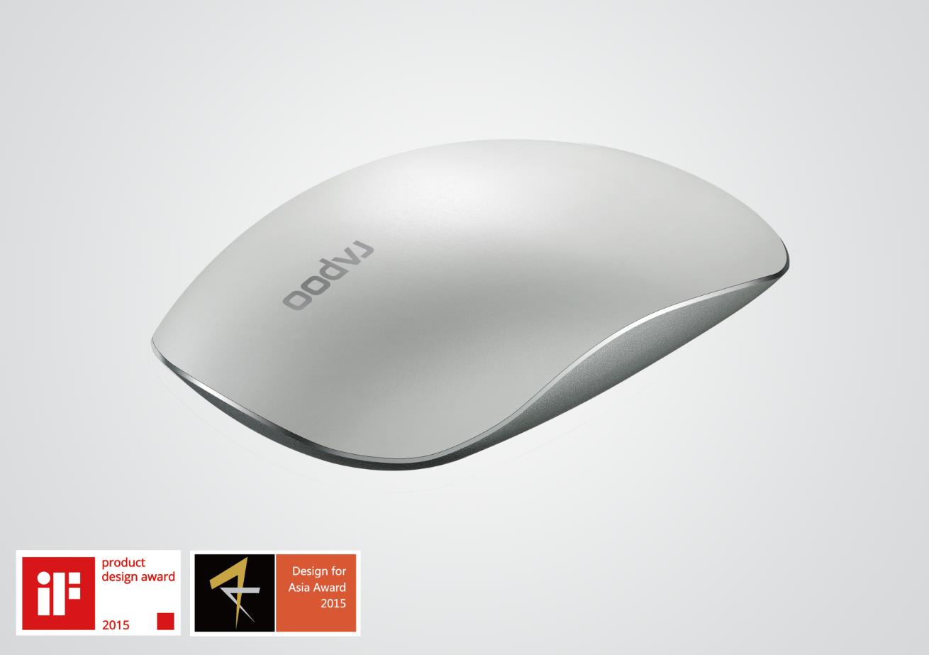
T8 Touch Mouse
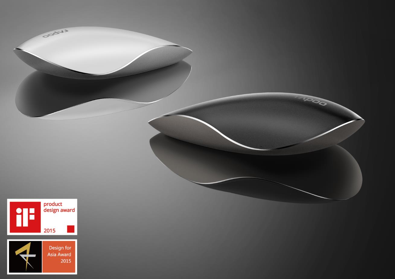
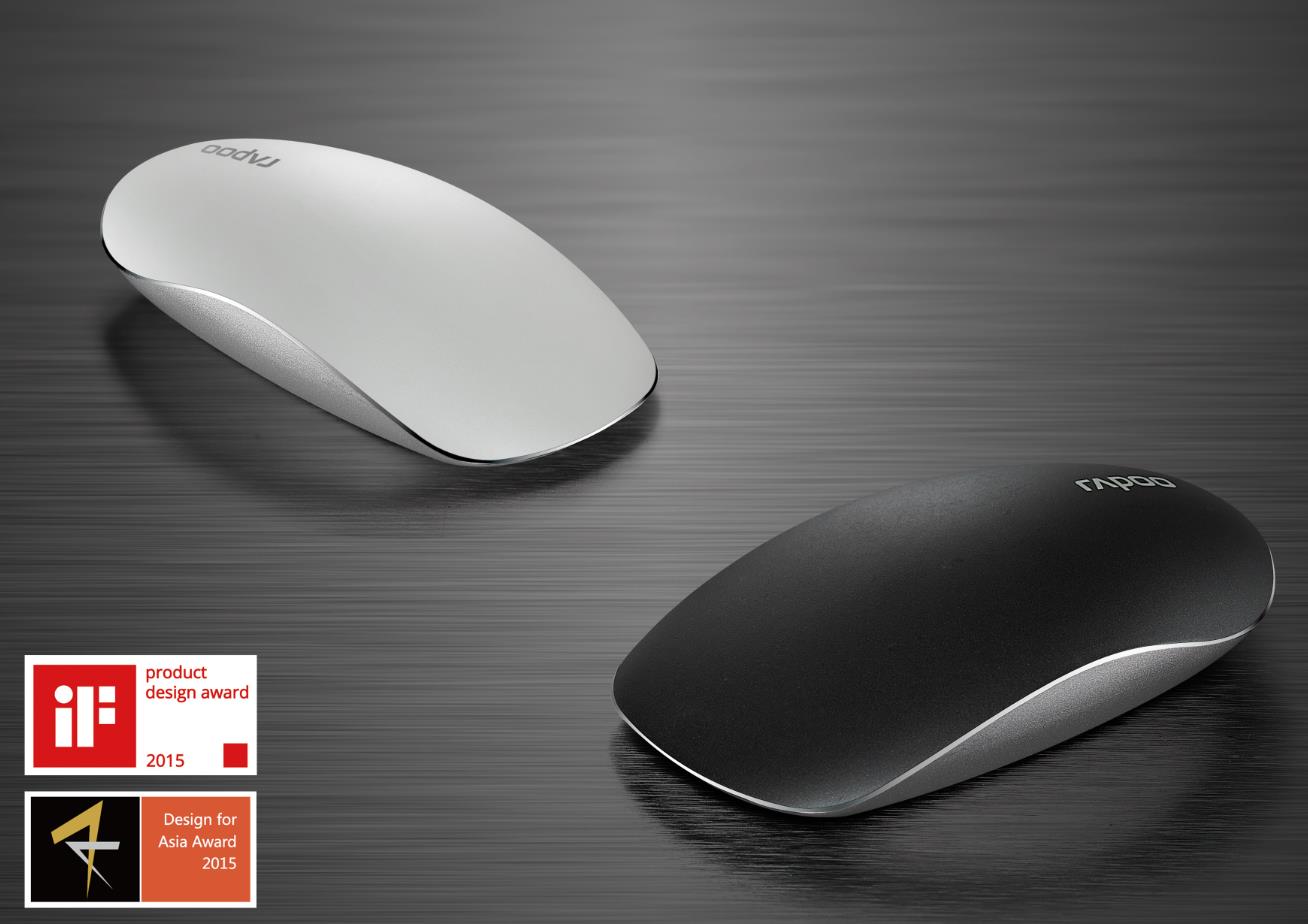
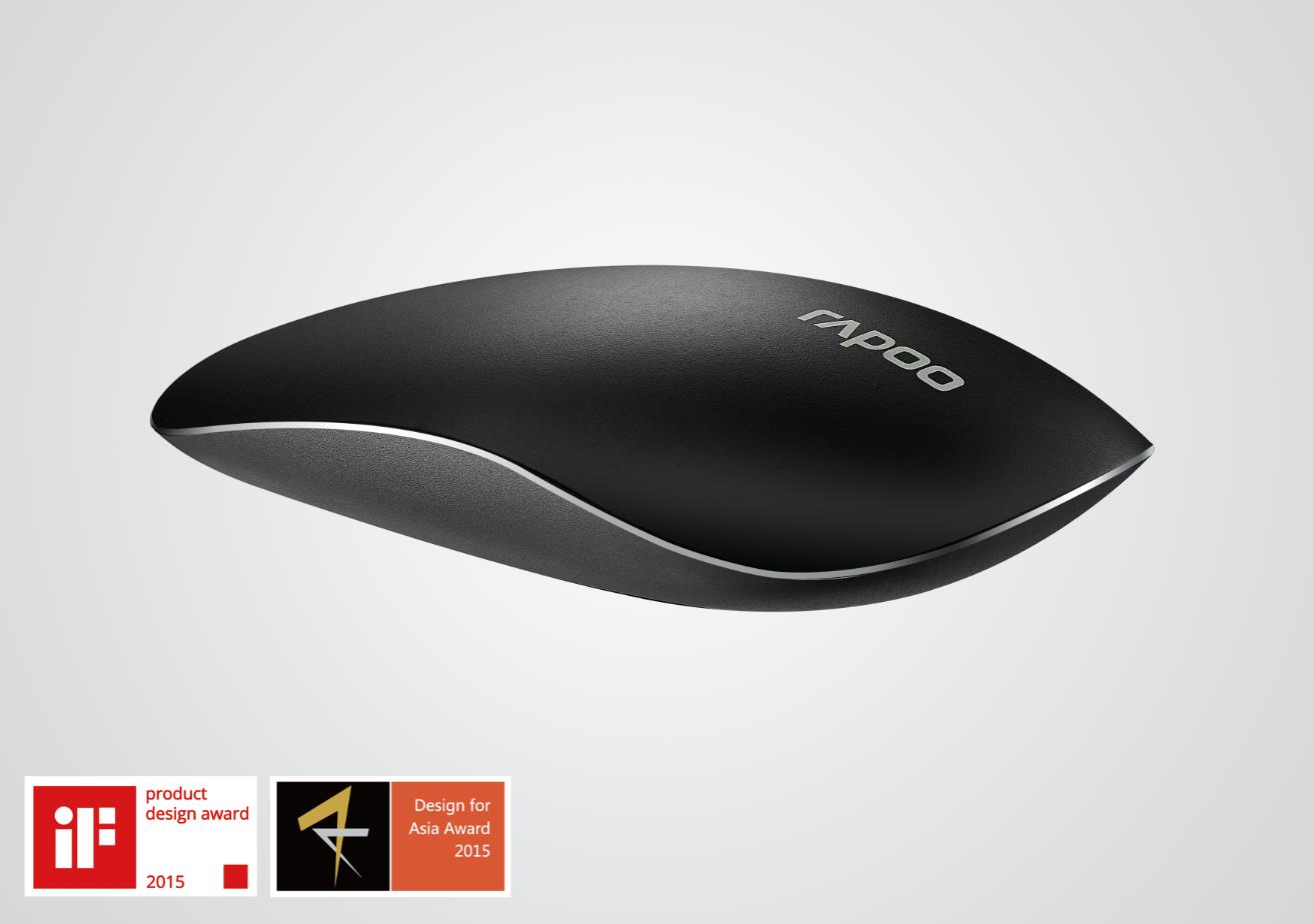
The design reinterprets the integration of ergonomics and aesthetics, and the exterior image carries the brand image and contains human-machine comfort elements. The design is reasonable and implicit. What users see is only simple streamline. The real feeling of use is presented in five time periods, that is, the five senses of man and machine. Won the German IF Design Award and the Most Influential Design Award in Asia
II. Define morphological style
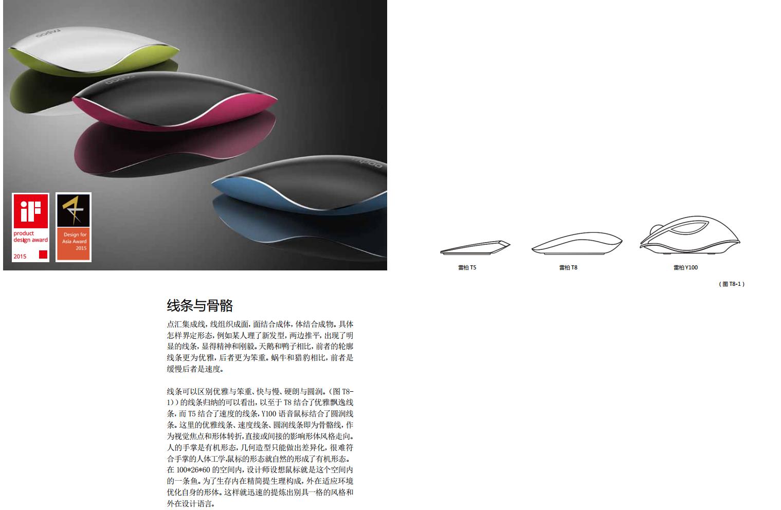
Point sinks into a line, the line is organized into a surface, the surface is combined into a body, and the body is combined into a composite. How to define the form, for example, someone has a new hairstyle, both sides are flattened, and obvious lines appear, showing spirit and fortitude. Compared with ducks, swans have more elegant silhouette lines in the former, and bulkier in the latter. Compared with cheetahs, snails are slower in the former and faster in the latter. Lines can distinguish between elegant and bulky, fast and slow, hale and mellow. (Figure T8-1)) The lines can be summarized, so that T8 combines elegant and elegant lines, T5 combines speed lines, and Y100 voice mouse combines rounded lines. The elegant lines, speed lines and rounded lines here are the bone lines, which, as the visual focus and body turning point, directly or indirectly affect the body style trend. The palm of a person is an organic form, and geometric shapes can only be differentiated. It is difficult to conform to the ergonomics of the palm. The shape of the mouse naturally forms an organic form. In the 100*26*60 space, the designer imagines the mouse as a fish in this space. In order to survive the internal simplification of the physiological composition, the external adaptation of the environment to optimize their own form. In this way, a unique style and external design language can be quickly refined.
III. Modeling Principle and Evolution
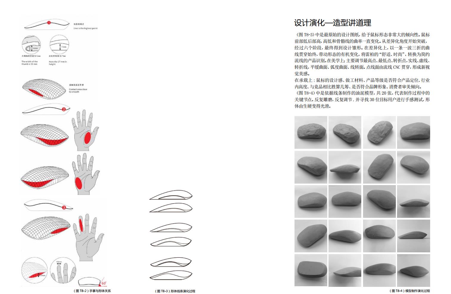
(Figure T8-3) is the most original design drawing, giving the mouse a very large tendency. Mouse
The front is low and the back is high, high and low, and the curvature of the bone line changes all the time. Starting to break through from the perspective of differentiation,
After six stages, the prototype of the design was finally obtained. In terms of differentiation, with a twists and turns
The line runs through the whole process, driving the organic change of form and transforming Lei Bai's "comfort and fashion" into simplicity.
Product identification of streamlines. In aesthetics; mainly adjust the highest point, lowest point, turning point, solid line, dashed line,
Turning line, gentle surface, radian surface, line turning surface. The point line surface is penetrated by the streamline CNC, forming a new view
Feeling beautiful.
On the bearing: whether the design sense, workmanship materials and product grade of the mouse conform to the product positioning and industry
The internal height, the odds of winning compared with the competition, whether it conforms to the brand image and the aesthetic tendency of consumers.
(Figure T8-4) is a sludge model made according to lines, a total of 20, representing the production process
Key nodes. Repeated carving and grinding, repeated adjustment. And look for 30 target users for hand test, shape
The body changes from stiff to smooth.
IV. Trimming Proportion and Scale
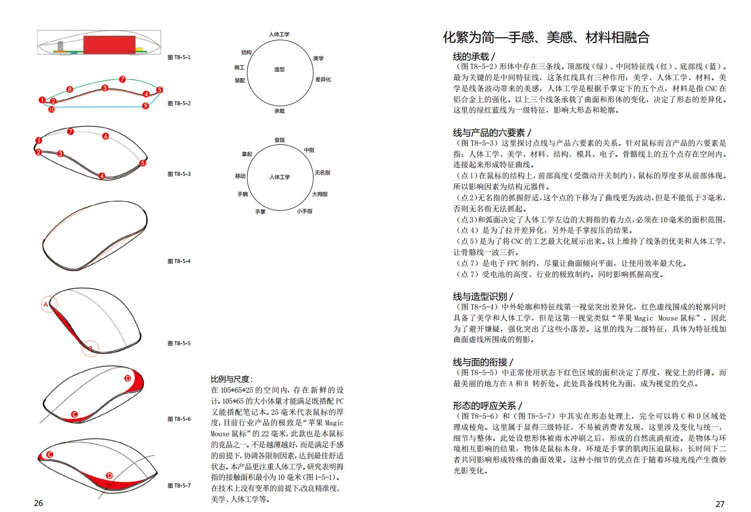
In the 105*65*25 space, there is a fresh design. The size of 105*65 can meet the requirements of matching both PC and notebook. 25mm represents the thickness of the mouse. At present, the ultimate product in the industry is 22mm of "Apple Magic Mouse Mouse", which is also one of the competitors of this mouse. Not the thinner the better, but on the premise of satisfying the hand feeling, coordinate various limiting factors to achieve the best comfort state. This product pays more attention to ergonomics. Studies have shown that the contact area of the thumb is at least 10mm (Figure 1-5-1). On the premise that there is no change in technology, improve accuracy, aesthetics, ergonomics, etc.
V. To simplify-feel, aesthetic feeling, material integration
Bearing of 5.1 Line/
(Figure T8-5-2) There are three lines in the form. Top line (green), middle feature line (red), bottom line (blue). The most important thing is the middle characteristic line, which has three functions: aesthetics, ergonomics and materials. Aesthetics is the beauty brought by line fluctuations. Ergonomics is the five points set according to the palm of the hand. The material refers to the strengthening of CNC on aluminum alloy. The above three lines carry the changes of curved surface and shape, which determine the difference of shape. The green, red and blue lines here are first-class features that affect large shapes and contours.
Six Elements of 5.2 Line and Products/
(Figure T8-5-3) Here is the relationship between the dot line and the six elements of the product. For the mouse, the six elements of the product refer to: ergonomics, aesthetics, materials, structure, mold, and electronics. The five points on the bone line exist in space. Connect to form a characteristic curve. (Point 1) On the structure of the mouse, the front height (restricted by the micro switch) and the thickness of the mouse are mostly reflected from the front. Therefore, the influencing factors are structural components. (Point 2) The ring finger is comfortable to grasp. The downward movement of this point makes the curve more fluctuating, but it cannot be lower than 3mm, otherwise the ring finger cannot be grasped. (point 3) and the curved surface determine the focus of the thumb on the left side of ergonomics, which must be in the area range of 10mm, (point 4) is for differentiation, and the other is the result of palm pressing. (Point 5) is to maximize the display of CNC technology. The above maintains the beauty and ergonomics of the lines, making the bone lines twists and turns. (point 7) is the electronic FPC restriction, try to make the surface tend to the plane, so as to maximize the efficiency of use. (point 7) by the height of the battery, the extreme constraints of the industry. At the same time, it affects the grip height.
5.3 Line and Shape Identification/
(Figure T8-5-4) The first vision of Chinese and foreign contours and feature lines highlights the difference. The contours surrounded by red dotted lines have both aesthetics and ergonomics. However, this first vision is similar to "Apple Magic Mouse Mouse". Therefore, in order to avoid suspicion, these small falls are highlighted. The line here is a secondary feature, specifically the silhouette enclosed by the feature line and the curved dashed line.
5.4 the connection between the line and the surface/
(Figure T8-5-5) The area of the red area under normal use determines the thickness and is visually thin. The most beautiful place is at the turning point of a and B. Here there is a line converted into a surface, which becomes the intersection of vision.
Echoing Relationship of 5.5 Form/
(Figure T8-5-6) and (Figure T8-5-7), the C and D regions can be processed into edges and corners. This is a three-level feature that is not easy to be discovered by consumers. It involves changes and unified details and the whole. Here, imagine the natural flow marks formed after the body is washed by rain. It is the result of the interaction between the object and the environment. The object is the mouse itself, and the environment is the muscle of the palm oppressing the mouse. For a long time, the two influence together to form a special curved surface effect. The advantage of this small detail is that it produces subtle light and shadow changes with ambient light.
VI. Textured vision and touch
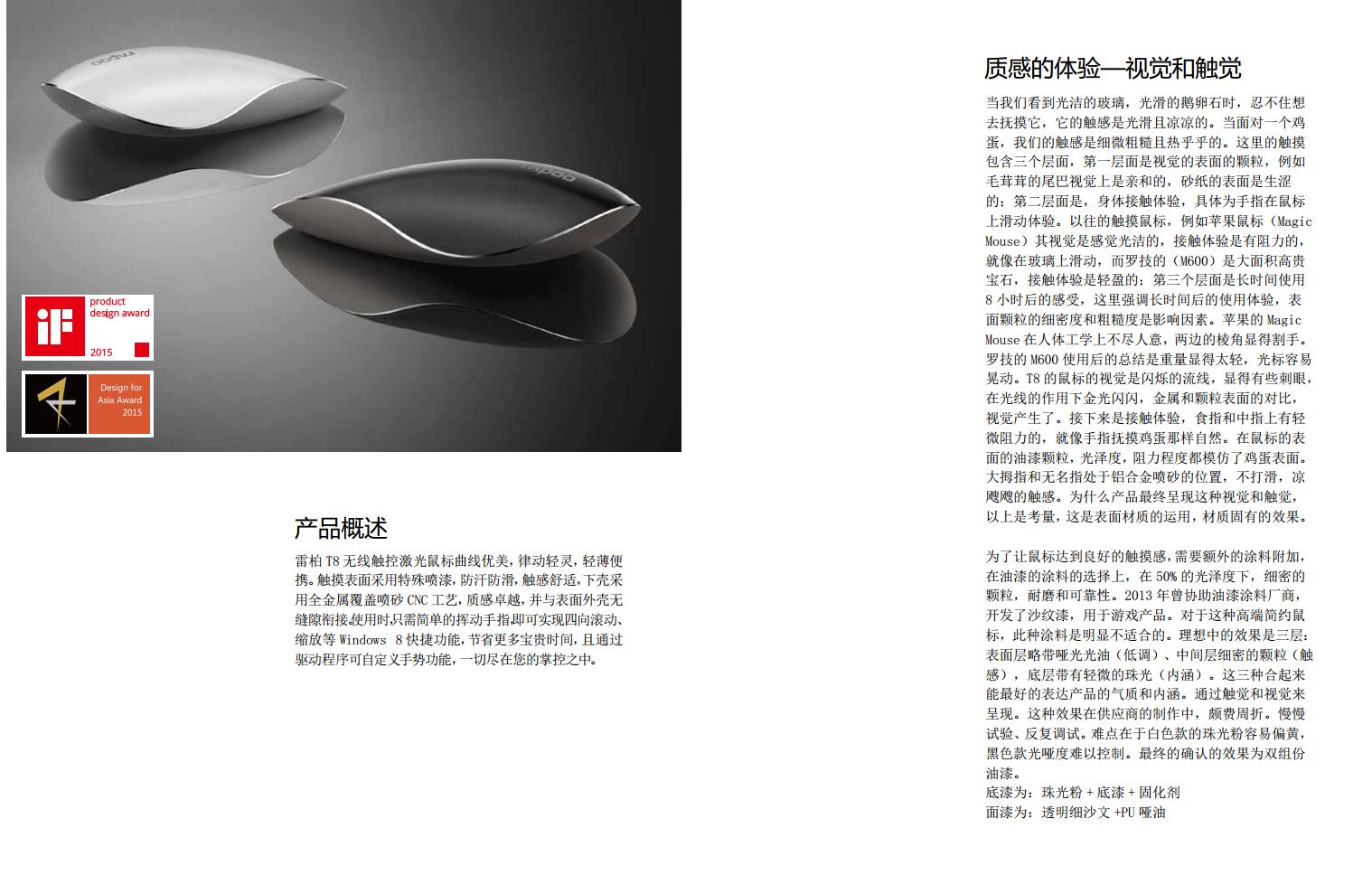
When we see smooth glass and smooth pebbles, we can't help but want to touch it. Its touch is smooth and cool. When faced with an egg, our touch is subtle and coarse and warm. The touch here consists of three levels. The first level is the particles on the visual surface. For example, the furry tail is visually friendly and the surface of sandpaper is jerky. The second level is the physical contact experience, specifically the finger sliding on the mouse. In the past, touch mice, such as Magic Mouse, have smooth vision and resistance, just like sliding on glass, while Logitech's (M600) is a large area of noble gem, and the contact experience is light. The third level is the feeling after 8 hours of long-term use. Here, the use experience after a long time is emphasized, the fine density and roughness of surface particles are the influencing factors. Apple's Magic Mouse is not ergonomically satisfactory, with the edges and corners on both sides appearing to cut hands. Logitech's M600 is used to sum up that the weight is too light and the cursor is easy to shake. The vision of T8's mouse is a flashing streamline, which is a bit dazzling. Under the action of light, the contrast between metal and particle surface, the vision is produced. Next is the contact experience. There is slight resistance on the index finger and middle finger, which is as natural as touching an egg with a finger. The paint particles, gloss and resistance on the surface of the mouse all imitate the surface of the egg. The thumb and ring finger are in the aluminum alloy sandblasting position, not slipping, chilly touch. The above is the consideration of why the product finally presents this kind of vision and touch. This is the application of surface materials and the inherent effect of materials. In order for the mouse to achieve a good touch feeling, additional paint is required. In the choice of paint, fine particles, abrasion resistance and reliability are required under 50% gloss. In 2013, he assisted paint manufacturers to develop sand paint for game products. For this high-end minimalist mouse, this paint is obviously not suitable. The ideal effect is three layers: the surface layer is slightly
With matte varnish (low-key), fine particles in the middle layer (touch), and slight pearlescent (connotation) in the bottom layer. These three together can best express the temperament and connotation of the product. Presented by touch and vision. This effect is quite difficult in the production of suppliers. Test slowly and debug repeatedly. The difficulty lies in the fact that the white pearl powder is easy to turn yellow and the black version is difficult to control. The final confirmed effect is two-component paint.
Primer: pearl powder + primer + curing agent
Top coat: transparent fine sand + PU dumb oil
Design trivia (I)
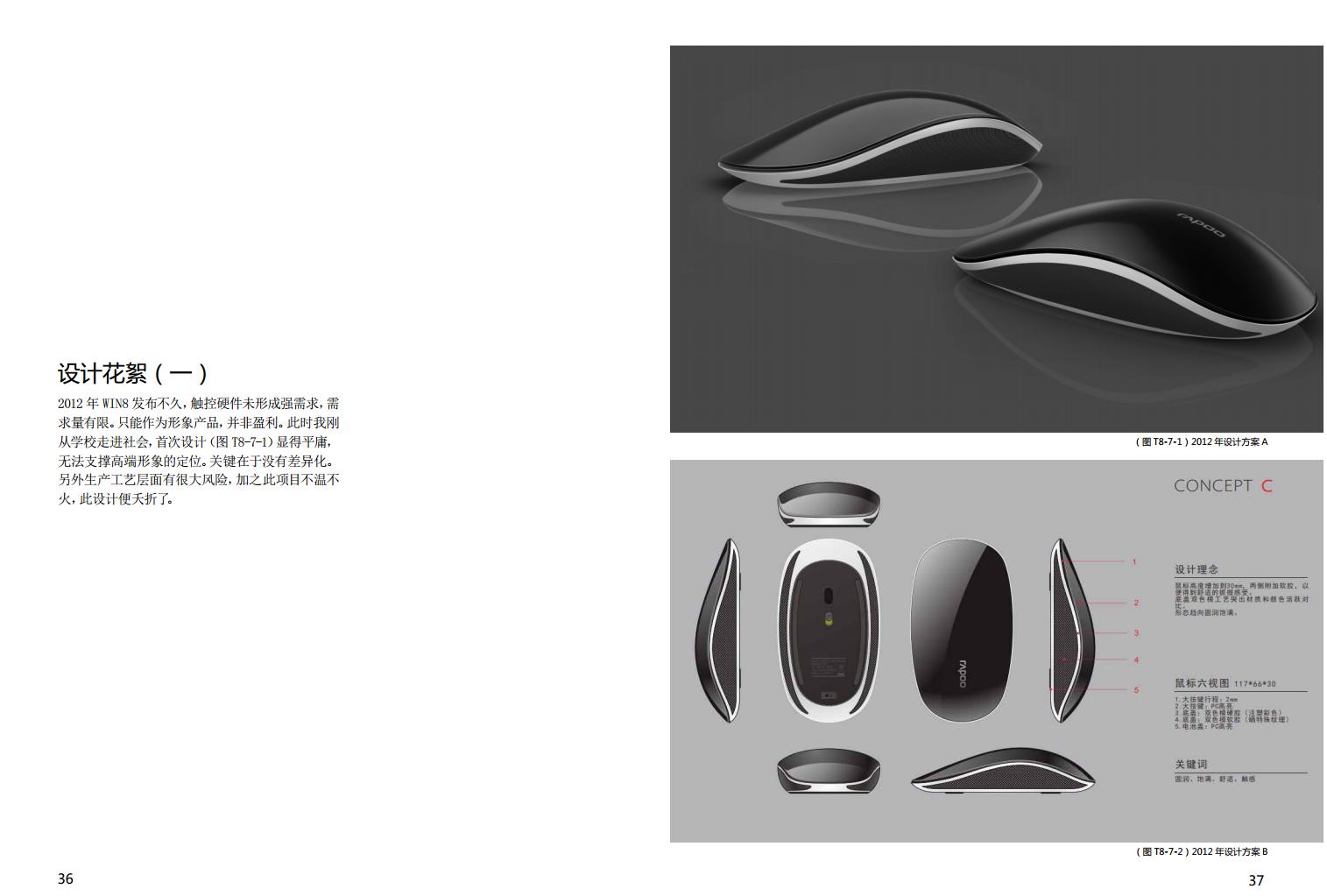
Shortly after the release of WIN8 in 2012, there was no strong demand for touch hardware and limited demand. It can only be used as an image product, not a profit. At this time, I just entered the society from school, and the first design (picture T8-7-1) seemed mediocre and could not support the positioning of high-end image. The key is that there is no differentiation. In addition, there are great risks at the production process level, and this project is tepid, and this design is aborted.
Design trivia (II)
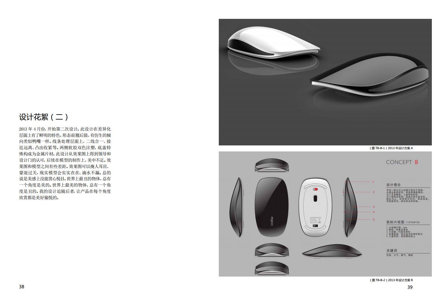
In April 2013, the second design began. This design has distinctive features on the level of differentiation. The shape is tilted forward and bulged back. It has a bionic tendency similar to a duckbill. On the line processing level, the two lines are integrated, close to away, protruding and tightening, etc. Two-color injection molding of soft rubber on both sides, and the special structure of the bottom cover is metal sheet. This design has been approved by the leaders and the design door from the effect diagram, and the subsequent production of the model is deficient in the ointment. There are some gaps between the renderings and the models. The effect diagram can hide people's eyes and eyes and muddle through, and the real model will be real and watertight. In general, it is not aesthetically pleasing to the eye. The ugliest object in the world always has an angle that is beautiful. The most beautiful object in the world always has an angle that is ugly. My design follows the latter and makes the product beautiful and pleasant to appreciate from every angle.
Design trivia (III)
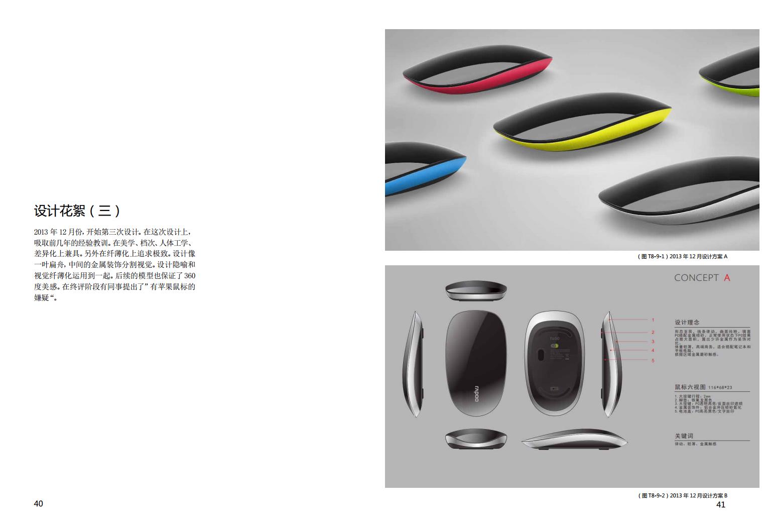
In December 2013, the third design began. In this design, learn from the experience and lessons of previous years. In aesthetics, grade, ergonomics, and differentiation. In addition, the pursuit of perfection in thinness. The design is like a flat boat, with the metal decoration in the middle dividing the vision. Design metaphor and visual thinning are applied together. Subsequent models also guarantee 360 degrees of beauty. In the final evaluation stage, some colleagues raised the "suspicion of having an Apple mouse".
Design trivia (IV)
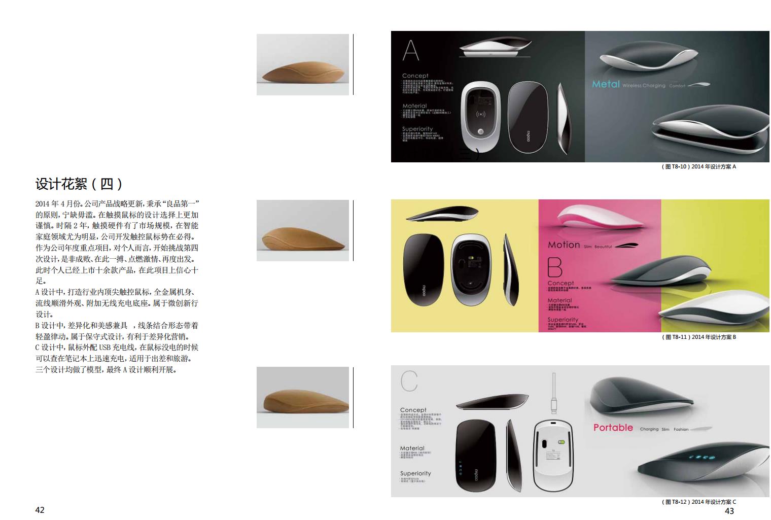
April 2014. The company's product strategy update, adhering to the principle of "good products first", rather than lack. Be more cautious in the design choice of touch mouse. After 2 years, touch hardware has a market size, especially in the field of smart home, the company's development of touch mouse is bound to win. As the company's annual key project, for individuals, they begin to challenge the fourth design, success or failure, fight here, ignite passion, and start again. At this time, the individual has already listed more than ten products and is confident in this project. A design, to create the industry's top touch mouse, all-metal body, streamline smooth appearance, additional wireless charging base. It is a minimally invasive new line design. In B design, differentiation and aesthetic feeling are both, and the combination of lines and forms is light and rhythmic. It is a conservative design that facilitates differentiated marketing. In the C design, the mouse is equipped with a USB charging cable, which can be quickly charged on the notebook when the mouse is out of power, and is suitable for business trips and travel. All three designs were modeled, and finally design A was carried out smoothly.
The copyright of this work belongs to 周红超. No use is allowed without explicit permission from owner.

New user?Create an account
Log In Reset your password.
Account existed?Log In
Read and agree to the User Agreement Terms of Use.

Please enter your email to reset your password
Niubi, how long does it take to analyze a product like this .... party a refuses to spend this time on research and development
Great, your design!!
666
Give you this praise! It's much better than burning incense, haha
There is a style like Lamborghini.
Rigorous design, the process is very sufficient, praise
Personal WeChat: qwer312456 Welcome to Exchange
It's great!
The game mouse is very cool to do
I like the design of T8 touch mouse ~ ~ ~
Wow, I have been designing the mouse professionally for 100 years. It is amazing. I can see my concentration from the designer's head portrait!