Name of Work: Packaging Design of Mo Xiaoxian Series Products
Brand Holding: Shanghai Moxiaoxian Food Co., Ltd.
Original Design: Tiger Pan
Executive Design: Xia Xuedan
With the help of single economy, house culture and consumption upgrading, self-heating convenience food is rising rapidly. Mo Xiaoxian, a new convenient fast food brand born on the Internet, is suitable for all kinds of eating scenes. The brand is positioned as "a fashionable fast food brand specially designed for young people".
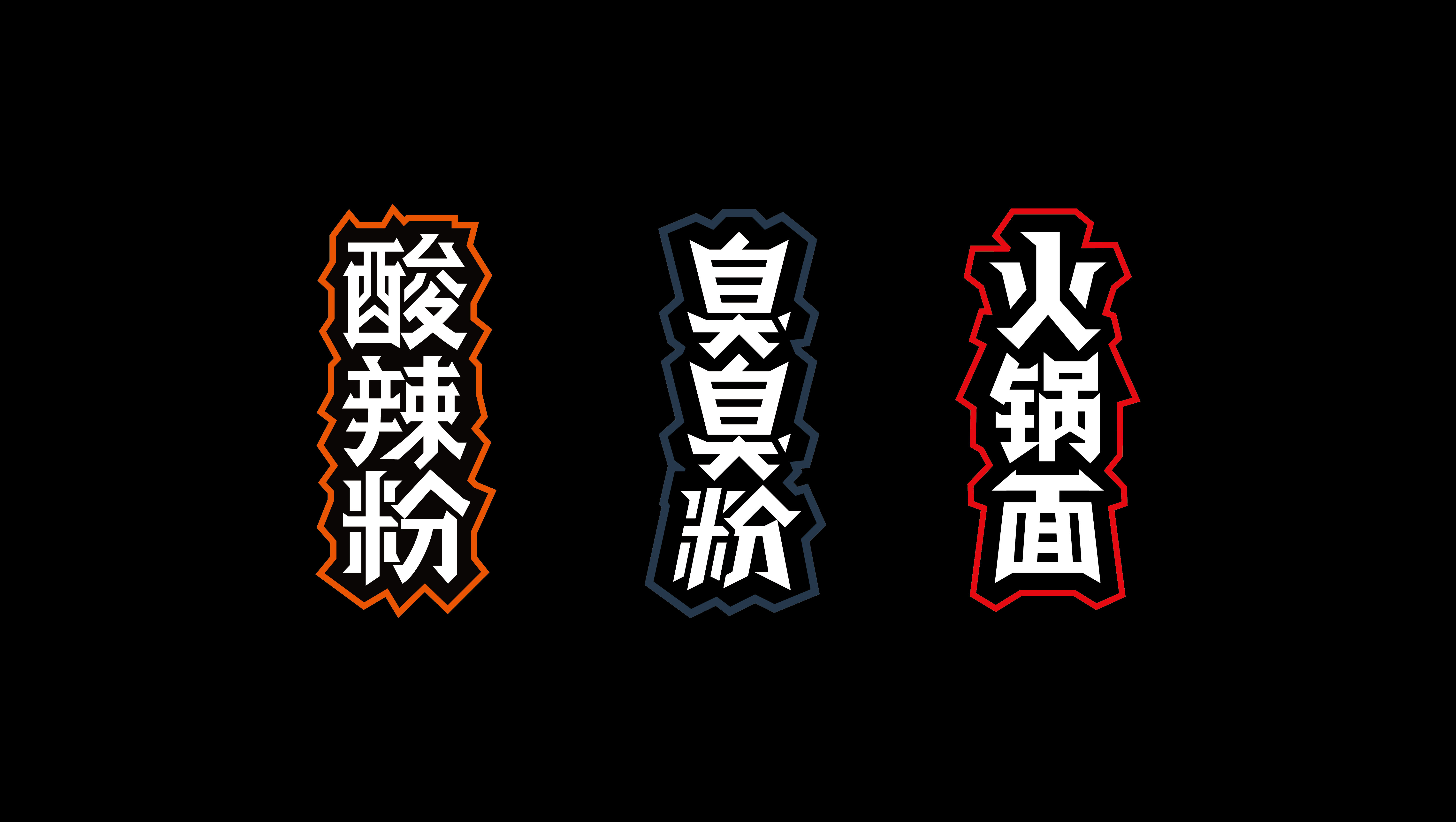
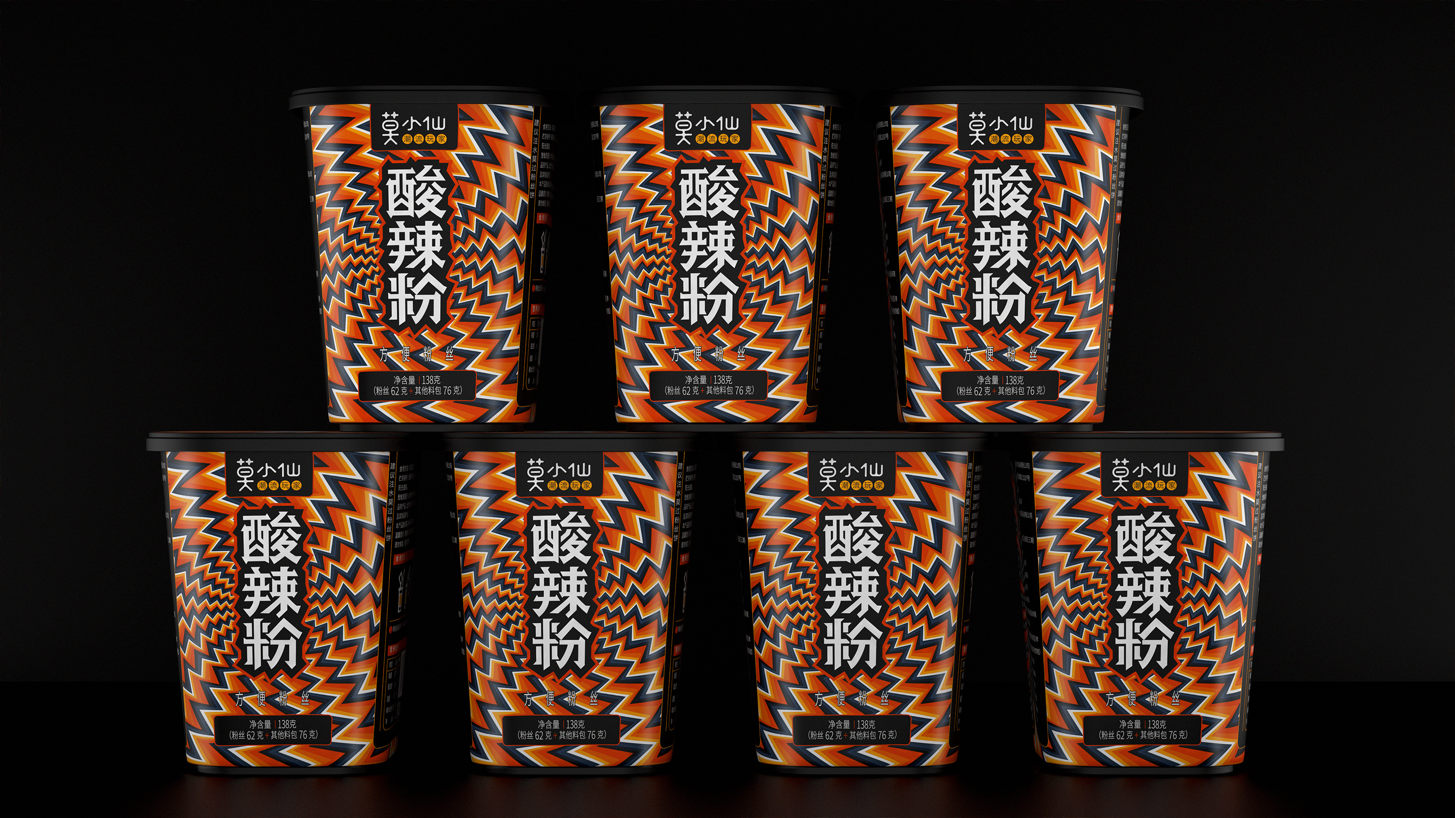
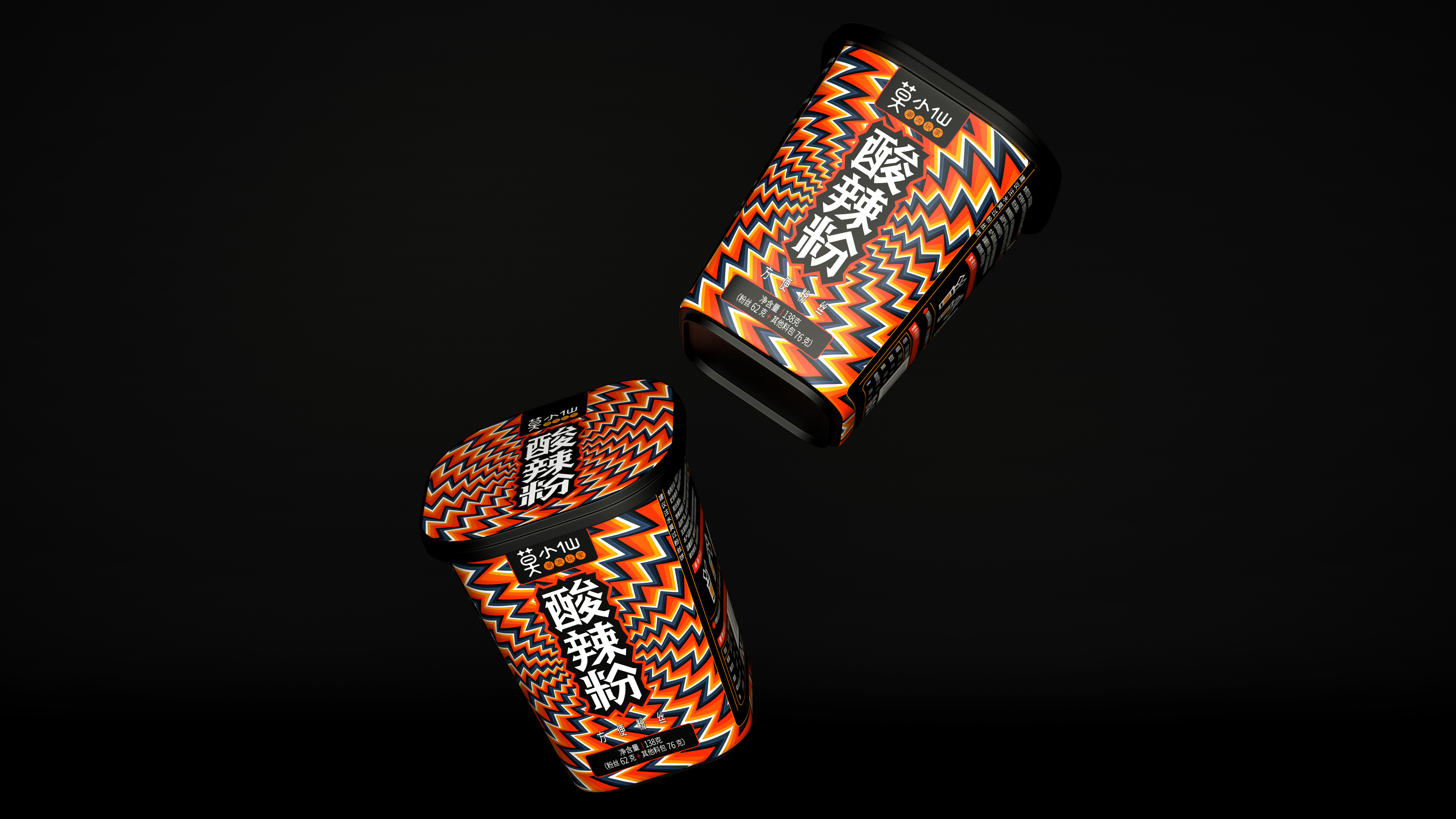
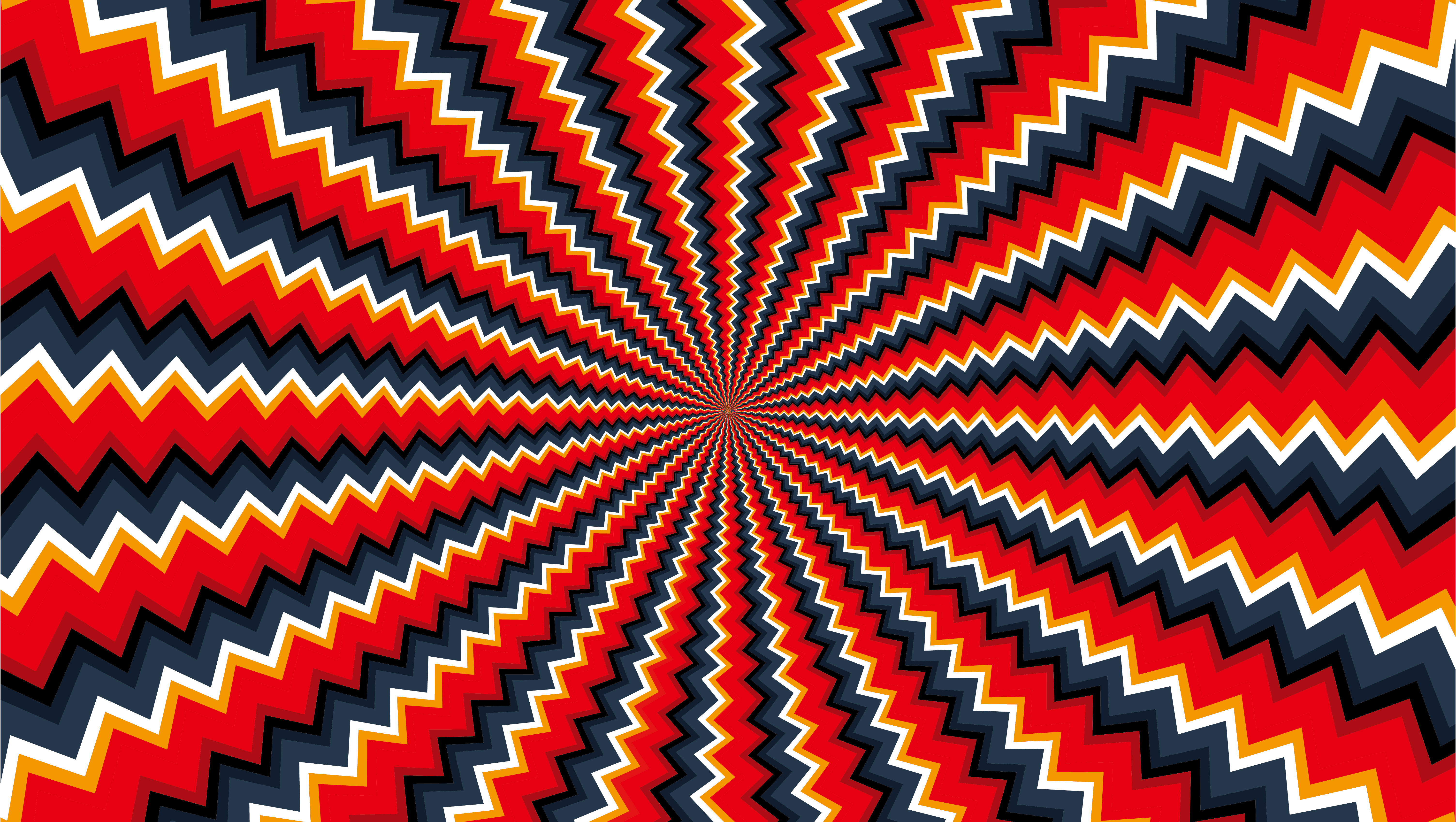
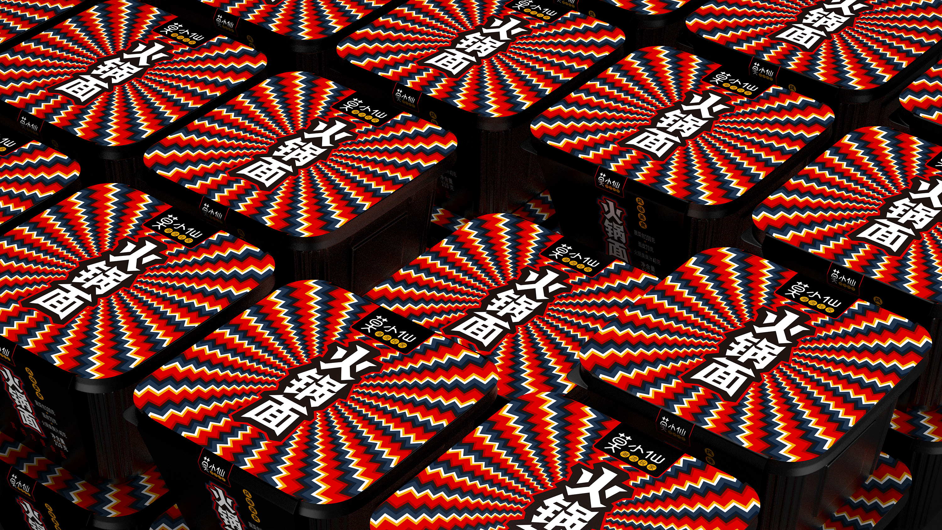
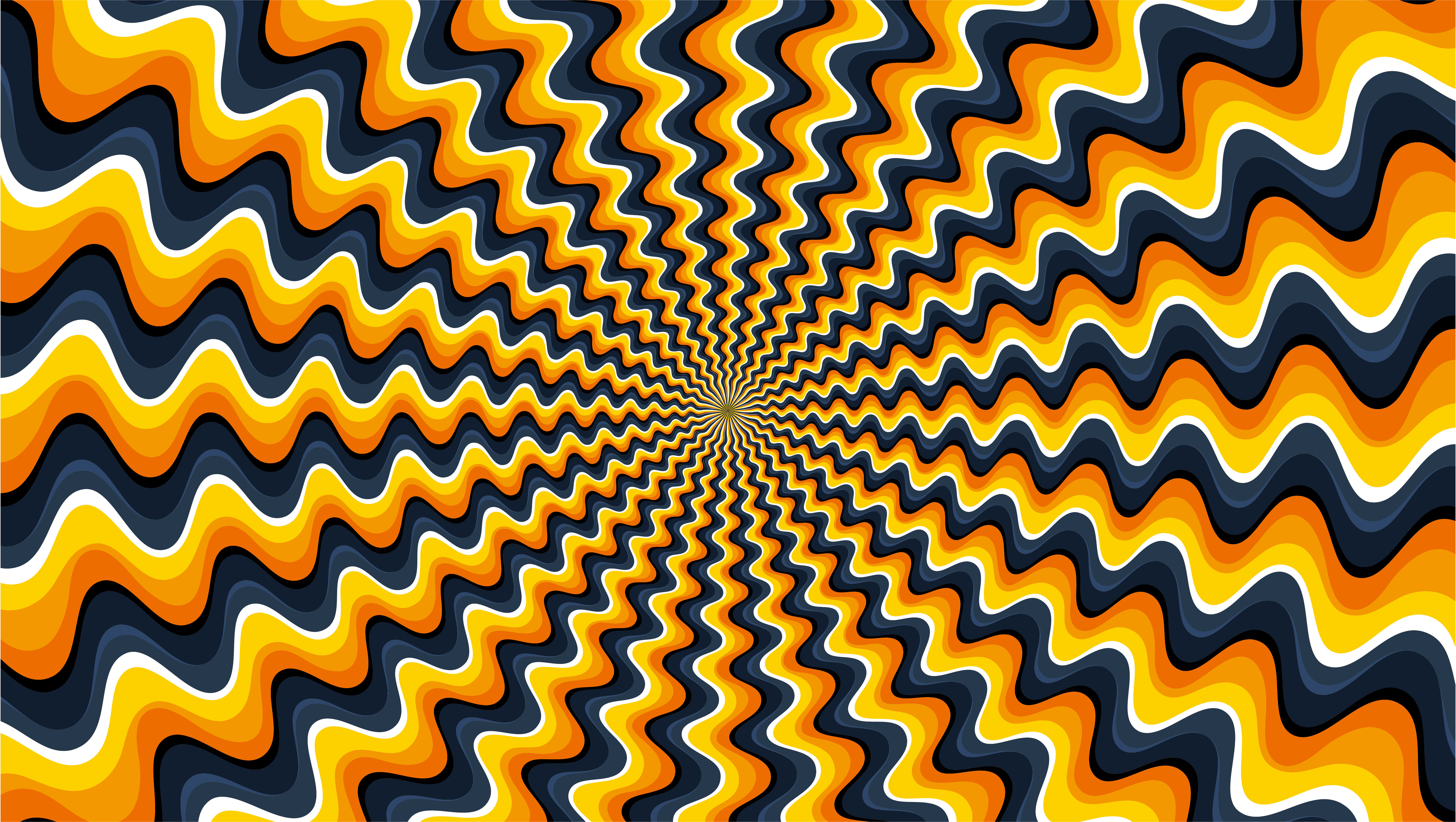
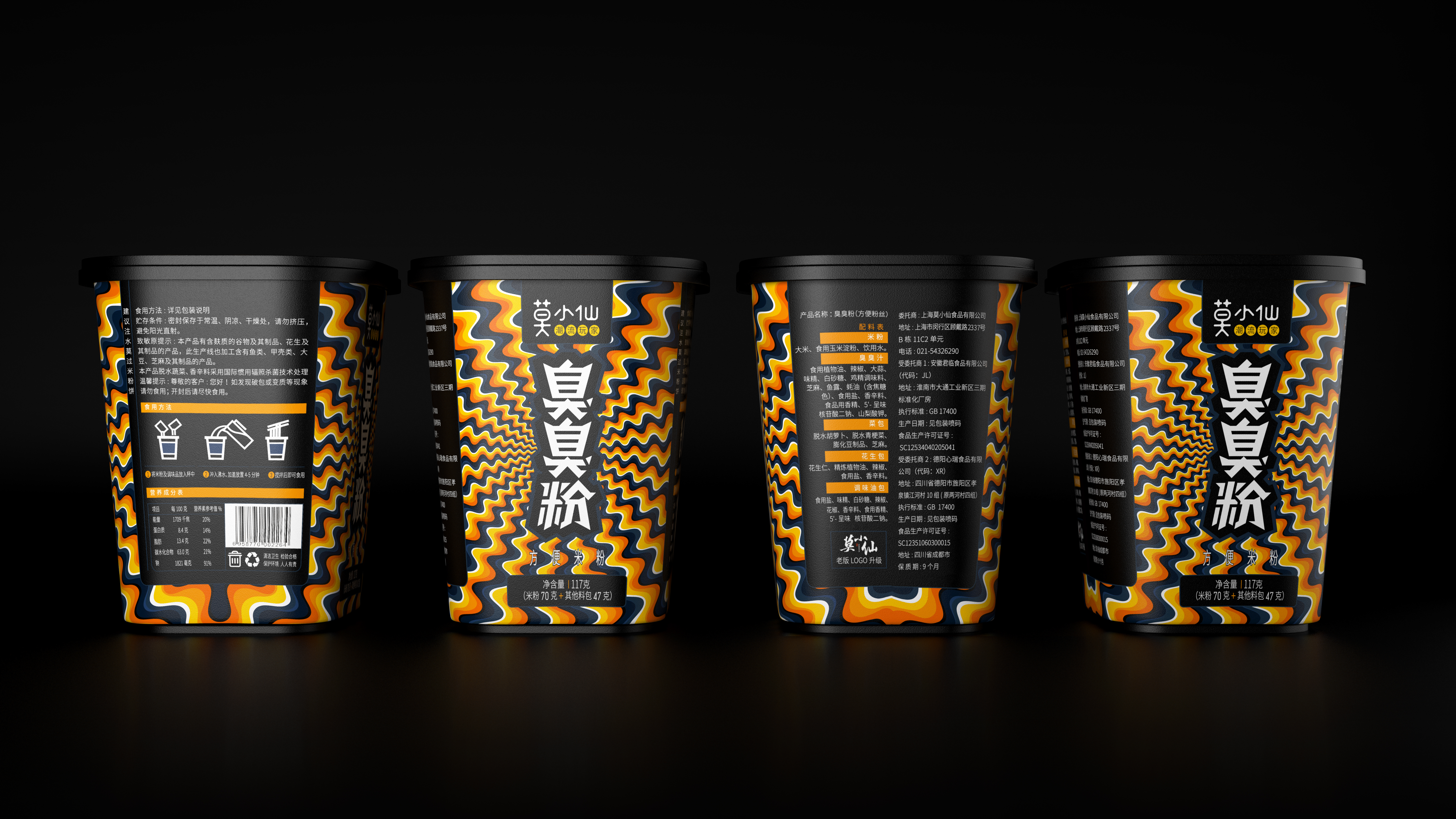
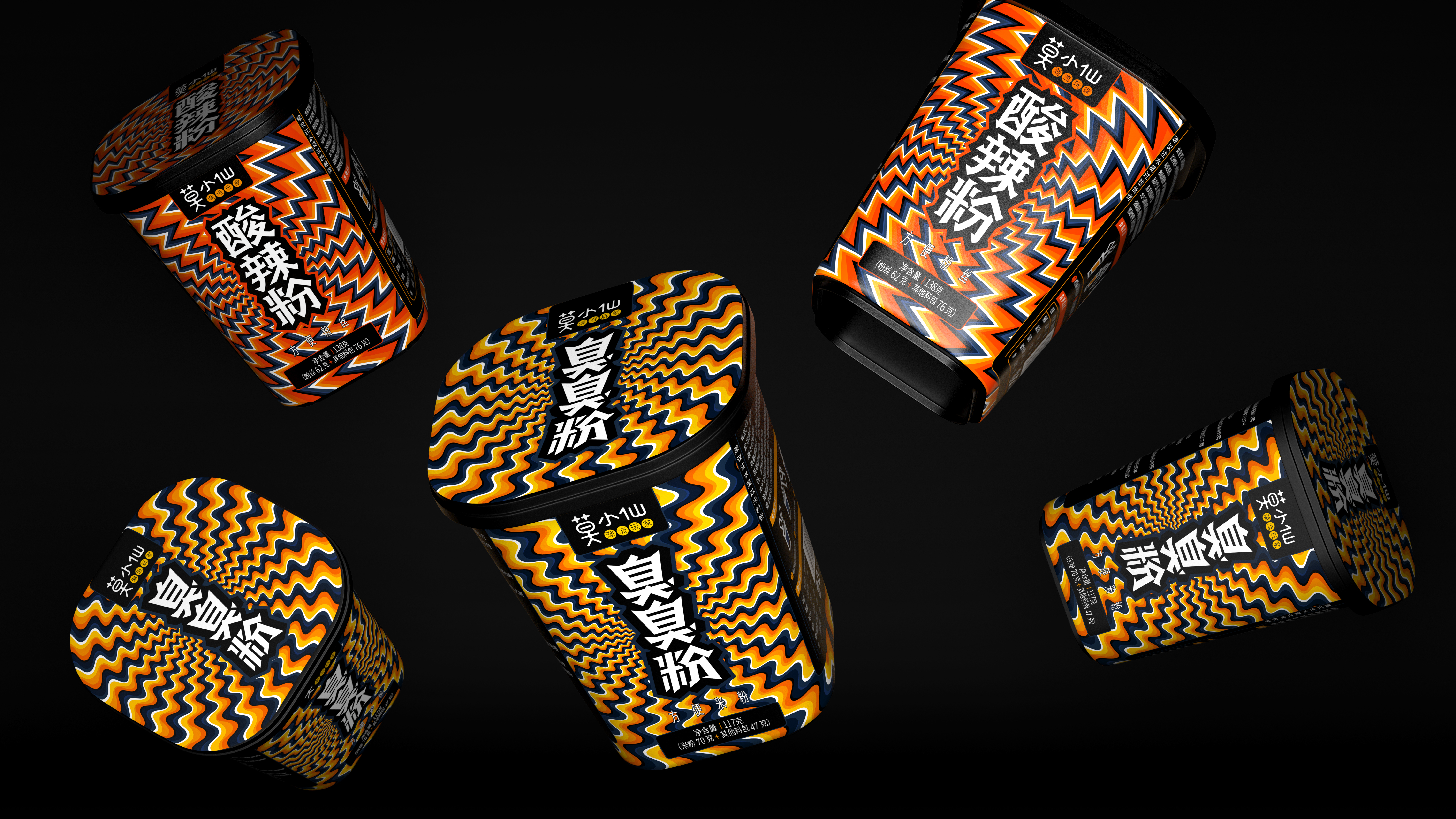
We draw on the form of "optical illusion" graphic design, combined with the product's own morphological characteristics, to create a brand visual symbol belonging to Mo Xiaoxian, throughout the series of products.
Stinky powder, dark temperament, hot and sour powder, cool and cool personality; Hot pot noodles, rolling and warm. Mo Xiaoxian packaging design breaks all rules, realizes visual differentiation of packaging design, and uses the most fashionable way to eat.

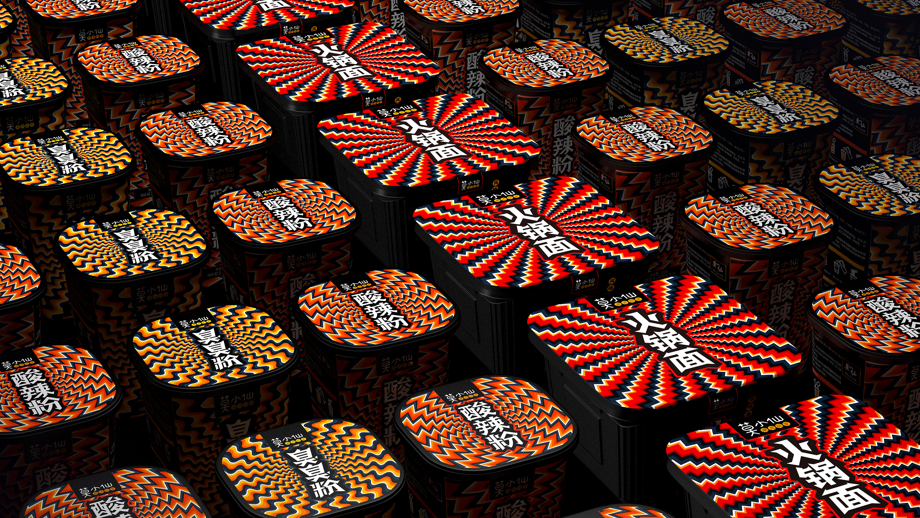


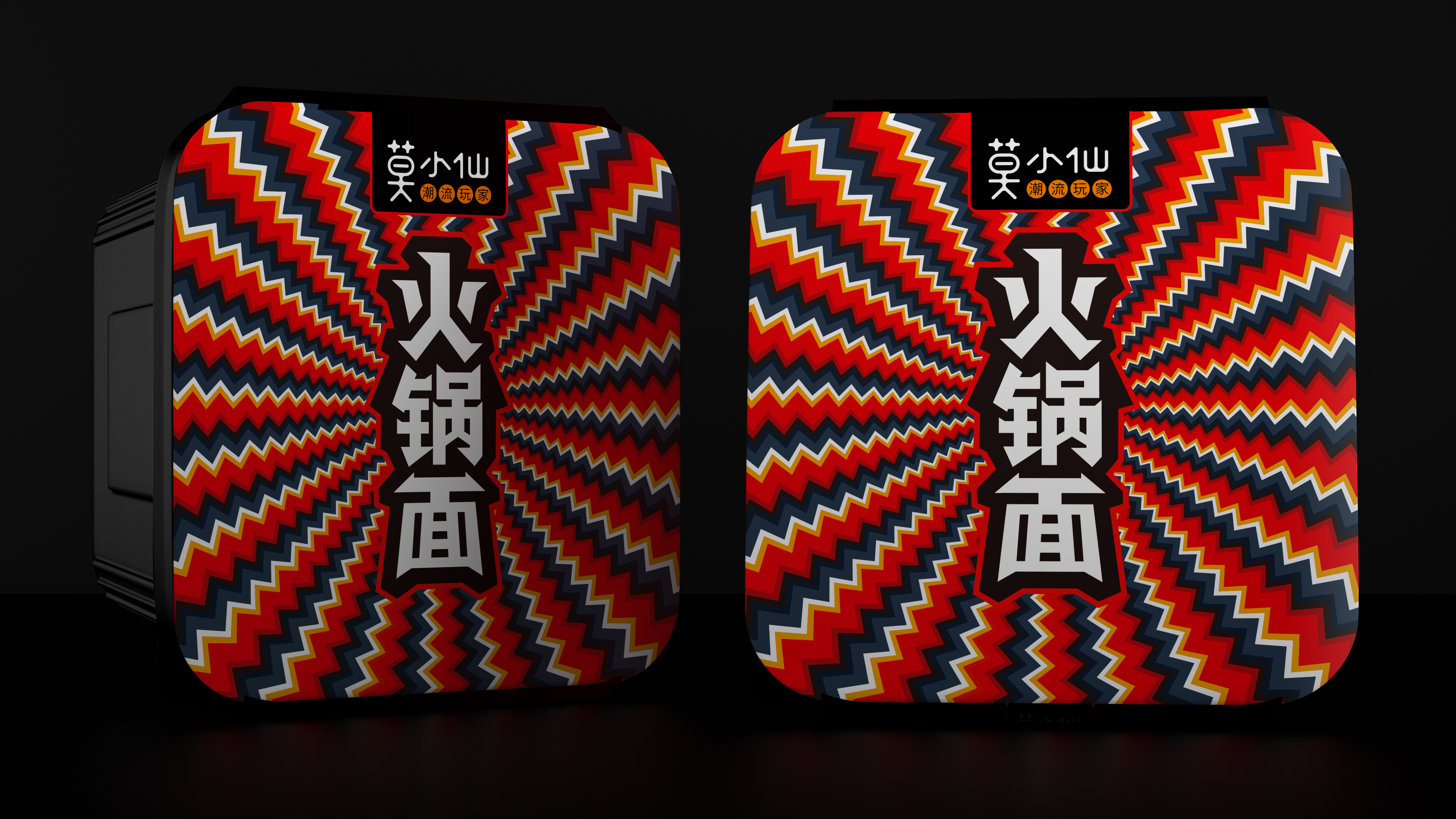
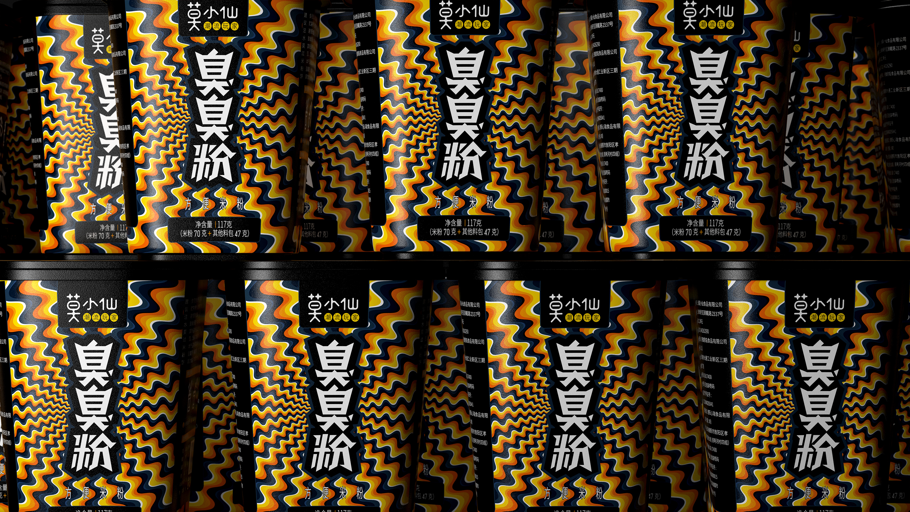


Looking around, you didn't notice
A little magic ha ha ha
The brightest boy
As Mo Xiaohu
This must be very conspicuous on the shelf, ha ha