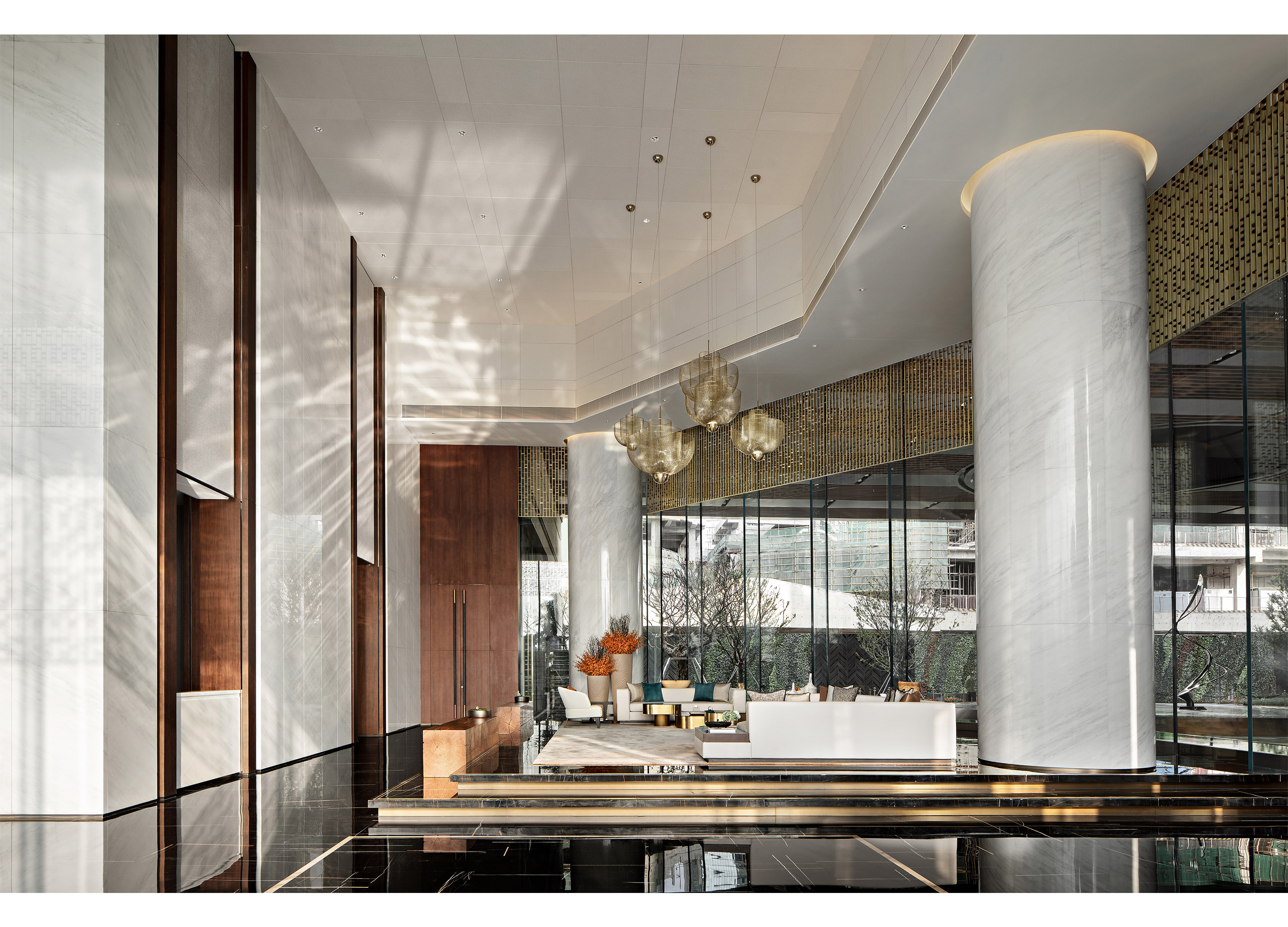
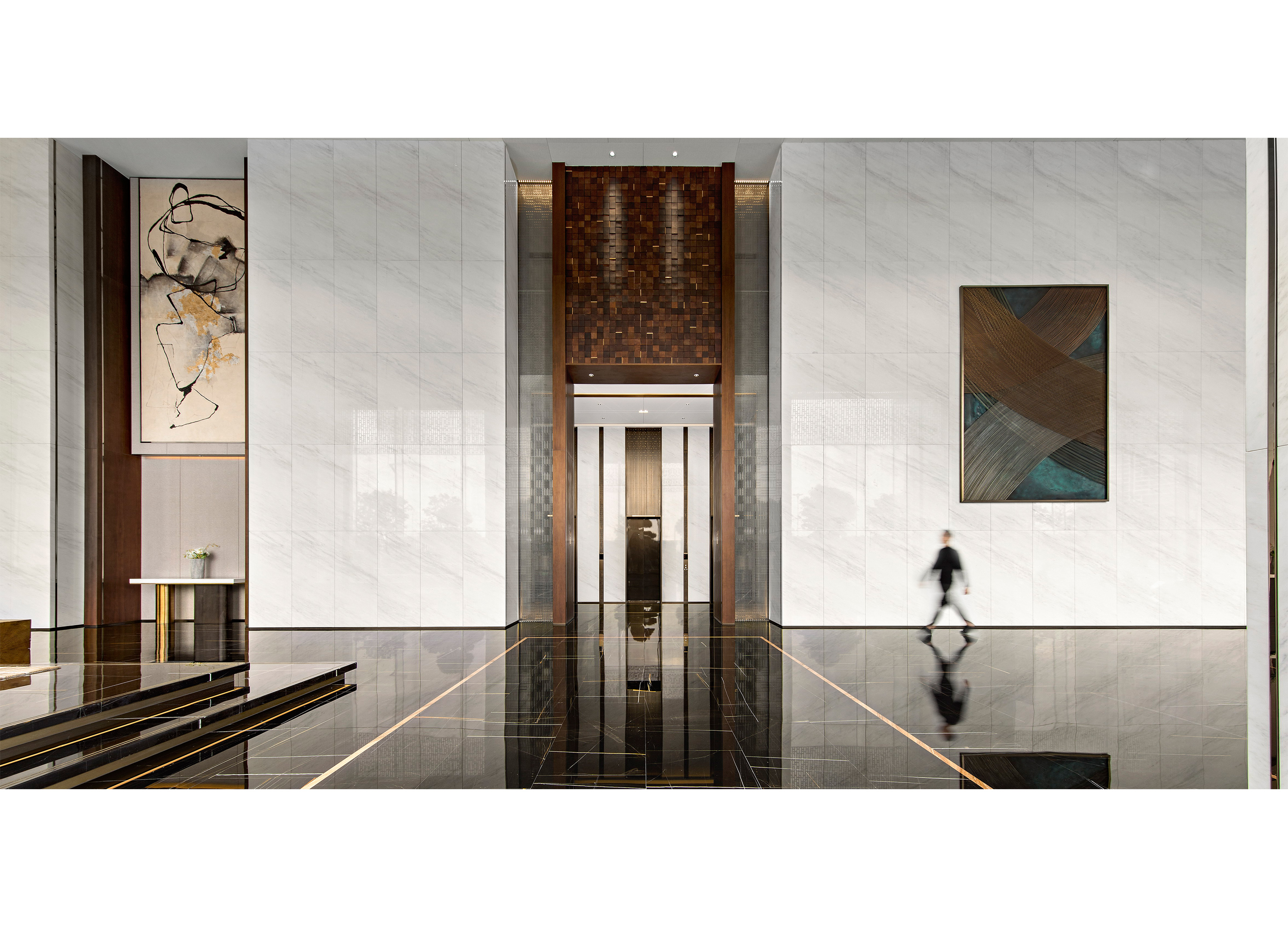
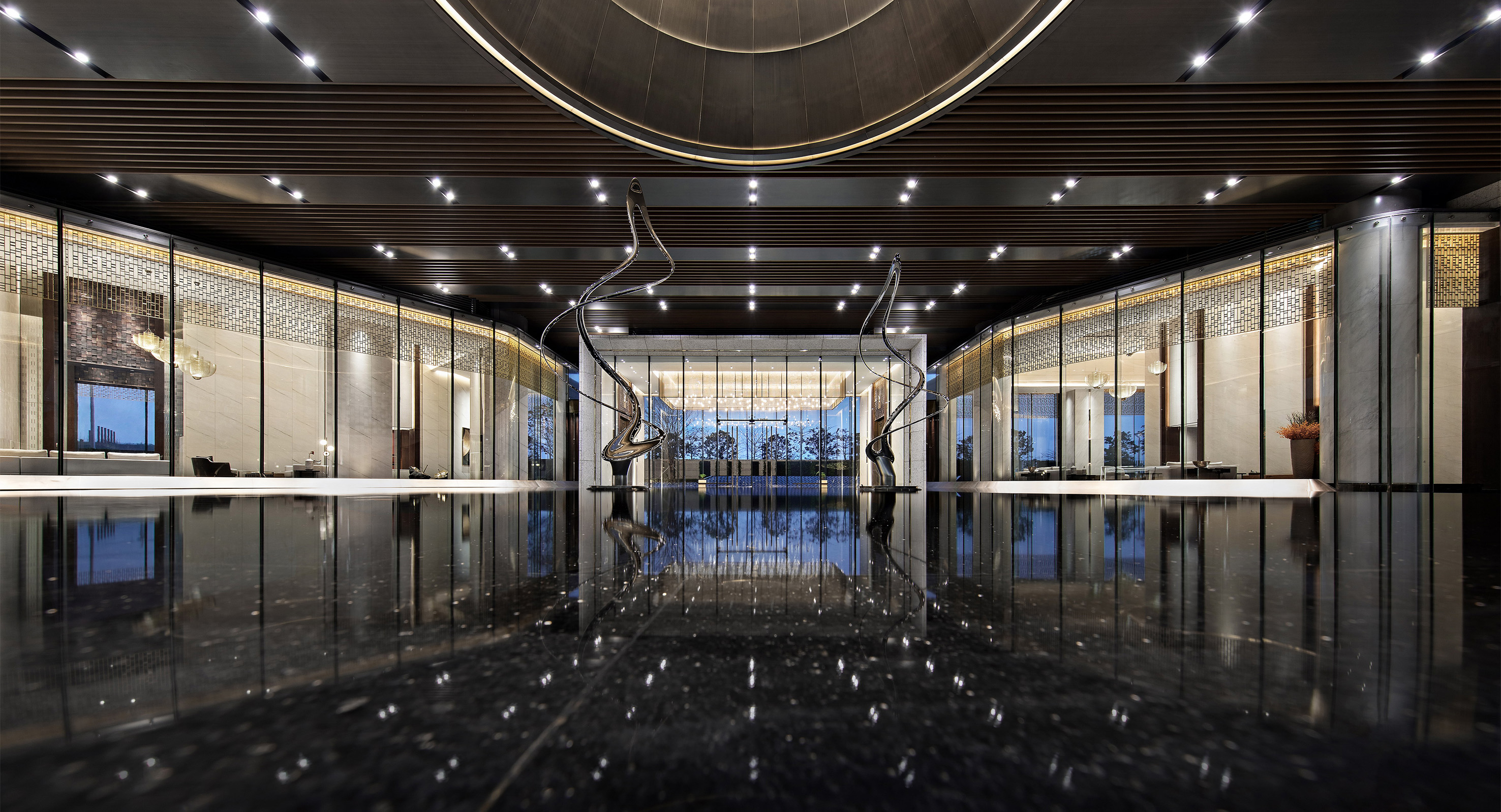
The focus of the lobby space on the first floor is vision and imagination, and the hard conditions of the building "12.5 meters high" have laid a very appropriate foundation for shaping the sense of space vision. In terms of space layout, the concept of "private butler" is integrated into the design of the reception in the front hall, which can make the owner pay attention to the front porch and give the owner considerate private butler service in time. From the lobby to "enter the hall", the order of multiple doors is designed, and the penetration of vertical lines is emphasized. The open and closed Chinese-style symmetrical space order gives people a sense of honor and classical mansion. The main color is black gold, derived from classical culture, intended to create a low-key luxury but introverted cultural temperament. The large-scale floor-to-floor glass eliminates the indoor and outdoor boundaries, follows the concept of natural to urban derivation, and directly incorporates the world's Qianhai and first-line seascape into the interior. In this case, the design also uses grid design details to mottle the light penetrating the interior of the glass. The light not only exists in the form of linear surfaces, but also shows the delicacy of the top from the extreme details. Light is the best medium to present spatial language. The spatial level is more abundant in the light behind the grille. There are grille devices that echo each other in the entrance hall and negotiation area. When you go to different areas, you will have different visions, but you will have a coherent spatial feeling. This is the natural atmosphere in which the design wants to shape the harmonious coexistence of light at the midpoint, line and surface of the space. Entering the four-story space through the elevator, the moving lines are clear, the benefits of large space are highlighted, and all functional partitions can be properly presented. The film and television hall is like an original gathering place. The design builds spatial boundaries through light lines, showing the sense of future that modern cities cannot do. After the sand table area appears in the film and television hall in a concise and clear manner, the dynamic line arrangement of first suppressing and then raising mainly creates an atmosphere of contrast ratio, with a sense of ritual and order.
China
Award : WINNER
Client : China Horoy
Affiliation : Matrix Design
Designer : Wang Guan, IdmenLiu, Wang Zhaobao
www.asiadesignprize.com/132977


New user?Create an account
Log In Reset your password.
Account existed?Log In
Read and agree to the User Agreement Terms of Use.

Please enter your email to reset your password
It's too luxurious, isn't it
Style