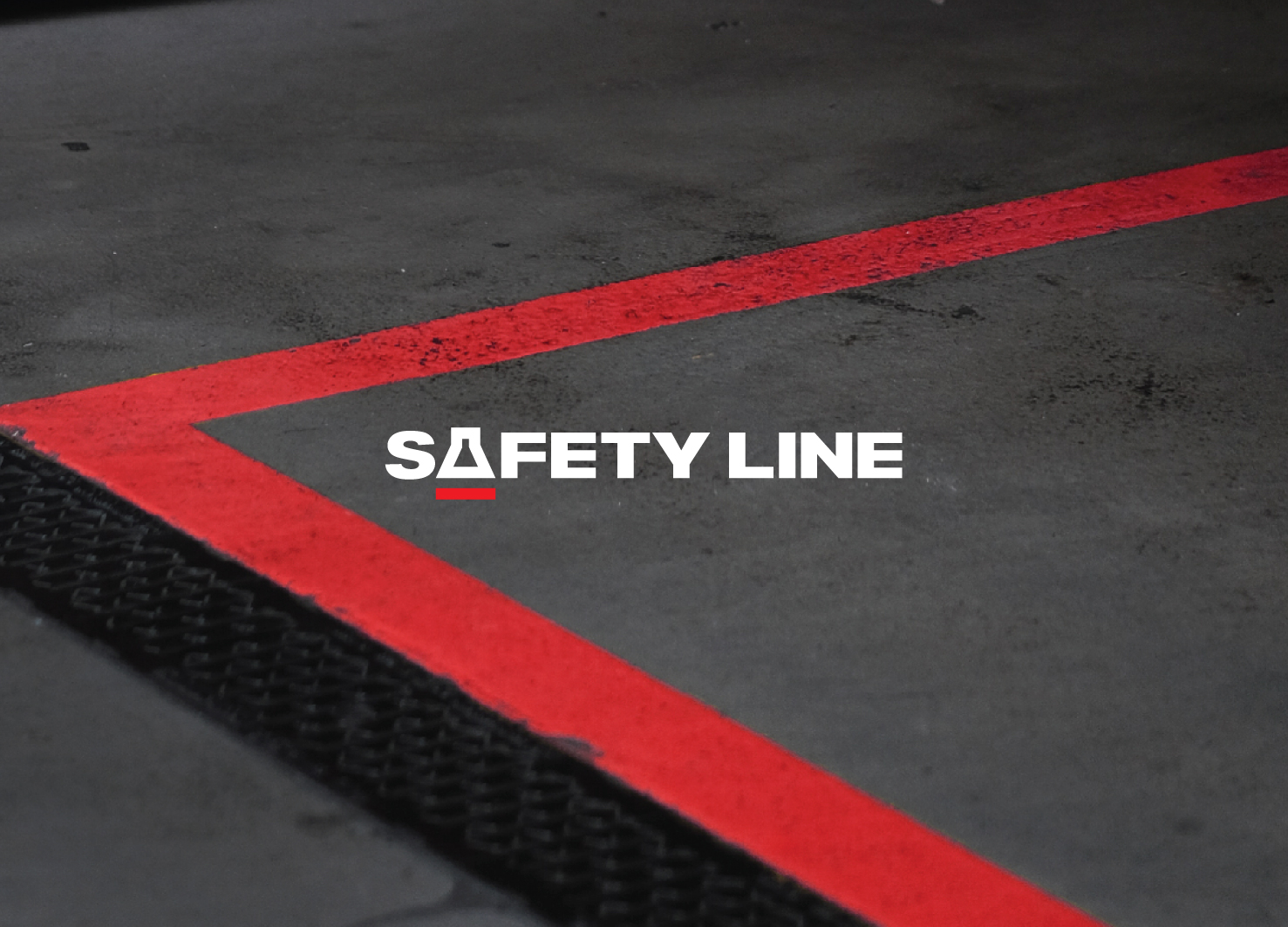
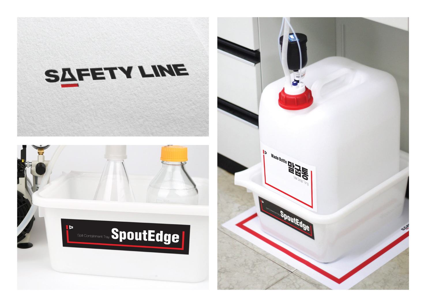
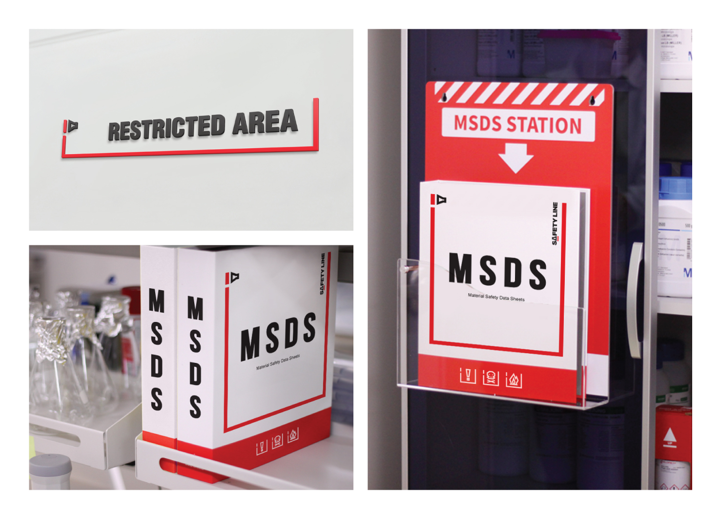
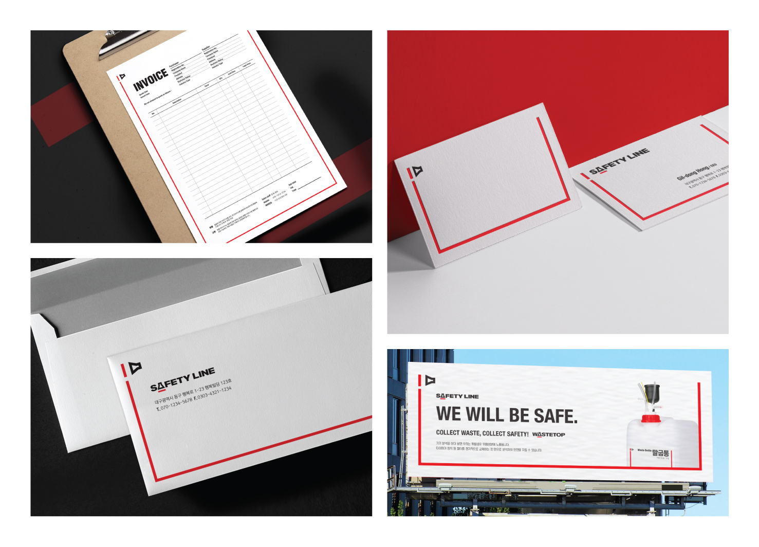
The Safety Line is a brand that offers guidelines for safety and risk prevention in laboratories. The most important keyword in the branding process is 'safety'. As safety is connected with life, the brand graphics need to be intuitive. Consequently, a safety line became the brand motif. Generally, safety line associated with yellow. However, by using 'red line' as a design motif, it can give much more powerful warning to users than yellow.


Country
Korea
Year
2019
Client
Echrom Science
Affiliation
IDEA DO IT
Designer
Yerok Ahn, Juyoun Kwon, Sungeun Jang
[ASIA DESIGN PRIZE]
[www.asiadesignprize.com/]
The copyright of this work belongs to ADP. No use is allowed without explicit permission from owner.

New user?Create an account
Log In Reset your password.
Account existed?Log In
Read and agree to the User Agreement Terms of Use.

Please enter your email to reset your password
Comment Board (0)
Empty comment