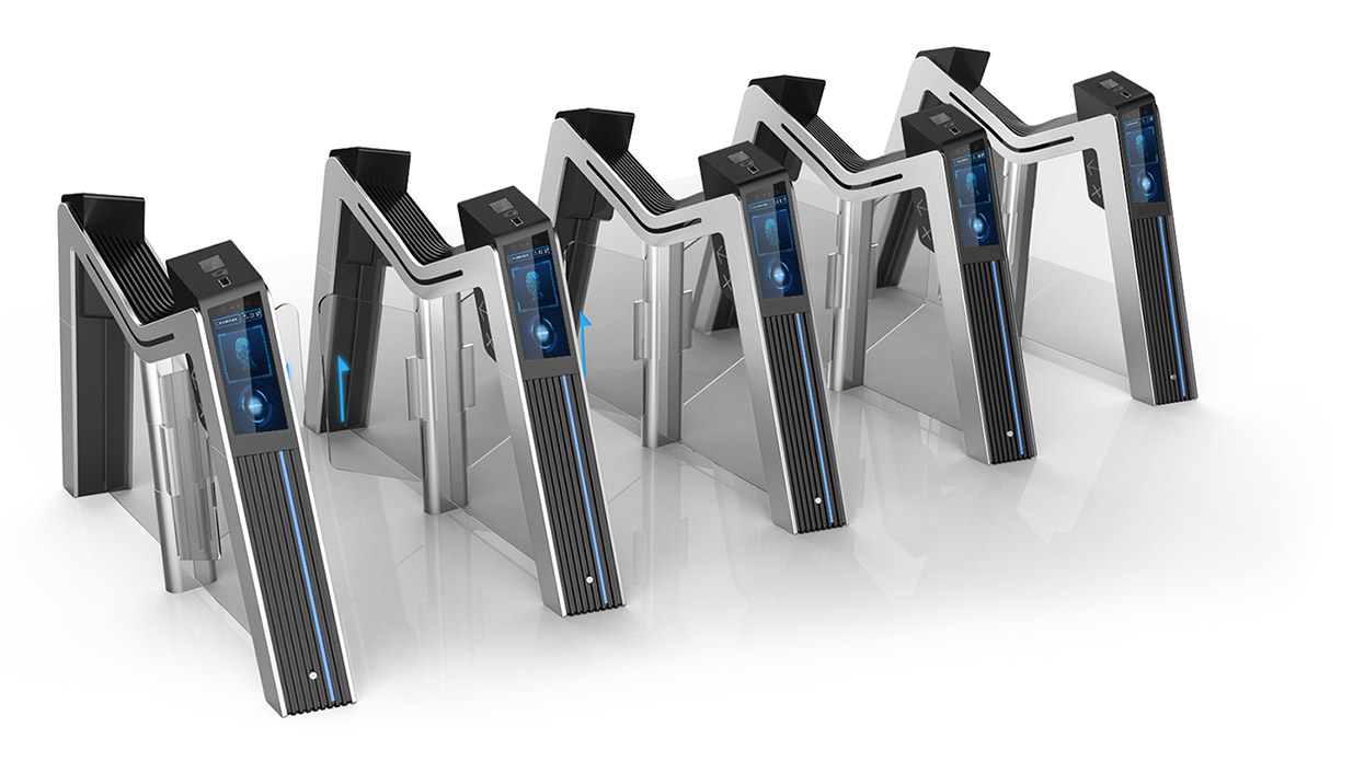
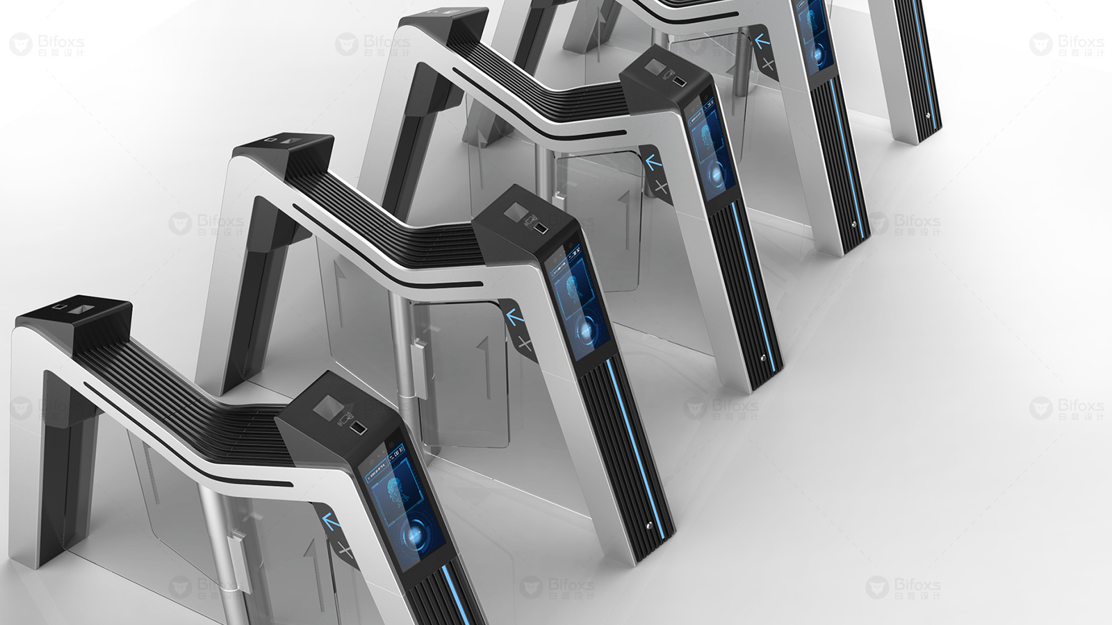
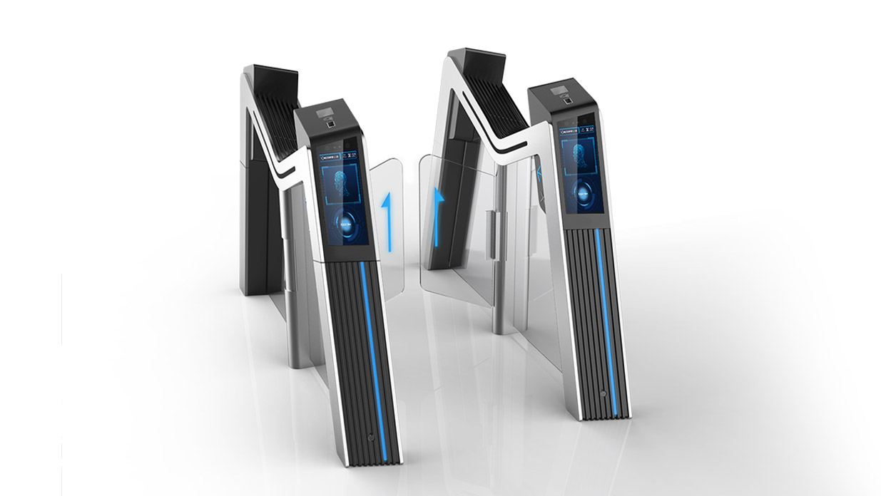
Automatic ticket checking machine design technology determines the physical functions that the product can provide, and interactive design determines how to make these functions better for passengers. The interactive design builds a bridge of communication between the product and the passengers, so that the product can realize the physical function while allowing the passengers to feel the deep-seated physical comfort and psychological pleasure.

Visibility. In the control and function design of the automatic ticket checking machine, passengers should be allowed to perceive the operation process and basic execution principle of the equipment as much as possible, and the execution process of the equipment should be consistent with the actual practical process of the passengers. This can not only meet the psychological needs of passengers, but also enable passengers to correctly understand and perform various functions of the equipment.
Correct and clear feedback. A direct, efficient and correct correspondence should be established between the operating status information of the automatic ticket checking machine and the intuitive experience of passengers, so that passengers can use it correctly and get a pleasant and efficient feeling from it.

Restrictive. In the design process of the automatic ticket checking machine, the restrictive design of physical, logical and cultural knowledge should be adopted, so that passengers must take the correct interactive behavior to realize the ticket checking function, so as to effectively avoid and reduce the misoperation of passengers.
Ease of use. The use speed of the automatic ticket checking machine is proportional to the use effect, and it has a clear timeliness. The design must consider the passengers' psychological ease of memory, the simplicity of the use method and the ease of learning of interactive behavior; the designed product should be consistent with the passengers' use habits, and provide passengers with a safe and reliable use environment.

Through the design of graphics and symbols, the visual "dialogue" between the machine and the passengers is realized. For example, the red light bar indicates the prohibition, the green light arrow indicates the direction of movement, and the flashing light indicates the fault or display error. If there is information that is not easy to tell through graphics, clear and concise text information can be used. In terms of notification of information such as the success of ticket checking and the amount of deduction, methods such as expanding the area of information notification and enhancing the brightness and size of the information can be used to make the information clearer and easier to read.
Passengers who are not familiar with automatic ticket checking machines may ignore visual information. For this reason, voice prompts can be used to remind passengers with voice messages to save time.
Through the design of a reasonable product form, the product is given life, so that the product itself will "speak", so that passengers can obtain information from the form, thereby generating a sense of intimacy and trust in the product.
The copyright of this work belongs to 白狐设计. No use is allowed without explicit permission from owner.

New user?Create an account
Log In Reset your password.
Account existed?Log In
Read and agree to the User Agreement Terms of Use.

Please enter your email to reset your password
Comment Board (0)
Empty comment