Project background:
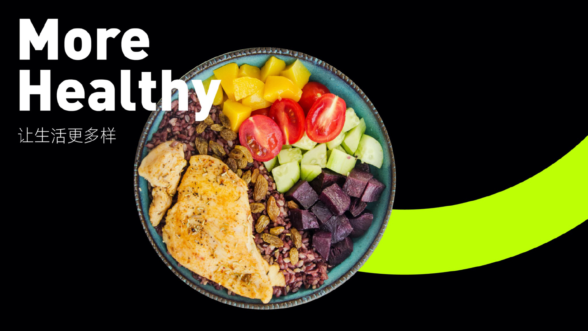
Less than three is a food brand that specializes in fitness and fat reduction and is the pioneer of low-fat ready-to-eat beef. The name was inspired by national standards for low-fat foods-less than three grams of solid fat per hundred grams. Less than three pursuit of low-fat, delicious, appetizing, healthy, hunger, convenient ready-to-eat beef products.
User requirements:
Through the construction of brand language system and visual system, Rococo increases the influence of less than three in the market and brings more commercial transformation.
Market Insights:
The new brand must find the core group when entering the market. After repeated communication with customers, the portrait of seed users, that is, young people who like fitness, must be used as protein supplement after fitness.
User strategy:
We see that fitness has become a fashion and trend. In order to have good muscle lines, it is more important to eat besides practicing. There is a widely circulated saying in fitness circles: "eat seven points and practice three points". It is difficult to grow muscle without a large amount of protein intake. Therefore, we have insight that many iron players have to eat a large amount of protein powder, egg white, lean meat and other protein supplement products after fitness. Product insight: We define the product as "low-fat ready-to-eat beef", which allows users to eat more conveniently, without tedious cooking, and without repeating the same monotonous taste. Make weight loss easier, so put forward the product concept of "want to be thin, but also to enjoy. Brand strategy:
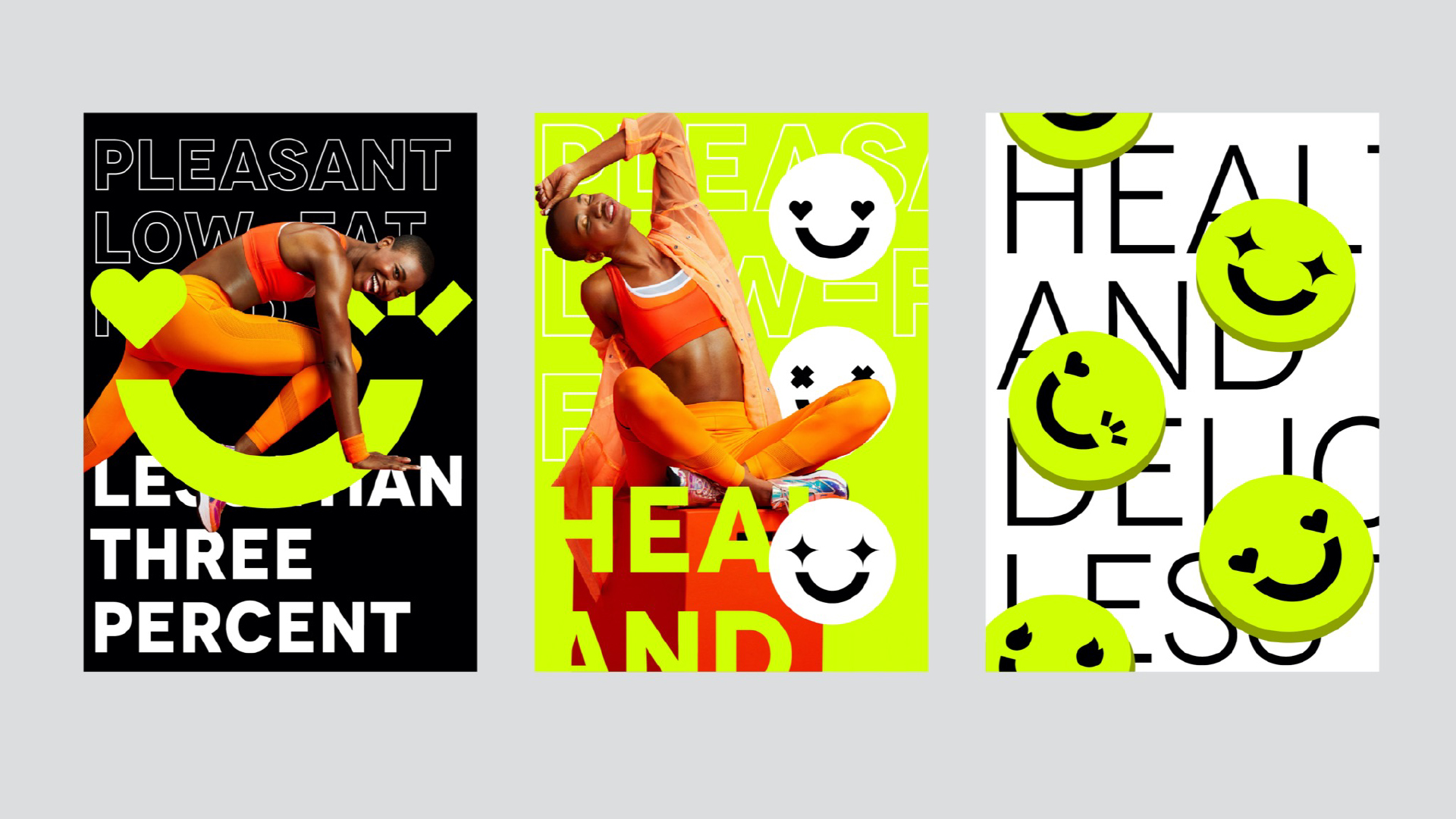
Use the smiley face element to reflect the value of the product "enjoy". Although exercise and fitness are bitter, a good meal after training is the happiest moment of the day. We freeze this moment into smiling faces and skillful processing of words to make the words graphic. Full of positive energy seems to encourage users to refuel.
Visual Communication:
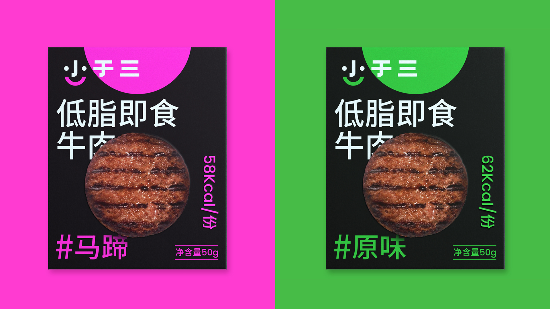
In the expression of the whole brand communication, we use mysterious black and cool pure color to match, increase the attitude of vitality, youth, self and personality, and attract the attention of young people.
Solution:
1. The product has a variety of flavors, corresponding to different color systems, and the product matrix has a strong impact, which also allows users to have more choices to satisfy users with various tastes and preferences. At the same time, they will not feel bored if they eat frequently, which increases users The possibility of re-purchase.
2. In order to let users form habits, we try to create 28-day packs, 7-day sets, fixed with frosted pet envelopes, which look like an encyclopedia of delicious food as a whole, increasing the interest and interaction of the experience. Product combination is also an important means to help sales. Once the product is on the market, it is well received by the target population.


The copyright of this work belongs to 洛可可咨询设计. No use is allowed without explicit permission from owner.

New user?Create an account
Log In Reset your password.
Account existed?Log In
Read and agree to the User Agreement Terms of Use.

Please enter your email to reset your password
It looks quite appetizing.
Eat to lose weight