It's been more than two years since I graduated, but for various reasons, I didn't do any design work. However, I think it is very interesting to do furniture design, and I plan to work in the design industry in the future.
Here are two exercises made by myself last year, which is still a long way from the complete design. However, because there are no conditions for continued trial and error and verification at home, I plan to issue it first, and if there is a chance in the future, it may be improved.
Because I was born in the Institute of Materials, the contents of my undergraduate study are quite miscellaneous, and I am only a novice in artistic aesthetics. Plane and rendering software are also relatively unfamiliar. Therefore, I hope I can exchange and learn more on the Internet in the future. If the bosses have any suggestions for improvement of these two designs, they are also welcome to leave a message in the comment area, thank you!
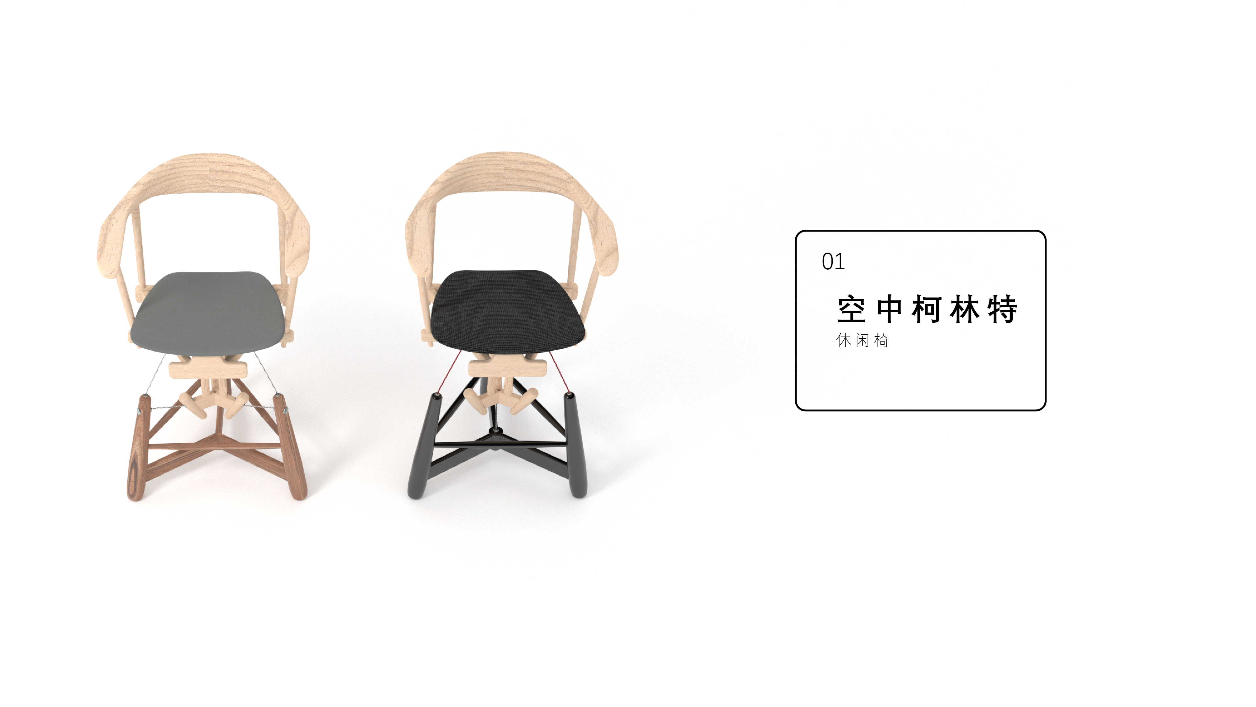

On the Internet, there are many "popular science" videos called "pulling the whole" structure.
But after understanding the relevant information, I think this structure is not the same as those "real" tensile structures. The inside of the tension structure is to apply stress-in short, its inside is as tight as a bow with a string, and will not change shape easily.
This structure is completely different. It actually just gently "hangs" on the cantilever, cleverly using the gravity of the object to achieve a delicate balance. It is more like a person who grabs the rock with his hands and steps on the rock wall when climbing. If the earth's gravity changes direction, the athlete will fall off the rock wall.
The real tension structure is stable and can be used on buildings and large sculptures; but this structure will slightly swing within a certain range with the user's center of gravity.
So my expectation for this chair is a lounge chair similar to a hanging chair. In other words, it is essentially a relatively novel hanging chair.
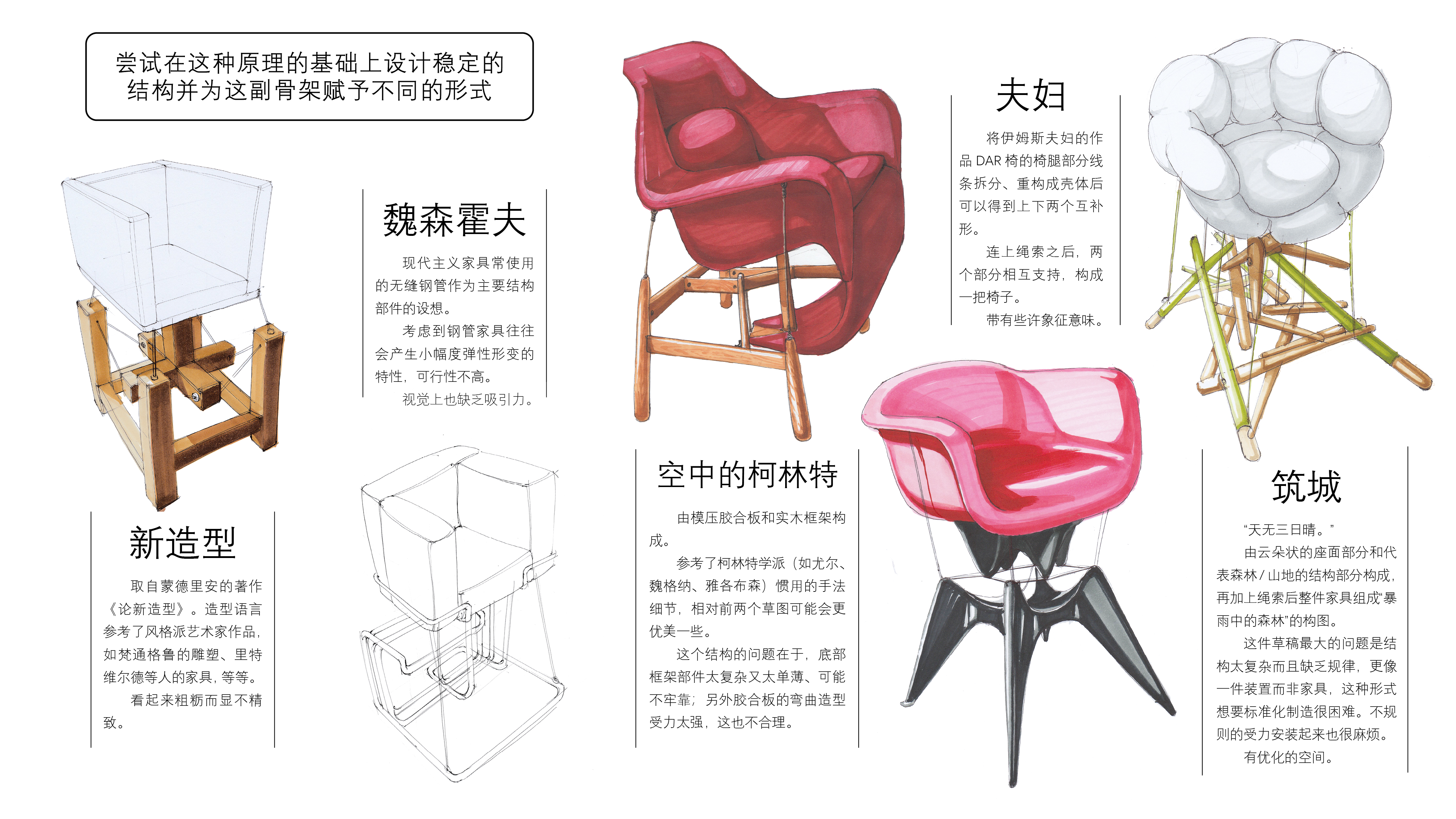
Of course, there are also some detailed deduction steps omitted in the middle. I drew ugly pictures. I am sorry to put hhh
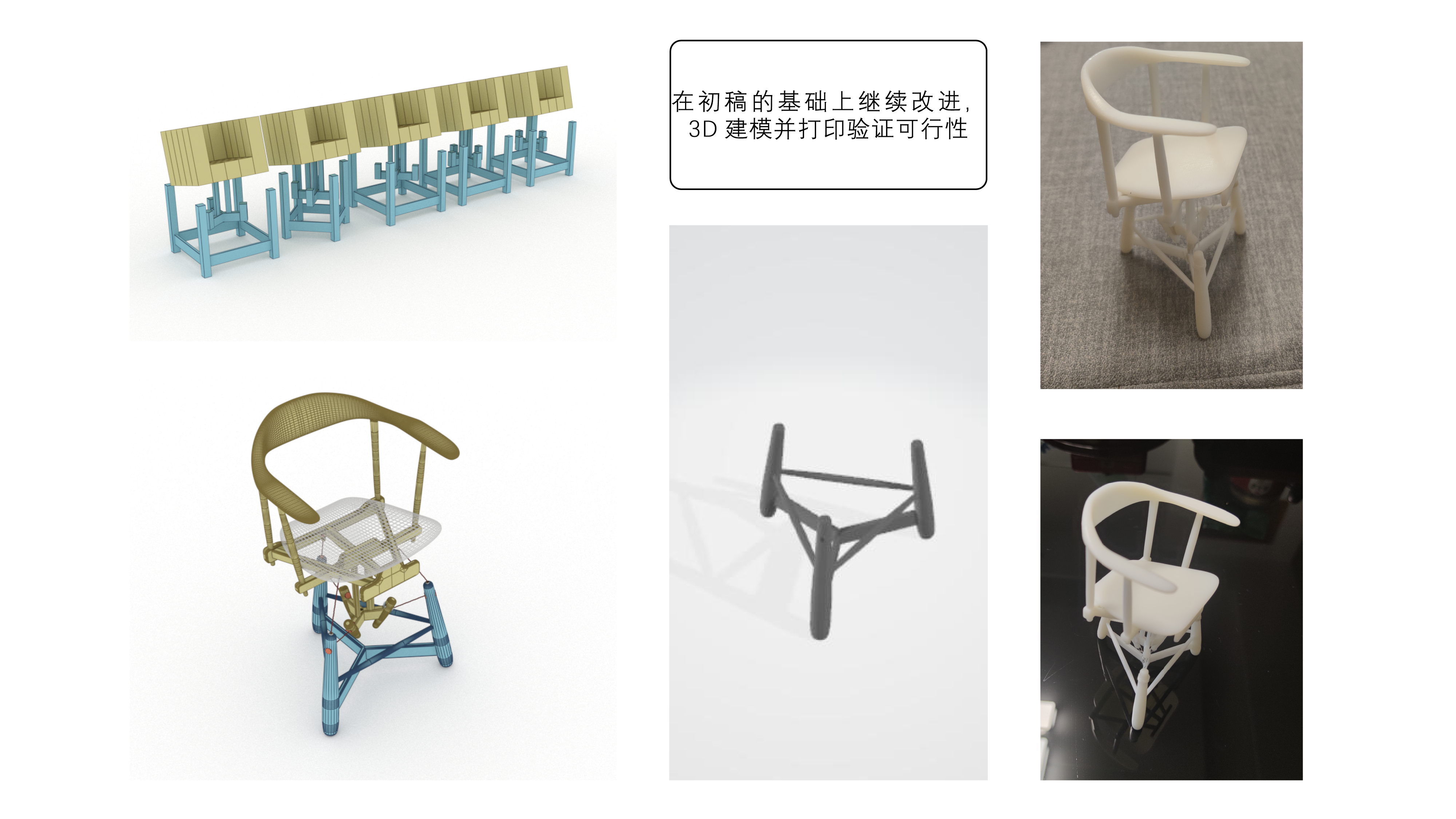
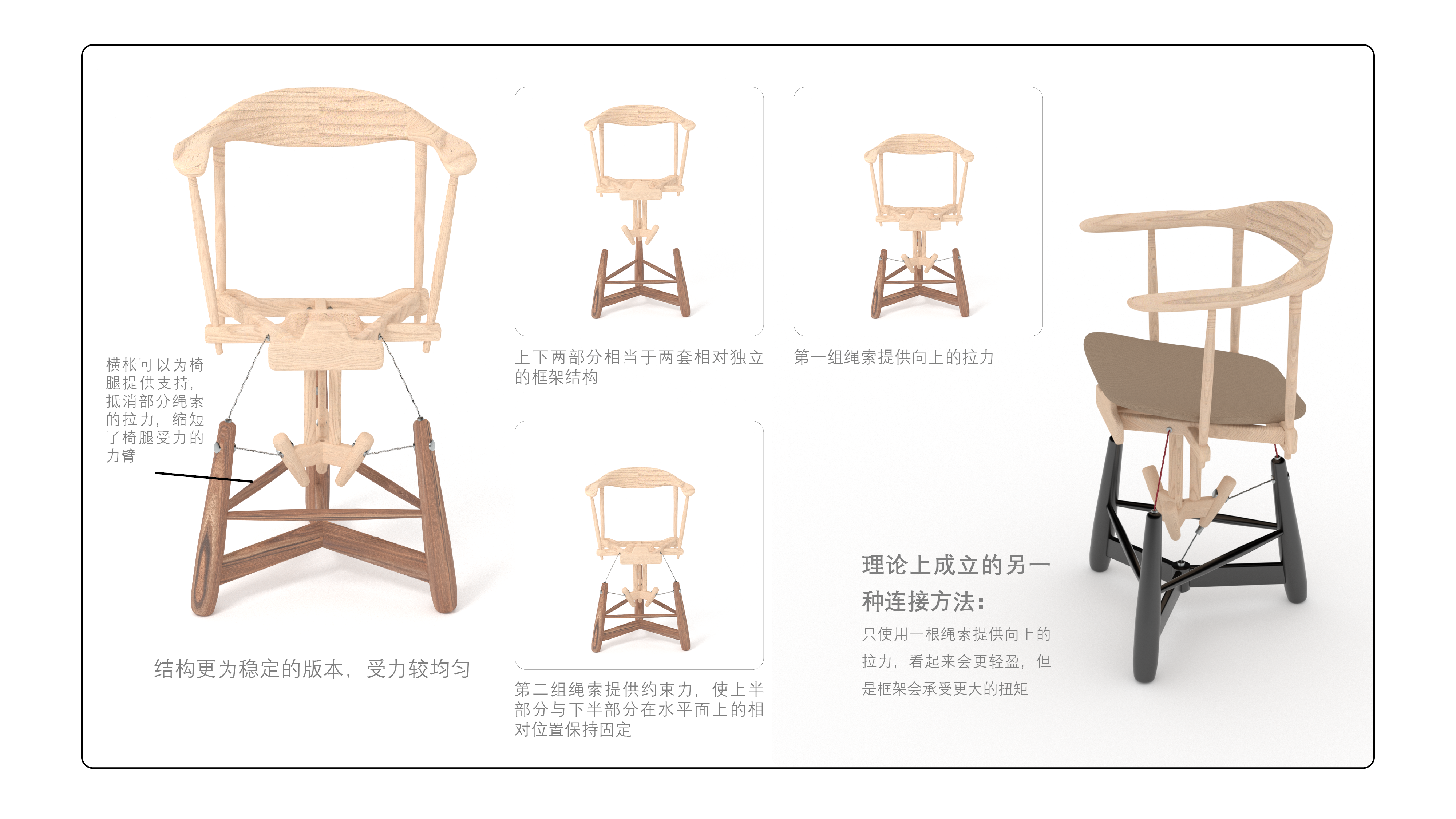
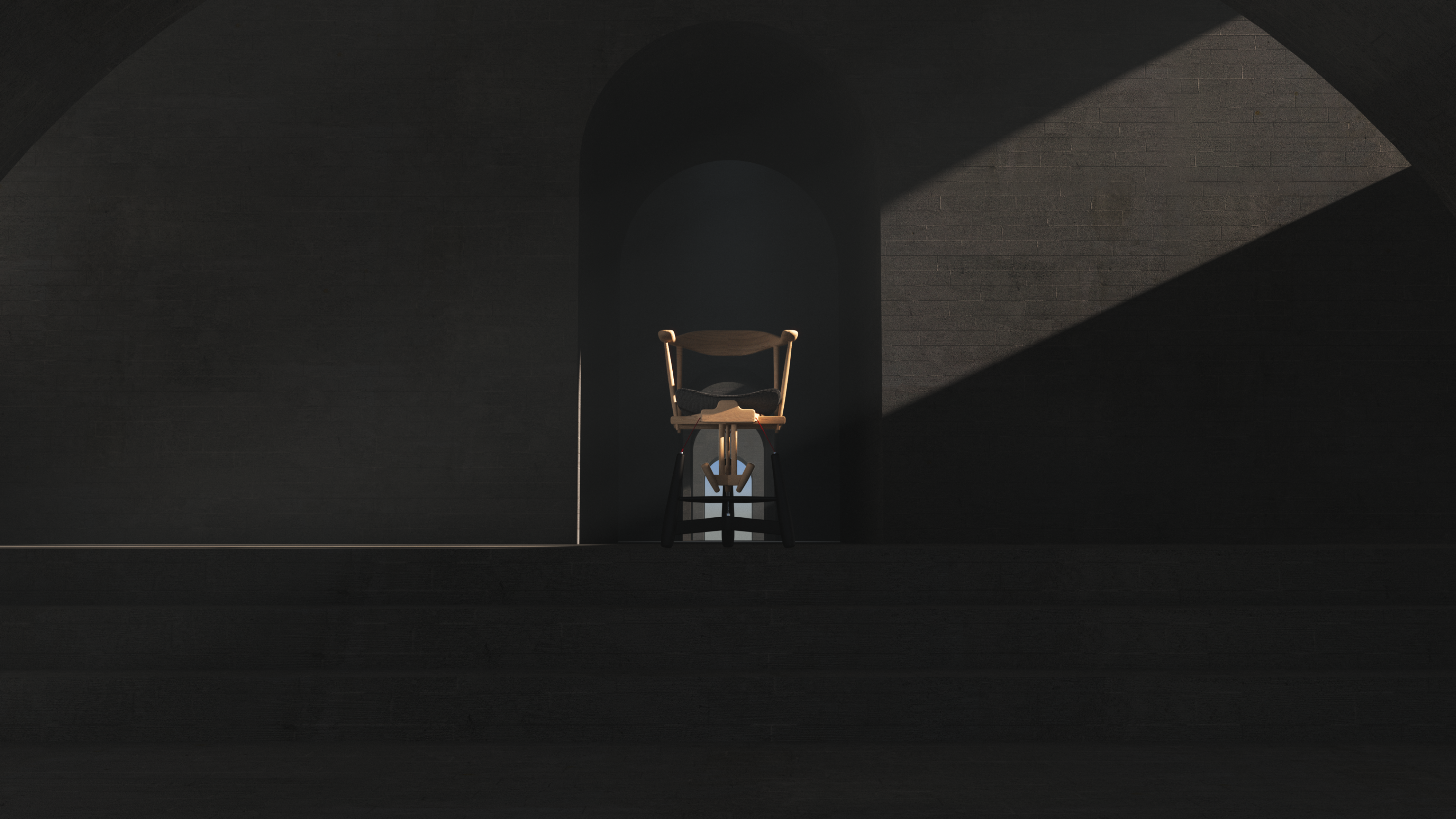
You should see that in order to stabilize the structure, this version of the chair does not look so "suspended. So I am not satisfied with this version.
If you simply change it, it may be useful to change the proportion of parts and the contrast of manufacturing volume. However, if you want to solve this problem further, the structure will need to be overhauled.
Why does this suspension structure lose its "sense of suspension" after rotating and copying it?
My guess is this:
The sense of "suspension" comes from the failure of expectation. There is only one rope pulling upward, but the structure can be stably balanced. This is contrary to our life experience: a rope hangs such a big thing, and we instinctively believe that it will tip over.
But the three ropes greatly reduce this expectation, because the role of the "invisible hand" of gravity has been reduced, we can see all the forces at a glance, increasing the visual "sense of stability".
On the Internet, there are indeed DIY cases where the entire structure is supported by only one rope. But in order to resist the huge stress, the diameter and shape of the cantilever must be compromised accordingly, and the shape will fall into the problem of crude benzene. This is hard for me to accept.
In short, this is a plan that is far from my purpose. However, I think the shape is quite pleasing to the eye at present, so I share this temporarily suspended design.
I hope I can continue to push it forward in the future.
The copyright of this work belongs to [宝]. No use is allowed without explicit permission from owner.

New user?Create an account
Log In Reset your password.
Account existed?Log In
Read and agree to the User Agreement Terms of Use.

Please enter your email to reset your password
Come on!
The dining chair that suddenly thought a baby
This chair is very special.