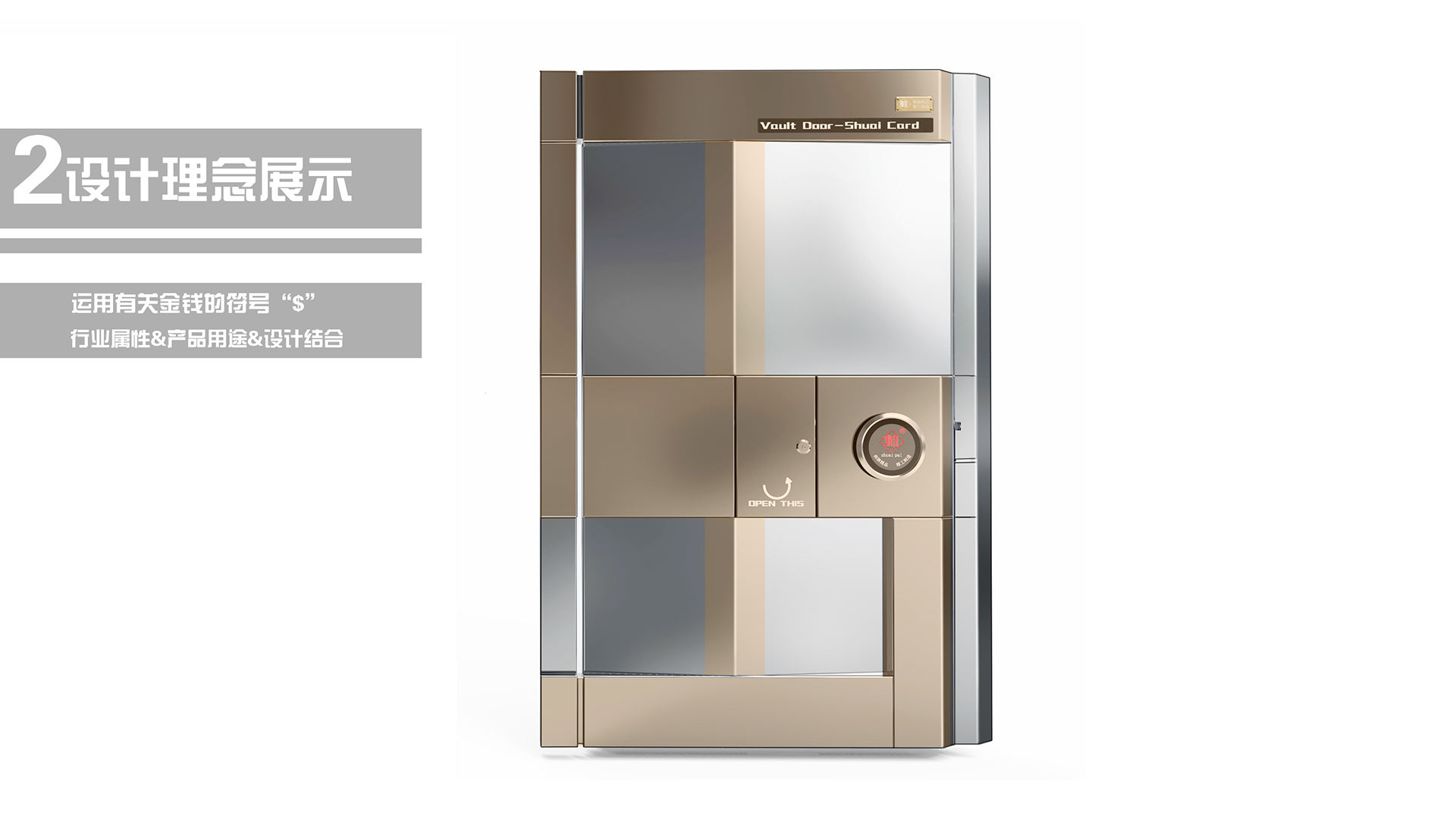
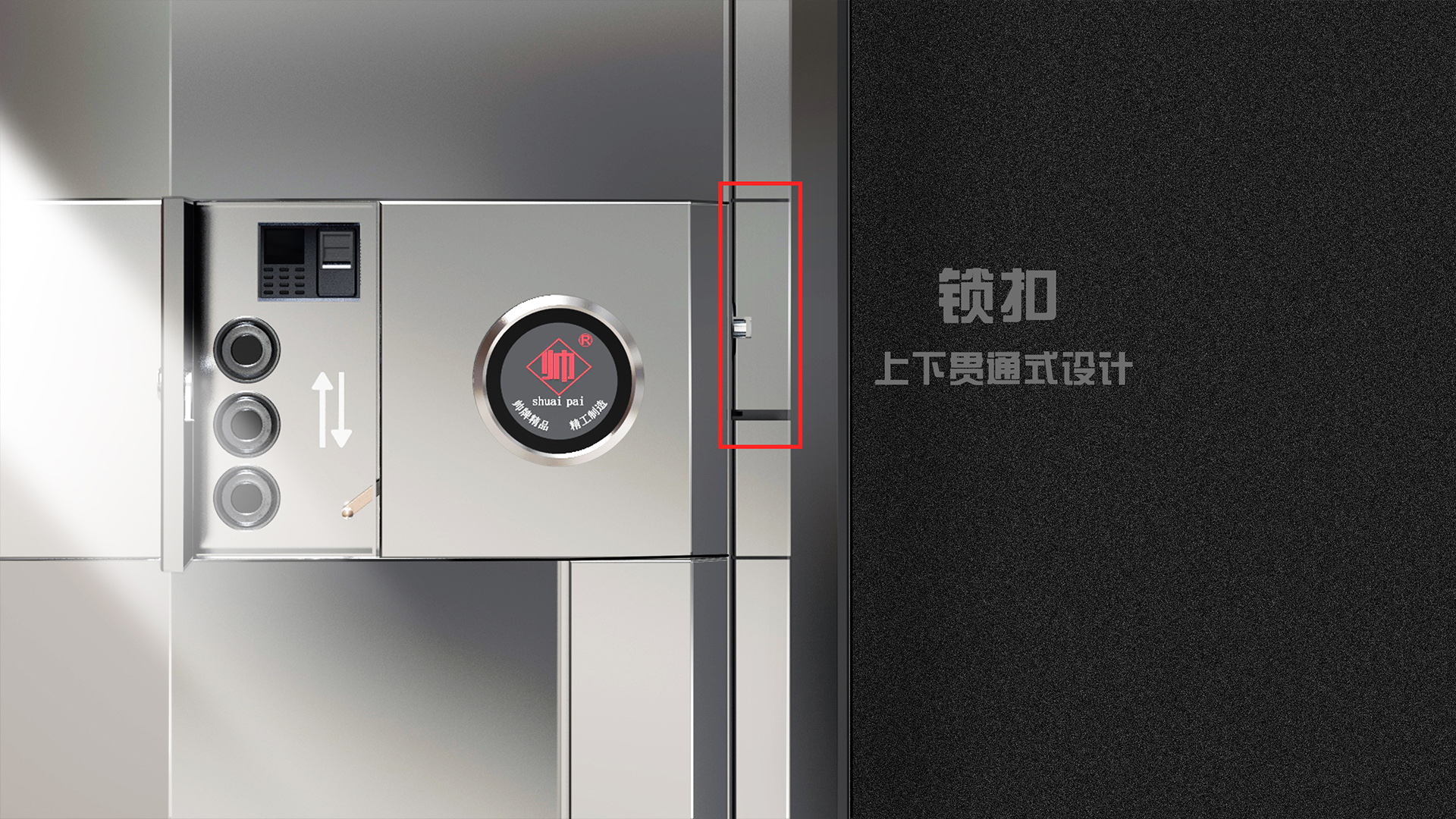
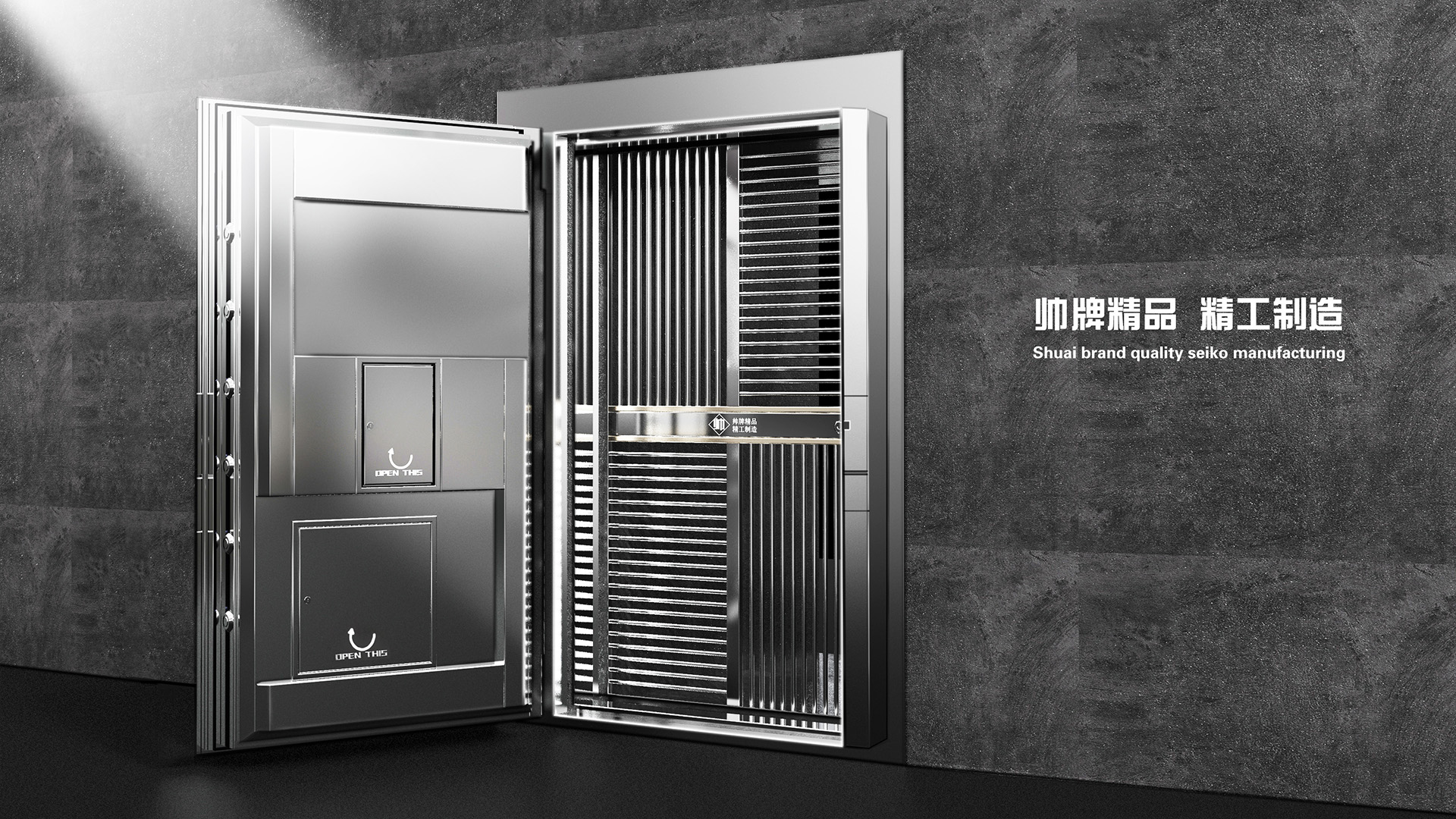
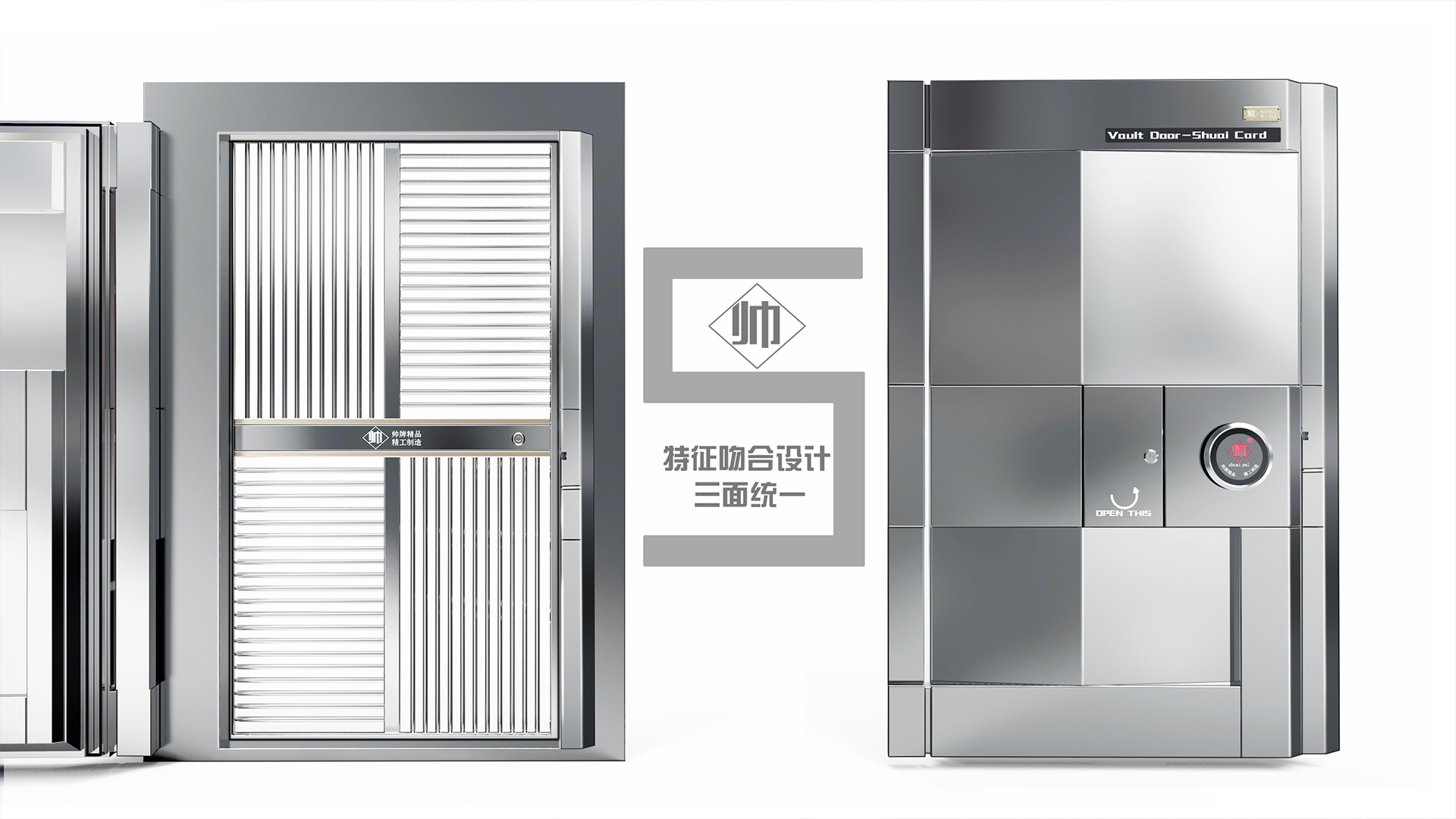
Inspired by the shape of the brand's first letter "S", the brand design is integrated, the shape conforms to the characteristics of the bank, the cost is low and the atmosphere. The door lock hinges on both sides form a unified design, visually regular, the open state of the door presents brand characteristics, and the closed state presents the letter "B", which means "bank" and bank. The small door is cleverly integrated into the overall shape to become a money symbol "$", the overall design language is unified, and the door body is simple and atmospheric.




The copyright of this work belongs to 韵博设计. No use is allowed without explicit permission from owner.

New user?Create an account
Log In Reset your password.
Account existed?Log In
Read and agree to the User Agreement Terms of Use.

Please enter your email to reset your password
Not bad
Good job!
Great!