Name of Work | Shanghai Medicinal Soap Sulfur Liquid Mite Soap
Brand Holding | Shanghai Soap Co., Ltd.
Original Design | Tiger Pan
Executive Design | Chi Qian Xiang Jing Wen Ye Mei Tao
Craft Design | Xie Zhangkun Zhou Jinyan
Visual Presentation | Zhu Yuling
Video Presentation | Ma Chao Liu Sijia
"Shanghai Medicinal Soap" is a well-known domestic brand under Shanghai Soap Co., Ltd. It is believed that "leather soap" can arouse many people's childhood memories. The aesthetics of the times are undergoing drastic changes. Rough bold enlargement is no longer the mainstream. As a national brand developing with the Shanghai era, this packaging upgrade will not blindly add oil and vinegar to the new Shanghai medicine soap, but will restore the original tone. The elements of the times serve the past and the present, and the exclusive style of "Shanghai medicine soap" will be integrated and innovated.
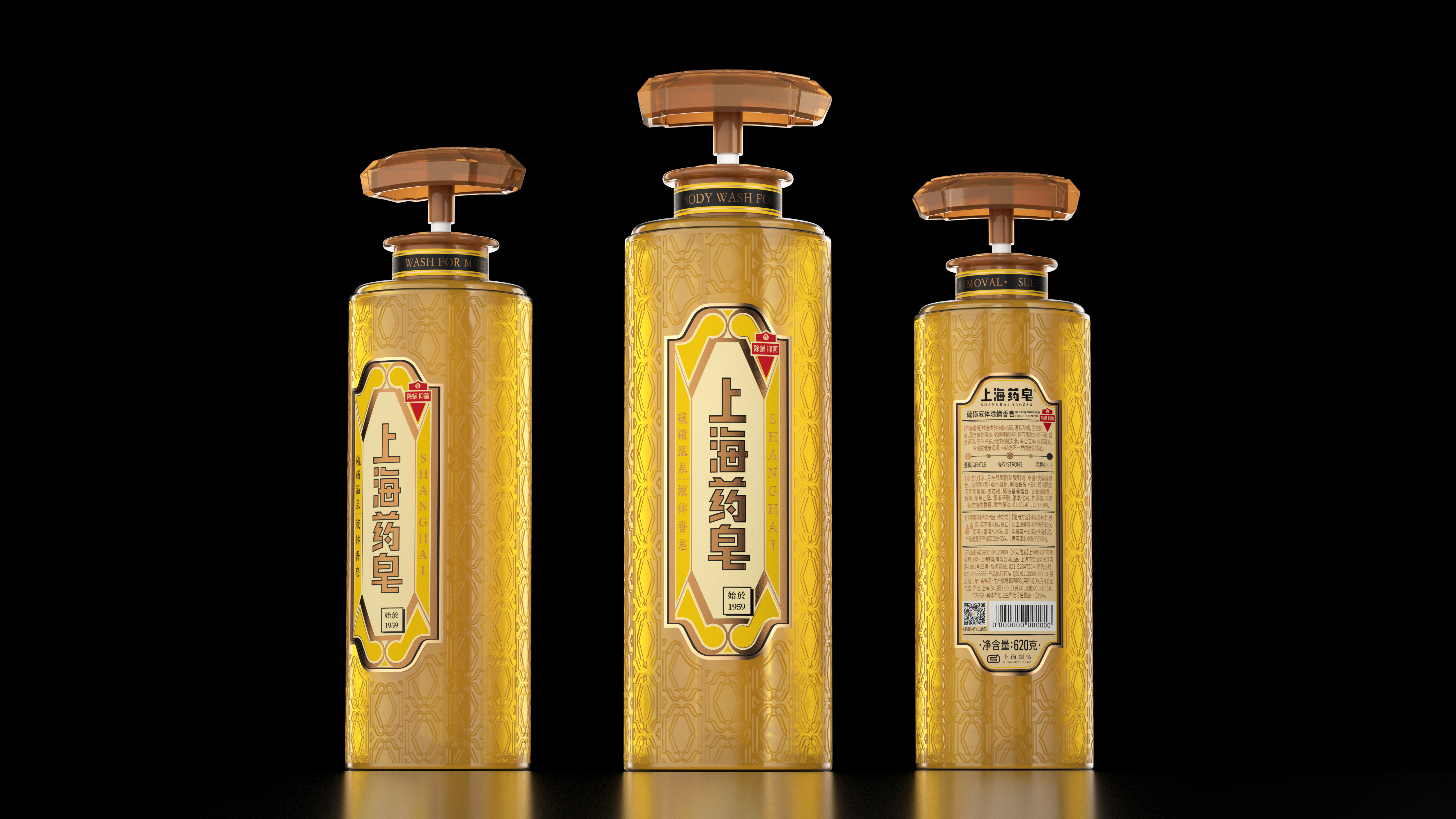
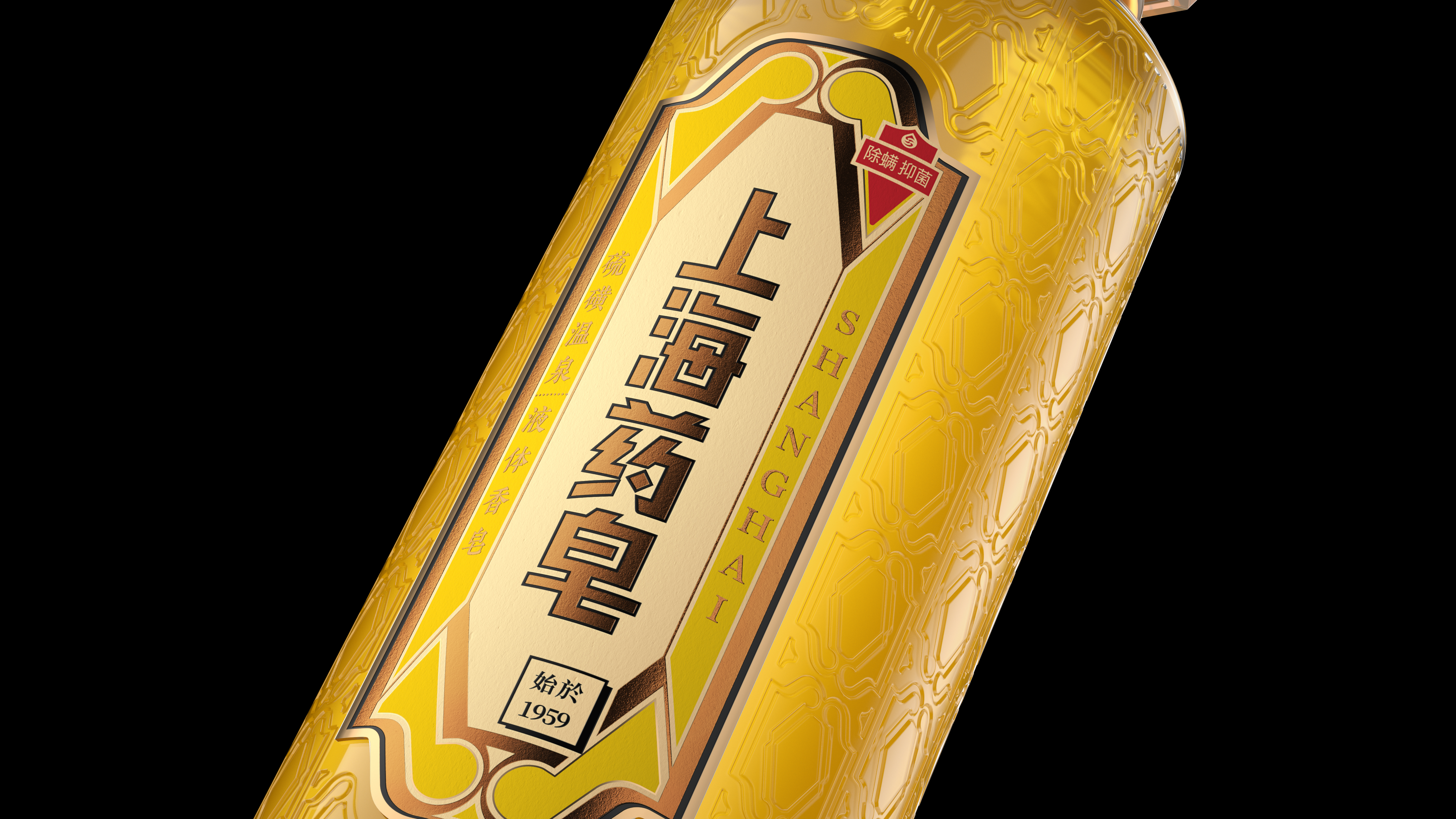
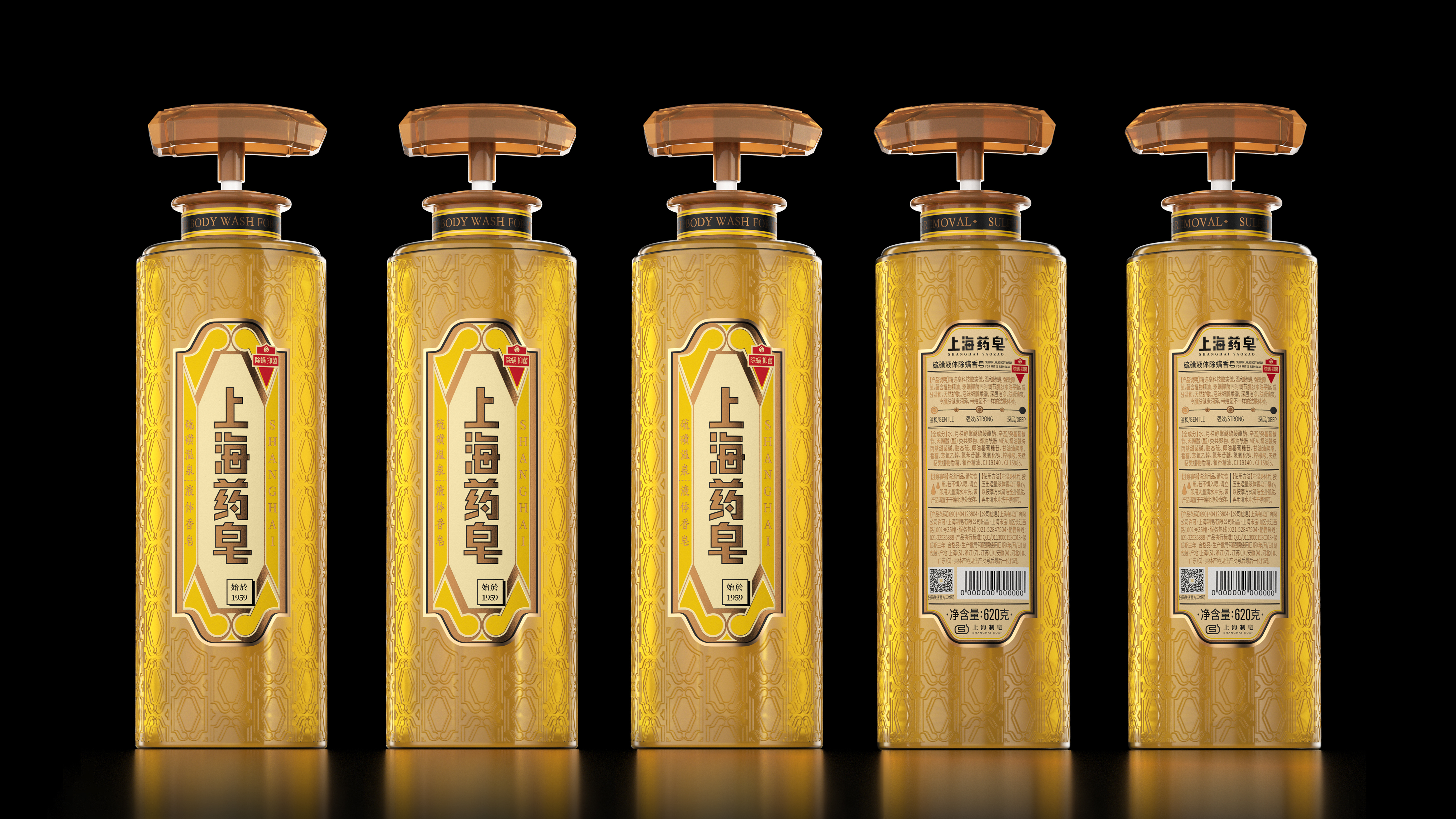
When it comes to Shanghai medicine soap, what impresses consumers most is the light yellow solid sulfur soap that is popular all over the country, which has the effect of removing mites and inhibiting bacteria. We extract the outer contour shape from the soap, and use the decorative art aesthetics as inspiration to create a visual symbol exclusive to Shanghai medicine soap. Maximize the display area of bottle stickers, keep the original logo, and use exclusive graphic language to tell the brand connotation and story.
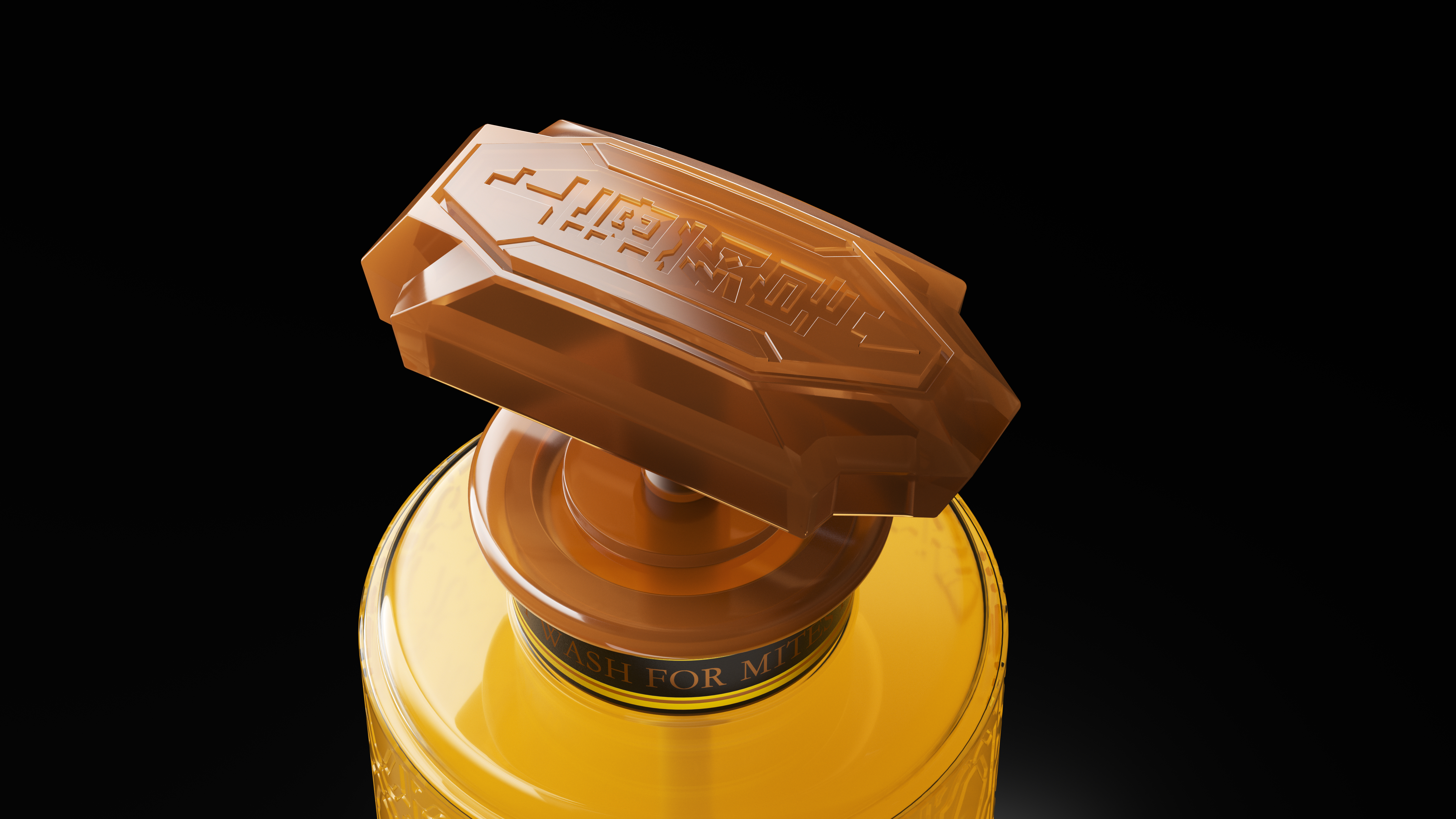
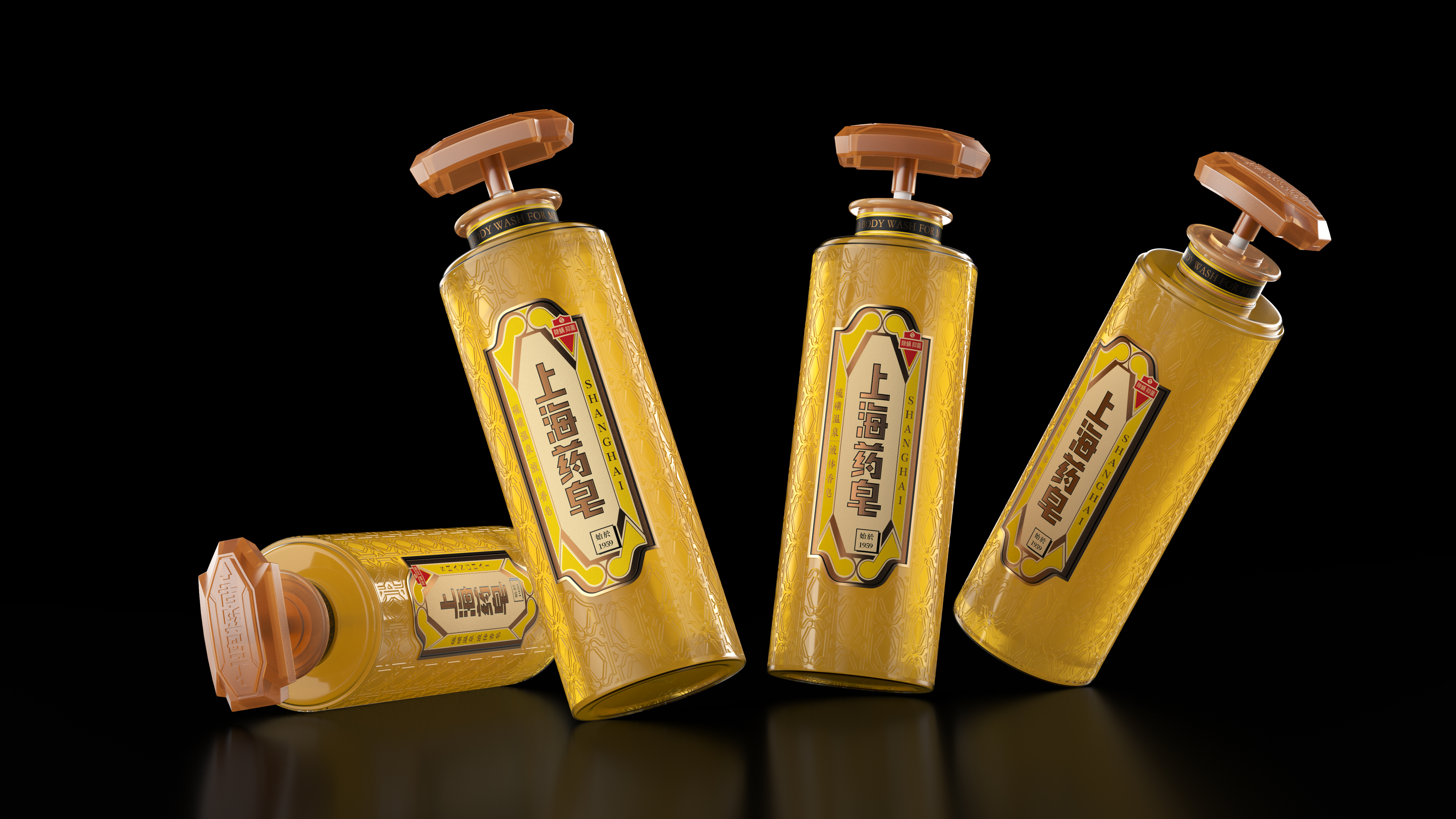
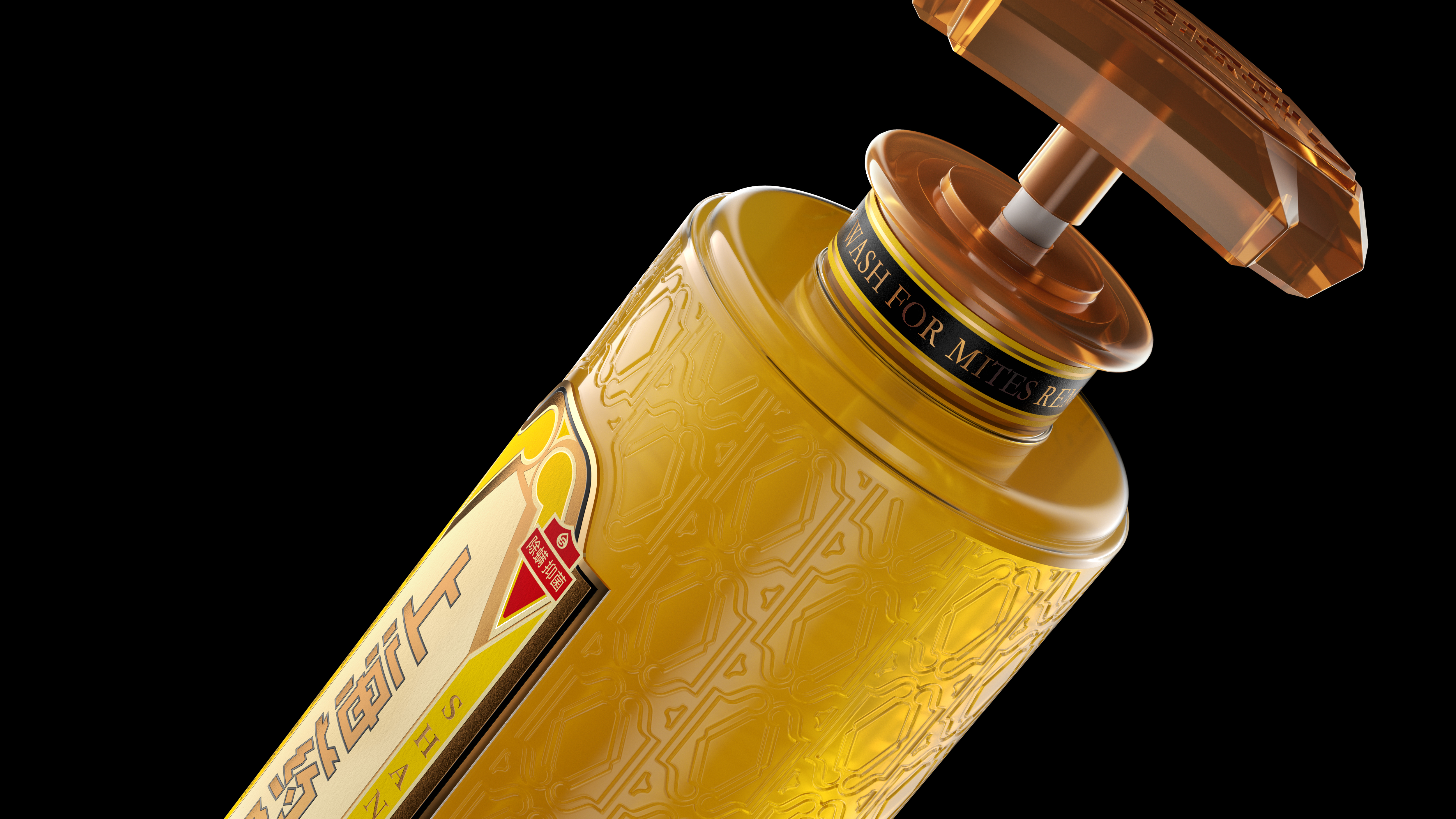
The shape of the container is one of the highlights after the upgrade. The decorative graphic relief is attached to the transparent bottle body. The shoulder of the bottle body is added with shoulder pads, and the black gold choker shining on the neck makes the bottle instantly have personality characteristics, just like a fashionable and exquisite Shanghai woman. In the shape design of the bottle cap pump head, it still runs through the outline of the medicated soap, has anti-skid effect, leaves the inside empty, maintains the super symbol shape and saves more materials. The rhythm of text information is clear, bronzing, printing and other processes are matched, and the quality is highlighted between delicate changes.
If the upgrading of the packaging of Shanghai medicinal soap is the awakening of the old Chinese products to conform to the development of the times, we are very pleased to see that such old brands are no longer conformist, nor are they staying in the so-called "rough" national trend, and creating products of the new era that belong to their own style is what everyone hopes.
The copyright of this work belongs to 潘虎设计实验室. No use is allowed without explicit permission from owner.

New user?Create an account
Log In Reset your password.
Account existed?Log In
Read and agree to the User Agreement Terms of Use.

Please enter your email to reset your password
It's too full
Great!
There is noble spirit, the identification is completed