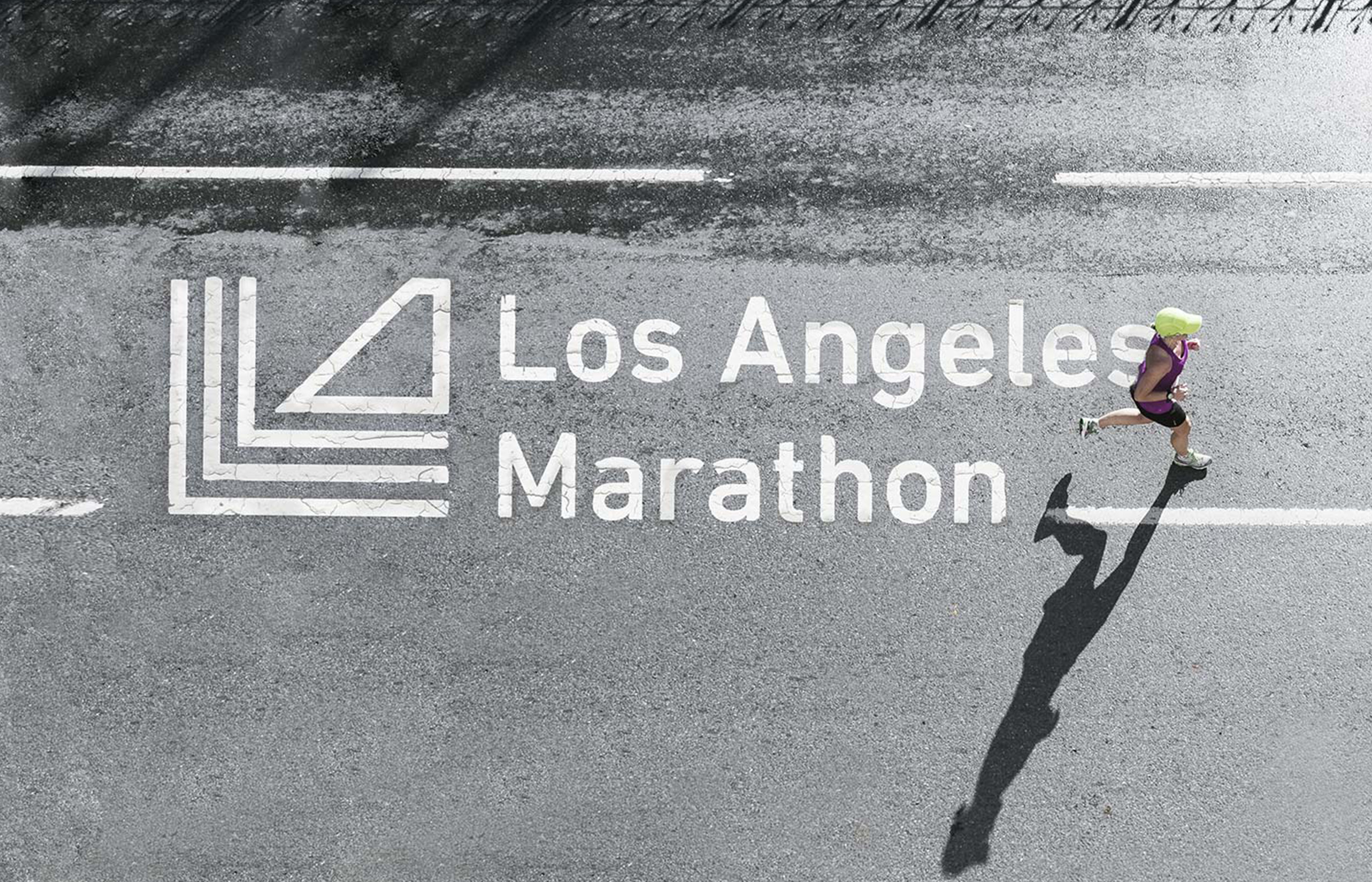
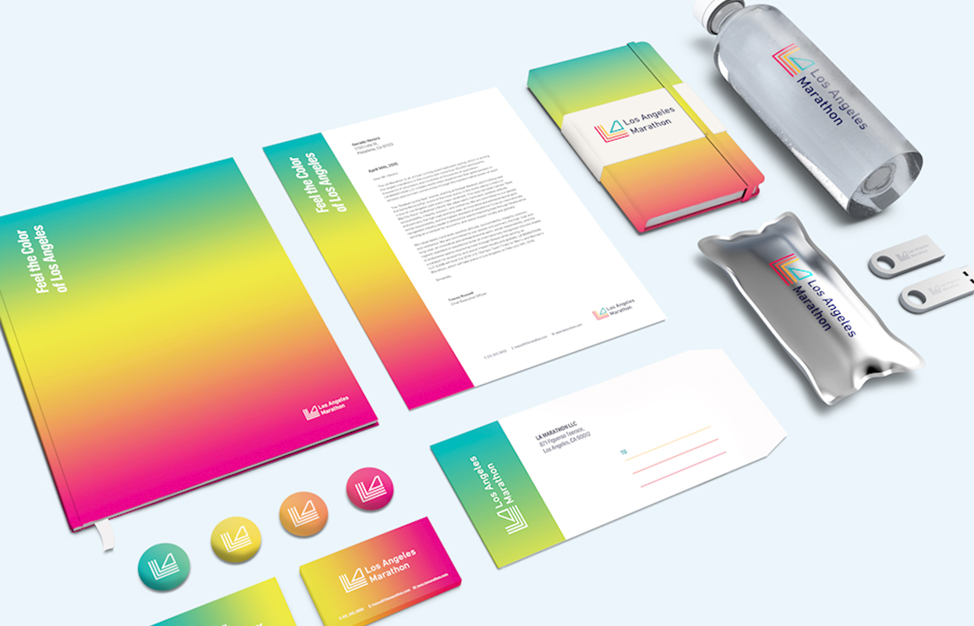
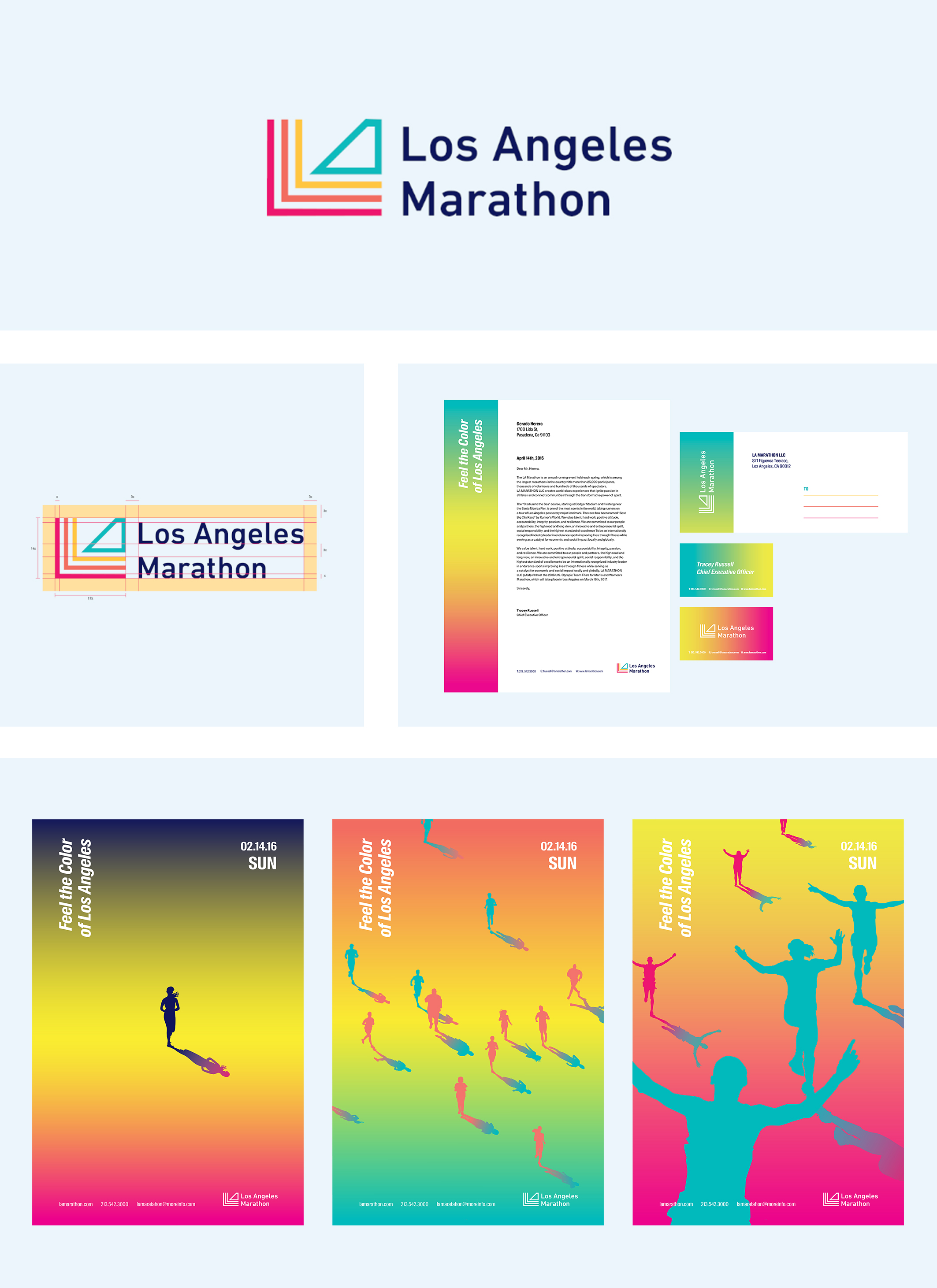
The Los Angeles Marathon rebrand conveys the question of what makes Los Angeles, Los Angeles. Its rebrand emphasizes the identity of its iconic city, and what Los Angeles can offer. The slogan is “Feel the colors of Los Angeles." The runners are not only from California but runners from other states and countries get to feel the iconic city of Los Angeles by participating in the marathon. The new mark has 3 meanings: the letters LA, the marathon routes, and the thriving city represented by a Los Angeles building in its shadows. Its new brand identity embraces the colors of the city of Los Angeles from dawn till sunset. The Los Angeles Marathon rebrand conveys the question of what makes Los Angeles, Los Angeles. Its rebrand emphasizes the identity of its iconic city, and what Los Angeles can offer. The slogan is “Feel the colors of Los Angeles." The runners are not only from California but runners from other states and countries get to feel the iconic city of Los Angeles by participating in the marathon. The new mark has 3 meanings: the letters LA, the marathon routes, and the thriving city represented by a Los Angeles building in its shadows. Its new brand identity embraces the colors of the city of Los Angeles from dawn till sunset.
Country
United States America
Year
2018
Designer
So Yoon Kim
The copyright of this work belongs to K-DESIGN AWARD. No use is allowed without explicit permission from owner.

New user?Create an account
Log In Reset your password.
Account existed?Log In
Read and agree to the User Agreement Terms of Use.
Please enter your email to reset your password


Comment Board (0)
Empty comment