The overall concept of this project is centered on the characteristics of Jinhua Development Zone, which is shaped like the structure of the Chinese character "people", combined with the letter jk, which means that Jinkai is a work feature with people as the core; the circle represents wisdom; the changing curve represents flexible policies and mechanisms. The logo as a whole is based on yellow, red, green, and blue, which reflects Jinkai technology, efficiency, eternity, and has vigorous vitality.
The copyright of this work belongs to 合木设计. No use is allowed without explicit permission from owner.
New user?Create an account
Log In Reset your password.
Account existed?Log In
Read and agree to the User Agreement Terms of Use.
Please enter your email to reset your password
Good
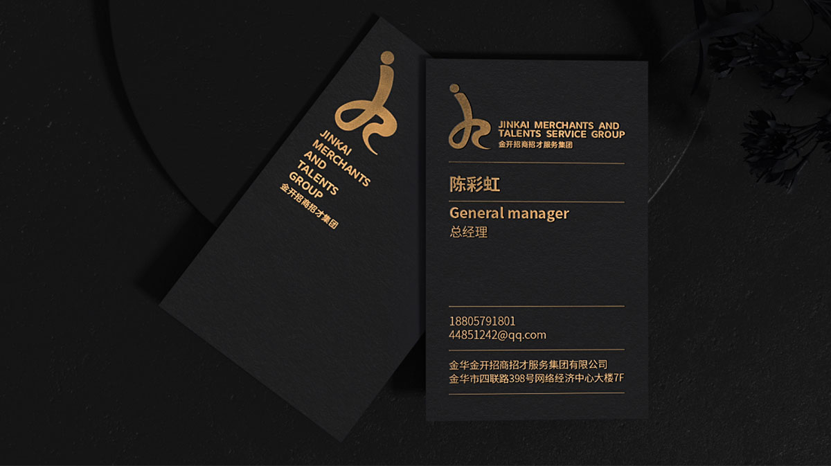
The manager's name and background match well.