Aca ~ aca ~ aca ~
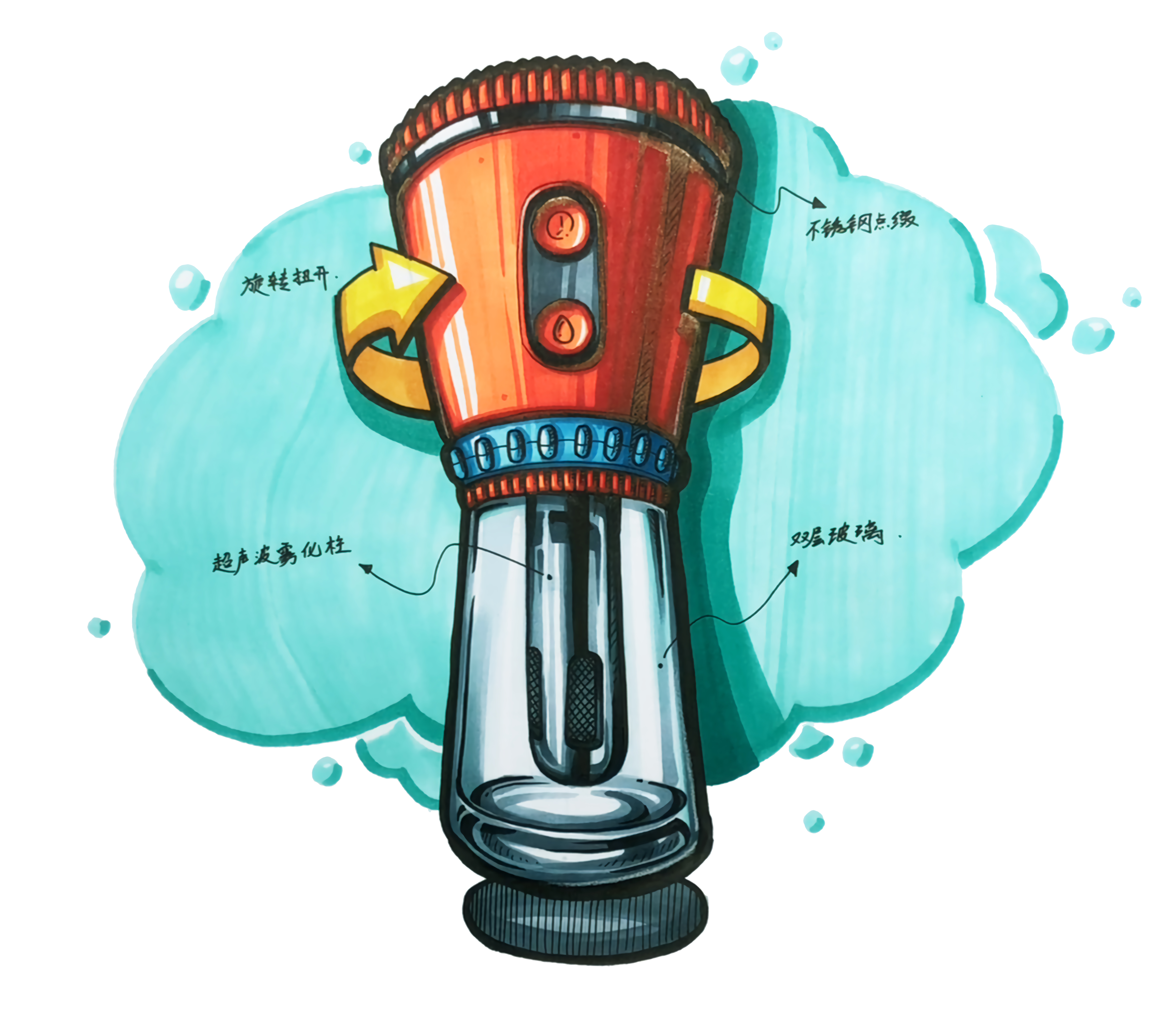
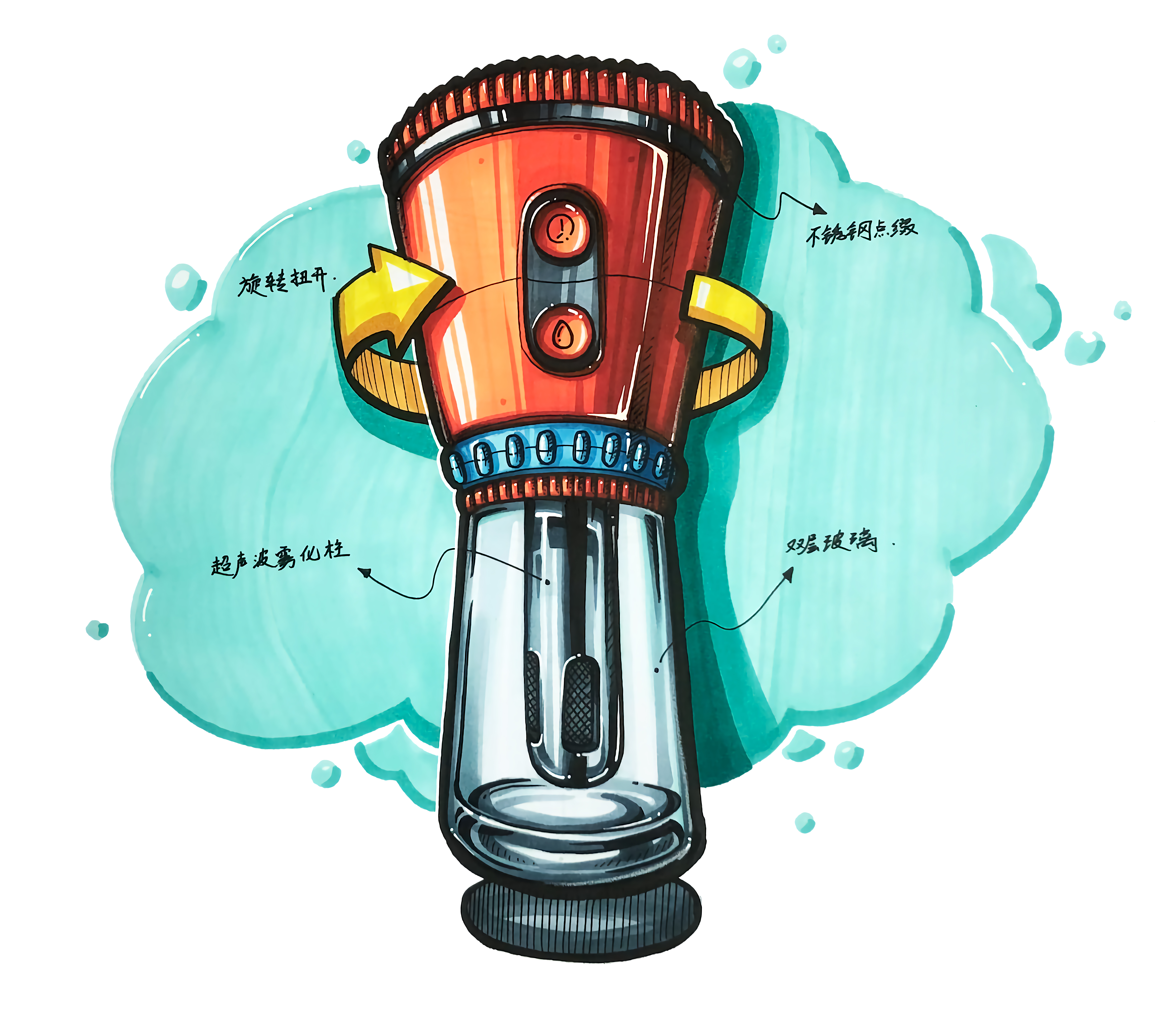
Hello, everyone, I am Xuanwei. You can call me Xiaoyi. Today we are going to draw a cold coffee cup. The picture will finally show a smart and transparent feeling.
Before painting, first analyze the picture from two points. First, starting from the shape of the product, the appearance and dynamics of the product are relatively conventional. In order to make the visual effect of the product more prominent, we choose to use a special perspective -- The two-point perspective of head-up is used to depict our product effect today. How to use this perspective, we will have a detailed explanation later.
The second point is to analyze the material of the product. This product needs to show three different material effects, namely glass, stainless steel and plastic. The expression of glass effect is the focus of our practice today.
In order to make the picture more dynamic, we have refined liquid bubbles as elements to depict the product background, so that the product and the picture have more interaction, and the whole product is richer and more harmonious.
Well, that's all for the analysis. This is the tool we need today. Let's draw happily together next ~
Come and hand-draw together❤️❤️❤️
Teaching video link
https://www.bilibili.com/video/BV1xe4y1Y7bi?share_source=copy_web&vd_source=2e222812481ac3497ec0e2f3da0eb012

In the starting process, we should focus on the application of "two-point perspective of head-up vision". If students who do not understand this perspective, they can first refer to the schematic diagram next to it, draw the auxiliary line, and then grasp the large shape of the product.
When it comes to tracing, our key point is: to grasp the coherence and structural accuracy of elliptical lines; Of course, if we draw one or two curves incorrectly or do not draw smoothly on the way, these situations are normal. For the remedy of this clock problem, we can repair it in the strengthening feature link, coloring link and soul injection link. Xiaoyi will teach you some emergency tips, so we can draw boldly, don't be afraid of shaking hands.
We can show the small black color blocks with the thickness of the glass at the tracing stage, which can make us more clear about the area where we focus when coloring, and can also effectively avoid excessive cross-border of the color blocks, resulting in poor glass effect.

When it comes to strengthening the feature link, the purpose of this link is to make the product more prominent. We can appropriately emphasize the feature line of the product. In this strengthening process, it is also the process of repairing the line problem.

In the bright face link, there are two core concerns: to reserve appropriate blank space and reasonable distribution of color blocks. Regarding the reasonable distribution of color blocks, we mentioned in the previous video that color block distribution can refer to the visual principle of 60:30:10, but this principle is obviously not suitable for the product picture requirements of large-area glass materials, because the performance of glass materials requires large-area bright gray surfaces, therefore, when we face this 40:50:10 multi-gray color matching ratio, how should we avoid the problem of poor visual effect of the whole product due to too many gray blocks? The key lies in: pulling apart the chromaticity comparison between gray block parts. Under normal circumstances, light gray must be the main part, dark gray should be used as embellishment, and adjusting the dark area of the product appropriately, this is one of the effective ways to avoid the above problems.

When it comes to the gray surface, in addition to the conventional control of the proportion of the gray surface, there are two main points that are specially paid attention to. The first point is to control the relationship between the local and overall light and dark changes of the components; When we portray components with small bumps, we need to pay attention to the harmony between the light and dark changes of the local concave and convex and the overall light and dark changes. In general, the overall light and dark changes include local light and dark changes, in this way, the light and shadow effect of the picture will be more unified. The second key point is: the texture of the glass is depicted. The core of the texture expression of the glass lies in the expression of the thickness of the glass. In the process of this expression, attention must not be paid to painting the glass too gray or too black. Generally speaking, the effect of the glass must be mainly bright gray surface, and the medium ash and heavy ash are concentrated in the expression area of the thickness of the glass.

Then deal with the dark part. The dark part is the surface with the smallest proportion of bright gray and dark when we portray conventional products. What should be paid attention to is: avoid cutting the dividing line of dark surface as far as possible, and keep the integrity of the dividing line of dark surface as far as possible; When dealing with the dark part of glass, we must avoid excessive use of color on the backlight surface of glass parts in order to strengthen the volume feeling of glass parts, keep in mind that when depicting glass materials, medium ash and heavy ash are concentrated on the thickness of the glass, emphasizing that the body block can be used, but special enough must be paid attention to for glass materials.

When it comes to the card point link, it is necessary to pay attention to the point until it is in place. The dividing line of the dark part, the effect performance of stainless steel and glass materials all need to be adjusted through the card point to realize the effect of the material. We can use the skill of scanning pen to emphasize. If there are students who do not know how to use scanning pen, they can leave me a message in the comment area and I will give you a detailed answer.

In the detail description link, in addition to the conventional requirements, we also need to strengthen the performance of the product volume sense; the expression of small concave-convex changes in the product components can be achieved by adding small cable to the dark surface, which can make the overall product more harmonious, but also the fineness of the product full.

To adjust the completeness of the picture, we add arrows and product introduction copy in the blank part of the picture, depict the icon of the button and make up the structural lines of some missing parts, so as to enrich the overall effect of the picture.

Finally, to inject the soul, this link should pay attention to: to depict the light and shadow changes of glass thickness, we can first use white colored lead to draw the reflective and highlight parts of the product, and then use a high-gloss pen to highlight the highlights and some places that need to be emphasized. Such light and shadow changes will be more delicate and richer, thus showing the transparent texture of glass.
All right, this cold coffee cup is finished. I hope all my friends can support it a lot. You can leave me a comment on anything you want to see. I will try my best to meet your needs. Don't forget, please pay more attention. Goodbye ~
Come and hand-draw together❤️❤️❤️
Teaching video link
https://www.bilibili.com/video/BV1xe4y1Y7bi?share_source=copy_web&vd_source=2e222812481ac3497ec0e2f3da0eb012
The copyright of this work belongs to 小艺设计考研. No use is allowed without explicit permission from owner.

New user?Create an account
Log In Reset your password.
Account existed?Log In
Read and agree to the User Agreement Terms of Use.

Please enter your email to reset your password
It's good except for a little candy, which is super sweet.
Excellent!
Can
Are there any rendered pictures
This is actually a coffee machine